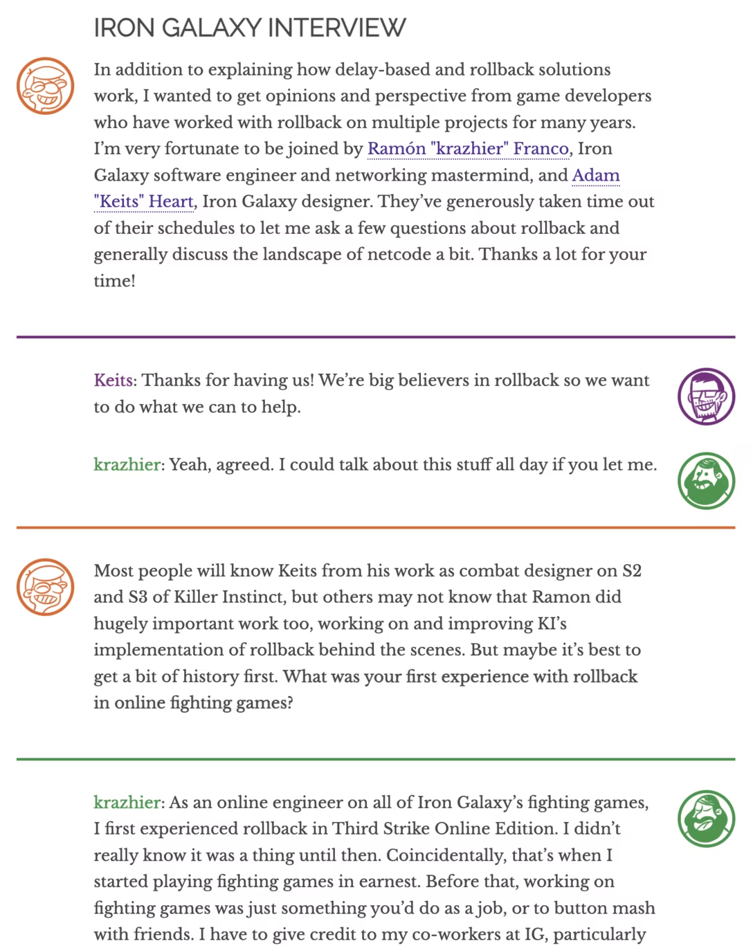
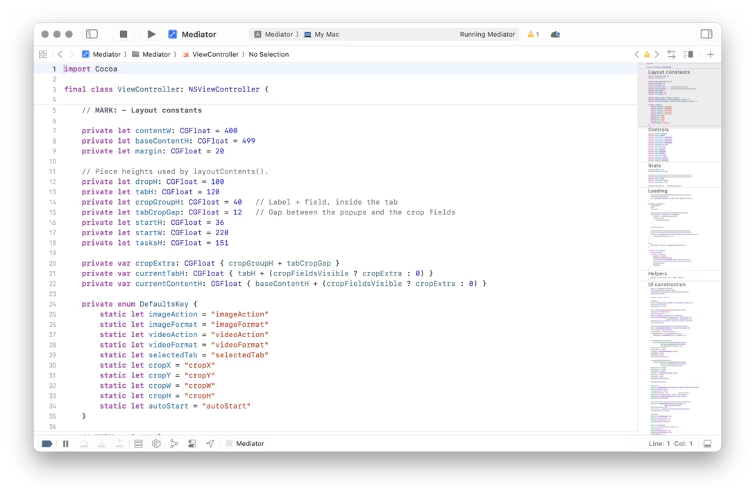
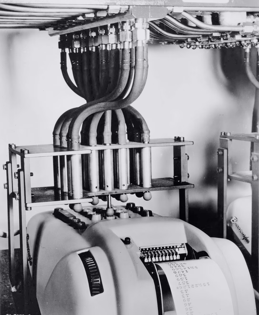
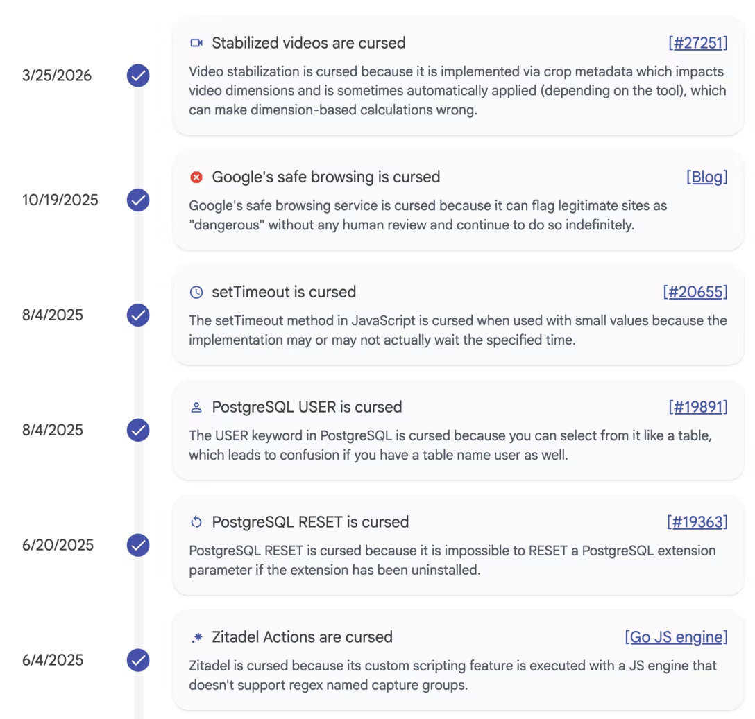
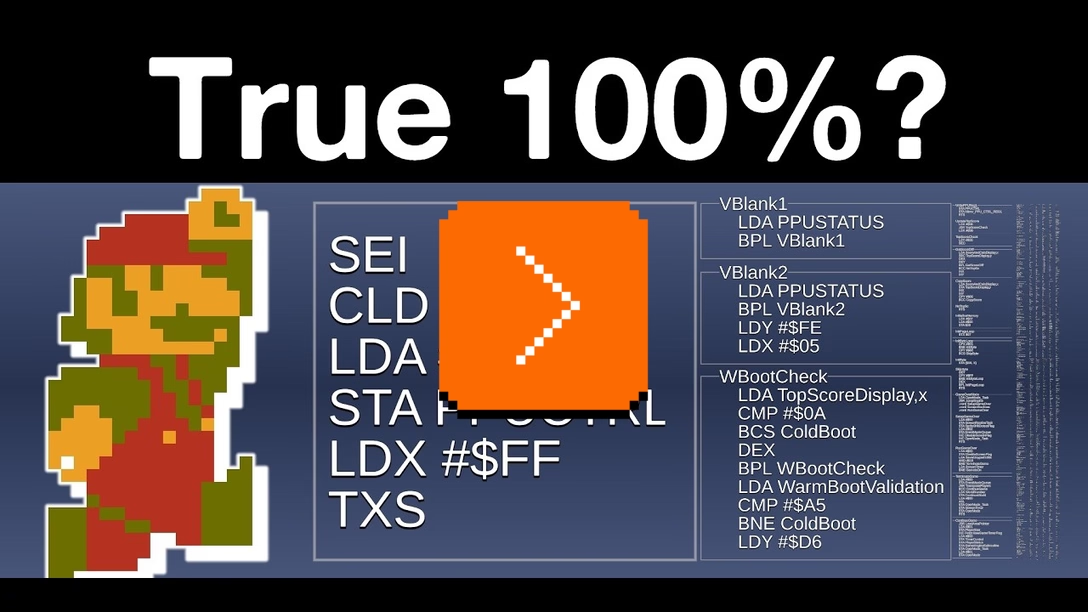
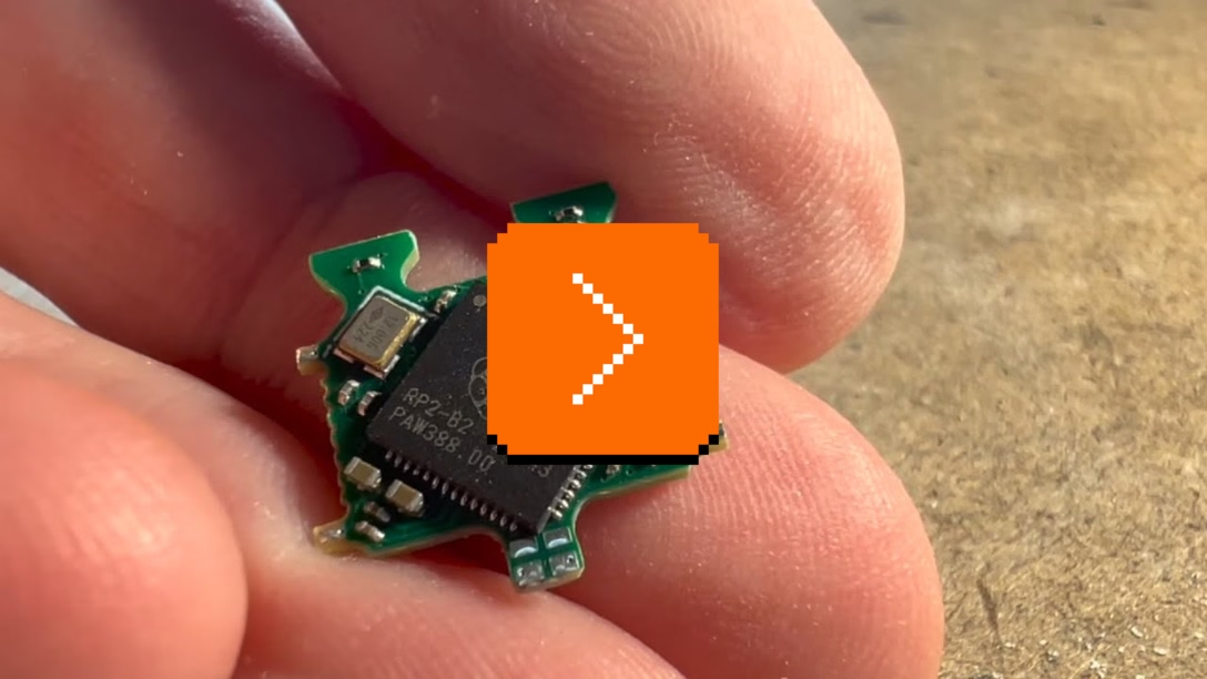
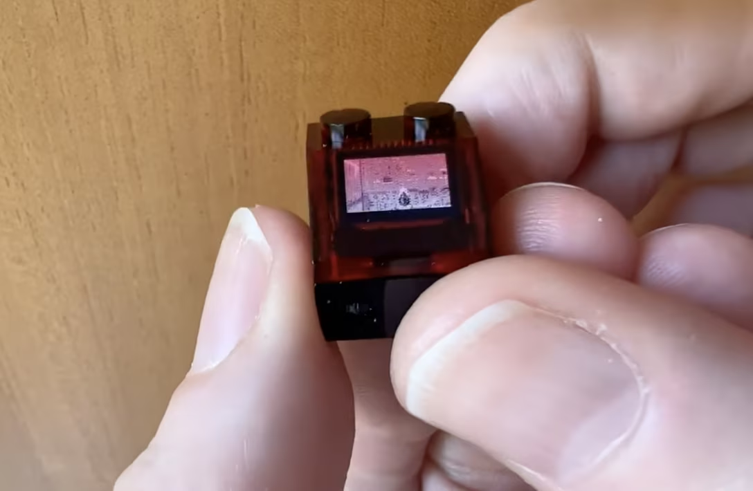
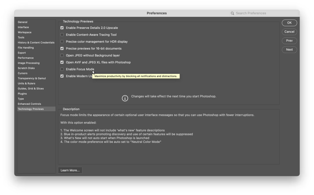
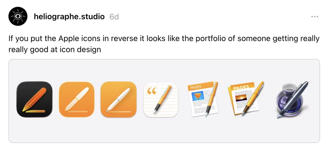
I liked this post by Roel Nieskens, about
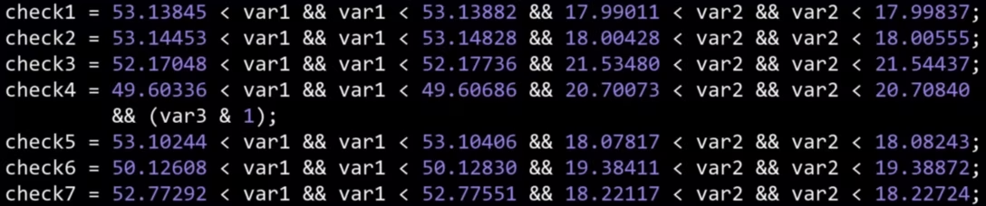
ten lines of code that, one way or another, mean something to me. Either because I wrote them, or I extensively copied them, or they made me laugh. Or cry.
It’s perhaps a different take on cursed knowledge, and made me wonder what those would be for me, or for other people with different specializations. (We previously talked about Duff’s device, which had a certain impact on me – even though I never used it myself.)#coding
Content Preview
ten lines of code that, one way or another, mean something to me. Either because I wrote them, or I extensively copied them, or they made me laugh. Or cry.
It’s perhaps a different take
on cursed knowledge
, and made me wonder what those would be for me, or for other people with different specializations. (We previously talked about
Duff’s device
, which had a certain impact on me – even though I never used it myself.)
I would phrase this as the fault of the animation having violated the Hippocratic oath for animations, which is “first, do no harm” a.k.a. “first, don’t interfere with user input”.
Yes, one has to be afraid of hyperbole – was there ever an onscreen transition that saved a life? – but there is something I really liked about this phrasing. After all, most transitions and animations are decorators, and
every
transition and animation is, by definition, also a
delay
.
Here’s Shazam as I open it, and overlaid are my frantic taps as I’m trying to make it start the song recognition process:
It’s a cute cold start animation, but:
It’s not interruptible, like animations should be.
It doesn’t even buffer the taps, so – in case the animation covers for something truly uninterruptible, like loading from the cloud – I can’t simply tap and forget, but instead have to wait and tap after it’s done animating.
What’s particularly frustrating here is how Shazam is being used. On the other end of this whole flow is a song that might already be fading out – timing myself, a user, can’t control – so time wasted on the uninterruptible animation might be seconds separating failure from success.
I know it does feel like a blink of an eye when watched out of context, and it
is
literally just a bit over a second of a delay in the best case scenario, but I wanted to share it as a general example. I believe these seconds add up, especially in a stressful moment, on an older device, repeated many times a day, across different apps… or all of the above. (My go-to example: Imagine your keyboard keys reacting with a second of delay!)
At least, I should compliment Shazam for not making another mistake: after the recognition starts, tapping the same button doesn’t cancel it – instead, you have to tap a close box in the corner. Here, the designers realized I might actually be slamming the big button many times over, and I shouldn’t be punished for it even more.
I wrote recently, about macOS, “it’s hard when the operating system cedes its responsibilities to provide good design patterns,” and Mac developer Brent Simmons in a recent essay shares a parallel line of thinking about how unreliable and untenable designing with the basic macOS UI components has become:
Content Preview
I
wrote recently
, about macOS, “it’s hard when the operating system cedes its responsibilities to provide good design patterns,” and Mac developer Brent Simmons in a recent essay shares
a parallel line of thinking
about how unreliable and untenable designing with the basic macOS UI components has become:
But there’s another reason: the stock Mac UI is designed by Apple, the best designers in the world, and do you really think you can do better? Really?
The app world is full of people who think they’re better and they’re really, really, really not.
Well, I still think Apple has the best collection of UI designers in the world, but, for whatever reasons, the guidance from above on how the Mac UI should look is missing the mark. I’m not blaming the people doing the work — they’re doing great work with the direction they’re given.
So this — bad direction — is where the secret third reason falls down. And we’re left with no real reason to stick with stock Mac UI (except for wanting approval from longtime Mac people like me, and you really shouldn’t care about that at all).
In addition to low interface quality and sometimes flimsy guidance, Simmons also adds how much effort it is just to keep up with default macOS interface, which feels like the opposite of its social contract:
The idea was that by using stock Mac UI you the developer would be carried along — you’d get most of the macOS changes every year mostly for free or with not
that
much work, since you’d kept up every year.
But my app NetNewsWire has a very stock Mac UI, and Liquid Glass adoption last year was a lot of work. Using stock Mac UI didn’t save us much — in fact, we had more work to do compared to the apps with more custom UI.
We talked about
this before
in the context of all those menu icons that were mandatory…
for just one version
. Imagine sinking time and resources to create the icons one year, only to learn 12 months later that this was just a head fake, and one without – as far as I know – even a hint of an apology from Apple.
On his fascinating and long-running Windows dev blog The Old New Thing, Raymond Chen writes about the story of scrollbar right-click menus:
Content Preview
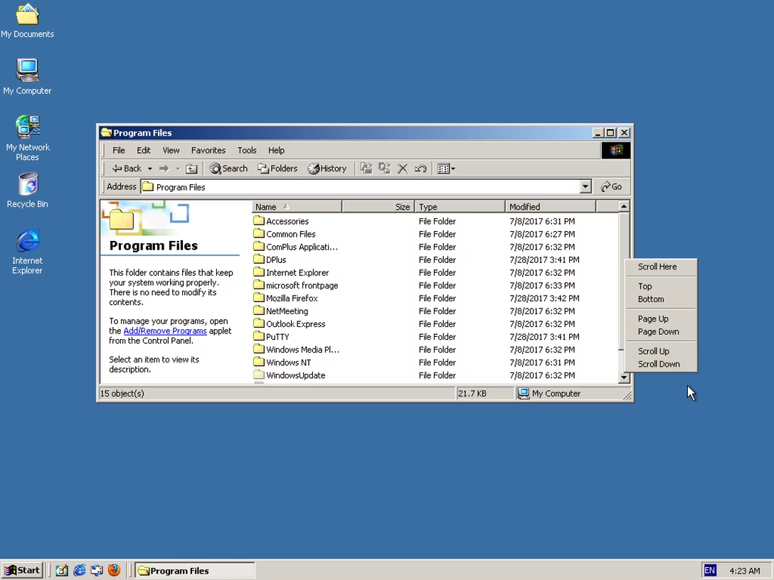
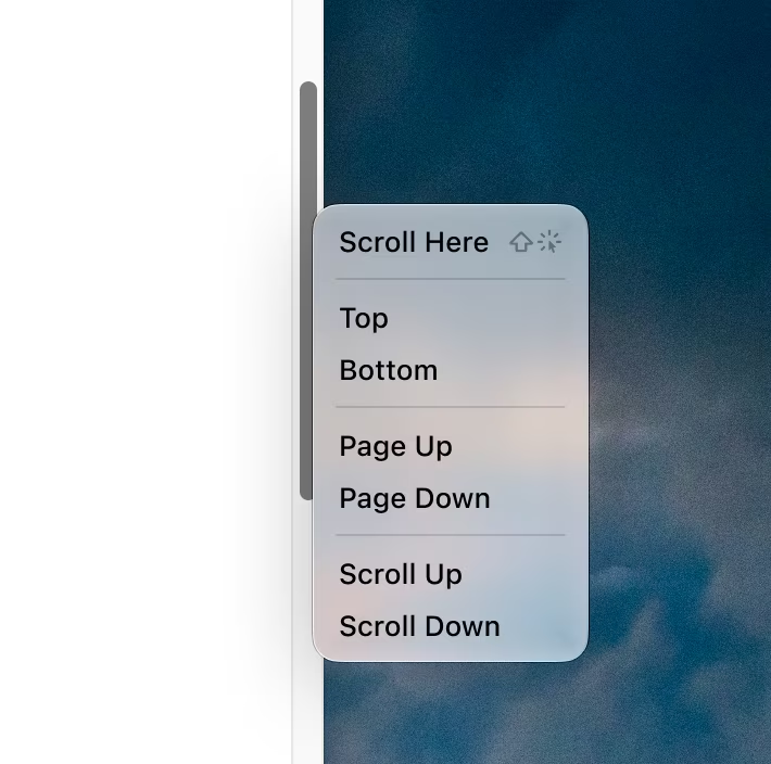
Windows 2000 added a right-click menu to the scroll bar. This menu gave you four options that matched existing mouse operations, two operations that matched existing keyboard operations, and a new operation.
The interesting new one is “Scroll Here”: You can right-click directly on the spot you want to scroll to, and then pick “Scroll Here”. This is much more convenient if you want to scroll a long distance, since you don’t have to grab the scroll bar thumb and then drag it all the way to where you want to go. You can just focus on where you want to go and not where you are coming from.
I used this context menu a lot when I needed to jump long distances. […] An even-more-hidden shortcut was added at the same time: Holding Shift while clicking on the scroll bar jumps the thumb directly to the spot where you clicked. ¶ I didn’t know about this shortcut until recently.
The menu looked like this, for what it’s worth:
(The equivalent function also exists on a Mac, except there it’s hiding under ⌥, and not ⇧.)
Chen covers a few interesting things in his post, including the challenge of new frameworks losing hard-won UI affordances of their predecessors. But what caught my attention was something else I’ve thought about occasionally: why are menus so averse to mousing shortcuts?
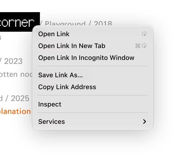
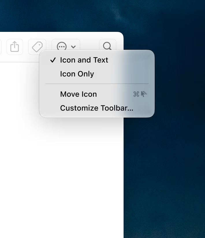
For example, you can imagine a browser link menu showing a few simple click gestures:
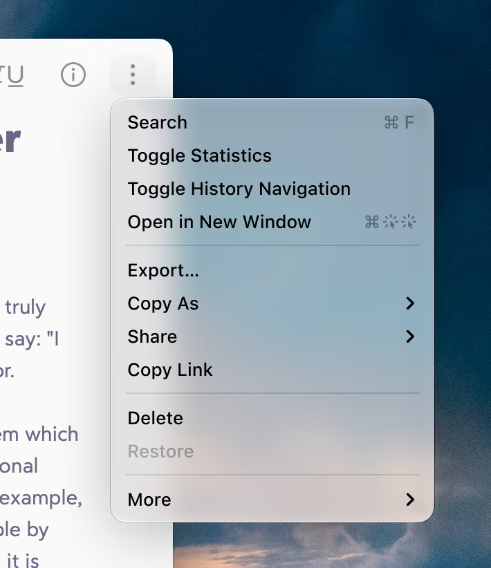
Or, this tapback details shortcut in the right click menu in Messages:
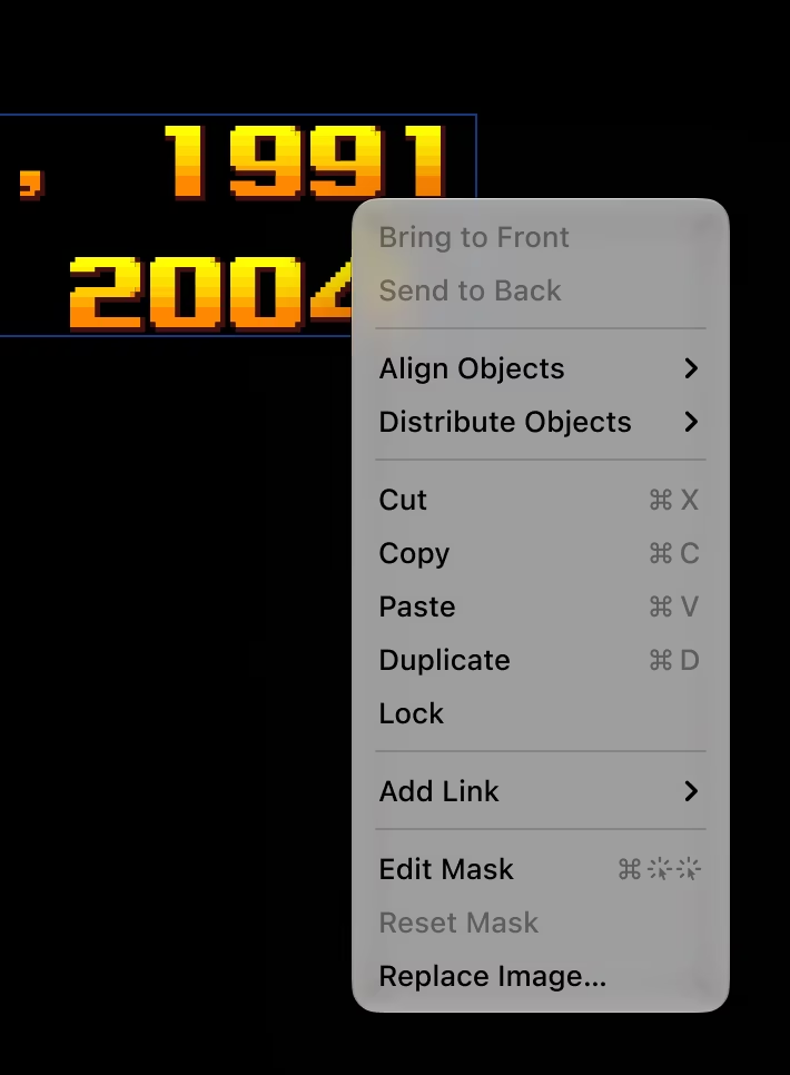
Or this for masking in Keynote when you right click an object:
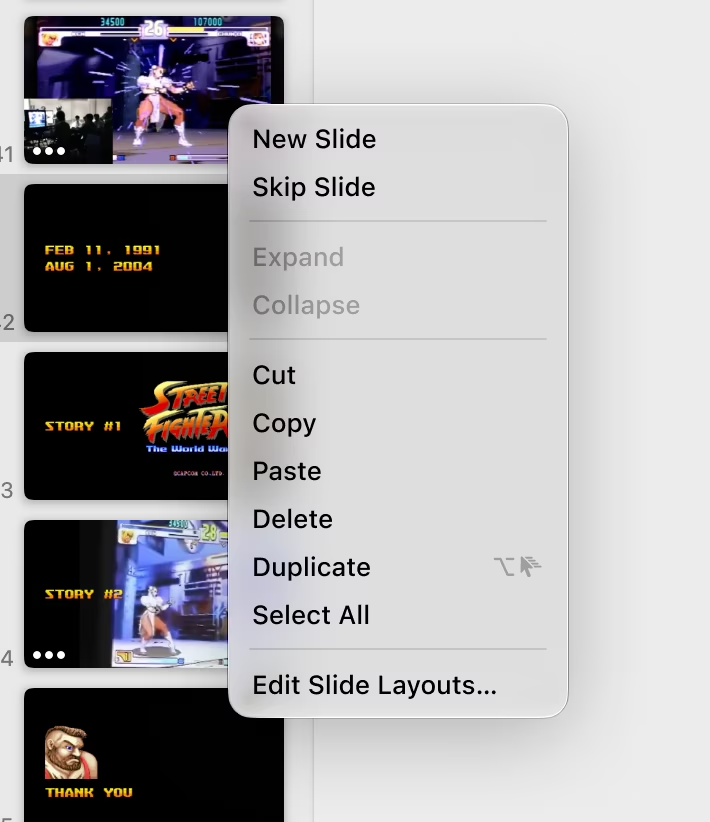
You could even imagine announcing simple gestures, like ⌥+dragging to duplicate, or ⌘+dragging for a quick modeless move:
Item menus would also work, not just right click menus (and yeah, ⌥-opening is a real Finder feature!):
I am curious why we’ve never gone in that direction. I haven’t seen anything like this, and I can imagine some counterarguments:
“The symbols might be confusing.” I am not sure. Here, I used a few temporary SF Symbols that have some challenges (the double click in particular feels clunky), but I could imagine a talented icon designer taking it all for a spin, and arriving at a clean and elegant visual vocabulary.
“It’s too specific. It will only work for right click/context menus.” Yeah, I see this challenge. The mouse gestures and shortcuts require the mouse cursor to be at a specific position – the noun to the menu item’s verb – which only context menus provide. When you look at one of the menu commands I invented – Move Icon – there is a lingering question: what would that command do if I selected it? But on the other hand, I also see this visual gestural vocabulary growing to be useful in other places: hint text, tooltips, documentation.
“Power users don’t need onboarding.”
This last one I feel passionate about, and this is where we can go back to where we started. If Chen, having written about Windows in detail for decades, didn’t know about this keyboard shortcut, what chance do
we
have?
I believe onboarding should be universal and ongoing. There is always a new thing to learn somewhere regardless of one’s proficiency; you don’t ascend some sort of a Mountain Of Poweruserness, get a certificate, and proclaim your learning complete. Plus, proficiency is usually localized: no one is fully an expert in every aspect of even one app, let alone all of them. If Chen were to see something like this back in the day, it could have helped him – and I imagine others, too:
I’m curious if you have seen any app attempting anything like it. If you did, please reach out.
À propos the previous post, wanted to share a 2019 article by Gregory Travis about the two Boeing 737 Max disasters that shook the world in late 2018 and early 2019. It’s titled How the Boeing 737 Max Disaster Looks to a Software Developer, and I found it fascinating, well-written, and filled with great details.
Content Preview
The Max variant of the 737 was redesigned to allow larger, more efficient engines, but this made it less predictable, which the company decided to paper over in software:
The airframe, the hardware, should get it right the first time and not need a lot of added bells and whistles to fly predictably. This has been
an aviation canon
from the day the Wright brothers first flew at Kitty Hawk.
Apparently the 737 Max pitched up a bit too much for comfort on power application as well as at already-high angles of attack. It violated that most ancient of aviation canons and probably violated the certification criteria of the U.S. Federal Aviation Administration. But instead of going back to the drawing board and getting the airframe hardware right (more on that below), Boeing relied on something called the “Maneuvering Characteristics Augmentation System,” or MCAS.
Boeing’s solution to its hardware problem was software.
This feels like an interesting extension to the
fly-by-wire story of Air France Flight 447
, where Boeing seemed to be on the other side of the fence to the Airbus. Perhaps no more:
[…] It seems that with the 737 Max, Boeing has changed philosophies about human/machine interaction as quietly as they’ve changed their aircraft operating manuals.
Travis argues that people building the software did not fully understand the shift, and particularly didn’t really understand how pilots fly the airplane during more challenging moments:
Those lines of code were no doubt created by people at the direction of managers. Neither such coders nor their managers are as in touch with the particular culture and mores of the aviation world as much as the people who are down on the factory floor, riveting wings on, designing control yokes, and fitting landing gears. Those people have decades of institutional memory about what has worked in the past and what has not worked. Software people do not.
The real reason? Money.
MCAS is certainly much less expensive than extensively modifying the airframe to accommodate the larger engines. […] What’s worse, those changes could be extensive enough to require not only that the FAA recertify the 737 but that Boeing build an entirely new aircraft. Now we’re talking
real
money, both for the manufacturer as well as the manufacturer’s customers.
That’s because
the
major selling point of the 737 Max is that it is just a 737, and any pilot who has flown other 737s can fly a 737 Max without expensive training, without recertification, without another type of rating. Airlines—Southwest is a prominent example—tend to go for one “standard” airplane. They want to have one airplane that all their pilots can fly because that makes both pilots and airplanes fungible, maximizing flexibility and minimizing costs.
It all comes down to money, and in this case, MCAS was the way for both Boeing and its customers to keep the money flowing in the right direction. The necessity to insist that the 737 Max was no different in flying characteristics, no different in systems, from any other 737 was the key to the 737 Max’s fleet fungibility. That’s probably also the reason why the documentation about the MCAS system was kept on the down-low.
Put in a change with too much visibility, particularly a change to the aircraft’s operating handbook or to pilot training, and someone—probably a pilot—would have piped up and said, “Hey. This doesn’t look like a 737 anymore.” And then the money would flow the wrong way.
There are some harsh words toward the entire software industry toward the end. This feels directionally accurate to me, and resonated even before the arrival of generative AI:
I believe the relative ease—not to mention the lack of tangible cost—of software updates has created a cultural laziness within the software engineering community. Moreover, because more and more of the hardware that we create is monitored and controlled by software, that cultural laziness is now creeping into hardware engineering—like building airliners. Less thought is now given to getting a design correct and simple up front because it’s so easy to fix what you didn’t get right later.
From The Verge:
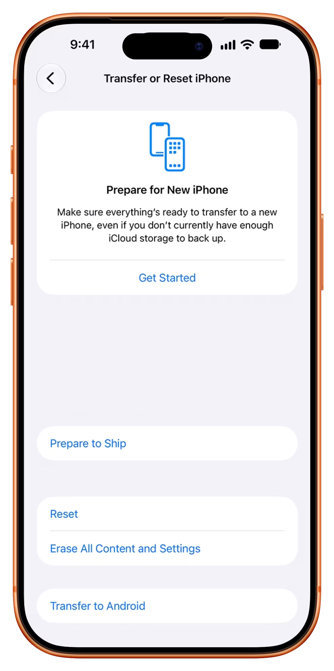
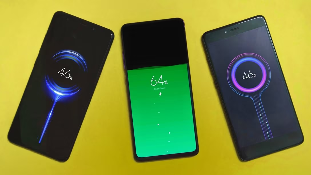
Apple has developed an unexpected workaround to prevent the iPhone 18 Pro Max from being hit by shipping restrictions on big batteries. There’s a “battery-firmware solution” in place on the new iPhones, according to Apple’s support page, which keeps capacity below the 20Wh limit for single-cell batteries set by international shipping regulations — but this firmware lock automatically removes itself when the device is booted up for the first time. […]
If the user needs to send off their phone for repair or resale, the charging limitation can be restored using the “Prepare to Ship” feature, which caps charging to 80 percent for 14 days.
This is interesting, and reminds me of a category that should be present on Unsung more often – software fixing the sins of hardware.#apple #hardware
Content Preview
Apple has developed an unexpected workaround to prevent the
iPhone 18 Pro Max
from being hit by shipping restrictions on big batteries. There’s a “battery-firmware solution” in place on the new iPhones, according to
Apple’s support page
, which keeps capacity below the 20Wh limit for single-cell batteries set by
international shipping regulations
— but this firmware lock automatically removes itself when the device is booted up for the first time. […]
If the user needs to send off their phone for repair or resale, the charging limitation can be restored using the “Prepare to Ship” feature, which caps charging to 80 percent for 14 days.
This is interesting, and reminds me of a category that should be present on Unsung more often – software fixing the sins of hardware.
In 1996, Street Fighter Alpha 2 was ported onto Super Nintendo Entertainment System, a 1990 machine on its way out and not really up to the task of running such a modern game.
Content Preview
In 1996, Street Fighter Alpha 2 was ported onto Super Nintendo Entertainment System, a 1990 machine on its way out and not really up to the task of running such a modern game.
The team put up a hell of a job, involving adding a custom compression chip, with the game being much better than anyone expected – but still suffering from a big flaw, which was a momentum-breaking
3-second freeze
at the beginning of every battle.
Turns out, the problem wasn’t the compression chip, but sound effects – and the fix to complelty remove the delay relatively trivial in hindsight. A community member named gizaha
posted a patch
to the game in 2020, and its description can send shivers down your spine:
Disable some waste sample loads
Sounds good.
Tweaked audio engine for faster start of loading
Alright, fair enough, perhaps the game was rushed to market and some light optimizations skipped.
Faster audio load, upload 2 bytes at the time instead of 1
Oops.
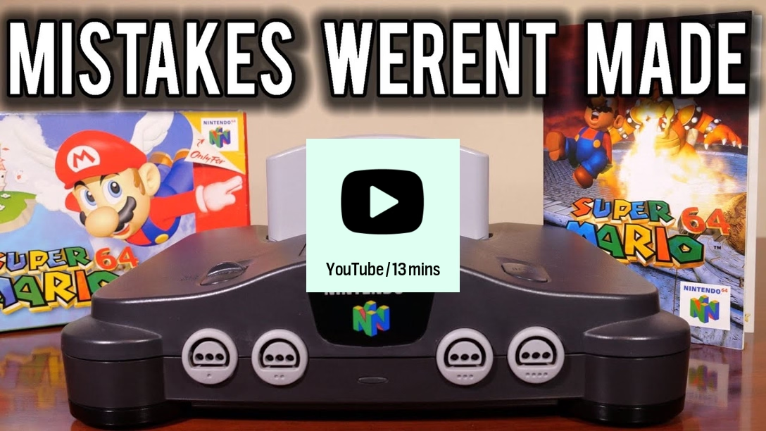
Also in 2020, people set their sights on another 1990s game, Super Mario 64.
For years, if not decades, this has been accepted as fact: Bowser’s sub is just too big and too goofy for the N64 to draw consistently. But what if I told you it didn’t have to be?
Nintendo just… forgot to turn on a C compiler optimization feature before shipping the game. The result wasn’t as egregious as random 3-second freezes, but still gave people much lower framerate on certain levels:
However, Giannakis followed up on that, and
discovered the story wasn’t as simple
. The optimization in question was still itself evolving at the time, and had known issues when Super Mario 64 was being developed. As easy as it is to turn it on in 2020, all polished and tested, it was a different story in 1996:
The video actually compares the versions visually, and even investigates other optimizations.
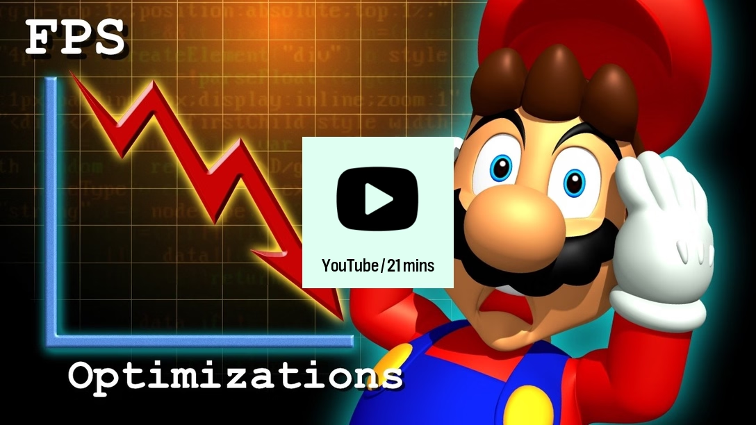
But it all pales in comparison to
this 2024 video by Kaze Emanuar
, who says “hey, guys, you have been looking at the wrong place the entire time” – as a matter of fact, it wasn’t the optimizations that Nintendo didn’t turn on that made the game slower. It was the optimizations they
added:
The video is kind of intense, but I feel you can learn a few really interesting things from it:
how you show the debug information matters,
there is such a thing as a “performance lottery,”
naïve efforts to optimize can be heavier than not doing anything at all,
it’s best to optimize for maximizing minimum frame rate, rather than average frame rate.
It’s a fascinating watch, suggesting framerate increases of
up to 50%
on the original hardware, with just software changes
.
Both the Street Fighter 2 Alpha and Super Mario 64 efforts also portray a terrifying notion: imagine
your code
being hyperanalyzed by a group of people 25–30 years later, pointing at your flaws.
Here are a few nice and interesting design decisions I spotted on various websites in the last months.
Content Preview
Here are a few nice and interesting design decisions I spotted on various websites in the last months.
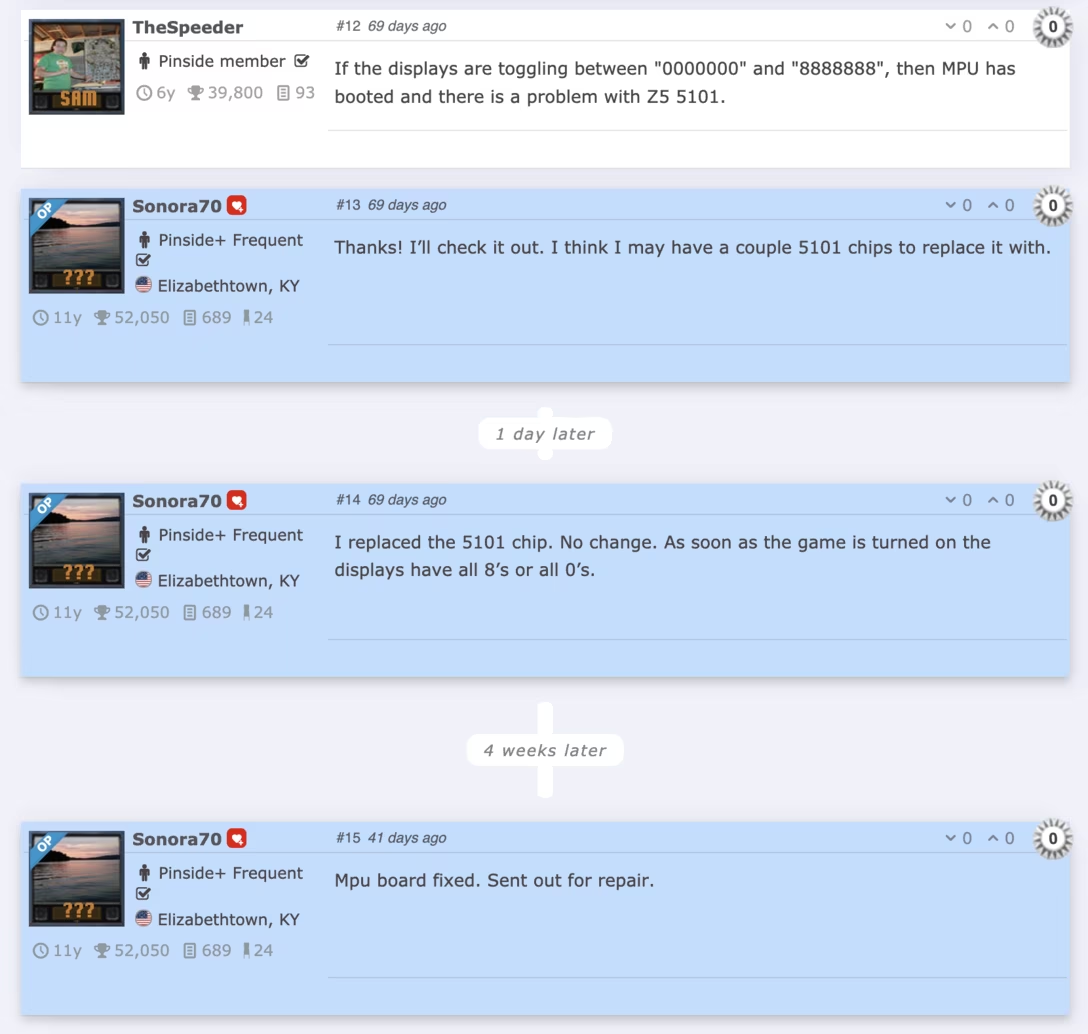
The
pinball repair forum Pinside
shows specifically how much time has passed between posts. This is great for orientation and especially when catching up or revisiting – history always gets flattened, and this gives the original story a much more truthful cadence:
In
a post
from Reimar Servas I mentioned yesterday, you can see generous linking through the writing…
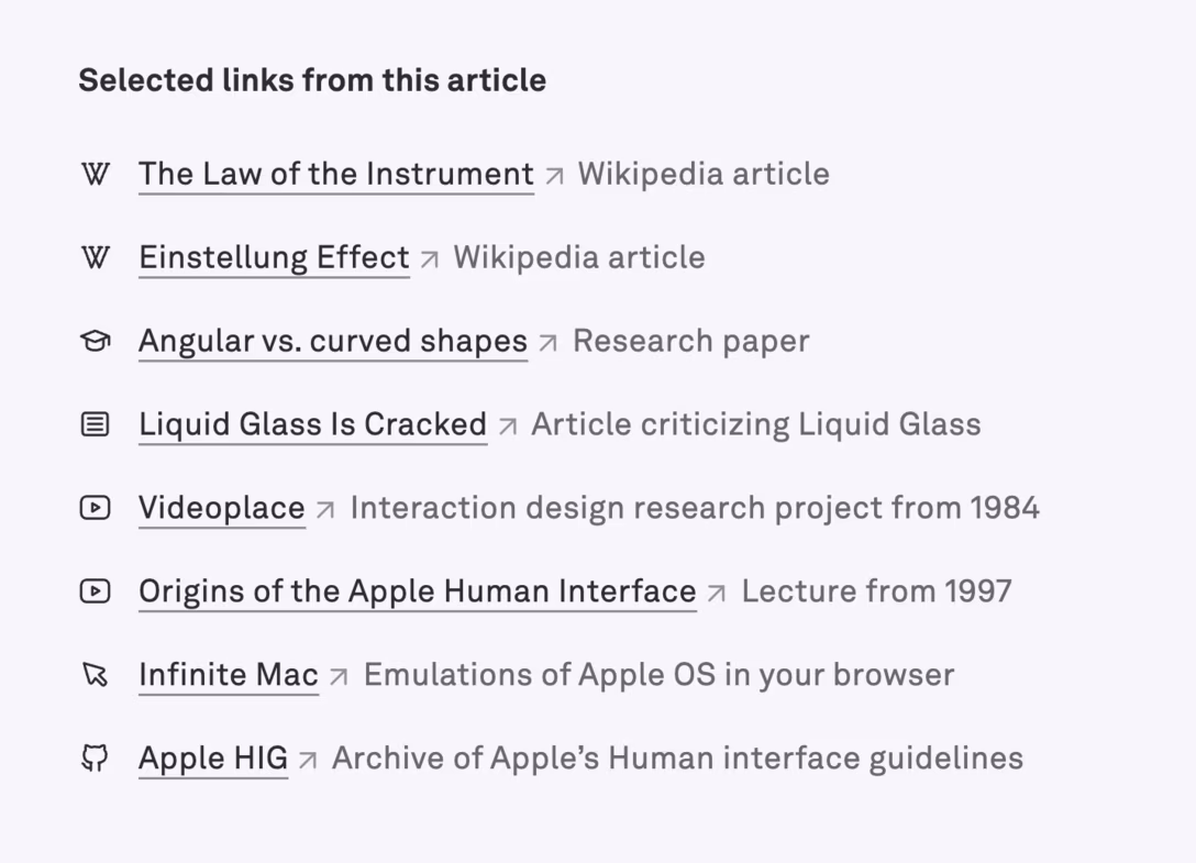
…but also a nice “link summary” at the bottom. I like this because I think this accommodates both people who branch out in the moment, and people who might prefer to read in full, and
then
explore. Also, it’s just easier to click all of the links if they’re laid out like this:
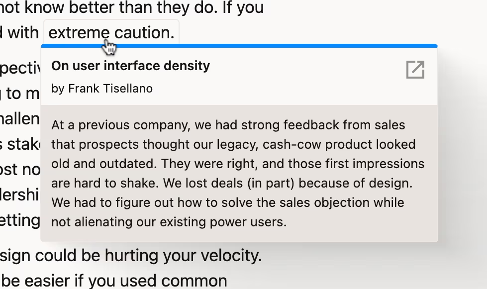
In the same space,
Frank Tisellano
provides these interesting callouts. They feel perhaps a little too eager, but I perhaps the eagerness is intentional: they build on how browsers show the URL on hover in the corner as a hint:
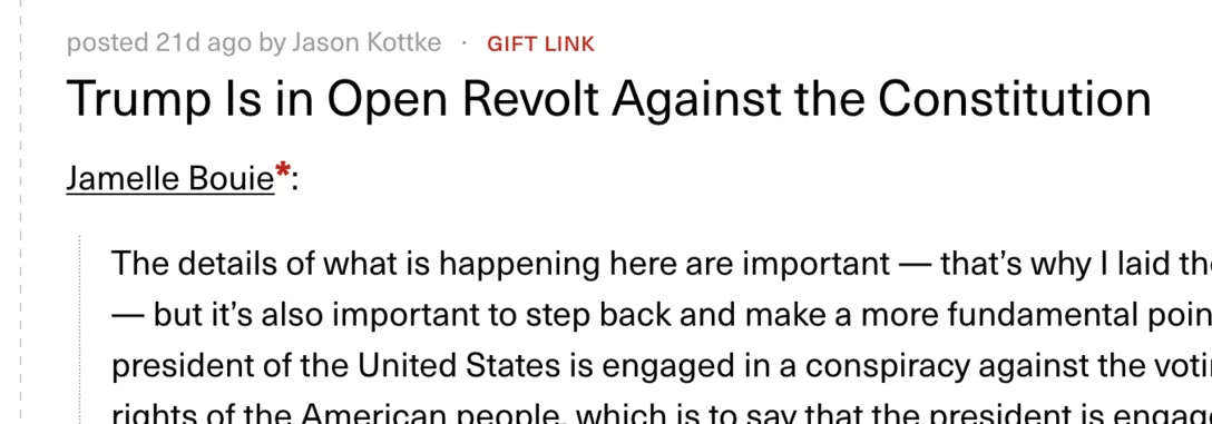
I liked kottke.org’s
annotation
when something is a gift link (here to the New York Times):
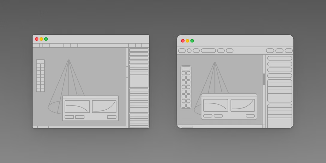
Designer Reimar Servas goes further than the usual Border Radius Discourse and thinks about the deeper but often ignored questions of border radii as a system, and about the consequences of such a system that go beyond visuals:
Content Preview
[…] These redesign efforts suggest ignorance of a fundamental problem: rounded forms have a smaller surface area than angular ones. Used as containers, they reduce usable space.
This is fine on most touch-based UIs since they typically feature simple layouts with only a few controls and plenty of white space. Such spacious designs help our fingertips, which demand larger touch areas. A mouse pointer, by contrast, can target much smaller elements.
Professional desktop software — think 3D modelling, video editing, or music production — is often packed with small controls. On these complex interfaces (and the operating systems that host them) screen estate is precious, even on large screens. Heavily rounded elements don’t work well here.
I liked this simple, but powerful visual:
Servas adds:
Apple is well aware that principles from pointer-based UIs rarely translate well to touch interfaces. After all, they spearheaded the evolution of touch UIs and introduced multi-touch interactions like pinch-to-zoom to consumer electronics — formerly only seen in
science fiction
or obscure
research projects
. Yet they’re now rolling out single unified design language across watches, phones, desktop computers, and XR goggles.
The piece was written just before the arrival of Golden Gate, which undoes some of Tahoe’s damage. Yet, I remain worried about the rumoured touch MacBook. I consider adding touch to macOS an unsolvable challenge, unless you happen to be okay with compromising on precision and density. I’m not.
A fun lil convention from the financial app YNAB’s release notes page – there is always a headlining feature with a hero shot and a long description, but the smaller improvements are still listed as “pocket change”:
#release notes
Content Preview
A fun lil convention from the financial app YNAB’s
release notes page
– there is always a headlining feature with a hero shot and a long description, but the smaller improvements are still listed as “pocket change”:
Just as there is a ticking bomb built into cut/⌘X – if you cut something, and then cut something else again without a paste in between, you overwrite the clipboard without any way to bring it back – there is another one that awaits you when you use undo/⌘Z.
Content Preview
Just as there is a ticking bomb built into cut/⌘X – if you cut something, and then cut something else again without a paste in between, you overwrite the clipboard without any way to bring it back – there is another one that awaits you when you use undo/⌘Z.
Here’s a typical undo chain, illustrated using Photoshop’s classic interface. You can do things, then undo into the past with ⌘Z to your heart’s content, then zipline back to the present via redo’s ⌘⇧Z:
But if you go far into the undo history and do something
then
– accidentally or intentionally – poof! Your entire undo stack, no matter how precious and storied it was, evaporates in an instant:
And it’s not even Back To The Future II rules where you can at least go back to the original separation moment and still get the better future for free…
…no, the entire original undo stack is gone.
The most popular solution for the cut problem, inasmuch as it really needs one, is a clipboard manager. Clipboard managers only move forward in time and record everything passing through the clipboard, so even if you override it with a careless cut or copy, you can ask the clipboard manager to resurrect the contents.
The most popular solution for the undo problem is something conceptually very similar – version history. It also always marches forward. Do something new? You’ll see a new version history entry. Undo it? New version history entry. Redo? New version history entry. Both the clipboard manager and version history are like paper ledgers, hostile to erasers and shredders, addicted to additivity.
(Mixing both universes, Figma’s version history will allow you to copy something from its past entry. But, naturally, you won’t be able to
cut
from it.)
I like this conceptual distinction, and you can see it in places outside of undo, too. Any browser has a tactical back/forward button staring you in the face, and a strategic history log hiding deeper inside. Linux offers up/down arrow keys for tactical recall, and
history
for the ledger:
It all feels like the correct
proportionality
– the simple thing comes with a quick UI, the heavier thing with an interface that matches its heaviness. This is why I got a bit nervous hearing about
persistent undo
, because undo is meant to be more like a fruit fly, like stockpiling things on your undersized cafeteria tray, knowing the journey to the table won’t last very long. Undo’s interface is not compatible with longevity.
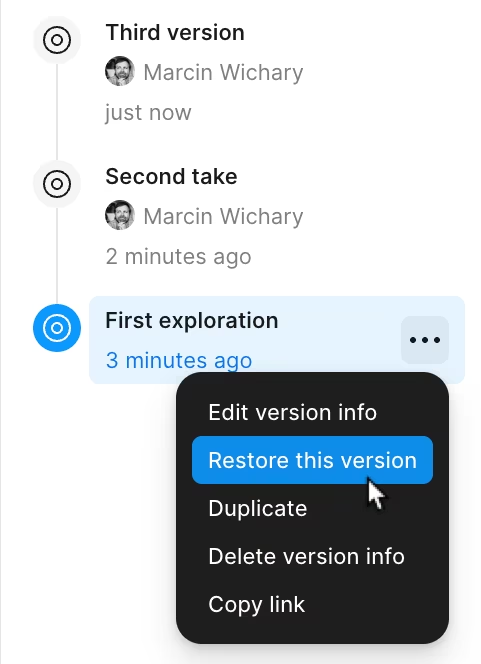
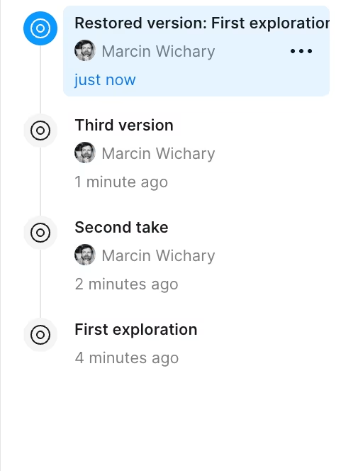
But even for version history, the devil’s in the execution. Many tools don’t offer version history, and others add to it only at seemingly random intervals. Chrome’s back/forward buttons are wonderful, but its history UI is a hot mess: slow, and with only an infinite scroll when it comes to exploration. Figma’s version history doesn’t make it as clear as it could (sorry, my bad, I never got around to fixing it) that restoring an older entry is not rewinding back to it like undo, but using ledger rules – so it might not feel as safe in use:
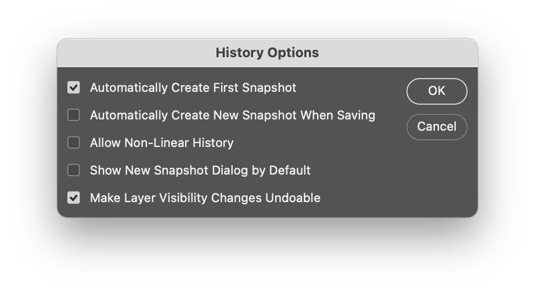
But I also wanted to go back to Photoshop and show you something interesting. One of the history settings offers “non-linear history”:
Turn it on, and a fascinating thing happens: There is no poof. Undo behaves more like a ledger, always marching forward:
It is an interesting idea. In practice, it’s confusing – time is not meant to work this way. But I feel this was really close to a nice solution that could be enabled for everyone: preserve the discarded branch, but keep it off of ⌘Z and only show it in the visual UI so you can get back to it this way, perhaps presenting it slightly off the main axis, perhaps, I don’t know, looking something like this:
(Okay, technically the future collapse is *exactly* like Back To The Future II, but given you’re the only actor in the universe, you still have to recreate the future all by yourself. See, now I’m starting to sound like Primer.)
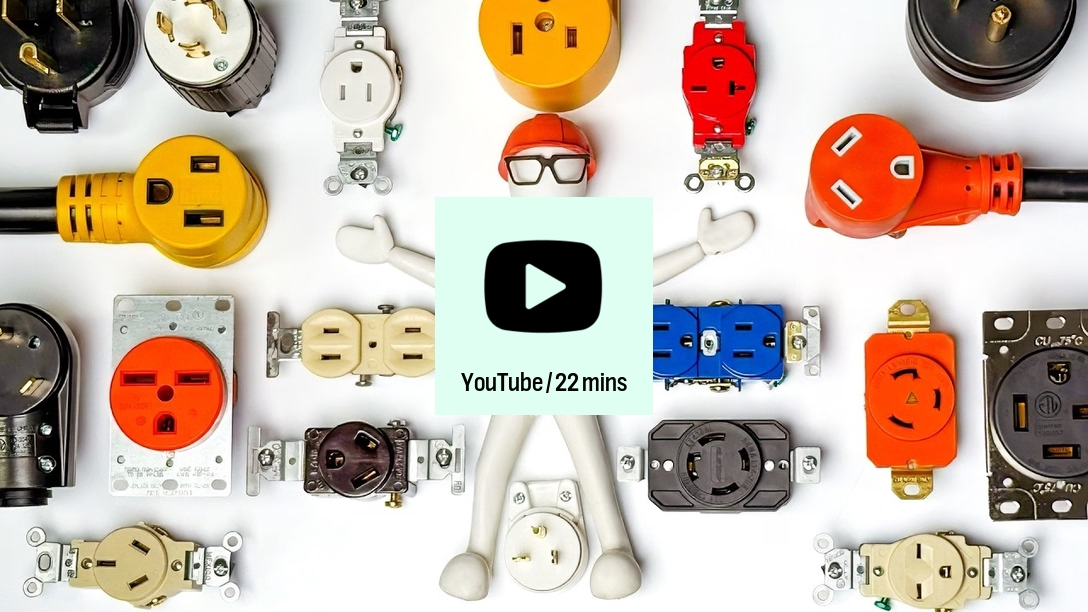
Completely unrelated to software, but sometimes stepping outside is what’s needed to develop perspective and find creative solutions – this is Practical Engineering’s video about the many electrical plugs and sockets in America:
There are a lot more socket kinds than I expected, and sprinkled in between are some useful observations about system design, change management, power users, backwards compatibility, and consistency vs. inconsistency – in my head, that last part puts this video right next to the previous post in my brain, even if they seem nothing alike.
Also, that early video snippet from the 1920s?
Jesus Christ. What a UI.#change management #real world #system design #youtube
Content Preview
Completely unrelated to software, but sometimes stepping outside is what’s needed to develop perspective and find creative solutions – this is Practical Engineering’s video
about the many electrical plugs and sockets in America
:
There are a
lot
more socket kinds than I expected, and sprinkled in between are some useful observations about system design, change management, power users, backwards compatibility, and consistency vs. inconsistency – in my head, that last part puts this video right next to
the previous post
in my brain, even if they seem nothing alike.
In a recent post, Jim Nielsen used the term “bulldozing of an interface”:
Content Preview
In a
recent post
, Jim Nielsen used the term “bulldozing of an interface”:
I’ve found this to be true a lot as of late. Lots of tiny details that were meticulously crafted over years with specific rationales tied to real-world use cases, all completely bulldozed in a giant refactor.
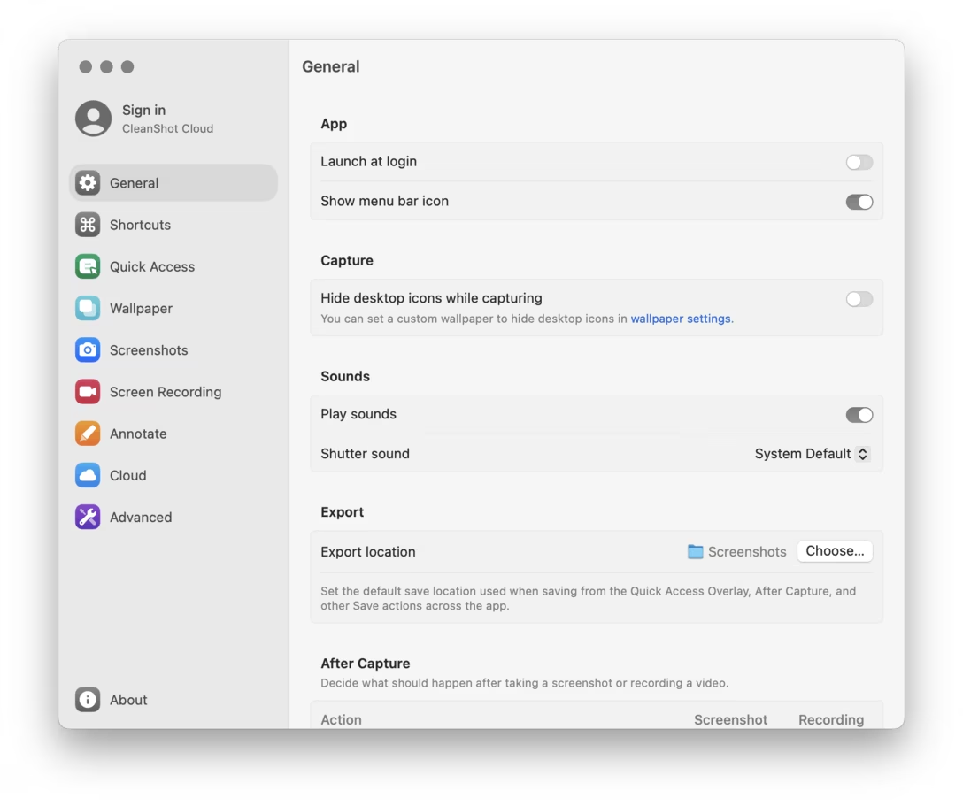
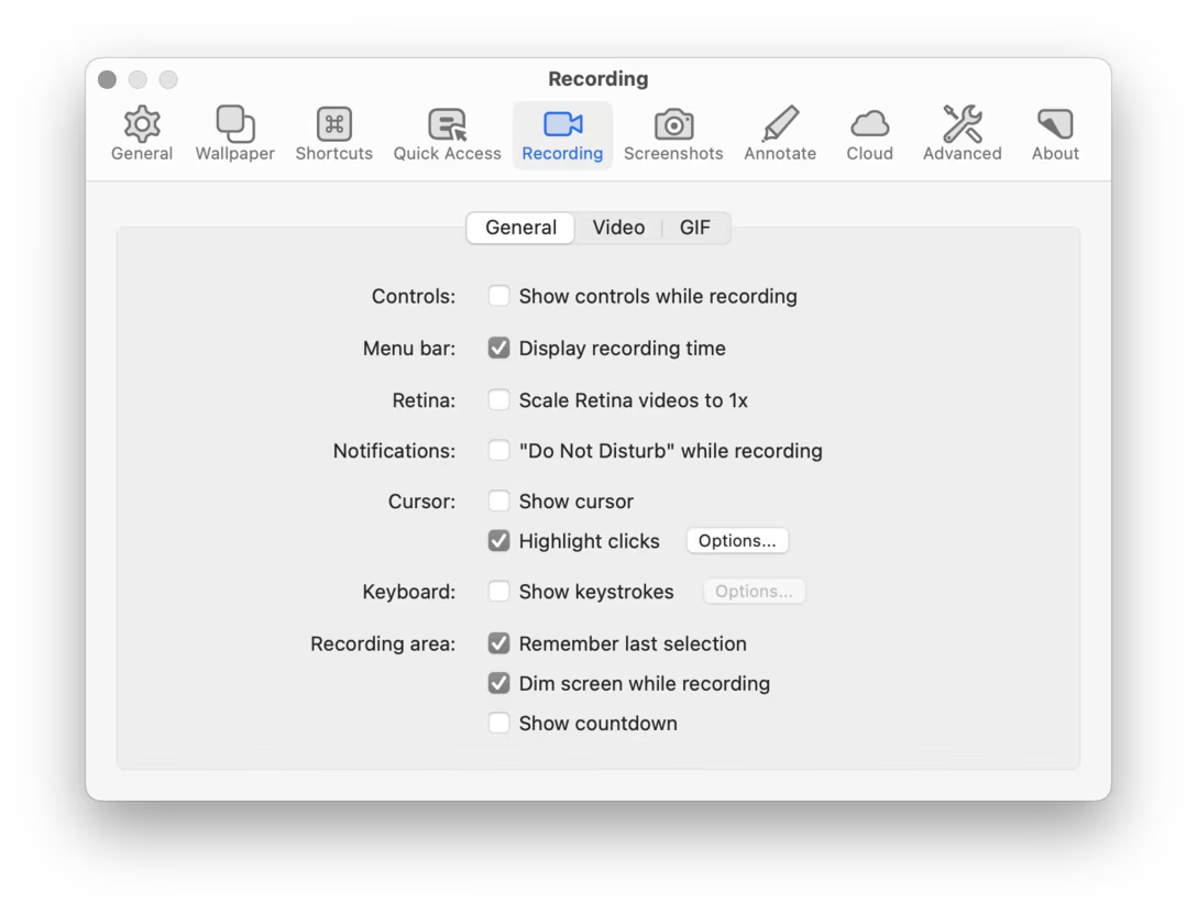
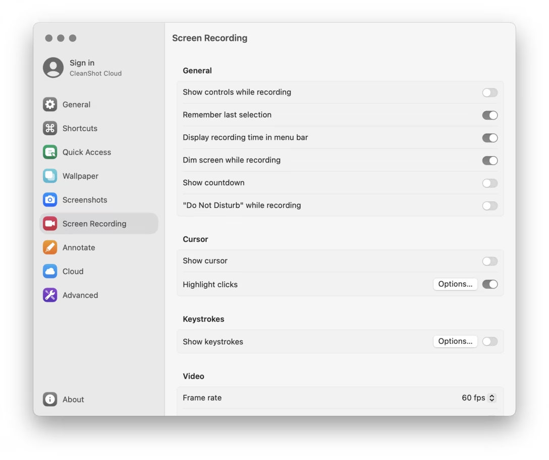
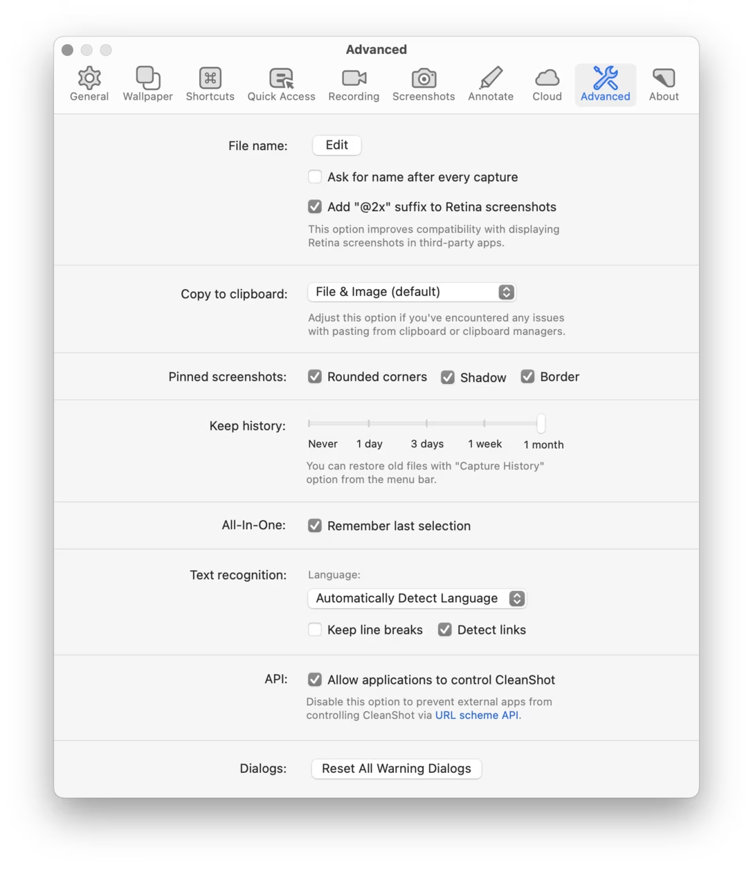
I liked that term and description, but I didn’t expect I’d put it to use so soon. Unfortunately, mere months after praising
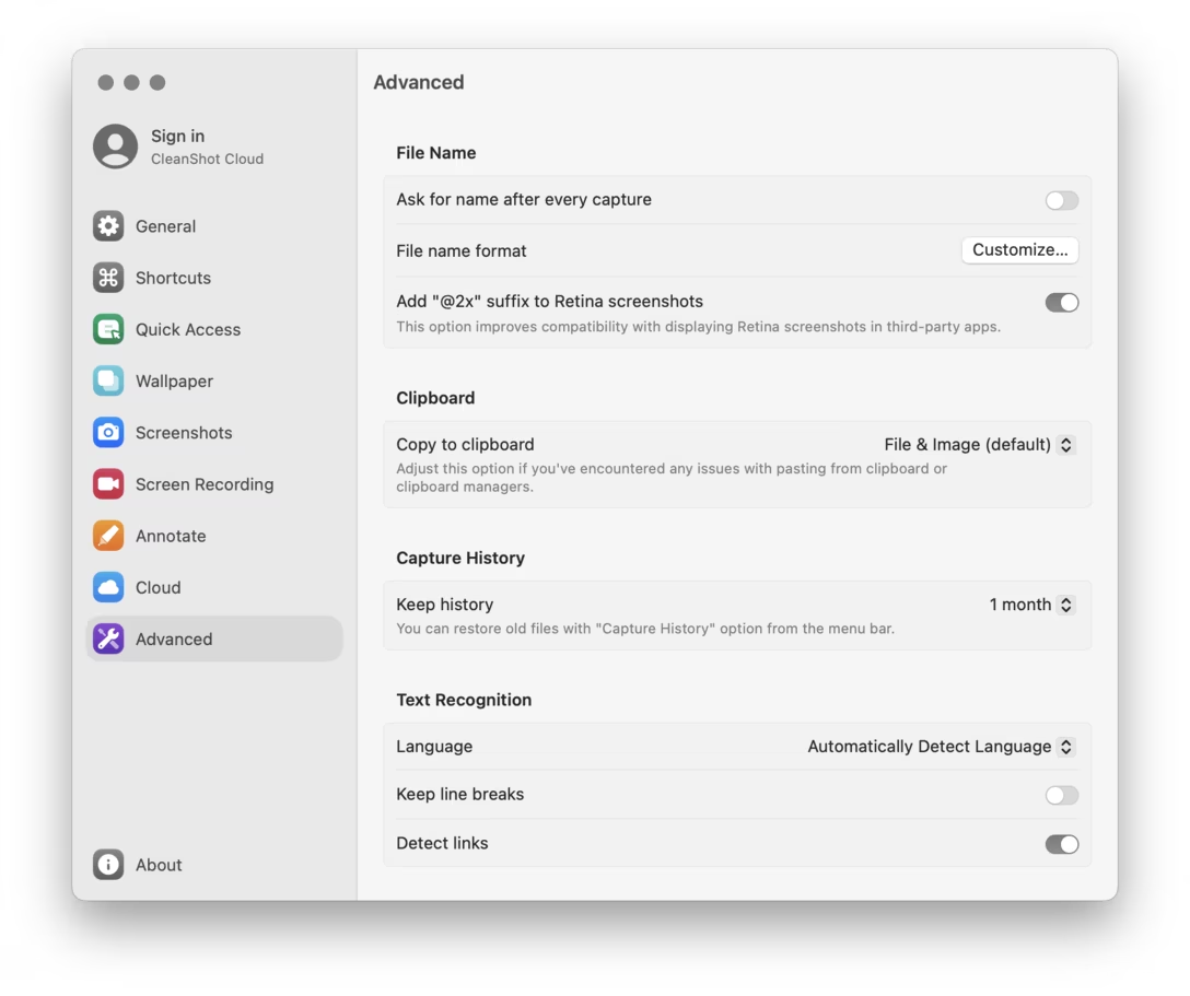
CleanShot’s settings
, the new version 5 update bulldozed them into something much worse.
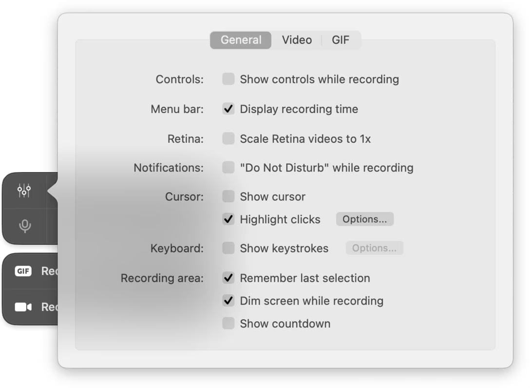
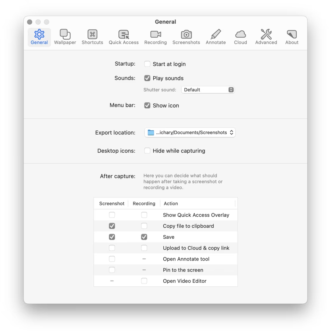
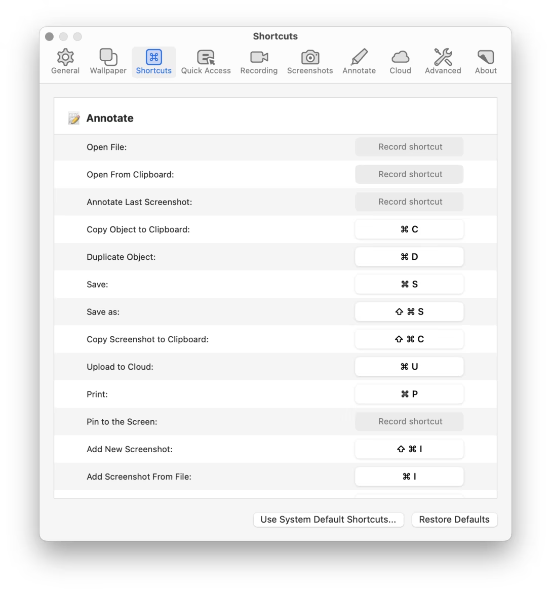
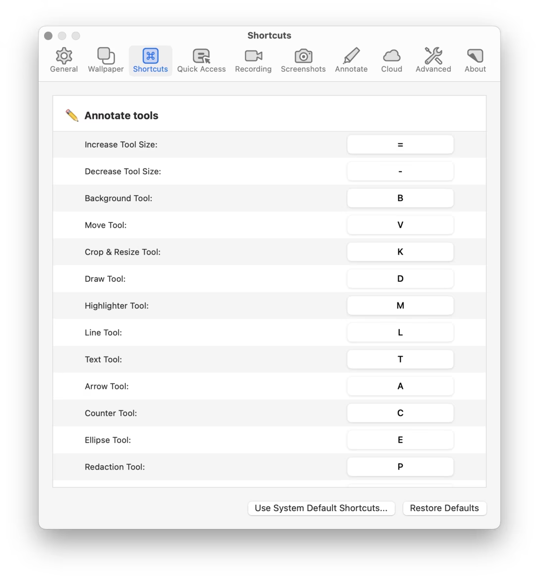
Let me show you first. In the following screenshots, version 4 design is followed by its version 5 equivalent.
Quick recording settings:
General:
Recording:
Advanced:
The other panels follow the same pattern. (The screenshots are from macOS Sequoia, but I checked in Tahoe, and things are not materially different there.)
I was taken aback by this – a feeling exacerbated by the fact that the quick settings on a dark background
looked even worse
– so I shared an early reaction with CleanShot’s support team, and asked how to downgrade to version 4, which luckily remains possible. The support team member said that they actually liked the previous settings themselves, but conveyed they shipped the redesign in order to feel more consistent with the operating system, and more modern.
I followed up with a longer response, which I’m sharing below. I am hoping this can be valuable to others facing a similar situation in the future, or give some specific observations to latch onto – for me, it allowed to put in words the feelings I’ve had about the Ventura Settings redesign that were rattling in my brain since 2022:
Hi,
I don’t think you have to follow the OS if its own designers are making bad decisions – I gather it’s even our responsibility as designers
not
to – and we know they are bad, if only from how people reacted to the macOS Ventura System Settings redesign.
Here are the problems I see that CleanShot 5 settings now inherit from Apple:
The two-pane settings layout was originally designed for the first iPhone with its 320px screen width. macOS Settings stretches it to 460px, and in your app you went with 550px. As a result, the settings panes start registering, gestalt-wise, as “left column first, right column second” rather than “first option first, second option second, etc.” This requires eyes to dart around a lot more, as the labels are disconnected from their controls. The shading and lines help, but they’re just a crutch – and they also reduce density. In version 4, your eyes could follow the solitary center spine with more ease.
The second column is right-aligned, which makes visual processing harder – not just because it further separates the label from the control, but also right alignment is harder to process in a left-to-right language. (In the previous layout, sure, the labels were right aligned, but they were still near the common spine. Plus, the labels are short and simpler visually than Ventura-style right-aligned UI controls.) This also creates attendant problems, like Options… buttons being on the “wrong side,” or Options… and Choose… buttons needing to be in inconsistent positions.
In version 5, every panel looks much more alike. This doesn’t feel like helpful consistency, as it makes it harder to recognize where you are. Version 4 had a nice variety of silhouettes that felt cohesive as a whole, but still allowed for
shape coding
to help you orient yourself. We’re all pattern matchers, and varying shapes enter our brains on a deeper level, freeing us from having to consciously process the environment (or even read labels) over and over again, slowing us down.
Ventura’s settings design does not really allow for radio buttons and struggles with sliders, forcing pop-up buttons for every one-of-many option, which further reduces shape coding, but also is worse for orientation as you can’t see everything – if you just want to find an option like “Plain color” in Wallpaper, it’s no longer immediately visible. You might never, as a matter of fact, learn it’s there. CleanShot 4 really nicely knew when to choose radio buttons and when to reach for pop-up buttons, depending on the importance of the control. (A smaller, but similar argument could be made for subtabs and streamlined checkboxes, both used to a good effect in 4, but missing in 5.)
The new layout is also less usable as you can no longer click on long labels next to switches to toggle them, which was possible with checkboxes. The pop-up buttons are more narrow, too. This means you have to be a lot more precise in clicking, which adds up over time.
The previous layout had a nice consistent feeling of “things that are actionable and I can click on are white, everything else is gray.” It was yet another way that aided in scannability and orientation. In the new system, pull-down menus look like (inactive) labels.
The switches themselves have visibility and contrast problems. This might be particularly prominent in my setup with graphite as the accent color, but I believe it’s not unique to that. I continue seeing feedback from people who are always confused about “reading” the switches, whose both states look similar to one another. (The checkbox’s shape doesn’t have that problem.)
It’s not too late to undo this. This reminds me of
city planning in the 1970s
, when enchanted by the notions of modernism we remade city downtowns to be all identical-looking, clad in concrete, and surrounded by freeways. We look at it with shame and regret today, realizing we made previously alive places basically inhospitable.
You could still keep the modern left nav – that indeed didn’t age well, as screens are wider today – and perhaps left align the version 4 labels to make the gestalt hold better. It’s definitely more work, which I sympathize with; it’s hard when the operating system cedes its responsibilities to provide good design patterns. But you had something really wonderful before, crafted and signposted with care, both a
great welcome mat for new CleanShot users
and – important here more than for many other apps! – fantastic in repeated use.
(I know this is kind of an intense reply and I hope it doesn’t arrive feeling like concentrated condescension. Part of it is that I am x-posting it to my blog, as I believe it might be helpful for other designers.)
The relationship between keyboard manufacturers and standards bodies in various countries is so complex I barely understand a snippet of it.
Content Preview
The relationship between keyboard manufacturers and standards bodies in various countries is so complex I barely understand a snippet of it.
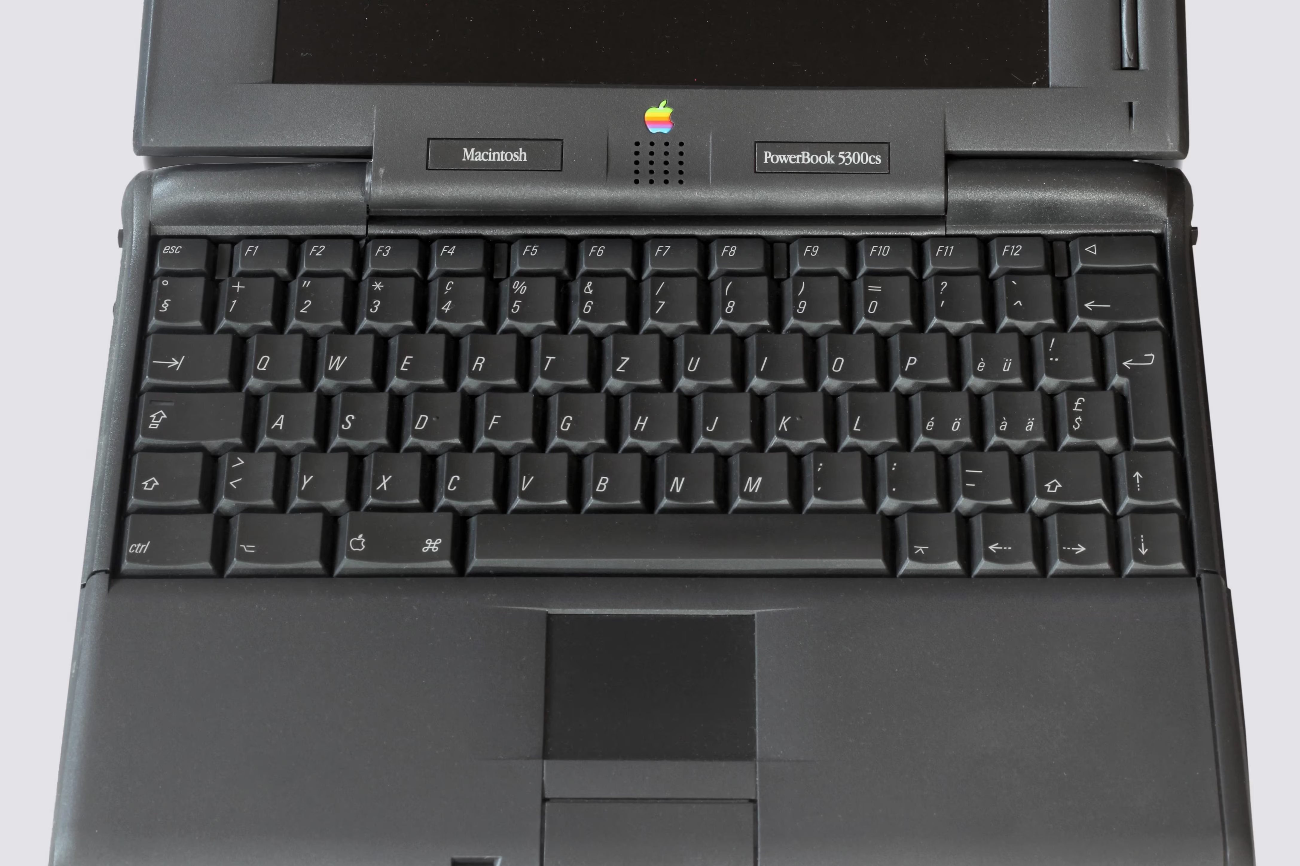
The most famous example must be the 1990s PowerBooks, which had a beige variant for Germany and Germany only, to conform with local laws that prescribed and enforced specific color and contrast combinations for keyboards, in order to avoid glare and attendant ergonomic problems for terminal operators in the decades before. (It wasn’t just Apple.
ThinkPads did the same
.)
(I know. Jump scare!)
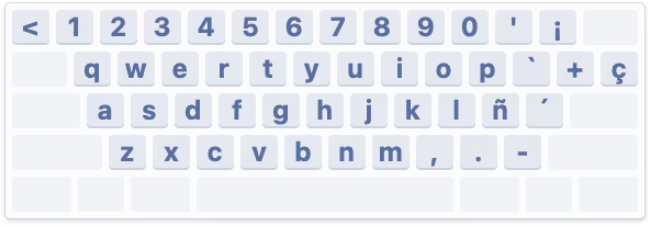
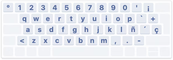
But you’ll understand that what caught more of my attention was an obscure variant of keyboards for (parts of?) Canada in the late 1990s and early 2000s.
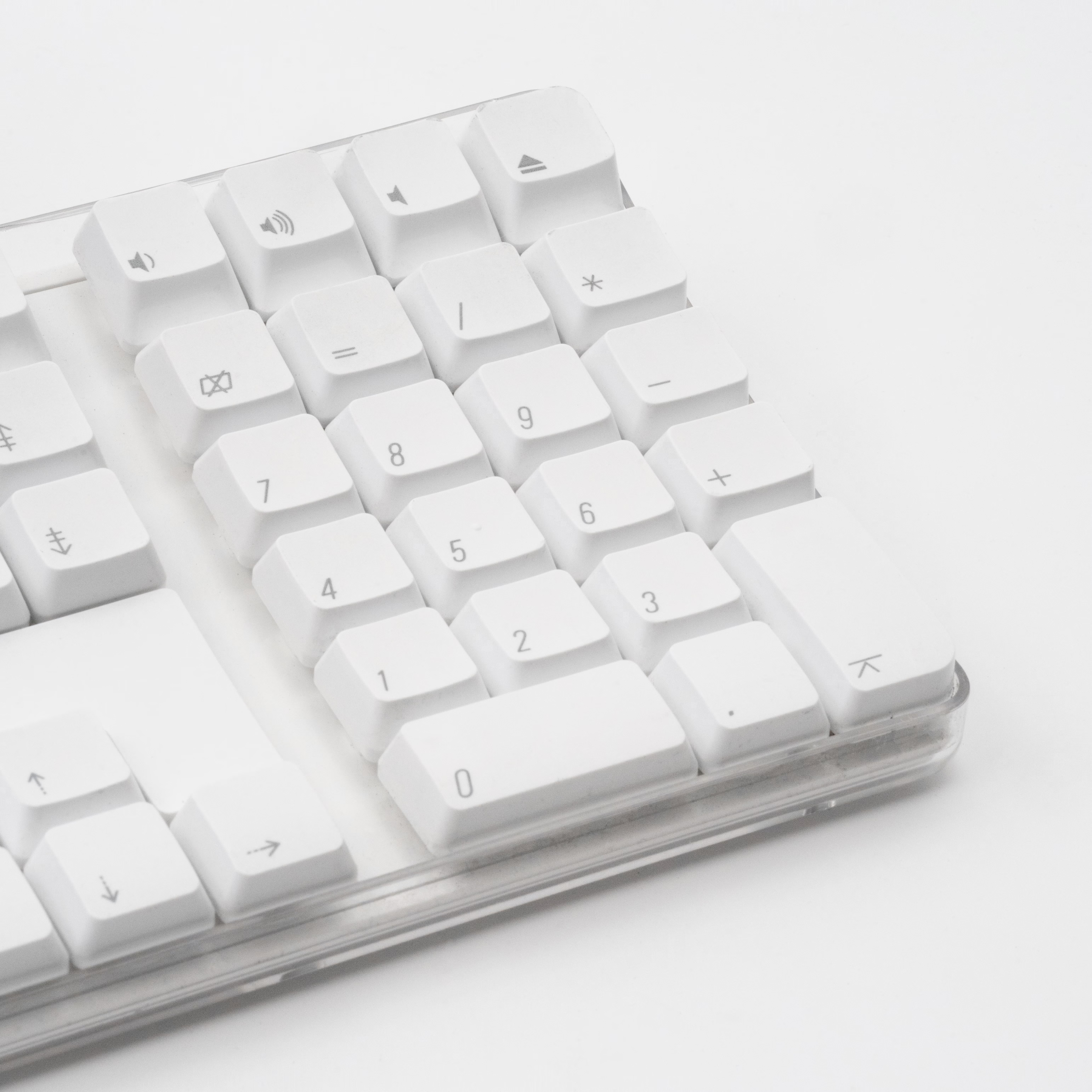
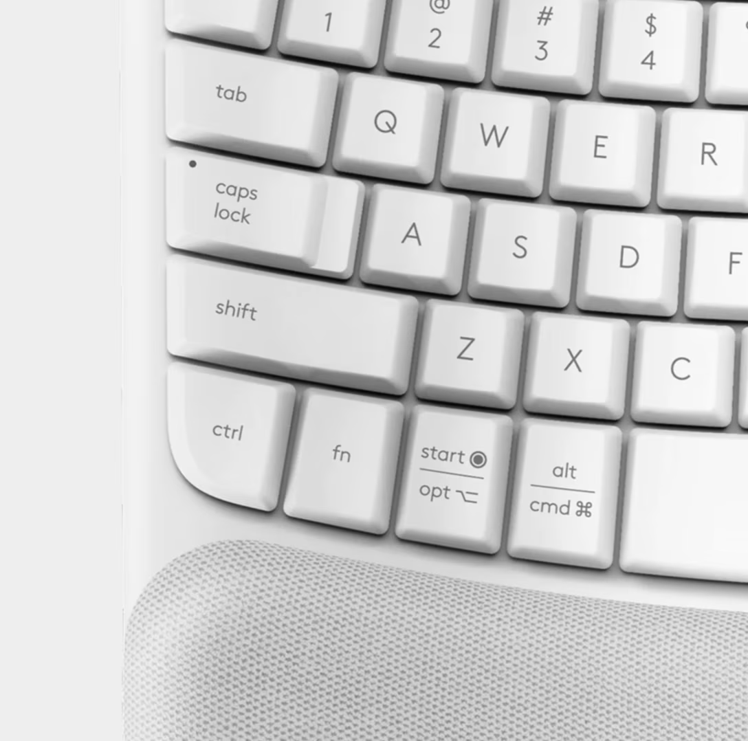
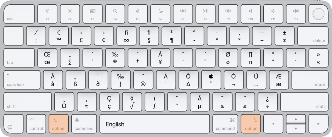
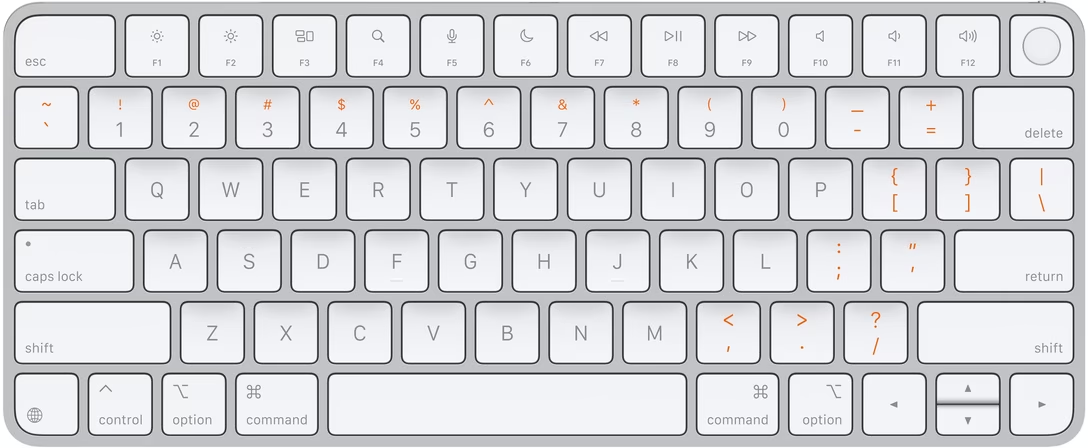
The white 2003 keyboard might be my favourite of Apple’s keyboard design, instantly recognizable in either the American version (more words), or the European one (more symbols):
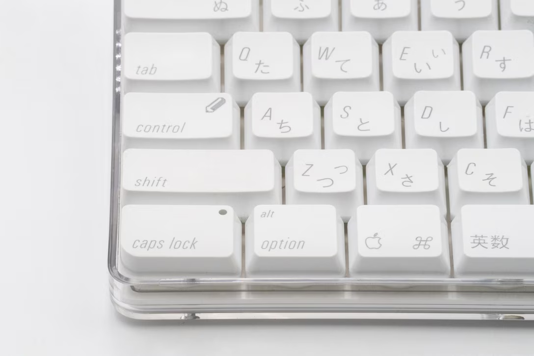
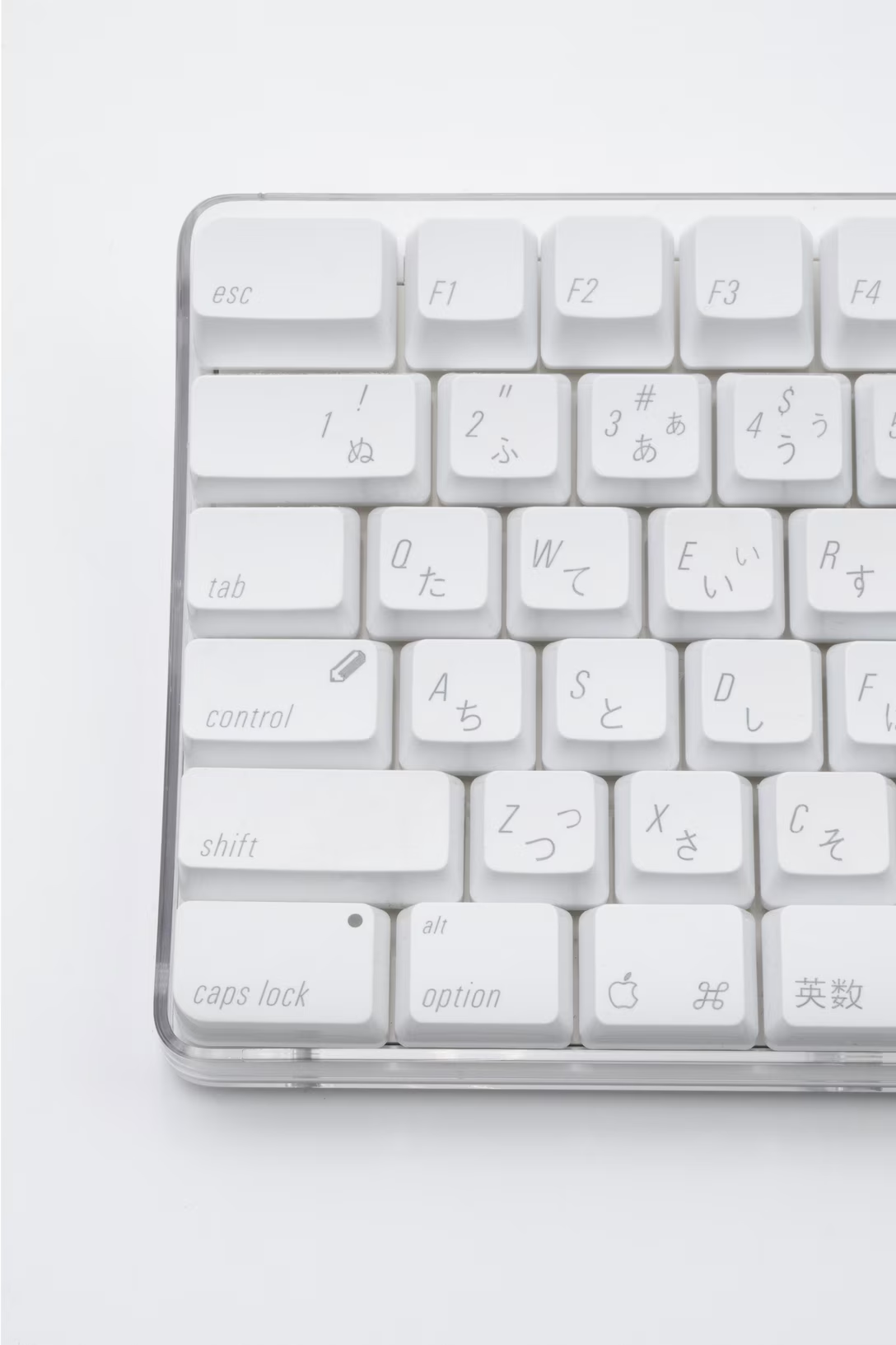
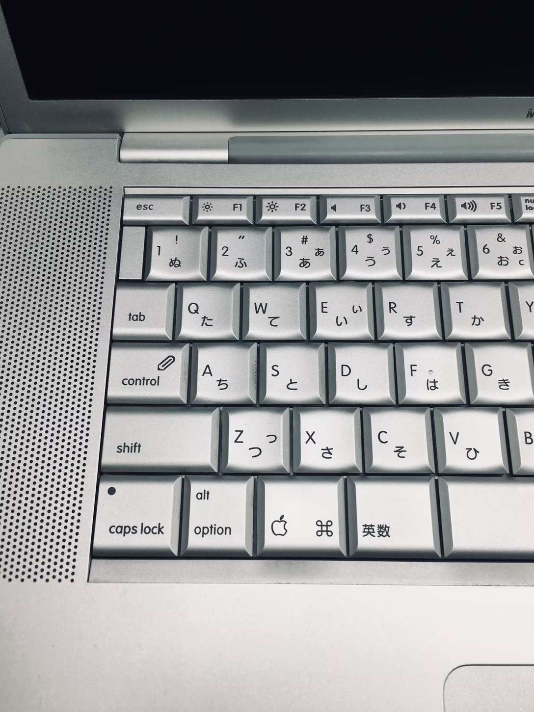
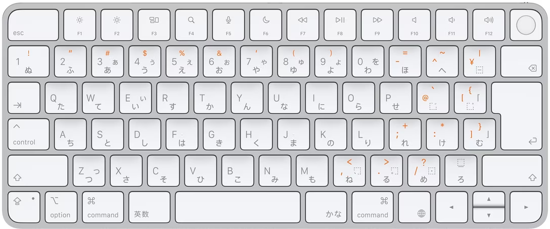
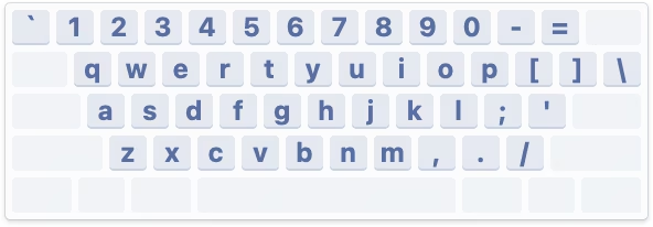
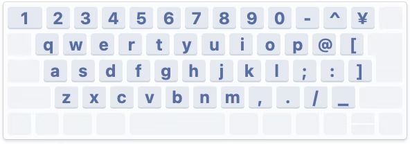
There was also the Japanese JIS standard keyboard, which famously kept Control where older terminals had it – to, no doubt, delight of Japan’s programmers:
These are the
three well-known layout standards
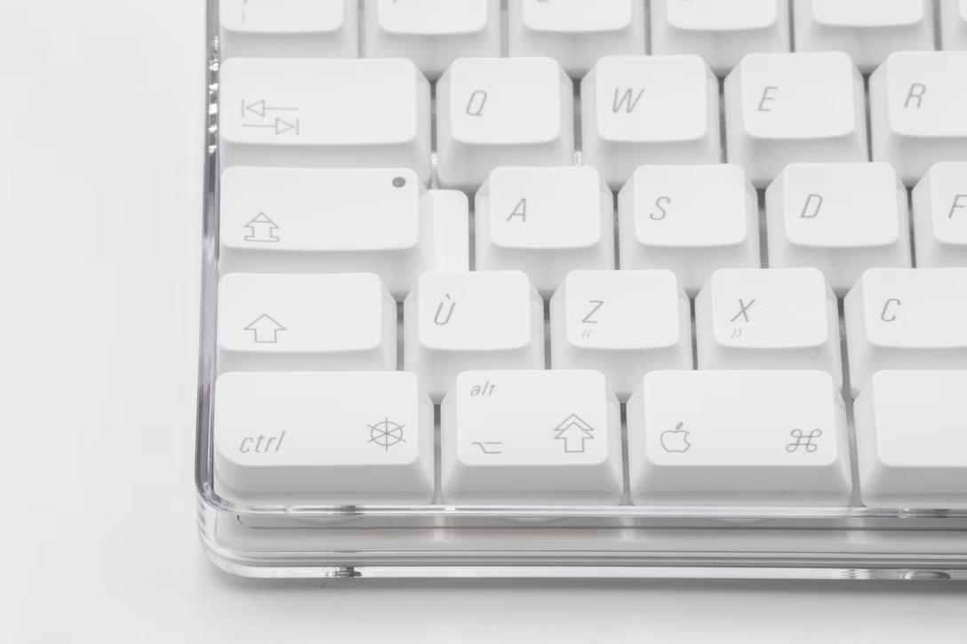
. The one for Canada followed Europe, but only to a point. The layout was the same, but the symbols weren’t:
Here’s an alternate view of the European and Canadian keyboards, and you can see that the latter one introduces different, unique symbols for Ctrl, Alt, Tab, Caps Lock…
…and even goes as far as Esc. (The Esc symbol is roughly the same you see worldwide, but for some reason, Apple always shied away from putting it on even symbol-friendly keyboards – even though frustratingly it’s being used in macOS menus in all the locales.)
The story repeats itself in the middle of the keyboard. Here are, again, the US and European editions…
Canada, with its abundance of icons, makes Europe feel like America:
Even the arrows are different – here’s America vs. Canada:
Even the
Enter
arrow – here’s Europe vs. Canada:
And numeric Enter/Return gets a different shape, too:
I don’t really know what is the full story here. I imagine the government exerted some pressure and Apple relented, creating a unique set of keyboards with some really ugly icons.
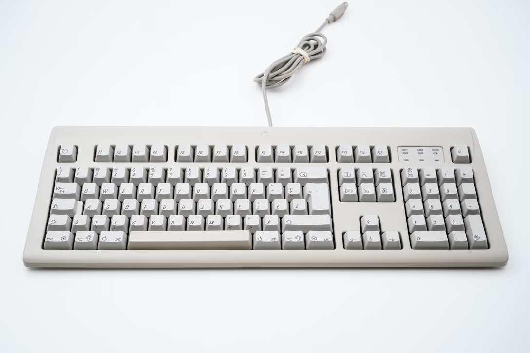
I know the previous two models were affected also – here’s AppleDesign keyboard from the second half of the 1990s:
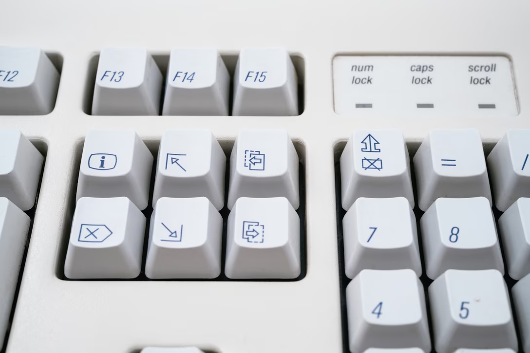
You can see all the same symbols…
…and even the extra glyph for Num Lock I imagine was prescribed for the PC side, too:
And, closer to the present, I have seen examples of the first metal keyboard from the late 2000s, too. But I don’t believe these symbols are used today. Even in their heyday, I’m not sure whether they were sold in the whole of Canada, or just its French-speaking portion – if you know, please share.
It’s my understanding this is called the CSA or ACNOR keyboard. And,
just like before
, these symbols are in Unicode – ⇬⇭⎆⎈⇱⇲⎗⎘ – looking just as gorgeous.
That was me being sarcastic. I can imagine the pain inside Apple of someone having to put the ugly symbols coming from above, alongside otherwise generally thoughtful and refined typography. Sure, Apple did good here
compared to other keyboard makers
, but still, it must have hurt. This is what makes these keyboards so interesting to me.
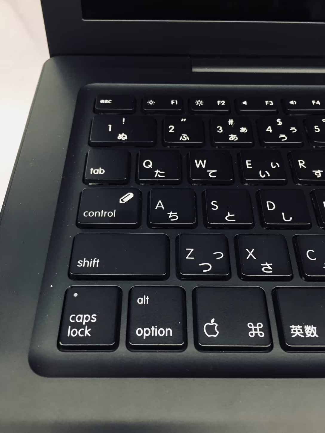
But there’s one more symbol that might be interesting to talk about, and perhaps you already spotted it above. It’s here, on the Japanese keyboard:
This time around no standard was involved; I believe that the pencil on the Control key is solely Apple’s invention.
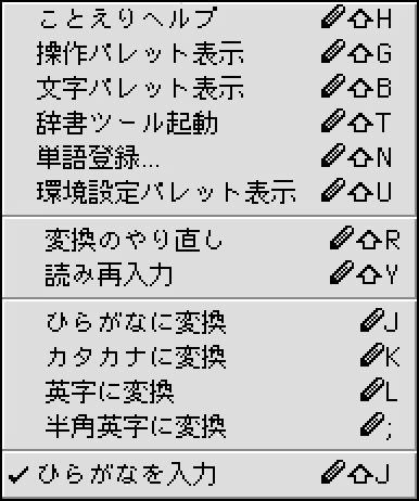
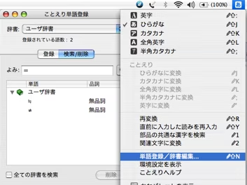
What is it for, and why was it there just in Japan? Typing in Japanese might be among the most complex, requiring switching between a few writing systems – katakana, hiragana, kanji, and also Western letters – as fluently as possible. To help with that, Apple used a system called
Kotoeri
, and added a new alternative symbol for Control that was also present onscreen, in the relevant typing menus:
The system was there in the waning years of classic Mac OS and early years of Mac OS X.
Just like with the Canadian symbols, I don’t fully know what happened to Kotoeri. I’m reading that it was gone from Mac OS X by 2014 – but even already in the years before, Apple removed the slightly pixellated symbol from their keyboards, and switched back to a standard ⌃ Control symbol in the UI.
Of course, if in the 1990s it was people in Japan who had to switch between various keyboards all time, today, thanks to emoji, it is
everyone
. If the Kotoeri pencil reminds you of something, Apple came back to the same well more recently with the 🌐/Fn key –
but I already wrote how much I hate that
.
Inspired by a conversation with a friend, I made a mini site that’s an interactive representation of my design bookshelves:
I am hoping it becomes a fun reference to browse, or something just enjoyable to play with. I made the interface feel very differently on desktop and mobile, and I hope both are fun. (There’s also a simple list if not.)
I wish, just like with a regular bookshelf, you could open any book and check it out – but that’s tricky for many reasons. (I did at least scan some of the covers that weren’t available on the web.)#marcin wichary #reference
Content Preview
I am hoping it becomes a fun reference to browse, or something just enjoyable to play with. I made the interface feel very differently on desktop and mobile, and I hope both are fun. (There’s also a
simple list
if not.)
I wish, just like with a regular bookshelf, you could
open
any book and check it out – but that’s tricky for many reasons. (I did at least scan some of the covers that weren’t available on the web.)
Make Some Noise is one of many fantastic improv comedy shows on Dropout. I noticed one of the ongoing themes is “tech gone bad,” so I compiled a short list below. I just find these really funny.
Video call with shitty wifi:
Logging in with 30-factor authentication:
A cutscene in a video game that’s glitching out:
In case you’re curious, the improv actors are: Zac Oyama, Josh Ruben, and (occasionally) Brennan Lee Mulligan.
(If you’re a Dropout member, these are the original, slightly longer landscape videos inside their respective episodes: wifi, 30-factor, game.)#humor #youtube
Content Preview
Make Some Noise is one of many fantastic improv comedy shows on
Dropout
. I noticed one of the ongoing themes is “tech gone bad,” so I compiled a short list below. I just find these really funny.
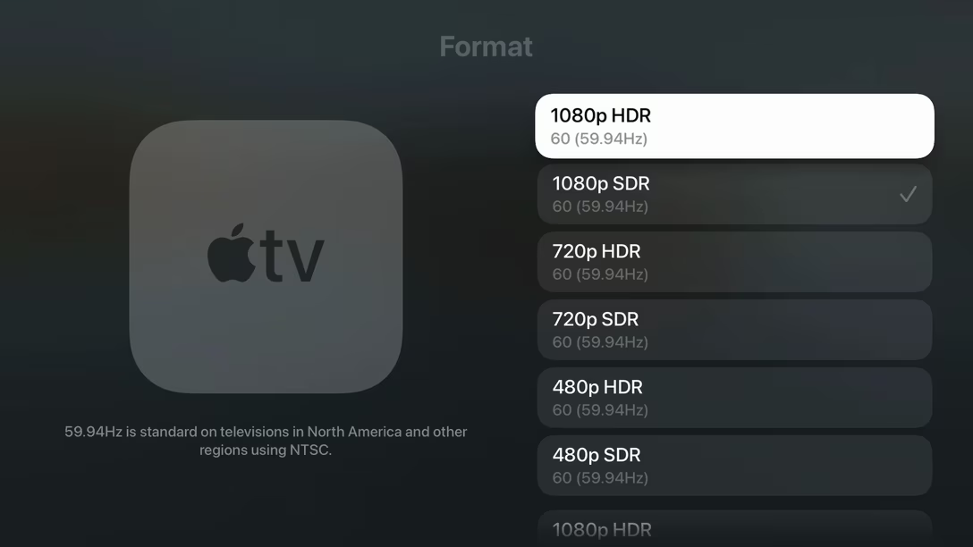
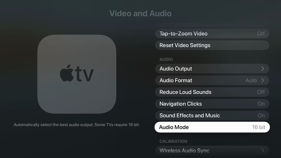
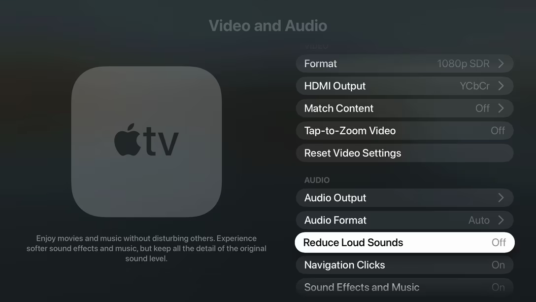
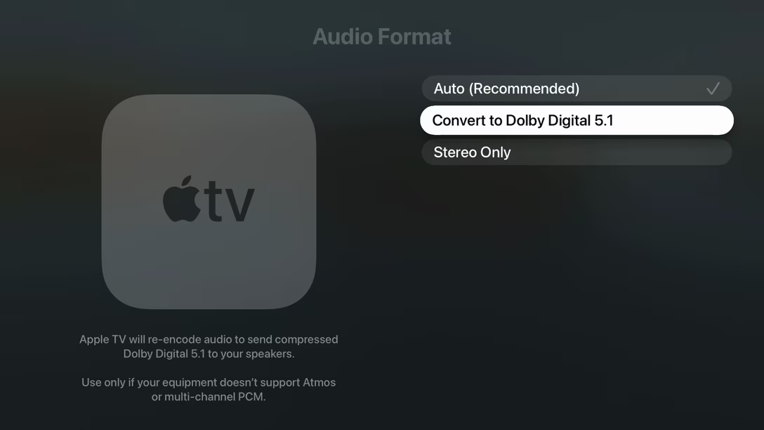
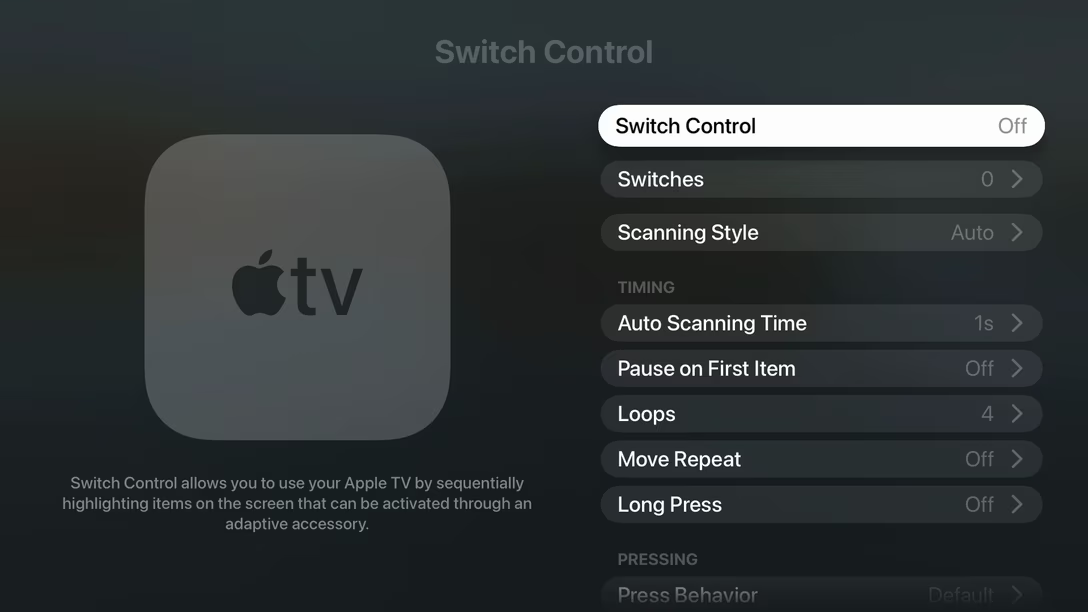
A big screen carries with it different UI expectations, and how that manifests itself in Apple TV’s Settings app, is that there’s always room for an additional hint about the thing you’ve just selected.
Content Preview
A big screen carries with it different UI expectations, and how that manifests itself in Apple TV’s Settings app, is that there’s always room for an additional hint about the thing you’ve just selected.
So yes, I have been exploring Apple TV’s Settings after the recent update
like any normal person would,
and I have noticed how well-written those are. They help navigate difficult technical things, and they’re not afraid to get conversational, or offer advice, or even commentary… but they always seem to stay succinct and on-point. I think they’re worth studying.
59.94Hz is standard on televisions in North America and other regions using NTSC.
Automatically select the best audio output. Some TVs require 16 bit.
Enjoy movies and music without disturbing others. Experience softer sound effects and music, but keep all the detail of the original sound level.
Apple TV will re-encode audio to send compressed Dolby Digital 5.1 to your speakers. ¶ Use only if your equipment doesn’t support Atmos or multi-channel PCM.
Switch Control allows you to use your Apple TV by sequentially highlighting items on the screen that can be activated through an adaptive accessory.
À propos Unsung’s
first post ever
, whoever works on these did not abuse the privilege. It would be so easy to just keep writing, but if a hint is not necessary, it just doesn’t appear:
…with one exception, which is the screensaver section. Here, the hint strings feel redundant, mostly repeating what the label already said:
For the many early years of its existence, Chrome sported a pretty distinctive – perhaps even iconic? – look to its tabs…
Content Preview
For the many early years of its existence, Chrome sported a pretty distinctive – perhaps even iconic? – look to its tabs…
…with even the “new tab” button looking like a tab embryo waiting to be brought into existence. At some point, however, during one of the redesigns, the tabs have been flattened to look like many other round rects in the UI, and the new tab button asked to dress in the minimalistic button uniform every other button was already wearing:
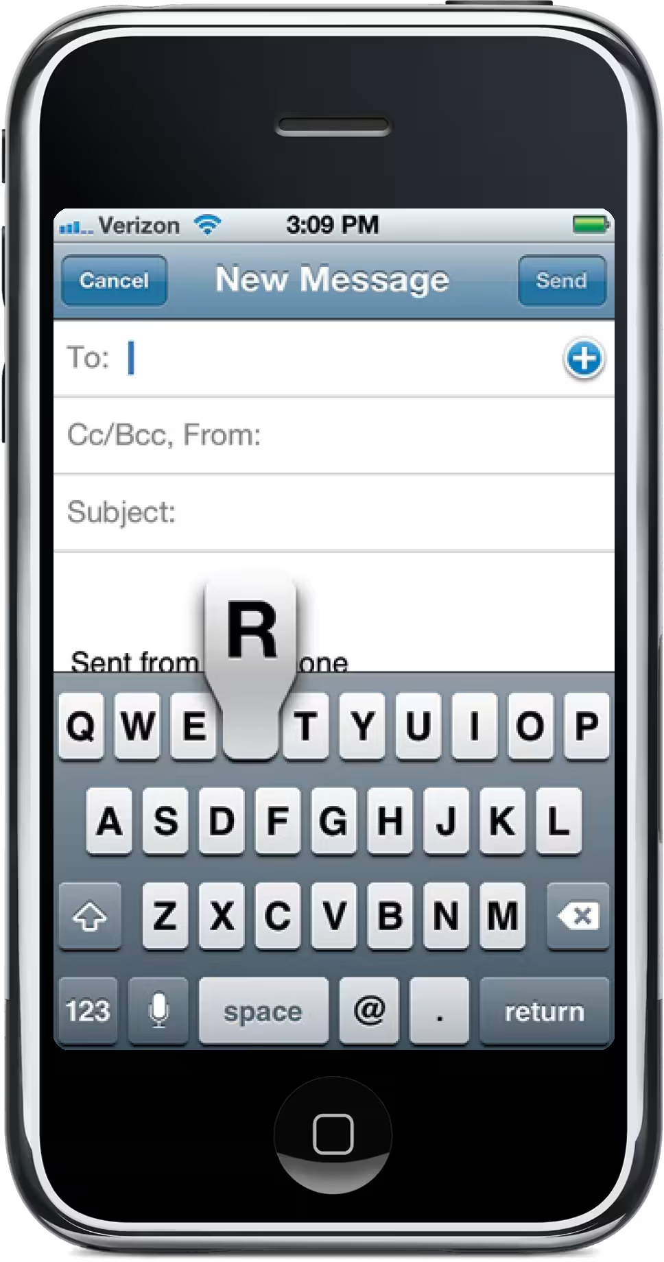
Here’s a new example of this trend. iOS’s memorable tooth-shaped keyboard key extensions, there with us since 2007… that is, until yesterday, when iOS 27 designers turned them into Yet Another Round Rect:
There would be a time in my life where I’d see these two as a triumph of minimalism and consistency. But I feel differently today.
I don’t even mean that tabs should look a certain way to help users, or that skeuomorphism absolutely needs to come back, or that someone has to brush up on
shape coding
. I mostly feel that way because modern interface design practice – these ubiquitous round rects on ever-present white backgrounds, set in one of the near-identical neogrotesque fonts – is just,
once again
, so… boring. It’s not fun, not inspiring, not – in any real way – exciting.
I also have this feeling that “consistency” might be just an excuse. Defaulting to round rects could be
running away from a challenge;
the original shapes would be harder to make work, but it was absolutely possible to do that, given enough effort and care.
Occasionally a designer is faced with an important question that awaits an honest answer: are you doing something to make your user’s life simpler, or
yours?
It’s not that the first answer is always better than the second, of course; sometimes you have to put on your mask before helping others. But, without knowing all the considerations, I feel that way about these two examples – and a tinge of sadness seeing those unique shapes bulldozed.
(And yeah, I know I’m not doing the case any favours by comparing these to teeth. I think originally the key shape might have been typewriter-inspired; early iPhone’s keyboards were
making what to me felt like typewriter-esque sounds
too.)
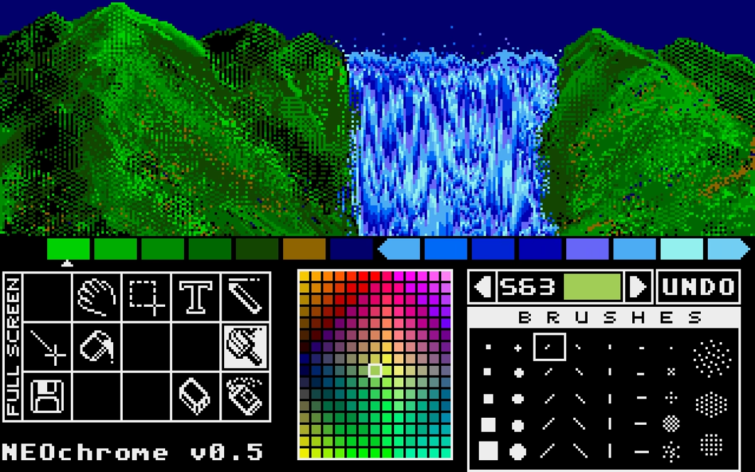
I linked to palette cycling before, and I was just reminded of palette cycling art by Mark Ferrari, who back in the 1990s made 30+ landscapes that looked like this:
Content Preview
I linked to
palette cycling before
, and I was just
reminded
of palette cycling art by Mark Ferrari, who back in the 1990s made 30+ landscapes that looked like this:
They have been
collected on this webpage
some 15 years ago, and I’m linking to it in part because it’s also a great explainer of how palette cycling works – you can see the colors move around, you can point to one to see it frozen, and you can see multiple cycles running in parallel, compare palette ranges between different environmental conditions, and turn on a “blended” technique that feels clever and I didn’t realize existed.
Mark J. Ferrari […] invented his own unique ways of using color cycling for envrironmental effects that you really have to see to believe. These include rain, snow, ocean waves, moving fog, clouds, smoke, waterfalls, streams, lakes, and more. And all these effects are achieved without any layers or alpha channels – just one single flat image with one 256 color palette.
The launch was also accompanied by an interview with Ferrari, which
is an interesting read
– in part because it shows the work was even more elaborate than all of the above:
These versions of the scene are all the same piece of art ‘shifted’ to different palettes, and, in some cases, using additional ‘baked in’ overlays, (such as rain or the lighted windows at night). But those overlays are all ‘baked in’ to the same layer of the same piece of art that appears in any other ‘day-time’ or clear weather iterations, and are all deriving their color and motion from the same palette as the rest of the picture in that state.
While [the page above] finally allows us all to watch these images color cycle online, many of the scenes posted were actually ‘built’ to do much more than merely animate. By fading the one piece of art through whole sets of palettes, sometimes also using a very sparse set of ‘baked in’ overlays, a number of these scenes can go seamlessly through the 24 hour light cycle, and even change weather conditions ‘naturally’ and seamlessly in real time as you watch. I am not just talking about changing the brightness or color scheme of these pictures either. In the images built for it, over the course of ‘sunrise and morning,’ ‘morning to afternoon’ or ‘evening and sunset,’ light and shadow will actually gradually change angle, climb down the sides of things, move across lawns, up cliffs or building walls, as changing light does in life – all just by fading through palette series designed to make those things happen without altering or adding anything at all to the single layer of 8-bit pixel art.
Ferrari also suggests an interesting analog to palette cycling, which I quoted in the title.
(Bonus: Ferrari’s animated landscapes were made for a new-age’y personal organizer app called Seize The Day, and on top of the above preservation effort, there is also this independent,
extremely retro page
from a fan of the app who loved it so much she decided to keep the app itself alive, too.)
Recently, I asked on social media, “Is there a UX design equivalent to this?”, and attached this photo:
Content Preview
Recently, I asked on social media, “Is there a UX design equivalent to this?”, and attached this photo:
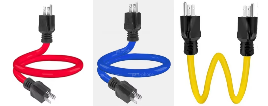
In case you don’t know, this is a (mythical) male-to-male power extender. Requests for those seem to spike around Christmas, and the reason is this: if you put up your lights, chain them together, and only then realize you did it in the wrong order – with the holes next to a socket – it seems much easier to imagine using this cable than reversing all the lights.
There are apparently other uses, like powering your whole house from a portable generator. But I don’t know if you can actually buy such a cable. What I do know is why you wouldn’t
want
to buy one. The cable has a horrible flaw that might not be immediately obvious: once you plug it in, the other end now has exposed live wires that can electrocute someone.
So, my question was really: What in design has a similar property? What’s something that seems like a good idea, but is actually pretty bad and/or even dangerous?
I would be curious if you have any nominations, but I got two answers that seem interesting enough to share.
Warren Teitelman originally wrote DWIM to fix his typos and spelling errors, so it was somewhat idiosyncratic to his style, and would often make hash of anyone else’s typos if they were stylistically different. Some victims of DWIM thus claimed that the acronym stood for ‘Damn Warren’s Infernal Machine!’.
In one notorious incident, Warren added a DWIM feature to the command interpreter used at Xerox PARC. One day another [user] there typed
delete *$
to free up some disk space. (The editor there named backup files by appending
$
to the original file name, so he was trying to delete any backup files left over from old editing sessions.) It happened that there weren’t any editor backup files, so DWIM helpfully reported
*$ not found, assuming you meant 'delete *'
. It then started to delete all the files on the disk! The [user] managed to stop it with
a Vulcan nerve pinch
[Ctrl-Alt-Del] after only a half dozen or so files were lost. […]
DWIM is often suggested in jest as a desired feature for a complex program; it is also occasionally described as the single instruction the ideal computer would have.
I have a complicated relationship with the Jargon File – a collection of computing anecdotes from the 1970s – and I don’t know if I fully trust it, but I liked this story and Wikipedia
has a bit more about it
:
Teitelman’s DWIM package “corrected errors automatically or with minor user intervention”, similarly to
autocorrection
for natural language. […] Critics of DWIM argued that it was “tuned to the particular typing mistakes to which Teitelman was prone, and no others” and called it “Do What Teitelman Means” […]
The second answer was a property of the desktop trashcan on Windows or a Mac, and this one I could’ve thought of myself, because in 2020,
I wrote about it in my book’s newsletter
.
To spoil the story: any onscreen trashcan that has a bulging/filled/gross appearance whenever there are files inside will prompt some percentage of users to clean it just to restore its pristine appearance… in the process nullifying its utility and purpose.
Like the original power extender, the second visual state of the trash
seems
like a useful thing to offer to the users, but it comes with a possibly regrettable price. This is what connects the two stories – both talk about “nice,” but underbaked improvements leading to potentially losing files.
Oh, you say,
all
of onscreen trashcans do that? Well, then, there’s your problem.
Three nice moments in Buttondown’s (pretty comprehensive) release notes:
There is a filter and tags to search more easily.
Blog entries are linked throughout, complete with cover images – it’s a nice way to distinguish small changes from big improvements.
The fixes are attributed to specific people. (This part doesn’t appear on mobile.) Particularly nice to see support for more than one person collaborating on a fix – I’ve had fun memories working at various companies of pairing up with someone else to debug a particularly tricky problem.
#culture #release notes
Content Preview
Blog entries are linked throughout, complete with cover images – it’s a nice way to distinguish small changes from big improvements.
The fixes are attributed to specific people. (This part doesn’t appear on mobile.) Particularly nice to see support for more than one person collaborating on a fix – I’ve had fun memories working at various companies of pairing up with someone else to debug a particularly tricky problem.
Fighting games require rather precise timing: the action is frenetic, the inputs rapid, and the outcomes can be determined by what players do down to – sometimes – individual one-sixtieth-of-a-second frames.
Content Preview
Fighting games require rather precise timing: the action is frenetic, the inputs rapid, and the outcomes can be determined by what players do down to – sometimes – individual one-sixtieth-of-a-second frames.
This is fine when you play locally, but gets infinitely more tricky the moment you attempt to kick someone’s more remote ass:
Information sent to your opponent may be delayed, arrive out of order, or become lost entirely depending on dozens of factors, including the physical distance to your opponent, if you’re on a WiFi connection, and whether your roommate is watching Netflix.
The part of the game responsible for dealing with networking is called
netcode
, and the classic solution to the lag problem has been
delay-based netcode
with a sort of lowest common denominator approach: if your opponent has a “ping” of 50ms, your actions will also be delayed by 50ms, to ensure fairness.
It’s not that hard to imagine many problems with this idea. Lag comes and goes but the game doesn’t smooth it out, the play feels like jello with even an okay connection, and the game occasionally
freezes
, waiting for a suddenly dropped connection to resume, not knowing what to do in absence of information.
That’s why within the last decade, what gained popularity is a new kind of netcode called
rollback netcode,
which operates by… lightly
predicting the future
. Most of the time, within a reasonable lag, the game will feel as fast as a local game to both players – and even when the optimistic prediction doesn’t match what eventually happens in reality and the code has to roll it back, visibly, in front of a player, the change might be too small to notice and only rarely it’ll result in
rubber banding
.
It covers a lot of stuff, including nuances like drift and design decisions that game makers might want to incorporate to soften rollback netcode’s most annoying side effects. (Also, the guitar playing bit at 0:22 is absolutely brilliant.)
The video is largely based on an
earlier essay by Infil
, which has even more details (audio!) and which I excerpted above.
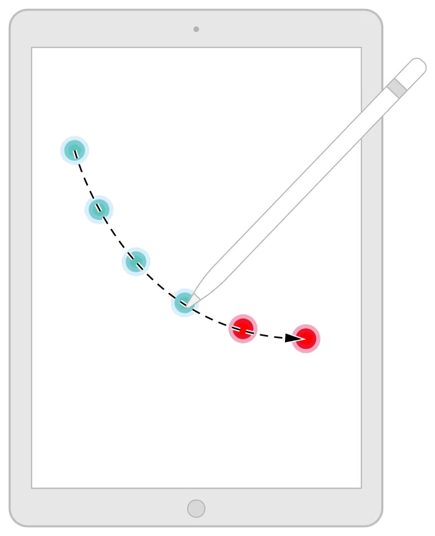
It’s not just videogames. When Apple
announced
in 2019 that they reduced the latency when using their iPad Pencil from 20ms to 9ms, they didn’t hide that they had to peek into the future as well:
The specifics were, as far as I know, never revealed. But the fact that some of the input events the app receives are not actually real is
official and documented
:
It takes time for UIKit to generate and deliver touch events to your app, and it takes time for your app to process those events and render the results. In fact, it takes enough time that there can be a visible lag between the movements of a person’s finger or Apple Pencil and the rendered results. To minimize the perceived latency between touch input and rendered content, you can incorporate predicted touches into your event handling.
In fighting games, the most accurate prediction is a trivial “whatever buttons and controls the player holds on the current frame are likely the same they will hold on the next frame,” but for other games – and for Apple’s Pencil – slightly more advanced prediction might be necessary:
It feels disappointing that no matter what we do, there might be no way to reduce latency below a certain threshold without cheating.
But if there’s any consolation, it’s that
cheating seems to be the only answer,
and that has been the case long before computers came aboard. There are many documented ways our brains have their own netcode to cover for various lags occurring within our bodies. There’s the
stopped-clock illusion
, the
cutaneous rabbit effect
, the
color phi phenomenon
, and – most relevant for today, even though it has the most boring name – the flash-lag effect, documented
on this nice page by Michael Bach
:
The flashing lines are shown exactly at the same time and angle as the rotating line, but it certainly doesn’t
appear
to be the case. Just like fighting games and Apple Pencil do, our brains predict and extrapolate the movement of the moving line so that our other senses can intercept it at the right moment. The go-to example of why it’s needed is that you wouldn’t otherwise ever be able to catch a ball thrown your way – but I imagine it might be useful in a street fight, as well.
From its earliest days, Macs established an interesting convention – whenever you press a keyboard shortcut to an action that’s somewhere in the app menu, the matching top menu label blinks quickly.
Content Preview
From its
earliest days
, Macs established an interesting convention – whenever you press a keyboard shortcut to an action that’s somewhere in the app menu, the matching top menu label blinks quickly.
Here, I am pressing ⌘A (Edit > Select All), followed by ⌘+ (Format > Font > Bigger), and then ⌘B (Format > Font > Bold):
I believe this is meant to help you connect those things better. While you might not need a map to an action that you already know a shortcut for, it might be helpful to tell you where to find other actions like it.
I imagine it also helps whenever you press a wrong shortcut – or the right shortcut under the wrong circumstances – and you want to deduce what happened or what was meant to happen. Knowing roughly where a command “lives” makes it easier to open the menu and look for it, even if you might still have to dig through all the submenus.
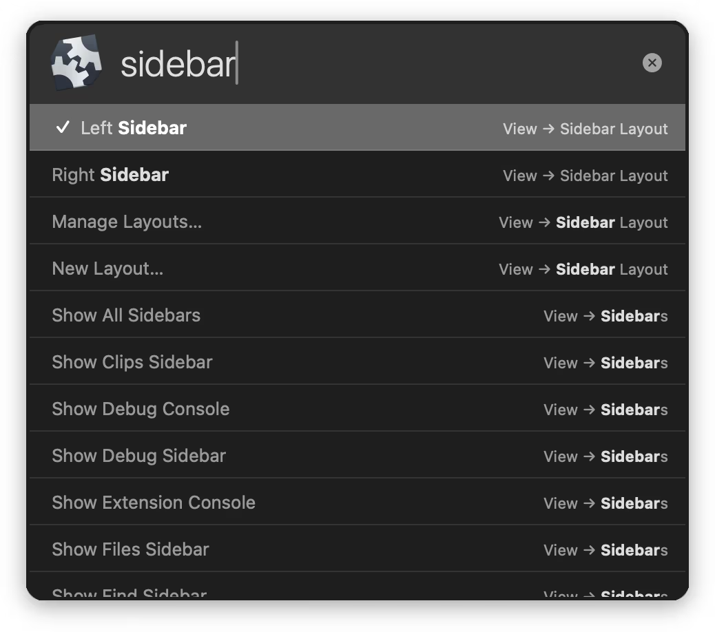
Recently, I spotted the programming editor Nova use a parallel technique. In its command palette, commands show their keyboard shortcuts, but if they’re hiding in submenus – also their menu path:
I am not sure how effective either of these techniques is, and both can feel a bit… busy. But they also appear thoughtful – we’re all spatial creatures, and I imagine helping you visualize a map of the entire system of commands can make it easier for you to feel at home.
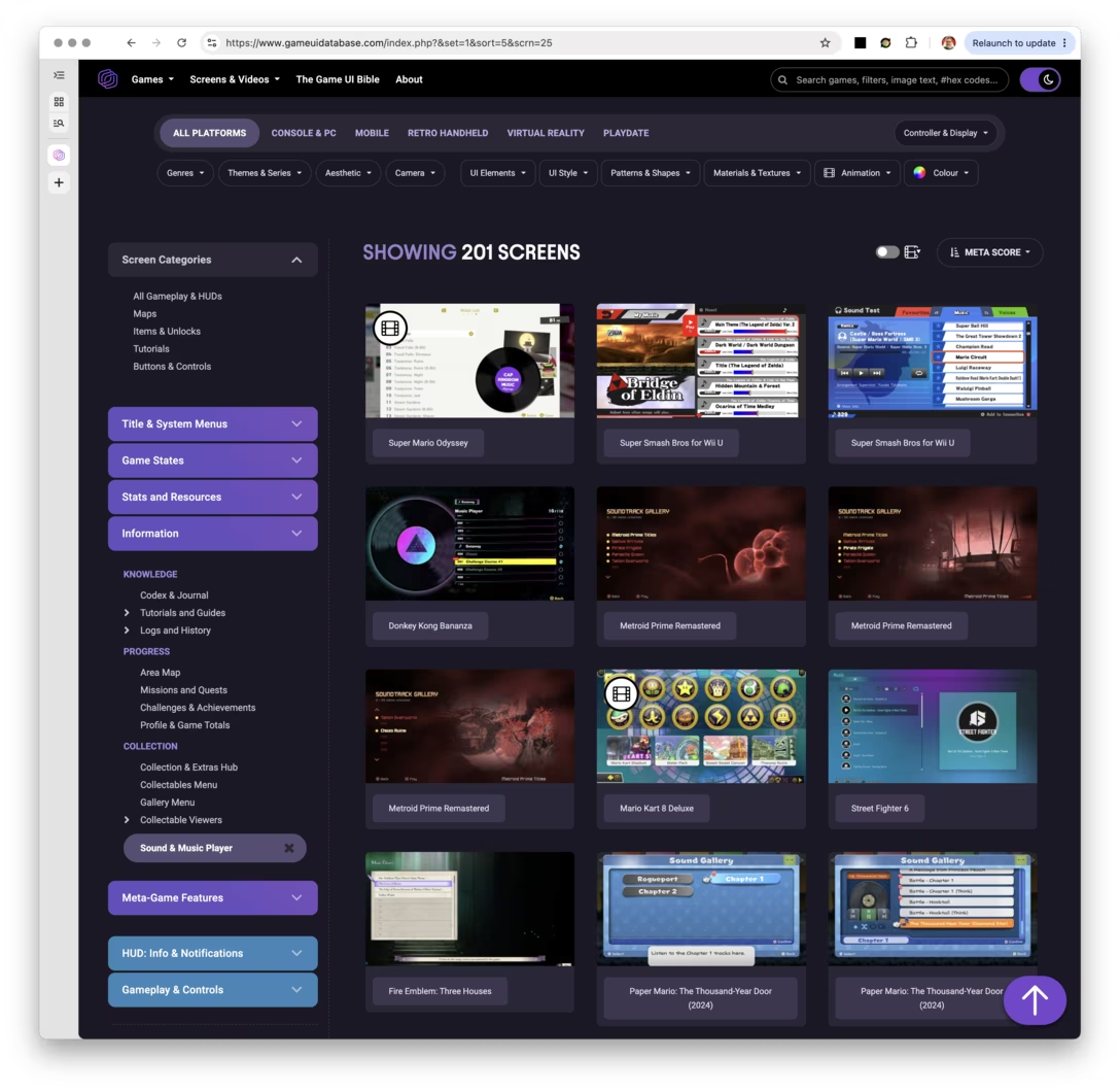
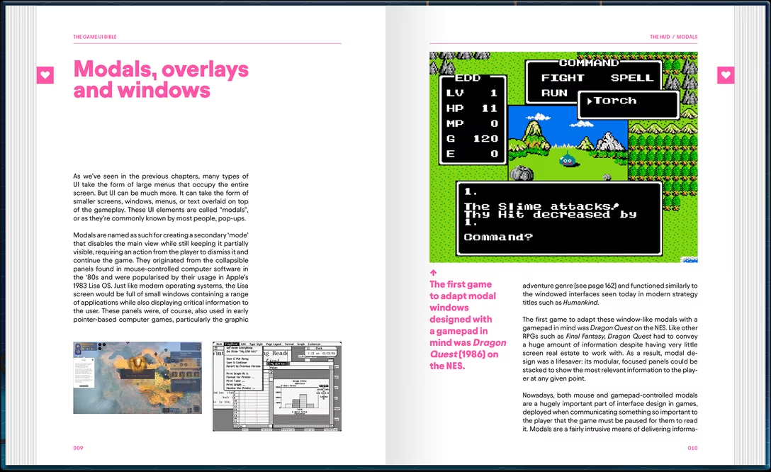
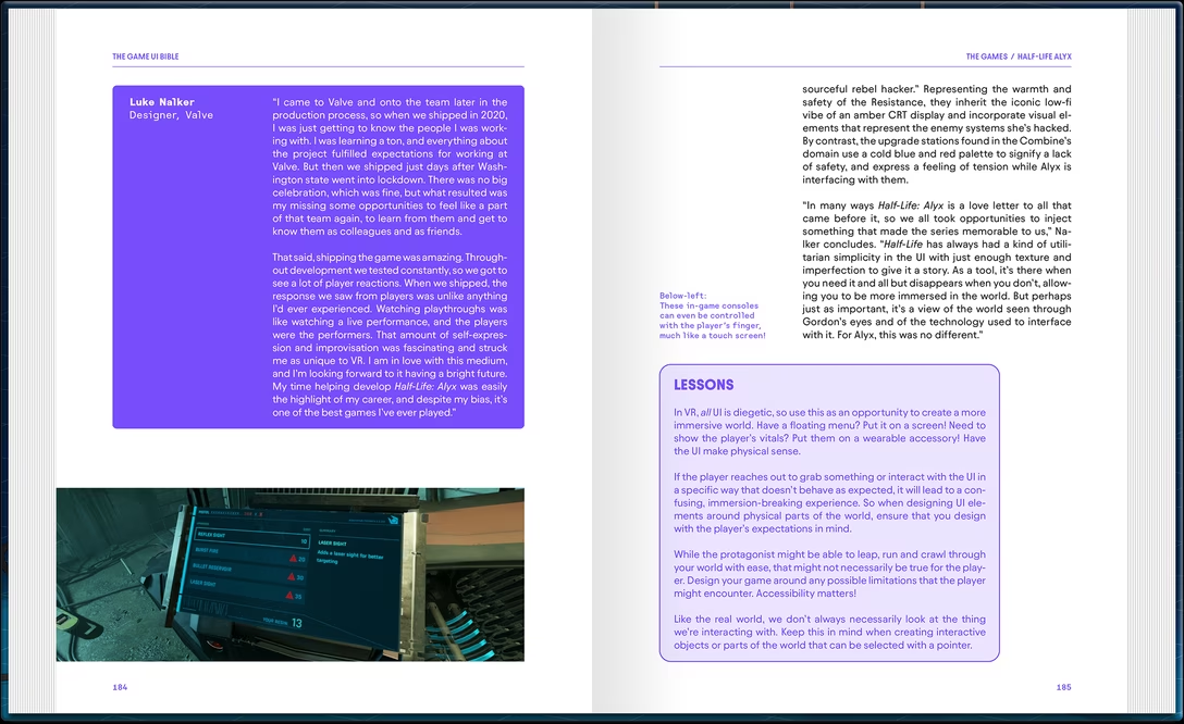
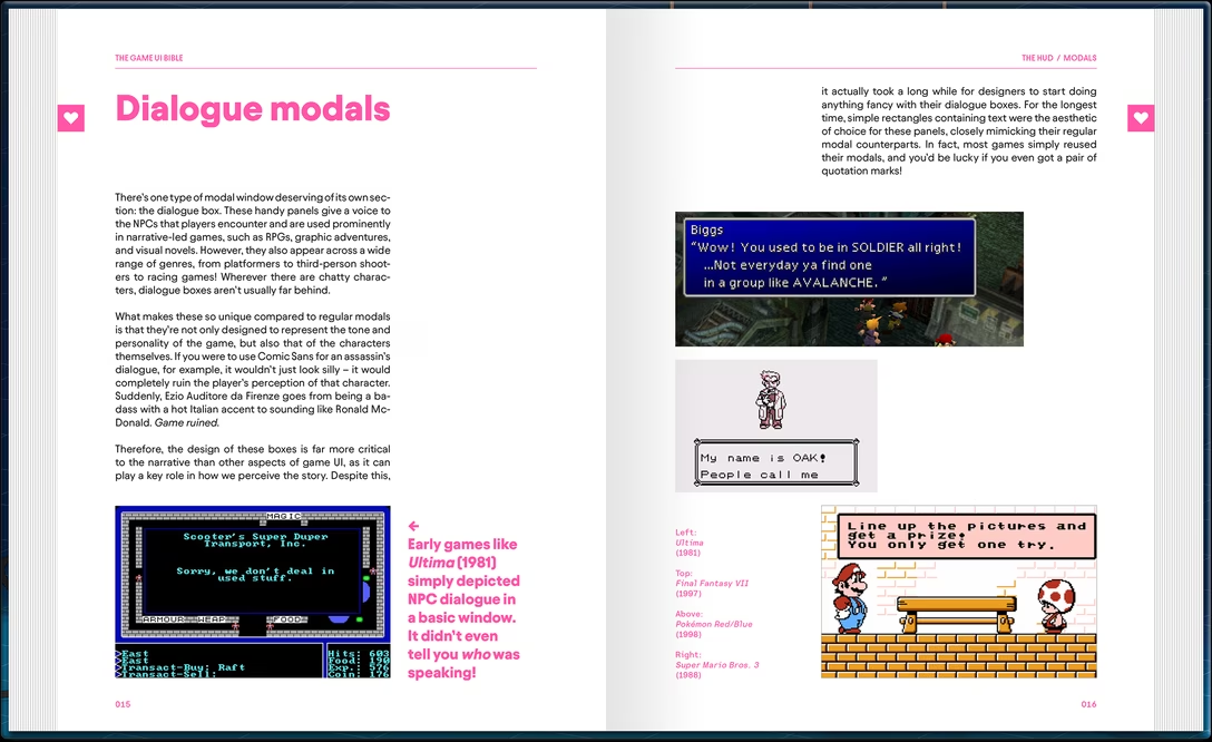
Even if games and productivity software seem worlds apart – the creator of the site, Edd Coates, calls himself “UI artist,” which is not a title I’ve ever seen in my line of work – I’ve long thought games do some things better, and these can be an inspiration.
The database was started by Coates a few years ago. This
launch article on Mashable
has this interesting passage:
The site is relatively short on context, with only the collections of screenshots gathered under different tags for visitors to go on. […]
That’s the site working as intended. As Coates explained: “It’s useful for designers to identify recurring and pre-established patterns in successful titles when building their own interfaces.” Added context isn’t necessary because the contrasting approaches evident in each image is the whole point.
Needless to say – I mean, you know this after spending 12 seconds on this blog – I disagree. But it seems the author does too, since he’s working on a book called
The Game UI Bible
, to be released in the first half of 2027:
I recognize the volume is pricey and last time I was
excited about a book
, it turned out to be
quite a disaster
. The Game UI Bible book also touts a lot of interviews with UI artists, and I find these to be a mixed bag in practice; it’s really hard to interview people in a way that yields something interesting.
But still, I am excited again – and if you’re not, the
Game UI Database
is worth checking out.
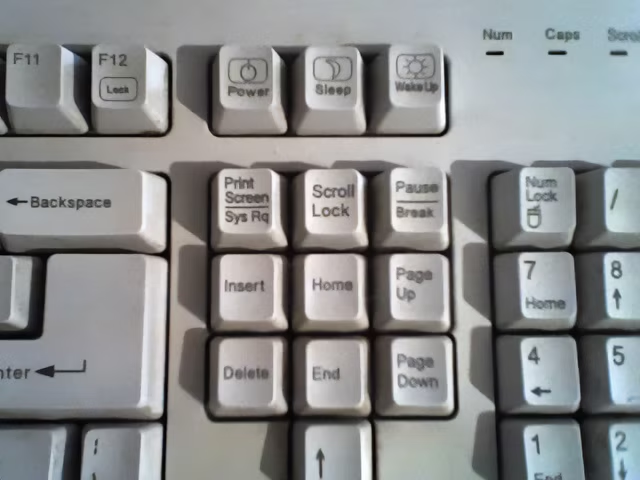
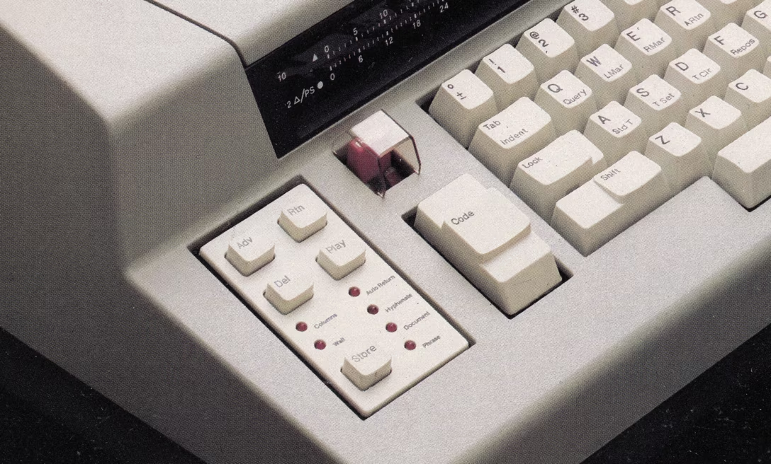
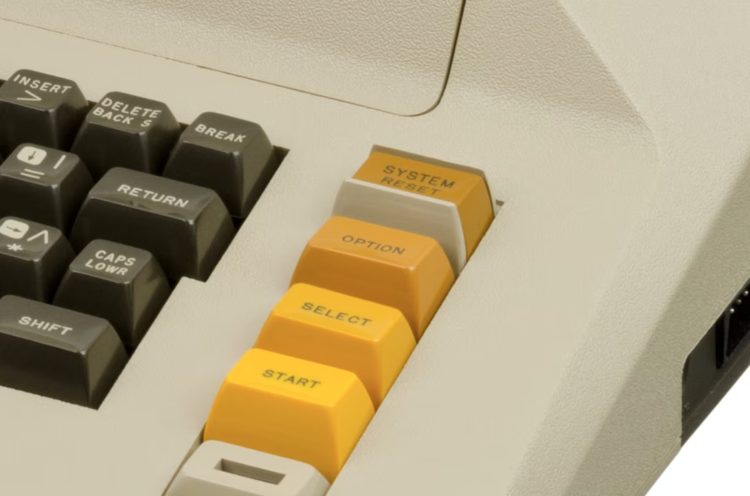
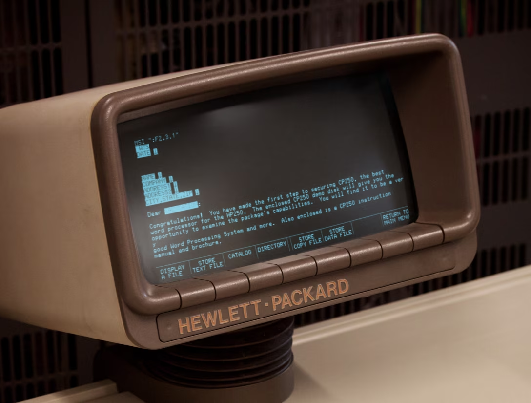
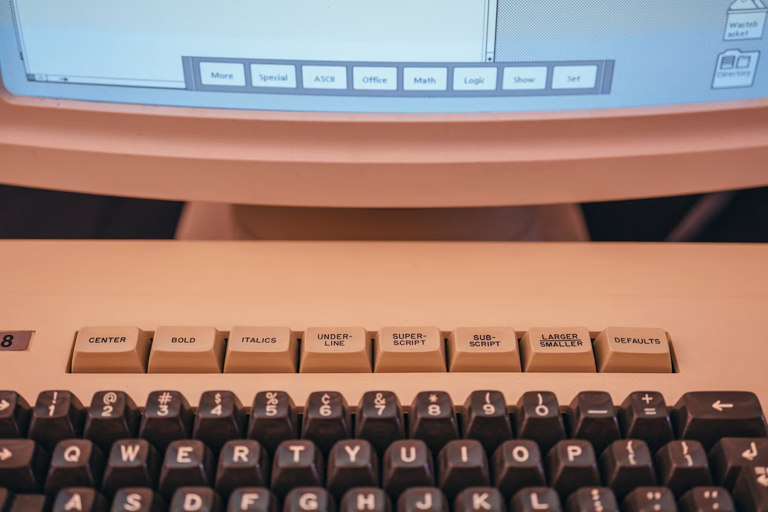
Various old computers had their keyboards adorned with unique symbols. Companies like Commodore, Atari, Amiga, or even – in its previous life – Apple chose to put their company logos on keys, and there were other weird and obscure keys on weird and obscure keyboards.
Content Preview
Various old computers had their keyboards adorned with unique symbols. Companies like
Commodore
,
Atari
,
Amiga
, or even – in its previous life –
Apple
chose to put their company logos on keys, and there were other weird and obscure keys on weird and obscure keyboards.
But it was Apple’s recent push to
move their American keyboards closer to European ones
by embracing more iconography, that made me think of forgotten key symbols less obscure, ones that belonged to platforms we still use today. Even on a Mac and a PC, some key symbols didn’t make it to modern times. So let’s start with the PC side today since that part of the story begins earlier, and do Macs in a follow-up post.
For a lot of 20th century, a battle has been waging between words and icons. The first salvo was, perhaps,
the traffic signs
: America embraced words, while Europe relied more on iconography. (As much as it looks like it, it wasn’t just “graphic design vs. not”; as a more varied continent with multiple languages, Europe needed a more universal visual language to help people travelling between countries.)
This, I understand, trickled down to other things: home electronics, and computers. There, iconography also made it easier to make one product and sell it across all of Europe, without needing to introduce many SKUs with different UI strings.
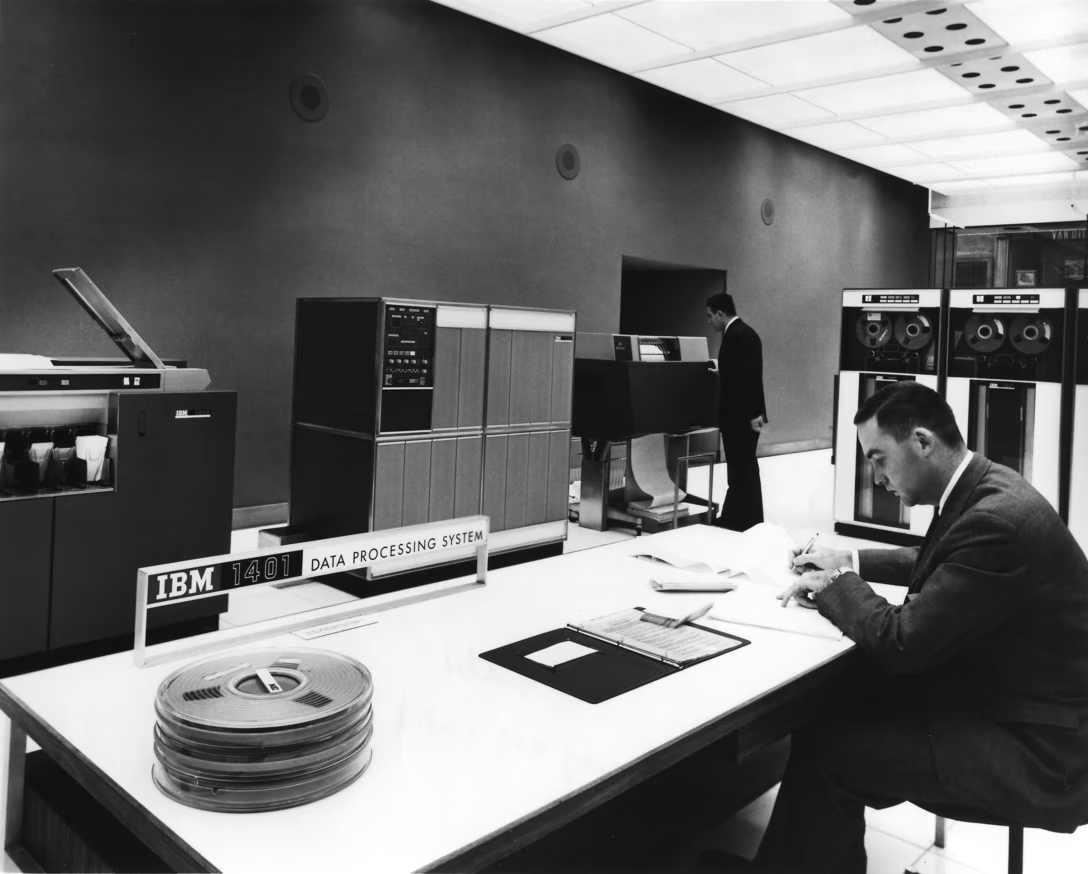
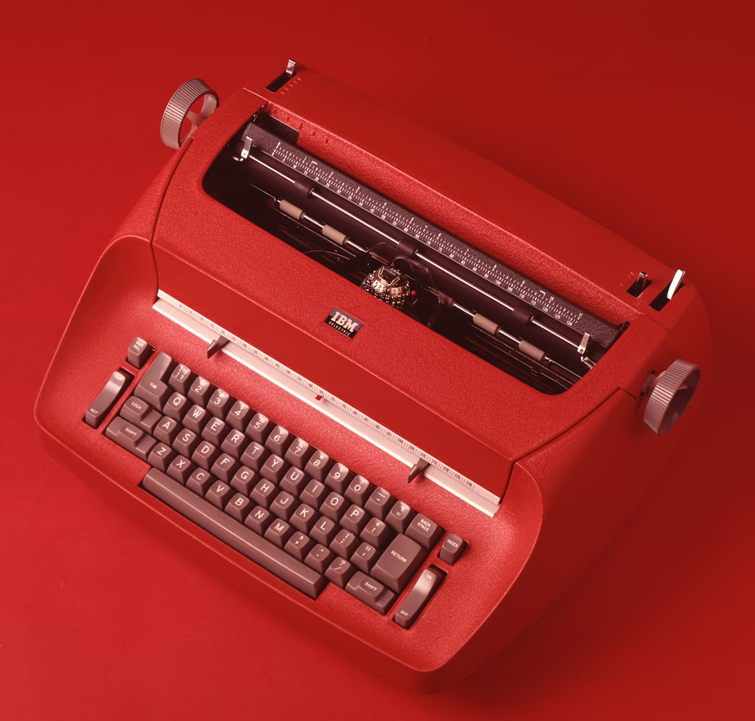
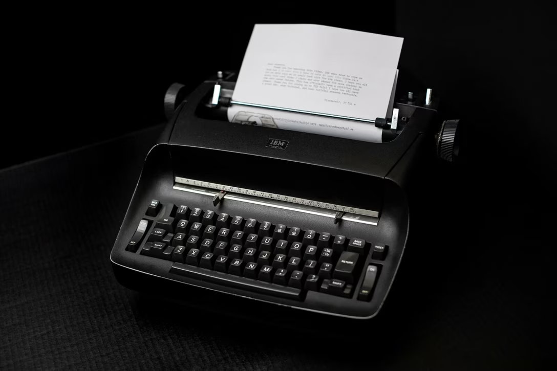
Here’s IBM’s Selectric typewriter from the 1970s, in its American and European edition:
(If you’re curious, Express was a very fast Backspace, and Index moved the page down; both were prototypes of future arrow keys.)
Here’s IBM’s early 1130 computer from 1965, which sported an unusual symbol for space:
Some IBM laboratory and scientific computers in the 1970s and even 1980s veered more into iconography, but eventually lost to text as office PC users rejected the confusing symbols. As their keyboards morphed into PC/Windows keyboards we know today, only four symbols remained and gained widespread acceptance: ⇧ for Shift, ↵ for Enter, ⇥ for Tab, and some version of an arrow for Backspace.
But let’s look at those old symbols, some beautiful, all interesting.
The two symbols below are: Print Screen (old CRT screen turning into a piece of paper) and key beep – popular when people were transitioning from loud typewriters to relatively quiet keyboards:
Here – on the front edge of the also-forgotten Reverse Tab – you can see Home, which historically meant “return to the top left corner of the screen” and sometimes even “clear the screen”:
But my favourites were these, for Insert (gone from many keyboards) and Delete (still with us):
These seem inspired by proofreader marks, which feels wonderfully old-time’y:
Building on that visual language, one could also find invert/reverse video, blinking, and underline:
And this absolute beauty, which I think meant “delete word”:
The really interesting thing is that some of those symbols survive today in Unicode. I spotted at least ⎀, ⎃, ⎁, and ⎂. The last two are for contiguous and non-contiguous underline, which I feel is a story I should know, but I don’t (yet).
Buttondown, a newsletter publisher, has a pretty standard CSS editor in its web app. You can edit the code and whenever you make any change, you can then press the Save button to make it go live:
Content Preview
Buttondown, a newsletter publisher, has a pretty standard CSS editor in its web app. You can edit the code and whenever you make any change, you can then press the Save button to make it go live:
The view also thoughtfully supports pressing ⌘S to do the same thing:
However, if there is nothing to save, ⌘S is ignored by the CSS editor, and falls back to the browser’s handling:
It feels logical: ⌘S only takes effect when the button is visible, otherwise why would a user press it? In a front-end sense, it might even seem thoughtful. We all witnessed web apps that greedily took over some interaction, and broke things in the process. Hell,
I did that myself
.
In theory, you – the user – take a careful look at the state of things, notice the button, and then press ⌘S.
But in practice? It’s none of the above. Fingers don’t look around. You might press ⌘S twice in a row. Or after an undo to an already saved state. Or after pressing another key so light it didn’t register. Or after just sitting down to an open document that’s already saved. Or because you weren’t sure if the previous ⌘S press worked. Or just to be sure. You might not know why, and you might not even
notice.
The beautiful raw power of ⌘S as a citizen of motor memory is that it’s automatic, mindless,
habitual
.
That’s why ⌘S here needs to be both
deterministic and idempotent
– if there is nothing to save, don’t let it fall back to the browser, don’t show an error message, don’t beep at the user. Just ignore the keystroke altogether.
It might feel funny, but there are tons of places in the UI that already look the other way. Off the top of my head:
if you center align already center-aligned text in any writing app, the app just ignores you,
if you press ⌘A to select all more than once, no one’s shouting at you,
if you try to click a disabled button, the click gets quietly swallowed.
It gets a lot more interesting than these, but we’ll talk about more examples of “finger logic” in future posts.
There are two distinct flavors of speedrunning:
Content Preview
There are two distinct flavors of speedrunning:
completing a game as fast as possible through feats of extraordinary mastery, timing, and precision,
completing a game as fast as possible by finding all sorts of bugs and exploits in the game (commonly known as “glitches”) that allow the player to find eerie shortcuts between areas without having to play them.
Watching the first one feels like watching the Olympics. The second one is absolutely incomprehensible without someone narrating over and explaining things.
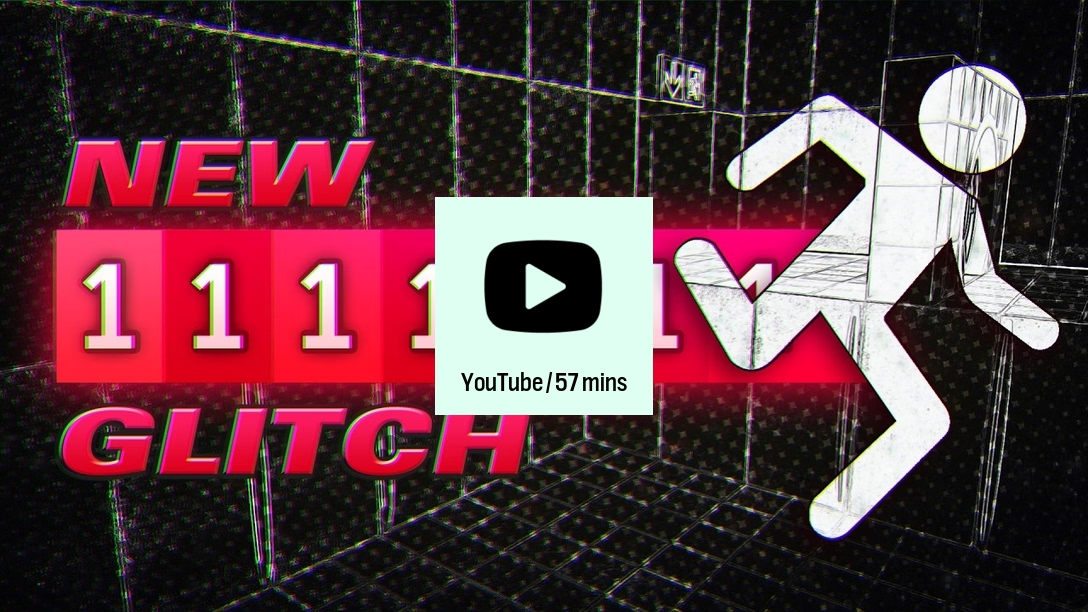
This video by Marblr
is such narration and explanation of a particular glitch in Portal that significantly shortened a few speedrunning moments:
It’s an hour-long video, and I think it’s a really well-made one, and one you can learn a lot from.
The video has some nice history of strafing – similar in some way to
Scroll Lock
– and motor memory accommodations. It also shows the source code of Portal to explain things. This is fun on its own, but on top of that, Marblr layers some really cool visualizations – watching how one value “infected” by infinity proceeds to infects the others is riveting.
Even the levels and their geometry are presented in a really beautiful and informative way, too:
I’m still not fully onboard with this branch of speedrunning – if the entry point to your effort is changing mouse sensitivity to an abnormally high value, or if you have to pick a very specific version of the game that just happens not to have patched the glitch you care about, then perhaps things have gotten too esoteric and maybe even academic? But at the very least we get videos like this one –
or one I linked to in May
– going under the hood of software in some particularly enthralling ways.
Anthony Hobday is a product designer and I like his approach of cataloging and sharing references on his website. Here are some choice pages:
Content Preview
Anthony Hobday is a product designer and I like his approach of cataloging and sharing references on his website. Here are some choice pages:
I admire this kind of rigorous practice, and if you’re doing that on your own, please consider sharing it with others, too! (And please consider letting me know.)
As a reader, I find these fun to go through, as they light up different parts of my brain than most of other design resources.
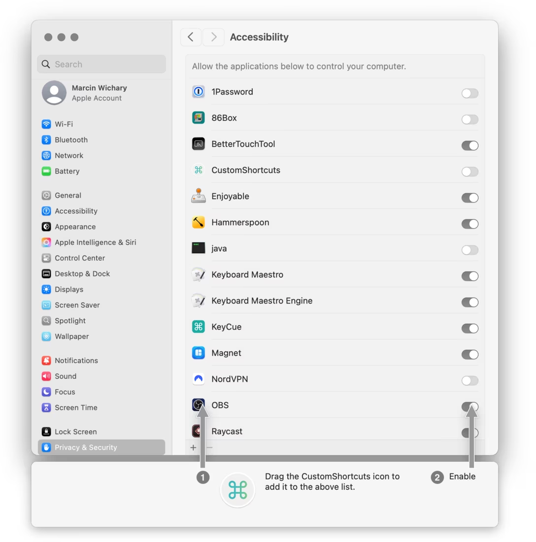
Any Mac app that has to ask for system permissions has its work cut out for it. In a previous post I showed “the MacCharlie method,” which looked like this:
Content Preview
Any Mac app that has to ask for system permissions has its work cut out for it. In
a previous post
I showed “the MacCharlie method,” which looked like this:
DaisyDisk, a disk cleanup app, does something different.
First of all, I like that the app icon is animating here to indicate it’s movable. It’s a version of “jiggle mode” and while it would be frustrating to see it in a common UI surface (our brains our wired to be distracted by movement, especially in the periphery), this is a tab that you only click into to fix this:
But something even more interesting happens. The moment you start dragging the icon, the app actually spawns System Settings, positions them close, and even opens them at the right pane… so you can just drag the icon over:
I don’t believe I have ever seen anything like it before. This feels a bit aggressive, but I think it is… good?
I now wonder, however, why do the instructions still tell me to do it by hand. What if they just had a wiggly icon saying, “start dragging it, and we’ll open Settings for you,” with only some fallback or manual option if wanted?
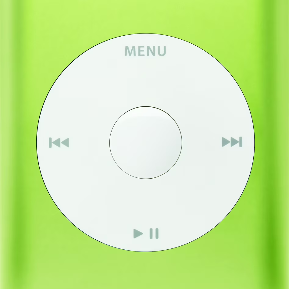
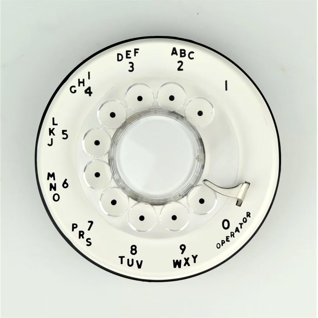
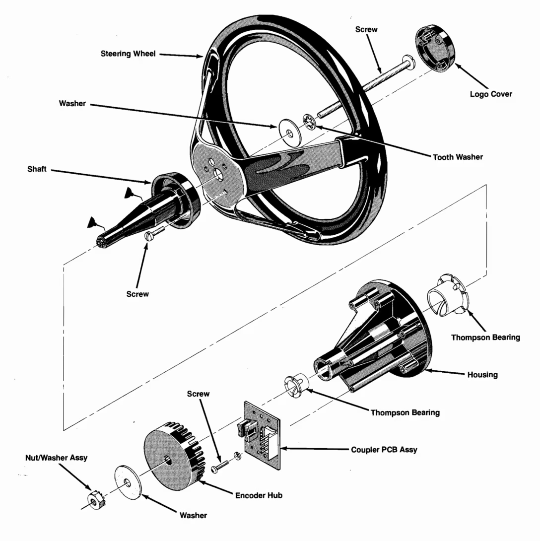
I know, I know. I’m supposed to say iPod’s click wheel, or the Western Electric 500 rotary dial, or maybe the first Nest.
Content Preview
I know, I know. I’m supposed to say iPod’s click wheel, or the
Western Electric 500
rotary dial, or maybe the first Nest.
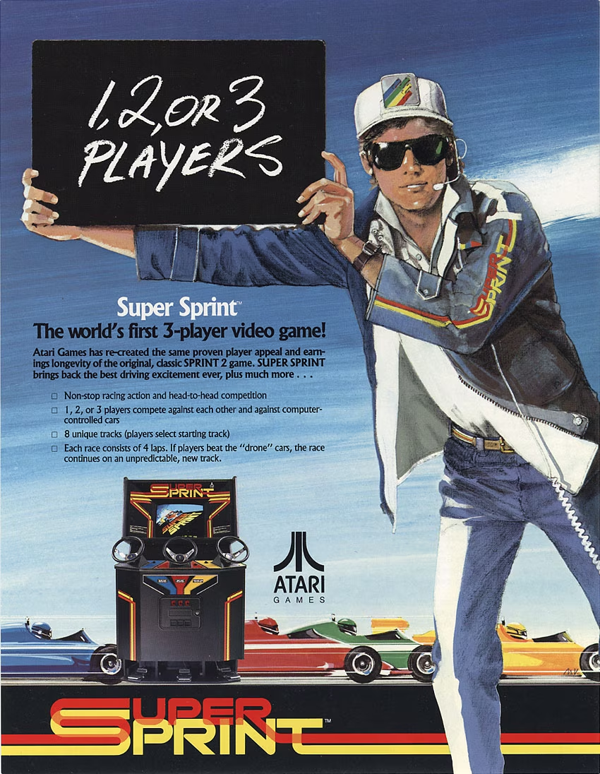
But, have you ever played Super Sprint?
It was Super Sprint that had the first amazing rotary controller I’ve ever used, and the whole cabinet design told you the game was very well aware of that.
Super Sprint was a 1986 arcade game from Atari that was, in a nutshell: four cars (at least one computer-controlled), eight tracks, fast races.
You might think that those wheels functioned similarly to a regular car steering wheel, but not really – they were much easier to spin, and needed to travel further to rotate the car. You wouldn’t steer delicately, but rather the opposite: you needed to throw the wheel violently in one direction, and then, at the perfect moment,
stop it on a dime
:
So the huge wheels were not realistic. Neither were the cars. They accelerated rapidly – the gas pedal was your only other control – and had a ridiculous amount of understeer.
Don’t let the size and intensity of the interface fool you, though: this was a very precise operation. The game was
tight
–
Rollercoaster Tycoon
tight or
Excel 97
tight, a whole decade before them. In the world awash with slow computers, Super Sprint lived up to its name, laughing latency and delays in their faces. It’s hard for me, even today, to imagine something faster or tighter – and for even my contemporary work, it’s good to remember things can
feel
this way. And, on top of all that? Better-than-usual
sound design
, higher-than-usual resolution, shortcuts to reward really good players, and a bunch of great details and easter eggs.
Super Sprint wasn’t Atari’s first attempt here – it was preceded by
Sprint 2
, Sprint 4, Sprint 8, and Sprint One – and you could tell. It was designed and coded by Kelly Turner and Robert Weatherby, polished as hell, and might have been the first interface between the person, the hardware, and the software that really inspired me. It was almost as much fun to watch three good players compete, as it was to play yourself. But when I played it, it’s possible these were my first – please excuse me here – motor memories.
Atari used the same wheel for other games,
famous
and
obscure
, but this was where it met its match in software. I can show that to you, but
experiencing
it is impossible from afar. Even perfect emulation can’t do it justice – there has simply never been a home controller that approached it. (I mean, the whole cabinet weighed 400 pounds!)
But if you are ever in an old-school-themed arcade, look out for Super Sprint (
locations
), or its two-player cousin Championship Sprint (
locations
) – and give it a turn or two.
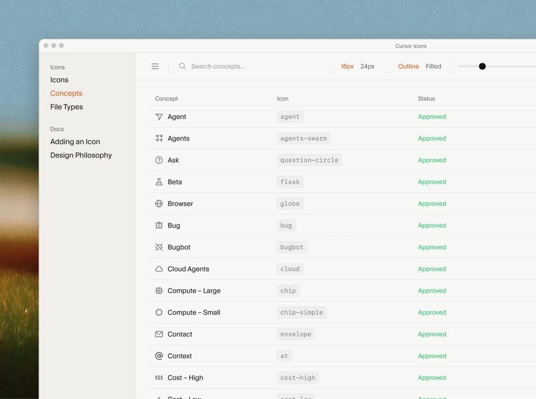
A few nice moments that caught my attention in Marek Minor’s case study of designing icons for Cursor.
The diagonals for “cancel/wrong” icons are always backslashes, and all the “positive” icons are always slashes:
There is a system that provides 1-to-1-and-only-1 mapping between a concept and an icon:
The point of the table is that each “What’s the icon for [X]?” has exactly one answer, and keeps having exactly one answer as the product grows. Without it, a set slowly develops two icons for the same idea, and at that point it stops being a system.
And, on the page itself, a few nice blink-comparator-like vehicles with subtle text animations:
#case study #iconography #system design
Content Preview
The diagonals for “cancel/wrong” icons are always backslashes, and all the “positive” icons are always slashes:
There is a system that provides 1-to-1-and-only-1 mapping between a concept and an icon:
The point of the table is that each “What’s the icon for [X]?” has exactly one answer, and keeps having exactly one answer as the product grows. Without it, a set slowly develops two icons for the same idea, and at that point it stops being a system.
And, on the page itself, a few nice
blink-comparator
-like vehicles with subtle text animations:
Ivory is a Mastodon client, and their account switcher has a few interesting mechanics.
Content Preview
Ivory is a Mastodon client, and their account switcher has a few interesting mechanics.
The standard one is that you can tap on your avatar, and get a menu in response:
But you can also drag down on the avatar, and get a different reaction:
This, I believe, is meant to be a slightly faster way. The settings option is gone to simplify, and the whole thing looks and feels more… gestural, in lack of a better word.
But I think it also serves one more purpose. The moment I saw this, I thought to myself “I wonder if I could just swipe on the icon itself?” and, lo and behold, this is actually possible:
Why does it matter?
I think for some power users of social media – perhaps people doing it professionally – you switch accounts all the time, and investing in this interaction being fast and smooth is important.
This whole small interaction system feels similar to switching apps on a Mac. You can choose an app in your dock with a mouse (the slow, but well-lit way). You can then learn to use ⌘⇥ and hold ⌘ to get to it quicker from a temporary menu. Eventually, you will also start tapping ⌘⇥ quickly, skipping any visible UI surface altogether.
There is also something great in seeing an interface that grows with you, or one where you can say “I wonder if…” based on your prior interactions and expectations, and the interface actually rewarding you for that thought.
Many years ago, I put together a quick proposal of what I called “responsive text” for social proof:
Content Preview
Many years ago, I put together a quick proposal of what I called “responsive text” for social proof:
I think you get the idea – instead of dumb truncation, the underlying code could prepare a few strings conveying the information with different levels of specificity, and then the UI could choose the longest one that could still fit.
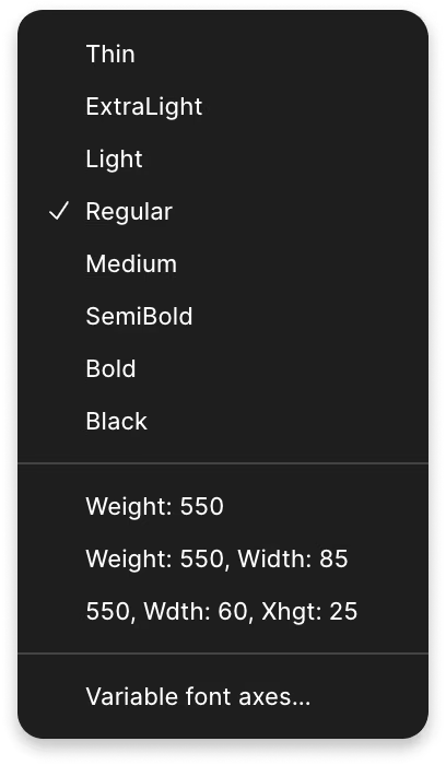
This idea can apply in a few places. Here, in Figma, one of the menu items switches to a more “compact” string that uses four-letter abbreviations and skips “weight” altogether – but only because there isn’t room for a verbose treatment. You can also compare it with the original, naïve truncation:
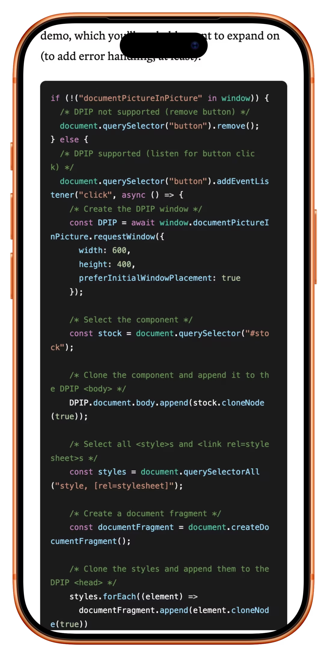
I think this is a lot more clever and a lot more important. Mobile phones are everywhere. Wrapping code like regular text without understanding it makes it basically impenetrable, but preserving long lines and introducing horizontal scrolling is also frustrating – just in a different way, forcing you to hold more stuff in your head:
I can see Archibald’s solution be very helpful here if used well –
and not just on mobile
– and perhaps could inspire other kinds of solutions for similar problems (have you ever tried to read any table on Wikipedia on your phone?).
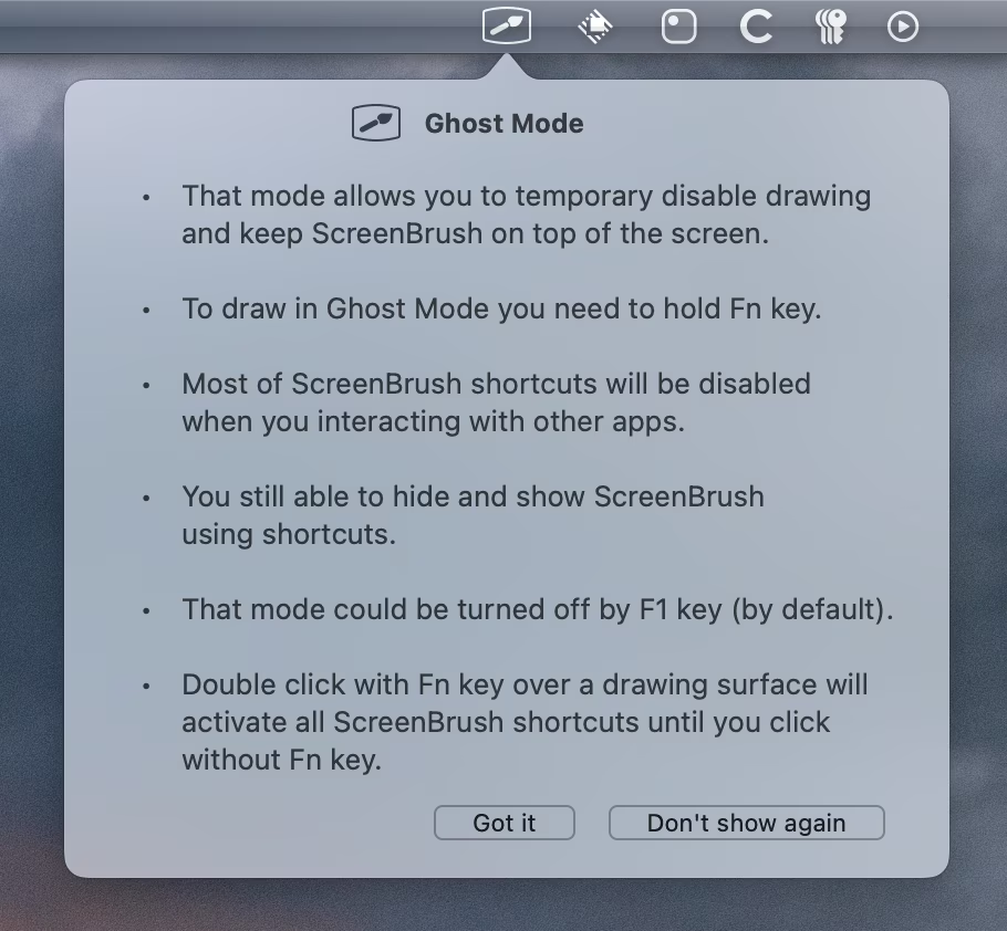
An interesting take from a screen annotation app ScreenBrush – instead of a standard “don’t show again” checkbox modifying a button, it shows two buttons as a fork in a road:
I am not sure I have ever seen it laid out like this before, and I am not sure if it’s good, as it does force a user to make a choice where a choice might not be necessary. In case you are curious, Esc (or click away) is the equivalent to “Got it,” and Enter does nothing at all, which makes the interface somewhat incongruous – the “Don’t show again” button is positioned as a primary command, but takes more effort to invoke.
But what is interesting to me in particular was seeing it next to all of these “Maybe later” buttons that litter user interfaces these days. People seem to generally despise those, and it is refreshing to see a modern UI with a button string that doesn’t hesitate.#attention #interface design #writing
Content Preview
An interesting take from a screen annotation app ScreenBrush – instead of a standard “don’t show again” checkbox modifying a button, it shows two buttons as a fork in a road:
I am not sure I have ever seen it laid out like this before, and I am not sure if it’s good, as it does
force a user to make a choice
where a choice might not be necessary. In case you are curious, Esc (or click away) is the equivalent to “Got it,” and Enter does nothing at all, which makes the interface somewhat incongruous – the “Don’t show again” button is positioned as a primary command, but takes more effort to invoke.
But what is interesting to me in particular was seeing it next to all of these “Maybe later” buttons that litter user interfaces these days. People seem to generally despise those, and it is refreshing to see a
modern
UI with a button string that doesn’t hesitate.
A nice moment in iOS – even if you delete an app, you might still be on the hook for its subscription, so the operating system shows this right after deletion:
(Context for the screenshot: I’m only uninstalling Quiche Browser to reinstall it and get back to the pristine onboarding for the previous post.)#got your back #ios
Content Preview
A nice moment in iOS – even if you delete an app, you might still be on the hook for its subscription, so the operating system shows this right after deletion:
(Context for the screenshot: I’m only uninstalling Quiche Browser to reinstall it and get back to the pristine onboarding
for the previous post
.)
(This is a meta post about this very blog. If that’s not interesting to you, skip to the next one!)
Content Preview
(This is a meta post
about this very blog
. If that’s not interesting to you, skip to the next one!)
A few people recently asked about my writing and publication process, so this post is for anyone who’s interested in that.
The process
My present goal is posting every day, and at least eleven posts a week. This is arbitrary and will change; I’m making sure I’m enjoying it, and paying attention to burnout.
I have at this point hundreds of unfinished posts, or snippets of posts, or just two-three-four-word ideas. I try to jot them down whenever they pop into my head. Here’s a lil sample:
How I choose to publish something on a given day is a bit of a mystery even to myself. I generally try to listen to what inspires me. I’m always excited when a blog post or a YouTube video arrives that makes me want to share it
on the spot
. The original idea for Unsung was to do only this kind of stuff, but that doesn’t happen as often.
Sometimes, it’s your emails or messages that prompt a post (thanks!). Sometimes, I try to be strategic about “if I want to post about Y, it’d be good to first have posted about X” – for example, I needed to write about
menu secrets
before writing about
Move Item Here
). But I try not to overthink it; once you start considering all the dependencies, it really becomes an escape room.
I sometimes mark items with
[NEXT]
or
[SHOULD]
or
[READY]
or
[EASY]
– this is not markup, these are just words to help orient myself – but it’s kind of a mess.
I made a
dashboard
to help me steer clear of blind alleys over time. Some patterns I’m trying to avoid: writing just from me instead of linking to other things, or relying too much on YouTube videos. Recently I noticed I wrote a lot about keyboards and old things, so I added a few charts to monitor these patterns, too.
I try to do both of these at once:
Recognize that something I wrote or explored ended up not that interesting, and stop the presses. But I don’t delete these posts – maybe a better story or a more interesting take will save them in the future:
Get something out there even if I don’t feel it’s perfect, just to keep the momentum.
This “pull stuff that’s boring/push stuff out anyway” seesaw feels hard to navigate, but I think it’s important to practice and pretty universal to creative process.
Lastly, I occasionally look at the stats of the weekly digests to see how I’m doing, but mostly they serve as celebration – yet another week of stuff in the books.
Infrastructure
It’s really hard to say why I find things motivating, or how I know something is interesting, or even how I do my research – these feel personal or come from having thought about this kind of stuff for decades now. It’s really hard to give advice here. (“I’m an immigrant which often comes with a particular work ethic” or “my parents were not as supportive as they should be when I was growing up, so I try harder” are not particularly… actionable.)
But one advice I will give: I invested a lot in infrastructure of the blog, so I can focus on writing, and I don’t get exhausted by menial production tasks (except those I like).
For example, I have my own little markup language in Notes, so for example I can say
[device frame:nothing phone]
and the dragged image or video get automatically framed without me doing
anything else
, so I can focus on writing.
Here are some other tags in my markup – I’ll let you figure out what they do. (I have to use different brackets here so they don’t get interpreted!)
{side by side}
{border on dark}
{border on light}
{force retina}
{no height limit}
{thumbnail}
{secret}
I also wrote a little app that’s a wrapper around
imagemagick
and
ffmpeg
to allow me to quickly deal with image and video production as this is the least pleasant part of the job:
Having my own blog backend and frontend can be frustrating, but it also allows me to slowly improve things, which is important to me. I have a long to-do list of things that I want to do better, and I slowly chip away when inspiration strikes (or, when people report bugs). I want to try 120fps and P3 videos, more interactive elements, better information architecture, nicer visualization of keyboard and touch events. I have tons of bugs to fix.
I recognize this flipflopping from previous projects – when I work on presentations, I sometimes switch over just to “making slides pretty” and this keeps me excited and still helps me figure out what I want to say, but in a roundabout way – and learned how important it is for me. I
love
that I get to improve a surface for my writing alongside doing the writing. I think it’s really cool this is even possible.
Speaking of writing
I write in Apple Notes, mostly on my Mac (but occasionally on my iPhone on the go). This is an example of a
published post
in its natural habitat:
My general writing process is very messy – I start with specific ideas or links or even phrases and drop them in, and then I write around it. It always feels 20% done all the way until it’s 100% done; at this point I’m used to this curve.
Here’s an example of a post I’m not working on actively, but kept adding to over the last weeks:
As I flesh a post out, I use
a lot of TKs
for future phrases and also to denote assets (images and videos) needed, and occasionally put to-do items in there, too.
Each note can also have a “graveyeard” section where I can keep random thoughts and that section doesn’t make it to the blog. I like keeping it in as a sort of artifact of messiness of the creative process. Here is it
in a recently published note
:
At some point during writing, I throw it over from Notes to the blog to see how it actually feels. I usually do it too early, intentionally. The writing in Apple Notes looks rough and the assets are always sized strangely; seeing the note how it will actually look gives me momentum. It also engages a different part of my brain, as I can more seriously think of how the images or videos help to tell the story.
Once I decide to finish writing something, I try not to have more than 2–3 items in that state.
I do not use AI in any way for writing; I am very protective of this thing I worked on for most of my life. If I use AI for research, it’s for simple Google-like questions, the answers to which I never fully trust.
Tools
I write in Apple Notes, which I
fell out of love with
for actual note-taking. I code in Nova, although I struggle with some of its bugs and design decisions. I record screen with either native recording or CleanShot. I edit photos and videos with my little tool and command line, but I still occasionally reach out for Photoshop, which I’m not happy about.
(This is a meta post about this very blog. If that’s not interesting to you, skip to the next one!)
Content Preview
(This is a meta post
about this very blog
. If that’s not interesting to you, skip to the next one!)
1.
Clicking or tapping on Newsletter or About links just above reveals the options in small drawers underneath, hopefully making it easier to engage without having to deal with new page opening, and so on:
2.
You can still ⌘-click on those links to open full pages. And the mouse cursor changes to the hand whenever you hold ⌘ to match the difference in behaviour:
3.
All the random posts are on a loop, so you can keep clicking to read the entire blog without ever encountering anything twice. (Well, at least if you do it in between post publications, as each new publication recomputes the random chain.)
4.
However, if you keep ⌘-clicking on “Random post,” each click will generate a different post, so you can spawn a bunch of tabs to read and then close them all.
5.
Even though Warbler (the body font) has old-style numerals, I turned them off so that the site doesn’t feel
too
old-fashioned, but also maybe too pretentious.
6.
In the title, I shortened the underline a bit so that it ends just at the base of the Y. (Wrapping that letter in a span also broke the kerning pair, so I had to compensate for that also.)
7.
You can press / or ⌘/ or ⌘K to get to search at any point.
8.
I used to do it by hand, but now every YouTube video link also shows the length of the video automatically. (This below is a static image and not a link.)
9.
The diagonal dividing lines are aligned optically to the left spine on desktop, but slightly more to the center on smaller devices:
I also updated the
Cursed knowledge
page with some things I learned, and lightly updated
Technical details
– although with this one I usually wait to hear what people are curious about.
Unless you’re reading via RSS, welcome to Unsung’s new livery!
Content Preview
Unless you’re reading via RSS, welcome to Unsung’s new livery!
I dreaded even attempting the redesign, but as I was adding full-text search to the blog, I realized the previous simple frame couldn’t accommodate it – no matter what I did, the search felt bolted on. I suppressed my PM side, decided to scope creep, and the 500th postiversary provided a good arbitrary deadline. (This is post №492, so hopefully I’m not jinxing it.)
One trick helped me. I decided to start the redesign coworking from a friend’s startup in a cool Chicago building, for the first time ever, hoping that the new surroundings will inspire me. It worked!
Functionality
The main impetus for the redesign was to recognize the blog’s growing body of work and make Unsung more evergreen, and something one could revisit in the future as a resource. Here’s what I did:
There is now a “Random post” link – I’m hoping it becomes a delightful little way to poke around.
There is also a search that can help you find an older post or navigate the site in a different way.
The
sitemap
shows all the tags, now with light commentary.
Posts that are in a series are now connected through navigation:
I also added a way to follow and comment on the blog posts on
Mastodon
and
Bluesky
, on top of existing RSS and weekly email digest.
Visuals and interactions
The first edition of Unsung was the default
Montaigne
styling (just so I could focus on writing and establishing a routine), and the second edition borrowed a lot from the design of my main site,
Aresluna
:
For this first proper design of Unsung, I wanted something more distinct, something that wouldn’t feel too “computer retro,” and something that steered clear of the
preeminent AI aesthetic
.
The sans serif working hard (and occasionally having fun) is David J. Ross’s
Bild
,
The logo font that you will see pop-up occasionally elsewhere is
Neonoir
by Phospho Type foundry, with some modifications.
The color – well, didn’t you see me yearning for something
evergreen
above?
Just kidding. I liked this
factory green
in a few places I spotted it recently, and I thought it felt appropriate, and beautiful in its own pedestrian way.
A lot of the design tenets of Unsung are still the same as before: no rounded corners, no shadows, no blurs, and a general distrust of symmetry. Plus, there are now a few more uneven surfaces.
I could write some bs about how the sharp edges vis-à-vis the flowing neon text (and the neon-inspired icons I designed) represent the tension between craft and manufacture…
…but, I don’t know. A lot of this design stuff is rattling around in different parts of the brain and doesn’t bubble up to the surface where words live. It just felt to me the contrast was fun.
Personal goals
Because yeah, in addition to all the explicit and implicit goals, I also wanted to have a bit of fun and learn new things, and add a bit of delight, which hopefully you will spot here and there.
I hope it makes both reading and navigating the blog more enjoyable.
(Thank you to Naz Hamid and David J. Ross for their help with the redesign.)
Speaking of cut in File Explorer, Will McGugan, creator of the writing editor Ishmael, proposes doing the same thing for text editing – that is, leaving ghost text behind:
Content Preview
I call it “Ghost Cut”, and it works like this: pressing Ctrl+X fades the selected text and makes it inert—you can’t click on the cut text and the cursor just kind of leaps over it, but it is still present in the document. Nothing is placed in the clipboard at this point and there is nothing to undo. If you decide you don’t want to paste then hitting Escape will restore the text to its active editable state.
I do not think this is a good idea. It seems like McGugan proposes somewhat arbitrary reasons that cut and paste are “broken,” and to me the proposal fails even within his own framework: for example, it still doesn’t avoid the reflow, but moves it to the other side, making paste feel unstable (the included JavaScript playground feels disorienting to use). I think it also is at odds with the editor’s own
about page
, which talks about distraction and simplicity – and yet, what’s introduced here is a host of complex new things: a new visual state for cut text (that looks like AI autocomplete), some new logic to avoid moving into the cut text (which will also prevent easy selection adjustments), likely new confusion around undo, and a necessary new Esc gesture to get rid of a cut you decided not to pursue.
But! There is something interesting in seeing this ghost text, and specific critique aside, it is fun to see experiments like these, with interactive explainers, poking at long-established interactions. Just yesterday, a second one appeared:
an interesting new way to extend selection upwards
– similar to double and triple clicking on text, but via the keyboard. This is the power of prototyping: sometimes seeing an idea you disagree with is the only thing that can unlock a different solution in your head.
Let’s go back to cut and paste, though. You will notice that what’s listed as a precedent is not File Explorer, but Excel. It also doesn’t immediately remove selected cells on cut, but leave them in a temporary “possibly getting moved or removed” state first, only to have them disappear after paste:
Why is that? I believe out of a similar principle, but a distinct reason that File Explorer too opts to leave a cut ghost behind. The stakes are higher in a different sense: cells refer to other cells. Were the removed cells to disappear immediately, you might witness the rest of the spreadsheet error out or show zeroes, as its formulas start pointing to emptiness.
And it’s a good principle to generally avoid frightening your users.
Here’s an example from Numbers, which doesn’t do ghosting, making cut a bad choice to do a simple move, as it doesn’t even recover after paste:
Dragging and dropping files with your mouse in the Finder is nice, but there are many moments you wanna reach for the keyboard instead. Finder supports that. You dragged the file to a wrong place by accident? ⌘Z can undo it in a jiffy. You already have the right windows open? ⌘C and ⌘V can start a copy faster than the fastest of mouse gestures. And for cutting, there’s always…
Content Preview
Dragging and dropping files with your mouse in the Finder is nice, but there are many moments you wanna reach for the keyboard instead. Finder supports that. You dragged the file to a wrong place by accident? ⌘Z can undo it in a jiffy. You already have the right windows open? ⌘C and ⌘V can start a copy faster than the fastest of mouse gestures. And for cutting, there’s always…
…well, no, there isn’t. To the best of my knowledge, the Cut item in the menu never lights up around files or folders; you simply cannot ⌘X or cut in the Finder.
I think I understand the reasoning here. Of the Fantastic Four that is ⌘ZXCV, it’s ⌘X that is the truly dangerous one. Putting something in a clipboard is always a balancing act – a moment of inattention, and ⌘X turns into Delete. We generally accept it for text because the stakes are not very high, and text undo is basically
too cheap to meter
. Even then, occasionally, disaster strikes.
For files, the stakes are quite a bit higher. The creators of the File Explorer in Windows knew all that – yet, Cut still works there:
The way this is done is that the file isn’t immediately removed and put on the clipboard. No, only the
intention
of cut is registered – one half of the handshake, if you will – but the file stays put and nothing happens until the deal gets closed via a subsequent paste.
Or, almost nothing. There is a signal that ⌘X took effect – the cut files turn slightly transparent to indicate they put on their shoes and they’re ready to go. But if you don’t finish the paste, they become solid again the moment you cut something else, or when you restart the computer. (I wouldn’t be surprised if there’s a timeout, too, although I couldn’t verify that.)
I am not sure why macOS doesn’t do it the same way, particularly since they have a half-finished state designed already, for copying larger selections:
This feels like a strange omission I don’t fully understand, particularly given that it was vintage Mac OS that put the ⌘XCV combination on the map:
What’s even stranger is that the Finder
has
a command to move files – but an unusual one, buried inside
the secret area
in one of the menus, as an ⌥ alt to Paste:
It works. By putting the action on the other side, it avoids the “file floating in outer space” challenge, too. But it’s so undiscoverable that even though Move Item Here was introduced in 2011, I only learned about it a month ago as I started researching this more – and even though I know about it now, it still feels profoundly alien, being on the wrong side of the cut/paste continental divide.
In a reversal of typical state of things, it feels to me is that it was Mac that did a simple/cheap thing, and Windows that spent extra effort to dress it up into clothes of an existing Cut for reasons of familiarity, consistency, and better experience. Sure, a keyboard way to move files like Move Item Here is somewhat valuable, but nowhere near as valuable as a traditional cut, put under ⌘X
ahead
of ⌘V, working the same as everywhere else for years, even for decades, as one of the first denizens of motor memories all around the world.
Phones grow big and their top edges inch closer and closer toward the horizon. Over time, iOS and apps moved some of the important surfaces to the bottom (for better or worse – I still struggle with seeing results and completions appearing above inputs), and the well-designed Reachability gesture helps, too.
Content Preview
Phones grow big and their top edges inch closer and closer toward the horizon. Over time, iOS and apps moved some of the important surfaces to the bottom (for better or worse – I still struggle with seeing results and completions appearing
above
inputs), and the well-designed
Reachability gesture
helps, too.
Still, the iOS web browser called
Quiche Browser
chose to tackle the problem, not the symptoms. It offers “Comfort Mode,” where you can ask it to move down the top edge of a bunch of surfaces closer to your fingers:
On top of that, true to the spirit of the app which revels in power-user customization, Quiche Browser allows you to decide precisely where the top should go in order to accommodate different people’s hands, and it even offers to do so
per surface:
These are the affected surfaces with the option off and on:
The author, Greg de J., expanded on that
on Threads
:
While designing Comfort Mode in Quiche Browser, a tricky problem I had to be thoughtful about:
When you hold your phone in your right hand, favorite icons in the top left are harder to reach than ones on the right.
Search suggestions don’t have this problem, since they span the width of the screen.
That’s why favorites need to sit slightly lower than search suggestions, and why Comfort Mode lets you position both independently, so they all stay easy to reach one-handed.
It’s an interesting idea and I wonder if it’s seeing a lot of use.
The only design thought I had was: could the top space be filled or stylized so that this looks more intentional, rather than a potential rendering bug? Reachability does a good job of making it feel physical and adding a little arrow:
Then again, given my job, my brain might be perfectly primed to see rendering errors everywhere.
I’m curious if you know of this pattern that existed for as long as I remember.
Content Preview
I’m curious if you know of this pattern that existed for as long as I remember.
On a Mac, you can hold an ⌥ key (Option) whenever any menu is open, and often see more powerful, advanced, or faster variants of existing commands, helpful for a power user. Here’s Audio Hijack and Forklift:
And in the Finder’s File menu, both ⇧ and ⌥, and even the rare ⌃ (Ctrl) get to play:
This feels like a nice, thoughtful extension of the command system. It’s clever, too – the key to reveal secret things is the same key you would use for their shortcuts, so you can make the connection either cerebrally or in your fingers.
There are menus that treat it slightly differently, though. Here in Finder and Safari, you can see
commands themselves
changing when you press ⌥, no shortcut in sight:
(By the way, a nice touch in the entire system: Once the menu gets wider to accommodate longer strings, it doesn’t shrink on key release.)
And in other places, the modifier key only reveals an alternative shortcut for the same command:
I have mixed feelings about this feature.
On one hand, it has felt like dying art for a while now. Apple has never invested in the discoverability here, which I think kneecapped it. As far as I know, there is no hint these exist, and no way to see all of these options easily by clicking something on the screen. Even if you know the alternate name and you search for it, it doesn’t always reveal the key to press to see it natively:
It’s not as much fun to keep pressing all the modifier keys in every menu to find out what might be hiding in there. I wonder if an alternate version where
any modifier key
reveals all would be better? (And more compatible with commands without modifiers changing anyway.)
On the other hand, I really want this to spread its wings. In theory, the feature makes it possible to build up good motor memory habits, and understand some of the modifier key patterns: ⇧ often means “more,” and ⌥ (ironically) often means “alternate” (try ⌥ while selecting text on a Mac if you haven’t ever done it). It is also a clever way to accommodate power users without blowing up the menus for everyone else.
And, once in a while, I have a truly glorious moment – like what happened to me last year.
I scan a lot of documents, and merge them into PDFs using a database application called DevonThink. The process usually goes like this: I drag individual page files, select them, right click, and choose Merge:
But at the end of that process, I am left with the extra original files I no longer need, so I have to select these, and then delete them:
Not a big deal, but any “not a big deal” becomes a big deal if you have to do it dozens of times a month.
Yet, only after
years
of doing it this way, I had a thought. More precisely, my
fingers
had a thought. Surely, more people must be facing this issue? So, on a lark, I pressed ⌥ with the menu open, and saw this:
The precise option I needed was there all along, with a perfect label, hiding exactly in a place and under a key combination that was the first thing my fingers naturally tried.
I smiled so much. It’s a really great feeling when you’re rewarded for learning a pattern, when your motor memory does the job for you, and when you sense you’re on the same wavelength as software’s creators. Someone was there ahead of me and cleaned up this rare path for me.
After two more serious posts in this series, I wanted to stop somewhere a bit more lighthearted and inconsequential.
Content Preview
After
two
more
serious
posts in this series, I wanted to stop somewhere a bit more lighthearted and inconsequential.
“Here’a a fun thing you can try,” begins
this 13-minute video
from Retro Game Mechanics Explained:
The premise of the parlor trick the video describes is a bit convoluted:
Get your Nintendo Entertainment system, put in the Mario cartridge, and power it on,
without powering it off, grab the cartridge and replace it with the Tennis cartridge,
start the game, wait until the music stops, then move around for a bit,
take
that
cartridge out and put Mario back in,
press A+Start and you will see that you will start at a random “invalid” level that doesn’t exist, which should not be possible.
I’ll let you watch the video for a nice explanation, but this I think is a good example of the Swiss Cheese model:
A+Start is real feature that allows you to continue the new game at the last level you finished (as opposed to Start, which always goes to Level 1).
The NES allows you to take the cartridges out and put them back in while the machine is under power.
The creators of Mario decided to make the game reset itself on every game over, and differentiate between cold boot and warm boot in a specific way.
Tennis doesn’t wipe the memory on start.
Tennis happens to change the memory in a very particular way that ends up being accidentally “compatible” with Mario.
The Mario game doesn’t sanitize the level number on entry, so you can start on an invalid/broken level.
Just like before, the absence of just one of these Swiss Cheese holes would prevent the bug from happening. But the holes line up perfectly.
I found this whole thing kind of fun and delightful, and I actually understood why the creators of Mario decided to reset the game (with a small exception) on every game over – it’s brutal but elegant, and something I found myself wishing was easier to do during various projects I worked on in the last few decades.
Of course, there might be an argument that this is such a highly manufactured scenario (how did anyone even find that out to begin with!?), and of limited value, particularly if you end up at a random level anyway. We will pull on that thread in a future post, because the story doesn’t end here. People who spend time hacking old games go
way
further than this.
You know how much I love simple and clean release notes, and I just stumbled upon these supercasual video release notes by designer Rafael Conde, and they made me smile.
The video is just 45 seconds, and the following short thread is filled with a few other fun details of Conde’s app Hand Mirror. Particularly this one caught my attention – an about page mimicking software coming in physical boxes:
There’s a lot more delight and perhaps even sugar in these than I usually link to – but hey, it’s Monday.#craft #release notes #software evolution
Content Preview
The video is just 45 seconds, and the following short thread is filled with a few other fun details of Conde’s app Hand Mirror. Particularly
this one
caught my attention – an about page mimicking software coming in physical boxes:
There’s a lot more delight and perhaps even
sugar
in these than I usually link to – but hey, it’s Monday.
It seems sometimes that browsing the web these days is just constant closing of pop-ups and banners, and ignoring those that cannot be closed:
Content Preview
It seems sometimes that browsing the web these days is just constant closing of pop-ups and banners, and ignoring those that cannot be closed:
old school modals and in-page ads,
Substack-style “subscribe to my newsletter”on-scroll pop-ups,
cookie banners and popovers,
(relatively new) VERIFY YOU ARE HUMAN, HUMAN_ interstitials.
Yeah, it is somewhat unfair to bundle the cookie banners into this list, but stripped down to the user experience,
they are a nuisance
– the road to hell is paved with tiny, slow close boxes.
Nick Heer at Pixel Envy did the lord’s work of
writing a succinct summary
of recent efforts to fix this experience, and significant energy expended to derail those efforts.
At the core of it is the
Kill the Cookie Banner initiative
, which might be somewhat unfortunate naming; while companies like Meta want to get rid of the cookie banners altogether to avoid having to ask the user for any permission (automatic opt in to data collection), the initiative goes the other way, killing the banner but not its plumbing. It proposes an uber cookie banner
inside the browser settings
that the user could set up once in a “fire-and-forget” way, and all the sites would have to obey automatically without showing any annoying UI themselves.
The site also does a nice job explaining the problem and, if you are in Europe, offers a
take action
page.
I don’t think anyone particularly enjoys typesetting in monospace.
Content Preview
I don’t think anyone particularly enjoys typesetting in monospace.
Regular text is okay – at least as okay as it can be:
Right aligning is also fine, as long as you don’t mind counting spaces, but centering already gets tricky, as you don’t have a half space to make things truly even:
And full justification is where things get particularly weird. The spaces are just too large, and cannot be distributed evenly, creating a really unpleasant feeling:
The solution used in typesetting elsewhere is hyphenation, but in monospace hyphenation also feels unpleasant, with the hyphens drawing too much attention to themselves (and subsequently messing up copy and paste):
This is why you don’t see full justification in text files very often.
But there is one more option. You can
rewrite the text
to choose only words that precisely add up to the line length to avoid any double spaces.
It’s astonishing, as it goes like this on for
17,000 more words
, each right margin perfectly ending on a letter, no twin spaces in sight.
The author lightly covers in the FAQ at the bottom:
What program did you use to justify the text?
None. I just chose words carefully so that everything lined up on the right hand side. Everything was done with an ASCII editor.
I’m sharing this mostly as a curiosity; some rewrites for physical books are par the course to avoid widows and orphans, but you don’t see them as much in onscreen writing.
At the same time, who among us didn’t nod in recognition at least, having once spent hours massaging a button UI string or a tooltip just to get it to fit under the certain width in a densely packed interface?
I often link to John Gruber’s Daring Fireball posts with a nod, but this time around I want to offer an opposing point of view. About a month ago, Gruber linked to a Markdown editor written by Sean Malseed in 2026 for the early 1980s Macs, and commented:
Content Preview
I often link to John Gruber’s Daring Fireball posts with a nod, but this time around I want to offer an opposing point of view. About a month ago,
Gruber linked to a Markdown editor
written by Sean Malseed in 2026 for the early 1980s Macs, and commented:
I absolutely love that this exists. I don’t like the actual app at all. I guess “full screen” mode is the point of some “distraction free” editors, but I for one would never look twice at a Mac app that didn’t use windows. Full-screen mode just wasn’t a thing back then, except for games. ArtfulType is not a Mac-assed 1984 Mac app.
I posit: It doesn’t have to be. It’s not 1984, after all.
I actually really loved the creator of
ArtfulType
bringing back a few pieces from the future into the past: the fullscreen/distraction-free editing, the dark mode menu bar, the shy scrollbar. Those anachronisms felt exciting to me. They made me wonder: What if dark mode was invented decades earlier? What if Mac had a different windowing mechanism? What if we could do it all over again?
I recently linked to
Sopwith
, which felt interesting in the same way, and I thought I would expand on this and share a few favorite examples of similar projects that inspired me in recent years.
Playdate
Confession: I’m not a fan of Teenage Engineering. I find their products well-put mechanically, but lacking in thought and soul, a certain apotheosis of “capital D Design” that feels as incomplete as it is masturbatory. (
Rabbit R1
was a perfect example, consumed by gimmicks and strange design decisions.)
Good news is that
Playdate
is not a Teenage Engineering project, and that it was actually initiated by the software company Panic, which gave it copious amounts of thoughtfulness and care. Playdate is a 2022 handheld game console, and a fun little device that’s intentionally anachronistic. Its design picks the best parts of each decade: the gadget excitement from the 1980s, the onscreen aesthetics of the 1990s, the social internet of the 2000s, the explosion of indie games from the 2010s, all wrapped in contemporary build quality.
Playdate is partly made out of metal and pleasant to hold and touch in a way no vintage gadgets ever were – this is where Teenage Engineering
does
deserve a credit – but sports an old-fashioned monochromatic display that seems to be harking back to the darkest years of the first Gameboy… which is very, very deliberate:
I love the black and white, 400 by 240 pixel Playdate screen. I kind of like don’t want to design in anything else anymore,” says [Panic designer] Neven [Mrgan]. “It is so freeing for me, personally, to not think about the color and not think too much about, like, even things like line weight and whatnot. ”
Playdate’s games
are equally spread across time as if in a horrible time travel accident – some with simple mechanics utilizing the gimmick of a crank, others with much more modern or artful sensibilities. Many, confusingly, with both. Some also come packaged in a novel system of seasons, where the games drip onto your machine at a pre-determined rate, meant to mimic surprises and serendipities one could encounter in record and software stores of yore.
PICO-8
I’ve been profoundly inspired by
this talk by Joseph White
, explaining his “fantasy console” called PICO-8, introduced in 2015:
PICO-8
is Playdate abstracted away. It flips the world order on its head – emulators are known to emulate existing hardware, but what if they emulated
imaginary
ones? Why not imagine a gaming console that was never made?
The wild part of this approach is that it automatically gets rid of a lot of unnecessary nostalgia, focusing instead on crafting “hardware” and software precisely calibrated to achieve things White wanted them to achieve.
PICO-8 has a puny 128×128 resolution that makes Playdate feel like IMAX (although with
very deliberate 16 colors
), and many other constraints that would feel ridiculous even 30 years ago. They are, once again, brought back from the past intentionally – chiefly, to avoid “design fatigue.”
At the same time, PICO-8 doesn’t revel in the past – it also comes with built-in suite of tools, and support for modern keyboard and mouse for development. Its
cartridges
are not only a single file to allow easy distribution on the web or otherwise – they’re also literally baked into PNG files so the spreading can be even easier.
White’s software chimera works because he understands where nostalgia ends and the needs of modern development begin. PICO-8’s idiom, for example, is a custom subset of Lua, an easy-to-approach language likely familiar to many game programmers, whether they
script emulators
or use the free 2D engine
LÖVE
. Though PICO-8 initially ran BASIC to stay true to its ’80s pedigree, White switched because “Lua has a small footprint and is portable and quite fast. I think any language could have worked though, as long as it allowed the user to mess about in an unstructured way without worrying about programming style.” PICO-8 Lua feels snappy and sensible. There are just enough functions to get up and running quickly without the bulky overhead of complex libraries or object-oriented syntax. Need to draw a sprite? Provide an index and two coordinates. A circle? Coordinates, radius and color. It’s fast and friendly for programming beginners.
The conference talk above and the design of PICO-8 are dripping with intentionality; even the startup chime is meant to evoke a feeling. At some point White went as far as to consider whether his console would glitch nicely if its software was buggy, and then mentions “I designed a [more advanced] PICO-16 just to remind myself to not make that” – a really interesting technique to help him zero in on what he really wanted.
White also expressly states “I value design over content,” which is another thing his project has in common with Playdate.
PICO-8 saw all sorts of software developed for it since 2015 that you can all play online – from the absolute platforming classic
Celeste
, to a series of unofficial “demakes” like
WarCraft III
, complex games like
SlipWays
, or even tools like
PicoCAD
. The hardware is confusingly powerful enough for
Poom
(a clone of Doom) to exist, but then there’s also tons of delightful
tweetcarts
, cartridges whose code used to fit inside a single tweet.
Infinite Mac
PICO-8 started as an emulator for an imaginary thing.
Infinite Mac
, despite emulating really well-known Macs from the 1980s and 1990s, can also inspire in its imagination.
Made by Mihai Parparita in 2022, Infinite Mac is all about focusing on the right details. Emulators of vintage Macs existed before and, as a matter of fact, Infinite Mac uses those very emulators under the hood. But the glue that holds them together is Infinite Mac’s real and wonderful contribution.
If you’ve ever used an emulator, you know they are usually incredibly unpleasant to set up. You have to find a ROM that fell off of a back of a truck, set up the drives and the media inside, and fight with the poorly-designed settings and a UI that often feels like an afterthought, with the whole thing often feeling more rickety than the very 40-year-old machine it’s trying to approximate.
Infinite Mac awaits you in the browser, literally
two clicks away
counting this one (there is no step three!). It doesn’t show all the possible options, but curates the most useful machines instead.
The emulation is precise but Infinite Mac also – and this is my favourite thing – breaks the fourth wall in some truly useful ways. You can drag a file into the emulator and it just does the right thing with it. You also set up a magical folder that connects to the host machine both ways, in a way that was simply impossible to do back in the day.
There’s also a CD drawer underneath, and a wonderfully seamless integration with Macintosh Garden’s library of vintage software.
It’s the same story as with Playdate and PICO-8: a lot of intentionality and effort and cherrypicking so you get the best of an earlier experience without the worst of it. Pick a Mac, and use it without worry; Infinite Mac keeps the Macs both faster and more reliable than they used to be. (In a beautiful repudiation of modern software practices, I have heard of people who launch Infinite Mac to write in old word processors not just because they’re simpler, but also because they’re
faster
than the modern native apps.)
Parparita occasionally writes about the project
on his blog
; those entries are rather technical, but sometimes also highlight various design considerations (I particularly enjoyed
the NeXTSTEP entry
).
Epilogue
I was at the
Vintage Computer Festival West
recently, and for the first time I noticed how many young people were there. This got me excited. It’s one thing to revisit those old machines just to relive your own years of (likely imagined) glory, but yet another to see people see them as inspiration: to encounter computers that were simpler, unencumbered, unenshittified, and with software you could understand, remix, and own.
I hope some of those people find inspiration in the past without succumbing to it as a whole, pushing and pulling on it like the creators of Playdate, PICO-8, and Infinite Mac did.
I think that kind of push and pull is important, especially today. I don’t love using Google Sheets, but my favourite spreadsheet is not
Excel 97
, either. My favourite spreadsheet is some hypothetical anachronistic version of Excel 97 that also has modern high-dpi typography, and a ⌘K command palette, and today’s trackpad gestures, and support for AVIF and HEIC.
Of course, there is immense value in studying the past just so we know what was already made or just explored, what is worth being aware of, and what could deserve remixing. But it’s not great to
get stuck in history
.
When you venture out to do some time travelling, you get the booklet with all the rules: don’t interact with another version of you, don’t flirt with your mother, definitely steer away from any butterflies. I love that these projects, and others like them, ignore all those rules.
I mentioned Atari’s Pong recently, a game often considered to be the first videogame ever. It wasn’t, and as a matter of fact, it was a clone of one of the games from the first home console Magnavox Odyssey, released earlier in 1972:
Content Preview
I mentioned
Atari’s Pong recently
, a game often considered to be the first videogame ever. It wasn’t, and as a matter of fact, it was a clone of one of the games from the first home console
Magnavox Odyssey
, released earlier in 1972:
I found it a very interesting case study. The Odyssey had a version of Pong before Pong – but it also had many other games that could be charitably described as “Pongs in disguise.”
It all feels very, very convoluted for such a simple concept. You have to insert the right cart, tape an overlay to your TV of a certain size (the roll of tape is included), and understand the complex and poorly written instructions
in the manual
. Then, during the play time, you’d have to master the very strange controllers (left dial – horizontal movement, right dial – vertical movement), often do a lot of work that the console didn’t do (keeping track of collisions, or even scoring!), and deal will all sorts of accessories in the real world, like included cards, dice, stickers, and so on.
You can admire the scope of this all – when life gives you Pong, you make a pongolade – but it all feels so clunky and convoluted, which the video catalogs in detail. But, in hindsight, it doesn’t matter if the included Pong (here, called Table Tennis) is good, right?
Reader, Table Tennis wasn’t good at all. It wasn’t just the strange controllers, but also the really weird logic where you could twist the ball already in flight:
Only looking at this made me realize, some 50+ years too late, the true power of Pong.
Pong didn’t bother with many games, with complicated rules, with the breadth of it all. It just did one thing really, really well.
For the Odyssey, it seemed like a lot of games were about mastering the controller. For Pong, it was only ever about mastering the
game
. The interface was simple: you have one dial, so rotate it. The game was fun to play, with its logic both challenging and predictable. The instructions were sparse and barely needed anyway. There was automatic scoring, which Odyssey didn’t have. There were also
sounds
– turns out, people really liked sounds.
The Odyssey was clearly an in-betweener, a complicated hybrid device weighed down by its well-intentioned maximalism. Pong was simple, attractive, optimized to the bone. I feel that it offers universal lessons, feeling eerily similar to iPod’s release in 2001 – focusing on just the few things that mattered, and doing them really, really well.
I have used vim since around 2000. I have written five books, a PhD thesis, a few dozen papers and over 150 articles with it. At this point, my higher brain functions are not engaged at all when I use a bunch of common vim commands, they just happen. Documents I wrote with anything else have random :w in the middle.
Chisnall goes on to talk about one specific
vim
feature:
Persistent undo is one of my favourite features of vim. […]
I don’t often need the persistent undo. But on the few occasions when I have needed it, it’s been invaluable: ooops, I deleted something from this file, maybe last week and one reboot ago, what was it? Undo until I find it, copy it, paste it into the current version. Or, a bit more commonly: I had this working, then I tidied it up ready to commit, now it isn’t working, what did I do?
Vim has kept this working across major version upgrades over a period of about 20 years. I don’t even think about it, it’s just part of Raskin’s First Law: A program may not harm a user’s data or, through inaction, allow a user’s data to come to harm. If vim or the computer crash, or if I close a file and come back to it six months later, my undo history is still there.
So I tried NeoVim when it was quite new. Vim that you are familiar with, but better? Great!
The first thing I noticed in NeoVim was that undo didn’t work. I tried opening the file in vim and undo didn’t work there
either
.
Neovim had changed the format of the undo files. It hadn’t upgraded the old one. It hadn’t used a different name for its undo files. It had just noticed the existence of a vim undo file, deleted it (losing all of the data in it) and replaced it with one that vim couldn’t read.
I raised an issue about this and was told that the persistent undo format was unstable and users should not rely on data being preserved in a feature explicitly called
persistent
undo. It had changed once and would probably change again.
And that ended my experience with NeoVim. The authors showed immediately that they absolutely could not be trusted with any of my data. Breaking persistent undo is something I could forgive as a bug, but the attitude that just because something is a persistent file on your filesystem that contains data that you might want is no reason for their program not to delete it meant they had no concept of a duty of care to their users.
I liked this post (which I quoted almost in its entirety), because it covers a few important things:
I have never heard of the persistent undo like that, and it seems kind of amazing.
People do remember when software loses their hard work or disrespects them.
I can see how “It had changed once and would probably change again” can be such a powerful feeling.
I also loved it for the appearance of Raskin’s First Law. Jef Raskin, of Macintosh and Canon Cat fame, put together the three laws in his 2000 book
The Humane Interface
, and they go as follows:
A computer shall not harm your work or, through inaction, allow your work to come to harm.
A computer shall not waste your time or require you to do more work than is strictly necessary.
An interface is humane if it is responsive to human needs and considerate of human frailties.
It was a very important and formative book for me to encounter as a young designer. I have no idea how these laws haven’t made it to Unsung before today.
It is a testament to how much things have changed in competitive NES Tetris – a game released the same month the Berlin Wall fell – that this hour-long documentary by Summoning Salt that talks about the 2018 Tetris Championship covers the previous revolution in a play technique:
Content Preview
It is a testament to how much things have changed in competitive NES Tetris – a game released the same month the Berlin Wall fell – that this
hour-long documentary by Summoning Salt
that talks about the 2018 Tetris Championship covers the
previous
revolution in a play technique:
I don’t watch a lot of sports, but I think this is a sport movie: a battle between the classic DAS players – DAS stands for Delayed Auto Shift and means that the player just holds the left or right pad and have the piece slide on its own – and the new-at-the-time technique of hypertapping, which allowed to move the piece to the side faster, but was really demanding on the player’s hands.
It’s gripping at times – wait until the moment when a DAS player runs with a dangerous move called “quick tap” – but also surprisingly touching at the very end.
(If you are interested, the newer
playing technique
that was invented in the 2020s, and even more effective than hypertapping, is
rolling
.)
One of the small things I added to Medium in early 2016 was a change to the favicon:
It came from an observation about the writing process. When writing on Medium, you are likely to have a bunch of Medium tabs open with other posts, yours or otherwise, for reference… but you usually only have one tab you’re writing in. Why not make it extra visible so that you can easily come back to it?
But there was a second, more emotional reason. Writing is hard. Many people never touch the “New story” button, on Medium or otherwise. I wanted the writers to feel extra amazing, with the interface itself giving them a nod of recognition. (Visually, the hollow draft icon was also meant to be a “scaffolding” of the published story icon.)
I’d love to hear more about websites or web apps that are using favicons in a particularly useful or delightful fashion. If you have examples, I would appreciate a note!#details #iconography #marcin wichary #web
Content Preview
One of the small things I added to Medium in early 2016 was a change to the favicon:
It came from an observation about the writing process. When writing on Medium, you are likely to have a bunch of Medium tabs open with other posts, yours or otherwise, for reference… but you usually only have one tab you’re writing in. Why not make it extra visible so that you can easily come back to it?
But there was a second, more emotional reason. Writing is hard. Many people never touch the “New story” button, on Medium or otherwise. I wanted the writers to feel extra amazing, with the interface itself giving them a nod of recognition. (Visually, the hollow draft icon was also meant to be a “scaffolding” of the published story icon.)
I’d love to hear more about websites or web apps that are using favicons in a particularly useful or delightful fashion. If you have examples, I would appreciate a note!
A perfect example of breaking the “let me click” slash “the current action has the most momentum” principles we just talked about, in macOS Settings. When you try to add a new keyboard layout, the layouts you already have added are completely disabled, not just from addition, but even from selection:
Content Preview
A perfect example of breaking the “let me click” slash “the current action has the most momentum” principles
we just talked about
, in macOS Settings. When you try to add a new keyboard layout, the layouts you already have added are completely disabled, not just from addition, but even from
selection
:
On a surface this seems useful, right? A good signal to help you understand what you’ve already done? But this implementation also makes it unable to compare layouts of keyboards you have installed with the layouts you have not, since they previews are now in two different places. And this is important, as the differences between those layouts can be tiny, but significant.
This breaks momentum, and in the process also makes it hard to establish a good map of the entire space, since you are not allowed to walk around it freely. A tactical solution seems to be relatively standard at this point – disable the Add button instead, and indicate the already-added layouts in some other way.
Unrelated, but also – this popup-on-a-popup reminded me of this glorious old tram bezel city I’ve seen in Melbourne:
A thoughtful moment in the Arrange Displays pop-up in macOS’s Settings when you choose to designate a screen to be a primary screen:
It not only shows a nice preview of where your menu is going to land, but also changes the shape of the menu proxy you’re holding, to help you connect the two.
(The whole interaction is probably obsolete, though – if I remember correctly, it used to be that you could only have a menu on one designated screen. Today, the menu is replicated on all screens.)#above and beyond #mouse #preview
Content Preview
A thoughtful moment in the Arrange Displays pop-up in macOS’s Settings when you choose to designate a screen to be a primary screen:
It not only shows a nice preview of where your menu is going to land, but also changes the shape of the menu proxy
you’re holding
, to help you connect the two.
(The whole interaction is probably obsolete, though – if I remember correctly, it used to be that you could only have a menu on one designated screen. Today, the menu is replicated on all screens.)
If you haven’t played Kern Type yet, you’re in for a treat – released by Mark MacKay in 2011, it’s a delightful browser game that teaches you the art and the math of text kerning:
Content Preview
If you haven’t played
Kern Type
yet, you’re in for a treat – released by Mark MacKay in 2011, it’s a delightful browser game that teaches you the art and the math of text kerning:
If you
have
played it, you’re still in for a treat, as MacKay under the
Method of Action
label released a few similar games since:
They’re interesting not just because you can explore the feel of visual, typographical, and color craft by play – but also because they’re also really nicely made explainers. Here, you can learn things, but also learn about making things that teach things.
For example, I liked the thoughtful onboarding, animations, and sound design of The Boolean Game, the keyboard navigation in Kern Type, and this general idea present in a few games that it’s fun to learn by fixing slightly broken things, rather than starting from scratch.
As far as I can tell, MacKay also occasionally revisits the older games, so Kern Type today might feel much better than when you played it last. MacKay also vibecoded a quick
aspect ratio game
, and is
thinking of a new game
to teach text editing, which excites me to no end.
(I added a new tag to Unsung,
#explainer
, to cover explainers and playgrounds like these.)
Ilya Birman on his blog talks about interfaces that unnecessarily slow people down, in a series of two posts.
Content Preview
Ilya Birman on his blog talks about interfaces that unnecessarily slow people down, in a series of two posts.
In
the first one
, titled “Let me click,” Birman shows a few places that force the user to go through a roundabout series of clicks, instead of taking a direct route:
In Aegea’s comment settings, there is a “send by email” checkbox with an email-address field associated with it. If the checkbox is unchecked, there is no point filling in the field: the address is not needed for anything else. If the checkbox is checked while the address is blank, the system cannot send anything as it does not know the address. In short, these controls are interconnected.
Logically you could disable the input altogether if the checkbox is unchecked — there is no point filling it in anyway. But that is irritating. What if I want to enter the address and then turn on the checkbox? It would be even worse not to let me turn off the checkbox when the address is filled in. I want to turn it off — let me click!
In a
follow-up
, Birman talks about a specific example from the podcast app Overcast, whose creators faced with a tricky systemic challenge:
For any podcast, you can set how many episodes to keep downloaded on the device. Say you set the limit to three, then stop listening to a podcast regularly: the next three episodes download, and after that it stops downloading them — why waste the space? […]
[But,] what if someone manually asks to download an episode when they already have three downloaded? You can’t just immediately delete it to keep things tidy. […]
Finally, Marco’s wife Tiff suggests a solution to all the problems: just don’t let users download more episodes, she said, and show them a message, roughly: “Your episode limit is three, but this would be the fourth, denied”.
Marco liked the solution. I didn’t. Sure, it solves Marco’s problems, but not the user’s.
I haven’t seen the Overcast block in action, but all of Birman’s examples across both blog posts rang true to me. Motor memory wants what it wants, and stops for no one.
I wanted to add two things from my end.
1.
Birman presents this as “Let me click,” but I wanted to offer two alternative/complementary principles that helped me before:
Let me do things in any order
. Here’s Google Home app, where I can change the temperature and the time for holding – but if I change the time first, it frustratingly resets when I subsequently change the temperature. It forces one specific order in an interface that suggests any order is okay:
The current action has the most momentum
. The user is right there, active, tapping on things, wanting to get stuff done. If Overcast indeed throws a “your episode limit is three” message, then it forces the user to remember how to get to the settings and change it. The momentum is lost. The decisions of past me should not be as important as the decisions of present me.
2.
I agree with all the examples given by Birman, but things can be stranger, and sometimes letting people click or do things in any order can make the interface harder to understand.
In Figma, each text box dimensions could be set to be completely automatic (automatic width and height – used for short labels), with only specific width (and automatic height – used for paragraphs of text), or with manual width
and
height (used for graphic elements):
You can also see that in text boxes where width or height are automatic, the fields for those values are grayed out, and cannot be changed. In order to change them, you have to switch to a particular mode first, which makes the relevant fields active. This is to help people understand how those things relate to one another in a pretty tricky space, but it effectively means sometimes Figma won’t let you click, and will force you to do this in one specific order.
But this is only in those fields – you can
always
grab the object on the canvas and resize it, and it will switch to manual on its own, respecting the drag’s momentum:
The inconsistency here is intentional. I’m not saying these are the right choices, and we indeed heard from some users frustrated that they cannot click easily when they already understand the system (unfortunately, I am aware of no good affordance for “breaking” a disabled field in modern GUIs, like a
molly guard
). I mostly wanted to share that these things can be hard, and the balance between “let me click” and “not being able to click can be helpful in understanding the system” tricky to achieve.
I keep thinking of the story from a decade ago when
someone’s phone rang at the front row of a New York Philharmonic’s concert
, prompting an actual performance halt, and anger from both the conductor and the audience. The ashamed patron’s eventual explanation was: “I turned the phone to silent, but I also had an alarm set up.”
Let’s assume this is actually true (in people’s reports, the phone rang the marimba ringtone, which isn’t standard for alarm – but people’s recollections are routinely flaky, too). This, I think, is a perfect example of “let me click” in action. You can set an alarm for a certain time, and you can subsequently turn the phone to silent. You can also do it in the opposite order. You just gave your phone two inconsistent instructions, and the phone logic decided in either case the alarm will win.
I can’t think of an easy interface solution here. It feels correct for the order to not matter here. It’s hard to imagine disallowing you switching to silent mode with any alarms on, since the silent mode also affects calls. It’s also hard for me to imagine any effective UI warnings at any given moment in the process. (Besides, back in the day, iPhone used to give you a gentle one via a little alarm icon visible in the top bar.)
The silent mode and the alarms are, as Birman put it, interconnected – but their connection is ultimately tricky to explain to the user.
A fascinating 11-minute video by Modern Vintage Gamer about the PC videogame piracy in the 1990s:
This is a “no honor among thieves” story about a few groups racing to pirate and release one of the most important videogames in history: 1996’s Quake.
There is a lot of interesting vernacular here: leetspeak, nfo files, cracktros, ASCII art, BBSes, IRC, a bunch of slang, and even specific font styles. At the same time there is also some unexpected bureaucracy – apparently videogame pirates had sort of a governing body, which perhaps was also somewhat corrupt?#games #piracy #youtube
Content Preview
This is a “no honor among thieves” story about a few groups racing to pirate and release one of the most important videogames in history: 1996’s
Quake
.
There is a lot of interesting vernacular here:
leetspeak
,
nfo files
,
cracktros
, ASCII art, BBSes, IRC, a bunch of slang, and even specific font styles. At the same time there is also some unexpected bureaucracy – apparently videogame pirates had sort of a governing body, which perhaps was also somewhat corrupt?
I believe every modern operating system allows you to set the key repeat rate and the delay before first repeat:
Content Preview
I believe every modern operating system allows you to set the key repeat rate and the delay before first repeat:
By default, on a Mac, the initial delay is 500ms, and the key repeat rate 1000ms. You can adjust both:
Initial delay goes from 250ms, to as long as 2s.
Repeat rate goes from 2000ms (once every two seconds) all the way to a whopping 33ms (30 times a second).
On a PC, the shortest values are exactly the same, but Windows 11 only allows up to 405ms between key presses, and 1000ms of initial delay.
My suggestion is to make them both as short as possible for testing.
Why would that be helpful? There are two reasons.
First, it’s good to test whether your keystrokes behave well when repeated. Occasionally you might want your interface to
suppress repeating
, or
do something special
if the key is held longer.
Second, it’s a good test not just of repeating, but also of a user pressing keys really fast. It’s very important for the UI to never make you wait for any animations or transition, and a lightning fast 30fps repeat rate is a good way to stress test your system this way.
Here’s me holding the Tab key in Figma at a standard key repeat speed:
It’s nice to see those transitions help you orient yourself as you’re thrown around the canvas. But look at what happens when I do the exact same thing with the key repeat cranked up:
The transitions are now slowing the UI so much that you can no longer see
any
canvas movement – the canvas only catches up when I release the Tab key.
The smooth movement assumed a certain minimum key rate, and perhaps wasn’t tested with a faster one.
There are of course ways about it, like speeding up the interactions, suppressing the transition smartly, or introducing a custom repeat rate if needed – I talked about it a bit in
my essay about designing fast keyboard interfaces
.
Here’s an example of an interface that suspends transitions at a fast keyboard rate and responds in real time:
This looks very chaotic especially since you’re not in a driver seat, but this interface is at least honest and doesn’t make the user wait. And it might not be pure madness – you would be surprised how fast people’s brains and fingers can react.
But first, you have to be aware of the problem, and I think setting up those key repeat values as short/fast as possible will help you find more of those kinds of issues.
(And you might choose to keep those high speeds anyway in regular use, like I do.)
In 2018, Tom Cruise and Christopher McQuarrie teamed up to make a short PSA about the dangers of frame rate interpolation, a.k.a. the soap opera effect:
Content Preview
In 2018, Tom Cruise and Christopher McQuarrie teamed up to make
a short PSA
about the dangers of frame rate interpolation, a.k.a. the
soap opera effect
:
It’s a strangely boring video from the men known for exciting filmmaking, but it captures a fascinating debate. TL; DR of their argument: Home TVs have an option to take a typical 24fps movie and create interim frames to make it feel like a 60fps production. It’s often on by default, but you should turn it off.
What’s interesting is that 60 or more fps is indeed in some ways objectively better: you see smoother movement, and you can notice more. Once you start paying attention, any whip pan or drastic movement in the cinematic 24fps appears very choppy…
…and, of course, that is completely missing the point. The argument for 24fps is that it’s simply cinema’s vernacular, right next to anamorphic lenses with their blue lens flares and vertical stretching. The movies are not about conveying information, but they are about conveying a certain
feel
. (And also, about tradition.)
I’m mentioning this because I spotted a similar battle happening when it comes to scrolling.
Go to any page in Vivaldi and hold a down arrow key for a while. That scrolls through the page, moving it in chunks, reacting immediately to the initial key press and then the synthesized autorepeat presses:
Firefox listens to the keys the same way, but it “upgrades” the choppiness to a 60fps movement by interpolating it:
And Safari does something different altogether – it approaches it more like a game physics engine would. It only listens to ↓ down (when it turns on the scrolling “motor”) and then ↓ up (when it turns it off):
This has an interesting effect: the movement is smoother than even Firefox’s – that’s because it doesn’t try to straighten something choppy, but it
is
itself smooth, by nature.
At the same time, this approach feels a bit loose, like driving an old 1960s car. It also takes away any control of speed; Safari pages always scroll at this rate, no matter your keyboard settings. (Arguably, however,
control via the key repeat rate
that other browsers respect is also an illusion, as it affects typing as well. Would you ever change it just to control the scroll speed?)
Of course, the analogy to frame interpolation doesn’t really make sense. Safari is not a soap opera, Firefox is not a smooth motion effect on your TV, and Vivaldi is not a cinematic experience. In contrast with movies and television, I don’t think there are any expectations or tradition here.
In this particular context, I believe Firefox and particularly Safari are better because this
is
about conveying information, and smoother scrolling
does
help your eyes and your brain connect all the little befores with all the little afters.
But I am sharing it mostly as a reminder that a keyboard is really just a button board by a different name. And sometimes it’s good to look at a key hold, and decide:
is this a sequence of pulsating key presses,
or is it a button being held down and then released up?
An interesting mechanism in YouTube I just learned of.
Content Preview
An interesting mechanism in YouTube I just learned of.
If you right click once, you get their context menu:
If you right click
again
, you get the native browser menu:
This is clunky and not discoverable, but I can see YouTube team’s bind here. As far as I know, it is not possible to extend browser’s native right click menu (even with user’s consent), or invoke it in some other way (so that, for example, they could have an entry point to the native menu in their menu).
At the same time it
does
feel like the correct use of a right click menu, to host quick functions like Miniplayer or Copy Video URL At Current Time or Copy Embed Code – and, you can also see how Chrome’s own menu has a lot of cruft in it.
In a way, this might be what is often called a “progressive enhancement.” It is better than blocking the native menu altogether, and I cannot think of any smarter alternative given the constraints. But it
is
clunky, as things often are when websites venture out to become web apps.
General Magic was a company started in 1990 by some of ex-Apple staffers, working on a pocket communication device and its operating system (Magic Cap, sporting a fascinating room user interface). The product launched in 1994, but swiftly failed in the market, similarly to and concurrently with its chief competitor,
Apple Newton
. Many alumni of the company – including Megan Smith, Kevin Lynch, Tony Fadell, and Pierre Omidyar – ended up having successful careers in tech after that, to a point that General Magic is referred to as “
Fairchild Semiconductor of the 1990s
.”
The eponymous documentary
, released in 2018, was disappointing to me. Sure, it is well-edited, and particularly shines owing to a lot of archival footage shot during General Magic’s happy years.
Unfortunately, we get to see none of the sort of details I was hoping to see: no pre-release interface or hardware, no discussion of product nuances, no solid reflection on the company, the culture, or the zeitgeist. The movie drops so many fascinating questions and avenues, but doesn’t really follow up on them:
At some point, Andy Hertzfeld reflects on setting a bad example by focusing on small playful details instead of rallying the team to ship stuff. Where did this realization come from and did that change him as a person going forward?
In hindsight, did the company benefit or suffer from the culture of freewheeling “superstars” who are also perfectionists? In a strange, brief vignette, a few people talk about not wanting to have any managers – but that is not picked up again or resolved in any way.
How did the company manage to hire all of this past and future talent? Are there any repeatable lessons in here?
During the launch, there is a brief slide with “whole person thinking,” which felt unique for a tech product reveal. Near the end of the movie, Kara Swisher talks about worrying how mobile devices can affect and perhaps even impair human-to-human communication. Those two threads are not connected.
About the only lesson learned and spoken out loud comes from Tony Fadell, who says: “with the iPod, we iterated a
lot
faster.” Would this have mattered if the premise of the movie seems to be that General Magic was too early on the market anyway?
There was a mention of a skeuomorphic room interface done pretty much overnight by Andy Hertzfeld. From the perspective of today, it is the device’s perhaps most distinctive characteristic, but it’s not covered more than that one mention.
In another very rare specific example, there is a beat talking how iPhone’s (very controversial, early on) software keyboard owes its existence to General Magic’s team trying that first. How did whoever created it feel about it?
An external observer suggests that General Magic missed the early ascendance of the web, but we don’t see anyone from the company reflecting on it.
Unfortunately, I kept thinking of the movie as “generic magic” – a sort of interchangeable valorization of Silicon Valley’s “failure is secretly success in the fullness of time,” defaulting to romantic or rousing music, that must have felt obsolete even in 2018. It felt like the documentary could very well talk about one of the many other companies and efforts, which is frustrating, because there
was
something special and unique about General Magic.
I also kept remembering
The Soul of the New Machine
, Andy Hertzfeld’s own
Folklore.org
, and even
Halt and Catch Fire
, all of which more adeptly interspersed personal and emotional drama with specific details you could learn from and take home with you. I think General Magic deserved more.
(I do want to recognize that perhaps this wasn’t a movie for me. The
documentary is free on YouTube
if you want to check it out – it’s consistent throughout, so if you like the early minutes you might like the whole thing.)
(To play with Magic Cap, go to
Infinite Mac
, click on Macintosh Garden tab at the bottom, search for “magic cap”, click on magic_cap_simulator.sit, go back to the emulator, double click on the Outside World icon, double click on Downloads, double click on the .sit file, wait for it to unpack, close the Downloads window, reopen it, double click on the Magic Cap Simulator icon.)
The best way to predict the future is t̷o̶ ì̴͇n̵͓̆v̶̝̕ȇ̷̝͈̩͊̇̾̄̂̀̈̔̀͛͋͆̓͒͘͝ͅn̸̦̙̣̤͓̜̼͙̲͔̺͚̮̬͆̇̇͐̇̽̒̎t̵̮͎̃̒͒̋̂̏̒̀̿͌͗̄͑̀̀͒̈̚͠͝ ȋ̸̧̛̭̠͈̰̰̦̹̥̜̖̈̂̀̽̿̋̊́̇̍̓̆̉̄̄̊͊̒̎͋̂̒̍̽̄͝ͅt̶̨̢̺̱̻̭̣͉͕̥͚̯͍̣͕͔̬̥͔̘̼͌̉̀̄̊̆͛̽̍̐̔̐̀̾̋̆͒̏̏̋͋̽͗̌͋͗.̸̧̨̧̡̢̪͙̦͙̝̜̦̞̳̤͖̟͍̮͖̘̙̳͉̳̲̲͉̠͎̽̍̓̒̅̿͂͑̎͊̋͒̈́̅̈́̆̽̒͛͐͛̉̀̈́̈̉̏̏̋̒͘͝͝͝
In the lore of the web, this kind of a strange glitchy text is known as
Zalgo
:
Zalgo is a meme where a popular picture/comic is edited in a way that “corrupts” it, producing scary results. The term “Zalgo” refers to the being apparently responsible for the corruption, whose name is uttered by its victims in an eldritch manner.
I’ll let you read up on that at the above link if you are curious, but what’s interesting for us here is that… Zalgo is text. You can grab the line above. You can copy and paste it. You can even try to edit it. But… what is that, and why is it possible to construct text this way?
In Unicode, ä is a completely independent character from ą, and they are both completely unrelated to a – any type designer treats them as a variant of the same base letter, but there’s nothing preventing them from making them look very, very different.
This gives us 104 accented letters, and 30 doubly accented letters, just for this one language.
Sure, you can imagine adding all of them as independent characters, but at some point another idea appears on the table: What if we just allowed a system where you can add an accent to any letter?
Instead of outputting ä as one letter, you could output a followed by ̈ , which then would be recombined by the rendering logic into ä. And to get two accents, output a and then ́ and ͆ , to get á͆.
Now, the
zero-one-infinity rule
says that once you open the door to two, you might as well allow three or even more. Add to it the fact that some accents go
under
the letter, and here you go: perfect conditions for the Zalgo meme that just creatively stacks up accents one after another – not for communication, but solely for aesthetics.
Today, there are a whopping 122
combining diacritical marks
used in all sorts of occasions, and
Zalgo generators
know about them all. A fun thing to try in one of them is to let it do its thing, and then keep pressing Backspace:
Now you might ask, why do separate characters exist for ä and ą then? Why isn’t every accent combining? Two things: history (some pre-combined accented characters existed for as long as movable type was around) and complexity (combining accents are harder to process, to display, to edit, and even to design). There were many debates around this – you can
open the History box on the above Wikipedia page
and pore over the old documents to learn. (As a matter of fact, today all Vietnamese letters exist as precombined characters, too.)
A few bits that might be useful to know:
Zalgo is a good reminder that while it’s hard to
contain text
, you can at least crop it – often you might see things like these, where in some places Zalgo is allowed to roam free, and in others the text is clipped so three or more accents fall outside of the clipped area.
Eagle-eyed among you might have noticed above that ä and á͆ look different. As far as I understand, if the combination of a letter and accents isn’t supported by the current font, the entire combination
falls back to a different font
, rather than picking bits and pieces from different fonts.
There are even more
combining characters
, and emoji use
a similar system
to add skin tone modifiers, gender, or turn a woman next to a fire truck into a female firefighter.
Lastly, I found this warning on the very Fandom page that explained Zalgo amusing:
Do
not
post Zalgo text in the discussion area or anywhere else on the wiki. Doing so will subject you to a ban.
Every warning tells a story; it seemed like more people were perhaps infatuated with the glitchy text than
expected
.
Nice recent addition to Gmail – a little warning if you’re replying to a thread you were BCC’ed on.
Please note that I’m not necessarily endorsing the execution details, as I consider Gmail kind of a clunky operation overall. You can’t swat the message away with a swipe, the wrong quotation mark is used, and I’m perplexed about the location of this message – something tells me it was really cheap to do it this way rather than put it close to the recipient field, to help you understand the relation.
But still, I appreciate something shining at least a bit of light at the complex relations between To, CC, and BCC.#google #got your back
Content Preview
Nice recent addition to Gmail – a little warning if you’re replying to a thread you were BCC’ed on.
Please note that I’m not necessarily endorsing the execution details, as I consider Gmail kind of a clunky operation overall. You can’t swat the message away with a swipe, the wrong quotation mark is used, and I’m perplexed about the location of this message – something tells me it was really cheap to do it this way rather than put it close to the recipient field, to help you understand the relation.
But still, I appreciate something shining at least a bit of light at the complex relations between To, CC, and BCC.
One not listed there, perhaps because it’s the most obvious example, is Pac-Man’s
kill screen
.
A few weekends ago at an
arcade game convention
, I spotted something really interesting. It was an arcade cabinet of Pac-Man, but with a twist: The game was modified and set up to start immediately at level 255, with all its challenges: fast timing, very angry ghosts, ineffective energizers.
And once you beat that, you immediately face level 256: the infamous kill screen.
I don’t think I have ever seen anything like this before. It reminded me of this joke someone made once about the olympics: that each competition should begin with the organizers grabbing regular people from the street to participate, just so the viewers can truly realize how impossibly hard those competitions are.
I know a lot of software onboarding starts gently, walking you through basic scenarios to make you comfortable and to have you understand basic concepts. But sometimes I wonder: for professional apps, would it also be cool to start with a really advanced use that would get you excited? A really well-made, complex spreadsheet? A really sophisticated graphic? Instead of gently propping you up, what if the onboarding was about breaking something really complex down?
I played the game a few times. I didn’t finish the level 255, and I never saw the kill screen. But it was a great challenge; if I had more time, I’d definitely spend it trying to make it happen.
Oh damn, you caught me in the middle of something. I was just trying to make a list of Windows versions for a friend – in Google Docs, of all things.
Content Preview
1.
Oh damn, you caught me in the middle of something. I was just trying to make a list of Windows versions for a friend – in Google Docs, of all things.
Should be easy. I already grabbed this one off of Wikipedia and massaged it a bit, but it’s still kinda ugly:
I don’t love the tight padding here. Let me try something bigger, like 0.08 inches? I’ll just select the first column and punch the number in, and…
What the hell!!!
Jesus. What happened? Okay, let’s press ⌘Z to get out of it…
Oh, no. Maybe I can press Esc…
Shit.
2.
Okay, here’s what happened in precise detail:
I pressed Backspace to delete an existing zero:
I started to type “.08”. Pressing “.” was okay, although it showed a pretty thirsty tooltip:
upon adding “0” Docs removed the “.” and so the output was just “0”:
upon adding “8” Docs removed the leading zero and we ended up at just “8”:
the page saw the resulting “8”, applied 8 inches of padding (a hundred times of what I wanted!), and just showed it to me in real time, resulting in a profoundly unrecognizable table that looked like something went horribly wrong,
pressing ⌘Z didn’t do anything,
pressing Esc only removed the focus from the input field.
I believe I can explain exactly the chain of reasoning and bugs here:
To start with, any number entered is immediately previewed on the left. This generally feels good!
Instead of fixing my input on commit (Enter), the input is being rewritten on the fly, as I’m typing. This wouldn’t be my recommendation, but I can understand this design decision.
If I typed just “08,” it would be rewritten to “8”. This makes some sense since it normalizes the numbers, and makes them consistent.
If I typed “.1”, it would be rewritten to “0.1”. Sure, fine, a similar idea.
However, typing “.0” rewrites it to just “0”. I believe this is a bug or a lack of imagination – it should be rewritten to “0.0”.
⌘Z doesn’t work. I believe this is a bug where system’s rewrites of numbers don’t put the change on the undo stack. (As a matter of fact, it appears worse than that – pressing ⌘Z a few more times ended up rewriting my number to “80”, which would have made this even worse!)
So, in effect, my “.08” got mangled to “8”, applied immediately, and wasn’t easily undoable.
If just one of these bullet points below behaved differently, I would not end up in this situation:
with numbers not being rewritten on the fly, there would be no problem,
with “.” not be aggressively rewritten to “0.”, there would be no problem,
without live preview, the rewrite could’ve been caught and fixed it by hand, instead of panicking seeing a huge change on the screen that felt like data loss,
with a fully functioning input field undo, the moment of panic could be reverted,
with Esc to abort instead of commit, likewise.
All of these decisions made sense and didn’t feel dangerous or important in isolation. Together, the holes in cheese aligned perfectly, creating a pretty scary experience.
(Thank you to Ezra Spier for sharing this with me.)
I spotted this kind of a keyboard shortcut pattern the other day. Here it is in Photoshop:
Content Preview
I spotted this kind of a keyboard shortcut pattern the other day. Here it is in Photoshop:
Here it is in DevonThink:
And here in Linear:
Those “ordinal” keyboard shortcuts feel nice and orderly, and look so elegant, too. But beware! The moment you’ll want to introduce a new option, or even reorder the ones you have, you’ll be in trouble: Either you preserve people’s motor memories, and then the elegant ordering immediately goes to hell – or you will have to change an existing shortcut to something new, and frustrate your users. Might be best to be
really
confident in your selection being forever locked before attempting this.
But then there’s a similar treatment here in Linear:
Or here in Raycast (when you hold ⌘):
Or here in Ghostty:
Those three look like the same idea, but they worry me less.
Why? Because these shortcuts more clearly point to a
position
rather than a thing. Here, the mechanics of the UI themselves convey that people, commands, or tabs are going to be moving around. Of course, some will get used to “1 means assigning to Marcin,” or “⌘3 means the Unsung tab” – the same way we get used to “second item on the Recent list” or “at the top of the third search result page,” if they start repeating as a pattern – but at least it feels to me that the interface here is more honest about what it can promise.
I often think about this, by the way: Not what the interface conveys in the moment, but what it promises in the long run.
For all these times we talked about Super Mario, we never covered another important game, Doom.
Here’s a 17-minute video from decino explaining how the Doom monsters move and attack the player (the “AI” in the old sense of the word):
What’s really fun about this video is how it uses annotated source code (in contrast to Super Mario, the Doom source code was officially released and open sourced), and particularly how it tasks the engine with explaining itself, setting sometimes elaborate stages just to show a principle or an algorithm – an absolutely perfect example of “show, don’t tell.”
decino has tons more of these kinds of videos (click on Popular!), distinguishable by their yellow covers, if you want to pick another aspect of Doom that interests you.#games #youtube
Content Preview
What’s really fun about this video is how it uses annotated source code (in contrast to Super Mario, the Doom source code was officially released and
open sourced
), and particularly how it tasks the engine with explaining itself, setting sometimes elaborate stages just to show a principle or an algorithm – an absolutely perfect example of “show, don’t tell.”
decino has tons more of
these kinds of videos
(click on Popular!), distinguishable by their yellow covers, if you want to pick another aspect of Doom that interests you.
Speaking of user interface guidelines, developer Matt Sephton and others compiled many of Apple’s human interface guidelines, starting from 1980, all the way to 2014, including some goodies like early drafts, NeXT, Newton, and so on.
Elsewhere, designer Geof Crowl put together his own list that goes broad instead of deep, including style guides other than Apple’s, too.
The list was made in 2020 and a few links are already broken, but there are some gems here like the modern Designing for Playdate, or the classic Zen of Palm from 2003. You can learn a lot just by grabbing one and scanning it.
Let me add a few more I know of:
Amiga User Interface Style Guide (1991)
Magic Cap Concepts (1995) with a strange subtitle “Everything right is wrong again”
Java Look and Feel Design Guidelines (1999)
Windows Interface Guidelines for Software Design (1995)
#interface design #mouse #principles #reference #style guides
Content Preview
Speaking of user interface guidelines, developer Matt Sephton and others
compiled many of Apple’s human interface guidelines
, starting from 1980, all the way to 2014, including some goodies like early drafts, NeXT, Newton, and so on.
The list was made in 2020 and a few links are already broken, but there are some gems here like the modern
Designing for Playdate
, or the classic
Zen of Palm
from 2003. You can learn a lot just by grabbing one and scanning it.
I like learning new things, and I like learning new old things. I was looking at Apple Human Interface Guidelines from 1987 and this passage caught my attention:
Content Preview
The most common use of double-clicking is as a shortcut way to perform an action. For example, clicking twice on an icon is a faster way to open it than clicking once to select it, then choosing Open from the File menu; clicking twice on a word to select it is faster than dragging through it.
I knew that double click an icon was a shortcut to the first action (typically Open), but I never really thought of double-clicking a word as a faster way to
drag across to select it
– even though, in hindsight, it makes perfect sense.
Another vintage thing I learned of recently from a coworker is this, also covered in the 1987 HIG:
If the user begins a double-click sequence, but then drags the mouse between the mouse- down and the mouse-up of the second click, the selection becomes a range of words rather than a single word.
This doesn’t feel (to me) like a very pleasant gesture to perform repeatedly, but what feels nice about it is that it automatically snaps the selection to the endings of the words:
Part of me would prefer this to be the default behaviour when selecting more than 3 words, or so, so you could be less precise.
Anyway. The double clicking to perform default action applies to a lot of lists of things. Here are some examples from Scrivener, Word, and Lightroom – you can double click on each of these items to proceed, without having to select and click the button:
But sometimes the creators of such dialogs forget. Here’s Screen Sharing in MacOS, and a notification in Chrome where only the slow path is available – double clicking on items doesn’t do anything:
The tricky part about not being a good citizen of a shared user interface is that those omissions aren’t just local to your app – they can ruin the gesture in other places, as people’s fingers learn to distrust it in not just your app, but in general.
The Touch Bar arrived in 2016 seemingly already pre-doomed, on a generation of machines that had a “we’ve run out of ideas” smell all around them. The arrow keys were reshaped, the keyboard got a slimming down, and even the beloved MagSafe wasn’t, in fact, safe. All of these changes would prove unpopular and get reverted in time, and the axe would eventually come for the Touch Bar, too.
Content Preview
The Touch Bar
arrived in 2016
seemingly already pre-doomed, on a generation of machines that had a “we’ve run out of ideas” smell all around them. The arrow keys were reshaped, the keyboard got a slimming down, and even the beloved MagSafe wasn’t, in fact, safe. All of these changes would prove unpopular and get reverted in time, and the axe would eventually come for the Touch Bar, too.
With an enormous benefit of hindsight, a decade after its arrival, and on the (rumored) eve of fully multitouch MacBooks, I wanted to look critically at the Touch Bar in more detail. I put a spicy title above this post, and while I’m not sure I can answer it
in the affirmative
, I feel I got surprisingly close to that.
What did the Touch Bar do?
The Touch Bar replaced the top row of the keyboard with a narrow touch screen and a Touch ID surface/button on the right.
The touch screen provided a constant virtual Esc key on the left, and the remainder could become one of a few things:
app controls – whatever the app wanted (either buttons or more interactive surfaces):
control strip – roughly the same as what function keys do today by default (brightness, transport controls, volume):
a hybrid mode of smaller app controls on the left, and expandable control strip on the right:
F1–F12 keys:
a few smaller modes, like showing spaces, quick actions, or emoji:
small submodes where only the middle of the Touch Bar would be taken over:
Touch Bar arrived with a hybrid of functionality for casual and pro users – some built into the macOS itself, and some coming from specific Apple-owned apps.
A few apps offered basically a subset of their toolbars (although often without customization), with an occasional submenu, like digging deeper into font options or choosing a color adjustment. Some apps like Safari and Photo would invest in tiny previews of objects.
Particularly demo-friendly were sliders for volume and brightness, and those in specific apps – playback in QuickTime, or swiping through the photo gallery, clearly inspired by similar controls on the iPhone. Even though Touch Bar was referred to as “multitouch,” it really only supported tapping and horizontal swiping, with just the latter being something classic function keys
clearly
couldn’t do.
A simple but effective was also an arrow pointing to Touch ID authorization and payments – a small example of
software proprioception
– which Apple even included as a GIF in their press release:
But there were also some strange moments, the strategy feeling a bit like “let’s throw a lot of stuff at this and see what sticks” (then again, it worked for the first Apple Watch!):
Any system dialog would show its buttons repeated in the Touch Bar. This felt puzzling to me, as those were already served well by both mouse interactions and keyboard (Esc/Enter).
It was nice that you could drag the volume or brightness control, but then the slider would be disconnected from your finger
and
the volume would also appear in the old HUD on the screen, altogether feeling like different parts of the system weren’t aware of each other.
Xcode offered a button to comment out the current line or selection, which must have felt almost insulting to programmers – is there anyone who’d prefer that over the ⌘/ key combination?
Lastly, for the first edition, the IA felt complex:
Word completion was in the middle of the bar, but the emoji entry point was on the left.
There were many kinds of chevrons (at least three!), and the action didn’t fully match their arrows – some of the chevrons indeed made the controls expand in an expected direction, but some instead drilled deeper and took half of the bar, and others took over the whole thing. (On top of that, some controls had regular horizontal scrolling.)
Some controls that looked like regular buttons expanded on tap, too, so in effect it was never truly clear what a control would do when touched.
The close boxes were sometimes on the left, and sometimes on the right of the buttons.
Settings
Strangely for such a high-profile feature, the Touch Bar settings arrived sprinkled in between older keyboard options, rather than in a separate Touch Bar tab that could help you understand the whole system easier, and also perhaps offer nice previews of what was possible.
Apple’s penchant to brand even small things also backfired a little bit – customizing the Touch Bar required facing strange phrases like Quick Actions, App Controls, and Control Strip (this is where the usually non-nostalgic Apple
reused a classic name
, rather than naming it System Controls to mirror App Controls).
On the other hand, the Customize Control Strip interaction here was an absolute highlight, providing a magical-feeling bridge between the world of the Touch Bar and the heavens above it – this was perhaps the best-designed part of the whole system:
(That kind of customization was also available in some, but not all of the apps that supported the Touch Bar.)
By the way, Apple seems to have learned the settings lesson since 2016, or even
overlearned
; the action button introduced to the iPhone in 2023 came with a lavish new interface:
First public reactions and the evolution
Back in 2016, the Touch Bar arrived to muted optimism (“not great, perhaps promising, looking forward to season two and three”), mixed with loud frustration from seemingly every single person who relied on the physical Esc key.
Touch Bar was only revisited once, in 2019; this slight update reintroduced a mechanical Esc key, and felt slightly faster in use.
There were no other hardware improvements, and I believe zero software changes from Apple’s side during the whole lifetime of the feature. Some third-party apps
added Touch Bar support
in the first few years, but even then the verdict seemed somewhat reserved:
Most Final Cut Pro power users will be so used to using keyboard shortcuts for the editing functions they use regularly that they may not find the Touch Bar any quicker for simple editing and playback, but the sheer number of context-dependent settings means it’s likely to prove its value eventually.
The Touch Bar never made it to non-Pro MacBooks or other computers, and started being phased out altogether five years after its arrival. Perplexingly and for reasons we might never know, the project was “maintenanced” almost as soon as it launched, and it wasn’t immediately removed perhaps only to save face.
Haptics and ergonomics
Touch Bar felt unpleasant to fingers.
People’s ire around the Esc key was mostly in how “dead” it felt next to the other keys, which was especially important for something further in the periphery, used as an escape hatch or as a core interaction by programmers. (The key was also slightly offset, likely only to preserve symmetry vis-à-vis Touch ID on the other side.)
I bet that the unavoidable and constant comparison of the feel of the Touch Bar buttons to the real keys just below was what made the whole thing feel worse than it was, and I’ve always wondered if haptics could have helped here. What if a light touch offered gentle haptic feedback similar to feeling the “ridges” of the keys without pressing them, and a deeper press offered a proper haptic tap?
Already in 2016, Apple had similar tech in the trackpad underneath. I bet I’m underestimating how hard or expensive it would be to repurpose it, but: the iPods never had true haptic feedback, yet even in the first model they arrived with a little speaker that emitted
haptic-like sounds on actions
. It was surprisingly effective, and I was curious why Apple didn’t do the same thing here.
On top of that, while the row of function keys above is fun for an occasional press, it doesn’t ergonomically seem as great in prolonged use. Reaching up to the Touch Bar is more effort than reaching for the trackpad, whether you put it below or to the side – there’s a reason keyboards grow wider but they rarely grow taller. In The Verge video above, you can see the reviewer use a Touch Bar button as a modifier key while interacting with the trackpad below, and it feels unpleasant just watching that happen:
On top of
that
, the Touch Bar surface sat lower than the surface of the keys, which made it ever so slightly less pleasant to use – it didn’t only feel like it was above the keys, but also
behind
them.
There were other rough edges that added up:
The Touch Bar would go to sleep eagerly (after only 60+15 seconds), hiding all its controls and forcing you to tap it or press a key to wake it up.
The quality of the animations was not the same as on the other touch devices or the Apple TV.
While the Touch Bar itself was fast enough to support smooth scrolling, there was also some (I think intentional) delay when pressing the Fn key and some Touch Bar controls, plus a general slight, but perceivable latency on every touch.
Speaking of scrolling, it was uneven: in Calendar, you could use momentum scrolling but the calendar didn’t update in real time, and stopping the momentum by tapping anywhere like on the iPhone actually selected a different month:
Often the only way to escape a submode was to press a close box on the left, which was unpleasant given the position of your hand; there was no thoughtful shortcut, like double tapping an option, to exit faster.
Size
Using the Touch Bar was being constantly aware of its small size: The previews were tiny, your fingers overlapped content all the time, and scrolling only happened in the horizontal plane. (And you had to keep your finger in a straight line instead of a slight arc – not a natural gesture.)
Expanding the Control Strip required tapping on a very small chevron; there were tons of those tiny chevrons elsewhere, too, narrow and hard to press without haptic feedback. It made the interface feel fiddly, a strange compromise from a company that thoughtfully established and enforced the “44 pixels” minimum size for touch targets with the first iPhone. (The chevrons were exactly
half
of the recommended minimal physical width of any touch target on the 2007 iPhone – 3.5mm instead of 7mm.)
Many spaces felt tight in other ways, too. Craig Federighi’s
keynote demo
showing Safari previews was claustrophobic with just
five
tabs:
When using any typing surface, the Touch Bar would get divided into three areas: app controls, suggested words, and control strip on the right:
In other apps, some areas were scrollable, but there was no room for a scrollbar. Using the Touch Bar in any meaningful capacity felt like constantly guessing what’s movable and what isn’t, and constantly resizing tiny virtual windows, except without any pleasant resizing mechanics from Apple’s larger screens. Here, the emoji pane UI is doing some really clever things to help traverse hundreds of emoji, yet it still feels not enough:
The interactions in photo editing and a few other places felt so cramped and convoluted that I wonder why anyone would choose them over the spaciousness and precision of the screen above.
I wonder if the limited height also created other downstream effects. For example, drilling down did a (slow) fadeout/fade in effect, instead of scrolling down and up to help you understand the hierarchy – and showing the chevron pointing in that direction, too. I am guessing that was because the movement would suggest you can
swipe
up and down, and there simply wasn’t enough room for that gesture to feel good.
Using the Touch Bar, I kept thinking of the wonderful customization feature I mentioned that cleverly fused the Touch Bar with the screen above, and also a similar interaction from a 1980s Xerox machine (where pressing the key below More would show other options):
Could this have worked for other Touch Bar interactions to create more room, or would it become frustrating as your fingers would naturally want to tap the bottom of the screen? There is a small thoughtful integration like this in text editing, where the Touch Bar seems to be aware that while your fingers are downstairs, you might be looking up:
But then, in the same place, choosing a color is not integrated the same way:
All in all, the Touch Bar was new I/O sandwiched between an old O and an even older I, and it didn’t seem like all the relationships here were fully figured out.
Could Touch Bar just grow larger? Asus Zenbook Pro showed the endgame of this idea – it enabled some new interesting things, but threw in tons of more challenges like a missing trackpad, or deciding what to put on each surface:
I wouldn’t expect Touch Bar to go
nearly
as far, but I was curious to see it grow a little bit vertically to alleviate some of the pains.
Customization and infrastructure
Apple bet the Touch Bar house on individual app built-in support and a few core interactions. But I wonder in hindsight if the answer was user customization.
On that front, the Touch Bar exposed Apple’s underinvestment in the actions infrastructure. Keyboard customization in macOS has already felt ancient in 2016 and did not improve since, and Shortcuts app didn’t even exist then. This was Apple’s chance to provide a gentler Keyboard Maestro-like experience for the masses, but the Touch Bar didn’t allow you to plop in even a few function keys alongside the new features – the only option for that was the old-fashioned mode with F1–F12 with none of the benefits of the Touch Bar (you couldn’t even change the labels!), and
also
without haptics.
Sure, there was a
gesture in this direction
with Quick Actions, but those felt extremely underbaked; in my explorations with Automator and Touch Bar, I encountered some truly confusing settings and flows and could never make it work fully. Here, I had to go to a faraway System Preferences pane, and see various Quick Actions that were not talking to one another:
In a better setup, it would be possible to assign any key or action or menu command to any ground-floor Touch Bar button; something like SF Symbols (formalized in 2019) could provide all the necessary icons. Or, one could imagine some delightful integrated interactions
like this one
that would make it easy and pleasant to make the Touch Bar feel personally useful.
Or, how about
sparklines
or other tiny widgets that’d quickly show visual status, of the kind pro users like to put in the menu bar already, and easily pluggable to data sources (see the very recent
TerminalWidget
)? Or a left/right slide gesture, buttons, or a keyboard combination to swap between Touch Bar “spaces”?
How about learning what commands you use most often that don’t have keyboard shortcuts, per app, and suggesting them as the first five buttons on the Touch Bar?
Could the Touch Bar have been saved?
Today, it often feels like the Touch Bar chose revolution in the moments the right answer was evolution, and evolution in places that called for a revolution. With hindsight, after seeing projects like
Stream Deck
and
Flux Keyboard
capture people’s attention, maybe it could have worked this way:
First version arrives with a physical Esc or at least “sound-based haptics,” and allows you to do more things via much nicer settings software: easy assigning of buttons to system actions, and icons so you no longer have to remember whether it was F3 or F7 doing your thing. Don’t treat the Touch Bar as repudiation of function keys, but as their
enhancement
. On top of that, add some easy-to-put-together widgetlets and sparklines. This is Pro hardware, and these feel like pro features.
Staying tighter, focused, and reigning in some more complex interactions would help, too (problem: they look so good in videos!). Instead of boiling the ocean and recreating a lot of the existing GUI in a cramped space, focus on just one–two great interactions per app. Finder: Show the Quick Actions that were already customizable and not as easy to access in some views! Emoji: Paginate instead of scroll, but do a really clever pagination that highlights the power of a parallax swipe gesture that can only exist here. System: Add immediate screenshotting by default.
If this worked, subsequent versions would add haptics, perhaps increase the size, and go mainstream from pro users to regular users, learning all the useful lessons along the way (also from third-party apps like
Pock
).
But I’m not sure. Touch is fun but there is, ultimately, a ceiling on value you can squeeze out of a small touch strip, and a floor on complexity of yet another input/output device.
And there was always an elephant in the hardware room – many pro users are likely to use computers on desks with separate keyboards, which puts the Touch Bar either too far away or makes it altogether inaccessible. In the decade since, Apple hasn’t even solved this for Touch ID, the only part of the Touch Bar that didn’t get sacrificed to the angry IBM 3270 terminal gods.
Would the Touch Bar have worked
as a standalone device
? Could it ever become good enough for you to want to pay for it
twice
?
Perhaps not. But had Apple improved the keyboard and action customization software for the Touch Bar, only to see it crash and burn, we could at least still keep the software.
Old computers loved 8×8 fonts and they also loved 8×8 graphics.
Since for many of those computers the graphics were displayed side by side without any gaps, the fonts had to waste a precious pixel or two to create some breathing room between the characters. But there was a benefit to this arrangement – you could seamlessly combine two or more tiles into something bigger.
You could see that already in built-in graphics for a late 1970s computer Ohio Scientific Challenger 1P: a lot of single-character graphics of houses, tanks, planes, and people – but also some that only made sense fused together, forming submarines, warships, or the U.S.S. Enterprise:
A later computer called Atari ST had an Atari logo spread across two characters, and an easter egg – a 16×16 face of
“Bob”
.
And Apple II’s character set allowed to
combine a few glyphs
into a running man, a folder, or a scrollbar:
You can even spot a fascinating technique above. The ghost could cleanly fit in a 2×2 grid, but instead it’s offset vertically and takes up a 2×3 slot. Why? Just so the eyes and the “skirt” could move independently without a combinatorial explosion of tiles needed:
The Finder before Mac OS X, from 1984 to the late 1990s, didn’t have that feature, and yet you could occasionally see something like this:
How was it done? By splitting the graphics into many 32×32 icons, and then positioning them carefully inside the window.
The icons weren’t proxies of apps or even images. They were just there. The last ingredient was names composed of only whitespace, and it all started looking like one unbroken huge image… except when you invoked the Clean Up function, which proceeded to ruin the whole thing in a particularly delightful fashion:
3.
Ever since its launch in 2014, Slack allowed anyone at any workplace to create custom, shared emoji, and starting a year later, people could also use them in their reactions.
Those proved to be very popular, and many books could be written about how custom emoji reflect a given organization’s culture.
Many emoji could also be output side by side, and Slack chose not to put any space between them:
I think by now you know where this is going.
People started splicing bigger images into smaller emoji, first
by
hand
…
What’s the point, you might ask, if Slack also allows to share images?
I am not certain there is one. Sure, you can write around a tiled image in a way you cannot around a regular image, and you don’t get any chrome. But the real rationale here is, simply, the love of the game.
But this is why I love the details of history. You never know when an old detail chooses to come back to life again. Sometimes it will be a fun hack to try, but once in a while, it might be the only solution to a gnarly problem.
(Thank you to Andrew Yaros for teaching me about tiling in classic Mac OS.)
A really well-produced 27-minute video from Super Splash Wave about 8-bit and 16-bit pixel art:
What I liked about the video is that it doesn’t just revel in nostalgia, but goes deeper into some techniques and trends and details in the videogame graphics of the 1980s and the 1990s: palette limitations, palette animation, sizes of objects, dithering, parallax, small ventures into 3D, etc.
It was also great to see specific changes and evolution of what from the distance of 2026 might seem like one monolithic era. The very first games used rigid grids and the assets were generally done by engineers themselves. Then, the work was split between artists doing the visuals, and engineers implementing then. Only after that, closer collaboration between engineering and artists allowed truly spectacular effects to take place, mirroring what we’ve seen in UX design when designers and front-end engineers work closely together.#games #graphics #history #youtube
Content Preview
What I liked about the video is that it doesn’t just revel in nostalgia, but goes deeper into some techniques and trends and details in the videogame graphics of the 1980s and the 1990s: palette limitations,
palette animation
, sizes of objects, dithering, parallax, small ventures into 3D, etc.
It was also great to see specific changes and evolution of what from the distance of 2026 might seem like one monolithic era. The very first games used rigid grids and the assets were generally done by engineers themselves. Then, the work was split between artists doing the visuals, and engineers implementing then. Only after that, closer collaboration between engineering and artists allowed truly spectacular effects to take place, mirroring what we’ve seen in UX design when designers and front-end engineers work closely together.
A nice moment I spotted in Asana – you can quickly record your name pronunciation (the video below does not have sound):
As someone who has “How to pronounce my name” in the footer of his website, it’s much appreciated!
The result appears as a simple icon next to your name:
For discoverability, if you spot this speaker icon on someone else’s profile yet, it shouldn’t be that hard to connect it to the microphone on your own profile that allows you to record:
#details #onboarding
Content Preview
A nice moment I spotted in Asana – you can quickly record your name pronunciation (the video below does not have sound):
As someone who has “How to pronounce my name” in the footer of his website, it’s much appreciated!
The result appears as a simple icon next to your name:
For discoverability, if you spot this speaker icon on someone else’s profile yet, it shouldn’t be that hard to connect it to the microphone on your own profile that allows you to record:
Safari broke tap to top for tabs (say it three times fast), and Bear added two-fingers gestures. Ivory – a Mastodon client for iOS – tries a different approach in a slightly different setting.
Content Preview
The normal tap to top gesture works as expected, but tapping the top
again
returns you back where you were before:
I believe this is meant to be a small gesture of help if you tap to top accidentally, yet I am not entirely sure it’s effective. Would you, in a moment of panic, decide to do the same thing again, after years where every other gesture like this in the entire system taught you those taps are
idempotent
?
It gets a little bit worse, too. There is another established standard of going to the top – tap the selected tab again. This works across the entire operating system, too. But Ivory changes it, requiring you to tap twice, not once:
I don’t have access to the combined feedback of Ivory’s users, but I am much less of a fan of this than of
Bear’s approach
, as it doesn’t feel like it comes together as a system.
At the bottom of the screen, the interface teaches you that you have to tap one more time than usual, likely putting in your fingers the idea that you just have to tap
many times
, especially if you never figure out it’s a double tap and not two taps that trigger the interaction.
But then, at the top, this is how the interface reacts like this when you do exactly the same thing:
It feels like a system that’s well-intentioned, but inconsistent not just with the rest of iOS, but also with itself.
I praised the note-taking app Bear before for its memory; the app would always remember your last-visited note and the precise place within it, even if it had every right to forget it.
Content Preview
I praised the note-taking app Bear before
for its memory
; the app would always remember your last-visited note and the precise place within it, even if it had every right to forget it.
But there is a general problem here: memory that kicks in when not expected can be frustrating, as you have to undo its results and “reset to normal.” For Bear that’s not a problem, though, right? The whole iOS has a nice “
tap near the top to scroll to the top
” gesture that would work here as well, making it easy to recover if you return to the note where you last happened to type.
Except, with any writing app, the very bottom is as valid of a destination as the very top.
Bear designers understood it and tried to solve it in a new way, by adding two gestures: a two-finger swipe up takes you to the very top, and a two-finger swipe down to the very bottom:
It doesn’t
quite
work as well as I hoped – for some reason, it scrolls way too far down, and does feel a bit sticky mechanically.
It’s also, like any
complex gesture
, not very discoverable. But here’s where Bear tries to help, by… adding even more gestures atop these two. There is a two-finger swipe left or right for jumping back and forward in history…
…and even a two-finger
tap
to reveal a navigation menu.
That last one feels like overkill to me, but there is something interesting about the app building an entire little universe of compatible gestures – “Come here for all your navigation needs!” – knowing that it increases the chances users will develop a habit of learning and using them. (The gestures also work whether you’re in view or edit mode.)
I am curious, though: Would allowing to tap somewhere near the bottom edge not work as the “obvious” solution to get all the way down?
The paddles on the original Pong didn’t go all the way to the top. There was a defect in the [circuit] – I used a very simple circuit, I had to, to make the paddles, but they didn’t go to the top.
This meant that there could be situation where the ball sneaks up past the paddle at the very top of the screen, and the player cannot do anything to stop it.
I could have fixed it, but it turned out to be important, because if you get two good players they could just volley and play the game forever. And the game has to end in about three or four minutes otherwise it’s a failure as a game. So that gap at the top, again – a feature. So that was sort of a happy accident.
“Happy” primarily in the context of the industry – the goal of an arcade game was, after all, to bring in quarters, and this here was the unexpected equivalent of the zero in a casino roulette game. But I wonder if some of this bugginess/randomness also helped the game feel challenging and surprising, even for skilled players.
The task manager app Linear does something interesting I have not seen before. In the keyboard shortcut tooltips, it highlights the modifier keys you already pressed, to give you confirmation you’re on the right track:
Content Preview
The task manager app Linear does something interesting I have not seen before. In the keyboard shortcut tooltips, it highlights the modifier keys you already pressed, to give you confirmation you’re on the right track:
I think this is nice, particularly given that the modifier key situation is
kind of
a
mess
, and particularly if you consider some keyboards present their modifier keys like this:
I think it’s valuable to offer a connection between your fingers touching keys and something happening onscreen in real time – similarly how the blinker arrow in your car pulses exactly at the same rate as the sound it makes, to help you connect the two.
However, Linear does not do this in all the contexts:
While the first two videos might be simply bugs, I am not sure about the last three. It’s entirely possible this was done intentionally because these surfaces – the menus, the command palette, and the keyboard shortcut pane – do not support actually invoking the shortcuts. (Pressing the listed keys would not actually achieve anything.)
But I still wonder if this was a good call. One of the most important things for any new systemic pattern is building trust: making sure it’s consistently applied in all the nooks and crannies so that the user can understand what it does, learn to rely on it, and form the habit. Just one place where it doesn’t work might make it easy to just give up on it altogether.
Perhaps this is an example of how hard it is to design a cohesive system, which in Linear’s case is compounded by the fact that a lot of shortcuts start with regular keys like G and O and P, exacerbating focus issues. Either way, it’s delightful to see someone doing something new in this space.
Something different for today: a one-hour episode of a podcast A Life Well Wasted from 2025. (I can’t link to it directly, but it’s the most recent episode, called “Game Over.”)
Content Preview
It’s a human story whose beats might be familiar to some of you: a long software project that ultimately failed despite the enormous effort. And it did so in an industry – high-budget videogames – where failures might feel particularly brutal: the projects take multiple years but the defeat can be swift, the servers get shut down and the game instantly evaporates, and instead of employees being reallocated to other games, the studio gets disbanded and people let go.
There are some nice moments in the podcast’s interviews with about a dozen people, hearing about personal pride and responsibility, working together with others, and a certain camaraderie not just with other people, but with their
software
that develops:
I think the best part about it was being able to play with my coworkers and then cutting loose, and being silly, and really enjoying what we made together, as a unit. That experience alone made it worth it.
There are also questions about the management’s role in all of this – this part we might never get to know fully – and the worry about game preservation.
This is not mentioned in the podcast, but it seems widely understood the story is about
Concord
, a AAA live-service game that is rumored to have cost a staggering $400 million dollars and taken 8 years to develop, only to be shut down mere 12 days after its launch in the late 2024. (
AAA
means a blockbuster with highest budgets seen by the industry, and
live service
means a game like Fortnite, which is expected to make money over time from add-ons and upgrades.)
Learning about Concord’s macro view adds a lot of color to the boots-on-the-ground podcast above, but one has to be careful exploring it; the online discourse about the game felt similar to the 2016 reboot of the movie Ghostbusters where sure, the product might have been subpar, but also a lot of commenters seemed eager to arrive to the conversation carrying truckloads of bad faith, gatekeeping, and misogyny.
Some good articles? Keza MacDonald in the Guardian has
a nice summary
of the whole situation:
This is a brutal sequence of events. Sony bought the makers of Concord, Firewalk Studios, in 2023. Concord had been in development for eight years, and it was an expensive game, with bespoke cinematics and a long-term plan that would have cost $100m or more to develop. In its two weeks on the market, it sold fewer than 25,000 copies, according to estimates. This is a shocker, even compared with the year’s other bad news for developers and studios.
MacDonald also adds:
Speaking personally, I do not want a game that takes years to play. I want one with something to say, an experience to impart, and one that eventually ends. A game whose artistry comes
before
its business model.
This is partly a matter of taste. Self-evidently, there is an enormous market for live-service multiplayer games; it’s just that most of those people are already playing one. I highly doubt that there are untapped millions of players desperate for a hero shooter or battle royale game who just haven’t found the right one yet. It’s time that publishers try something new instead.
With so many games now taking close to a decade from the beginning of development to release, we’re starting to see the financial and creative consequences of an overlong development cycle. Spend too much time in development and ideas that were once novel are no longer in vogue. Furthermore, the time and money spent over those years has to be recouped somehow, which leads to decisions like the $40 cost of entry for Concord when many of its peers are free to play.
The cost of coming late to the party means you must bring something new to the table. Unfortunately, Concord is neither particularly innovative nor content-heavy. That said, it does have a level of polish at launch that was often absent from its hero shooter peers when they were first released. Indeed, Concord’s weekly animation story drops are fully motion-capture, and Firewalk’s time spent on crafting its lore has helped secure Concord an episode of this winter’s video game animation anthology series,
Secret Level
.
But well-established hero shooters like EA’s Apex Legends launched almost bare bones and still managed to make a splash thanks to its intriguing central concept which combined hero loadouts with a battle royale match format. Valve’s Deadlock doesn’t even have finalized assets or art but has still caused a huge burst of excitement among the PC community, thanks to the way it changes up the classic 6v6 hero formula with its heavy lane-and-minions MOBA [Multiplayer Online Battle Arena—ed.] mechanics. By contrast Concord appeared with an all-too-familiar offering and, frankly, the time spent on finessing its presentation – the graphics, motion capture, performance, and so on – likely lead to a later release date which in turn meant it lost valuable time establishing itself among its peers. If it had been released four or five years ago, when the PS5 first came out, maybe its launch would have been an entirely different story.
I think this is important to quote on this blog that often talks about “finessing” and implicitly – or sometimes explicitly – about the value of taking time to get the details right. We can’t forget that there are such things as overdesigning and overproducing, and that ultimately there is no way to polish your way out of something that lacks a soul.
I am generally not a fan of typewritten art, because at some point it all starts to feel a bit same’y, and the gimmick of using a typewriter as a paintbrush wears off pretty quickly.
But these drawings by German artist Arno Beck caught my attention, because it feels like they playfully remix three eras:
overtyping keyboard art (early 1900s),
the sort of photorealistic smooth shading I most associate with ASCII/ANSI art (1990s),
big pixels from early home videogames (1980s).
In case this interests you, in 2018 I gave a 46-minute talk called “The abridged history of having fun with keyboards” that’s a (hopefully fun) walkthrough of this whole space:
#art #conference talk #games #marcin wichary #youtube
Content Preview
I am generally not a fan of typewritten art, because at some point it all starts to feel a bit same’y, and the gimmick of using a typewriter as a paintbrush wears off pretty quickly.
But these drawings by
German artist Arno Beck
caught my attention, because it feels like they playfully remix three eras:
overtyping keyboard art (early 1900s),
the sort of photorealistic smooth shading I most associate with ASCII/ANSI art (1990s),
big pixels from early home videogames (1980s).
In case this interests you, in 2018 I gave a
46-minute talk
called “The abridged history of having fun with keyboards” that’s a (hopefully fun) walkthrough of this whole space:
I still use Sublime Text for all of my programming
and
all of my newsletter-ing. […] The app is simple and superfast; I have it set up exactly the way I like it […], and it’s difficult for me to imagine ever switching to anything else.
Here is a piece of software as sturdy and obedient as a cast-iron pan.
I don’t know who develops it and I don’t care. All I know is that I can place my text cursor and read the surrounding code without a bombardment of popovers, pop-unders, pop-left-and-rights, pop-inlines, pop-in-and-out-too-fast-to-sees. […]
The perfect dev stack is a collection of software that each does one job and doesn’t suffer main character syndrome. I want to code, I’m not looking to make lifestyle choices. I don’t want a bloated everything app. Don’t get me started on the “unified toolchain” plague! Show me the latest VC-backed build tool and I’ll show you ten lines of PHP that does a better job.
If you’re fed up of the absolute state of things, Sublime Text still works.
I
do
care who develops good software since, at the very least, I want to give them credit.
This is the best I could find
, if you too are curious. It was prompted by someone asking:
I’ve been a Sublime Text user for over a decade, and now a Sublime Merge user, too. But it occurs to me that I know almost nothing about the team/company behind it.
I wonder if this is a nice example of the (quiet) posture of the company matching the (utilitarian) personality of the software it is making.
iPhone’s home button and then the swipe up home gesture are so important and well done that they probably need to be covered as Unsung Heroes, but I wanted to mention something else today as we’re revisiting the whole “app icons in squircles” story (my most recent post + Louie Mantia’s post).
Content Preview
iPhone’s home button and then the swipe up home gesture are so important and well done that they probably need to be covered as
Unsung Heroes
, but I wanted to mention something else today as we’re revisiting the whole “app icons in squircles” story (
my most recent post
+
Louie Mantia’s post
).
The first iPhone in 2007 put apps as squircles on the home screen, and it also put a matching shape on the home button:
The shape on the button didn’t survive very long. It was removed starting with iPhone 5S in 2013, which introduced Touch ID – I guess it wasn’t possible to print the icon atop the button without sacrificing the finger detection accuracy. Then, in 2017, the button itself disappeared with the iPhone X.
The iPod Touch was the iPhone without the cellular radio – it was made from 2007 to 2019, supported all the same apps as the iPhone, and sported a home button with a squircle up until the end. (Ironically, despite its name, it never got a Touch ID.)
But there was another iPod that entered the app fray. It was the iPod Nano, whose last edition from 2012 had a home button – except it looked slightly different:
What was the reason? I don’t know if Apple ever explained it, but I believe the idea was that this iPod did not have downloadable apps, nor the App Store, nor even iOS. Those were all built-in apps, and I imagine Apple wanted to indicate visually that they’re different. Because it wasn’t just home button. The apps – eight of them, across 2 pages, although you could rearrange them! – all sported circular icons:
I don’t know if this approach was in any way effective, but I found it a funny little footnote.
Some years ago, the inimitable channel Technology Connections posted a 17-minute video about the peculiar design quirk of ceiling and room fans – they usually order their options Off → High → Medium → Low rather than the more natural Off → Low → Medium → High. The video is a bit off topic for this channel, but check it out if you’re interested how sometimes weird physics considerations influence design in the real world:
Content Preview
Some years ago, the inimitable channel Technology Connections posted a
17-minute video about the peculiar design quirk of ceiling and room fans
– they usually order their options Off → High → Medium → Low rather than the more natural Off → Low → Medium → High. The video is a bit off topic for this channel, but check it out if you’re interested how sometimes weird physics considerations influence design in the real world:
In the video, the host also talks about the more natural order that typically looked like this:
I wonder if you recognize this kind of an interface. I have a distinct memory of it from radios (where “zero volume” would mean “off”) and from TVs/early computer displays (where “zero brightness” meant “off,” too). There was something special about these controls that stuck in my memory, motor and otherwise: this tangible, heavy click when you ventured outside or back into “off,” almost as if you had to break the interface itself.
I thought this, too, was a convention from an old analog time. Yet, I keep occasionally finding the “the first notch is special” interfaces on screen.
Sometimes, they are pretty literal translations of the concept, like when you adjust the key repeat rate in macOS:
Or, similarly, when you choose the dock magnification:
But sometimes they are a bit more conceptual. Here, Nova treats the first notch of the zoom scale as a “list” option:
Or: The new horizontal tabs in Chrome allow you to resize to whatever width you want. Below 125px, however, they snap directly to the minimum 55px width, a one-off “column view” with streamlined and purely iconographic controls:
These all have pros and cons, too.
On the con side, just like the fan or volume controls, they miss any memory since turning them off physically moves the knob away from any “value”; if on/off was a separate button, you could just leave the radio at your preferred volume and never touch it again. They also won’t be as discoverable as a separate onscreen toggle would be. (Here’s an example of a more classic treatment from the Nothing Phone.)
Pros? They are compact. They allow you to change from “off” to a value in one quick gesture, skipping an explicit “on” step. You could even argue they are simpler also in a visual sense.
But also, they are a bit… magical. I don’t know. That’s what to me unifies those old physical controls and their newer digital equivalents – they’re a little extra, a little different, a little special. They break the monotony of a predictable interface built out of boring, identical components. (Although, sadly, not a single onscreen example above uses haptics!)
And I think that’s kind of nice. Not just in the very functional sense of breaking up the UI through
shape coding
etc., but also in a sense of making UIs more interesting.
Speaking of volume, macOS used to show it as a sort of a HUD, using a treatment that borrowed from both the “first notch is special” radio knobs, and from early onscreen interfaces in TVs:
But after 20+ years, macOS Tahoe changed it so it now looks this way:
I can understand the argument that this is more consistent, and that it even teaches you – by proximity – that Control Center is what these controls call home. Yet I can’t help but think (and it seems
I am not alone
) that this is so
boring
and exactly how Windows would approach things – and that this change, just like the
squared icons
, is how macOS lost one more bit of magic.
On the positive side, here’s a delightful interaction from macOS. I can easily maximize the window to take up half the screen, but the moment I start dragging it, it recalls and nicely restores itself to its original size:
macOS designers correctly figured out that the window being maximized or half-maximized is a
state
– but it has to be a state dressed up as a size. The button entry point is the “state” version. But on the way in, there is also a more natural “size” version: you can have the window snap and maximize to half screen when you drag it to the right edge. And on the way out? You just saw it. You don’t have to switch the state to “non maximized” first, and you don’t have to restore to the original size by hand.
Here’s a bad example – one of the macOS’s horrible settings pages:
So far, it seems good. Some of the toggles are on, some off. You not only see a position of the switch change, but also the track under the switch is a different color to help you disambiguate. Nice.
But now look what happens when I toggle off the second option, which the third and fourth option rely on:
Processing this dialog visually, does it look like “on, off, disabled off, disabled on,” or does it look like “four toggles, each one inexplicably with a different shade of gray”?
There are many solutions here: some visual, some IA, some systemic. Also, I use the graphite accent color, which somewhat exacerbates the issue, although it’s there with any accent color.
But I wonder if one of the challenges here is that someone thought it’s important to show the state of the toggle even if it’s disabled, and everything else followed from that. This feels similar to the dark mode essay in that there will always be someone making that argument, and that argument will always
feel
stronger, because it will feel like it’s backed by logic. The system will make sense as a diagram. Each of its parts will come from a logical conclusion. So did the
tri-state dark mode toggle
. Or the Power/Sleep/Wake keyboard buttons. Or
Abort, Retry, Fail
in DOS.
Arguments for systemic completeness are always going to be easier to make than arguments for thoughtful simplicity.
I sketched two possible solutions. They’re not the best ones, and you might recoil at them, since either one is a compromise. But that’s the point.
On her blog, Lea Verou makes a case that each user-facing website dark-mode toggle should only ever show two options, but in a smart way.
Content Preview
The challenge is that any dark mode toggle needs to actually accommodate three options: dark, light, and the default “whatever the system says” (which can be always dark, always light, or
change with the time of day
). Many toggles simply pass that complexity onto the user:
I want to get something out of the way: I don’t think Verou’s
article
as an article
is fully successful. I feel like it spends a great amount of words to explain something not entirely as complex, and even the interactive playgrounds felt slightly too rigid and altogether confusing. If you care about (interactive) explainers, it might be an interesting case study in and of itself.
But I am very much much on board with the proposal and the line of thinking it represents. Verou suggests a “smart” dual state toggle, which still allows the website to follow the system, but shoves the complexity of the “whatever the system says” branch into the crevices between visible UI. Here’s how I understand it:
The smart toggle only has two options: light and dark. Mechanically, clicking or tapping the toggle brings you to the opposite option. Simple.
If your new option is the opposite of system (e.g. you switch the page to dark mode if your system is in light mode), it will stay in that theme forever, no matter what the system does in the future.
If your new option is one that currently matches the system, it will then continue following the system in perpetuity (e.g. it’s back to the default behaviour).
This toggle will feel compromised, and you might immediately find some rare use case it doesn’t fully support – maybe attached to an imaginary user, or even an internal user giving you feedback in person. But Verou is absolutely correct in her insistence to fight through that:
Tri-state toggles are implementation-driven UI. One of the most common UX mistakes is designing UI around the underlying data model instead of user goals. Good interfaces abstract away the underlying model and expose a model that aligns with user goals (unless of course these happen to coincide, which is rare).
Now, it’s just a dark mode toggle. It might not seem like a difference between a smart dual state toggle and an explicit tri-state toggle is that much. But:
“Whatever the system says” is not just one extra option. It’s also one extra
weird
option. It doesn’t feel like the other two. It’s seemingly repetitive. It’s often unclear what it does before clicking. It’s not obvious where to put it in order. Verou doesn’t mention this in her post, but even just seeing the word System next to Light and Dark feels complicated. (Auto is slightly better.)
The cognitive load here
might be larger than it seems.
What is an interface if not a collection of a million challenges, each one seemingly insignificant on its own? Trivial things add up. One compromise here and one cheap decision there, and soon you’re talking real money.
Thinking deeply about something like this gives one practice for dealing with complexity elsewhere, and facing even more difficult challenges where the stakes are higher and the compromises larger.
A similar example might be that of PC keyboards in the late 1990s, which also exposed system complexity and pestered people with Power/Sleep/Wake keys:
Computers do not do that anymore, simply having a smarter singular power button, piped to a more sophisticated logic underneath.
From Marton Barcza at TechAltar, a good 12-minute video analyzing what went wrong with the famed Live Tiles that Microsoft was pushing throughout most of the 2010s:
Content Preview
From Marton Barcza at TechAltar, a
good 12-minute video
analyzing what went wrong with the famed Live Tiles that Microsoft was pushing throughout most of the 2010s:
Now, among Windows Phone fans the pervasive opinion is that Live Tiles have failed because Microsoft did a poor job with them, which I think is at least partially true – after all, even many key Microsoft apps like Skype had broken Live Tiles half the time, the Windows 10 start menu was filled by Microsoft with Live Tiles that were clearly just animated ads rather than showing you something actually useful, and the company of course never built out any of their advanced interactive concepts either.
But while all of that might be true, the fact that every major company has walked away from this idea and nobody else has picked it up since, means that there probably are more fundamental problems with this idea. And I can think of three distinct ones:
user experience,
form factors,
and horizontal integration.
Barcza goes on to talk about some specific interactions and problems, and arrives at the conclusion that Live Tiles ended up at this unpleasant intersection where they’re tried to be icons, widgets, and notifications all at once, not doing a particularly great job at either task. That, and there were also challenges with the design primarily being mobile-first, and struggling surviving a jump to a large screen. (Live Tiles were abandoned in 2017, at which point desktop Windows reverted back to what it was before, and the mobile/tablet lines were altogether disbanded.)
What I found interesting in watching this today is that it feels Apple has made some similar mistakes in their Liquid Glass approach and wider platform unification desires (see: macOS Settings). Both these and Live Tiles attempted to create A System Of Systems, and both ended up occasionally feeling like they awkwardly crowbarred some wider concepts into places where they didn’t truly belong.
If it helps with your further research, I understand Live Tiles were part of a bigger UI effort called
Metro
and started in earnest with
Windows Phone
.
Minimaps are an interesting UI element because they often feel very exciting – something about things being small, or responsive, or maps just being cool? – but fail to actually be useful.
Content Preview
Minimaps are an interesting UI element because they often feel very exciting – something about things being small, or responsive, or maps just being cool? – but fail to actually be useful.
I find minimaps for coding particularly tricky because, at least in my world, code all looks very much the same from far away. Seeing a thumbnailed/
greeked
version of it felt just like a more expensive and distracting version of a regular scrollbar, without any benefits.
But Xcode does something interesting. It allows you to use
MARK
to create a sort of a “header” for the minimap anywhere you want:
The minimap then shows those headers not greeked, but as human-readable text:
I thought this was clever, allowing you to see the bird’s eye view of the code not just in the most obvious visual sense, but also as a sort of “table of contents,” adding so much more utility.
This, of course, is technically no longer a “zoomed out view” but then again, it’s not that there is some sort of rule that it has to be. As a matter of fact, quite the opposite; it all reminded me of the famous
London subway map
by Harry Beck, which also broke the expectations in a similar way.
The original, geographically accurate map of London’s tube looked like this:
Beck decided to take liberties with the geography and reimagine the map as a
diagram
to help the travellers, and ever since he’s done so in 1933, many transit maps followed suit:
Sopwith is a 1984 videogame made by David L. Clark for the original, seminal IBM PC model 5150. It sports the distinctive 4-color CGA palette and an equally distinctive PC speaker soundtrack.
Content Preview
Sopwith is a 1984 videogame made by David L. Clark for the original, seminal IBM PC model
5150
. It sports the distinctive
4-color CGA palette
and an equally distinctive PC speaker soundtrack.
It’s also one of the oldest videogames still in active development, and I was surprised how enthralled I was learning about it.
(First of all,
you can play Sopwith in a browser
. Choose “single player” and then “novice” first for the game to tell you about its unusual keyboard control scheme.)
The current maintainer of the effort is Simon Howard. He wrote about
Sopwith’s interesting history
; I appreciate this kind of approachable and caring preservation of obscure titles. The history is worth a read.
From that, I learned a fascinating factoid. The game was intended as a demo for networking hardware, and the original author didn’t realize the game was “in circulation” for many years:
Intended as a trade-show demo, it’s unclear how Sopwith escaped to the general public. David L. Clark didn’t even discover
until around 2000
that it had “gotten out”. Little did he know, Sopwith had been circulating for years in collections of early games for the IBM PC. Only a couple of years after the first version was released, ads were appearing in magazines like PC Magazine advertising Sopwith for sale as part of collections of games for the IBM PC
The modern edition started by Howard is called SDL Sopwith (SDL being a cross-platform graphics
library
):
SDL Sopwith is directly derived from the source code to the original DOS versions, and still includes changelog comments that date all the way back to 1984.
What I particularly liked about the contemporary Sopwith is its
guiding document/philosophy page
, also worth checking out in full. Here are some choice principles:
Sopwith has a long history that deserves to be honored and preserved. By default, the game should always play like the original DOS version. That means the gameplay in particular should be the same, without any significant differences. Someone who has just discovered the project should find it to be a delightfully accurate recreation of the game they may have played when they were younger. […]
Some new features can be enabled by default, as long as they are subtle, unintrusive, carefully considered and can be turned off. An example is the medals feature.
The game will never try to be “something it’s not”. This means that it will always have four color CGA graphics, PC speaker sound effects and a low resolution display. It will never add (for example) hi-res sprites or 3D models, digital sound effects or MP3 music. The goal is to be “a great old game” rather than “a mediocre modern game”.
New features should be fun and recognize the comical aspects of the game. Features should be carefully considered before being incorporated, not just added arbitrarily and thoughtlessly.
There is something in all this that I feel a lot of software could learn from – not just vintage games. I appreciated Howard being thoughtful about growing Sopwith without forgetting its roots, but also with understanding that some things have changed since 1984. You could imagine remixing “The goal is to be a great old game rather than a mediocre modern game” to something like:
Better be a great focused app than a mediocre sprawling app.
A strange thing happens when you press Enter on an empty item in a list in most text editors – the entire list item disappears:
Content Preview
A strange thing happens when you press Enter on an empty item in a list in most text editors – the entire list item disappears:
This feels counterintuitive. Isn’t Enter for committing and adding more things? Wouldn’t Backspace be the right key to press to break a list?
Yes, and no. I am not sure who invented this pattern (I spotted it first in Word 95), but that someone understood a strange interaction contract existing in text editing – Enter is actually an escape hatch. In text editing, no matter where you are, you can always press Enter multiple times to just create more room for writing.
In an app that doesn’t cancel a list on Enter, you can face a terrifying moment where you get
stuck
in a list, and getting stuck is never fun.
This principle feels so useful that I see more and more apps apply a version of it for other things. For example, in many modern text editors pressing Enter after a headline returns you to regular text, just so it’s not as easy to get stuck in a headline style:
It covers some of the same areas we recently talked about:
diacritics
and
Polish S
(and
a fun video about English conventions from a while back
), but it tackles them on a higher level. McManus talks about how people express themselves via their usernames, how that changes in various countries of the world and for what reasons, how it intersects with some UI considerations, and how people use it creatively – and also, sometimes, abuse it.
This is the K-pop star IU. Uh her Instagram handle is “dlwlrma.” And I think at first this maybe seems already like complete hyperreality, like it’s bearing no relationship with her Hangul name, or even with her stage name. But actually, I think this is at the third stage of Baudrillard’s theory because really “dlwlrma” is Lee Ji-eun’s Hangul name typed out on a Korean keyboard but backwards, distorted, while that keyboard is set to render Latin characters, almost like a cipher. And then her display name is her Hangul name typed out with one of the characters changed, so it’s like a pun.
I didn’t feel the talk stuck the landing – in the end, I wasn’t very sure why the decision that was made was made. But there’s a whole lot of stuff before that was fascinating and thought-provoking.
Mac’s operating system has a peculiar way to install apps. An app typically arrives in a file with a .dmg extension (it stands for “disk image”; my brain always reads it as “damage”), which upon double clicking becomes a kind of a drive. You go inside the drive, and there is the app icon.
Content Preview
Mac’s operating system has a peculiar way to install apps. An app typically arrives in a file with a .dmg extension (it stands for “disk image”; my brain always reads it as “damage”), which upon double clicking becomes a kind of a drive. You go inside the drive, and there is the app icon.
But the journey isn’t over. While you can run the app from the virtual drive, the drive will eventually disappear after the reboot – or if you eject it – so it’s in the app’s interest to suggest a more permanent home for itself.
The way many apps choose to do it is by creatively combining a few of Finder’s options. Those options are available for everyone, in any folder, but perhaps not as known. The first stop is removing the toolbar and the sidebar, and any other bars. The second is switching to the icon view, and picking the right window dimensions. What’s needed next is a link to the Applications folder. The last ingredient? A custom background that’s placed underneath and creatively uses the fact the size and the position of all the icons are known:
After this makeover, the Finder window resembles almost a specialized app window, and you can use all of this power to… tell the user to drag the app to the permanent folder:
There are nuggets of something good in this flow – dragging an app icon to Applications is consistent with the other gestures you use to navigate the Mac, and teaches you that the app is just a file that you can place anywhere, or trash when done.
Overall, however, it feels quite a bit confusing, leading to
spurious dangling drives
, extra confusion, and attendant problems like these:
But I am not here to relitigate the flow itself, but to take a look at a few of those customized Finder windows. They became, in a way, a particular design playground with just enough constraints to make it interesting: an app icon, an Applications avatar, an arrow between the two, a typical size, and a bitmapped background tying it all together.
Below, I went through many windows to find what I thought were the most well-made or interesting “drag to Applications” treatments.
The arrows
The first obvious place to start playing is the arrow, which can really be any shape and color… or maybe even not resemble an arrow at all:
An unusual direction
That last window shows that although in Western cultures it’s customary for time and flows to go from left to right, it doesn’t mean we can’t choose a different axis. Here are a few more examples:
More specific instructions
You might have also spotted above that some places aren’t content with the arrow itself, and adorn the window with more explicit text instructions.
Here are more examples of that. This one adds a simple two steps, but also perhaps starts feeling like Arrow City:
This one distributes the two steps differently and tries to cover the clean-up also, so you don’t end up with a dangling drive:
This one has a certain “cheapness” to it, but I find its minimalism endearing – the “link” arrow almost serves as the action arrow, and since you can rename the link itself, why not rename it into a set of instructions?
And this one feels like mad libs. Does this work, or is it more confusing to intersperse (passive) instructions and (active) objects this way? I’m not sure.
Scenes with icons
What I also noticed is a fun way that some of these used the dimensionality of the icons themselves, to place them in “the real world.”
Issues with gestalt
These next few feel like they have some issues – specifically with gestalt – and I thought it might be informative to look at them.
The first one has a very strong left-to-right directionality, and I wonder if people try to drag the left blue folder onto the right one?
This one is an interesting lesson in how versatile arrows can be, but also how tricky it feels if you go against the convention:
This I’ve seen a few times – despite the arrow, this still feels like a 2×2 grid of equally important things, or can also be misunderstood as “drag two items onto the other two items”:
And this is a better example of how to accomplish something the above window botched:
Different mechanics
Not all the apps choose the arrow-drag mechanic, and some are not allowed to. Here are other treatments I particularly liked:
Fun visuals
Some apps go deep on visuals. Here are a few I liked:
A modern app called Inkscape does something interesting:
[The Finder backgrounds] are designed by our users on the website in the about screen content. Held with every major release!
So I downloaded all the major releases of Inkscape to show you:
Today
And that brings us neatly to today. I think Firefox deserves extra credit for keeping their Finder install window beautiful and elegant throughout all these years:
And let’s close this off with a few gorgeous modern examples. Many apps these days come from the App Store and skip the Finder flow altogether, but here are a few that still ask you to drag:
That’s it! But send me more if you have them!
(Thank you to Chris Messina for creating
the Disk Images collection
which I pulled from extensively for this post. Additional thanks go to Jean-Michel Durand, Mindaugas Rudokas, Louie Mantia, Colin, mimi, Jeremy Visser, Luke Dorny, Oskars, and Peter Tripp. The title comes from a reaction to one of my
social
posts
where I asked people to send me good examples.)
If you’re a professional web app, your key shortcut situation is not to be envied. Once the operating system grabs the ⌘ shortcuts it requires (⌘M to minimize, ⌘H to hide, ⌘Q to quit, etc.), the browser has its turn, claiming everything from ⌘R, T, N, L, W for tab operation, to ⌘F, P, O, and S for other things. And then, some input controls inside the browser also need to listen to ⌘Z and XCV, and maybe even A (select all), B (bold), and I (italic).
Content Preview
If you’re a professional web app, your key shortcut situation is not to be envied. Once the operating system grabs the ⌘ shortcuts it requires (⌘M to minimize, ⌘H to hide, ⌘Q to quit, etc.), the browser has its turn, claiming everything from ⌘R, T, N, L, W for tab operation, to ⌘F, P, O, and S for other things. And then, some input controls inside the browser also need to listen to ⌘Z and XCV, and maybe even A (select all), B (bold), and I (italic).
At this point things feel barren, and some web apps start reaching instead for less common modifier keys (⇧, ⌥, ⌘⇧), and others go straight to no modifier zone, or override those of the above shortcuts that they can. Each approach, of course, has its own set of
challenges
.
It’s perhaps not a surprise that someone got fed up, and that someone was people working on the project management tool Asana, which did something relatively unique: it promoted Tab to be a modifier key.
The video shows me using Tab+K to like tasks, Tab+Return to open a sidebar, Tab+Q to add a quick task, and Tab+H to return home. Here’s the entire official shortcut list, with Tab shortcuts emphasized:
What’s fascinating about choosing Tab is that the key already has so much to do:
it moves focus to the next UI control,
it indents a bullet point or even just text,
it accepts an autosuggestion or a placeholder (and
similar things
).
On top of that, repurposing a key to be a modifier key – especially one that already has a job or two – will also have a long tail of strange consequences. And, Tab is only on one side, which could wreak havoc with the ergonomics of keyboard use. (You are, technically, always supposed to use the modifier key with the opposite hand to the hand you’re pressing the main key with.)
But…
I am not ready to hate it quite yet.
Tab is not the worst key to use in this context, as it’s really the only available big key other than Caps Lock, which is impossible to mess with on the web. The other big keys – the spacebar, Return, and Backspace – would be radioactive for this purpose.
The asymmetry issue? Anecdotally, I understand that both right-handed and left-handed people most often use the pointing device (mouse or trackpad) with their right hand, and consequently often prioritize left modifier keys anyway.
Here is how Asana deals with some other challenges:
When you press Tab to move focus around, the action can now only take place on key up, not key down, so tabbing (or, indentation of bullet points) feels
slower
.
When you hold a regular modifier key and then change your mind and simply release it, no action occurs. But Tab already has a job as a regular key (tabbing or indentation, depending on context), so if you change your mind, something will still happen. This might be annoying. (You can press Tab+Esc or Tab+Space for a safe cancel, but that doesn’t seem very intuitive, especially in a
moment of panic
.)
An action only on key up also means there can be no repeat when holding Tab. I am not sure how important this is, especially in the context of accessibility.
What’s interesting and I bet the main reason Asana approached it this way, is that Tab is a separate little island, far away from other modifier keys – and thus not just without any preexisting conflicts, but also impossible to confuse with other modifier keys. Asana could have kept all the shortcuts above but substituted Tab with Ctrl on a Mac and Alt on a PC, but those would then be packed among
many other similar-feeling keys
.
(There is a price for this isolation, as Tab backfires the moment you have to combine it with other modifier keys. Asana doesn’t do it very often – I have only seen Tab+Shift+D, G, and F – but I wish they didn’t do it at all.)
Overall, I’m surprised how positively I feel about it. If you use Asana a lot, I’d be curious how Tab-based shortcuts feel to you. If you work at Asana, I would love to know if you consider these a success.
The only thing that seems to be missing is an option to go back to regular shortcuts if needed, for people who might want it for motor control reasons. (It is possible to achieve that with tools like Karabiner Elements, but that tool is really unpleasant to use.)
Oh, also. Tab+B does this, because, well, “tabby.” Cute.
Speaking of computers that used to stop running if you looked at them funny, a few years ago I wrote about the Monkey app that was there on the original Mac. Many software engineers will recognize the premise – Monkey was just a chaos script randomly pressing mouse buttons and keys during the night hours, and if the computer crashed because of Monkey’s random actions, the team would be able to reproduce it and try to fix it.
I was also inspired to try a Monkey-like approach for something creative. In hindsight, it’s a very Unsung post, so you might enjoy it!
Also, in the post, I showed this boring version of Monkey:
Since then, I discovered a different version with its own icon, perhaps designed by Susan Kare:
(If creative use of randomness rings a bell, here’s also an earlier Unsung post about a different take.)#apple #history #marcin wichary #process #qa testing
Content Preview
Speaking of computers that used to
stop running if you looked at them funny
, a few years ago
I wrote about the Monkey app
that was there on the original Mac. Many software engineers will recognize the premise – Monkey was just a chaos script randomly pressing mouse buttons and keys during the night hours, and if the computer crashed because of Monkey’s random actions, the team would be able to reproduce it and try to fix it.
I was also inspired to try a Monkey-like approach for something creative. In hindsight, it’s a
very Unsung post
, so you might enjoy it!
Also, in the post, I showed this boring version of Monkey:
Since then, I discovered a different version with its own icon, perhaps designed by Susan Kare:
(If creative use of randomness rings a bell, here’s also an earlier Unsung post about
a different take
.)
Contra the previous post, just spotted this “Same settings, new look!” callout in Firefox, on a page I have never visited before, talking about a feature I have never used:
Content Preview
Contra
the previous post
, just spotted this “Same settings, new look!” callout in Firefox, on a page I have never visited before, talking about a feature I have never used:
I mentioned
this once
– when you get someplace new,
everything
is new. This redesign announcement’s conditions were engineered poorly, because they didn’t even consider people who didn’t use the feature before the redesign.
I keep thinking of the very old computers from the 1940s, 1950s, and even 1960s, where the challenge wasn’t what to do with the computer, but with
keeping the computer running.
There was a machine called JOHNNIAC which gained a nickname “pneumoniac” because it refused to work on a warm day. On many other computers, there was a daily ritual of finding which of the vacuum tubes blew up and had to be replaced. Some teams had a literal downtime tax; they knew and communicated in advance that 40% of the days the machine would not be up to the task, consumed by tweaks and repairs to bring it just to the state of
being ready to do work
.
When I look at those kinds of pop-ups and callouts, I think how we’re unwillingly recreating the very same conditions. I deeply believe people are exhausted not just by
changes in software
, but also constant questions, pop-ups, unnecessary notifications, “STOP 2 END,” “tell us what you think,” emails to unsubscribe from, unsubscribes that don’t work the first time, and so on.
Software should not require the user to occasionally click on buttons just to keep it running.
I wanted to show you a year’s worth of messages from my barber’s software, because this is what software should be.
No spam, no upsells, no growth hacks, no unwelcome cuteness or puzzling verbosity. It’s so curt and straight to the point it should be set in a 1970s Helvetica: The appointment’s tomorrow. Any questions?#attention
Content Preview
I wanted to show you a year’s worth of messages from my barber’s software, because this is what software should be.
No spam, no upsells, no growth hacks, no unwelcome cuteness or puzzling verbosity. It’s so curt and
straight to the point
it should be set in a 1970s Helvetica: The appointment’s tomorrow. Any questions?
From Robin Sloan:
Yet we should never forget that the product of work isn’t only the work — it’s also the worker. Doing the work changes you; the up-close experience transforms your capabilities and even your desires. Insights and ideas emerge from that interface, and I believe the agent maestros lose a lot — too much — when they take their big step back.
But I suppose this is just my temperament, which I’ve written about before. I don’t merely want things done; I want to do them.#ai #craft
Content Preview
Yet we should never forget that the product of work isn’t only the work — it’s also the worker. Doing the work changes you; the up-close experience transforms your capabilities and even your desires. Insights and ideas emerge from that interface, and I believe the agent maestros lose a lot — too much — when they take their big step back.
But I suppose this is just my temperament, which
I’ve written about before
. I don’t merely want things done;
I want to do them.
Tangentially related to the previous post, this 8-minute video from CrowBranch is a fun tier list of various ways games try to keep you in bounds:
The limits here are I believe unrelated to precision, and rather to wanting to keep the player within a controlled, designed environment. (We once covered a story of this backfiring horribly, and also talked about skyboxes and streaming.)
The video also made me want to see people – especially designers with less experience slash less baggage than I have – doing a tier list of e.g. common interface elements. Or maybe I should make such a video…#errors #games #youtube
Content Preview
The limits here are I believe unrelated to precision, and rather to wanting to keep the player within a controlled, designed environment. (We once covered a story of this
backfiring horribly
, and also talked about
skyboxes
and
streaming
.)
The video also made me want to see people – especially designers with less experience slash less baggage than I have – doing a tier list of e.g. common interface elements. Or maybe I should make such a video…
When you learn computer science, at some point you encounter floating-point numbers in all their peculiar glory. Floating-point numbers allow you to store values that are extremely huge or extremely tiny, but that comes with a strange price. The number is still just a number with a regular limited precision, but is accompanied by a floating point – another number that just says how many zeroes to put after or in front.
Content Preview
When you learn computer science, at some point you encounter floating-point numbers in all their peculiar glory. Floating-point numbers allow you to store values that are extremely huge or extremely tiny, but that comes with a strange price. The number is still just a number with a regular limited precision, but is accompanied by a floating point – another number that just says how many zeroes to put after or in front.
In effect, when your number is millions, you get a precision of thousands. When your number if billions, you can only count in millions, and so on. This makes intuitive sense, in a same way a billionaire doesn’t care about pocket change. (Go to a
floating point visualizer
, and you will see you can input 9000004 and 9000005 and 9000006 with no problem, but add one more zero and 90000004 will be rounded down to 90000000, and 90000005 up to 90000008. Bigger numbers get even less precise.)
This has a strange effect when it comes to videogames or graphic software: The further you move something away from the origin of your universe – where X and Y are 0 – the more you have to worry about its internal precision.
This is not a problem in real world. You can send a tiny, incredibly meticulous watch screw far beyond the solar system and back, and it will do fine. But now jump to the digital world, assume Earth is 0:0 – apologies to Copernicus – and now the further away you go, the more the floating point moves to the left, and at some point the precision of the number on the other side runs out; a value that can express billions of kilometers is too coarse to even consider millimeters.
This is a fascinating problem which is visualized nicely
in this short video
. This is what happens when you move an object with its constant internal precision further and further away:
There are ways around this – you can increase the precision, introduce a “floating offset,” have two precision centers around two floating points, or do a bunch of other things – but each one will cost you. So, sometimes, the best solution is the simplest one: do not allow the numbers to get too big.
And this is why Adobe Illustrator, Figma, and I bet at least a few other tools that promise infinite canvas, actually stop you if you stray too far away from the center. Precision is like atmosphere, the canvas says, thinning out the further you go. We cannot promise your structural integrity will survive going past a certain point, so we won’t allow you to do that.
Here’s Figma, where I at some point the canvas stops following your scroll commands:
The first invisible X value is 131,072 and it’s not a surprise it’s
one of these numbers
that will look very, very familiar.
It seems like a huge enough value, but if you consider a slide in a slide deck is 1920×1080, it’s not as infinite as it might initially seem. And this is also why – in part – Figma Slides manually wraps you after 20 slides:
I’ve enjoyed John Gruber’s posts about ads appearing on an increasing number of Apple surfaces: the App Store, Apple News, and – soon, perhaps – Apple Maps. (Just for reference, here’s an example of such an ad.)
Content Preview
I’ve enjoyed John Gruber’s posts about ads appearing on an increasing number of Apple surfaces: the App Store, Apple News, and – soon, perhaps – Apple Maps. (Just for reference, here’s an example of such an ad.)
In
a post earlier this week
, Gruber likened ads to stickers on laptops, and shared a fun Steve Jobs story:
That’s what those stickers on PCs are: they’re ads. Intel pays for the “Intel Inside” stickers that booger up PC laptop palm rests. Longtime readers will recall that
back in August 2007
, Apple held a Town Hall event to introduce new iMacs and some iLife and iWork software updates. In a post-event Q&A (imagine that),
Bob Keefe of Cox Newspapers asked
“Can you say why you all are not participating in the Intel Inside program, putting the stickers on your new or previous Macs?” This question was so absurd
from the perspective of those who covered Apple closely
that it prompted outright laughter. […]
The 2007 exchange went as follows:
Keefe: Why are you not participating in Intel Inside program and not putting stickers on your Macs?
Jobs: Uh… what can I say? We like our own stickers better.
(In case it’s not clear, this was a joke; Apple didn’t and doesn’t put any such stickers on their products. They instead used to include
Apple logo stickers
in boxes.)
I feel like a variation of Zero-One-Infinity is a good rule of thumb for ads, too. From the perspective of users — and probably developers — zero was the best number of ads for Apple to show in App Store search results. One was worse but acceptable. But now that they’re showing more than one, they’re on their way to infinity. They’ve started down the slippery slope. Remember when Google only showed one ad in search results?
“Slippery slope” is a perfect term. But I wanted to add something here. In my experience, in the realm of UI, there is no middle notch. I’ve seen it time and time again… the moment you open the door to One, Infinity starts exerting its pull:
adding just one setting will send a message that We Do Settings Now and more settings will follow,
one uncomfortable exception followed by weeks of deliberations will inevitably
open the door
to subsequent mindless exceptions,
one
cheap
or
lazy
approach can spread through the interface like rust, subconsciously telling people “cheap and lazy solutions are okay here.”
Here are two examples I’ve been thinking about recently:
This right click menu in Chrome started with just one fork (new window or new tab) – now there are three alts that I have to choose between, every single time, even if I only ever use one option:
This – screenshotting in iOS – was originally just one fork: Save or Delete. Now it’s a staggering
five
options I have to choose from, every time, even if I never touch four of them:
Once you wedge one thing in the door, it’s really hard to stop. My theory is that this is because digital interfaces are pretty much all infinitely extensible. There will
always
be a way to add one more button, one more link, one more setting, one more ad. If something doesn’t fit, you make it smaller. If making it smaller looks bad, you add a scrollbar. If a scrollbar doesn’t feel right, there’s always overflow.
Not only is it very hard to create interfaces that have limitations, but a bad decision is not just precedent – it’s code that can be copied and reused. Existing code always had tons of… well, gravity, even before LLMs.
And so, products grow complex without anyone intending them to; a new team adds just one more thing, which in isolation always feels like nothing to worry about. The
Hick’s Law
, the
extra mental load
, the
weirdness
all grow in between those moments, in a no-man’s land no team typically feels responsible for. The logic is always circular: Why would the team adding a third option have to do something a team adding a second option didn’t have to do? Why would the team adding the second option worry in advance about option number 5?
This is why it’s important to hire and recognize people who will understand that those limitations have to be imposed arbitrarily, and empower them to be able to say, “Let‘s not add this. We like our own stickers better.”
(My MacBook does have a sticker, which I
bought
and put on it since for some reason I find it really funny.)
An interesting short story from Ernie Smith at Tedium, who ventured out to do the opposite of what we usually cover on this blog – disrespect his motor memory:
Content Preview
An interesting short story from Ernie Smith at Tedium, who ventured out to do the opposite of what we usually cover on this blog –
disrespect his motor memory
:
Recently, I made a realization: I have been unwillingly addicted to Facebook for a long time, and it’s not even because I like Facebook. Rather, it’s because I find it an extremely easy URL to type into a modern web browser’s omnibar. This sounds crazy, but the first two letters, f and a, are on the home row, and I don’t really rely on bookmarks, but my browser’s history function to type in URLs.
This creates a sort of recency bias. If I type in the same URL a lot, it’s the one that pops up the most. And so, if I’m at a browser with no clear idea of what my intent for the next page I load up, I inevitably type in “fa,” which would suck me in. […]
So, what I ended up doing was creating a URL that does nothing but forward to Google News. […] The result is that whenever I type in my new Facebook URL, I go to a news aggregator, which is inevitably what I was using Facebook for anyway. A week later, and my Facebook usage has gone down considerably.
There is something really interesting about creating your own URL for a purpose like this. Smith doesn’t disclose his, but you can imagine it’s something like
facebook.aresluna.org
that just redirects to a news aggregator. If creating a new URL is too difficult, there are always other options:
This is a good example of some of the challenges with “recent” interfaces I am
such
a big
fan of
. If you’re designing recents and you think they can turn against the user or otherwise get in their way, it’s good to offer not just a “clear recents” feature that gets rid of them all, like here in Apple’s Music…
…but also individual clears, like here in Bluesky:
I don’t know if this is true for all the browsers, but in Chrome and Safari, you can also clear individual suggestions this way:
Smith writes a bit more about the addictive nature of computers, but I’ll let you
read on your own
.
Nice moment in Slack and Medium – when logging in, the login code that arrives via email is already there in the subject, in addition to hiding inside:
This feels good for two reasons. One is the obvious one: you see the code earlier, it might show up in a notification, etc.
But also, this should prevent multiple login codes to be threaded as a “conversation” inside your email client, since threading is based on the email subject – and threaded utility emails can be extra confusing.#flow #security
Content Preview
Nice moment in Slack and Medium – when logging in, the login code that arrives via email is already there in the subject, in addition to hiding inside:
This feels good for two reasons. One is the obvious one: you see the code earlier, it might show up in a notification, etc.
But also, this should prevent multiple login codes to be threaded as a “conversation” inside your email client, since threading is based on the email subject – and threaded utility emails can be extra confusing.
Over the years, I acquired this weird collection of almost-invisible, but important signifiers of when I know a product really focuses on craft and thinks about its users.
Content Preview
Over the years, I acquired this weird collection of almost-invisible, but important signifiers of when I know a product really focuses on craft and thinks about its users.
I thought about one recently. Here’s what happens when you try to copy a long block of text from YouTube’s (otherwise very useful) text transcript pane:
And here’s an analogous example from GitHub:
GitHub’s arrives ready to go. YouTube’s throws in a lot of messy things in between the lines.
Why does it matter? Because these both feel like places you’ll be copying a lot from, and dealing with a messy paste can feel so, so unpleasant.
You have probably seen this chart before,
from xkcd
:
This is the fabled automation trade-off, or the high fixed cost vs. low variable cost dilemma.
Yeah, if you’re doing a lot of copy/paste, you might invest in creating some sort of a clean-up step, or even going through a programming text editor which has multiple cursors or other
casual automation
. But what if you don’t do that often, or if you don’t even know how much time it’d take you to automate it? Then the investment seems scary or insurmountable, and you’re stuck doing something like this, time and again:
And it’s really nice to encounter a place like GitHub, where the team was thoughtful enough to save you all this trouble.
There is also an asymmetry that’s worth pointing out. I believe making this good doesn’t have to be a lot of work for people putting these surfaces together. Here’s me fixing the YouTube situation with two simple lines of CSS with
user-select: none
:
I don’t know if it’d be as easy for all big text block situations, but I think it’s good practice to look around a bit and think about what are tiny things that you can do on your side that will save your users minutes or hours of tedium (see also:
recents
and
paste
and
even more recents
).
I still don’t use any AI code in my work, but I have to review more and more of it these days. One of the things bothering me about that these days is just how lacking in personality that code is.
RenderMan is a code base which is now over forty years old. It is a collection of idiosyncratic styles written by equally idiosyncratic people.
I’ve been in this code base for 26+ years and I can recognize the author of many chunks simply by looking at indentation, comments, or coding style. And I can often map style to personality quirks of the author.
Dan McCoy’s code for converting general polyhedra from 1990 still survives today. Probably one of the few pieces of code left that actually has a
for ( ; l; l = l->next)
loop for linked lists. Dan is also the only person I’ve ever seen use the abbreviation R.N.G in comments.
Tom Duff is the inventor of the Duff Device, so you can imagine what kind of code he might write. But he also left a comment in the implicit field code which was a quote from the Preface to Samuel Johnson’s Dictionary, from 1755. That’s just who he is.
(In a fit of hubris, many years later when I refactored the code, I left an answering comment which was a quote from the Preface to Noah Webster’s “An American Dictionary of the English Language. I’m not sure Tom ever noticed this.)
I could go on and on about all of our recognizable quirks, but living in a code base with that history is like living in a Berkeley Craftsman home. It’s old, it’s creaky, okay, it’s missing AC and you’re probably going to die when it hits 100 in the summer (which happens all too often these days), but dammit, it’s charming and it’s artsy. […]
[With Claude-generated code] there’s no typo or quirk that immediately recalls an interesting whiteboard discussion in the author’s office. It’s just code and comments repeating what the code does.
Code is art. I work at a studio full of ungodly talented artists, but I will still die on this hill. Code is often messy and dirty and it’s a pain to create and get right but the results reflect the personality of the creator and the pain of the creation. Just like the rest of art. Sometimes you have to look at the source code to see that, but it’s there if you look for it, hidden beneath the surface.
In the era of the telegraph, a century ago, you could listen to the dits and the dahs and decode the literal message, but you could also pay attention to the rhythm and the timing and the quirks of someone’s particular finger on someone’s particular Morse key – and learn to recognize not just a particular person, but also, sometimes, even their mood. There are stories of Allied spies knowing exactly which of the German operators they surveilled (but never met in person) was sending messages at a given moment, just by learning their tapping style, known as “fist.”
I found it delightful to read Fong’s stories of his coworker programming fists.
In early 2023, Dan Olson at Folding Ideas made a scathing, smart, almost two-hour-long video essay about Decentraland, the metaverse that was one of the poster children of the web3 era:
Content Preview
In early 2023, Dan Olson at Folding Ideas made a scathing, smart, almost two-hour-long
video essay
about
Decentraland
, the metaverse that was one of the poster children of the web3 era:
Most of what Decentraland does, and what it fails to do, are things that would be considered forgivable or quaint in a Kickstarter MMO that had clearly bitten off more than the creators could ever chew, but given that this is a project founded on cryptocurrency, all of those foibles are laced with the language of finance and landlordism. Strolling down Decentraland’s spacious boulevards at 5 frames per second rewards the user with a seemingly endless parade of virtual billboards brightly proclaiming that the space you see is all available to rent.
In May this year, Nick Heer at Pixel Envy wrote a copiously annotated birds-eye overview of Meta’s metaverse attempts thus far, in an essay called
The Metaverse Fever Dream
:
Officially, Meta is still all-in on the concept around which it pivoted the entire company in 2021. It still has a
whole marketing page
proclaiming its belief “in the future of connection in the metaverse”. You can go shop its lineup of Quest headsets which Meta says represent the best and most immersive metaverse experience, though its flagship model is now two-and-a-half years old. It has awkwardly promoted its Ray-Bans as “
A.I. glasses
” despite them becoming the company’s most successful line of mixed reality products, and it is desperately trying to connect its newest muse of A.I. with its last one. The single mention of “metaverse” on its
Q1 2026 earnings call
(PDF) is when Zuckerberg claimed to be “excited for more of our metaverse efforts to be powered by the A.I. models we’re training as well”.
I linked to Meta’s metaverse
reviews
before
, but I thought these two (very) deep dives are great to invest in, side by side. Both of the failed metaverses look similar only on the surface. They were spun by very different organizations, started with different goals and premises, and their creative and maybe even ethical bankruptcies have a very different dimensionality.
In the context of this blog, it’s also interesting to reflect on how poorly they’re both made, which is extra fascinating given the disparity of budgets of the efforts. My guess would be something like this:
Mark Zuckerberg and Meta’s leadership do not understand design, so even though there might be a lot of talented designers at Meta, their efforts do not end up mattering as much.
Decentraland is ostensibly “open source” – or at least open-source-flavoured – and open source generally struggles with attracting talented designers.
These are two interesting and distinct failure modes – although, as the essays make abundantly clear, no amount of design talent, execution, or craft could turn successful an idea whose entire premise is a house of cards made out of newsprint-grade paper and magical thinking.
Here’s a nice moment in Logic Pro, a music app. Like with most such apps, you can press R to record playing an instrument. However, if you forgot to start recording, or were just goofing around and stumbled upon something wonderful, you can press ⇧R and the recording will appear anyway, as if you had a time machine. This is a quick TikTok video showing it in action:
Content Preview
Here’s a nice moment in Logic Pro, a music app. Like with most such apps, you can press R to record playing an instrument. However, if you forgot to start recording, or were just goofing around and stumbled upon something wonderful, you can press ⇧R and the recording will appear anyway, as if you had a time machine. This is a
quick TikTok video
showing it in action:
The feature is called Flashback Capture. Of course, just as it was with
undo send
, this is no magic. The app is always recording the events quietly, and then offers you to make them “real” if you want.
I dug around and found a
support document
that offers a rare view into the mechanics of this feature, which are slightly more sophisticated than I imagined:
When playback is stopped, Flashback Capture creates a separate region containing all the MIDI events received since the last playback. However, after a pause of 20 seconds between incoming MIDI events, those initial MIDI events before the pause are discarded. If when playback is stopped, you perform some MIDI events and then pause for 1.5
bars
or longer, those initial notes aren’t included in the visible part of your region. If you do want those MIDI events to be included in the created region, you can drag the left region boundary to expose them.
What it seems to say is:
If there is a longer pause within your play, the notes are still recovered, but hidden. You can always drag to reveal them, but in effect, only the most recent of your notes are immediately visible – a nice touch. (The moment you start dragging, it also shows you a quick preview of where you’re going, which is extra thoughtful!)
If the pause is 20 seconds or more, all the notes before that pause are no longer preserved – presumably to prevent too much wasted data in your file.
However, after you stop playing, you have infinite time to invoke Flashback Capture and recover the notes.
This seems like a good and thoughtful feature that prevents data loss, a sort of magical “reverse redo.”
(Thank you to Chris Krycho for telling me about this feature, which is apparently also available in other music apps, e.g. Cubase and Dorico.)
This is an image file, containing a picture of my cat. But if I rename it to .MP4, it becomes a video file – also of my cat. If rename to .PDF, it becomes a text document containing the script for this video. It can also be a valid webpage, a .ZIP archive, or a PowerPoint presentation, all by simply changing the name. This kind of file is sometimes called a “polyglot” (although, usually that term refers to code that works in multiple programming languages).
This kind of a file is not something that you will realistically need, but it’s a fun look into various approaches to headers and structures of file formats – something we don’t usually get to think about a lot.
Buried inside the video is also an interesting digression: is the file extension just a method of delivering the file to the right application? If I rename .jpeg to .gif, and both are routed to Pixelmator, should Pixelmator do its best to detect it’s a JPEG file under the hood, or fail with a “this doesn’t look like a GIF file” message?
The web has a similar challenge in the form of
MIME sniffing
– “MIME” is sort of the web’s equivalent of extensions, “sniffing” means detecting the file from its contents alone, ignoring everything else – and that had some security considerations, as it allowed bad actors to sneak in some malicious code under the guise of something more innocuous… basically what the video is doing for fun, but now weaponized.
This is all pretty technical for this blog, but inside the Wikipedia entry for MIME sniffing is this passage that caught my attention:
[MIME sniffing is still used by some browsers. However,] by making sites which do not correctly assign MIME types to content appear to work correctly in those browsers, it fails to encourage the correct labeling of material, which in turn makes content sniffing necessary for these sites to work, creating a vicious circle of incompatibility with web standards and security best practices.
Decades before MIME sniffing, Jon Postel captured the essence of that line of thinking by coining
Postel’s Law
– “be conservative in what you send, be liberal in what you accept” – but as enticing as it is, that has challenges similar to the above quote:
A flaw can become entrenched as a de facto standard. Any implementation of the protocol is required to replicate the aberrant behavior, or it is not interoperable. […] Ensuring interoperability in this environment is often referred to as aiming to be ”
bug-for-bug compatible
”.
While Postel’s Law was about data flowing in and out of computer systems, the premise is to me a more evergreen design question, applicable to so many other things. Feeling “liberal in what you accept” can feel helpful, but can teach users bad habits and have bigger consequences. For any project where this applies, it’s worth asking: should we go out of our way to help the user even if they mess up, or should we be more rigid and teach them to follow the rules more strictly, as it will benefit them in the future?
You can ask if they want to run the suggested command, but don’t force it on them. For example:
$ heroku pss
› Warning: pss is not a heroku command.
Did you mean ps? [y/n]:
Rather than suggesting the corrected syntax, you might be tempted to just run it for them, as if they’d typed it right in the first place. Sometimes this is the right thing to do, but not always.
Firstly, invalid input doesn’t necessarily imply a simple typo—it can often mean the user has made a logical mistake, or misused a shell variable. Assuming what they meant can be dangerous, especially if the resulting action modifies state.
Secondly, be aware that if you change what the user typed, they won’t learn the correct syntax. In effect, you’re ruling that the way they typed it is valid and correct, and you’re committing to supporting that indefinitely. Be intentional in making that decision, and document both syntaxes.
I got pissed at Chrome the other day. This is not the first user-hostile thing Chrome did – off the top of my head, I remember the updater fiasco from some years ago, and the more recent auto-installation of a 4GB file – but as you’ll see, this one is squarely in my wheelhouse.
Content Preview
The transgression: Chrome took over a shortcut on my Mac – Ctrl+G – and it used it to throw me into Chrome’s version of Gemini that I have never used or was interested in using. Moreover, it decided it’s okay for Ctrl+G to put me there
even if I pressed the shortcut outside of Chrome
.
I was never asked by Chrome if it’s okay to do so. The way I found it installed it was in a very unpleasant way: I tried to use Ctrl+G in my coding editor to jump to a specific line, and I got this instead:
Stuff like that can make you feel like you lost your mind. I have no idea what this window is supposed to do, where did it come from, or even – initially – why it appeared. Note that it
doesn’t even identify itself
as either Chrome or Gemini, unless you read the scary caveat. It feels like the UI equivalent of breaking and entering.
Unsurprisingly, the pop-up doesn’t confess to stealing the shortcut, or allow you to toggle it off in any way:
It
is
possible to undo that behavior, but one has to connect it to Chrome first, and then go deep into its settings – first by clicking on “AI innovations,” and then by clicking on “Gemini in Chrome” – to find it:
Let’s not beat around the bush: This is effectively malware behaviour. It’s bullshit. It’s cancer. It’s deeply disrespectful toward the user. It’s
prioritizing hollow metrics at the expense of everything else
. But I don’t want this blog to chase news of the day or feed the outrage machine, so let me try to turn my anger into something useful.
We can start here: There are some global keyboard shortcuts that are genuinely good. A video call mute shortcut, screenshotting, “next slide” if you’re presenting in Zoom. Everything related to computer operation – volume, brightness, media transport controls – needs to be available regardless of focus or context. (In my keyboard customization essay, I introduced
my own global keyboard shortcuts
, for example for scanning the next page.)
But, an app installing a global keyboard shortcut
without user consent
is bad. This can never be anything other than opt-in. At the very least, Chrome should have shown me a clear UI that said “We’re thinking Ctrl+G would be fun for you to use. You okay with that?” and a button for me to press to confirm.
(Note: Ctrl+G is the shortcut for Macs. As far as I can tell, on Windows it is Alt+G.)
From people’s reactions, it seems this shortcut is auto-enabled for a subset of users – perhaps people who used Gemini before, or people on a plan that happens to include it. No matter how specific or small that group is, or how useful they might find the Ctrl+G pop-up, the issue remains: I have never consented to the app doing this.
I also partly blame macOS for ceding its responsibilities here. Mac’s keyboard customization features are a mess, and Mac doesn’t have a modern command repository. It’s not just that apps can register global shortcuts as they want, without the user knowing. It’s also that there is no shared inventory of them; if an app “swallows” a shortcut but does nothing noticeable with it, it can be really hard to figure out why a shortcut seemingly just stops working.
(Other apps that I remember having problems with “stealing” global shortcuts, and apps that a few readers posted are: 1Password, Notion, and Perplexity. I’d be curious if you have other examples!)
In light of macOS’s deficiencies, as an app, if you offer any shortcut customization –
especially
if you allow global shortcuts – I think it’s important to have a page that lists all of them shortcuts in one place. This is not what Chrome does, as various shortcut options are hidden on various pages in settings. Even Zoom, which is not generally known for having a great user interface, does better here:
And, since we’re back to Chrome, what a fall from grace! When Chrome started in the late 2000s, it felt like a browser that had user’s interest in mind, and protected people from ill-behaving websites. Today, it’s the operating system that needs to protect us from Chrome.
(Also, don’t call a tab “AI innovations.” It’s tacky as hell. The market gets to decide what’s innovative and what is not.)
A computer science professor Paul Cantrell, on Mastodon:
Content Preview
A computer science professor Paul Cantrell,
on Mastodon
:
Creative work keeps taking roughly the same amount of human labor / attention / care, even as new technologies accelerate or remove things that used to take time.
This is because creativity is fundamentally not an efficiency problem; process is not just the means of producing output, but rather a labor vessel that holds the near-invisible work that is truly important.
One can
feel
the care that goes into creative work without being aware of that work, or even being aware that work of that type exists at all. This feeling is approximate, loose, vague, but cumulative and eventually all-important; work with no care behind it wears thin and tends to fade as people live with it over time.
I constantly see some people praise it not for what actually makes it good, but by taking the things it’s bad at and turning them into a puzzle to have “fun” solving.
I’ve had people tell me how “fun” it was to build a macro to handle some one-off text-refactoring problem. But when I looked at what they were doing and how long it took, my honest reaction was: I could have done that in Sublime in a minute with multiple cursors, or just written a quick script. […]
That’s what I mean by “invisible tools”. When you’re proficient with your editor of choice—whatever it is—it disappears into the background. But the moment it cannot handle something easily, it stops being invisible. What baffles me is that so many people treat that friction—the effort of working around a tool’s limitations—as the “fun” part, and then advertise it as evidence that the tool is great. […]
The text-editor-macro anecdote I mentioned is really about a gap between
feeling productive
versus
being productive
. There’s a sensation of cleverness that comes from solving a fiddly problem, and it’s easy to mistake that feeling for actual output. A tool that makes hard things feel heroic and clever feel like an achievement can register as “powerful” while quietly being slow. The honest test isn’t how engaged or clever you felt, it’s wall-clock time and how many mistakes you made getting there.
This I had more of a mixed reaction to.
I think it’s necessary to expect from tools to get out of the way, but there’s also nothing wrong with having fun with them.
My simple go-to example is this: When writing code, I sometimes use Find & Replace All, and am done within a few keystrokes. But sometimes, I press Find and then replace one at a time, jumping methodically through the file, and seeing each string in situ before changing it. I know the tool could do it all for me. I know I could be more efficient. But this intentional slowing down allows me to refamiliarize myself with the code, visit its forgotten nooks and crannies, and make sure I understand where and how the thing I’m changing is actually used.
The editor I use allows me to not be efficient when I choose not to be. In my work, flow operates at different speeds; a good tool understands that and doesn’t force me into a particular one.
I think ultimately indeed, the tool
does
need to disappear, and make you be in charge of whatever speed you want to operate at, and how much friction or difficulty you choose to face (do you
bump the lamp
or not?). But it’s not as simple as always “reducing wall-clock time and mistakes.” Like Cantrell says above: Creativity is fundamentally not an efficiency problem.
Around the time I was writing about iPhone’s Safari breaking the expected “tap to jump to the top” gesture, a conversation on social media pointed to yet another thing that this tab control does strangely.
Content Preview
A typical use of Safari means two groups of sites: a regular set on the right, and “private” pages on the left (this is what Chrome calls “incognito mode”):
As expected, you can tap on either label, and switch to the relevant group with ease:
It also feels like you could slide it – and you can, except…
…you immediately encounter
a Scroll Lock problem
. You are not dragging the pill – you are dragging what’s underneath the pill. To switch, you have to go
the other way
:
You can immediately intuit some inherent unpleasant complexity of the whole system – not just in it “going the wrong way,” but also in how it creates room and then contracts it, in two separate steps, after you’re done.
The reason is that you can actually have more site groups than just the initial two. You can even drag to where the new site group would be, and create it this way:
I normally welcome these kinds of accelerators. But here, this feels overdesigned and confusing, as if someone
drugged
the tab instead of dragging it. The very same natural gesture – a left swipe – that should feel safe and send you to Private, will now put you in a scary new full-screen/keyboard-out flow you almost never need.
Why this relates to system design is that on/off toggles in iOS were recently redesigned to resemble oblong pills:
Those
do
respond to dragging as you’d expect:
Along the same lines, on the springboard pagination pill, dragging
to the right
means the next page:
And so now the system is schizophrenic and identical-looking design primitives mean the opposite things. It’s as if the computer itself kept randomly pressing Scroll Lock for you, preventing you from developing a solid understanding of the system first, and motor memory second.
I think the mistakes made here were twofold. First, the design overoptimized for two unnecessary things: people actually using site groups (not common), and ease of use in creating site groups (not important). My slightly cynical hypothesis is that this design presented really well in demos, which sometimes can derail a project. A
more
cynical theory is that this led to “accidental discoverability” that
made the site group metrics look better
.
Second, and more important part: This particular design received an exception that it didn’t deserve. No one noticed the systemic challenge of similar UI elements doing opposite things, or people who did were not effective in pushing back. The metrics for new feature discovery are easy; the metrics for user confusion or frustration do not usually exist.
This is how interaction systems slowly fall apart. As I mentioned
in the first part
, it is likely that Safari’s exception will now be treated as “blessed,” and start spreading further. Given enough time, more and more pills will go in whatever direction they want when dragged – and people will learn not to trust any of them.
(I know the feature is actually called “
tab groups
” but I called it “site groups” intentionally, because otherwise it’s a tabbed control controlling tab groups, and things get
confusing really quickly
. Also, thank you to Martin Hoffman for initiating this post.)
My favourite was
Shakespeare
, in which the whole program resembles a play. Believe it or not, but this code outputs “HI”:
A New Beginning.

Hamlet, a literary/storage device.
Juliet, an orator.

        Act I: The Only Act.

        Scene I: The Prince's Speech.

[Enter Hamlet and Juliet]

Juliet: Thou art the sum of an amazing healthy honest noble peaceful
        fine Lord and a lovely sweet golden summer's day. Speak your
        mind!

[A pause]

Juliet: Thou art the sum of thyself and a King. Speak your mind!

        Thou art the sum of an amazing healthy honest hamster and a golden
        chihuahua. Speak your mind!

[Exeunt]
It was interesting for me to see programming languages that intentionally remove some of the niceties and affordances we learned to take for granted. My guess is most of them are just art, or jokes, or a certain one-upmanship. But I couldn’t help but think of Arika Okrent’s excellent book
In The Land Of Invented Languages
. The book is about “human” languages like Esperanto and Klingon, but it’s much more interesting than I imagined, and maybe even quite a bit sadder: a story of people afflicted with a certain perfectionism who are not willing to accept languages simply cannot be perfect.
As a teenager I adored Norton Commander, learned some UI magic from early videogames, and dreamed of a Mac my family couldn’t afford. But I think the first product that taught me something truly memorable in terms of user experience was, of all things, Excel 97.
Content Preview
As a teenager I adored
Norton Commander
, learned some UI magic
from early videogames
, and dreamed of a Mac my family couldn’t afford. But I think the first product that taught me something truly memorable in terms of user experience was, of all things, Excel 97.
Excel 97 cooked. It was rendered in brand-new, gorgeous Tahoma, had
keyboard underlines
everywhere, and felt complete in terms of features. Sure, you could maybe sense the beginning of
the bloat
with the reorderable menus and the bolted-on Clippy, but Excel 97 felt tight and zippy even on an abominable computer put together on a high-schooler budget from used hardware pieces that were never meant to meet.
But what made me love Excel 97 was one specific thing: the Repeat command. You could invoke Repeat via Ctrl+Y, but my fingers learned to love its stranger alter ego, F4. This is what pressing F4 did:
It was a bit more clever than just replaying the previous action. If you changed the font and its size, it would repeat both:
And it didn’t only repeat formatting, but also some actions, like inserting new rows, or merging cells:
There are, of course, many other solutions to make these things less tedious:
make a complex selection first (if possible), and format later,
use styles instead of naked formatting,
copy/paste formatting only,
paint format from one cell to another,
record and repeat keystrokes,
save individual actions into bigger macros and reuse them.
…and some of them were even available in Excel 97.
But it was Repeat that stole my heart. I think this is because it was two types of magic combined: the magic of motor memory + the magic of smart software.
The first part meant that soon, it didn’t really feel I was pressing F4. The shortcut lodged itself in my fingers and in time, it became a gesture as natural as pressing Backspace or arrow keys. All the other alternatives above required thought or
bureaucracy
, but Repeat was mindless – I would occasionally watch my hand perform it on its own.
The second part is that F4 felt like it was reading my mind. There were no options; Repeat just always seemed to do the thing I expected from it. As I understood this kind of functionality more, years later, I learned to appreciate the deeper thinking necessary to make it work. Repeat wasn’t actually repeating keystrokes and commands – it was some tricky dance of adjectives pretending to be verbs, with groundwork necessary so that the system felt stable and consistent.
The feature wasn’t flashy. It didn’t even have a separate toolbar button. But it was beautiful.
Repeat is still there in Excel on my Mac today, in Google Sheets, and a few other apps like BBEdit. It’s often an extension of redo, although I prefer thinking of it as something independent. Some apps like Sublime Text or Keyboard Maestro have a quick record/repeat function that feels similar, although it’s not as smart – this one
is
solely repeating keystrokes, and requires you to start recording first. (Part of Repeat’s beauty is that it works retroactively.)
If you look at the keyboards on my desk, they all appear blank…
…with one exception:
Repeat was fantastic. I wanted it as a user elsewhere. Then, as a designer, I wanted it for
my
users.
In time, I learned to appreciate
other things like it
, but both the solitary legend on my keyboard, and the current favicon of Unsung, are an homage to the original, 1997’s Repeat. (Original to me, at least. Repeat existed in Office 95 too, and perhaps in some other apps before that.)
If I got to spend my entire professional life designing hard-to-make, invisible things that make other people feel powerful and awesome, it would be a life well spent.
Let’s Game It Out is a YouTube channel where Josh Knoles occasionally grabs a modern videogame and tries to play it in a particularly creative way – finding bugs, breaking things, doing an action more times than anyone thought possible. What makes it even more fun is that what’s tested often are early access, unfinished games. Here’s an example 27-minute video of a game called Parking Tycoon:
There are many more. I could tell you that occasionally putting one on teaches me something about bugs or lets me put myself in the mind of a very inventive user. Sure, occasionally, perhaps. But mostly these are just fun to watch.
#bugs #games #humor #youtube
Content Preview
Let’s Game It Out is a YouTube channel where Josh Knoles occasionally grabs a modern videogame and tries to play it in a particularly creative way – finding bugs, breaking things, doing an action more times than anyone thought possible. What makes it even more fun is that what’s tested often are
early access
, unfinished games. Here’s an
example 27-minute video
of a game called Parking Tycoon:
There are many more
. I could tell you that occasionally putting one on teaches me something about bugs or lets me put myself in the mind of a very inventive user. Sure, occasionally, perhaps. But mostly these are just fun to watch.
Bear (a notetaking tool) has simple image resizing, with one extra nicety – if your images are near each other, resizing one will snap to the width of the other:
Content Preview
Bear (a notetaking tool) has simple image resizing, with one extra nicety – if your images are near each other, resizing one will snap to the width of the other:
In the Finder, columns snap to the width necessary to keep all the names untruncated – and not one pixel more:
(Sidebar: This is also the only place I’m mentioning today that nicely uses the trackpad’s haptic feedback at the snap moment. I tried to indicate it in the video; this is not the final visual treatment I’m thinking of, but let me know if this kind of visualization of haptics feels useful to you!)
macOS does something really interesting when you get its windows close to each other. Instead of typical snapping – pulling the thing you hold toward the other item like a magnet – it instead prevents you from going further for a while, in either direction. Perhaps the right analog here would be
glue
:
If initially feels a bit funny, but I think I like it. It’s less aggressive and avoids needing some sort of cancellation (an option or a modifier key) if you don’t want it, because it never feels in a way.
It also works for matching heights, like in Bear:
In Figma, building atop regular snapping, we introduced something I awkwardly called “self-snapping”: if your objects are inside a container, the container will snap its padding to whatever it sees on the other side, without any explicit auto layout/flexbox:
I am sharing these five examples (and
one from before
) because I think they exemplify a nice thing:
precision without bureaucracy.
In each case you could imagine an explicit heavy option somewhere in the menu…
Bear: Set Image Width…
macOS: Match Window Heights
Finder: Restore Column Width
Figma: Unify Padding
…that would feel slow and cumbersome.
Instead, these take the freedom of direct manipulation and sprinkle just enough almost-invisible structure in a moment where that structure is undeniably useful. (Of course, you still might want explicit options somewhere in the menu or your command palette, if only for accessibility reasons.)
I like that these quiet features have your back and make you look good, and that their creators understand that something
almost
aligned can feel worse than something completely misaligned.
Earlier this month, I talked about a rotation button in photos that behaved really nicely in iOS, and not so great on the Nothing Phone. Here’s a story of a similar fumble iOS once made that might bring the point home even more.
Content Preview
The calculator app has been preinstalled on iPhones ever since their debut in 2007. For the longest time it hasn’t been anything more than a standard four-function calculator with a decades-old feature set. If you’re not careful, however, you can mess up even that.
Ten years into iPhone’s history, iOS 11 introduced a problem just like the Nothing Phone rotation – quickly tapping on keys would show them as responding, but the actual action wouldn’t be registered. Michael Tsai’s aggregator’s
first entry
has a video from Stephen Heaps:
It shows typing 1+2+3+4 where iOS forgets one press of +, resulting in 1+23+4 = 28. Many more people posted about it afterwards, and showed
various other examples
.
It is oddly enthralling to see a computer fail at basic math. But what’s particularly historically interesting and perhaps even more embarrassing for Apple is the absolutely rich history of solving this kind of a problem.
Calculators evolved alongside typewriters as the earliest devices with button-like (as opposed to piano-like) keyboards. But the stakes were different.
Imagine a badly constructed typewriter and all the ways it can disappoint you: the letter might be faint if you press the key lightly or puncture the paper if you press it too hard, the output might be misaligned, or the typebars will jam in some way, forcing you to go again.
A typewriter has to work hard to divvy up a blank, analog piece of paper into a reliable, pleasant-looking grid via escapements, ratchets, and so on. But a calculator’s work to convince the analog world to be digital was much more important. After all, it’s not likely that the typewriter key you pressed will output the wrong letter – but on a badly constructed calculator, a light press of 5 could absolutely output 4, or 6, or 4.5.
And, while the typewriters only take your words verbatim, the calculator’s job is precisely to create new numbers out of the numbers you type. An imprecise mechanism can mess up that math. A jam could perform a partial or nondeterministic calculation. Adding 1 to 999,999 and the force necessary for the resulting cascading carry could break a device in the middle of work.
On top of all that, languages have a built-in redundancy. Evn if yuo mak many typoes, th sentece can stil be understod. But all numbers basically look alike. A calculator could make a mistake when it comes to a number that is absolutely vital for your payroll, for engineering, or for navigation – and you would never spot it.
Understanding all this, many calculator makers even already in the 19th century spent a wild amount of effort convincing people not just that their devices were helpful, and fast, and easy to use, but also that they could be
trusted
. Buttons were carefully weighted.
Comptometers
came with a locking mechanism. If a machine
felt
something didn’t go right, it would stop working and require a hard reset. The message was: “You can trust me, because I won’t ever show you bad math, and I’ll stop myself before I will ever lie to you.” Charles Babbage was so confident in his Difference Engine that he welcomed people to try to mess with its mechanical wheels in the middle of the calculation, convinced that even a sabotaged machine won’t ever make a mistake.
Of course, I don’t expect everybody at Apple core iOS team to be a calculator UI historian (although it would be nice for at least one person on the team to be one!). It
is
embarrassing that no one on the team had enough imagination to realize that making a button respond to a quick press during animation, but not
register
it would cause all sorts of serious trouble. (The bug was fixed in iOS 11.2 by removing the animations, and subsequently the animations were brought back without the original problem in iOS 11.3.)
But maybe the bigger embarrassment is that Apple didn’t have a battery of tests to run on top of the UI at various speeds, mimicking fingers of what must be millions of people using the calculator app. That, too, has been a standard procedure for decades.
Those tests seemed missing in 2017. I hope 2+3+4 years later that’s no longer the case.
When you visit parts of the website of the Driver & Vehicle Licensing Agency in the U.K. outside of standard office hours, you will see this:
Content Preview
When you visit parts of the website of the Driver & Vehicle Licensing Agency in the U.K. outside of standard office hours, you will see this:
It seems ridiculous, almost like the famous
500-mile email bug
, but
Dafydd Vaughan explains how it came to be
. It won’t be a surprise that the story starts with an old computer system, built around a day/night cadence where people would visit the agency during the day, the information would be collected, and all the data processing would happen overnight:
At the time, many of DVLA’s services – particularly those relating to driving licences were still backed by an old IBM mainframe from the 1980s – fondly known as Drivers-90 (or D90 for short). D90 was your typical mainframe – code written in COBOL using the ADABAS database package. Most data processing happened “offline” – through batch jobs which ran during an overnight window.
The team upgrading it in 2013 decided to not attack too many things at once, and swap the innards but keep the day/night system intact.
I’ll let you read some details inside if you are interested, and if you want to learn why the 2013 decision is still a 2026 (or at least 2025) reality. Like
many of these
, it is a story of heavy financial and technical constraints. But I will excerpt this bit, because I think many teams in any company – design systems, security, or “core” (whatever that happens to be) – would relate to it:
It’s difficult for an organisation to keep its focus and attention on a complex upgrade – particularly without getting noticeable benefits along the way.
The tricky part is that in many places you do end up in a legacy situation that is exactly as absurd as “an internet service having opening hours,” but you might be too close to the problem to even realize it.
Why log in when you have to, when you can instead experience the same Kafkaesque maze of pages, redirects, confirmation emails, copying codes, and searching for a second device—all a week in advance?
I agree with authentication experiences being absolutely horrible, especially in the corporate context. But I think the “your login expires in 5 days” callout is actually positive. Your reauthentication will happen anyway according to the security regimen. Instead of it potentially surprising you at a wrong moment – for example just before, or
in the
middle
of the presentation in front of a boss – you could get ahead on that process during the next moment of downtime, and have some peace of mind.
I know Slack has a similar warning, although I don’t happen to have a screenshot handy; I imagine a few other places do, too.
(However, that gesture doesn’t give apps permission to handle expiring credentials badly. There should be no excuse for losing anything the user is doing – for example writing a long comment – just because the reauthentication kicks in in the middle of them doing that. Even the app losing its mind for a while just as its separate parts are waking up to the reality of reauthentication at their own pace and throwing strange errors, but the login screen hasn’t reappeared yet, can be really confusing.)
Have you head of the Swiss Cheese model? You see it sometimes in descriptions of how complex systems fail. The visual usually goes like this:
Content Preview
Have you head of the
Swiss Cheese model
? You see it sometimes in descriptions of how complex systems fail. The visual usually goes like this:
The whole idea is: even if you have multiple layers of safety – like many slices of cheese – there are always holes in each slice. Typically, a hole in any slice is covered by a non-hole in the previous one or the next one. (For example, a car might not allow you to grab your keys if you have not shifted to park – or, if you start driving with a handbrake on by accident, the car might yell at you.) But occasionally, the holes just happen to line up, and a larger disaster strikes.
The model is used in analyses of past accidents, and prevention of future ones. It has proponents and detractors. It’s hard to talk about its applications because the most common examples are horrific. In my book, I wrote about
Therac-25
, and that was a really unpleasant chapter to research and to write. Other go-to case studies are equally bleak:
Chernobyl
,
Challenger
, the
Tenerife airport disaster
, the
Deepwater Horizon explosion
.
But I wanted to share it because in my head it applies to UI design also, and sometimes helps me think of how small details add up to a larger whole.
In this first part, let’s start with a more traditional example, although a non-drastic one. Here’s a story of Knight Capital Group, a financial services and trading firm. I’m going to hand off the summary of the accident to
Henrico Dolfing
:
On the morning of August 1, 2012, Knight Capital Group opened its systems for what should have been a routine trading day, yet within minutes the firm began sending a flood of unintended orders into the U.S. equity market, buying high and selling low across dozens of stocks in a pattern that made no economic sense and could not be stopped through normal controls. What initially appeared as unusual market activity quickly escalated into a systemic failure inside one of the largest market makers in the United States, with algorithms behaving in ways that neither traders nor engineers could fully understand in real time. […]
By the time the issue was identified and the system shut down roughly 45 minutes later, Knight had generated more than 4 million executions across 154 stocks, covering approximately 397 million shares, and accumulated positions worth billions of dollars, resulting in losses of more than $460 million […]. The scale of the incident was not only financial but structural, as a single deployment failure had propagated through a system responsible for a meaningful share of U.S. equity trading. […]
Here’s what happened.
Long ago, the firm built a pretty boring function called Power Peg to automate some transactions. The function used a standard shared limiter that made it stop executing when all the required transactions were fulfilled. After some years in use, the function was deprecated in 2003 and stopped being used then, but crucially, the code was never actually removed.
Some time in between 2003 and 2012, the limiter functionality was upgraded, and the old code stopped being compatible with it. All code in production was rewritten to use the new limiter, but the Power Peg feature wasn’t, as it was already deprecated and not in use.
In 2012, the firm started writing a new program for automated transactions. Its creators decided to reuse the same software flag that previously activated Power Peg. The existence of the old code was known at the time, and the idea was that the code would be overwritten by the new program, so the reused flag would only trigger new code.
In July 2012, the new code was finished and the firm started to install it on all the servers, overwriting Power Peg. The firm intended to deploy the new code to all eight servers, but a mistake resulted in it only arriving on seven servers.
No one caught that mistake.
At this point, you can piece it all together. At this point, I imagine many of you have been wincing more and more with each passing paragraph.
On August 1, the flag for the new functionality was turned on. Everything was fine on seven servers, but on the eighth one, the flag reawakened dormant code that immediately started executing. As the old code was not compatible with the new limiter, it was never limited, cascading into millions of transactions in less than an hour, and a lot of collateral damage; the subsequent market reaction to the news of the firm losing over $400 million and caused its own stock to tank.
Oh yeah, I didn’t mention this yet – the failure killed the firm. (Well, it resulted in a merger, but that seemed to be a way to save face after Knight Capital Group almost went under.)
How does the Swiss Cheese apply to this? You can see it as five holes in five different slices of cheese:
it was a mistake to not actually remove the old code
it was a mistake to reuse the same flag
it was a mistake to not deploy to all 8 servers
it was a mistake to not have a procedure for someone to double check the deployment
it was a mistake to not have a way of auto-detecting (and perhaps auto-stopping) the runaway processes when the regular limiter failed
What’s important to understand about this model is that either of these in isolation would objectively be a small mistake, and caught by the other slices. As a matter of fact, any
four
of these happening would still not add up to a catastrophe.
But in this case, the five mistakes lined up perfectly.
Many analyses of such accidents blame a single event in the chain – in this case often
the sysadmin that didn’t deploy the code to eight servers properly
– but this is primarily because we like stories of individual agency, and are not well equipped to understand
stories of systems
. (Even Star Trek added a Borg Queen.)
That’s the accident eventually dubbed “a Knightmare.” More examples of systems closer to our hearts in following parts.
I am generally not someone who cares much for easter eggs (unless they come with interesting stories), but John Gruber’s one-liner made me pause for an unexpected reason:
Joanna Stern explains why this emoji is correct today: 📅. (This one too: 📆)
I thought the two different calendars was some trickery, but the answer is simpler than that. I did not realize that, inexplicably, there are two distinct calendar emoji: one for calendar, and one for a tear-off calendar.
The way I learned about it was to use a tool I made a few years ago called text.makeup:
I thought this would be a nice opportunity to share it with you. If you’re debugging a string you don’t understand, or are just interested in learning about various Unicode or encoding secrets through playing (see the left sidebar!), it might be a fun thing to use.
I just updated it with the most recent emoji (and Unicode goodies) that will drop after September this year.#encoding #marcin wichary #toolmaking #typography
Content Preview
Joanna Stern explains why this emoji is correct today: 📅. (This one too: 📆)
I thought the two different calendars was some trickery, but the answer is simpler than that. I did not realize that, inexplicably, there are two distinct calendar emoji: one for calendar, and one for a tear-off calendar.
The way I learned about it was to use a tool I made a few years ago called
text.makeup
:
I thought this would be a nice opportunity to share it with you. If you’re debugging a string you don’t understand, or are just interested in learning about various Unicode or encoding secrets through playing (see the left sidebar!), it might be a fun thing to use.
On Mastodon, Alex Russell, a product architect who’s worked on Chrome and Edge, and has focused on tech standards for a while:
Content Preview
On Mastodon
, Alex Russell, a product architect who’s worked on Chrome and Edge, and has focused on tech standards for a while:
Once Upon A Time At Google, a team presented results that had confounded them: making the system load several times faster increased engagement somewhat, but in line with Tammy’s findings, engagement went
way
up for every 100ms improvement
below
the 1s threshold.
Going fast enough to become “dial tone” changed user behaviour and expectations in a hugely positive way for the product.
This sort of “no such thing as too fast until you prove it” lesson is
everywhere
.
Phrasing it as “no such thing as too fast” is really interesting, and not something I encountered before.
(The way I understand the “dial tone” remark is commenting on reliability of landline phones in the second half of last century. The landlines were extremely reliable and even came with their own power source; you could pick up the handset and the dial tone – the system’s confirmation it’s ready for you to dial – was inevitably and immediately always there, already waiting for you. There was never any delay when the phone had to get ready for you to call.)
If you make websites for a living, stop what you’re doing and read this research by Tammy Everts; it shows what many of us have been saying for a long time: even if there is such a thing as “fast enough” (there isn’t), it’s generally
much
faster than you are targeting.
The report itself is perhaps too deep and jargony for this blog, but the TL; DR seems to be: Google suggests the time for the site to finish loading its largest piece is 2.5 seconds, and Everts argues and shows evidence that it’s a lot less.
I have before
focused on “finger speed”
– making sure the interactions operate at the “speed of flow,” which requires sweating speeds counted in milliseconds. Everts’s and Russell’s comments confirm that millisecond-speeds matter for other reasons, too.
Thank you to everyone who answered the call for good software updates from last week. I received so many nominations that the list below is severely narrowed down, but I appreciated every response!
Content Preview
Thank you to everyone who answered the call
for good software updates from last week
. I received so many nominations that the list below is severely narrowed down, but I appreciated every response!
I grouped the answers in sections I saw emerge organically, I included links to apps, and did some light editing for clarity. (You can always explore more answers on
Mastodon
and
Bluesky
.)
I hope you find this inspiring in some way – I know I did! – or at least enjoyable.
Something I asked for
People shared examples of improvements they particularly asked for, improvements that meant something for people close to them, or even simply seeing people given credit for ideas:
I’m a space educator and bring a mobile planetarium in schools. I use a piece of open source software called
Gaia Sky
. It is developed by only one developer, and I seem to be one of only a handful of people in the issue queue requesting updates. Always a prompt and incredible reply from the developer.
I filed a request
: “In my shows, I tell the audience that the rings of Saturn are made of bits of ice, rock, and dust. Then when I fly through, it shows a mostly 2D ring system. Has [making the rings use particles instead] been considered before?” I made the issue on February 12, and by May 11 had a Saturn ring system with thousands of little rocks and pebbles running smoothly in my planetarium dome. Kids loved it.
Earlier this year I contacted
Fantastical
’s Flexibits requesting that hiding an event was accessible through the menu bar, not only in the contextual menu. Few weeks later, they emailed me to let me know the feature was coming in the following release.
The dev behind
OpenStreet Browser
listened to my feedback and added a filter item to a more logical category.
The recent
SailfishOS
update brought back the weather app and implemented Bluetooth for the Android support. Both of those are things my dad asked for, so I was quite happy! :)
The [social network]
Pachli
developer is amazing, the care he puts on everything, and mentioning every people that was involved on new ideas/fixes/improvements/translations... I do not remember others doing it. It’s great.
Every Pachli update is a prove of something great happened/is happening... Increases the hope world count a little.
I enjoyed using Easy CSV Editor and JSON Editor by
VDT Labs
in 2020-ish. Unfortunately, JSON Editor was macOS-only at the time while Easy CSV Editor was also available on iOS. So I contacted the guy behind VDT Labs, and asked whether he planned publishing an iOS version of JSON Editor anytime soon.
He got back to me immediately, said he didn’t have any plans, but liked the idea. He asked for my opinion on a few decisions he’d have to make, then published an iOS app literally weeks later. I love using his software. […] When you published
I trust in TextEdit
, his stuff came to mind immediately despite getting the occasional feature here and there. It’s nothing flashy, but the apps are simply reliable and haven’t changed much at all.
Apps that are updated respectfully, without changing too many things
On that last note…
The last
AntennaPod
UI update looked great, but didn’t force me to re-learn how it works. It has remained stable from a UX standpoint for as long as I have been using it.
I use the
Infuse
app primarily on the Apple TV (but also on the Mac and iPad occasionally) and I’m constantly impressed at their singular commitment to deliver on making their app useful for its users in
all sorts of small thoughtful ways on an ongoing basis
. Most recently it was supporting Plex and Jellyfin-style folder/file naming conventions for movie extras.
The only upgrade that always pleases me is a major
Debian
release. actually I’m happy because it’s been a rock for more than 20 years for me. I hate how everything is perpetually changing in IT nowadays. Debian doesn’t. The only change I fondly remember is when zfs integration got easier.
Updates that showed developers cared about more groups of people than just mainstream
Pachli’s update
to include pronouns of the posters in the timestream.
OCR on macOC and iOS expanded into Swedish a while back. Super useful, especially on OS level, so all apps can use it.
Not sure what version, but the recent macOS that added made-for iPhone hearing aid support made a huge difference in my work life.
TL; DR: Apple established a standard for “made for iPhone” hearing aids that pair directly to iPhones quite a few years ago, but it’s only recently (in the post M1 era) where Macs have supported the same protocol. It means that calls and other audio from my work Mac go directly to my aids, without needing a clunky intermediary device worn around the neck. Since I need to wear the aids anyway, it means seamless access to audio. It’s just such a nice quality of life improvement.
An update that made an app better for me was the recent
addition of flood warnings to Watch Duty
. I have a mountain cabin in California but my main home is now in coastal North Carolina. I installed, and pay for, Watch Duty for warnings on California fires, but I can now also use it for warnings about North Carolina flooding, which can happen during tropical storms.
Updates that felt genuinely focused on helping users
The grocery list/recipe keeper/meal planner app
AnyList
. They just added “leftovers” tags and recipe queues to a recent update and my wife’s over the moon. It meshes perfectly with how her brain operates.
It has not been made fully public, but I am playing with the preview release of [font editor]
Glyphs
. And it’s great: Huge number of small fixes all around, but the whole UI has been revamped to match the macOS latest. Running variable fonts for testing is so much easier with an axes slider. Lots of editing tweaks that make things much easier. Genuinely nice and useful stuff, they pay attention and listen.
Every upgrade to
Halide
has made me happy. I can’t think of a specific change but every upgrade seems like it does better what a camera app should do: have stuff where your finger needs to go without thinking about it. Anything that helps my finger hit the right place at the right moment without thinking it’s a win. I think a camera app is the ultimate example of cognitive load mattering.
I’ve been building different things with [web framework]
Web Origami
and the most recent 0.7.0 beta
release
allowed me to do a lot of things I couldn’t before.
The creator is an absolute pleasure to work with. He
listens
to folks using the tool. Every update is gold and makes meaningful improvements based on how people are actually using it.
[Window manager]
Niri
consistently has extremely well thought and well implemented out features. Many of them are things that I hadn’t even considered wanting from a window manager that I now can’t live without.
Every update I have ever received for the Android application
Kanji Study
has been delightful. Chase Colburn does a great job with steadily improving the app and adding great new features. There are a bunch of little UI flourishes in it that I think you’d like. The kind of thing that comes from a tight loop between developer and users, smoothing off the edges that provide friction.
Something that comes to mind is the way it implements history. If I clicked on one of the characters in the Kanji listing for 美人, it would take me to the page for that kanji, and it’s easy to end up down a short rabbit hole if you’re the kind of person who enjoys leafing through a dictionary semi-randomly. But there’s a good history functionality that makes it a breeze to get back,
and
you can jump to an arbitrary point in that history instead of mashing “back” until you get to where you want to be. That’s not award-winning design, but it’s
good
design.
Updates to core stuff that never asks for limelight
Flighty
: I don’t think I’ve seen a team work so hard to get the core use of their app nailed perfectly. No enshittification, no horrific UI changes. Their most recent update just further enhances what they’re great at.
[Painting app]
Krita
’s latest version has on screen text editing and it’s a very welcome addition to an already great tool!
I don’t know how recent it was, but the one for macOS where you can cut and paste text from images was a real pleasure to encounter.
When [3D modeler]
FreeCad
hit 1.0 – lots of small improvements in the sketching workbench made an area of the app you spend lots of time in so much nicer.
I’m thinking of the
Transit
trip planning app, which I love! There’s a bug fix for a problem where you would be en route, then looking at a different app on your phone, then come back to find out that the Transit had been killed in the background, and you had to restart your trip planning. That was a definite problem and i’m excited to hear that it’s been fixed!
I was also reading about the
big design update
they put out last year, which i continue to enjoy and get a lot of use out of. :)
[Text editor]
Zed
once had “improved font rendering on Linux” in the release notes and the text really looked better after the update.
I really want to share the
Fantastical
Calendar Mirroring feature. I have happily paid for Fantastical for years. And over that time I have paid for some calendar mirroring tools, none of which I liked for the money. Now I get a streamlined mirroring feature in the app I already love. It was a total surprise too!
I have used
Fantastical
for years now and, when I had to switch to using a Windows desktop at work last spring, I downloaded the released-but-still-under-development Fantastical for Windows app. I was accustomed to changing the visible calendar group on macOS using Ctrl+1 and would often try it out of habit, even though it wasn’t implemented on the Windows version yet. In fact, I would even mentally convert the macOS Ctrl+1 command to Windows-speak and type Alt+1. Then one day earlier this year, Alt+1 actually changed my calendar group. Much to my surprise, I had again typed the shortcut, despite it doing absolutely nothing many times before, and found that Flexibits had not only added a keyboard shortcut for that setting, they had added
the
keyboard shortcut I knew to expect coming from macOS.
When did iOS add document scanning with OCR? iOS 17? 18? Much better to use a phone instead of a dedicated scanner for periodic receipt scanning, plus the document then syncs to a Mac.
[Text editor]
BBEdit
16 has some nice quality-of-life improvements, like per-project colour settings, which might help me to avoid accidentally making changes to the wrong version of a project, something I’ve done more than once.
This is a sad, sad commentary on my life choices in general, but i happen to be really glad that a recent Outlook for Mac update gained the ability to import PST files. [Legal software] eDiscovery still exports in PST format, so until this feature launched you had another step (or more, depending on your method) in getting exported mail back into a mailbox that lives on a Mac.
App makers working hard on developing trust in ongoing updates
The Playdate game console. They do such a great job adding joy and functionality to the platform with each software update. I continue to love the music and thoughtful interactions throughout, but more specifically the recent-ish update they added to the game browser, adding in folders and improving access to games on the system.
Cities: Skylines II
has been on an incredible upward trajectory ever since Paradox gave the game to Iceflake. Optimization, features, just overall feel of the game have all improved since they took over at the start of the year. It’s a great redemption arc for a game that many people want to be great, but fell short in its first few years.
[RSS reader]
NetNewsWire
: every update does something genuinely useful like action log in one of the latest updates, so I can see what’s the problem if feed update takes suspiciously long time.
Wrike Desktop for Windows
: very much a rolling release model, they do a monthly update, and I’m just happy when my work applications don’t break or get a bunch of BS added that I didn’t need (just didn’t want to use enshittification twice in one email). The most recent update was minor, some field admin changes and some further detailed reporting. Can’t beat that.
The release notes I’m always excited for are
Zen Browser
. They’ve been cranking through a roadmap of user-focused features, and their design is opinionated about it. Not always right, mind, but with strong convictions. Recently, improvements around tab tiling and the addition of “boosts” – color scheme and element zapping without an extension.
Stripe continually improves. it’s the SaaS vendor I use and am most pleased by. Every few months they add a new feature and I usually react “ah, that’s good” and “wow, their documentation is so good I can decide if I want to implement this and implementation will be so easy”
The team at [map software]
QGIS
consistently makes the app better with each release. Over the years I’ve made my peace with a dorky OSS interface and I appreciate that this isn’t being continually reinvented. Meanwhile, they’re keeping up with all the changes and movements in geospatial tech and ensuring that updates to key packages make their way in.
Let’s hear it for game devs who do free content+QoL updates for years after release. No Man’s Sky is the poster child here, but I’m constantly amazed by the number of indies who substantially add to the game experience long after they’ve been paid. (And yes, I know this helps sell the game + DLCs). I think Criterion’s Burnout Paradise was the first to really surprise me this way. IIRC they didn’t add much content for free (maybe a couple of game modes?), but they overhauled the UI completely.
Yeah,
Pachli
and [browser]
Vivaldi
came to my mind too. These are the ones that I’m
not afraid to update
, and while they were great already, somehow they are still getting better and better.
the Typeface app for MacOS continues to be a spark of joy for me. Recent updates have added a nice font pairings tool and thoughtful UI updates.
I always look forward to new updates from this dev
.
[Personal finance app]
YNAB
! This one has been the most consistent over the past few years for me. It feels like
every single update
just made it so much better. They added a summary home screen, removed some fluff, and added even more reflection features which is really convenient for a budget app.
App makers that feel like they’re going against the current bad trends
For me, every [photo gallery]
Ente
update so far was a significant improvement and going in the direction I’d like things to go. Recently, I was positively surprised by
the new offline gallery
feature to use Ente without account from March this year – refreshingly different from where most projects are heading.
NetNewsWire 7 required macOS Tahoe when it came out, but was in a later update made compatible with previous macOS, Sequoia.
[Personal database] Obsidian — one
change
that was fun.
The folks at FernCRM
made their platform AI-optional
. They basically will turn off all the AI features if you don’t want them. And for the folks who use those features a tiny bit, they offer selective metering so
you don’t have to pay for everything if you don’t use everything
.
I literally canceled a premium subscription to a software I liked because it was mandatory and weirdly intrusive. People appreciate choices!
Pretty much any [social network server]
GoToSocial
update falls into that category for me. [Software framework]
Forgejo
updates do as well.
I found that projects with a strong anti-AI policy generally deliver delightful updates. I wonder if there’s a correlation. (I really don’t, there is.)
The excellent [podcast app]
Pocket Casts
just launched
generated chapters in podcasts
. They’re automatically added with (whisper it) AI, but that doesn’t matter. They just work and are surprisingly useful and delightful to use.
This isn’t an “AI feature” - it’s a feature that just happens to have been made possible because of AI.
I find myself looking at the chapters of almost every podcast I listen to now as a sort of preview and taster and navigation menu. Helps me decide if I want to commit to the whole episode or just skip to a particular section. Wonderful stuff. I didn’t realise it would be such a valuable addition until it was added and I started using it. I’ve attached a screenshot from a recent episode of Blair Braverman’s brilliant What To Carry, What To Burn pod (which I can also recommend).
Updates that are presented well and fun to explore
We chatted about
good release notes before
, and here are some more good updates – ones designed that exude some amount of healthy pride, and ones that people simply enjoy reading.
The first thing that makes me happy is how pretty the notes look. They’re not a boring list of changes.
Soulver 4’s
release notes
were great: an overview of the new features followed by examples / documentation of how to use them.
I also enjoy reading
This Week in Plasma
for [Linux distribution] KDE, even if I don’t use it much and it’s not release notes strictly speaking, but the fact they explain what and why they did is so cool.
Apps that don’t pressure people to update
The most delightful part of the [calculator app]
Soulver
update is that they’re still doing major paid versions (not subscription).
Soulver
2 and 3 never stopped working. (I never got to use Soulver 1, so can’t speak to that.) In fact, the email that announced v4 said: “Please note, there’s no pressure to upgrade if you’re happy staying with Soulver 3, which you can continue to download from here.”
Ever since I started using
Blender
a few years back, every update has been solid, well documented, and focused on improvements to real things its users care about. Whenever I check the release notes it’s like: “new geometry nodes! more cycles renderer optimizations! more compositor features!” Even if this post jinxes it and the next release has all kinds of AI garbage grafted onto it, it will also never force me to update.
Particular updates that stuck in my memory
I really liked this section:
You asked for recent, but about 30 years ago I got a BIOS upgrade which fixed a bug in the HD driver and made it quicker. That was sweet.
I was just thinking the other day about how the MKII version of Roland’s MC-500 sequencer software is still one of the most joyous software updates I can ever recall. This was in like 1987 or something.
The details are somewhat lost in the mists of time but I just remember getting a whole boatload of new functionality, some of which I didn’t even know I needed, and yet it all fitted perfectly within the conventions established by v1 so there was nothing new to learn in terms of the UI. Amazing stuff for what was essentially a numerical keypad and a few function keys.
The MkII software came out when they released MkII hardware –
but was completely compatible with my MkI
. That was the big joy about it, getting all the great new features without having to obsolete/upgrade my hardware. (I think it even came with a sticker to put over the logo.) Can you imagine that?!
I hope you’ll forgive me breaking the rules a little bit, but one of my favourites ever was Super Mario Brothers 3.
Let’s pretend as we all should that Super Mario Brothers 2 never existed and look at SMB3 as a sequel that fixed so many things from SMB:
You could now go backwards in a level in case you missed something
You could replay a level you’ve already cleared to explore and find new things
You had a place to put power-ups for later
You could freaking fly
Perhaps that’s the dream – to release an update so good that the users think about
forever
.
In this 7-minute video, kaptainkristian talks about the fascinating process of making Who Framed Roger Rabbit, the pre-CGI hybrid animation/live action movie from 1988:
Content Preview
In
this 7-minute video
, kaptainkristian talks about the fascinating process of making Who Framed Roger Rabbit, the pre-CGI hybrid animation/live action movie from 1988:
This is called “bumping the lamp” – a phrase coined by Disney during the production of Roger Rabbit to describe going above and beyond what was expected of the animators.
It would’ve been perfectly feasible if Roger stayed flatly illuminated throughout this scene like a cartoon normally would, but instead the animators put in the time to shade every cell uniquely so that the practical light would bounce off from the same way it would a physical object.
And they had to account for that dynamically shifting lighting with every contour in Roger’s limbs, his clothes, his face, the cast shadow he creates on the environment as well as the texture of the light, the slightest difference in color temperatures, the lamp sways… even Roger’s ears have a slight translucency, since they’re much thinner than the rest of his body. They thought of that.
Audiences had no expectation for this level of realism in 1988, but all these seemingly-superfluous details help sell the effect at a subconscious level.
“Bumping the lamp” can be seen on two interlocking levels: one that focuses on the quality of the output (as above), and one that focuses on process toward personal mastery of craft.
On that second level, here’s
an anecdote
from the original Mac team, a few years earlier:
One day Burrell started doing something radical. Andy came by my cube and said “You’ve got to come see what Burrell’s doing with Defender.” “How can you innovate with a video game?” I wondered. I’d seen Burrell and Andy innovate on all kinds of things, but I couldn’t image how he could somehow step outside the box of a video game - the machine controlled the flow and dictated the goals. How could you gain some control in that environment?
We started up a new competition, and when Burrell’s turn came up, he did something that stunned me. He immediately shot all his humans! This was completely against the goal of the game! He didn’t even go after the aliens, and when he shot the last human, they all turned to mutants and attacked him from all sides. He glanced in my direction with a grin on his face and said “Make a mess, clean it up!” and proceeded to dodge the swarm of angry mutants noisily chasing after him.
I am neither a good visual/motion person, nor a great gamer. But I recognize this desire to once in a while walk up to a pool and throw
yourself
into a deep end of it, out of principle. Sometimes when I start a new project, I choose a different framework or method I haven’t used before, just so things are harder. On
Aresluna
and here on Unsung, I very deliberately chose “no centering” as an arbitrary principle, just to push myself to embrace the – harder, but more rewarding – asymmetry, and see where that takes me.
I am sharing this just after I shared
the other maxim
because I believe in those more that I believe in style guides or design principles coming “from above.” I see craft blossom when it can flow from individuals, and when the organization and attendant processes recognize that. Let people bump the lamp, make a mess, feel certain way about weird things, and do other things – and then let others observe, learn from that, and share the strange rituals and arbitrary rules that make
them
try harder when no one’s asking for that.
(Thanks to Jon Wiley for sharing the original video.)
If you want to record the screen from your iPhone on your Mac, open the QuickTime Player app but ignore New Screen Recording, and click on New Movie Recording instead.
Content Preview
If you want to record the screen from your iPhone on your Mac, open the QuickTime Player app but ignore New Screen Recording, and click on New Movie Recording instead.
This instruction is a fever dream of three weird things in sequence:
What on earth is “QuickTime”?
I am recording with a
player
?
Why can’t I choose the option that describes exactly what I want to do?
It’s interesting to me to think how we got here:
QuickTime is a 1990s brand, an offshoot of QuickDraw. Instead of QuickAnimate or QuickPlay, Apple called it QuickTime because it felt cute: time is what separates static images from video. The branding was much more
prominent
in the 1990s and 2000s, but mostly fell out of use – searching for “quicktime” in system settings today, for example, yields zero results.
Long ago, the Player was the only free, consumer-facing part of QuickTime, so it needed special branding. You could purchase
QuickTime Pro
– you would even get aggressive ad banners for it inside Mac OS! – and its encoding and saving capabilities would then be sprinkled across the entire system.
“New Movie Recording” originally offered recording from external video cameras (like
iSight
, another cute name). “New Screen Recording” was added later, for recording from internal screens. My guess is that technically, architecturally, or both, it was easier to treat external screens (like iPhone or Apple TV) as external video cameras since the UI and affordances matched them more closely. So that’s why screen recording from external devices ended up under “New Movie Recording.”
As a UX historian, this is fun and fascinating! I love tracing back that kind of stuff and learning how certain strange things came to be.
As a user… not so much.
“If you want to record the screen from your iPhone on your Mac, open the QuickTime Player app but ignore New Screen Recording, and click on New Movie Recording instead.”
This feels thrice arbitrary, closer to a magical incantation than a computer command, requiring you to hold a bunch of counterintuitive things in your head, or look them up every time. “Wait, what was the strange name?“ “Yeah, it’s called a player, but that’s ok.” “Hmm, I remember something about not choosing the obvious command.“
I have this internal rule that a flow or a space in the UI should have at most one weird thing. I can’t prove it to you mathematically, and I would be the first to find exceptions to my own rule. But one weird thing makes me nervous, and two or more weird things in concert raise the hair at the back of my neck. Two weird things is when the “launch blocking” bulb lights up in my head. Work needs to happen to bring the weirdness count back to 1 or 0.
This is one example of what I
dragged Apple earlier for
: it’s not just speed that matters. It’s noticing this kind of complexity, places where an easy way was chosen, design debt accumulated, and things got simply too weird. Apple allowed
three
weird things to accumulate here.
(By the way,
delightful
weird
doesn’t count! But it’s hard for me to imagine anyone defending these three things above as delightful or positive in any way.)
“If you want to record the screen from your iPhone on your Mac, open the QuickTime Player app but ignore New Screen Recording, and click on New Movie Recording instead.”
“If you want to record the screen from your iPhone on your Mac, open the Recorder app and click on New Screen Recording.”
It’s not trivial to get to this or something similar, but it’s also not really
hard
. You can get rid of weird things, but you need to want it.
This is a design joke that always makes me laugh:
Content Preview
This is a design joke that always makes me laugh:
This was made by… someone, a while back, I believe in response to the Twitter logo redesign of 2012, which showed the new logomark as composed of exclusively circles:
It’s just… design can be so pretentious and up its own golden-ratioed ass, and I can’t help but love anything piercing that bubble. (In my perfect, naïve world, Doug Bowman – the designer behind the logo – also finds the joke hilarious!)
Also, I feel like design is just not… funny, all that often. Quick, think of any product design joke.
See what I mean?
I can’t, either. My favourite
graphic
design joke is “if it’s big and ugly, it’s not big enough.” (You know, it’s funny because it’s sad.)
Immich is a self-hosted photo/video app, and one of their side pages is Cursed Knowledge:
Cursed knowledge we have learned as a result of building Immich that we wish we never knew.
There is something about this format that I really enjoyed as a reflection but also as a way to share with others – simple one sentence/paragraph updates with links, so you can inhale quickly but also go deep if needed. There’s some overlap with bugs here, but it’s not necessarily only buggy stuff – also quirks of formats, observations, etc.
I made a cursed knowledge page for Unsung – let me know!
(Thanks to Casey Gollan for posting about the original page.)#bugs
Content Preview
Immich is a self-hosted photo/video app, and one of their side pages is
Cursed Knowledge
:
Cursed knowledge we have learned as a result of building Immich that we wish we never knew.
There is something about this format that I really enjoyed as a reflection but also as a way to share with others – simple one sentence/paragraph updates with links, so you can inhale quickly but also go deep if needed. There’s some overlap with bugs here, but it’s not necessarily only buggy stuff – also quirks of formats, observations, etc.
Favorite and least favorite file formats? I’ll start.
Favorite: TXT
Least favorite: HEIC
The answers – both
replies
and
quote posts
– are really interesting because most of the time they’re not about inherent capabilities of each format, but:
how well supported it is in the general ecosystem?
how painful it was last time I used it?
who’s using it and for what?
if there is one app I use it with, do I like this app? (interesting in the context of PDFs which some people love, and others hate)
Of course, Walsh put a finger on the scale with her initial example, but HEIC stands out as a favorite least favorite. I understand this is mostly out of its limited support, raising a question whether Apple spent the right amount of time socializing and incentivizing its adoption – even on a Mac, you can’t escape blank stares the moment you drag it into many websites/web apps:
HEIC on the other hand, Apple’s way of making photos smaller and everything else more complicated than it needs to be.
By the way HEIC is when you drag a picture from your Notes app into your email, and then it laughs in your face and is like sorry, girl, I’m HEIC!! I don’t do things like that!!
I didn’t know I had a least favorite file format but yeah HEIC can fuck right off
Sweet fucking hell fuck heic into the sun
Reading the replies here makes me feel like I live in an oddly privileged bubble in an inverse of the usual meaning of privilege for being a poor Android-using mfer who has never seen a HEIC in their life and had to actually look that sh*t up.
Least favorite is a toss up between HEIC (WHICH NOBODY ASKED FOR, APPLE) and WEBP
Controversial but I hope everyone involved with HEIC only tastes soap instead of cilantro forever
I agree with this person that WebP is much better supported than it used to, but it sometimes takes one link in the chain –
cough
Google Docs
cough
– for you to avoid a format forever. And, those are always lagging indicators. If a format didn’t work once in an important flow, it might take many years before you come back:
all the people saying “webp” in the quotes might as well be fighting WW2 still. look for another grievance. please
Some other fun answers:
IF IT’S CALLED [C]OMMA [S]EPARATED [V]ALUES WHY DO I HAVE TO OPEN A WINDOW AND CHANGE THE DEFAULT DELIMITER OPTION FROM TAB TO COMMA ??!?!?!
Favorite: MP3 (invented piracy, patents all expired, doesn’t need an FPU)
Least favorite: DICOM (nightmarish metadata, too many possible image encodings, when it wants a 3D volume the solution is just “a bunch of files in a folder”, also IT IS A NETWORK PROTOCOL >:( )
Least fave: .R01, .R02, etc... – nothing needs to be split into multiple rar files! Please stop! The world has moved beyond this.
Least favorite: can I count those awful pointer doc types Google uses, like .gdoc and .gsheet
favorite: transparent PNG
least favorite: transparent PNG that is not really transparent but just a fuckin checkered background
I forgot about this meme:
For least fav I voted for GIF, having not only spent countless hours trying to make good-looking animated gifs that do not weigh tens of megabytes, look horrible, and cause performance issues… but also having worked on two different products (Medium and Figma) that had to swallow gifs made by others, and seeing engineers lose their minds peeking into their
insides
and how
messy they were
.
To be fair, GIF comes from the late 1980s, and simply outlived its purpose. It’s a fascinating format that literally deserves a book written about it: the messy patent wars, the pronunciation, the technical format and many
surprises hiding inside
, even the word “gifs” transcending the format itself to mean “short animated memes.”
To go back to the thread, a small pattern that I also encountered from time to time:
Least favorite: .md, specifically when it’s used for Sega Genesis game roms. There’s already a type of text file type called .md, so Windows tries to open them in notepad. Just call it .gen instead, nerd.
Favorite: TS, the one that opens in my IDE
Least Favorite: TS, the one that opens in Quicktime
I’m endlessly confounded (as a user) and fascinated (as a designer) when it comes the shortcut conventions in Google’s professional web apps.
Content Preview
I’m endlessly confounded (as a user) and fascinated (as a designer) when it comes the shortcut conventions in Google’s professional web apps.
They seem… bad, but bad in a strange, inexplicable, enthralling way.
Previously
, we encountered this:
The lessons there were, primarily: don’t… do this, and also maybe don’t show it like this.
Today’s entrant, from Google Drive, offers a different lesson:
Immediately, I have so many questions. Why a sequenced shortcut instead of something simpler, in a space where there aren’t that many shortcuts? Why Control of all things? On a Mac? Why is it so different than Google Docs in every way – don’t you all talk to each other? And why not a proper typographical symbol for Control (^ is not ⌃)?
But there is also a mechanical lesson here. I’d encourage you to actually press any of these three shortcuts, and watch your fingers doing that. I bet you will observe one of two ways:
⌃ down, C down, C up, ⌃ up, F down, F up
⌃ down, C down, C up, F down, F up, ⌃ up
Turns out, people are messy when it comes to modifier keys. That messiness was even encouraged from the very first day we breathed life into the very first modifier key. Most of 20th century typewriters had a full stop and a comma on both shifted and unshifted positions – pressing Shift was heavy early on, and this helped when punctuating all-caps sentences or preparing for a capital letter starting the next sentence. (Also, Shift Lock wasn’t as smart as Caps Lock is.)
But even without that encouragement there are still two legitimately valid ways to understand “^C then F” – you release ⌃ before the second key, or after – but Google Drive only listens to the first one. Couple this with giving you zero feedback after ⌃C, and I won’t be surprised if many people try this sequence once, and give up assuming it’s just not working. So, it feels it’d be good to think about being extra forgiving here, the same way it’s good to think about “coyote time.”
As always, please let me know if you see the method in this
alleged madness
. After all, the goal for this blog is not to blindly ridicule things, but to learn together through thick and thin.
Somewhere next to optimistic loading and optimistic saving exists another technique to make apps feel faster: optimistic committing.
Content Preview
Somewhere next to optimistic loading and optimistic saving exists another technique to make apps feel faster: optimistic committing.
Flickr is a great example. After navigating to photo upload, you enter a sort of a foyer where you can drag in the photos, reorder them, name and tag them, and otherwise prepare them before pressing the big Upload button.
But Flickr also optimistically assumes you
will
press that button, and slowly starts uploading the heavy photos in the background the moment you drag them in.
Like all optimistic schemes, being friendlier toward the user complicates things for Flickr’s designers and engineers. After all, there is still a regular upload modal after you
do
commit to the upload…
…so the two states – quiet staging area upload, and the official visible upload – have to be reconciled and kept in sync.
Also, optimistic but eventually cancelled uploads have to be cleaned up from the servers.
Lastly, there’s signposting. Contrary to lighter optimistic loading schemes, which typically simplify reality by pretending no data transfer is actually happening, the optimistic committing here is actually visible through small indicators:
Did you ever record a video on Facebook to post directly to your friend’s wall, only to discard the take and film a new version? You may have thought those embarrassing draft versions were deleted, but Facebook kept a copy. The company is blaming it on a “bug” and swears that it’s going to delete those discarded videos now. They pinkie promise this time.
In this context, it’s good that Flickr conveys data is being sent to the servers; I believe this helps with building trust.
On top of transparency, I think it’s also good that this process shows the progress of uploading with a lot of precision – not just between files, but also within each file. Internet connection speeds vary so much, not just geographically, but also even situationally, that this is really helpful in practice. There are many moments where auto saving to the cloud needn’t bother the user unless the connection goes offline for a longer while, but this feels like a situation where clarity is better than magic.
When I was at Medium, over a decade ago, I really enjoyed going deep on typography.
Content Preview
When I was at Medium, over a decade ago, I really enjoyed going deep on typography.
People seemed to generally enjoy what we did. Writers really loved automatic em dashes and range dashes, discovered the beauty of hanging punctuation, and as funny as it might sound today, the
smart quotes
were a huge hit, too. I was proud of the tight drop caps, the
underlines
brought me some notoriety, and we even supported ligatures at a time when not only this wasn’t the default, but it also had some mildly scary performance consequences.
But for every two things that worked well, there was also something that in retrospect proved to be me trying too hard, and had to be quickly undone.
I was really excited about
resurrecting pilcrows
, but many users saw them as rendering or escaping errors.
I briefly added vulgar fractions to all the places where Medium rounded numbers, but that made those numbers confusing and weird in practice.
It was an interesting calibration process. And somewhere in between successes and failures was one thing that I have never mentioned before, and one nobody ever brought up.
I recently shared
the story
of 2015’s typographical redesign of Medium. As we were exploring the candidate typefaces, we fell in love with one in particular:
Charter
, a font designed by the industry legend
Matthew Carter
– and no, this is not a bug, Google Search switches to using Carter’s own Verdana to honor him.
Charter had this perfect balance of “casual” and “refined” we wanted for Medium at the time. Unsurprisingly, it also came with a bunch of typographical niceties – among them
lowercase
(old-style) digits, which I really wanted:
But there was a problem. Those lowercase numerals came with a “medieval 1,” a particular style of a lowercase digit 1 that resembled an uppercase I. People hated it and were confused by it, thinking indeed that a bug caused a letter I to make its way to the numbers.
No amount of pleading would get us to push that digit through. The backup plan was going with uppercase numerals, but I hated the idea; those digits felt so ugly and pedestrian to me – they were not just uppercase, but also monospace! It was a frustrating situation, being so close and yet separated from a warm Charter embrace by one glyph that it didn’t happen to have.
And so… I drew one.
I, someone who has never ever designed a typeface, decided to vandalize Matthew “
The Most Widely Read Man In The World
” Carter’s typeface and plop in a new digit 1 of my own creation.
The internal complaints stopped. Weeks later, we launched the new fonts, Charter front and center, my fresh non-medieval 1 attached. I don’t remember the exact details, but we found a way to do this that was compatible with the font’s licensing – and yet I never talked about it because… well, I think you can understand why.
I believe my rogue 1 lasted until a subsequent redesign in 2022, long after I left the company. A decade in, I still don’t know how to feel about it. Did I save Charter as a candidate for Medium by mutilating it a bit, am I writing this post just to launder my own ego, or is this the equivalent of a perp coming back to the scene of the crime? Was I ambitious (laudatory) or ambitious (derogatory)? Maybe you can tell me. But I hope either way it makes for a fun story.
From Jakub Krehel, a new blog post about self constraint in the era when AI makes it easy to ignore constraints altogether.
My caveat is that the post doesn’t fully come together for me – jumping from AI to animations and then back to AI the way the author did does not feel cohesive.
At the same time, in the middle of the post, there are some nice examples of animating juxtaposed with overanimating that caught my attention. We talked about sugar and juice before, and this adds to that conversation. Here’s one example:
Not all animations need to be wholly meaningful and functional – just like not all graphic design, iconography, and typography have to be – but part of growth as a designer is knowing how to limit your budget of “superfluous” stuff even if no one else tells you to, and then how to spend that budget really, really well.#ai #craft #motion design
Content Preview
From Jakub Krehel, a
new blog post
about self constraint in the era when AI makes it easy to ignore constraints altogether.
My caveat is that the post doesn’t fully come together for me – jumping from AI to animations and then back to AI the way the author did does not feel cohesive.
At the same time, in the middle of the post, there are some nice examples of animating juxtaposed with
overanimating
that caught my attention. We talked about
sugar
and
juice
before, and this adds to that conversation. Here’s one example:
Not all animations need to be wholly meaningful and functional – just like not all graphic design, iconography, and typography have to be – but part of growth as a designer is knowing how to limit your budget of “superfluous” stuff even if no one else tells you to, and then how to spend that budget really, really well.
Perhaps ironically given the subject matter, I found this 34-minute video by Razbuten a bit intense, but I would still recommend it to people who work on onboarding, settings, etc.:
Content Preview
Perhaps ironically given the subject matter, I found
this 34-minute video by Razbuten
a bit intense, but I would still recommend it to people who work on onboarding, settings, etc.:
In the video, the author tries to answer the question: how to make any given game a challenge, given there is no
universal standard of difficulty
and every player arrives at a game not just with different skillset, but also likely different goals.
There are many techniques a game can use to adapt to the player – a simple upfront difficulty selector, complex difficulty settings, a training level, adaptive difficulty, accessibility/assist modes – but there are no easy answers. Each method comes with pros and cons, and perhaps the very notion that a game should adapt to the user is flawed; some players might find it more rewarding to have to step up to the game instead.
In the video, Razbuten covers a lot of examples really well. I’m not going to say any of this maps 1:1 to productivity software as goals of games are very different than goals of apps… but even though I have never played any of the games mentioned, the examples made me think. After all, some of the psychology of mastery will be the same between these two realms. (I bet there were at least some of you who saw the
previous post about LaTeX
and thought “this looks hard and fascinating – I’m going in,” and others took a note to never approach it.)
Collier talks about why physicists prefer LaTeX to Word. LaTeX is sort of a nerdy HTML that predates HTML. It looks like this…
…and given how nerdy HTML already is, you might imagine this is a power-user tool that’s chiefly about power and control. But Collier makes the argument that there are some things that LaTeX makes much easier:
there is absolutely no need (or peer pressure) to spend time styling the document by choosing fonts, colors, etc.,
there is no “live preview,” and making a PDF is a separate step similar to compilation in coding – which means it doesn’t constantly occupy your mind,
GUIs can slow you down because the keyboard is faster than the mouse,
(Of course, there is also the issue of typographical craft of LaTeX documents set in
Computer Modern
, but let’s save this for another time.)
Also, the video starts with Collier apologizing for potentially making the audience feel dumb in a prior video. I don’t think it’s a joke, and I found it thoughtful and refreshing.
My arch nemesis lives only about 1.5 blocks away from me. It’s a coffee shop door. More specifically, it’s a sign on that door:
Content Preview
My arch nemesis lives only about 1.5 blocks away from me. It’s a coffee shop door. More specifically, it’s a sign on that door:
This is what happens with embarrassing regularity: I am inside, about to step out, my brain reads PUSH
from the other side
– and so of course, like an idiot, I push the door instead of pulling it.
Sure, bad design. But don’t worry, I am not going
full Don Norman
on you. I wanted to show you this other thing, in Pixelmator Pro:
A pretty non-threatening menu, it seems, but sometimes when I see a treatment like this, my brain actually sees this…
…and it takes just a bit of extra thinking to figure out where I am and where I’m going.
This is one of the recurring boolean problems in UX design. Given a choice, do we show the noun/adjective of the present, or the verb of the future? Because another way would be to show the current state:
To me, this is unambiguous; the state is easy to understand visually without thinking, and the implied flip action also feels pretty natural. You could go even further:
Without knowing much of the context here, this would be my recommendation. Of course, this last configuration not only implies toggling but also implies
showing
, but that’s probably
okay
given all the context surrounding it?
Now, like with many things I talk about here, I don’t have the benefit of user testing or research. (In practice, though, they aren’t often available for small things like this, anyway.)
Also, this isn’t a universal recommendation. This is an evergreen UX problem for a reason. If there were other commands around it, the showing/hiding verbs might have to appear. Same if no option had a checkmark by default. (One or two checkmarks establish an implied “show/hide” verb for the whole section, but without any, it might feel like an unusual menu filled with only nouns.)
There are
more conventions
– “Turn X On,” showing both options, submenus – each one with pros and cons. It’s good to be aware of all, because even if your tool uses one consistently, users might bring a different one as a default way of processing things. But the worst part about the Pixelmator menu is that it’s mixing conventions:
This screenshot, like the first one at the top, is real. It’s hard for me to understand the rationale here, and it makes processing this menu even harder. Maybe I need to go to a certain neighbourhood coffee shop to get more coffee…
I know software updates can be exhausting these days; on top of regular weariness of things changing, there’s contentious stuff like Liquid Glass, or thoughtless AI integrations.
So, I’m curious: What is a recent software update, anywhere, that made you happy? Something that made an app genuinely better for you, or showed a developer listening to users, or was just plain old delightful?
I’d love to learn, and I will summarize the responses next week.
If you want to, you can respond on Mastodon and Bluesky – and see other a few people’s nominations as inspiration – or send me an email. Thank you in advance!#change management #maintenance #software evolution
Content Preview
I know software updates can be exhausting these days; on top of regular weariness of things changing, there’s contentious stuff like Liquid Glass, or thoughtless AI integrations.
So, I’m curious: What is a recent software update, anywhere, that made you happy? Something that made an app genuinely better for you, or showed a developer listening to users, or was just plain old delightful?
I’d love to learn, and I will summarize the responses next week.
If you want to, you can respond on
Mastodon
and
Bluesky
– and see other a few people’s nominations as inspiration – or
send me an email
. Thank you in advance!
John Gruber at Daring Fireball penned a short eulogy for Maestral:
As of today Maestral continues to work just fine. I don’t know when these certificates are expiring. And I don’t know what I’m going to do when they do.
Dropbox enshittified its app – my friend joked once that Dropbox is a rare example of a company that pivoted away from a product-market fit – and it seems Apple’s API changes didn’t really help, either.
Maestral stepped in to help restore the minimalistic, functional core of Dropbox – I believe Doctorow terms this “disenshittification” – but it was helmed by one person, Sam Schott, who has every right to move on to other things.#enshittification #software eulogies #third party fixes
Content Preview
As of today Maestral continues to work just fine. I don’t know when these certificates are expiring. And I don’t know what I’m going to do when they do.
Dropbox enshittified its app – my friend joked once that Dropbox is a rare example of a company that pivoted
away
from a product-market fit – and it seems Apple’s API changes didn’t really help, either.
Maestral stepped in to help restore the minimalistic, functional core of Dropbox – I believe
Doctorow
terms this “disenshittification” – but it was helmed by one person, Sam Schott, who has every right to move on to other things.
I have never been particularly fond of “shake to undo” on the iPhone. It’s not a pleasant gesture to perform, I feel like typically I don’t have strong enough of a grip on my iPhone to invoke it without fear, and the gesture often undertriggers, requiring an even harder and more cumbersome shake, etc. etc. (One thing I never want to undo is my screen’s pristine surface by having it meet the sidewalk.)
Content Preview
I have never been particularly fond of “shake to undo” on the iPhone. It’s not a pleasant gesture to perform, I feel like typically I don’t have strong enough of a grip on my iPhone to invoke it without fear, and the gesture often undertriggers, requiring an even harder and more cumbersome shake, etc. etc. (One thing I never want to undo is my screen’s pristine surface by having it meet the sidewalk.)
I am aware that many years ago, iOS introduced an alternative: a three-finger swipe. But I feel like Apple flubbed that, also – three fingers are hard to plop onto a small screen, and while regular going back navigation means swiping from left to right, undo is inexplicably a three-finger
right-to-left
swipe. I mean, okay, it’s explicable – it’s the movement of the cursor before and after the typing is undone. But to my brain that feels less strong than the other association, and undo is not always about typing.
I also see many people not knowing about this alternative and I must not be the only person struggling, since I see more and more apps throw in the towel and put undo and redo as on-screen actions:
Curiously, I even spotted Gmail on desktop doing that recently:
It’s all a welcome improvement under the circumstances, but those are literally all over the place – imagine if on a laptop, each app had a different key shortcut for undo. (We’ve had that, in the 1980s. The 1980s Nostalgia Industrial Complex doesn’t want you to know about stuff like that.)
Anyway, some time ago I
promised more onboarding content
, and here’s a little thing that happened to me recently. The inciting incident is that I accidentally shook my iPad, and then I saw this:
Wait, does it mean there is yet another,
third
undo shortcut?
I swiped through the carousel to see these:
None of these feel particularly pleasant to use – although they are nicer on the iPad than on the iPhone – but I started playing with them, and I discovered a
fourth
entry point. Just a single three-finger tap shows a new-to-me onscreen editing menu, sort of the equivalent of the Edit menu on the desktop:
This works on the iPhone and the iPad, and since then that’s the one thing I
did
remember and I find using. So, to summarize:
shake to undo – unpleasant
double tap with three fingers to undo – unpleasant
a three-finger swipe to undo – unpleasant, confusing direction
single tap with three fingers to show a menu, then tap to undo – less unpleasant, but stuck with me
Yeah, even
this
still doesn’t feel great. But it’s there in a (no pun intended) pinch.
So, is this a success story for onboarding? I think not quite. It all started with an accidental iPad shake, after all, and the gesture I ended up using I also discovered accidentally. But to be fair, I also
did
learn something, and I think there are some bones of the right solution in here somewhere. Onboarding and in-product education generally feel so bad that even this rickety encounter can be counted as a small victory.
It’s Button Week here on Unsung, and here’s a 10-minute video by Jago Hazzard about the door opening/closing buttons on London’s tube:
We previously covered elevator buttons and the enduring myth that – at least in America – they are just “pacifiers,” disconnected from the elevator’s systems.
The door opening and closing buttons in London went a different, but no less complex route, having to do with changing expectations, dwell time, and air conditioning. The video also briefly covers how the subway trains changed, which is fun to see.#real world #youtube
Content Preview
It’s Button Week here on Unsung, and here’s a
10-minute video by Jago Hazzard
about the door opening/closing buttons on London’s tube:
We previously
covered elevator buttons
and the enduring myth that – at least in America – they are just “pacifiers,” disconnected from the elevator’s systems.
The door opening and closing buttons in London went a different, but no less complex route, having to do with changing expectations, dwell time, and air conditioning. The video also briefly covers how the subway trains changed, which is fun to see.
I have to admit that when a reader wrote to me and said…
Content Preview
I have to admit that when a reader
wrote to me
and said…
Every point release of BBEdit delights me. I live in BBEdit. It’s one of the few packages for which I read through the release notes every time (they often have spots of hilarity).
…I got a bit concerned. One thing that I hate more than wasted release notes (“Bug fixes and performance improvements” is the
boilerplate
’s boilerplate) is
funny
release notes – the ones where instead of actually conveying what changed, the text field is used for something, erm, “creative.” (Perhaps most infamously, Medium had had a spell of “fun” release notes about 10 years ago, to a mix of
amusement and blowback
).
But I needn’t have worried.
The release notes of BBEdit
are just plain old solid good work, with only a sprinkle of humor:
The “Zoom” command makes a triumphant return to the Window menu.
Fixed crash which would occur when displaying completions from language servers which violate the published specification and provide something other than a string for the details field of a returned completion item. (glares at Solargraph)
SNUCK IN A SPECIAL FEATURE FOR CRAIG NO NOT HIM THE OTHER ONE I HOPE HE LIKES IT
It’s been a while since we
looked at release notes
, and these are a great example of something that can help you understand not just what an application is, but what it will
become
. For example, I saw this fly by…
Made a change in the minimap so that punctuation isn’t greeked, which helps improve visualization.
…and even though I have never used BBEdit, I immediately started nodding. It made sense;
greeking
is helpful for letters, but I can see how it can do more damage than good for punctuation that has a pretty specific visual signature. BBEdit’s author knows what they’re doing.
Nothing in BBEdit is “abandoned.” Everything is on the table for possible improvements. Also remember that this is an app that was originally written for classic Mac OS!
The release notes of BBEdit made me trust it so, so quickly. Not just the pace of change and clarity of communication, but also indeed this certain feeling that the product is “alive” in all the right ways. Even if I don’t know or use the features, I quickly get a sense that the changes are for me, or at least other people like me, rather than serving unspecified corporate needs, chasing fashionable trends, or pursuing unnecessary pivots. Hell, even the
ratio of changes
– new features vs. quality-of-life fixes vs. performance improvements – seems good.
On top of all that, it’s fun to read good release notes, because you can learn something new. These, to me, were fascinating:
“Entab” and “Detab” have had their names changed to “Convert Spaces to Tabs” and “Convert Tabs to Spaces”, respectively. This is more verbose but less abstruse.
Jargon!
There is a new setting in the Keyboard preferences: “Enable macOS “Help” key”. This is off by default, so that pressing the “Insert” key which is present on some PC-style keyboards doesn’t open the in-application help. (This frequently happens accidentally.)
Keyboards!
If an FTP browser window is active and disconnected, “Open from FTP/SFTP Server” will start its connection sheet, rather than doing nothing.
A truly fascinating 17-minute video where Chris Siebert at 100th Coin ventures out to play Super Mario in a way where every single byte of code and every single byte of graphics are used, and then shows his work:
Content Preview
A truly fascinating 17-minute video
where Chris Siebert at 100th Coin ventures out to play Super Mario in a way where every single byte of code and every single byte of graphics are used, and then shows his work:
There was something about seeing the visualization of the entirety of the code being “used” that made me sit up:
It reminded me of
IBM 1401
, the 1959 business computer I saw a lot at the Computer History Museum. It takes up a big chunk of the room…
…but is still so simple that you can watch its console and understand exactly what is going on in its little huge electronic brain:
There’s something very powerful about this and made me imagine a version of it for my code, my CSS, my blog. Even the web lost a lot of its visited link vs. unvisited link
fog of war
kind of feeling of exploring the space and understanding how it is shaped.
The video gets into the coding weeds in between 2:25 and 13:35 – by the way, isn’t it scary to imagine your code pored over decades later, bugs and hacks and all? – but if you skip this part, make sure to come back at 13:35 for the verdict, and then for the graphics.
Spoiler alert: Some bits of code are never used, but the reasons are fascinating. All the untouched bytes are remnants of shameful mistakes, abandoned decisions, head fakes, and twin protections so strong that their first layer never gets penetrated – each one of them a tiny afterimage of other possible versions of Mario we’ve never gotten.
(This is a meta post about this very blog. If that’s not interesting to you, skip to the next one!)
Content Preview
(This is a meta post
about this very blog
. If that’s not interesting to you, skip to the next one!)
Here are some improvements I’ve made to Unsung in recent months. Always curious of your feedback or pointers to places that do these things better!
Weekly emails
I made it so clicking on every (non-YouTube) video or image takes you to the equivalent of the weekly email you’re looking at, but on the web, where you can watch the videos in their natural habitat. It’s scrolled to the right position, so you can just continue reading there.
I’m sorry, I know it isn’t great to shove people outside of their mailbox, but I don’t think there is any way for videos to work well inside emails, and a lot of Unsung is about precise videos. (The only thing allowed is GIFs, and they are really not up to the task.)
Video playback
On that note, I improved the handling and controls of video playback. On mobile, you can tap to play/pause and swipe left and right to move. On desktop, you can drag the handle, or also swipe left/right. You can also use ← → keys to advance frame by frame.
My goals are to have video controls that are both minimalistic (for example, never covering the contents) and precise, to match how videos are used here. (But if you tab to the video, it still shows “classic” controls for accessibility.)
Blink comparators
You might have noticed that I added some
blink comparators
in a few posts where they seemed to be useful (
one
,
two
,
three
,
four
). Is that fun? Does it work for you? Because I have more ideas for light interactivity on Unsung.
Technical details
Some people asked technical details about specific things on this blog, so I added a
technical details page
with answers.
Dashboard
If you are interested in that kind of stuff, I added some more charts and stats to Unsung’s
internal dashboard
(and deprecated sentiment, which wasn’t really working).
Here’s the best printer in 2023: the Brother laser printer that everyone has. Stop thinking about it and just buy one. It will be fine!
The Brother whatever-it-is will print return labels for online shopping, never run out of toner, and generally be a printer instead of the physical instantiation of a business model. […]
I am telling you to just buy whatever Brother laser printer is on sale and
never think about printers again.
Patel did the same in
2024
and
2025
– you should check them all out if you want to smile, because they’re genuinely funny, as are some of the comments:
I’ve been using one of these for 6 years. The low toner indicator came on about 7 months ago. I bought new toner.
Reader, I haven’t replaced anything. It still prints fine, the new toner is still sitting on a shelf somewhere.
Least frustrating printer I’ve ever owned. Would buy again.
I’m sharing these on this ostensibly software-related blog not only because printer enshittification happens primarily
via software
. I wanted to share it also because this feels very similar to me to
the post about TextEdit
– a simple and deserved desire to own technology that works without any strange machinations, forced updates, and stress.
Past decades get compressed into a singular point in time, so we might all think of Selectric as “yet another old typewriter,” and I definitely did before learning about it. But the Selectric came 80 years after the first typewriters, and it packed so much user-benefitting innovation it really was an iPhone of its time. (Alas, I don’t believe there was a matching “are you getting it?!” keynote.)
Selectric was, honestly, a triumph of engineering. It popularized
swappable typewriter fonts
, showcased good industrial design, enabled jam-free typing, and even invented – although that came a decade after its introduction – an actual
destructive Backspace
. Crucially, on day one, its typing experience was so fantastic that many of the keys on keyboards we’re using 60 years later are still in the same place Selectric put them.
What’s even more impressive? Selectric was
purely electromechanical
. It had no software, no chips, and no electronics. Everything it has accomplished was expressed in the mechanical language of steel, grease, links, and levers.
Here’s one problem that’s trivial in software, but hard in hardware: How do you prevent people from pressing two keys at the same time?
This is a thing that plagued typewriters since day one, and IBM’s engineers came up with a smart solution: each key was connected to a bar (interposer), each bar had a little protruding notch (lug), and that notch would smoothly dip into a little horizontal row of steel balls (selector compensator tube).
The balls had just enough wiggle room for one notch, so if you tried to press a second key at the same time, the balls would now be packed tight, there would be no room to accommodate the second notch, and the key press would be blocked.
I thought that was really clever, but it was even more clever than that. If you
read my essay
, you know it starts with the very notion that fingers overlap: as one is going up, often another one is already pressing down. If you were to block any second press before the first press was completely done, you wouldn’t be able to type very fast – and Selectric was meant to be a professional typing tool.
Here’s where the choice of the carefully sized and arranged steel balls came into play. In practice, the second press was not
completely
blocked. The lug was able to slide just a little bit in between the adjacent steel balls. It was a half press – or, effectively, a
half-character buffer
. It was all fine-tuned just enough to not impede overlapping typing, while still offering protection from two keys at the same time.
Now, if Selectric did this, in a universe where creating even a half-character buffer meant a little row of carefully machined steel balls, and added weight, and anticipating future wear and tear, and multiple pages in the maintenance manuals… what’s your excuse?
One thing I was (and still am) worried about when it comes to my recent big interactive essay is that by showing all these classic desktop examples, the whole thing might appear old-fashioned, relevant only to a bygone era.
Content Preview
One thing I was (and still am) worried about when it comes to my
recent big interactive essay
is that by showing all these classic desktop examples, the whole thing might appear old-fashioned, relevant only to a bygone era.
Yet, the challenges it shows are universal. Here’s something I just spotted. This is how you rotate an image on an iPhone and on a Nothing Phone:
It’s a pretty standard control – tap once to rotate counterclockwise, tap a second time to do it again, etc. – with a helpful transition of the photo’s orientation so that you don’t lose yours.
Now, I’m going to exaggerate the problem a bit and tap 90-degree rotation quickly
eight times
. Eight times should result in what engineers call a “no op” – the image rotating twice in full, and ending up where it started. That indeed happens on the iPhone:
But it’s a different story on the Nothing Phone/Android:
iPhone will remember and buffer the taps, so that the second, pending rotation will happen as soon as the first is done. The Nothing Phone button gives you a tap confirmation via both haptics and sound, and then
ignores the tap
if a previous rotation is still animating.
Why does it matter?
I often keep thinking about the framework of
situational disability
, stating that disability is not just something that happens to a few people and no one else. No, pretty much everyone will occasionally encounter a
situation
that will make them effectively disabled, and this is why accessibility matters much more than many of us assume:
I think similarly about casual and non-casual use. Photo-taking on phones is typically casual. Phone cameras are typically very good at detecting the photo orientation – but get confused when you’re pointing down. Now, as an example, if you had to take photos of a bunch of landscape documents, you might end up having to rotate dozens of photos, one by one. And it would be so much more predictable and pleasant if you could just tap the button three times at any pace you wanted without thinking, without paying attention, without getting your UI blocked by an animation that no longer helps you.
This is, I suppose, “situational power user-ness.” Given a long enough timeframe – or, in this case, a large enough population – even a casual interface like phone photo editing (or,
GarageBand
) will meet someone who will have no choice but to treat it more seriously and expect more from it.
By the way, buffering the taps is not the only answer. You can also stop/accelerate the animation after an interrupting tap, and it seems the iPhone does that as well. But the rule is:
never force the user to wait for the animation to finish.
I liked this page I just learned of called Incomplete List of Mistakes in the Design of CSS. It might not mean much to you if you don’t write CSS, but could be fun to check out if you do. Here are some choice quotes:
Content Preview
I liked this page I just learned of called
Incomplete List of Mistakes in the Design of CSS
. It might not mean much to you if you don’t write CSS, but could be fun to check out if you do. Here are some choice quotes:
border-radius
should have been
corner-radius
.
It shouldn’t be
!important
— that reads to engineers as “not important”. We should have picked another way to write this.
white-space: nowrap
should be
white-space: no-wrap
.
The “caron” should have been called
hacek
and
combining hacek
. The term “caron” is suspected by some to be an invention of some early standards body, but it has also been claimed by others to have been in use at Linotype before the days of digital typography. Its true origin may be lost in the mists of time.
These are great because they simply say “this is how we messed up.” They are succinct and candid about problems. More work needs to be done at this point, of course – the CSS list only really contains the “simple,” low-level observations, and I think for both CSS and Unicode fixes cannot simply be made because people and systems rely on the existing behaviour – but the first step is admitting you have a problem, right?
If you’re on the outside, it can be comforting to realize “oh, it wasn’t just me, other people don’t like this, too.” (Scanning bug reports from other users can help in a similar way.) If you’re on the inside, consider making a list like this for a long-standing project. It might do you or your team good!
If you are aware of more documents like these, I’d love if you could send them over.
A fun (and funny!) 9-minute video from Linternet User about designing a perfect onscreen lever with the right amount of juice:
Love seeing real work in progress like that, plus it ends up in a place I didn’t expect.
It was also great to see “delay and snap” action elucidated so clearly. It feels like a variant of rubberbanding (or, elastic scrolling) where you intentionally disconnect an object from the cursor or finger dragging it.#above and beyond #hardware #interface design #youtube
Content Preview
Love seeing real work in progress like that, plus it ends up in a place I didn’t expect.
It was also great to see “delay and snap” action elucidated so clearly. It feels like a variant of
rubberbanding
(or, elastic scrolling) where you intentionally disconnect an object from the cursor or finger dragging it.
A nice and I think effective notification preview in Retro, with a verbatim sample text of a notification right below its name:
Not only you can see exactly what you’re going to get and make a much better-informed decision, but the app even uses actual names of your in-app contacts, so you can relate to the notifications more.#attention #preview
Content Preview
A nice and I think effective notification preview in
Retro
, with a verbatim sample text of a notification right below its name:
Not only you can see exactly what you’re going to get and make a much better-informed decision, but the app even uses actual names of your in-app contacts, so you can relate to the notifications more.
I know I’m usually driving the Finder pretty hard, but I think that’s a necessity, given its position as the center of macOS for power users, and its situation where it feels like Apple pretty much gave up on it.
Content Preview
I know I’m usually
driving the Finder pretty hard
, but I think that’s a necessity, given its position as the center of macOS for power users, and its situation where it feels like Apple pretty much gave up on it.
But I also want to show things that Finder does well, and this might be something no one does nearly as thoughtfully: text truncation.
This is what happens when you have a filename that’s too long:
This is really nicely done, for many reasons that work in lockstep:
Finder cleverly elides text from the middle, knowing that both the ending of the last words (or digits!) of the file name, and its extension are important.
Finder shows the full name in a tooltip. I’m surprised how many tools forget to do that, offering no easy explanation for the missing letters. Here are some examples from Notion and Bear, neither of which offers help on hover:
Finder position the tooltip exactly atop the existing text. I think this is really clever: it avoids overlapping other useful information, and makes it faster to reorient yourself. Compare with, for example, AirTable:
Lastly, Finder
only shows the tooltip when it’s needed
. This is something where so many places lose their way. For example, here’s Paper and Google Drive, throwing up a tooltip indiscriminately, even if it has absolutely nothing to add to the conversation:
Why does this last thing matter? Because unnecessary tooltips are distracting, cover information, and also – maybe most importantly – turn the interface into a minefield where no safe places remain to just mindlessly rest your cursor without worry.
This last thing is very fuzzy, but so important. You know how unpleasant a lot of articles are on the web these days, solely because you’re always on the edge about what’s going to happen while you read? Am I going to be moved up and down? When and where is the ad going to appear? When will I encounter a new subscription pop-up, and what will be the weird way to close it this time around?
I know you don’t literally tense your muscles while reading those, but I feel like in some sense, in the back of your head, there is always this unpleasant worry that you’re dealing with an
unstable interface
.
This is not as strong, but I feel a similar way about unnecessary tooltips; they make interfaces feel less stable. You rest your cursor, something jumps up at you, you get distracted and move your cursor instinctively to avoid it, and with any luck, you trigger yet another tooltip, and so on.
I will write more about this in the future. If you asked my former coworkers, I bet a significant portion would say “this guy gets angry at tooltips, like, all the time.” I promise I will get angry at tooltips more here. But today? Today, kudos to the Finder. It shows us that if you care, you can make this small moment feel really great and thoughtful – knowing that small moments multiplied in the thousands are no longer small.
Speaking of breaking search, an absolutely horrendous design decision I just spotted when using Bing Search:
Yep, you saw this correctly: as you scroll, the ads (already pretty much masquerading as regular search results) actually get bigger to grab your attention.
Jesus.
I don’t know why I was reminded of this fav Twitter joke:
On a more serious note, I was also reminded of this.#enshittification
Content Preview
Speaking of
breaking search
, an absolutely horrendous design decision I just spotted when using Bing Search:
Google’s feed-reading tool offered a powerful way to curate and read the internet and was beloved by its users. Reader launched in 2005, right as the blogging era went mainstream; it made a suddenly huge and sprawling web feel small and accessible and helped a generation of news obsessives and super-commenters feel like they weren’t missing anything. It wasn’t Google’s most popular app, not by a long shot, but it was one of its most beloved.
In the essay, Google Reader is presented as a victim of Google+. I was at Google when Google+ was announced and can corroborate the feeling of an end of an era at the company. The first large internal presentation was a shell shock: the arrival of secrecy, bureaucracy, corporate delusion, inevitable sycophants following not-so-inevitable bozos. But perhaps it was the opposite – Google as a company would have changed anyway, and Reader just randomly ended up being among the early beloved things that stood in the way. (I mean, arguably, Google changing for the worse
destroyed even Google Search
since.)
What gets me is that the vision Wetherell drew on that whiteboard—a single place to follow everything you care about, organized by your taste, shared with people you trust, and non-algorithmic—still doesn’t fully exist. RSS readers are the closest thing we have, and they’re good enough that I’ve built my entire reading and writing practice around one. But the curation layer Wetherell imagined is still unfinished.
One has to be careful about nostalgia since it has its own gravity and can corrupt as much as
a runaway World of WarCraft virus
. “They don’t make them like they used to” is a potent drug that can make us disinvested in shaping the future, but it is also true that, well, we don’t make software like we used to. Part of Unsung is about finding inspiration in history, and while each one of us can miss a certain era of computing, certain machines, and certain software for whatever reasons we choose to – healthy or not – I do believe we collectively miss Aperture and Reader for the
right
reasons that are worth listening to.
If you stepped into the dwarven capital of Ironforge on September 13, 2005, you would find only bones. Lots of bones. The city, along with every other major population center in World of Warcraft, had been ravaged by a plague that slaughtered players by the thousands, their bleached bones covering every street.
Content Preview
If you stepped into the dwarven capital of Ironforge on September 13, 2005, you would find only bones. Lots of bones. The city, along with every other major population center in World of Warcraft, had been ravaged by a plague that slaughtered players by the thousands, their bleached bones covering every street.
This is the beginning of the retelling of one of the most infamous bugs in videogame history,
written by Steven Messner in 2019
. It’s a surprisingly thrilling read.
The TL; DR of the whole issue is that during a specific special event in World of Warcraft featured a big bad boss who actually stole blood off of players to replenish his own health. The fun narrative idea was that players were meant to infect
themselves
with a virus called Corrupted Blood, to trick the supervillain into getting infected, too.
Things worked well except… the virus escaped containment.
“The corrupted blood was an effect and the designers forgot to clear it off your pet, so if your pet got despawned while it was in the encounter, it would save your pet with corrupted blood on it. The next time you summoned your pet there was no code to go «Oh you’re not in the raid, we should get rid of the corrupted blood.»”
“Our choices were either to go through every pet in every server in every country in the entire world and check if it had corrupted blood and get rid of it, or get really hacky code in where every time you summoned a pet it would check and see if it had corrupted blood on it and get rid of it.” […] Despite numerous hotfixes, it was nearly a month until Blizzard fixed the problem completely by making it impossible for pets to contract the disease.
The disaster had a few interesting codas. The first one was that World of WarCraft and other games eventually started occasionally introducing an epidemic – now 100% intentional – as special events in their games.
The second one? The accidental in-game event helped researchers understand actual real-life epidemics. As
summarized on Wikipedia
:
Of particular interest to researchers in the use of MMORPGs for epidemiology is that character responses to a virtual pandemic are the result of individual player reactions, adding “a level of authenticity that doesn’t exist in other simulations”. Disease researchers typically study disease spread and control through the use of three general models, all of which make significant assumptions about human behavior. As behavior is difficult to predict, the effectiveness of these models is limited.
Although the initial requirements include setting a minimum of characters or including numbers, uppercase letters, or special characters, the rules gradually become more unusual and complex. These can involve managing having Roman numerals in the string to multiply, adding the name of a country that players have to guess from random Google Street View imagery (as a reference to GeoGuessr), inserting the day’s Wordle answer, typing the best move in a generated chess position using algebraic notation, inserting the URL of a YouTube video of a randomly generated length, and adjusting boldface, italics, font types, and text sizes.
The explanation goes on for another paragraph, but I don’t want to spoil too many surprises. However, if you’re not a puzzle kind of person, you can just watch a
40-minute video of Bog trying to beat it
:
Last year, Agarwal followed The Password Game with
I’m Not A Robot game
, making fun of similarly onerous CAPTCHA requirements.
Here’s Bog completing it once again
– and you can also find other YouTube creators doing the same for both games:
In the same category, a game designer Linternet User just launched a
teaser
for their game
CAPTCHA Hell
, which has a different take and looks fun:
I need to add that underlying all of this “fun” is not just tons of frustration with passwords and CAPTCHAs, but also a genuine accessibility problem, as described by Robin Christopherson in 2019 in an article titled
AI is making CAPTCHA increasingly cruel for disabled users
, or by
A11y Collective
a few years later. I don’t know what is the absolute latest in the battle with AI bots; anecdotally, I have been seeing almost zero text CAPTCHAs and less visual CAPTCHAs, at the expense of more and more
CloudFlare turnstiles
(and
Google’s equivalent
), which make you only click the button, and do a lot of work under the hood to determine if that button press felt human-y or robot-y:
These challenges include proof-of-work (computational puzzles), proof-of-space, probing for web APIs, and various other challenges for detecting browser-quirks and human behavior. As a result, we can fine-tune the difficulty of the challenge to the specific request and avoid showing a visual or interactive puzzle to a user.
There is no more explanation. I think the nature of the beast is that the actual details of how to tell one group from another cannot be shared, which is a shame – I’m very curious.
In my three decades online, it has never occurred for me to try this, and I found it so delightful once I did – both Chrome and Firefox will quietly rewrite backslashes in URLs into slashes:
Not Safari, however, even though the URL living standard says it should.
I am very curious if the presence of backslashes in URLs is owing to Windows still showing backslashes in file paths, or just because people casually don’t see any difference between / and \, which are arguably both similar, and relatively alien in everyday typography. (“Solidus” is the proper typograpical name for this kind of a slash, partly to disambiguate it from all the other slashes with their equally fascinating names.)
#keyboard #typography #web
Content Preview
In my three decades online, it has never occurred for me to try this, and I found it so delightful once I did – both Chrome and Firefox will quietly rewrite backslashes in URLs into slashes:
I am very curious if the presence of backslashes in URLs is owing to Windows still showing backslashes in file paths, or just because people casually don’t see any difference between / and \, which are arguably both similar, and relatively alien in everyday typography. (“Solidus” is the proper typograpical name for this kind of a slash, partly to disambiguate it from
all the other slashes with their equally fascinating names
.)
Even before the “remaster,” my essay about the Polish S bug was routinely discovered by Hacker News and other places, so I thought I would take a look at all the commentary over the years and summarize.
Content Preview
Even before the “remaster,”
my essay about the Polish S bug
was routinely discovered by Hacker News and other places, so I thought I would take a look at all the commentary over the years and summarize.
First, pragmatically, these are the lessons for any keyboard shortcut designer:
On Windows, AltGr (Right Alt) and Ctrl+Alt shortcuts are one and the same, and Right Alt and alphabetic keys are used for some languages to output regular accented letters.
You should not prioritize Ctrl+Alt shortcuts anywhere your users write text.
On a Mac, ⌥ and most keys generate characters. They do so even on English layout for extra typographical flair, but particularly in other languages, regular accented letters might hide there. Note that these are not just letter keys, but also digits and other keys.
You should not prioritize ⌥ shortcuts anywhere your users write text.
I couldn’t find a good image, so I made these two as an example. First is Mac’s American keyboard with ⌥ held. Second is Polish keyboard with ⌥ held, with Polish letters highlighted:
Jumping to the promised comments, I liked
this story
:
Outlook has a shortcut Alt+S to send the current e-mail. In Polish “Hello” is “Cześć”. When you acidentally have non-Polish locale enabled and write “Cześć” in Outlook - you send “Cze” as your whole e-mail.
“Cze” is a very informal greeting, sth like “Yo”. There has been thousands of such e-mails in Polish companies sent to people who really shouldn’t be greeted with “Yo.” :)
Here’s a little summary of other similar bugs. I verified some of them:
“Oh, that explains why I accidentally triggered Claude with Alt+Space, despite it being configured as Ctrl+Alt+Space.”
Link
“Noticed similar issues with official Australian VISA / immigration pages. You can’t simply fill some forms with your email address using Finnish keyboard. Why? Because they block usage of AltGr button on their page. They also prevent using clipboard blocking copy paste option for that sign. User has to be smart enough to switch to US keyboard and then enter @ sign and then switch back. So this is nothing new, but it’s absolutely rude from part of the site designers to vandalize basic functionality like that. Normally @ is produced by AltGr+2.”
Link
“In a similar fashion, you cannot type the capital letter Ł in Notion. You type the letter with ⇧⌥L on the Polish keyboard on a Mac. Notion uses the ⇧⌥L keyboard combo for its own purposes.”
Link
“Medium learnt its lesson in 2015. Google still hasn’t and you cannot type Ś in Sheets, at least not on MacOS.”
Link
“Meanwhile, in 2026 I suddenly cannot type capital Ś in Edge on Mac. I feel like I moved back in time 25 years or so.”
Link
“I wonder if it is a similar reason why currently on MS Teams I can’t type the letter ń.”
Link
“It’s just like the new Copilot 365. Every time I try to type Ć, Copilot pops up. I have to close the app constantly.”
Link
“I had a similar issue when ASUS’s bloatware background service decided to bind something to both Alt+S and Alt+A
globally
. I have to keep it disabled or else I won’t be able to type ą, Ą, ś and Ś without using Caps Lock to work around the issue.”
Link
“In an Nvidia overlay there is a shortcut Alt+Z. It’s pretty annoying because it triggers on both left and right Alt, so polish users cannot type letter ż without opening the overlay or rebinding it. Nvidia pls fix.”
Link
“The very same bug used to be present in early Windows mobile GPU drivers - with global hotkeys making it impossible to enter Ł (with Intel GMA 950) and Ć (with ATI Catalyst). Being a Polish geek, I used to earn lots of free dinners from frustrated friends who were forced to copy-paste those letters on their brand new laptops. Funny how the same bug recurs in different types of software due to an obscure locale-dependent edge case - and it’s much less known than, for example, the Turkish dotted/dotless I.”
Link
“Installing KeePass used to silently disable ”ą” key (AltGr+A hotkey). KeePass broke system of every Polish user immediately after being installed.”
Link
I’m sharing this for awareness. I believe many other languages/writing systems also have this problem; the examples are lopsided toward Polish only because my original example was about Polish.
In Portugal we had a similar workaround in the early days of computers not supporting our alphabet properly. Like in Polish there are plenty of words that without diacritics get another completely unrelated meaning, e.g. caça vs caca, which you didn’t want the interpretation to be left to the receiver.
So tricks got invented, like adding additional letters for the missing diacritics, é becomes eh, è becomes he or eh as in the former case, the example above would be cac,a and so on. However it was still quite flexible, not everyone uses the same extension set.
I wouldn’t be surprised if every single language outside of English developed some sort of a way to cope and adjust to limitations of originally American-oriented computers. In
my book
, I wrote about Japanese and Turkish, and there is another book –
The Chinese Typewriter
– that spends a lot of time talking about this very issue for China.
If this subject is particularly interesting to you, venture out into the Hacker News waters to see more commentary:
2015
,
2021
,
2024
,
2026
.
I praised ⌘⇥ recently in my essay for cleverly not showing itself when you press the keys really fast.
Here’s another nice detail. If you press and hold ⌘⇥, you will eventually stop at the end. (You can then press ⌘⇧⇥ or ⌘` to go in the other direction.)
However, if you are already at the end, pressing ⌘⇥ again wraps around to the beginning:
The issue of whether to wrap around or not is more universal; you can see it in many lists, ⌘F, and so on. On one hand, it’s nice to have a solid deterministic stopping end that you can rely on, especially since sometimes the last item on the list is special (“See more items…”). On the other hand, going all the way back from the end can be frustrating, too, especially on a Mac that does really strange things with Home/End/PgUp/PgDn keys.
I thought the hybrid approach that ⌘⇥ is doing here was clever, and might be applicable elsewhere.#flow #keyboard #mac os
Content Preview
Here’s another nice detail. If you press and hold ⌘⇥, you will eventually stop at the end. (You can then press ⌘⇧⇥ or ⌘` to go in the other direction.)
However, if you are already at the end, pressing ⌘⇥
again
wraps around to the beginning:
The issue of whether to wrap around or not is more universal; you can see it in many lists, ⌘F, and so on. On one hand, it’s nice to have a solid deterministic stopping end that you can rely on, especially since sometimes the last item on the list is special (“See more items…”). On the other hand, going all the way back from the end can be frustrating, too, especially on a Mac that does really strange things with Home/End/PgUp/PgDn keys.
I thought the hybrid approach that ⌘⇥ is doing here was clever, and might be applicable elsewhere.
For decades now, Raymond Chen has been posting to his blog The Old New Thing about various technical Microsoft quirks, occasionally venturing into Unsung territory. Last week, Chen shared a nice remembrance of Tony Krueger, a person responsible for implementing the red squiggly underlines in Word:
Content Preview
For decades now, Raymond Chen has been posting to his blog
The Old New Thing
about various technical Microsoft quirks, occasionally venturing into Unsung territory. Last week, Chen shared
a nice remembrance of Tony Krueger
, a person responsible for implementing the red squiggly underlines in Word:
Tony worked on Word 1.0, 1.1, 2.0, then on Word for OS/2 and Word for Mac, then returned to Word 6.0 and several versions beyond that. He probably holds the record for “most versions of Word shipped.” […]
Tony made the spell checker much more unobtrusive so that it didn’t interfere with your foreground work. And when it found a problem, instead of waiting for you to trigger a spell check, it immediately drew red squiggles under potentially-misspelled words (and later green squiggles under potential grammatical errors). […]
Today, there are red (and even green and blue) squiggles in nearly every word processor, and often outside word processors. Tony did it first. The next time a red squiggle catches one of your mistakes, say thanks to Tony. I think he’d appreciate it.
Read on
for some fun celebrity encounters, and even a touching comment from Krueger’s father. Another person adds that a “PM named Diana” and another Microsoft employee, Jim Walsh, might have been the people who designed the feature.
Chen doesn’t name it specifically, but it’s my understanding that the red underlines were named Spell It (meh), and appeared in Office 95 in 1995.
Steven Sinofsky confirms it on his blog
, adding “The red squiggles were simply reflective of a proofreader’s style of mark (also one of the early uses of color in the interface).”
As far as I can tell by looking at various screenshots and photos of boxes, the feature wasn’t advertised at all. It was only mentioned more explicitly a few years later in Office 97:
Apple might have undone the macOS Tahoe menu icons decision, but this wasn’t the only contentious iconography issue in their ecosystem.
Content Preview
On his blog,
Jim Nielsen writes
how Apple filed away so much expression by forcing rigid icon bureaucracy in macOS. Nielsen focuses mostly on distinctiveness; previously, you could make the icon unique by its general shape
or
the shape of its contents, but one of these two levers has now been taken away:
This over-emphasis on “systems” design seems endemic to modern software. Systems prescribe rules because they are the easiest attributes to document, enforce, and automate — “All icons must use this shape, this lighting, this stroke.” Excellence, by contrast, is harder to systematize. It requires judgment, taste, care, experience, and a sensitivity to context — all in service of meaning and purpose, not superficial similarity.
However, one also can’t help but notice how ugly and amateurish the Creator Studio icons are, so it all feels absolutely like a net negative – the new system took something away
and
the proposed replacement feels low quality:
Elsewhere,
on Rogue Amoeba’s blog
, Paul Kafasis straight up asks Apple to undo the 2025 decision to contain macOS icons inside squircles:
Apple’s prohibition on shapes is a step backward for both usability and creativity in app icons. Icons are now harder to distinguish because they’re no longer allowed to be distinctive. But there’s no technical reason for it. Apple could, and should, once again allow icons to take on a wide variety of shapes.
Both these prompted me to think a bit of Apple’s app iconography as a system.
Let’s start with iOS:
I believe the rigid squircle shape of app icons starting with the first iPhone was to make them look like a grid of buttons, and also to establish apps as a new primitive, particularly with the subsequent arrival of the App Store. (Similarly how over time “a face in a circle” became recognizable as a “personal avatar,” a user proxy primitive.)
Soon, the rigid shape also helped when custom Springboard wallpapers arrived in 2010 – it reduced the likelihood of apps blending with the background.
Recently, a new option has been added to remove names of apps, which is another way to disambiguate them.
Also recently, Apple’s generally unpleasant-looking theming options (color tinting and glassification) reduced color coding as a way to recognize a particular icon.
At the same time, iOS is still
highly spatial
. Most apps have a specific physical place on a specific page of the Springboard, or inside a specific folder. I believe that this helps a lot even if shape coding, color coding, and name disambiguation are failing or turned off to begin with.
Now, for MacOS:
The original Mac OS X followed in the footsteps of the classic Mac OS and allowed arbitrary shapes, allowing for more flexible
shape coding
, although with some guidance on angles and styling:
However, more recently, the iOS squircle shape has been first strongly suggested (
in 2020
) and then rigidly enforced (in 2025) for macOS as well.
But then, the usage of app icons in macOS is different than in iOS.
First of all, macOS isn’t nearly as spatial as it used to be, and I would say not as spatial as iOS. Even Dock is more malleable compared to the
memory palace
rigidity of the Springboard, and its overflow section with suggestions and hand-off is very fluid. ⌘Tab is completely non-spatial and just like the Dock doesn’t upfront identify apps by their names. App icons also appear in more fluid contexts like Spotlight, Finder, and the right side of the menubar (I know iOS has some of those as well, but I would imagine they’re getting much less use overall). This all increases the pressure on icons to be easily distinguishable.
At the same time, there are fewer issues with custom backgrounds on macOS. Most icon surfaces have opaque backgrounds and while you can keep your apps on the desktop or put backgrounds in Finder windows, I don’t think that’s very common.
I’m probably missing some other aspects, but this would be my summary of where we’re at:
Apple has not done a good job shepherding their app iconography system. The system feels too rigid, and some of its ostensible benefits (dark mode, color tinting, glassification) have been executed poorly. You could imagine a better tinting system that doesn’t feel like a cheap CSS filter applied to the icon, or (my dream!) a way to tint individual app icons. I personally love when apps – here Raindrop, Bear, and Retro – give you a lot of icon options in various colors, so I can invest in color coding:
People’s trust in Apple’s skillset has deteriorated after the unveiling of horrendous icon redesigns
in 2025’s Tahoe
, and more recently in the
abovementioned Creator Studio
(the 2026 updates are nice, but
very minor
). This is in some contrast with other controversial visually-motivated changes appearing at the same time. Say what you want about Liquid Glass, but there are moments it looks absolutely gorgeous (see the video below for perhaps my favourite Liquid Glass surface). Forced menu icons felt similar: embarrassingly naïve as a system, but with icons themselves executed well (which you can still appreciate when perusing
SF Symbols
). But the app icon changes seem to have been assigned to the team that delivered on neither good visual craft, nor good systems thinking.
I think it’s fair to look at Creator Studio specifically, and fear Apple is following in Microsoft’s and especially Adobe’s unforgivable footsteps in prioritizing abstract corporate identity goals over both functional
and
visual aspects of app iconography. Adobe’s product icons used to be beautiful and distinct before they got all shoved into the same “uppercase + lowercase letter” framework that became a canonical example of a system that took something away from the user but didn’t really give anything in return:
I also feel this feeds right into another fear of Apple’s actions steamrolling over particularly indie app developers where being able to express one’s identity via the app icon feels
much more important
than it would be for a huge company.
I don’t see Apple abandoning their stance on the rigid, distinctive app icon squircle shape. It’s possible that iOS apps will start appearing on touchscreen Macs outside of screen mirroring. Even without that, it just simplifies things for them, even if the jobs for macOS app icons are not the same as those for iOS app icons.
At the same time, I could see Apple allowing the app icons to stick out of the basic squircle shape, like some macOS apps did in between 2020 and 2025; I believe it would even be possible to detect programmatically if the basic squircle shape is still there in the background. This would improve shape coding, and give icon designers some clearly much-desired flexibility. The icons below still register as squircles to me – why not allow this as an option? (For both macOS
and
iOS.)
I wish Apple standardized app icon changing UI on iOS. Right now, each app offers their own interface in a different place – you could see that above – and rarely links to that place from the Springboard’s long-press menu. But imagine if you could nicely change app icons in situ in the same flow when you’re customizing the Springboard itself! (And then, the same for Dock and macOS.)
I think it would also be a nice gesture to allow to rename iOS Springboard apps to whatever you want the same way you can rename folders, to give some users an opportunity to disambiguate by that if everything else fails.
Speaking of remastering (and diacritics), I grabbed my older Medium deep dive called The curious case of the disappearing Polish S, and put it on the new site.
It looks so much better than on Medium and while I was at it, I’ve redone all the visuals, and updated it a little bit.)
It’s still probably one of my favourite bugs to encounter. I hope you enjoy!#bug deep dives #keyboard #localization #marcin wichary #popular #text editing
Content Preview
In 1982, the videogame Yars’ Revenge for the Atari 2600 needed to show a “neutral zone” in the middle of the screen. The console was so primitive – an entire great book was written about this – that it didn’t have any video memory. Any cheap effect would do, even random noise… but something as simple as generating noise was also too much for the underpowered system. So the creator of the game decided to do something that in any other situation would mean at the very least trouble, if not a downright security disaster. He crossed the wires and output on screen… the game’s own source code:
Content Preview
In 1982, the videogame
Yars’ Revenge
for the Atari 2600 needed to show a “neutral zone” in the middle of the screen. The console was so primitive – an entire
great book
was written about this – that it didn’t have
any
video memory. Any cheap effect would do, even random noise… but something as simple as
generating noise
was also too much for the underpowered system. So the creator of the game decided to do something that in any other situation would mean at the very least trouble, if not a downright security disaster. He crossed the wires and output on screen… the game’s own source code:
The source code looked noisy enough, and the problem was solved. (Somewhat recently, Retro Game Mechanics Explained
analyzed it carefully in this YouTube video
, to make sure it’s not just a myth.)
A similar approach was used in a Nintendo GameCube game
Metroid Prime
, at a moment when the protagonist’s visor needed to appear disrupted. It was two decades later, but the team still bounced off of hardware limitations, this time
around memory
:
The GameCube only has 24MB of RAM, so every texture has to be carefully considered. If we used a low resolution texture (64x64) to save memory the “static” would be blurry and not crisp. One engineer on the team came up with a great idea: what if we just use the memory holding the Metroid Prime code itself! We quickly tried it out and it looked amazing. When you see Samus’s visor affected by electrical “noise” in game, you’re actually seeing the bits and bytes of the Metroid Prime software code itself being rendered on the screen. Turns out machine code is sufficiently random to work great as a static noise texture!
This is how it looked:
A few years later, in 2008, people working on Xbox 360 were testing a new interface for their entire console. It was called NXE – New Xbox Experience – and in the bottom-right corner it showed delightful ripples:
…or, not
just
delightful. While NXE was tested internally, the ripples actually encoded the serial number of the console,
to prevent leaks
. Apparently, it was built specifically so that Microsoft only needed just two images to find out the entire serial number.
A less surreptitious version of this idea exists today – for example, setting up a new Apple Watch shows a pretty pattern…
…that also happens to encode enough information to identify the specific one watch. It really appears to be nothing more than an obfuscated QR Code, and “boy, have they
patented it
.”
I know concealing a message inside another message is called
steganography
. I don’t think all of these fall under that umbrella, and I don’t even know all the above can be called “hacks.” I just thought they were interesting examples of information masquerading as noise, and noise pretending to be information.
A few readers wrote in response to me sharing Panic’s blog to say that they witnessed online publications doing the same.
Content Preview
A few readers wrote in response to me sharing
Panic’s blog
to say that they witnessed online publications doing the same.
Here’s a
1993 essay by William Langewiesche
from The Atlantic Online (sic!) that’s still on the web – which, by the way, you should read because it’s really great writing – juxtaposed with a screenshot of a
2026 Atlantic essay
on the same machine:
I do see those as something different, though. The old articles here are basically preserved as they were, which you can tell by the tiny images, pixel fonts, narrow widths, and so on. They’re likely the output of contemporaneous CMS frozen in time, functionally equivalent to a “Save As…” command.
This is better than those articles disappearing altogether, and better still than them being carelessly converted in bulk to a more modern CMS, resulting in formatting mistakes, broken images, and missing context. But what I appreciated about Panic’s approach is that it felt unified with the rest of the blog. In a way, it was less like preservation “as is” and more like “remastering” – ask
any Star Wars fan about
the difference – with slight updates to fonts, more thorough integration, and thinking about readability on smartphones that didn’t exist in the 1990s.
Of course, compounding the difficulty of online preservation, “as is” in the computer realm doesn’t really exist; even The Atlantic Online’s 33-year-old HTML is served using modern fonts via crisp and tiny pixels 1993 would die for – but even if it’s increasingly more and more possible, you also probably wouldn’t want to emulate an old, flickering CRT and Internet Explorer 3 to read it. On the web, just like
elsewhere in computing
, you truly can’t go home again.
Duff’s device is a C language technique that looks like this:
Content Preview
Duff’s device
is a C language technique that looks like this:
send(to, from, count) {
    register n = (count + 7) / 8;
    switch (count % 8) {
    case 0: do { *to = *from++;
    case 7:      *to = *from++;
    case 6:      *to = *from++;
    case 5:      *to = *from++;
    case 4:      *to = *from++;
    case 3:      *to = *from++;
    case 2:      *to = *from++;
    case 1:      *to = *from++;
            } while (--n > 0);
    }
}
It achieves two things:
It unrolls the loop in chunks of eight. Unrolling the loop is when instead of telling the computer “do X 5 times,” you say “do X do X do X do X do X,” trading some code readability and memory usage for higher speed.
It cleverly (ab)uses a property of the C language to unroll the remainder of the loop, which normally would be impossible to do as the remainder is less than 8 and different every time. It does so by basically overlapping a
do
/
while
loop atop a
switch
/
case
structure in a way that should come with a coding equivalent of a parental warning.
I always assumed the technique is from the 1970s and was just a show-offy thing that didn’t serve any function, a “look how clever I am” from a programmer who was perhaps just a touch too nerdy. But yesterday, I found a
1988 message from the said programmer
, Tom Duff, and it turns out I got almost everything wrong.
First of all, the technique was from 1983, when Duff was at Lucasfilm – much later than I expected.
Second of all, it actually solved a problem. Duff’s device wasn’t just making things faster abstractly, but actually fixed a user-visible performance issue. “[The loop before applying the device] was the bottleneck in a real-time animation playback program which ran too slowly by about 50%,” writes Duff.
Most importantly, however, Duff himself had mixed feelings about it:
Disgusting, no? But it compiles and runs just fine. I feel a combination of pride and revulsion at this discovery.
I recognize this set of feelings from many different software hacks I invented in my life. I think it’s important to carry them all with you – not fall in love with the hack and continue seeing it for what it is (and what it will be in the future as code ages), but at the same time not be above using it if it’s solving a real issue.
Also, Duff adds:
Many people […] have said that the worst feature of C is that switches don’t break automatically before each case label. This code forms some sort of argument in that debate, but I’m not sure whether it’s for or against.
I can’t speak for C, but I have always felt frustrated about JavaScript stealing that convention – it’s so error-prone, and in my many years programming in it, I have never had to use a Duff’s device or anything else that benefitted from it.
On the most recent episode of The Talk Show podcast, this monologue from Jason Snell made me nod my head (the passage starts at 1:35:47):
Content Preview
[… Apple] decides to do a big feature. The circus comes to town, they build the feature, they launch it, they leave town, and that feature sits there.
And the problem is, there’s bugs, things are broken, and in Year Two, you’re like, “You’re going to fix all the things that were broken in the thing you shipped last year, right?” And in the last decade, I would say, a lot of times what happens is they just don’t. And if you’re lucky, they’ll fix it Year Three or Year Four, […] give it a polish.
The thing that troubles me most about Apple software quality in general is the feeling like they don’t have the people to
own
the thing that they launch. They build the thing that they launch, and then those people go off and do something else, and nobody is maintaining and improving the thing that’s there.
And whether it’s Time Machine, things that are often really system critical but that are super quirky, then they will do a brush up and you’ll be like “yay,” but… there’s still this bug, and then it’s “good luck, wait three more years.”
Or I think the one that we’re all thinking of this year is Screen Time, which they have a big revamp of. […] On one level, it’s great, but on another level, if you’ve talked to anybody who’s tried to use Screen Time, it’s broken. And so what they’re really doing here is trying to fix it, and we’ll see how they do. […]
The new features with problems is not a crime. It happens. The crime is:
they never fix the problems.
And that’s the part that I would like to see Apple get better at: if you’re going to launch something, you got to maintain it. Sometimes I feel like Apple is willing to spend the money and time and effort to launch something, but then they’re not really willing to do anything other than walk away.
And I think that’s irresponsible. If you can’t stand by that feature, you shouldn’t launch it.
I think this is spot on, and said really well. Are you honest with yourself about resourcing and focus for
right after the launch
and then
later on
? Have you really thought about worst case and best case scenarios vis-à-vis bug reports, latency, user feedback, and craft/quality however you define it? Have you actually started to make room for those outcomes ahead of time?
For me, an ongoing tension with Apple is Finder, so central to my (and I imagine many people’s?) use of a Mac, but rewritten at some point eons ago in a new framework that caused all sorts of problems, and then pretty much abandoned like a proverbial American city’s downtown. (I gave up listing stuff
on this blog
because it didn’t feel like fun, but I also see 100% of what
Ilya Birman sees
in his “Finder” section, many times every day.)
It’s not a story unique to Apple – I’ve seen many a designer and engineer quitting their jobs when an empty promise of a “fast follow” never materialized – but you’d expect them to do better here.
For a while, the digital artist James Dalzell Hodge kept a video diary of various design decisions while making his next game. This 13-minute video is interesting because it harks back to my mention of diegetic interfaces just a few days ago:
It’s a nice quick dive into the subject – a rare coverage of what “diegetic” means outside of the realm of movies.
I like these videos because Hodge focuses on details and shows working through things, including approaches rejected along the way. Inside, there are even occasional peeks at interfaces from Unreal Engine tools and Blender, not to mention examples from other games.#art #games #interface design #typography #youtube
Content Preview
For a while, the digital artist James Dalzell Hodge kept a video diary of various design decisions while making his next game. This
13-minute video
is interesting because it harks back to my mention of
diegetic interfaces
just a few days ago:
It’s a nice quick dive into the subject – a rare coverage of what “diegetic” means outside of the realm of movies.
I like these videos because Hodge focuses on details and shows working through things, including approaches rejected along the way. Inside, there are even occasional peeks at interfaces from Unreal Engine tools and Blender, not to mention examples from other games.
A week of heads up before the payment happens
The specific amount I’ll be charged shown
Clarity about what is renewing and what I’m getting out of it
Even a reminder about what Nova is, in case I stopped using it
Seems obvious, but so many places fail at some, and sometimes all of these.#nova #panic #writing
Content Preview
A week of heads up before the payment happens
The specific amount I’ll be charged shown
Clarity about what is renewing and what I’m getting out of it
Even a reminder about what Nova is, in case I stopped using it
Seems obvious, but so many places fail at some, and sometimes all of these.
I keep thinking about MacCharlie, this strange product from 1985 that turned the original Macintosh into a dual-purpose machine that could also run software by its chief competitor, early PCs:
Content Preview
I keep thinking about
MacCharlie
, this strange product from 1985 that turned the original Macintosh into a dual-purpose machine that could also run software by its chief competitor, early PCs:
I’m fascinated by it because it almost feels like
cargo culting
: “hey, PCs are big and ugly, so if we make a Mac big and ugly, it must turn into a PC.”
Of course, there was more method to this madness, and two alien cocoons wrapped around the Mac and its keyboard actually have the correct technology, but still – what an absolutely soul-sucking experience: an ugly on/off switch, ugly disk drives, ugly, slightly misaligned elements, ugly, ill-fitting, slightly off-color plastics, even ugly colors for key legends.
(Okay, I liked
one
thing – the embossed Dayna logo matching the Apple’s.)
This was not a novel idea. Those kinds of matryoshkas happened to computers before, and are still happening to computers
today
:
There even exists a concept of a “naked robotic core” – devices designed specifically to welcome more infrastructure around them. Here’s an example from the professional cine camera world…
…but your smartphone with MagSafe is gesturing toward this idea, too.
This is not limited to hardware, and it is in software where things get really interesting to me. Here’s a thing I saw the other day when installing some keyboard modification software:
The top is the native macOS interface. The bottom, including those arrow tendrils, comes from the interested app, trying to walk me through the process using some overlaid coach marks.
Or, this is something I saw on my Windows laptop. Putting aside none of this was what I gave consent for – again, top is native, bottom comes from McAfee:
Those adornments, whether “white hat” (like the keyboard tool), or “gray hat” (like the McAfee), all feel equally desperate and hopeful.
Desperate, because if this is the best idea, there are no good ideas. You can almost feel developers gritting their teeth, saying “I can’t believe we have to do this.”
Hopeful, because – well, you’re skating where you hope the puck will remain. At least the hardware, once mounted, cannot morph into something else. But the software appendage you create doesn’t really know how the host organism will evolve. Even a singular word change in the original UI can throw everything out of balance. This is no
software proprioception
where you control both sides of the equation and can re-synch them when either needs to evolve.
Okay, I imagine if you think ahead enough, and have an appropriately vivid imagination, and a robust QA process set up so you can react immediately when the host changes its UI from under you, you might get something
passable
.
But I think it will be hard. Sure, McAfee’s pop-up didn’t even try so its approximation of the “Enable extension” button is basically laughable – but CustomShortcuts did, and even then, the rounded corners and the shadows don’t quite match.
I think this is the foundational disadvantage of this kind of an approach. I imagine there are much worse and more nefarious “black hat” examples than the McAfee callout I showed above, but even without that, shoddy facsimiles of things are all around us – fake text messages from fake support centers, fake smartphone pop-ups telling you to update your OS – and we learn not to trust them. And this kind of UI inevitably
starts
as a shoddy facsimile. You can pull it, with effort, to be something better, but it will never forget its roots.
Here’s another “white hat” example:
This is from Raindrop. Again, you can sense some pretty understandable desperation as presumably iOS doesn’t allow you to add the highlighting and annotating commands to its top toolbar – hence additional, bottom toolbar.
I consider Raindrop a generally well-made app, but you can immediately feel a certain maccharlieness of it all here – what was mismatched plastics in the 1985 is mismatched liquid glass effects in 2026.
And, on top of all that, once in a while, disaster strikes:
This is what happens when you go to the homepage of Gemini and start typing quickly:
Content Preview
This is what happens when you go to the homepage of Gemini and start typing quickly:
Mechanically, I think this is React or some other framework setting focus again with some delay, but the end result is… rather disturbing.
While the technical solution would be to fix the problem or at least do not set focus again if already set, I wonder what’s the real challenge here. I imagine it might be that the testing process (if any) assumes using the mouse or trackpad first. In this case, moving the hand to the keyboard to start typing gives the interaction just enough delay to miss the second, unnecessary focus.
I think a good assumption to have for all common interactions is that for some users,
fingers are already on the keyboard
and things can happen so much faster than you expect.
Not accounting for that, the creators of this flow inadvertently broke one of the cardinal rules. We talked about it
in the context of mouse pointers
before, but it applies as well to text:
don’t move my cursor for me
.
Since we’re talking about pixel art, in this 30-minute video, Stuart Brown known as Ahoy embarks on recreating an illustration called Four-Byte Burger:
Content Preview
Since we’re talking about pixel art,
in this 30-minute video
, Stuart Brown known as Ahoy embarks on recreating an illustration called Four-Byte Burger:
The original picture was created by artist Jack Haeger on an influential computer Commodore Amiga in 1985, on prototype software that “was in such an early stage of development that it lacked a save feature, entirely.” Proper to-disk screenshotting didn’t come to computers until the 1990s, so the only reproduction of the picture was a photograph taken off of the display and reproduced in print in a manual for the graphics software; the original image pixels evaporated when the computer was eventually turned off.
Brown recreates the image using more modern means (Photoshop), but eventually goes back to an Amiga to try to display it as close to the original as possible. It’s a soothing watch, and there are some fun moments in the video, like rotating the CRT to “portrait mode” – in a world populated by smartphones, in some sense the image aspect ratio seems oddly prescient.
(Also, if you ever find yourself having to rotate a CRT, you can just
degauss it
instead of waiting all night. Degaussing a monitor is one of the forgotten weird tactile pleasures bordering on dark magic, and if you’re ever near an old CRT, ask someone to show you.)
The videogame MainFrames was released on Steam and Nintendo Switch in 2025 to positive reviews:
MainFrames invites you to meet Floppy and to browse a clever and charming platformer that plays out entirely within the windows and desktop of a PC monitor. You won’t want to press the escape key on this cozy outing!
Recently, I stumbled upon the artist Alexis Morille who worked on a game sharing a few visuals and animations on Bluesky.
Here’s what really happens under the hood when you resize the window:
And here are the other “UI daemons” helping you scroll the contents:
I believe the word “gremlins,”x before being usurped by the 1984 horror comedy, was generally used to denote little mischevious creatures that live inside machinery and cause trouble. I wonder what the word would be for the little creatures that do all the hard work.
I haven’t tried the game yet, but I found these to be delightful.
#art #games
Content Preview
The
videogame MainFrames
was released on Steam and Nintendo Switch in 2025 to positive reviews:
MainFrames invites you to meet Floppy and to browse a clever and charming platformer that plays out entirely within the windows and desktop of a PC monitor. You won’t want to press the escape key on this cozy outing!
Recently, I stumbled upon the artist Alexis Morille who worked on a game sharing a few visuals and animations on Bluesky.
I believe the word “gremlins,”x before being usurped
by the 1984 horror comedy
, was generally used to denote little mischevious creatures that live inside machinery and cause trouble. I wonder what the word would be for the little creatures that do all the hard work.
I haven’t tried the game yet, but I found these to be delightful.
Before I say anything, I’d recommend you just visit the site of a new little app called Liquid Radius, click around, and see how you feel (don’t install it, though!):
Content Preview
Before I say anything, I’d recommend you just visit the site of a new little app called
Liquid Radius
, click around, and see how you feel (don’t install it, though!):
So. One of the design memes surrounding macOS 26 Tahoe from last year – the one with Liquid Glass – was this screenshotted quagmire of mismatched rounded corners:
The tool, Liquid Radius, promises a solution, and then goes to strange lengths to accomplish it.
Fixing the mismatched radii is, apparently, much harder than for example something like
Lickable Menu Bar
, which many of you have spotted me using via various Unsung screenshots. To get Liquid Radius to work, you have to
take a pickaxe
to deep recesses of your operating system in order to disable some of Apple’s protective measures – stuff like FileVault (which you have to turn off momentarily) and System Integrity Protection (which you are never allowed to turn back on). The installation requires friendliness with command line and a stomach for multiple reboots, including some of a kind you might have never actually done before.
Then, there’s the website you’ve just seen: elaborate, with nice “before and after” animations, and a fun landing page. I thought the
installation steps
, given the complexity of the effort, were exemplary and even educational. There’s also a page listing
all the apps
confirmed to work, and a “How Liquid Radius limits its blast radius” (ha) section, revealing the author is clear-eyed about their work being a hack, and even the dimensionality of its hackiness. Even within the tool there are nice design details.
But, as I was exploring the site, I kept switching between “this is ridiculous!” (laudatory) and “this is ridiculous!” (derogatory) in my head.
At some point it all started feeling like… overkill. Is this really worth all this effort? Are there people who pay for and install this, lowering their system’s overall security and installing unknown code by unnamed developers? Do the ends justify the means? How much do rounded corners
matter
?
I’ve also seen many products that were a lot more complex, but came with smaller landing pages and fewer snappy taglines. At some point I even had this thought that if you wanted to make The Onion-style joke describing how designers can get incredibly self-serious and obsessed about some teensy detail, the site is
exactly
what you would do. You’d just never build the actual app.
(Caveat: I didn’t buy or install Liquid Radius for reasons that are probably obvious – nor would I recommend you do so – so I cannot fully discount this actually being an incredibly sophisticated practical joke.)
Maybe it’s my reaction to rounded corners in particular being its own exhausting thing in the design world – a shiny, shallow distraction of product designers in lieu of focusing on more important issues of utility, ethics, privacy, and so on. Maybe it’s the fact I’ve always been suspicious of the
oft-told Steve Jobs round rect story
: sure, round rects are everywhere in the world, but then so are regular straight corners. Or maybe it’s my own frustration that conversations about macOS and Liquid Glass still feel largely
surface-level
, on terms established by Apple at WWDC last year.
Speaking of this: timing-wise, Liquid Radius is peculiar, too. This effort was only launched in May, and graduated to 1.0 on the first day of WWDC, the same moment Apple announced they will fix this problem in the upcoming macOS Golden Gate – to audience’s applause – which renders Liquid Radius obsolete, and was an absolutely predictable outcome.
The Liquid Radius creator
seemed perhaps surprised by it
, and promised to keep the tool running, allowing people to continue customizing their border radii even after Golden Gate makes them all match – but that makes the product an even trickier proposition given the frightening installation steps and the very notion of anonymous, closed-source code being allowed straight into your system’s bloodstream. Besides, if you judge the tool on its own, visual-design terms…
…I don’t think you can simply straighten the corners like they’re showing in the bottom row without rebalancing it with other design changes I’m not sure the tool can make en masse for all the apps.
I know this is navel-gazing, so I will stop. I linked to some
third-party fixes before
, but this one is newly fascinating. I’m sharing this in part because I don’t know how to feel about it. It reminded me of the mixed feelings I had after watching Jiro Dreams Of Sushi: is Jiro a hero or a villain of this story? I couldn’t say then, and I still don’t know today.
It has been an interesting few weeks to ponder the relationship of style and substance. macOS Golden Gate announcements made me wonder: if you strip Liquid Glass of a lot of its original style via all the reactionary fixes, is what remains even worth the name? The controversial Ferrari Luce reveal not long ago was another rich entry point, especially as for Ferrari the style
is
a large part of substance.
When taking screenshots, macOS at some point followed iOS and introduced a “floating thumbnail,” which serves as a proxy of the screenshot you just took – you can drag it somewhere, open it to annotate, etc.
Content Preview
When taking screenshots, macOS at some point followed iOS and introduced a “floating thumbnail,” which serves as a proxy of the screenshot you just took – you can drag it somewhere, open it to annotate, etc.
The thumbnail is a nice gesture. The problem is that I rarely do the things it enables, so the thumbnail is now an extra thing to deal with and dismiss. And you have to dismiss it, because inexplicably on macOS the floating thumbnail is
diegetic,
meaning it itself can be screenshotted. And this happens, routinely, if you do a few screenshots quickly in a row – the screenshotting tool literally ruining your screenshots. “You had one job,” &c.
(“Diegetic” is perhaps my favourite pretentious word. It generally stands for “in-universe.” If characters in a movie are listening to the song, that song is diegetic. If the song is just for the viewer as part of the soundtrack, that song is non-diegetic.)
You can turn off the thumbnail, but then outside of the sound – which is unreliable for other reasons – there is nothing else to tell you the screenshot was taken. And I think it’s good to have some sort of a confirmation, especially since the screenshot shortcuts are so
harrowing
.
Now, on Windows, when you press the equivalent (Windows key + PrtSc key), this happens:
I think this is better. It’s elegant, unmistakably recognizable as a screenshot, gone immediately, and a cute skeuomorphic nod towards old cameras.
There is nothing quite so frustrating as a persistent user interface papercut. You know it’s there, but you keep running into it because the moment you start thinking about
what you’re doing
instead of
how you’re doing it
, that knowledge slides away until BAM you run into it
again
.
I think this is really nicely put and highlights about why it’s very important to care about this kind of stuff.
If you forgo a standard interaction out of carelessness, a bug, bad systems thinking, or for other reasons, you’re not just making your users frustrated by something not working. You’re also at risk of making them frustrated
at
themselves
, assuming they can change what their fingers do easily, not fully knowing that a) this is motor memory, not just regular conscious actions (and any memory is hard to “update” intentionally), and b) motor memory is separated from regular, declarative memory, and not possible to reason with using the same techniques.
(As an example, it’s very hard when keyboard shortcuts or mouse gestures disagree between apps, because while you consciously might know which app you’re in, that’s not necessarily true of your fingers.)
Waider continues with an example:
The canonical example of this, for me, is Microsoft apps on macOS: even now, decades after Microsoft started producing macOS versions of their apps, they insist on largely disregarding the native UI idioms in favour of their own. Current pet hate is that if I’m commenting on a document, the Ctrl-A/Ctrl-E actions do not work, and boy howdy do I use those constantly.
My recent example is that even though I
wrote
about Safari
overriding the natural “scroll to top/bottom” tap gesture
on their tabs – so I am aware of it in my declarative memory, I know Safari designers messed it up, and I know exactly what to do and not do – my fingers still occasionally tap to scroll in Safari anyway.
Our wet little term for constant and bountiful user feedback. A juicy game element will bounce and wiggle and squirt and make a little noise when you touch it. A juicy game feels alive and responds to everything you do - tons of cascading action and response for minimal user input. It makes the player feel powerful and in control of the world, and it coaches them through the rules of the game by constantly letting them know on a per-interaction basis how they are doing.”
It’s
mostly
, but not exclusively videogame related, but it has some obvious tentacles reaching into the consumer and even professional UX world – at this point in Unsung’s history you all probably know I see these worlds as overlapping, hence linking to a lot of videogame interaction stuff.
Won’t be a
surprise
that I particularly liked the “level of juice” slider:
The whole page is messy, but that’s actually kind of great. It generously links to other things, too. I don’t agree with all the examples, but I the entire effort feels like it came from a person, and I really treasure that.
I also thought this notion was very clever:
There is a trend to juice rare events in non-game software. For example, an explosion of confetti to celebrate completing onboarding or a funny animated 404 page. Game developers do the opposite. They focus on the mundane, routine tasks. Because these are the foundation the rest of the software sits on.
(Brad Woods’s “
Digital Garden
” is generally worth checking out as a whole.)
A funny and occasionally spicy 15-minute video by Nerrel from October 2024 about some of the nuances and legal fights surrounding Nintendo’s fight with community-made emulators:
Content Preview
A funny and occasionally spicy
15-minute video by Nerrel
from October 2024 about some of the nuances and legal fights surrounding Nintendo’s fight with community-made emulators:
The video paints Nintendo in the harsh light, highlighting their double standards and willingness to throw their corporate legal weight around just to squash the challenges before they go to court, despite court precedents ruling against them.
The video also talks about software preservation – this is the part that feels very important to me – and I also learned things about piracy, DCMA, and modern video game encryption.
Just to highlight the versatile value of emulation, in another corner of the emulation universe, I found this fascinating project: a web page called
Yes we scan
, made by George MacKerron, that promises scanning directly from the browser – for example if you have an old scanner unsupported by your modern OS.
And… it actually works! It combines WebUSB with an interesting technique:
Your web browser emulates a whole PC running Linux with open-source scanning software (SANE). It connects that to your scanner via WebUSB.
If you are interested,
the details page has more… well, details
. MacKerron also wrote
Printervertion
that allows you to print directly from web, too, even if your operating system abandoned your vintage printer. The way I understand this, both efforts basically invite an alternative operating system that might be more supportive to take a stab at scanning or printing, and do it in a friendly and sleek way through emulation. It’s kind of incredible this is even possible.
Aanand Prasad, Ben Firshman, Carl Tashian, and Eva Parish put together Command Line Interface Guidelines for people who write command-line tools.
Content Preview
Aanand Prasad, Ben Firshman, Carl Tashian, and Eva Parish put together
Command Line Interface Guidelines
for people who write command-line tools.
I like that it harkens and links back to other writing, and is also pragmatic: shares good parameter-parsing libraries, commonly used options, and so on.
Here are some good principles that caught my attention:
Display output on success, but keep it brief.
Traditionally, when nothing is wrong, UNIX commands display no output to the user. This makes sense when they’re being used in scripts, but can make commands appear to be hanging or broken when used by humans. For example,
cp
will not print anything, even if it takes a long time.
It’s rare that printing nothing at all is the best default behavior, but it’s usually best to err on the side of less.
By default, don’t output information that’s only understandable by the creators of the software.
If a piece of output serves only to help you (the developer) understand what your software is doing, it almost certainly shouldn’t be displayed to normal users by default—only in verbose mode.
Catch errors and rewrite them for humans.
If you’re expecting an error to happen, catch it and rewrite the error message to be useful. Think of it like a conversation, where the user has done something wrong and the program is guiding them in the right direction. Example: “Can’t write to file.txt. You might need to make it writable by running ‘chmod +w file.txt’.”
Signal-to-noise ratio is crucial.
The more irrelevant output you produce, the longer it’s going to take the user to figure out what they did wrong. If your program produces multiple errors of the same type, consider grouping them under a single explanatory header instead of printing many similar-looking lines.
Consider where the user will look first.
Put the most important information at the end of the output. The eye will be drawn to red text, so use it intentionally and sparingly.
Make it recoverable.
If the program fails for some transient reason (e.g. the internet connection went down), you should be able to hit <up> and <enter> and it should pick up from where it left off.
(The document is undated, but I believe the effort started in 2020. It seems to still be updated
via GitHub
, where you can also send in your suggestions.)
Every once in a while, I stumble upon a long thread in a random corner of the internet where someone discovers Paste And Match Style, and everyone erupts in applause. “Yeah, it’s a life saver.” “I use it all the time.”“I can’t believe this isn’t the default!”
Content Preview
Every once in a while, I stumble upon a long thread in a random corner of the internet where someone discovers Paste And Match Style, and everyone erupts in applause. “Yeah, it’s a life saver.” “I use it all the time.”“I can’t believe this isn’t the default!”
Then, inevitably someone chimes in: “Oh yeah? I can show you how to make it the default.” And they explain how to wire ⌘V to use Paste And Match Style.
And I always get worried seeing that.
I believe this is the core problem people are bothered by before discovering PAMS – when you copy and paste from another doc, you inherit its style/visual appearance:
And Paste And Match Style, well, does what it promises:
This feels nice. So, what’s the problem? The problem is that PAMS is drunk with power and flattens
everything
on its way:
That includes:
emphasis by italics or bolding
links
bulleted and numbered lists
strike-through text
headlines
None of these are “style.” This is actual information that should not be removed. If you wire PAMS as your main ⌘V shortcut, or even if you use it occasionally, you might remove valuable data from text you’re moving around, without even noticing.
(And if you
do
notice, the frustrating irony is that recreating the information lost in transit – for example, re-linking things one by one – is often more work than fixing the style would be.)
If you are designing an app that handles rich text, here’s what I have seen others do:
Do not have styles to begin with. If you use Notion, Dropbox Paper, Medium, or anything that relies on Markdown, they give you no way to customize fonts, colors, letter spacing, and so on, so regular superliteral Paste has a limited blast radius and works well:
Have a very strong center of gravity toward the default style. Apple Notes does this well. Use Notes for years, paste into it from all over the world, and you might never realize it allows you to change fonts and colors. Its default Paste removes style, but it doesn’t remove any valuable information like links or bullet points.
Notes also introduces a shortcutless Paste And
Retain
Style as a third option after a “semantic” paste (which keeps data and removes style) and PAMS (which removes everything), for those who really want to paste extremely literally:
Word has Paste And Match
Formatting
that seems to be what Notes does by default, but it’s not the default:
Help users understand the options they have more. For example, Word offers a little post-paste menu. I don’t personally love (it doesn’t have a preview + it doesn’t remember my preference + the options are scary), but it uses better-than-default language like Keep Text Only, and it protects people from the harrowing backrooms of its own Paste Special:
Have some contextual rules – for example Figma does things differently depending on whether you paste into a new text box (preserve style), or a text box that’s already filled (match formatting).
(If you’re seeing some other apps doing something interesting, please let me know!)
Doing the right thing won’t be easy. Books have been written about the illusion of the difference between “stylistic” and “semantic.” People use bolding for either. Others treat headlines as visual style, right aligning means something different in English than it does in Arabic, you might still have to normalize indentations, and so on.
But I believe it’s necessary to put in the effort to make regular Paste work as well as humanly possible, rather than relying on people to know about the far-from-perfect ticking time bomb that is PAMS.
Here’s a big interactive essay I just finished.
The theme: What does it take to build interfaces that truly allow for fast operation – and why that matters.
If you like the interactive details posts here on Unsung, the essay is kind of a concentrated dose of all that. You can technically read it on the phone, but it’s so much better on a computer (or a big tablet). It has ~40 interactive playgrounds, and sounds, and a glossary, and all sorts of fun stuff I’m doing for the first time.
I wanted to share some things I learned over the years, and nod toward mostly anonymous creators of UX inventions I’ve long admired. I also thought it could be interesting to make interfaces appear as machinery – you’ll see what I mean.
Let me know if I succeeded!#explainer #flow #interface design #marcin wichary
Content Preview
The theme: What does it take to build interfaces that truly allow for fast operation – and why that matters.
If you like the interactive details posts here on Unsung, the essay is kind of a concentrated dose of all that. You can technically read it on the phone, but it’s
so much better
on a computer (or a big tablet). It has ~40 interactive playgrounds, and sounds, and a glossary, and all sorts of fun stuff I’m doing for the first time.
I wanted to share some things I learned over the years, and nod toward mostly anonymous creators of UX inventions I’ve long admired. I also thought it could be interesting to make interfaces appear as
machinery
– you’ll see what I mean.
There are tons of small bugs around. Occasionally, there is a really big one. In the “oh my god, I can’t believe it” category, here’s a story of the game Yakuza 6.
Content Preview
There are tons of small bugs around. Occasionally, there is a really big one. In the “oh my god, I can’t believe it” category, here’s a story of the game
Yakuza 6
.
A few months ahead of launch, in February 2018, Sega released a free playable demo of the game. The demo gave access to the first level, and then blocked the progress with a barrier:
Somewhat unusually, the demo actually contained the entire game in a hefty 35GB+ download. The idea was apparently that after the game release and player’s purchase, they could “unlock” the game with a code and resume as if nothing happened, instead of downloading it separately and likely losing their progress. However, that made this barrier a pretty load-bearing one, as finding a way to circumvent it would mean people could play the entire game for free.
But before
speedrunning hackers
laid their hands on this challenge, it turned out no circumvention was even necessary – a
bug in the game code itself
made the barrier simply not appear on American PlayStation consoles.
Sega
realized it quickly
, pulled the demo, and blocked the installed copies via DRM, but not before some players got access to the complete game and finished more than the expected first chapter.
Alas, there was no public post mortem or an explanation; I’d love to understand what happened on a technical level. Either way, it’s wild trying to imagine the moment people at the company realized what they’ve done.
In iPhone’s accessibility settings you can choose the allowed speed of double- and triple-clicks on its side button (why is it important? we talked about it once), and the interface does something nice – after you make your choice, it shows the expected speed in the same place a sort of a preview:
Content Preview
In iPhone’s accessibility settings you can choose the allowed speed of double- and triple-clicks on its side button (why is it important?
we talked about it once
), and the interface does something nice – after you make your choice, it shows the expected speed in the same place a sort of a preview:
To be honest with you, I was surprised that I liked it. This feels like it’d be a perfect example of
cheapness
, especially given the iPhone has this delightful animation that could be reused here:
But, I don’t know. Somehow, this one feels like it’d be too complicated. Maybe cheap is okay if one cannot think of a better “bespoke” interface?
Cheap here also has an added benefit of reusing existing patterns, which might feel nicer in the more utilitarian surroundings of settings.
But my favourite thing that elevated this was that with each visual blink there is also an accompanying haptic buzz. I think this is really clever. A haptic buzz is much “closer” to your fingers than onscreen blinking, and can help you
feel
the speed rather than just see it.
Unfortunately, the same clever preview is not present here in the otherwise very similar AirPods menu…
…and I also found myself wondering what would it take for it to make its way here as well:
You might have seen Bret Victor’s 55-minute Inventing On Principle talk soon after he gave it in 2012. If not, you should check it out. If you did, you should check it out again and see how it makes you feel today:
Content Preview
You might have seen Bret Victor’s 55-minute
Inventing On Principle
talk soon after he gave it in 2012. If not, you should check it out. If you did, you should check it out again and see how it makes you feel today:
It is about interactions but in the service of something grander, which (if I’m doing my job well) you might recognize as Unsung’s core theme.
Victor – a designer, researcher, and computing historian – gave a few other talks in the few years since, and I thought a little guide might be helpful:
Drawing Dynamic Visualizations
(35 mins) is specifically about information visualization, chiefly a demo of the “Illustrator, but programmatic” tool showed briefly in the above talk. There’s also a bit more theory.
Similarly,
Stop Drawing Dead Fish
(53 mins) is a demonstration of a different programmatic tool to make animations.
I love this blend of theory and practice, inspiration and pragmatism, high- and low-level. The tools look surprisingly professional for research projects, but underlying their microinteractions is a deep philosophical stance. It all reminds me a bit of Jef Raskin and Doug Engelbart.
Victor’s last talk of this era is
Seeing Spaces
(15 mins) from 2015, serving as a sort of introduction of him moving toward computing in physical spaces. As far as I understand, Victor has been spending time on
Dynamicland
since, which is definitely more physical computing, but also a lot more academic and scrappy, and as such out of range for this blog.
(His
website is worth checking out
, especially if you’re not in the mood for talks and would like to get to know his work in a different way.)
I thought about this the other day, and I thought it’d be fun to share this internal tool I made over a decade ago to aid with exploring options for Medium’s typographical redesign.
Content Preview
I thought about this the other day, and I thought it’d be fun to share this internal tool I made over a decade ago to aid with exploring options for Medium’s typographical redesign.
The motivation for building Fontificator came from two observations:
font previews on type foundry sites were generally too limited to get a real sense of how a certain typeface feels, and it was best to see a font in situ,
often an extremely tiny nuance – like adding some letter spacing, or messing with line height – was what separated something that was promising from something that seemed very far from working.
With Fontificator, I was aiming at this Doug Engelbart-esque notion of one hand on the keyboard + one hand on the mouse, and the UI where it was only necessary to
point
to an element, and the keys under your other hand would start working immediately – no clicking needed:
F and G to change the font,
– and + for font size,
← and → for letter spacing,
↑ and ↓ for line height,
< and > for opacity (for all the above you can hold Shift for bigger moves),
and, there are a few more shortcuts you can see at the top.
This way, we could move really, really fast. To accommodate that, Fontificator always tried to keep the current item under the cursor by counter-adjusting scroll position as needed.
On top of it all, a few more shortcuts:
⇥ and ⇧⇥ move very quickly between different types of stories so you can preview that,
Space compares to the original/current version,
1–9 allow you to switch to different “slots” so you can have various presets ready to compare,
Esc hides the toolbar for maximum immersion,
⇧R resets.
You can also edit any text if you are so inclined, and also drag in any font file from your computer onto a paragraph – then that font becomes part of the F/G stack. (Bernino Sans and Freight Text were the starting fonts before the redesign.) On the left, you can also see a naïve mobile preview – there was also more sophisticated on-smartphone preview, but I removed it from this restored version.
Fontificator was literally made for an audience of 2–3 designers (and perhaps 1–2 stakeholders in read-only mode), and it was surprising to me how quickly one could master this strange tool, have fun with it, and feel the page’s typography becoming much more malleable. We also put up a more “traditional” list of contenders on the wall…
…but it was in Fontificator where we learned the most.
I love
internal UIs
because they allow you to go very wild and very tactical. If you have one you’d be willing to share (maybe it, too, is on the other side of the statute of limitations?), or one you already wrote about or spotted someone else doing so, please let me know!
The software company Panic has a blog, and has had it since 2009. It has a clean, modern aesthetic that looks something like that:
Content Preview
The software company Panic
has a blog
, and has had it since 2009. It has a clean, modern aesthetic that looks something like that:
However, something interesting happens as you start going back in time by clicking Older Posts at the bottom – the historical posts are rendered using their original styling:
This isn’t something that happens for free, as with any redesign every piece of content gets ported to a new framework and style by default. So, I gather this was an intentional thing that also required extra effort both to make it work like this to begin with, and to allow the old style to appear nicely within the different confines and technical realities of the new style (you can compare the above screenshot of Firewatch announcement as retrieved today
with its original appearance in the late 2015
).
I love this effort. I wonder if more places on the web could use that kind of thinking. As an example: what if your social posts or blog posts from long ago came adorned with the same avatar that you used when posting them, even if you updated it many times since?
From the Animation Obsessive newsletter, a fun and nicely illustrated recounting of the way Jordan Mechner animated his seminal games Karateka and Prince of Persia. It’s rotoscoping, as everyone knows by now, but on a hard difficulty mode:
Content Preview
From the Animation Obsessive newsletter, a fun and nicely illustrated recounting of the way Jordan Mechner
animated his seminal games Karateka and Prince of Persia
. It’s rotoscoping, as everyone knows by now, but on a hard difficulty mode:
Mechner’s setup for Karateka was wild. Over his Moviola screen, he taped thin paper, upon which he traced key frames from the Super 8 footage beneath. Then he took his pencil sketches to a VersaWriter — an early drawing tablet — and traced them on
that
. Frames of movement became pixels on his computer monitor. From there, he cleaned them up with an art program he’d coded.
Everybody who saw the game oohed and ahhed. It was like a great proof of concept, but it wasn’t that much fun to play, and I kind of had the sinking feeling as I realized that I’ve done almost everything I meant to do, but it just doesn’t have that excitement that I was hoping for.
Also there was a ticking clock, which is that the Apple II platform was dying.
[…] So this was the problem: two years into development, I’d used up all the memory to get as far as I’d gotten, but the game was missing that suspense and excitement and sense of conflict that had made Karateka so simple and so much fun. What was I gonna do?
It’s a great example of a creative technical solution, which also informed the game’s storyline – a perfect collaboration between design and engineering.
This is a really nice set of transitions when pinching in and out in Photos in iOS 26.
Content Preview
This is a really nice set of transitions when pinching in and out in Photos in iOS 26.
This is trickier than it seems, because it’s not just a linear zoom (like it would be in Maps or Sketch, for example). It’s a zoom
and reflow
– from 3 items to 1 item per column – which makes things a lot more complicated.
Here are a few nice details about this transition:
It reacts to your fingers rather than being a rigid transition with a fixed duration.
It always prioritizes the photo you’re pinching in and out, assuming that’s where you look.
It smoothly transitions the aspect ratio (from always square when the items are smaller, to native when items are bigger).
It crossfades the other photos. Cross-fade is the “cheap” answer for transitions, but here it feels appropriate, as it happens in the periphery – actually trying to move the other items linearly between their respective positions would feel unpleasant and distracting.
In contrast to the other transitions, these crossfades are
not
fully tied to fingers, meaning you cannot stop in the middle of a crossfade.
Nikita Prokopov on his blog published other
examples of problematic transitions
, and it seems most of them are struggle in the same way, as transitions that cannot simply be linear. The above transition in iOS shows it’s possible to do it well if you care.
And it’s not just about smoothness or nice feelings. Prokopov:
[…] Desynchronization can lead to a lot of confusion. For example, in Photos, when switching between Crop and Adjust mode, picture snaps into place immediately but the crop border is animated.
This creates a
false
feeling that something subtly changes when you switch between modes. And you know what? I don’t want my UI to give me false feelings. I want it to be a precise instrument, not an animated toy.
The above iOS transition feels very precise to me.
It’s an impressive list that garnered universally positive reactions, but I have one observation:
“Fast” and variants thereof appear on this list 59 times.
“Reliable” and similar words appear 22 times.
It’s true that everything could be faster and a whole many things should. Speed is paramount to great user experience. Speed is also more than just speed; there are nonlinear aspects when latency or delays cross invisible thresholds that can drastically change app usage for the better.
But in my experience, much more often the things that frustrate me about using Apple’s products are not issues of speed, but issues of
reliability
:
I don’t need faster network connectivity in Finder, but I struggle with computers not appearing, a pizza cursor that occasionally just dies spinning, or randomly being thrown to the root of the networking volume.
I don’t need AirDrop to be faster. I just want it to connect reliably every single time, give me consistent and understandable UI feedback, and stop forgetting I’m not just “everyone” when sending stuff to myself.
I don’t need Messages to be faster. I need them to just, you know, not haphazardly stop syncing across computers on occasion.
It’s not just me. 15 out of 17 bugs listed on the
Bugs Apple Loves site
are about reliability. None seem to be directly about speed, although more on that in a second. Or, here’s a recent
list from Ilya Birman
– different issues, but a similar shape.
I’m going to say it: Speed is an easier problem. Not easier in an engineering sense; I’ve seen an engineer try to carve ten milliseconds out a busy computer’s schedule, and in that moment, one must truly imagine Sisyphus happy. But it’s easier
as a problem
: it often comes with a lot of pre-built telemetry, plus a clear goal of “here’s Xms and X now needs to be smaller.”
Reliability is much harder, more difficult to debug, reproduce, agree on metrics for, even find ownership of – just generally fuzzy around the edges, and less obviously thrilling as a challenge. It needs more champions and structures.
I know a simple marketing slide is not meant to be an accurate representation of Apple’s efforts. I wasn’t at WWDC so perhaps the vibe in the room was different than what this slide represents. Yet, the slide exists and I’m allowed to judge it.
(And yeah, I know in some cases speed and reliability are correlated. After all, if you have a timeout, making something finish faster and do so before the timeout will turn it from unreliable to reliable. But hey, I wasn’t the one choosing the words on the slide.)
I just… I would be a lot more excited if the 3:1 ratio of fast-to-reliable on that slide went the other way.
In game development, there is this strange effect known as “tunneling.” It happens when you do collision detection. Imagine a simple situation where every time you move a cube, you also test whether it touches the wall – and if it does, you make it bounce off of it.
Content Preview
In game development, there is this strange effect known as “tunneling.” It happens when you do collision detection. Imagine a simple situation where every time you move a cube, you also test whether it touches the wall – and if it does, you make it bounce off of it.
This works great, but if you move and detect the collision less frequently, something weird can happen:
Here, the movement was so coarse that there was no point at which the cube touched the wall, so the collision wasn’t detected, and the cube passed cleanly through… as if it made a tunnel.
The easy answer seems to be “well, run the collision detection more often then,” but… how often? And what if the entire game engine runs off of computer’s frame rate, which you are not in control of it at all? All in all, it’s not a trivial challenge, although various techniques exist to remedy it.
We talked before about another
challenge with frame rate dependence
. They’re not limited to games; for interfaces that are based on physics, they will rear their ugly head, too. But tunnelling happens in simpler UI situations as well. Here’s an example from Photoshop – I’m holding a button and if I drag slowly, each item will be toggled. But when I start moving fast…
Fortunately, the remedy here is much easier than in the complex world of videogame physics: just remember the last one touched, and toggle everything in between that and the current one.
Pointer input isn’t continuous. The browser reports the pointer’s position as a series of discrete samples, and when you move fast, those samples can land far apart. Flick your wrist and two consecutive pointer events might be a hundred pixels from each other, with three small shapes sitting untouched in the gap between them.
A naive eraser asks “what’s under the pointer right now?” on every pointer event. At slow speeds that works fine. At high speeds it tunnels straight through anything that happens to fall between two samples, which is exactly when people use the eraser most aggressively: big, fast, careless swipes to clear a region.
Here’s Ruiz’s example of the eraser in FigJam, with heavy tunneling:
And here’s one in his drawing tool:
You can
click through to learn more and see the algorithms
, but either way it’s worth remembering: if it applies to your interactions, think about the “flyover states” and make sure to make things deterministic, regardless of whether the mouse is a tortoise, or a hare.
And, I liked Ruiz’s sentiment at the end:
[…] The decision to test segments instead of points is the difference between an eraser you can trust at speed and one that mysteriously leaves survivors behind. Users will never notice it working, and that’s the point.
Though [the open source update framework] Sparkle serves us very well, it has one notable downside. Update announcements are most likely to appear at the least convenient time: right after you’ve launched the app.
With that in mind, we’re making changes to how update notifications appear throughout our apps. In the future, when the software’s timed automated check detects a newer version, it will no longer pop an obtrusive window like the one seen above.
Instead, a small “Update Available” indicator will be shown in the app’s interface. You can see it right here in Audio Hijack.
I first remember this approach from Chrome in the early 2010s. (If you know it from an earlier application, please reach out!)
The browser still uses it today, but the visual treatment was different early on; the update icon badge started with green, then yellow, eventually ending up red. While this resembles traffic lights the inspiration was, apparently, rotting fruit – you’d be more likely to want to clean up an old, stinky fruit than a fresh new one.
Here are, I believe, the first three visual treatments in Chrome, 2011-2013:
How effective was that treatment, I don’t know. (It definitely felt more thought through than the
trash where the skeuomorphism undermined the function itself
.) But it is all interesting to me in the larger context of the tensions underlying updates:
It’s in a company’s best interest for every user to be on the latest version, since that saves on support headaches.
A company needs to believe the newest version is the best ever – even if it’s not – similarly as our brains need to believe we are generally right most of the time, just so we can function.
That’s why I always appreciate the improvements that prioritize the user experience over the company’s.
I linked to a bunch of speedrunning videos before, but this 43-minute video by hbomberguy from 2018 is a good introduction to the whole concept and why people care:
It’s really funny, romantic (maybe a bit too romantic), and it has a few great examples and explanations of the different kinds of speedruns that exist.#games #speedrunning #youtube
Content Preview
It’s really funny, romantic (maybe a bit
too
romantic), and it has a few great examples and explanations of the different kinds of speedruns that exist.
Perhaps the worst UI crime in MacOS 26 Tahoe was the inexplicable decision to add inscrutable, distracting icons next to every item in the menu bar. You will recall
Jim Nielsen writing about it
, rightly describing it as exactly the sort of thing that Mac users look down upon in platforms like Google Docs and Windows. You will also recall
Nikita “Tonsky” Prokopov writing about it
, illustrating that the bad idea wasn’t even implemented well, with different Apple apps using entirely different icons for the same menu items. […]
Wonderful news in MacOS 27 Golden Gate: the icons are gone. It’s like Tahoe’s menu item icons never happened.
Kudos to Nielsen and Prokopov for pushing on this and
explaining
the
problem
so well. This wasn’t about ugly icons. This was about improper use and misunderstanding of iconography.
(Also may I try to manifest something:) Looking forward to reading the oral history of macOS 26 Tahoe and Liquid Glass some time in the 2030s!
A reader sent me this screenshot from PowerPoint, with one of the menus looking the best it’s ever looked, and the other one showing to work with what we could charitably call “a UI hangover”:
Content Preview
A reader sent me this screenshot from PowerPoint, with one of the menus looking the best it’s ever looked, and the other one showing to work with what we could charitably call “a UI hangover”:
It’s obviously bad craft and crossing over to the “embarrassing” territory, but I thought it’s an interesting question: what happened?
The main piece of the puzzle is that the first menu shows the name of the font in San Francisco, but the second asks to render the font name in itself, serving as a font preview.
Font previews are fascinating because they are the perfect showcase of how tricky fonts can be at scale.
Some time ago, I wrote an essay called
Typography is impossible
. TL; DR: It’s actually impossible to left align or center text. Ever. Not just because each font does whatever it wants – font size is a number that doesn’t really give you anything to hang a hat on, and the font can place itself in its box however it desires, too – and not just because fonts often lie (via bad metrics) about what they store inside, but also because aligning and centering are really in the eye of the license holder, and have more than one definition.
So, every time you align text to anything, in whatever way, it’s only an
approximation
. Most of the time that’s good enough. Here it is not.
I worked on font previews at Figma, and wanted to show you three screenshots of what we did.
This first one shows the default attempt: we ask the fonts to render themselves in the same size (16px), vertically centered in a box that’s always 28px tall… and they oblige on paper, but it really doesn’t
feel
like they are:
The second take shows what happens if you nudge the fonts up and down so they’re aligned to their baselines. This at least creates vertical rhythm; in effect, we need to make the fonts
uneven
to make them feel even.
And this is the final result, with extra adjustments:
What do we do in the final version? Too many small things to mention, but in essence:
We literally measure the fonts (programmatically) by rendering them and looking at them, and make adjustments. We blow them up (but not too much) if they’re optically too small, or reduce them (but not too much) if they’re too big.
We have a multiplier for scripty fonts and monospace fonts, where the traditional measurements are likely to be off.
We even special-case specific fonts by name. That feels like bad practice, but fonts are so varied and all over the place, that I think it’s perfectly fine to make exceptions for particular individual fonts that are popular or otherwise very important to your users.
These adjustments are all in the same category: getting off math balance to get to optical balance.
Here, you can compare before (the naïve version) with after (the final version):
If it feels subtle, imagine it applied to a much wilder menagerie of very thin, very huge, or very strange fonts. (The go-to example? Open a Mac and try typing in
Zapfino
.)
I’m not showing this to brag about my work – okay, fine, to some extent I am, we’re all human – and I truly believe this could be so much better, still. There are icon fonts, color fonts, and non-Western fonts so rich in variety and tradition that this category itself is basically a fractal.
Mostly, I wanted to share this lesson: dealing with fonts is hard, and dealing with fonts
as a system
even more so. Whether it’s the printing press, paper, or Illustrator, it takes people years or even decades to fully learn the craft of setting type, and to believe their eyes instead of only relying on math. But here, what’s needed is
manufactured craft
: we have to teach the machine to trust its eyes (which it doesn’t have) over math (which it can’t escape).
Now if you’re wondering why font previews look bad in so many apps, I believe it’s because people working on those did not allocate enough time to deal with all that.
But I’ve used the word “embarrassing” as there’s one more thing that the original did poorly, and something the reader identified immediately. The makers of PowerPoint allowed the font to escape its containment:
This is another big lesson: fonts will ignore their bounds at every single opportunity. That infamous CSS IS AWESOME graphic? That’s CSS underestimating text. That naked URL or code snippet pushing the mobile site past the viewport and making it scroll? That’s the creators of the site not building up enough imagination of what fonts can do when they’re not watching.
Zalgo text
? A joke, but based in reality.
Fonts are so much more feral than you think. Are you ready for it?
(Thank you to Giovanni Lanzani for sending in the original PowerPoint screenshots.)
A nice little old-school moment from Flickr: When you accidentally type the name of the new photo album in the search field instead of the “new album name” field, Flickr just passes on that value to save you from having to retype it:
(I bet you witness a version of this all the time when dealing with “I forgot my password” flows which should pass on your login from one field to another, but they don’t.)
I’m not saying this dialog is beyond reproach; one way to reduce this problem would be to make those two treatments different enough visually to reduce the chance of confusion. But it doesn’t matter, because the truth is that often there is no dividing line between the problems and the symptoms, and both overlap to a scary degree.
As a designer, I think it’s sometimes good to simply face this truth: no matter what I do, the user might type something into a wrong field. Anything I can do to help then?#got your back #interface design
Content Preview
A nice little old-school moment from Flickr: When you accidentally type the name of the new photo album in the search field instead of the “new album name” field, Flickr just passes on that value to save you from having to retype it:
(I bet you witness a version of this all the time when dealing with “I forgot my password” flows which should pass on your login from one field to another, but they don’t.)
I’m not saying this dialog is beyond reproach; one way to reduce this problem would be to make those two treatments different enough visually to reduce the chance of confusion. But it doesn’t matter, because the truth is that often there is no dividing line between the problems and the symptoms, and both overlap to a scary degree.
As a designer, I think it’s sometimes good to simply face this truth: no matter what I do, the user might type something into a wrong field. Anything I can do to help then?
In last year’s essay at Tedium, Ernie Smith investigated the rise and fall of screensavers, those pieces of software that peaked in the 1990s, originally meant to prolong the life of your display by kicking in after a period of inactivity, but eventually becoming “self-contained art projects.”
Content Preview
1.
In last year’s essay at Tedium,
Ernie Smith investigated the rise and fall of screensavers
, those pieces of software that peaked in the 1990s, originally meant to prolong the life of your display by kicking in after a period of inactivity, but eventually becoming “self-contained art projects.”
As it always happens, what we thought was the first screensaver – Peter Socha’s SCRNSAVE – was far from the original idea:
The accepted answer is often the easy answer, and when doing a little research, you can bust past that to the point of truth. [… But] while Socha deserves credit for popularizing the technique with a broad audience, the idea wasn’t totally new. See, during the 1970s and early 1980s, numerous hardware and software developers attempted to build things in the same wheelhouse as Socha’s early screen saver. The difference was, they weren’t for the IBM PC or even for a computer at all. Rather, they were for dumb terminals or video game systems.
The prior art includes “attract mode” in arcade games, and is accompanied by the absolutely terrifying, jump-scare-adjacent photo of CRT burn-in you wouldn’t want to miss.
2.
This is an enthralling 1-hour-long
video by Savvy Sage
that talks about the immense popularity of After Dark, a collection of screensavers for Macs and PCs, of the “flying toasters” fame:
This video absolutely blew my mind. I had no idea the screensavers were so popular that they had their own (official) merch and (unofficial)
guidebooks
, and that the company that made them employed over 100 people – half of them artists – and had tens of millions of dollars in revenue.
There’s tons of inevitable scope creep – screensaver remixers! screensavers with sound! interactive screensavers! licensed screensavers? – but also attempts to branch out to new ideas.
The video is great in documenting everything so you actually see all that’s talked about, in copious detail. And since this is a blog about craft, obligatory caveat: most of these screensavers are
absolutely garish
, although one also has to account for state of the art of computer graphics at that time.
3.
After Dark had a fish aquarium and so did competing products from Microsoft and
Fifth Generation Systems
– but in a moment likely recognizable to many people reading this blog, one person got fed up with
how bad they all looked
and created his own screensaver that became as well known as the flying toasters.
But it’s the first comment there that steals the show:
These were mesmerizing, but quite often IT folks would enable these on Windows Servers, and they would essentially “bring down the system.” See, they were CPU intensive and would take a tax on the system essentially stealing CPU time away from the business application running. […]
I can recall the first time getting a call on this – and back then things were remote, etc. sometimes using PCAnywhere – and then I saw 3D Pipes running. Just told them to turn it off – and done. From that point forward the first question asked of our customers was “are you running any screen savers?”
A customer complained that they were losing productivity because employees were spending too much time running the 3D Pipes screen saver and waiting for teapots to appear. They requested an option to increase the likelihood of a teapot, so the employees would be placated more quickly and get back to their work.
In
Smith’s essay
, he posts Socha’s recounting of the exact logic of his early screensaver:
How does Scrnsave do all this? The clock inside your PC ticks 18.2 times per second. Scrnsave contains a three-minute counter that starts at 3276—the number of clock ticks for three minutes. On each tick of the clock, Scrnsave subtracts one from this count, and it turns off the screen when it reaches zero. […]
Each time you push or release a key, the keyboard sends an interrupt signal to the PC. Scrnsave intercepts this interrupt; each time you push or release a key, Scrnsave resets its counter to 3276 (three minutes) before passing control to the ROM BIOS routines that read keystrokes. Scrnsave also resets its counter to 3276 every time a program sends characters to the screen. By intercepting these last two interrupts, Scrnsave can tell when you need to have the screen active, so it won’t shut out the lights unless you sit back or walk away for three minutes or more.
It’s a very simple algorithm, but I was amazed by it, because that’s exactly the same algorithm you would use – in reverse – for any sort of
debouncing
that’s crucial in good front-end engineering; there is something kind of beautiful about these universal algorithms floating around, kind of like math quietly ruling the world around us.
This wasn’t as much a “prevent CRT burn in” screensaver as it was “a piece of standalone, repeating, interactive art” screensaver. It graced many an Atari ST display.
The art is (again) garish, and there is no screen to save here, but also curiously – there are no electronics at all, either. How was it made? I’ll let you click through to find out.
It was fun for me to revisit this strange moment in time and learn more. It’s not just that there were tons of shared ideas, repeated algorithms, independent reinventions, and one-upping each other. What stood out to me was also how many people engaged here did other things I used and admired – SCRNSAVE’s Peter Socha created the absolute 🐐
Norton Commander
, Jim Sachs of the marine aquarium screensaver fame did graphics for the legendary
Defender of the Crown
game, a few people at After Dark also made the original
zoom peek gesture
before that, and the incredible
The Incredible Machine
after.
It seems like a fascinating time that attracted people equally interested in tech as they were in its creative uses.
John Gruber at Daring Fireball talks about a problem in SwiftUI-based macOS and iOS apps where undo is completely broken during text editing:
Content Preview
Basic stuff that’s worked reliably for decades — some things that heretofore had worked forever — are dangerously broken. If you’re running MacOS 26 Tahoe, open Journal and make a new dummy entry. Type something like “The quick brown fox.” Then double-click on the word “brown” and delete it. Now invoke Undo.
What you expect is for the word “brown” to reappear. What happens is ...
the whole sentence disappears
. Gone. Invoke Redo and you only get back to “The quick fox.” The word “brown” is just gone forever. It’s nowhere in the Undo stack. That’s just profoundly fucked up.
I couldn’t believe it, but I reproduced it myself just now on my phone (my backup Tahoe-running Mac is in a closet not responding to pings, I am now assuming out of embarrassment):
Gruber adds:
Apple’s developer message used to be that it was not just easy to develop apps for their platforms, but that it was easy to develop
good idiomatically native
apps. You got the correct complex behavior — for things like Undo/Redo — out of the box. That’s still true for AppKit and UIKit, but it’s never been true for SwiftUI, and
SwiftUI is now seven years old
. That’s too long for any excuses to hold water.
I don’t want to automatically assume that this problem has existed for seven years (vs. being a more recent deterioration), and I don’t know exactly which native apps use SwiftUI, but either way, this reflects very poorly on Apple.
Software engineering typically has some categories of bugs and failures that result in immediate action – a night shift, a war room, “sevs,” and so on. Those are, in my experience, things like:
the app crashes,
the site doesn’t load,
there is data loss.
Depending on what you work on, this list will also likely include security problems, regulatory considerations, privacy-leaking bugs, and so on. In a more mature organization, these are all well documented, but even in early startups there is some shared understanding that some bugs are bigger than life and they take immense priority over pretty much anything else.
At any company, a version of this list needs to exist for front-end and user-experience problems, and undo should be on top of that list. If you break undo,
you drop what you’re doing to fix it
.
Nick Heer’s analysis of Apple’s Pages interface over time is a nice counterpart to the recent post about Sinofsky doing the same for the early years of Microsoft Office. Here is the key comparison, 2011–2025:
Content Preview
I’ll let you read the whole excellent analysis and Heer poking at the notion of “content over chrome” which feels dogmatically attractive, but needs deeper thinking which usually doesn’t follow.
The interesting thing to me about that last screenshot above is that the team didn’t want a toolbar separated from content – and yet, they walked themselves into recreating a de facto toolbar anyway, just uglier and with more problems. (Just like
designers who use all-white for complex surfaces
, and arrive at visual hierarchy challenges that now require more work.)
We’re a few hours away from WWDC. I don’t imagine we will see any direct response to the criticism of Liquid Glass as Apple
doesn’t work that way
, but it will be interesting to spot any indirect signs of reactions or course corrections.
A nice blog post by Nathan Manceaux-Panot on Pending Design about the subtle design of the tabs underneath the search results in the programming editor Nova:
Content Preview
A nice
blog post by Nathan Manceaux-Panot
on Pending Design about the subtle design of the tabs underneath the search results in the programming editor Nova:
Through buttons right below its text field, the bar also lets you filter results: only show files, only show symbols, or only show symbols in current tabs. Here’s the thing, though: each one of these buttons has
four distinct purposes
. They’re not just for clicking.
The tabs are clickable as they normally are, but they’re also a treasure map (to tell you something is possible), a cheat sheet (to remind you how to do it again), and an onramp for faster keyboard navigation.
I’d add two more things to the celebration:
I myself often forget onboarding is not just about the first run, but also about
reinforcement
. Here, this UI does a lot of reinforcing over time, helping you build the habit. Pressing the key highlights the tab. Clicking on the tab adds a key as if you pressed it, and so does using an advanced shortcut (e.g. ⌃⌘O instead of ⇧⌘O). Even slash as a symbol comes from path names, so you might naturally associate it with files.
The search pop-up always has a nice contrasty appearance: dark when the background is light, or vice versa. Many modern interfaces go for white background for every UI element and surface. This
seems
like solely an aesthetic choice, but has more consequences when it comes to visibility of things, and even hierarchy. I am personally always excited when I see a duochrome app these days, because it feels like the team knows what they’re doing and isn’t just chasing visual trends. (Below is an example from Bear.)
★★★★☆ (as a book)
★★★☆☆ (for the purposes of this blog)
Content Preview
★★★★☆ (as a book)
★★★☆☆ (for the purposes of this blog)
There are as many books about Steve Jobs as there were Quadra models, but they focus mostly on two phases:
1955–1985 – Steve Jobs befriending Wozniak, the early days of Apple, Lisa, and the Mac
1997–2011 – Steve Jobs’s “second act” at Apple, and the creation of the iMac, iPod, iPhone, and so on
Steve Jobs in Exile
by Geoffrey Cain is a just-released, rare volume that focuses on the “in-between years” – starting with Steve Jobs founding NeXT and Pixar after his Apple ouster, and ending with him coming back to Apple under the absolutely strangest of circumstances. It’s a doubly interesting phase, both because we see Jobs maturing as a leader and actually learning from his many mistakes, and because the early technical NeXT decisions eventually became underpinnings for modern macOS and iOS.
I do not see this as a book of new immense insight, technical depth, or design details, but that doesn’t mean it doesn’t go beyond surface level. What I appreciated most was Cain not shying away from pointing at some of Steve Jobs’s mistakes: hiring wrong people he happened to like, almost driving the company to the ground through obstinance, inability to focus on things he considered uninteresting, and a profound dose of duplicity coming into the NeXT/Apple merger.
Other things that stood out: focus on people
around
Jobs, spotlight on Jobs’s disappointing moral flexibility around working with government (or befriending Larry Ellison, for that matter), and a really fun pizza ordering story that serves as a prelude to the Starbucks call during the iPhone 2007 keynote.
Some learnings:
Craft and taste alone are not enough; you can spend your talents and energy on things that don’t “matter” given some definition of the word. That could be okay if that’s a choice you make – “impact” is ill-defined and often overrated, anyway – but you need to approach it clear-eyed, which Jobs didn’t initially know how to do.
Confidence, like everything, needs to be practiced, and focused, and influenced back by feedback and reactions. (Witness the negotiating acumen of a certain Jean-Louis Gassée!)
It’s really hard to create a culture of hard and honest and deep conversations that’s also not a culture of abuse and toxicity.
The one thing I didn’t like about the book was that the few photos inside are only perfunctory; there’s a lot of chatter about a beautiful, symbolic NeXT lobby staircase, top-of-the-landline phones, and expensive chairs, but we never get to see them. Many of the photos are by Doug Menuez –
which you can also see online
– but the problem is that those photos are generally not that interesting.
That aside, it’s still a breezy and entertaining read that filled in some gaps and provoked new thoughts.
Welcome to another Super Mario Sunday!
Content Preview
Welcome to another Super Mario Sunday!
This is
an 11-minute video from gruz
talking about the fascinating world of South Korean bootleg Marios, such as Super Boy, Super Bros World, and Super Bio Man – existing solely because of Korea’s subpar copyright law of that era:
In short: The code was copyrighted, but the IP was not, so many companies rebuilt Mario for the dominant game console of the region, in the process stripping it of all of the original game’s actual craft – with “levels feeling assembled rather than built” and “getting the [visuals] right and missing almost everything underneath” – and as such become interesting as a reflection of the details that actually made Mario great.
However, as the time moves on, some of the bootleg games actually get better and better, and come into their own. It’s interesting to compare this to
Nintendo’s own “clone” I mentioned before
.
What I wouldn’t give for some oral history of what looks like an absolutely fascinating time and place for software.
A nice moment in the iOS emoji keyboard – after selecting an emoji from the grid, its name shows up for a second:
I have small reservations here, as reusing a placeholder like this trips up my “this is cheap” alarm. But otherwise I like that this – just like keyboard shortcuts in menus or tooltips – ambiently teaches you the alternative representation of the emoji that you can use later to get to it faster.
(Another way of looking at it: This is a tooltip in a place where tooltips cannot exist.)#search #touch #typography
Content Preview
A nice moment in the iOS emoji keyboard – after selecting an emoji from the grid, its name shows up for a second:
I have small reservations here, as reusing a placeholder like this trips up my “
this is cheap
” alarm. But otherwise I like that this – just like keyboard shortcuts in menus or tooltips – ambiently teaches you the alternative representation of the emoji that you can use later to get to it faster.
(Another way of looking at it: This is a tooltip in a place where tooltips cannot exist.)
When a user has one or more shapes selected, we display an interactive overlay that allows the user to transform their selection: a drag inside the box will translate the selection; a drag on the edges will resize along that axis; a drag from the corner will resize along both axes; and a drag from further out on the corners will rotate the selection.
Like many features in tldraw, my design here was meant to follow the conventions of design tools. This meant a broad survey of other applications, both new and old, reconciling differences between them, and picking a design that I felt best served the user while remaining conventional.
Some 3rd-party apps continue to fight a good fight, even as Apple’s definition of what an icon should be — or what’s even possible — shrinks all around them.
One finding from this blog post for me was that things changed. In Big Sur,
the squircle form factor was encouraged, but not enforced
. Well, it is enforced
now
, when even shapes very similar to the squircle are now inside “the gray box of hell”:
These gray boxes are not some pedestal for icons. They’re the actual icons.
Anyway, I always appreciate efforts of people methodically documenting things so we can all learn and notice patterns and/or continue the work from the best possible starting point.
Ever since I wrote a post about the molly guard, I have been on the lookout for those, and I think I collected enough to do a little follow-up.
Content Preview
Ever since I wrote a post about the
molly guard
, I have been on the lookout for those, and I think I collected enough to do a little follow-up.
First, some classic industrial molly guards from a museum in Germany:
This IBM electronic typewriter had a gorgeous perspex molly guard around the power button:
Other machines opted for “softer” quasi molly guards that still aimed to prevent you from pressing a button or switch by accident, but without having to get something out of the way first:
Even softer? This below is not a traditional molly guard, but the placement of “I’m writing to the SD card” red light was not accidental. Ejecting the card while the camera is writing to it might cause some damage, so the light was positioned right next to the card door and the card itself, making you more likely to spot it and wait:
This one is even more clever. You know how some old floppy drives have a handle that lowers the reading/writing head so that the diskette can be used? That same handle also prevented you from pulling the disk once the head was lowered. It felt so natural, you might not have even realized it’s a molly guard doing its job:
On the other side, these following guards are more of a “you
really
shouldn’t do this” variety – much closer to a disabled state in graphical user interfaces:
Let’s jump into software.
This is a nice situational molly guard in Finder when you press ⌘O and have a lot of files selected:
iPhone’s “slide to unlock” no longer graces the home screen, with one exception – stopping the alarm:
There’s something about this treatment that doesn’t sit well with me. I’m not sure what it is: The text not feeling centered? The control being circular? The icon on the slider making it seem like it’s a stop button you can press?
Speaking of stuff I don’t love, you might recognize this molly guard from Chrome:
This one never felt pleasant to me. You might say “isn’t the point of the molly guard that it
doesn’t
feel pleasant”? But I think one needs to separate the intent and the mechanics. I don’t mind the intent here, but the styling is ugly, the message kind of confusing – you don’t really have to hold ⌘Q, just press it again – and you also don’t get any feedback during holding.
Contrast with this extremely skeuomorphic CD burning molly guard in early iTunes, suggested by one of the readers:
And lastly, something I didn’t expect to ever see. Per
this issue
(page 14) of an alumni magazine of University of Illinois, here’s the actual Molly with her father:
In 2021 and 2022, product manager Steven Sinofsky wrote a…
Content Preview
In 2021 and 2022, product manager Steven Sinofsky wrote a…
…first-person account of what I saw at the PC revolution from the perspective of joining Microsoft as a newly hired software design engineer fresh from graduate school working on developer tools, through my time as a program manager and ultimately leading Office, and then moving to Windows, and everything in between.
The first part covers the challenge of the team in 2007, taking stock of Office after almost 25 years of its evolution. (Number of toolbars in 1983: one. Number of toolbars in 2003: 31.) The second part shows great screenshots of all the Office versions from 1.0 until then, and the remaining four cover the Ribbon redesign process.
Regardless of how you feel about Microsoft Office today, and whether you consider the Ribbon interface a success, it’s a perfect weekend read as it covers universal challenges of software complexity and change management.
It’s such a potent series I’m sure we’ll come back to it. It covers a lot, including – in the first part – wrestling with a definition of bloat or complexity, which in the context of Office was less about the number of functions available, and more about mastery:
[…] In practice, bloat comes from the fact […] that Office does so many things that customers just assume the product can do whatever they need it to do. Despite that fact, customers have no idea how to make the product do what they need. This feeling of helplessness that leads to frustration. […]
Bloat is owning a product that you cannot master.
This below is a great observation about the perils of an idea of a “simple mode,” which Sinofsky argues is always a
leaky abstraction
:
We tried reducing bloat by hiding features […], but that only added to the mystery of the product. Mac, Windows, and Office all went through periods of “simple means fewer” and tried mechanisms such as short menus, simple mode, or adaptive toolbars. But that frustrated or confused people. No one really wanted to use a simple mode and there was always one command missing that was needed, so simple mode became a complicated way to do that one thing that made someone’s work unique.
It was great to see this argument for a broad definition of a bug, as it slides exactly into
my post from a while back
:
Ages ago in ancient Microsoft history there was a debate on the original apps team about what it means for something to be a bug. Is it a crash? Is it data loss? Is it a typo in an error message and so on? Out of that was created a notion of bug severity, a measure for how serious a bug might be from losing all data all the way to simple cosmetic issues. However, when it came to talking about bugs with product support or ultimately customers the definition of a bug was very simple “a bug is any time the software does not do what a customer expects”. This definition created a discipline of documenting everything reported about the product and always making sure every issue was looked at, even if a code change did not result. The key lesson was how helpful an expansive definition was.
There are also observations and research about how users “debug” the product to make it achieve something they know is possible, but they don’t know how:
We called the futzing document debugging, and it created a frustration that the product was powerful yet overwhelming. People believed a specific result was achievable but getting from point A to B seemed impossible or unlearnable.
And some about the challenges of figuring out what features people use:
[…] Most people didn’t know or care what buttons they clicked on or menus they chose so long as it was working for them—and that meant when asked, “Did you use X?” most people couldn’t recall. To a skeptical press or IT manager (and they all were) that meant unused features.
I should stop quoting and let you read in peace. But, check this out.
Lisa
wasn’t the only one having linguistic fun:
Early keyboard shortcuts were simple, like using Ins(ert) key to copy text from the scrap (clipboard).
This is not italics. This is not even oblique. This is a side effect of how those displays work. Instead of a whole rectangle of pixels being changed at once, the display is updated line by line, starting from the top one. As it’s moving towards the bottom, the internal horizontal position might have already advanced, the subsequent lines will be drawn slightly to the left, and it all leads to a slanted appearance. (This is in effect the same problem as rolling shutter in photography.)
Content Preview
This is not italics. This is not even
oblique
. This is a side effect of how those displays work. Instead of a whole rectangle of pixels being changed at once, the display is updated line by line, starting from the top one. As it’s moving towards the bottom, the internal horizontal position might have already advanced, the subsequent lines will be drawn slightly to the left, and it all leads to a slanted appearance. (This is in effect the same problem as
rolling shutter
in photography.)
The interesting thing is that it could’ve gone the other way. Twice. In English or German, we treat scrolling left to be natural, and we consider only one direction of italic slant appropriate. The first has to do with the direction of reading. I believe the second is, like many things in typography, customary; there’s nothing inherently better than right-leaning letters, except we’re used to them since those are the only ones we ever see.
But, the person putting it all together could’ve just as well done it the other way: scrolling to the right, or slanting to the left (by updating the display bottom to top – not as unusual as you might think!). Were those intentional choices, or was it a default? I’m not sure, but it points to the value of knowing this stuff, or creating a culture where this stuff is treasured. Often, more craft will require more work. Sometimes, however, you will get it for free – but only if you choose the right fork in the road.
While we’re here, how about a few other examples of delightful moments in typography where I did not expect them? These, I believe, will be all intentional. But whether you consider them craft, or even good, I don’t know.
Here are some surprising small caps:
Here’s a cute depiction of a train carriage, somewhat hampered by the limitations of a similar workhorse 5×7 pixel font display:
But here’s something even better. This icon of a stadium cleverly leaned into the same limitations. It’s so delightful. These are, I believe, four characters side by side:
Here, someone added nice decoration to fill out the space:
Here, someone removed all the line height to create a
fascinating
vertical ligature. This is
Gorton
and the letters are carved into the plastic, so this required some effort!
Speaking of obliques, this NOT is too thick, and slightly too large, but you have to appreciate someone actually slanting the text rather than underlining it, or decorating in a simpler way:
Even if you underline, you can go a little… well, below and beyond:
Or, here, with maybe the most impressive, three-dimensional underline I’ve ever seen:
This I spotted on an old typesetting machine, and I would like to believe this is an intentional easter egg:
This was on a computer keyboard. You don’t expect hyphenation in this context…
…and you
definitely
don’t expect an old-fashioned contraction:
Interactive explainers are one of my favourite things about the web: people passionate about things introduce them to others, for free, with care, and often using some interesting interactive or educational approaches in the process.
Content Preview
Interactive explainers are one of my favourite things about the web: people passionate about things introduce them to others, for free, with care, and often using some interesting interactive or educational approaches in the process.
I picked a few I particularly liked for this post. These aren’t just explaining things useful to know as a designer, but also themselves contain inspiring/unique interactive moments worth knowing about:
Every example has draggable points, but it also pops up an undo button once you start messing around, so you can feel safe experimenting:
Specific ideas and definitions are color coded between text and the interactive pieces:
For complex three-dimensional shapes, you can simply rotate them around to orient yourself better:
I liked this trick of claiming something is impossible, but leaving a door open to try it anyway – I bet it will get some people more engaged, in the “but I’m sure
I
can lick my elbow” sense:
I think the traditional “drag a divider to swap between two representations” interaction is actually kind of bad, but this essay subverts it by allowing you to toggle between representation A, representation B, or both side by side:
A button to copy code to clipboard is always appreciated:
It’s hard to know what to do with complex interactivity, for example a specific sequence of keystrokes… let alone the fact that mobile phones don’t have easily accessible arrow or Tab keys. Here, a brilliant solution: not just on-screen soft keys, but also automatic playback!
Also, kudos to all three creators for their explainers working equally well on phones as they do on desktop computers.
The otherwise excellent note-taking app Bear has an interesting bug that’s worth talking about while it’s still here.
Content Preview
The otherwise excellent
note-taking app Bear
has an interesting
bug
that’s worth talking about while it’s still here.
When you’re around to-do items, you can press ⌘. (period) to toggle any task complete or incomplete. It’s actually a really fun shortcut in practice:
But when you have a larger selection with a mixed state (some checkmarks are on, others off), this is what happens:
This feels like an obvious thing to implement, and this is also where the code itself wants to go when left alone.
But this is not great. The rule is: When you have a mixed state, changing it should collapse (or: normalize) the entire selection to one state or the other, rather than perform individual inversion. Try ⌘B in your text editor on partially bolded text, and you can see that collapse in action:
It feels strange to recommend that, particularly as it seems like it loses data. So, what gives?
The first argument is “do not make the user jump through hoops” or maybe “respect a large selection.” If, as a user, I want to actually make sure all my tasks are done, the shortcut not being
idempotent
means that I now have to go through tasks one by one, and that’s a lot of work – especially since we’re talking about text selection, which is famously unpleasant.
The second reason is that even the UI layer has an opinion here. In the above bolding example, Pages collapsing the selection to bold when you press the B toggle, makes the toggle UI behave exactly as it normally would with a simple selection:
Elsewhere, in Figma, typing a number on top of a “mixed” state changes all the properties of relevant objects to that number:
Imagine how awful it would feel mechanically in both the above examples if your action would still leave the text in the “mixed” state. It would simply appear like the UI broke, since the change didn’t fully “stick” – kind of like those tiny hated moments when you close the door, but it doesn’t latch on and reopens on its own, or when you engage the turn signal stalk, but it refuses to stay put and snaps right back.
There is also one last reason. It’s the simplest one that I sometimes have to remind myself to put in my head before I jump too deep into the mechanics, or details, or technical nuances. Let’s say the toggles invert individually on a large selection. Who would ever benefit from it behaving this way?
I hate lorem ipsum with passion, but guess what? There’s more intentionality in it than I assumed, and even easter eggs, as this fun 25-minute mini documentary from Emily Zhang/Rabbit Hole shows:
You can tell that this was not the work of an amateur. The garbled text is done with a lot of care and knowledge. You can see a lot of rational decisions about why it looks the way it does in there. They are making very careful additions, such as adding letters… the “-and”s and the “-ng”s… The “y” got stuck in because that’s an English letter. […] I think the fact that it is garbled Latin text, and that it has those other letters in a fairly Latin-based alphabet amount of frequency, speaks to that it was done very, very carefully.
Just a fun watch all around.#typography #youtube
Content Preview
I hate lorem ipsum with passion, but guess what? There’s more intentionality in it than I assumed, and even easter eggs, as this
fun 25-minute mini documentary
from Emily Zhang/Rabbit Hole shows:
You can tell that this was not the work of an amateur. The garbled text is done with a lot of care and knowledge. You can see a lot of rational decisions about why it looks the way it does in there. They are making very careful additions, such as adding letters… the “-and”s and the “-ng”s… The “y” got stuck in because that’s an English letter. […] I think the fact that it is garbled Latin text, and that it has those other letters in a fairly Latin-based alphabet amount of frequency, speaks to that it was done very, very carefully.
In last week’s post, I made an off-hand comment about Vercel’s Geist Pixel announcement, and I thought it might be interesting to turn this into more of a full-fledged critique.
Content Preview
In
last week’s post
, I made an off-hand comment about Vercel’s
Geist Pixel announcement
, and I thought it might be interesting to turn this into more of a full-fledged critique.
I don’t think it’s a good announcement, but its flaws are pretty universal, so I want to put words to these flaws. This will extend to a lot of other writing about design, not even necessary even just about typography.
Here’s my advice that I believe would make announcements like this better:
Write like a human being would. This is famously hard, and takes practice. Here, we see stuff like “unapologetically digital,” “a functional tool within a broader typographical system,” “the result feels both nostalgic and contemporary,” and “constraints weren’t a limitation, they were the design tool.” No one talks like this. I think people believe font releases
have
to use these kinds of words and phrases, as a way to bring legitimacy to the project. I do not subscribe to that way of thinking. I think it leads to writing that’s optimized only for admiration, which is not as much fun for anyone.
Show a specific example of a problem you solved. This page hints at some things – “They don’t scale properly across viewports, their metrics conflict with existing typography, or they’re purely decorative.” – but that feels altogether too vague to be useful or even interesting. These are actually fascinating and hard challenges, yet I know as much at the bottom of the page as I did at the top.
Show details you are proud of. Zoom in literally or figuratively. “Each glyph was manually refined to avoid visual noise, uneven weight distribution, and awkward diagonals.” I would love to see a few examples.
Show work in progress! Show stuff you discarded. This will be hard, but why not? It’s good practice and I believe this, more than anything else, will have people appreciate what you did. Plus, everybody loves a blooper reel.
Related: talk about struggle. But don’t just motion in the direction of challenges, or performatively announce that this was the hardest project of your life. Actually talk about something that was hard, and why. Be vulnerable. Be honest. People didn’t care that Rocky lost in the first movie, because people cared about Rocky.
Talk about your inspiration or history. What we all do here is part of something much bigger. Why a pixel font to begin with? Why is this interesting to you? Is that because Vercel is filled with nerds, or because you got bored with bold and italic, or because it just seems visually interesting in a new way?
Let me type! Immediately and on every relevant page. I don’t think any modern font announcement/tester can exist without this. This is the easiest way to getting to know the font and explore specific things that matter to you. (To do this here, you have to
go to the font page
, switch to Geist Pixel at the top, and then scroll all the way to the bottom. This feels entirely too far away.)
Show, don’t tell, generally. The Geist Pixel announcement feels rife for an avalanche of “show,” but has so little. I mentioned above wishing to see examples of manual refinements. There is a visual for “seamless mixing,” but it’s really a marketing photo, not a real-use example – it visualizes what, but you want to visualize what and
why
at the same time. I would love to see the spread of variants, specific examples of how the font is not “breaking in production” and “scaling properly across viewports.” I don’t know what is a “semi-mono approach” and I would like to learn.
Motion is okay, but it has zero nutritional value. If you have limited resources, don’t spend it on motion. Anything interactive is better. (But again, the best interactive thing is letting you type.)
The “Already shaping what’s next” is a narratively unsatisfying section, as it promises stuff that you cannot see yet. Either show those, or skip the tease altogether.
I know the elephant in the room here is “how big companies do things.” A lot of redesign announcements and font unveils exist chiefly to make the execs who championed them happy, and perhaps as fodder for future promotion – I bet the whole “Already shaping what’s next” section isn’t really written for external audience – and they get chewed by the big PR machine that often files away whatever personality and quirkiness might have been there. Your job is to fight that machine! But I acknowledge that it might be hard.
However, I’ve also seen all this seeping into personal font announcements, which is unfortunate. (I don’t want to link to specific examples, since that’d be punching down.)
Also, this is not just about the joy of reading or some general notion of “craft” – although they are important, too. This is also purely informational. I feel I haven’t learned enough from the Geist Pixel announcement for the amount of time I spent with it. I don’t understand “multiple variants for different densities and use cases” or “semi-mono approach” or what stylistic sets are included. (My general goal is to write in a way that people can learn something new from any design announcement, even if they don’t have any prior context, and if they never actually use the font.)
It‘s a shame, because the work itself seems thoughtful and excellent, deserves a better intro, and could help others interested in typography as a jumping off point, particularly because this feels like a typeface off the beaten path.
Just to round up this post, some recent counterexamples:
I feel that every small essay from David Jonathan Ross’s
Font Of The Month Club
teaches me something new – pick a font you like on that page, then click Notes next to it.
A nice moment in Google Maps – if you are travelling by public transit, an indicator shows not just the current stop on the list in real time, but also exactly where you are in between stops:
It’s not just something traditionally delightful, a cute big icon moving smoothly. I also think it’s very helpful. Travelling in a new place can be stressful and station names look similar; it’s nice to orient yourself without having to go back to the map, and if the indicator only always pointed to a station, it would introduce off-by-one errors (“was it the last station, or is it the next one”)?
Plus, I think any design features that help your brain transition between abstract (list) and physical (map) views are very welcome.
My suggestion would be to consider making it pulsating and/or blue to tie it better together with the current GPS position, which has had the same visual signature since 2007.#details #google
Content Preview
A nice moment in Google Maps – if you are travelling by public transit, an indicator shows not just the current stop on the list in real time, but also exactly where you are in between stops:
It’s not just something traditionally delightful, a cute big icon moving smoothly. I also think it’s very helpful. Travelling in a new place can be stressful and station names look similar; it’s nice to orient yourself without having to go back to the map, and if the indicator only always pointed to a station, it would introduce off-by-one errors (“was it the last station, or is it the next one”)?
Plus, I think any design features that help your brain transition between abstract (list) and physical (map) views are very welcome.
My suggestion would be to consider making it pulsating and/or blue to tie it better together with the current GPS position, which has had the same visual signature since 2007.
I know I just mentioned the Google Search app, but I’m also in the process of disentangling myself from Google and Gmail after last week’s Google I/O revelations.
Content Preview
I know I
just mentioned
the Google Search app, but I’m also in the process of disentangling myself from Google and Gmail after last week’s Google I/O revelations.
On that note, this is an interesting, meandering
essay by Ernie Smith at Tedium
, reflecting on the enshittification of Google and the two-year anniversary of
&udm=14
, a simple site that removes AI from Google’s search results:
I spent two hours of my life building a thing. Google has probably spent thousands, if not millions, of collective employee hours building all their AI innovations. And for a surprisingly large number of people, the two-hour workaround I built wins out. There’s a lesson in that.
Somewhere in the middle, the essay transitions into talking about the value of good tools and single-serving websites:
Our world needs more, smaller tools that speak the same language, where everyone makes a little money, but nobody dominates the industry. In the 1980s, the software industry was kind of like this. Oh, sure, Microsoft and Apple were still out front, sucking up all the oxygen. But there were lots of little companies, selling software on disks. The bigger ones put them in boxes in stores. The smaller ones realized that they could just ship software through the mail and let the software spread naturally among user communities.
Shareware didn’t really survive the internet era—but, at least for a while, its spirit did. More recently, that spirit has taken a backseat to the larger companies that realize, if they’re big enough, they can shape how we interact with our world.
In 1991, if you wanted to start a software company, you had to hope that your product was good enough that word of mouth and a P.O. Box could push it around. That’s exactly what happened when Tim Sweeney released ZZT. It became the starting point for Epic Games, the kind of company that today is big enough that, thanks to its Unreal Engine and the success of Fortnite, it can dictate terms to much of the gaming industry.
If you ask me, I want a world where more software is like ZZT than it is like Fortnite, because more people have a chance to succeed in the former environment.
Previously in this general category, we covered
Keyhole
and (Gmail)
Simplify
. If you have a favourite small tool or a simple tool-like website, I’d love to hear from you!
Do you know those “Are you still here” screens? In some cases – like banking – they are ostensibly there to improve security. In public transit ticket or similar machines, on the other hand, they exist just so the machine can easily reset itself ahead of a future customer.
Content Preview
Do you know those “Are you still here” screens? In some cases – like banking – they are ostensibly there to improve security. In public transit ticket or similar machines, on the other hand, they exist just so the machine can easily reset itself ahead of a future customer.
Resetting to default state happens on your phone, too. I’ve been thinking about it this past week and found a few examples.
The Google Search app comes back how you left it, except if you abandon it for longer than 45 minutes. If that‘s the case, it returns to a pristine, deterministic homepage. (You can always come back to the previous session, though.)
When you pause a podcast or music, at least in my setup, it will be on the home screen for 5 subsequent minutes – you can then resume it by simply tapping on your AirPods. But leave it dormant for longer than that, and the home screen forgets about it and resuming is impossible:
My favourite: if you swipe through the apps back and forth on the iPhone in a touch UI equivalent of command-tabbing, there needs to be a specific moment where the app you switch to becomes the “current” app. On desktop, it’s easy – you can reset the state at the next invocation of ⌘⇥. But there is no such obvious moment on mobile.
When there is no obvious moment, timeout can be a great answer. And so it is here, and it seems to be set at about 5–6 seconds:
I understand the Google Search and the app switching examples. But I am not sure I know why a podcast resets so soon. A challenge when talking about this without seeing the code – as it is with many things on Unsung – is that I don’t know if this is carelessness, a technical limitation, a design consideration I’m unaware of, or just something that’s intentional, but I happen to disagree with. Even testing this has been hard if the delays are longer than seconds.
The extra challenge for Google Search, as it is for many other apps, is that they
also
reset when iOS itself purges it to make room for other apps. This isn’t great, and can be avoided if you care; we talked before about Bear and
how it remembers its precise state
even after the system evicts it from its memory.
Whether you want your app to remember you forever, or whether you want some deliberate forgetfulness, it could be important to take ownership of that. My go-to example of a miss in this category is Google Maps, which completely throws away its current trip-in-progress status whenever the iOS kicks it to the metaphorical curb – and returning to that status later again as a user is a really complicated sequence of steps including rewinding back the time, on top of travel already being stressful.
By the way, I can think of fewer examples on the desktop, but that makes sense given desktop apps are less tactical, and given that ⌘Q exists.
But Spotlight does freshen itself up after about 7 or 8 minutes…
…and Raycast actually offers an option to set its short-term memory from between 0 seconds and three minutes, with the default being 90 seconds:
I absolutely love Jimmy Maher’s body of work. He’s been writing about older games and software in general since 2011; it’s always solid, always an enjoyable read, and always providing new perspectives even on stuff I thought I knew well. (Maher also goes by The Digital Antiquarian.)
Content Preview
I absolutely love Jimmy Maher’s
body of work
. He’s been writing about older games and software in general since 2011; it’s always solid, always an enjoyable read, and always providing new perspectives even on stuff I thought I knew well. (Maher also goes by The Digital Antiquarian.)
I have never played any Ultima games, but this was a gripping read.
[…] Richard Garriott, the motivating force behind Ultima from first to last, has done his level best to write the aforementioned last out of history entirely. Ultima IX is literally never mentioned at all in his autobiography.
But, much though I may be tempted to, I can’t similarly sweep under the rug the eminently unsatisfactory denouement to the Ultima series. I have to tell you how this unfortunate last gasp fits into the broader picture of the series’s life and times, and do what I can to explain to you how it turned out so darn awful.
In some sense software projects always fail for one of the few obvious reasons, and it’s just details that change. Here, the details are fascinating. The
Ultima series
started in the very early 1980s as a series of small games made by one person, and ended ignominiously as an almost-AAA title rushed to market that no longer wanted it:
They met the deadline — what other choice did they have? — but the playable game eluded them.
It’s not just the deadline. There’s also a studio past its prime, a fascinating but deeply flawed leader, the market forces and trends, and perhaps even some
enshittification
long before the word’s invention.
It is also a story of the first two decades of the videogame industry itself. It happened so long ago that it almost feels like a fairytale itself, although one with a sad ending.
Maher also lists some learnings that are universal enough to apply to a lot of other projects:
No game can be all things to all people.
Development teams need a clear leader with a clear vision.
Checking off a list of bullet points sent down from marketing does not a good game make.
When the design goals do change radically, it’s often better to throw everything out and start over from scratch than to keep retro-fitting bits and pieces onto the Frankenstein’s monster.
It’s better to release a good game late than a bad game on time.
The biggest smallest GUI design schism between Apple’s platforms and Windows isn’t the black vs. white cursor or where to put the menu bar. It’s the presentation of keyboard shortcuts.
Content Preview
The biggest smallest GUI design schism between Apple’s platforms and Windows isn’t the black vs. white cursor or where to put the menu bar. It’s the presentation of keyboard shortcuts.
On a Mac, the shortcuts are iconographic. Command is ⌘. Option is ⌥. Shift is ⇧. Control is ⌃.
Fn is 🌐
. There are also icons for all the other non-printing keys, from the relatively well-known Tab (⇥), through the perennially confusable End and PgDn (⤓ and ⇟), to the absolutely cryptic Esc (⎋).
On Windows, the keyboard legends are mostly text. PC lost the icon battle in the early 1980s – IBM had them on their 1970s computers, worldwide, but apparently American users of the early IBM PC hated them – and the names are spelled out (Shift and Enter and Home), or close to it (Ctrl, Esc, PgDn, Prt Sc).
Why did Apple go this way? My speculation is the revered
Braun
and generally hi-fi hardware: a lot of stuff sold in Europe defaults to iconography in part because that makes exporting easier. Icons are also more compact – putting ⇧⌘C in a menu or a tooltip takes up a lot less space than Shift+Ctrl+C – and more beautiful when done well. Here’s Figma’s right click menu on Mac and Windows:
But there are also challenges, as icons are more cryptic and confusing. “Command” tells you something about itself out of the box, but “⌘” is completely abstract. (Arguably, only arrow keys and symbols like ⇥ and ↵ explain themselves visually.) The attendant issue is that icons are hard to talk about if you don’t know their names, hence tons of jargon like “propeller,” “splat,” or “beanie” for ⌘, for example.
It’s a hard situation. Here is one of Mac’s own menus being thoroughly inconsistent, and an example of CleanShot using
both
the icon and the label to be sure:
“Why not both” seems to be the best way in places you can afford it. Apple started doing that on the keyboards too, but it took them
decades
to get there for modifier keys alone. Even on the 2026 computers, many other keys like Esc and Tab are still single-legended:
With all that in mind, I want to show you what I saw the other day in Google Docs, on my Mac:
This is one of those
cryptic
things that I would
love
to understand the thinking behind. Because, on the surface, this breaks so many rules:
A strange hybrid of Mac and Windows styling: some modifier keys are spelled out, and the others are iconographic. (It’s very strange to see ⌘ conjoined with others using a plus!)
Complex and generally uncommon dual key shortcuts – to collapse the sidebar, you really need to press ⌃⌘A and
then
press ⌃⌘H, in sequence.
Three-modifier-shortcuts are in general really unpleasant and Google Docs does not seem complicated enough to warrant them.
(You can’t see that, but they’re also unreliable! ⌃⌘A ⌃⌘H doesn’t always work and seems to depend on where the focus is.)
There is also a visual argument that cannot be ignored. We’ve
been there once before
; if in your menu keyboard shortcuts start overwhelming the commands themselves, you are probably doing something wrong.
The only explanation for this I can think of off the top of my head is this: these were invented somewhere else (Word?) and inherited by Docs to respect motor memory of the users transition from the older app. That still doesn’t cover the presentation, plus there is a way for Docs to redesign the shortcuts to be better for people who are starting anew.
Ultimately, I think all of this also breaks a cardinal rule: it makes keyboard operation feel more scary and intimidating than it needs to be. Shortcuts are scary enough on their own, and they don’t need any help in this area.
Do you remember the video I once shared about making a song in Strudel?
I recently stumbled upon this 20-minute YouTube video by iSongs of someone recreating Eminem’s “Lose Yourself” in GarageBand on their iPhone:
Like the previous video, I believe this is so tight as it was previously rehearsed/prepared, which makes for an interesting watch if you even just check out a fragment of the video.
I can’t speak for the verisimilitude/quality of the composition, but it was fascinating to witness because The. UI. Just. Kept. Coming. I had no idea Garage Band is so fully-featured on the iPhone, and that there is so much going on!
Maybe my fascination is this: it’s amazing that “power users” come in various shapes and forms. Would I recommend using the iPhone to do this? Not really. Is it cool that this is possible, for people who might not have access to other platforms? Yeah.
(The channel has a lot more different songs if this one is not to your liking.)#touch #youtube
Content Preview
I recently stumbled upon this
20-minute YouTube video by iSongs
of someone recreating Eminem’s “Lose Yourself” in GarageBand on their iPhone:
Like the previous video, I believe this is so tight as it was previously rehearsed/prepared, which makes for an interesting watch if you even just check out a fragment of the video.
I can’t speak for the verisimilitude/quality of the composition, but it was fascinating to witness because
The. UI. Just. Kept. Coming.
I had no idea Garage Band is so fully-featured on the iPhone, and that there is so much going on!
Maybe my fascination is this: it’s amazing that “power users” come in various shapes and forms. Would I recommend using the iPhone to do this? Not really. Is it cool that this is possible, for people who might not have access to other platforms? Yeah.
I generally avoid think pieces about AI because a) a lot of them are boring, and b) they rarely match the pragmatic posture of this blog.
Content Preview
I generally avoid think pieces about AI because a) a lot of them are boring, and b) they rarely match the pragmatic posture of this blog.
But
this essay
on a new No One’s Happy blog was really interesting to read, and feels different in a few ways.
First, it examines what happens as AI slop spreads in the context that is less discussed – in a workplace:
This is a new form of slop, and it is more expensive than the public kind, because the people producing it are being paid a salary to do so. […]
The cost of producing a document has fallen to nearly zero; the cost of reading one has not, and is in fact rising, because the reader must now sift the synthetic context for whatever the document was originally about.
A lot in the essay feels pertinent to Unsung as real craft is not feelings or fluffiness. Real craft is
deep expertise
:
Generative AI can produce work that looks expert without being expert, and the failure arrives in two shapes. The first is when novices in a field are able to produce work that resembles what their seniors produce, faster or more advanced than their judgment. The second is when people generate artifacts in disciplines they were never trained in. The two failures look similar from a distance and are not the same. Research has mostly measured the first. The second is what it is missing, and in my experience it is the riskier of the two.
The term for this new challenge is, apparently, “output-competence decoupling.”
Other parts of the essay come back to a topic – toxic velocity – we
covered
before
:
The current generation of agentic systems is built around the premise that the human is the bottleneck — that the loop runs faster and cleaner without the awkward delay of someone reading what is about to happen and deciding whether it should. This is, in a great many cases, exactly backwards. The human in the loop is not a vestige of an earlier era; the human is the only part of the loop with skin in the game. Removing the H from HITL [Human In The Loop – eds. note] is not an efficiency. It is the abandonment of the only mechanism the system has for catching itself.
And one last thing that differentiates this essay from many others is the last “what to do about it” section.
I’m working on a column about the tech annoyances that drive us crazy, and I want it to be as universal as possible, so tell me yours!
E.g. scanning a QR code to read a menu, never receiving the one-time passcode they supposedly texted you, “verify you’re human” by IDing tiny motorcycles, etc.
There are already many responses. I am drafting behind Phillips before he even writes his essay, because I like
occasionally
checking in with people this way. Not just for commiserating; perhaps scanning the answers will also give you some inspiration, or validation, or quotes for something you can push to make better, wherever you are.
Some patterns I noticed:
A lot of logging in woes: password requirements, bouncing people from apps to web to log in, login flows forgetting context, “I trusted this device” settings you cannot trust.
“Local news websites that crash under the weight of all their pop-up ads and auto-play videos.”
This post
had a great take:
The way super sketchy bootleg websites used to look (written in questionable English, 2/3 of the window overtaken by ads, constant popups and redirects, incorrect information more often than not) is just how all websites are now.
Hatred of QR codes, or perhaps what they represent: needing to install an app, removing people out of the equation, introducing phones where they weren’t needed before.
Surprisingly little AI. Is that because of the audience or the way the question was phrased?
Actors are overwhelmingly diurnal, overtime is expensive, and film emulsion struggles with limited light, so since the dawn of time Hollywood has been using a technique called “day for night” – shooting during daylight, and then darkening and blue-tinting in post to pretend it was night time all along:
Content Preview
Actors are overwhelmingly diurnal, overtime is expensive, and film emulsion struggles with limited light, so since the dawn of time Hollywood has been using a technique called “day for night” – shooting during daylight, and then darkening and blue-tinting in post to pretend it was night time all along:
Now that you know it, you might spot it in movies that use it poorly: the ones that darken everything too much, the ones where too bright of a sky gives it away, or the ones where the shadows appear lunatic in the wrong sense of the word.
In UX design, you can day-for-night your dark mode as well – long before proper dark mode was a gleam in someone’s bloodshot eye, operating systems allowed you to invert their screens – but the limitations of that approach are apparent very quickly:
Sure, black becomes white, white becomes black, and grays swap places. But in real life, shadows do not get brighter at night, and photos do not behave that way, either.
The “proper” answer is not to do anything automatically and to go all out with a perfectly hand-crafted dark mode that’s an equal partner to light mode: a distinct set of semantic colors, a new strategy for shadows and layering, and a second set of visual assets like icons and images.
Here’s a comparison of naïve inverting and a proper dark mode:
A lot of apps do that for colors and shadows, some even providing multiple dark mode flavors…
…but visual assets is where things get tricky. Yeah, vector graphics can use the same swappable color variables as CSS text and elements, although in practice it
is
quite a bit of work and from my experience SVG doesn’t make it very easy, either (here’s an example
from my essay
):
But when it comes to bitmaps, they are usually left alone. Overtime is still overtime, and producing each bitmap twice is a lot of effort.
Since swappable variables don’t exist in this context, the only automatic approach method left is inverting, but a) inverting an already- dark image can make things
lighter
,and b) inverting things like photos makes them look creepy and mixes up all the colors:
What explains the last part? This has to do with the fact that inversion happens in the RGB color space. R becomes 1–R, and the same for G and B.
Everyone who’s into gradients knows of a similar challenge that results in the
gray dead zone effect
. This is fixable if you convince a gradient to traverse through a different space instead, or coax it through the RGB space on a more… bespoke path (this is e.g. what Figma gradient plugins do).
Could we invert in HSL or OKLAB color space, then? Yes, we could. They both look similar – this is HSL:
You can see how the photos get inverted now, but the colors remain the same! Still a curiosity, perhaps, but the bottom of the above screen shows this technique feels
really interesting
for diagrams, screenshots, and things of similar nature. Here’s another bitmap that looks pretty great inverted this way:
Unfortunately, while there are techniques and plugins to do gradients in non-RGB color spaces, I am not seeing a lot of options for inversion customization anywhere. Neither the graphics apps I use, nor CSS offer anything here.
But there’s a trick: do a regular invert and then rotate the hue halfway through. Through the magic of math, this is the same as inverting just L in the HSL space, which means the colors are preserved. This
is
actually achievable in graphic programs…
…and, more importantly, available in CSS as a filter: instead of
invert(1)
, use
hue-rotate(180deg) invert(1)
.
So, if you have dark-on-light diagrams, bitmapped text, illustrations, or other similar things – or even vector graphics you cannot throw dark mode variables at – this day-for-night trick that can get you places very cheaply. (And for other bright bitmaps, just reduce the brightness by 25%.)
It’s the same as with Hollywood trickery: remember to add a bit more nuance in the right place, and you get something that feels bespoke for the price of only light – please excuse the pun – manufacture.
This 22-minute video by Karl Jobst describes a pretty wild discovery of a glitch called Crystal Storage Glitch, allowing to skip a certain level for much faster completion times in Mega Man X2:
I won’t spoil the glitch because it’s a fascinating combination of a corner case, a race condition, and even a dose of dumb luck. Its finding unveils almost like a scientific discovery over many years – first a theoretical possibility, then a first sighting done in a modified emulator, then confirmation made by a machine via a tool-assisted speedrun, and eventually actual performance by someone by hand. And a lot of this achieved by relative newcomers to the community, too.
There is certain poetry here in having to go slow to go fast – you’ll see what I mean.#bugs #games #speedrunning #youtube
Content Preview
This
22-minute video by Karl Jobst
describes a pretty wild discovery of a glitch called Crystal Storage Glitch, allowing to skip a certain level for much faster completion times in Mega Man X2:
I won’t spoil the glitch because it’s a fascinating combination of a corner case, a race condition, and even a dose of dumb luck. Its finding unveils almost like a scientific discovery over many years – first a theoretical possibility, then a first sighting done in a modified emulator, then confirmation made by a machine via a tool-assisted speedrun, and eventually actual performance by someone by hand. And a lot of this achieved by relative newcomers to the community, too.
There is certain poetry here in having to go slow to go fast – you’ll see what I mean.
In Figma, when choosing a font, you can filter down a list of fonts from “all” to specific categories or e.g. only fonts present in the current file.
Content Preview
In Figma, when choosing a font, you can filter down a list of fonts from “all” to specific categories or e.g. only fonts present in the current file.
But when you type into the search field, the search cuts across all fonts again, ignoring the applied filter. The search effectively lives
outside
the filter.
In Keyboard Maestro, when adding an action, you can click in the nav to filter down to a specific category. And when you search, the current filter remains active, so you search
inside
the filter.
Which one is better?
I don’t have a universal rule here, because it will depend both on the UI treatment, and the specific filters and searches people do.
But I think here, my recommendation for Keyboard Maestro here would be to do the same thing as Figma does. I designed that flow in Figma, so I might be biased, but my reasons are:
There aren’t really a lot of options in each category, so you don’t benefit a lot from double filtering.
But the most important thing: For both Figma and Keyboard Maestro, the text field might
smell
like a text filter and as such expected to be multiplexed with the category filter, but I think this field is actually something else: It’s quick keyboard access, like ⌘F or Spotlight or Raycast. And if you think about it this way, it’s important for it to be
deterministic
– I can always type “Output Sans,” no matter what state am I in, and get to the font.
On that last note, I find it’s good to look around what you’ve designed once in a while and consider not what the UI set out to be, but what it
became
– there might be more examples of that around you.
Andrew Gleeson designed Analog Mono, “fixing the crimes of VCR OSD Mono.” There used to be this classic pixel font that you’d see everywhere in the 1990s on hi-fi equipment: VCRs, TVs, camcorders, etc. One of its challenges was a low baseline which resulted in all the letters with descenders pulled up, for example:
Content Preview
Andrew Gleeson designed
Analog Mono
, “fixing the crimes of VCR OSD Mono.” There used to be this classic pixel font that you’d see everywhere in the 1990s on hi-fi equipment: VCRs, TVs, camcorders, etc. One of its challenges was a low baseline which resulted in all the letters with descenders pulled up, for example:
Analog Mono fixes that problem:
Elsewhere, Kumiko Yoshida made
Coral Pixels
(also on
Google Fonts
), a color font that comes with the 1990s and 2000s colorful fringing baked in. The fringing was once an artifact of subpixel rendering, but now it is meant to evoke nostalgia or just as an interesting visual element in and of itself. (Perhaps adjacent to chromatic aberration?)
Lastly,
here’s Two Slice
by Joseph Fatula – a font that’s only 2 pixels tall, “and somewhat readable.”
Of course, these are all vector fonts – e.g. ready to be installed on a modern operating system – pretending to be pixel fonts. That’s maybe a separate post altogether, but it leads us to the last font,
Geist Pixel from Vercel
:
The copy introducing the font is a little pretentious/spicy, but it touches upon something important:
Geist Pixel isn’t a novelty font. It’s a system extension. [… It] was designed with real usage in mind, not as a visual gimmick, but as a functional tool within a broader typographic system. […] This matters because pixel fonts often break in production. They don’t scale properly across viewports, their metrics conflict with existing typography, or they’re purely decorative. Geist Pixel was built to solve these problems, maintaining the visual texture teams want while preserving the typographic rigor products require.
There
are
definitely fonts whose Achilles’ heel is not the letterforms, but the invisible hard work put into everything that surrounds them: the kerning, the metadata, the extra glyphs, the vertical metrics. It seems that the team being Geist Pixel is proud of especially that last part.
A nice, but unpolished onboarding callout directing people towards a more useful shortcut, in Google Docs. I’m holding arrow keys without ⇧ here first, then with ⇧:
To improve it, I would add some sort of small celebratory “completed!” state, and auto-hide it afterwards; right now, it seems that it hides on a delay, likely regardless of what happens.
(Testing onboarding is hard because once it’s invoked it disappears forever. If you are worried about onboarding experiences in a place you work, please insist on easy toggles to bring it back for testing. And no, one-size-fits-all “reset onboarding” is too crude; ideally you can reset each specific one easily through a simple UI.)
(Thank you to Ezra Spier for the tip.)#google #onboarding
Content Preview
A nice, but unpolished onboarding callout directing people towards a more useful shortcut, in Google Docs. I’m holding arrow keys without ⇧ here first, then with ⇧:
To improve it, I would add some sort of small celebratory “completed!” state, and auto-hide it afterwards; right now, it seems that it hides on a delay, likely regardless of what happens.
(Testing onboarding is hard because once it’s invoked it disappears forever. If you are worried about onboarding experiences in a place you work, please insist on easy toggles to bring it back for testing. And no, one-size-fits-all “reset onboarding” is too crude; ideally you can reset each specific one easily through a simple UI.)
Here’s a 2002 story from a younger internet, by programmer Trey Harris (link to the original and if you don’t like the classic Usenet formatting – my browser’s reader mode can’t even prettify it! – here’s a nicer-looking format):
Content Preview
Here’s a 2002 story from a younger internet, by programmer Trey Harris (
link to the original
and if you don’t like the classic Usenet formatting – my browser’s reader mode can’t even prettify it! –
here’s a nicer-looking format
):
“We’re having a problem sending email out of the department.”
“What’s the problem?” I asked.
“We can’t send mail more than 500 miles,” the chairman explained.
I choked on my latte. “Come again?”
“We can’t send mail farther than 500 miles from here,” he repeated. “A little bit more, actually. Call it 520 miles. But no farther.”
It would be easy to assume this is a classic case of
pebkac
, “problem exists between keyboard and chair,” the derisive term used (supposedly!) by support people, describing naïve public who had a tenuous grasp of technological reality. But the story goes to an unexpected place.
This might be the most widely-shared computer bug story of all time I’ve seen – I just saw a comment from 2008 calling it “oldie but a goodie,“ and it even has an
FAQ page
that’s actually a really great read. There’s quite a bit of chatter inside about something important to me: the balance between the needs of good storytelling and going deep into technical details:
In the story, I make it sound like it took all of ten minutes from being made aware of the 500-mile email limit and determining a 3 ms light-speed issue. In fact, this took several hours, and quite a bit of detective work. The point is, eventually I came up with that figure, ran units, and gagged on my latte.
You can sense author’s frustration with every nerd trying to “gotcha” him instead of just enjoying the story. Even a younger internet wasn’t without faults.
A delightful 24-minute video from ToffeeBun about sampling in videogame music and how it changed over the years:
The video helped me understand the difference between tunes purely synthesized from soundchips, those sequenced with samples (e.g. MIDI or sound trackers), and those that are completely “streamed” (e.g. MP3). It’s stuff in between that’s the most interesting – it always is – with really surprising sources of samples (and, surprising samples!) needed to “perform” sequenced music.
The video itself is frenetically edited, and the opposite of “dry” (which I mean as a compliment).#games #sound design #youtube
Content Preview
The video helped me understand the difference between tunes purely synthesized from soundchips, those sequenced with samples (e.g. MIDI or sound trackers), and those that are completely “streamed” (e.g. MP3). It’s stuff in between that’s the most interesting – it always is – with really surprising sources of samples (and, surprising samples!) needed to “perform” sequenced music.
The video itself is frenetically edited, and the opposite of “dry” (which I mean as a compliment).
I love looking at origins of obvious things, because of two things:
Content Preview
I love looking at origins of obvious things, because of two things:
They help me get unstuck. If you go far enough, you will find out that even the most ossified conventions that are older than you haven’t
always
been this way.
They put me in the mood of “what of the things that feel normal today that deserve to feel dated, obsolete, or awkward?”
I’ve been emulating the
Apple Lisa
recently, and I was struck by how many of its UI strings were slightly or wholly different than what we’re used to.
It makes sense. Lisa came out in 1983 as Mac’s predecessor and really the first GUI that is directly linked to what we’re using today. Even though it borrowed things from
work done at Xerox
, tons of conventions were not established yet.
So, I thought it would be fun to actually take a closer look.
For context, Lisa was as slow as it was expensive, and generally considered a failure. It was basically abandoned by 1985. Not much third-party software has ever been written, but Lisa shipped with 7 impressive office apps with fantastic names: LisaWrite, LisaCalc, LisaDraw, LisaGraph, LisaList, LisaProject, and LisaTerminal.
The screenshots below come from an emulator and from
manuals
(this links to the 1984 version, but each manual also includes a link to the original 1983 edition). The emulator is pretty harrowing; please
upvote
the idea of Lisa in
Infinite Mac
if you would want to see it!
As Lisa powers up, we see the appearance of the “wait” dialog box. We’ll encounter more symbols like this triangle, inspired by traditional flowcharts.
Let’s start with menus, as these really were the treasure map to the whole system.
The Desk menu is basically the equivalent of the dock today.
The File menu has Print appended to it, indicating how important printing was still then; a truly “paperless office” won’t really be possible for two more decades (and seemingly
still hasn’t fully arrived
).
There is no Window menu yet, so the menu also contains some of that burgeoning functionality. Set Aside is what we would call Minimize today. Save & Continue is basically a contemporary Save, and Save & Put Away a hypothetical Save & Close. Revert to Previous Version is the same as today’s Revert. By the way, in the Revert dialog I appreciated the nice gesture of telling the user how much time passed since the last save, and a warning about undo (we’ll get back to this):
Print Current Selection would today be just Print Selection. Print As Is is basically Print… but skipping the setup dialog with number of copies, etc. It was added later in Lisa’s life, and today, we’d probably call it Print Again?
If you’re noticing a pattern already, it is more wordiness compared to what we see these days. It makes sense. Our growing familiarity with these concepts is what will allow these strings to become tighter over time.
This is that Print… dialog, by the way, with beautiful “while you wait” and “while you work” verbiage (although usually I do not condone strings getting so close to each other). The manual
explains
: “You can have the Lisa use most of its attention to print your document while you wait. A document will print more quickly if you choose While You Wait, but you won’t be able to use the Lisa for any other tasks.”
The other strings feel less typical. Format For Printer… is Page Setup, but with a lot of quirks. Printers were not usually yet
WYSIWYG
, able to mirror stuff exactly on the screen. They often came with their own fonts, so some matching was necessary:
The manual had
an entire section
called “When Settings Don’t Match a Printer,” and there were I imagine god knows how many error cases that had to be covered, including:
And Monitor The Printer… is today’s Print Center: a way to see the real-time printing status. Note a lot of writing here elaborates further on the “while you wait/while you work” dichotomy:
Monitor The Printer was important, by the way, since the manual warned you your printer might occasionally become haunted:
But, let’s go back to the File/Print menu. I actually found a version of this menu that comes
from a 1982 pre-release Lisa
, never launched to the public. Let me show them side by side:
It’s fun to see designers figuring it all out. You will notice the lack of dividers and ellipses actually touching the work-in-progress strings. 1983’s Set Aside is 1982’s very modern Close. Save & Put Away is Put Back. And, at the bottom, it seems the team didn’t yet figure out that the menu options need to consistently use verbs for commands, and adjectives or nouns for toggles – so we see Intended for Printer… (rather than Format For Printer…) and Printing in Progress… (rather than Monitor The Printer…).
Lastly, in a released version of LisaList, this menu would come bearing a harrowing Fix Damaged Document command. Not only it doesn’t even have an ellipsis, but the manual also says “there is always the chance that the recovery process will make things worse instead of better.” Vaya con dios, I suppose.
Let’s move on to the Edit menu.
Today’s Select All is a verbose Select All Of Document, and since this is the first public appearance of undo, that feature is also more descriptive, appearing as Undo Last Change. But otherwise the menu feels surprisingly modern, shortcuts and all.
Unsurprisingly, the first undo wasn’t as developed. We saw earlier in this post “Once you click OK, you will not be able to change your mind, even with Undo,” which today would probably say “This is not undoable.” You could also see a frightening error message arriving without any further clarification, like above.
Sometimes, the app would warn you undo doesn’t have your back. We’ve seen this before, and here’s another example.
Since undo only had one step, LisaCalc and LisaList also had Restore Previous Entry for when you changed your mind after editing a cell in the spreadsheet. You had to employ this strategically, as you did the already-mentioned Revert to Previous Version.
“You can even undo Undo!” bragged the manual, and I imagine there must have been interfaces where undo came without a matching redo. But the eventual solution, of course, was bidirectional undo/redo with many steps. This basically only needed more memory, still very expensive in 1983.
Above we also see Clear Entries that would just be called Clear today.
Elsewhere in Edit menu, Clear Lines Off Top would appear in LisaTerminal only, and was a charming (and I would argue better) way of saying Clear Scrollback.
The next menu, Type Style, would be called Font today. “Type” is typewriter nomenclature – Lisa was meant to be a typewriter replacement. The point/pitch convention for font sizes and letter spacing also comes from typewriters, and in an older version of that menu even font names arrive from that universe (PS = Proportionally Spaced!):
Otherwise, notable is the
deterministic
Plain Text reset with a P shortcut that would in time lose to printing. I miss this sometimes, this “reset” idea, as I think it would nicely compliment Paste And Match Style.
While Type Style is for selection, Format ¶ is all about paragraphs – HTML people know this distinction as “inline vs. block.” (The pilcrow symbol means “paragraph,” although I did not expect it to be common use even then.) The flyout menus with their convoluted mechanics weren’t invented yet, but in some sense there was no need for them as the options were very limited.
It is interesting to see Margin/Tab Ruler as two options with deterministic shortcuts ([ and ]). But the most unbelievable shortcut must be Same As On Clipboard. It reformats the current selection to match what you have in the clipboard – an early salvo in an endless battle that later brought us Paste Special, Paste And Match Style, Paste And Retain Style, Copy/Paste Properties, Paint Format and so on, and so on. And it was given S, rather than spending it on Save (& Continue).
Otherwise Left Flush and Right Flush would be called aligning today, and the ¶ pilcrow symbol would be replaced by a simple Paragraph Spacing.
In LisaCalc, Format is missing the ¶ because, well, there are no paragraphs in spreadsheets! I love Words Left/Nos. Right, and empathize with trying to align the digits. But it wasn’t even
close
, was it.
Page Layout shows that we’ve had UI boolean problems from day one. Show Page Ruler and Hide Page Ruler do it deterministically, with one always disabled, and without checkmarks. Preview Pages and Don’t Preview Pages do the checkmark, but introduce a dreaded double negative. (These last options, by the way, is the “pages/pageless format” showing page margins and dividers, that bother us so much about Google Docs.) Today, these would all be in the View menu that doesn’t exist yet.
And speaking of boolean challenges, here are some top-level menus from LisaList with even more conventions:
But, back to the Page Layout Menu. Insert Page Mark would be Insert Page Break today. I really love Allow To Cross Pages as the opposite of Keep On Same Page, and the incredible O and Q shortcuts.
In LisaCalc, this particular menu comes with a beautifully named For Your Information (sentence capped, for some reason)…
…throwing up a sheet-like window showing basic stats. Today, that window would have a more boring name and probably land in the File menu:
The Search menu is fascinating – why wasn’t it called Find like its items are? I am particularly enjoying W keyed off of Find What (today: Find), while F is taken by Find Next Occurrence (today: Find Again). There is some mnemonic sense to it all, but I like today’s proximity of ⌘F/G better.
What we know as Replace is Change here, and I am particularly loving Cases Must Agree and Cases Need Not Agree (today usually called “case sensitivity.”)
Hide Dialog Box is a string with surprising to me amount of UI jargon. The H shortcut was added later in Lisa’s life, presumably at users’ behest. It’s strange today to see a shortcut like this to hide one specific floating dialog box.
Similarly, Insert Wild Card with a confusing ellipsis allows you to insert a symbol in your find dialog that stands for “match anything here” – top-level menu options reaching inside specific dialog boxes were not uncommon in early years of GUIs, but I think fell out of favor over time as the idea can be conceptually confusing.
The menu below is from LisaWrite, and I like how comparing it with other apps makes us see the team trying to settle on a convention. In LisaList there are no ellipsis, but question marks!
And in LisaCalc, there are… both:
You can notice that it wasn’t clear where one would put Find-related commands and their today’s presence in Edit menu doesn’t really make a lot of sense, either. We just got used to it. (Also note the “occurence” typo.)
Spelling menu has a bunch of fun options and conventions, and an extremely generous use of keyboard shortcuts:
Find Next Misspelling (you don’t often see that word!)
Suggest Corrections + Paste Guess (this is just replacing the word with the suggestion – interesting use of the clipboard metaphor)
Put In Dictionary (today: Learn Spelling)
LisaDraw sports the Arrangement menu, which will look very familiar to anyone using Illustrator, Sketch, Figma, and so on. This is where Bring To Front and Send To Back started! With a tiny bit of editing (Arrangement is now Arrange, and some of the Objects nouns would be omitted), this would feel pretty modern.
I love these visual menus, and I think we lost that kind of stuff along the way:
Okay, let’s move on from menus. The system also relied a lot of dialogs. Let’s look at some of them:
This wordy dialog would become a small loading state today. The verbose “To terminate the operation, hold down the Apple key while you type a period” probably felt necessary because other than Shift on a typewriter, people were not familiar with modifier keys. Lisa doesn’t have the Esc key, and Mac still respects the ⌘. convention in many places in 2026.
(By the way, why would you want to stop saving? Presumably because it could take quite a while.)
In this similar dialog, you can see a reference to a “micro diskette.” Even though Lisa’s
“Twiggy” disks
seem gargantuan today, they were smaller compared to the original,
8″ floppy disk
. (In a similar way, Lisa and other machines of the era were called “microcomputers.”)
Lisa had some
proprioception
: In this dialog, the disk put in the first drive is called an “upper diskette.” (Also note: more undo education.)
Disks were not large, so sometimes you had to deal with this kind of horror. It’s interesting how the dialog plain sends you to the manual – an early equivalent to eventual Learn More links.
This is another example of a rather verbose set of instructions. On one hand, this is better than “Error 456” and nothing else. On the other hand, it feels like a lot of stuff to memorize.
Also of note, the beautiful Housekeeping menu. I actually forgot about the Finder (or, in Lisa’s parlance, Desktop), so here’s a screenshot of it also:
Housekeeping was basically the junk drawer – on the Mac a year later, this will be named Special. It also has some stuff that today would be in the View menu. (This later version of Lisa calls Trash the same as the Mac. Earlier on, you would see it named a Wastebasket instead.)
Of note elsewhere in Desktop is the use of the term Stationery, roughly meaning “template,” but with extra sprinkling of
desktop-metaphor
skeuomorphism. Also, Attributes Of is an early version of Get Info.
Another verbose dialog (compare with
Abort/Retry/Ignore
from around the same time). This is before we invented hint text that we’d just put under the buttons themselves.
In case you haven’t noticed by now, Lisa’s strings all have two spaces after a full stop!
There was lot of “you cannot” dialogs, walking you through some recovery steps.
Plug and play didn’t yet exist (this would all happen in the 1990s), so that had to be explained also.
I also love the anthropomorphic phrasing “Preferences has been told,” which I don’t believe you see anywhere today.
And I think we can round up this post with a few small delightful language details like this one.
As a huge fan of the slightly pretentious “presently” over “currently,” I smiled seeing this next to the printing status.
“Just a moment, please…” feels so old-fashioned, somehow.
And I want to end on a pre-release version of the Edit menu we’ve already seen. You can spot here Select Entire Document (instead of eventual Select All Of Document), but of course the best thing is the Copy, Cut, & Paste with an ampersand! I find it so, so charming.
I hope you enjoyed this tour. It was interesting to me to see how many of these became the standard back there and then, how many were tweaked a little bit, and which ones had to be redone more thoroughly.
Now, excuse me as I have to go deal with my whistling printer.
I have mixed feelings about Raycast announcing their move from the native interface to one powered by web tech (this is the same thing that made Photoshop’s dialogs so bad), but their blog post announcing the change has at least a useful list of some details that separate good native apps from bad web ones.
Content Preview
I think it’s worth checking out that list and internalizing it even if you’re nowhere near that kind of a decision, because some of these are universal requirements for a better-feeling interface:
No
cursor: pointer
on interactive controls. Desktop apps don’t do this. It’s small, but it immediately signals “this is a website.”
No hover highlights on most controls. On macOS, buttons and list items don’t highlight on hover the way they do on the web.
Settings open in a separate native window, not a modal or a side panel.
Popovers and tooltips render as native windows, not as DOM elements inside the WebView. They can extend beyond the window bounds, just like native popovers do.
On macOS Tahoe, we adopted Apple’s new Liquid Glass material so Raycast blends with the system’s updated visual language from day one.
No flickering when views appear or transition. This is a common tell in web apps, and we did a lot of work to eliminate it.
There is more
in the blog post
, and a lot more still left unsaid. Let me add one that I see all the time: accidental text selection. Web makes all text selectable by default, regardless of whether it makes sense for that text to be selected. On top of that, text selection heuristics on complex layouts are not that great. That means that surprisingly often you will see half a text on the page being selected in response to an accidental click or drag.
Here’s an example from YouTube I just spotted, where dragging a sidebar selects everything inside it:
It’s all solvable via the use of event cancellation and
user-select
, but requires someone to think about it happening.
Yes, there are moments where GUIs allow you to select text for a reason…
…but it’s always been a tricky proposition given the scarcity of affordances. It might be better to employ a pretty common “copy to clipboard” pattern instead.
Chrome’s find option, like every search coming from a good home, does something clever with accented characters – it normalizes them:
Content Preview
Chrome’s find option, like every search coming from a good home, does something clever with accented characters – it
normalizes
them:
No matter whether you search with a proper accented character, or with its basic Latin equivalent, all the same stuff matches: The “ø” letter is treated the same as “o” both in the input field, and then in the search itself.
Yet, Chrome’s tab search inexplicably doesn’t do that, which confused me when working on a
post about diacritics
earlier this week. Here, it should match all four open tabs:
Tab search was introduced years ago; the Occam’s Razor says this isn’t a recent bug, but that the feature has always behaved like this. I
filed the bug
, but even if it gets fixed quickly, I think this doesn’t reflect well on Chrome’s team. If the right code already exists for ⌘F, why not reuse it? If it cannot be reused, why not repurpose at least its unit tests or the QA process to make sure this doesn’t fall through the cracks? Normalization should be treated as a core property of any search, rather than an optional “nice to have.”
But, Marcin, didn’t you just invalidate your assertion that
diacritics actually matter
? After all, wouldn’t you input “nestlé” instead of “nestle” if they did?
To this, I have a few answers:
Input is not output. This is no different than autocorrect, autocomplete, or other
IME
helpers.
The very fact that on many keyboards accented characters are hard to input is itself a sign of anglo-centrism of companies that made early typewriters (Remington, which established a lot of European layouts like QWERTZ and AZERTY, employed a person who
bragged
he didn’t actually speak any languages in a “how hard could it be” way) and then most microcomputers.
There is this really interesting rule, also known as
Postel’s Law
: “be conservative in what you output, but liberal in what you accept as input.” It’s not universally applicable – sometimes it’s better to teach the user to be more explicit if it benefits them in the longer run – but it feels appropriate to me here.
Why does it matter specifically for the ⌘F and the tab search experience? I have this personal theory: the simplest the search, the more the users will blame themselves if it doesn’t work, and assume the tab or the string just isn’t there, rather than rewrite their query. That’s what happened to me. I assumed that the tab wasn’t open and tried to get to it again, wasting time and effort.
The rule might be universally true for any UI surface – the tighter it gets, the less likely we assume it can break. After all, there is a manual for a typewriter, but there isn’t one for the pencil! And these UIs
do
feel positively basic; they are small windows with basically one input field and an immediate as-you-type reaction.
Turns out, the startup melody
was
intentional
in this particular model. The power converters have to adapt the current from the overhead line to convert it to the three-phase motors of the locomotive, and that generates a rising tone. The engineers decided to change the logic to increment the tone in precise few steps resembling a musical scale, rather than allowing it to rise continuously.
I debated whether to include this on Unsung. I guess it
is
software, even if it’s attached to the hardest of hardware. And sure, it’s “just” delightful, but it is still kind of nice to see someone go extra, adding a human touch atop a technical process that had to happen anyway.
But then, it reminded me of something. No, not the poor
CSIRAC
trying (and similarly struggling) to become a musician. Rather, a “musical road” built in Lancaster, California, where the engineers messed up the execution, creating a truly unpleasant, atonal melody. David Simmons-Duffin
wrote a fun essay in 2008
analyzing the “bug” thoroughly, including useful visuals, and even replicating the problem. Subsequently, Tom Scott
visited the road and made a video about it
ten years later.
It won’t surprise you that the cause of the bug was bad hand-off between designers and engineers, but there can be no software patch for grooves you cut in asphalt – and so at least
as of last year
, the embarrassingly sounding road was still there.
Turns out that the breathing light survives, sort of, not really, in an Apple product today:
The AirPods Pro case does this when charging – right at the start, or when you tap it later. But it disappears after a while, the pace is now 28 breaths a minute (over twice as fast as the original iteration), and the light is orange.
Is it still the same thing, reflecting on how smaller organisms breathe faster? Or is it mostly an unrelated idea, with the light fading in and out indicating activity rather than lack of it? My money is on the latter – the light turns white when pairing, too, and it cycles even faster then – but it was nice to imagine the return of the old feature for a second or two… or 2.1, to be precise.#apple #details #hardware #motion design
Content Preview
Turns out that
the breathing light
survives, sort of, not really, in an Apple product today:
The AirPods Pro case does this when charging – right at the start, or when you tap it later. But it disappears after a while, the pace is now 28 breaths a minute (over twice as fast as the original iteration), and the light is orange.
Is it still the same thing, reflecting on how smaller organisms breathe faster? Or is it mostly an unrelated idea, with the light fading in and out indicating
activity
rather than lack of it? My money is on the latter – the light turns white when pairing, too, and it cycles even faster then – but it was nice to imagine the return of the old feature for a second or two… or 2.1, to be precise.
This DOS demo called Wake Up! is astonishingly small – only 16 bytes:
Content Preview
This DOS demo
called Wake Up! is astonishingly small – only 16 bytes:
The demo doesn’t just make
QUOD
feel gargantuan. Output this one solitary emoji, “Woman Technologist with Light Skin Tone” – 👩🏻💻 – and you spent all your 16 bytes, too. (
Proof
!)
The creator’s write-up
is a bit hard to follow, but there are some interesting aspects to it: “stealing” the beauty from math itself, the reliance on the environment being set up properly (to avoid wasting precious bytes on initialization), and the tight connection between the hardware, the visuals, and the sound.
Oh yeah, in case you haven’t noticed, this has sound! Two out of 16 bytes are devoted to its production, using an existing BIOS function that slots nicely into the existing graphics routine.
This is another recent demo that caught my attention:
NINE
, from about a year ago:
The platform here is a computer of a similar vintage as the early DOS machines, Commodore 64. C64, like many other home microcomputers, supported special graphical entities called “
sprites
,” which were used for gaming since the rest of the graphics couldn’t move very fast. (Today, your mouse pointer is conceptually similar to a sprite, being imbued with special powers unavailable to anything else.)
C64 could output up to 8 such sprites. The demo inexplicably has… nine.
The NINE demo didn’t focus on absolute minimalism, but instead employed a barrage of ghostly (and ghastly!) trickery to achieve something that was thought impossible. This time around, the explainer from the author –
a 22-minute YouTube video
– is filled with great storytelling, and absolutely worth a watch:
I think both of these showcase two things that I appreciate and that translate to great UX design as well.
The first demo shows tight integration between design and the capabilities of software and hardware. Let’s pick the sound routine that needed just 2 bytes. If there wasn’t a way to output sound within this extremely tight budget, the author likely wouldn’t fight to their death to get sound… they would instead focus on what else was possible within two bytes. This is getting as close to full understanding of the medium you’re working in as possible.
The second demo highlights how sometimes you can use absolutely horrid sleights of hand to achieve something beautiful – and how you can perhaps find beauty in those sleights of hand, too. It reminds me of the quote attributed to Teller (of Penn & Teller):
Sometimes magic is just someone spending more time on something than anyone else might reasonably expect.
Penn & Teller talk a lot about how there are only two keys to their success: going further than others would think, and not worrying about employing inelegant tricks in service of something that would appear to be of utmost elegance.
Today’s computing limitations are different than the ones from the 1980s. But a lot of this attitude can still be helpful, even four decades in, and even if your work seems as far away from the demoscene as you can imagine.
The iOS 26 update introduced a bug in the Czech keyboard. Instead of the customary háček (ǍǎĚěǦǧǏǐǑǒǓǔY̌y̌) in the bottom row, another key was duplicated, removing access to the accent character (or, a diacritic) very popular in that language.
Content Preview
The iOS 26 update introduced a bug in the Czech keyboard. Instead of the customary háček (ǍǎĚěǦǧǏǐǑǒǓǔY̌y̌) in the bottom row, another key was duplicated, removing access to the accent character (or, a
diacritic
) very popular in that language.
Here is the before and after of this situation:
Ordinarily, this can be frustrating but not insurmountable; you can always copy/paste, rely on autocorrect to help out, or even add some topical text replacements for common phrases. The problem is that this bug only appeared on the keyboard used for logging on, and at least a few people used that character in their password. There, none of these workarounds were available – and so those people were now completely locked out of their iPhones.
The Register reported
on this on April 12
, and
a few days later
suggested that Apple was working on a fix. I won’t keep you in suspense; I just verified that the fix landed with the recent May 11 update.
This is, in an of itself, not a fascinating story, but with interesting things to talk about at its periphery.
First of all, The Register never showed a single screenshot. This led to a lot of confusion and speculation in the comments. Turns out, screenshots are valuable not just with bug reporting, but also with bug
reporting
.
Second, check out this Czech keyboard. Even within the limitations of the ancient QWERTY, there’s a lot of cool stuff happening here. Two new accented keys
just appear
on the top layer when you switch to Czech. Both have magical properties, too. They’re the modern “
dead keys
” that either stand alone, or get combined with the previous letter if that makes sense.
This is the stuff typewriters, and even desktop keyboards, could only dream of. But, as always, more software means more bugs, including some with unforeseen consequences; a typewriter could never break this way.
Thirdly, there is this interesting tension between us being led to believe “more interesting passwords are safer,” but then sometimes being penalized for actually making them interesting. A decade ago someone
used emoji in their password
without realizing they won’t be able to input it, and I’m sure there were other examples.
But the most interesting, to me, part? It’s the diacritic itself. Under one of the posts, a commenter wrote:
Stick with the 7-bit ASCII subset. You will never go wrong.
7-bit ASCII basically means “26 Western letters and nothing else.”
I hate this. I know it’s objectively true – in the late 1980s I felt a sense of relief my name didn’t have any of Polish language’s nine diacritics, which would complicate my life. Even just yesterday in Germany, I spotted this:
Software still struggles beyond ASCII. But this is why we need to keep pushing. Diacritical characters are to be found everywhere in the world. They’re detailed, and varied, and filled with histories.
Umlaut is not diaeresis
.
Kreska
is not the acute. A háček is not a breve. They’re rarely optional decoration, and often not even
decoration
at all; learning about Turkish
dotless i
might completely upend your understanding of what’s an accent and what is not.
If you don’t have
a favourite diacritic
, you are missing out. Even the names – grave! ogonek! horn! – are beautiful. (Háček is also known as caron and a wedge depending on context, and in other regions referred to with beautiful words kvačica and strešica.)
A simple rule for overflow logic that will prevent your app looking a bit stupid…
…is to avoid “more” expanding to just one item. If the expansion takes up as much room as the UI to show the expansion, why not show it in the first place?#details #interface design
Content Preview
A simple rule for overflow logic that will prevent your app looking
a bit stupid
…
…is to avoid “more” expanding to just one item. If the expansion takes up as much room as the UI to show the expansion, why not show it in the first place?
A reader asked me this, and I thought I will answer here:
Content Preview
A reader asked me this, and I thought I will answer here:
One bit of challenge with [where I work] is that my audience isn’t already almost-guaranteed to be into design! They’re hopefully interested in making good software in general, though, and probably curious about the app [I’m building] they could be using. I’m also afraid that developers sometimes confuse “easy to use” with “beginner-only, limiting”, which makes it harder to write about streamlining UIs; there’s only so many times you can invoke “reducing mental load.”
I love this question because it gets to the core of why I started this blog. I’m perennially unhappy with the conflation of “craft” with “delight,” and the subsequent narrowing of “delight” into “cute strings and slow animations.” In the famous words of Steve Jobs, “Design is not how it looks. Design is how it works. What’s tricky is that they’re sometimes related, and even if you learn how to tell the difference, your exec team probably never will.”
I am quoting from memory.
Anyway, I hope spending time on Unsung – please like and subscribe – helps with examples of what to talk about and how to talk about them. But, just to list some alternatives to “reduces mental load” for well-made software that come to my mind:
is more efficient
gets you home earlier
will allow you to spend more time on things you enjoy
will allow you to choose which parts of the problem to spend time on
reduces tedium
understands and practices progressive disclosure
understands
you
speaks your language
learns your preferences
meets you where you are
is made by people like you
respects you
will make you better at what you do
rewards mastery
doesn’t dumb things down
will teach you concepts helpful in other software
never takes control away from you
is easy to customize
adapts to you
doesn’t disobey you
will make you look good in front of others
respects history and legacy of the space
is built well
is conceptually/systemically beautiful
is well-considered or thoughtful
There’s more, and I am curious what comes to
your
mind and how you all connect with developers! But maybe just going through a list like this will provoke some ideas.
(Of course, if you cannot honestly claim some of these about software you’re working on, and you think they’re important – I guess you have some work to do.)
Software should be as small as it can be. Not as a gimmick, but as a discipline. The floppy disk is the measuring stick: 1.44 MB. If the software that ran entire businesses could fit in that space, then a modern, focused, single-purpose tool certainly can.
In my own work, I have mostly focused on the web side of this equation, as this is where the situation feels the most dire: tens of megabytes dedicated to heavy frameworks, unnecessary tracking scripts, and video ads have a real negative effect on experiencing websites. Progressive loading challenges also make it harder to offer a great experience.
But space considerations are starting to feel more pertinent to local software too, in an era where SSD and hard drive prices are going up, and where
local LLM models start taking up more room
.
Also, this passage feels very Unsung, and is exactly why the tag
#history
exists on this blog:
I don’t miss floppy disks. I miss the
mindset
they demanded—that every byte matters, that constraints breed creativity, and that software should be light on its footprint.
If you reduce tech history to just nostalgia, it won’t be that useful. But if you look at it as
inspiration
, you might find some truly wonderful and meaningful stuff in there.
On that note: Bonus for a nice classic domain, and a nod toward Mac’s most famous screensaver.
To me, “tap anywhere at the top to scroll to the beginning” is an amazing and underappreciated mobile gesture:
Content Preview
To me, “tap anywhere at the top to scroll to the beginning” is an amazing and underappreciated mobile gesture:
It not only provides an alternative to desktop‘s Home and ⌘↑ keys, but the student laps the teacher here; it’s actually better than
every
way to scroll to the top on desktop (do you like pressing ⌘↑? do you even have a Home key?), and it’s an icing on a cake of a regular flick to throw the page to the top already being pretty nice.
Tap to return to top is also
distinctively mobile
in that it allows you to tap just anywhere near the top edge that’s not already a tap target; as far as I can observe, traditional GUIs detest being imprecise in this way, always asking you to click on something specific (although window moving on macOS in the post-title-bar era is also starting to feel similar).
The iPhone gesture seemed to work so well that, over the years, more patterns started borrowing from it. In Bluesky and tons of other apps, you can tap on any tab with scrollable content
a second time
to scroll all the way to the top. (Again, something that’s hard to imagine on desktop, where you pretty much almost never think of clicking on an already-selected item.)
It’s not just the top, either. In Podcasts, tapping Home goes back to the left:
And in Photos, to the bottom:
To me, the whole “tap to return to the beginning” gesture universe feels ascended to be the core property of the interface. In that way, it is similar to scrolling, undo, copy/paste, arrow keys moving the text cursor, and so on, all inducted to the National Register Of Historic Gestures.
Why? Because these gestures can only blossom if they work
consistently
, everywhere. You need to start trusting them so much they slide into your subconsciousness. Breaking the gesture in one place will make it less trustworthy in other places, too, ejecting it from motor memory back to the level of
deliberate effort
, and therefore making it a lot less usable. “Does this thing work here or not?” is a death knell of flow.
The fact that tapping on tabs is
idempotent
means there’s also no penalty; if you’re already at the beginning but are not sure, tapping it mindlessly won’t hurt or send you back somewhere else.
This is all great. And this is why I’m unhappy Safari started mucking with it.
Safari has tabs at the bottom – starting with two (regular set and “private” set), although you can add more. Above is a long list of site cards, with newest at the bottom. It’s exactly the same situation as in Photos, and yet tapping on either tab doesn’t restore the scroll position. Instead, it opens the settings dialog:
And, tapping
around
the buttons does nothing.
I would imagine Safari is a pretty important app used by many people, and so this feels like a bad place to introduce an inconsistency that could have a more serious consequences of un-teaching people about tap to scroll to top in the long run.
The funny thing is that the solution is already there: you can tap ··· in the upper left corner to get to the same functionality. The long press on the tab also opens the same menu.
Messing with a “tap to go back to the beginning” system gesture like this means to me the design team doesn’t fully share the understanding of the value of their own creation, or maybe that stewards of the gesture system are not vigilant… or perhaps the awareness is there, but the caretakers aren’t recognized, rewarded, or empowered enough.
It’s similar to the “
no, thanks
” example I shared before, a possible worrisome tragedy of the UX commons in the making if the respective teams do not change course. Because, wedging that sort of an exception in – even if you have a great set of reasons in the moment – creates a
precedent
. Inevitably, from my experience, the next team that will want to override scroll to top, or misuse “No, thanks,” will now require less of a justification.
This video combines my first 5,162 attempts to speedrun Super Mario Bros. I recorded 193 hours of attempts (and practice) on an original 1985 Nintendo Entertainment System, then I wrote a custom computer program to process those videos and combine them via machine learning and conventional image processing techniques.
This is not just fun to look at, and – presumably – study as you’re speedrunning yourself. A sign of a good visualization is that it makes you see stuff that you haven’t before and here, at some point (after 1:42), you start noticing strange comb-like patterns in Mario running.
Turns out this is actually a thing called a “frame rule,” a quirk of game’s timing code where it only checks for a completion of the level every 21 frames, or one third of a second. That means that for every level after the first one, your start will be rounded up
to the nearest 21st frame
:
The analogy often given is to think of a bus that leaves every 21 frames, and levels can only end by getting on that bus, and so other than in the last level (which has no new level to load at the end of it), improvements in Super Mario Bros. can only happen in 21 frame increments. If you save a frame or two in a level, but it’s not enough to make the previous frame rule, it’s not enough to take the previous bus, you’ll just end up waiting for it to happen anyway.
Stay tuned to the end of the video for some fun stats, and click through in the description below to see the same tech applied live during an in-person speedrunning event.
I like sharing, thinking about, and revisiting basic rules and principles because they really do ladder up to help you with more complex things down the road.
Content Preview
I like sharing, thinking about, and revisiting basic rules and principles because they really do ladder up to help you with more complex things down the road.
I
wrote before
how a simple rule to give some breathing room to your length-limited edit fields can be upleveled to a more general “let me color outside the lines when I’m editing” principle. This is another example of a similar situation.
I am in Buttondown, which is a mailing list software. I created a quick test draft just to check something out in the editor, I didn’t do anything else, and then I proceeded to delete it. Then, I was greeted with this:
This is nothing more than a larger version of the
“You have 1 email(s)” problem
. There
might
be a situation when I’m deleting something that has been published
and
linked to. In that case, it’d be good to know about how any links to that thing will cease working.
But this is not that kind of a situation, and the software has all the info to know that. In this moment, it could show me a simpler, much less alarming message more appropriate to my situation. This is not the end of a radio pharma ad where you have to rattle out all the legal disclaimers just in case something
could
happen.
One tiny counterexample from my neck of the woods: in Figma, when you start writing a comment and then exit without posting it, you get a little warning. But you don’t get that warning when you type something that’s <= 8 characters. In this case, the assumption is that retyping a few characters elsewhere (assuming you haven’t just changed your mind altogether) is much easier and faster than cognitively processing and dismissing the warning.
The challenge with Buttondown’s dialog is that this is more than just extra cognitive processing and “cheapness.“ Here, the stakes are higher, as we’re talking about something adjacent to data loss; the dialog really does feel a bit scary and makes me think I can do some real damage in a situation no real damage is possible.
Software engineer Ajitem Sahasrabuddhe recently wrote a 6-post series called “Iron Core” about airline ticketing infrastructure. The entire series is probably too software engineer-y for us, but the third part has some interesting info about a particular 1960s user interface called “cryptic mode”:
Content Preview
Software engineer Ajitem Sahasrabuddhe recently wrote a
6-post series called “Iron Core”
about airline ticketing infrastructure. The entire series is probably too software engineer-y for us, but the
third part
has some interesting info about a particular 1960s user interface called “cryptic mode”:
Cryptic mode was born from a hard constraint: teletype terminals in the 1960s billed by the character transmitted. Every keystroke cost money. A command that took 50 characters instead of 10 cost five times as much. Commands were compressed to the absolute minimum.
The result is a domain-specific language whose syntax was shaped entirely by economics. AN for Availability Next. SS for Sell Segment. NM for Name. ER for End and Retrieve. No vowels wasted. No words spelled out.
Apparently the official name is “native mode,” but it gained its nickname because… well, see for yourself.
Asking the system for “Availability for Next flight” for February 8, from Nagpur to Delhi, is just 13 characters:
AN08FEBNAGDEL
And the system responds in an equally mysterious way:
** AMADEUS AVAILABILITY - AN ** NAG DEL SU 08FEB 0000
1 AI 416 Z9 C9 D9 Y9 B9 NAG DEL 0840 1030 32A 0
2 AI 416 M9 H9 K9 Q9 T9 NAG DEL 0840 1030 32A 0
3 6E 5317 S9 T9 W9 V9 Q9 NAG DEL 0840 0755 32A 0
With time these commands became wrapped inside more approachable interfaces and GUIs. But they exist under the hood and…
Many experienced travel agents still use it today alongside, and sometimes instead of, web-based agent interfaces such as Amadeus Selling Platform Connect. For a trained operator working a booking-heavy workflow, it is faster than the equivalent graphical interface for the same sequence of operations.
Except today, you get to choose. At the beginning, when “online” didn’t imply internet, and registration computers looked like this, you didn’t have a choice: this was the language you had to fluently write and read.
In light of a recent Googlebook announcement that uses a mouse wiggle gesture for AI (which to me doesn’t seem like a pleasant interaction), some of us were talking about how, on macOS, mouse wiggle helps you locate the cursor by making it bigger.
I am maybe a sucker for videos and podcasts where people start laughing, but here we go – a very short video about a version of Linux that “does not limit how big your pointer can get if you wiggle the mouse pointer”:
#humor #mouse #youtube
Content Preview
In light of a recent Googlebook announcement that uses
a mouse wiggle gesture for AI
(which to me doesn’t seem like a pleasant interaction), some of us were talking about how, on macOS, mouse wiggle helps you locate the cursor by making it bigger.
I am maybe a sucker for videos and podcasts where people start laughing, but here we go – a
very short video
about a version of Linux that “does not limit how big your pointer can get if you wiggle the mouse pointer”:
It explains those weird moments where sometimes the computer asks you to wiggle your mouse – to generate unpredictable numbers – although the specifics of
what
exactly was random in my wiggling was a surprise to me.
There is something poetic about computers yearning for that one thing they can never get – complete unpredictability – and collecting it in a little pool like you would something very precious. Also fascinating that in modern CPUs, there now exist hardware components that gather truly random data from the real world.
While I have never needed true randomness in my design career, knowing how to control pseudorandomness (specifically, how to replay it) has been helpful.
Here’s an example. In my
essay about Gorton
, there is this interactive bit where you can drag a slider for “messiness.” With regular pseudorandomness, the experience is wiggly and gross:
But when you always restart the prng from the same seed (“the Groundhog Day maneuver”), it feels much better:
The post about Photoshop’s new dialogs traveled through some of the internet’s pipes and alleyways. Michael Tsai has a nice roundup of reactions; let me pick a few things that caught my attention.
Content Preview
Maybe it really is possible to build a web app that feels platform native. But I have never used one — not once — and for this mess to be increasingly used in the industry-standard professional suite of creative tools is maddening.
I think it
is
possible – especially in the realm of classic form fields – but you really have to care and step up and test and replicate a some stuff that the operating system controls give you for free. (As an example, if the web platform/Electron don’t give you access to the “keyboard navigation” OS accessibility setting, you’ll need to build a bridge from the OS to pass it through. This is how Figma’s Electron app got haptics, for example.)
It is true that we don’t see that level of effort often. But there are also bad native interfaces, and there might be more; Roger Wong recently
made an interesting observation
that stuck with me. Emphasis mine:
The mechanism differs but the outcome is the same: the platform stops being a place a designer can rely on. […] [Text user interfaces] are back because
the platforms quit
, and the curriculum can’t fix that.
I think I agree with this; I’ve felt there haven’t been a lot of improvements in native desktop interfaces recently.
In the mid-1990s, Apple was losing to Windows 95/98, and after years of falling by the wayside, the team eventually got their priorities in order, and rebooted classic Mac OS into a (I believe generally successful) Aqua. And in later years, Apple as a whole has often been good about creating extra distance from the peloton even if there was no immediate danger of being overtaken.
But not here. Windows lost its way, and perhaps even the memories of the darkness of the 1990s and the revival of the 2000s are now forgotten. Even if Liquid Glass was executed extremely well, macOS would still feel bereft of true evolution and care. I know there have been some slight improvements to window tiling and more recently Spotlight, but little of this betrays urgency or suggests a vision.
Finder feels like it’s been abandoned for over a decade. AirDrop UI is worse in use than many of the file sharing interfaces that came before it. This common UI is stuck in the state of the art of display colour science that is
out of the
previous century
:
Just on the topic that is
fresh on my mind
: Why does Shortcuts feel like a toy in all the moments it shouldn’t, but few of the moments it should? Why does the keyboard customization situation feels so messy? Or, why are both macOS and iPadOS still stuck in the ancient way of thinking that menu bars contain all the app’s commands, when the modern approach is: it’s command
bars
that do, with menus containing only a subset? An innovative modern operating system would offer a universal API for command bars that any app that wants one could use – instead, apps invent their own with varying levels of success and UI quality, and automation tools cannot do much since nothing’s compatible. (This in particular is an example of an area where web apps started leading the way.)
These are just some examples that come to mind. It’s true I have admired and been inspired by some work done on
Apple TV
and the Vision Pro, but we also have to acknowledge that designing for net-new platforms is in many ways easier than for legacy ones.
2.
Back to Photoshop. In the
Hacker News thread
, at least one person from Adobe dropped in to comment, and one paragraph caught my attention:
These changes were part of the Beta program. As far as I am aware the response there was not on the same level as this blog post.
It’s not my intention to pick on this Adobe employee, and I am not aware of the specific of their beta program (although I have used Photoshop in beta for a few years). But from my experience, this is why beta testing fails in this regard:
People in beta programs might be more lenient and excited to experiment.
For obviously broken small UI things, people will be more inclined to think “oh, they will surely take care of that in the polish phase.”
In general,
reports of smaller UI things
are less likely than bigger functional bugs like “this is not working” or “this is really slow now.” You really have to encourage and reward and incentivize people to do that, and usually identify
the right people
first, too.
Please excuse my directness, but Photoshop’s user interface has felt low-quality for at least a decade now. There are a lot more examples. It’s hard to expect people in the beta to flag small UI stuff – including literal
broken windows
– when the evidence all around them is that the company doesn’t care.
Just because we all encounter interfaces doesn’t mean everyone knows how to identify the things and say the words and connect the dots, especially when it comes to generally undefinable and unmeasurable craft. Good UI is
deep
expertise
. Just like you cannot research or data science your way out of fundamentally bad product decision-making process, you also cannot add craft through relying on your users to tell you. You need to foster this on the inside.
3.
Oh, and when I say “broken windows,” I’m not just being cute. Here’s an example of Photoshop’s “explore” halo that occasionally appears on top of another app just because I have Photoshop open underneath. And, there is nothing I can do in Photoshop to get rid of it:
I think there is something fundamentally very broken with Photoshop’s (custom?) window management, seeing how PS windows jump in front of other applications, or how PS breaks other apps’s mouse pointers. But that’s a story for a different post.
The best thing the crypto industry coined might have been the expression “rug pull,” but I’m not happy about that. To me, it perfectly describes how it feels when an app or a website randomly changes your scroll position for no rhyme or reason.
Content Preview
The best thing the crypto industry coined might have been the expression “rug pull,” but I’m not happy about that. To me, it perfectly describes how it feels when an app or a website randomly changes your scroll position for no rhyme or reason.
You’ve seen it so many times before:
you start reading a webpage, but it throws you back to the top when JavaScript finishes loading,
you start reading a webpage, and ads or other stuff appear and shove you around up and down,
you press a back button and that goes to the previous page… but to its top, rather than where you actually were,
you zoom in or out, the position isn’t recalculated properly, and suddenly you see a different part of the page and lose your orientation.
To me, the scroll position is as sacred
as the mouse pointer position
, given the two are related whether
Scroll Lock
is around or not: one is you, the other is the world around you.
But there are moments when software scrolling
with the user
or even
for the user
is appropriate, and here’s one example:
When you switch tabs, the content below should always scroll to the top, but it doesn’t here.
Here’s an even worse example, also from Settings:
Why should the content scroll to the top here? Because in these situations, the fact that the content container gets reused is just a technical quirk of the implementation. From the user’s perspective, this is all new content, and new content should always start at the top. Otherwise, things will get confusing really fast; imagine it especially in the default configuration
without scrollbars
, where you might assume result number 6 is the first result, or completely miss the most important, topmost options.
Randomly found this 2014 Dribbble from Jamie Nicoll and it made me smile:
For context, Save For Web was a popular export function in Photoshop at the peak of its use for web design, but assigned a rather unpleasant ⌘⌥⇧S shortcut. Using it often turned your hand into a… claw of sorts.
There was a Tumblr cataloging real and humorous photos of people pressing Save For Web. You can still find parts of it on Internet Archive, and here are some choice photos:
This is funny, but I actually found it enlightening – and lightly frightening – to ask coworkers how exactly they press common shortcuts like ⌘Z, ⌘C, ⌘V, and so on. There was a lot more variety than I expected.
(My basic heuristics say: three-modifier-key shortcuts should not be assigned to anything used often.)#humor #keyboard
Content Preview
For context, Save For Web was a popular export function in Photoshop at the peak of its use for web design, but assigned a rather unpleasant ⌘⌥⇧S shortcut. Using it often turned your hand into a… claw of sorts.
There was a Tumblr cataloging real and humorous photos of people pressing Save For Web. You can still find
parts of it on Internet Archive
, and here are some choice photos:
This is funny, but I actually found it enlightening – and lightly frightening – to ask coworkers how exactly they press common shortcuts like ⌘Z, ⌘C, ⌘V, and so on. There was a
lot
more variety than I expected.
(My basic heuristics say: three-modifier-key shortcuts should not be assigned to anything used often.)
A fascinating 25-minute video from Mark Brown at Game Maker’s Toolkit about how the team building Grand Theft Auto 3 conquered the technical limitations of PlayStation 2:
Content Preview
How do you squeeze a city that occupies over 50 megabytes into the 32MB memory of the console? You simply do what
The Truman Show did
, and
construct the city around the player as they’re moving around
:
This has, as you can expect, a lot of technical and even game-design consequences, and the video goes into a lot of detail on these – including Brown rebuilding the Grand Theft Auto 3 source to visualize things better.
This technique is also used in interface design, for example if you have a really long list of things that would take too much memory or GPU power to render. What the video calls “streaming” is, in the context of UI, often called “virtualization”: instead of having a full long list (or an entire world), you abstract it away – or, virtualize – into something nimbler.
Some of the challenges and techniques used by Grand Theft Auto 3 apply pretty directly here, as well:
you can use UI skeletons as “low poly” models,
in some contexts, you can guess the user is more likely to move in one direction (for example, going through fonts in a font picker), and more eagerly preload where they’re going to look next, rather than symmetrically in both directions.
On the other hand, “speedy players” and “pop in” can’t ever be solved because any UI list is random access, and slowing users down is not typically appropriate; better to make loading as pleasant as possible than introduce any roadblocks, even if figurative ones.
Since the early 2000s, Mac OS X had a few orientations of icons depending on whether they were applications, files, utilities and so on:
In 2020, macOS Big Sur unified those styles and made them more iOS-like:
A few years later, Jim Nielsen revisited the icon “Big Sur-ification”, and showed examples of apps that did the transition really well, but also those where the transition felt… lazy, essentially shoving their previous icon into a roundrect.
For those, Nielsen proposes some alternatives that are delightful to see:
The Word/Excel/PowerPoint/Outlook explorations are particularly nicely done.#iconography
Content Preview
Since the early 2000s, Mac OS X had a few orientations of icons depending on whether they were applications, files, utilities
and so on
:
In 2020, macOS Big Sur unified those styles and made them more iOS-like:
A few years later,
Jim Nielsen revisited the icon “Big Sur-ification”
, and showed examples of apps that did the transition really well, but also those where the transition felt… lazy, essentially shoving their previous icon into a roundrect.
For those, Nielsen proposes some alternatives that are delightful to see:
The Word/Excel/PowerPoint/Outlook explorations are particularly nicely done.
In his latest video, Shelby from Tech Tangents unpacked, installed, and put to use a truly forgotten product: IBM 3119, one of the first consumer flatbed scanners.
Content Preview
In
his latest video
, Shelby from Tech Tangents unpacked, installed, and put to use a truly forgotten product: IBM 3119, one of the first consumer flatbed scanners.
The setup was a small nightmare, needing a rare hardware card installed in a specific computer, an ultra-particular combination of two operating systems working in lockstep, and even some careful memory balancing.
Even after all that, a 300dpi page scanner in the late 1980s was still a force to be reckoned with. It’s hard to remember how enormous scanned files were compared to anything else then, even on a black-and-white scanner like this one. The video shows a simple 90-degree image rotation in highest quality requiring
over 9 hours
, and I believe it.
But deep inside the video, at precisely 19:31, for only ten seconds, something appears that is absolutely worth celebrating. The nascent scanner software has a “curves” feature that allows you to redraw the shades of gray to capture shadows, highlights, and midtones exactly how you want them. Today, the feature would look something like this, with a real-time preview:
There would be absolutely no way to do something like this in the late 1980s, when just rotating an image is an overnight operation, right? And yet:
How was this accomplished? Absolutely brilliantly. Remember the
palette swapping
technique? Here, the entire screen’s palette is 256 shades of gray. It’s a very particular kind of a linear palette, and so you can easily take that line and… well, turn it into a curve. Since palette swapping happens on the graphic card, it takes as little as one frame of time, allowing for it to react to mouse movements as they happen.
This must have been mind blowing to experience in the moment. Sure, it’s only a preview, and actually
applying
curves to the image would take many minut—
No. This is a wrong frame of mind. Here’s my hot take: There are moments in software where
the preview is more important than the feature
following it. That’s because the preview making things faster isn’t just the difference between finishing something sooner or later. It’s a difference of doing something or not doing it at all. Would you even attempt to use curves if each adjustment took minutes or hours, especially in a land without undo?
I love this preview that hints at what the future will be. I like this clever use of extremely limited technology and tight collaboration between engineering and design. It must have been nice to be in the room whenever someone had the flash of insight to use palette swapping this way.
I have a confession to make. I prefer Apple TV’s 2015 remote:
Content Preview
I have a confession to make. I prefer Apple TV’s 2015 remote:
The remote was universally ridiculed for its “which way is up?” problem – too much vertical symmetry which didn’t give your hand enough cues to know whether you’re picking it up the right way or the wrong way.
Apple tried a half-measure first; in 2017 they broke the symmetry by making the MENU button slightly distinct in visual and tactile ways. Hindsight is 4K, but I don’t think it had a chance of working – the tactile cues were too subtle, and the visual ones do not matter when you’re not looking:
So Apple overshot – the subsequent 2021 edition was a full-measure-and-then-a-half:
The remote shrank the touch surface but otherwise drastically increased the volume, and added four arrows, two new buttons, and a strange iPod-inspired clock wheel interaction on top. And to me it started feeling a bit complicated, inching toward the very TV remotes that earlier designs ridiculed. (It also wasn’t as pleasant to touch, as the buttons feel a bit rougher.)
But the reason I like the 2015 remote is primarily because it introduced one of my favourite gestures in recent history: tap to see progress.
It’s hard to describe how wonderfully
light
this interaction feels every time I use it. You just tap anywhere on the remote’s top half, you see where you are in the video via a subtle UI, and then wait a few second for it to disappear. After this, doing the same in every other player – YouTube, Netflix, HBO Max, anything on a Mac or even the iPhone – feels clunky and heavy. In many of them, you can’t even see were you are without stopping the video!
It gets better. Tap for the second time, and the elapsed time gets replaced by current time, and the remaining time by what the clock will say whenever you’re done watching. I thought this is delightful and clever, sneaking in clock functionality without showing it all the time.
There is also this really nice gestural separation. When you watch the video, taps and swipes are safe. Anything that is “destructive” – that is, causes the video to stop, or rewind, or fast forward, is on the “click” layer: press stronger on the center to pause, or on either side to move forward or back.
What I’m describing feels mechanically similar to other input devices, but the devil is in the details. On smartphones, everything is a tap, so you don’t really get anything lighter. On a Mac, tap as a gesture could only be available for people who opt in to press to click on their trackpad (like I do) – but the fact that tap is the default for clicking, means that can never realistically happen.
The Apple TV tap feels conceptually like Mac’s
hover
instead, but so much more pleasant and elegant and simple. (I want to prototype tap on a Mac as a lightweight “explainer,” showing tooltips there instead of on hover.)
To be fair, the tap gesture still exists in the still-current 2021 Apple TV remote, too – but the tap area is much smaller.
And just in case you were curious, these are the first two editions: the 2005 remote – shipped with the iMac, predating Apple TV – and the 2010 remote. (I’m referring to model years, because
Apple’s own names
are so confusing.)
I don’t have access to Apple’s user feedback, but I guess that Apple’s 2021 design was likely the very right thing to do. But looking at four-and-a-half of these models side by side, I am still in the 2015’s minimalistic, unusual, innovative corner.
On April Fools in 2021, the popular xkcd comic ran Checkbox, which was a Morse code puzzle in disguise. (It’s interesting to see the community trying to figure out what it actually does.)
Content Preview
This year was a doozy. We specced and scrapped several different ideas in the months leading up to today. We finally settled on today’s concept just 3 days ago. The need to do something simple was a really useful constraint, and we leaned into the idea of making something primitive but deep.
The team seems to have had a lot of fun with it, including even JavaScript being encoded in Morse Code (the link in the blog post no longer works, but you can still see it
on the Internet Archive
).
Goodhart also wrote about the immense challenge of adjusting the Morse tapping speed to the user, which counterintuitively ended up needing… adjusting the user to the speed. But the best part is that the server communications used the Morse code in URLs, as well:
We took great pains to make the API for this project use morse code in the transport. If you take a look at the network inspector, you’ll notice that the URLs requested have morse code in them.
This worked for every combination of letters imaginable, with two oddly specific exceptions: a solitary E, and a solitary I.
I liked this description of what transpired next, which would have made me think I was going insane, too:
Then, an
even stranger thing happened
. I copied and pasted the correct URL into my browser and pressed Enter, and right before my eyes, it deleted the ”.” from the end of the URL and returned a different result.
I was delighted to discover an answer here, not only because in retrospect it’s such an obvious thing that was staring us all in the face for decades, but also because it has interesting URL construction consequences.
The Pixar animated short Lifted was released in front of Ratatouille in 2006:
Content Preview
The Pixar animated short
Lifted
was released in front of Ratatouille in 2006:
I’ve always been amused by this imaginary interface, which is so clearly
not
how any sort of computer would work.
Or so I thought. These are photos I took in Melbourne in 2024 of CSIRAC, Australia’s first digital computer from about 1949:
This is a “console” of the computer, used to tactically probe or input specific memory addresses (in binary), and to control functions like stopping and starting the program. Any
proper
programming and eventually inputting data would happen using gentler I/O devices like typewriter keyboards, paper tape, and magnetic storage.
Physical consoles like this one were last seen in the 1970s on hobbyist home computers such as the
Altair 8800
, and the Console app on your Mac diligently spitting out logs is its spiritual and virtual successor. But even if a CSIRAC console feels hostile today, 75 years ago it was
quite the opposite
:
And [CSIRAC] helped there too. It could display all its working registers and the last 16 instructions executed. It could be given an address at which to stop (a “breakpoint”), and be stepped by one instruction at a time. It even had lights to show the computer’s internal states. This was a user-friendly computer.
CSIRAC stood for Commonwealth Scientific and Industrial Research Automatic Computer, a typical naming scheme of the era. We also got ENIAC (Electronic Numerical Integrator and Computer) in 1945, BINAC (Binary Automatic Computer) in 1949, EDVAC (Electronic Discrete Variable Automatic Computer) in 1946, ILLIAC (Illinois Automatic Computer) in 1952, and then SEAC, SWAC, ORDVAC, TREAC, AVIDAC, FLAC, WEIZAC, BIZMAC, RAMAC, and UNIVAC.
The story goes that the name of 1952’s MANIAC (Mathematical Analyzer Numerical Integrator and Automatic Computer) was chosen to highlight and put a stop to the goofy naming practice. Did it work? I am not sure. Not only two more MANIACs were produced, but we also got 1953’s JOHNNIAC (nicknamed “pneumoniac” since it needed a lot of air conditioning), and SILLIAC (Sydney ILLIAC) in 1956. The last computer I can find using that naming scheme was TIFRAC, operating in India between 1960 and 1965.
CSIRAC had real work to do, but today it is known chiefly for being the first computer to
play music in real time
. The quality is… I’ll let you judge, with links below pointing to short MP3s
preserved by Paul Doornbusch
and subsequently Internet Archive:
Engineers working on other room-sized computers of that era did
similar
things
; whether this was solely one of the first attempts to humanize the big scary machines, or a distraction from the computers’s typically military uses is left as an exercise for the listener.
Today, one of the 1960s machines still plays music, headlining a fascinating annual tradition – every December, the PDP-1 restoration crew at the Computer History Museum in California invites visitors to
sing carols
with the computer older than most of them.
The last photo takes us back to where we started. Neither CSIRAC nor PDP-1 might be user-friendly by today’s standards but damn, wouldn’t you want some of your computer’s interface to feel this way?
A surprising entry in the thread started by Photoshop and continuing through screwdriver handles is this 11-minute video from Errant Signal about a platformer game called Derelict Star:
Content Preview
I was inspired by the video, and really enjoyed its exploration of a demanding game that’s composed of just a few mechanics that are done really, really well:
The number of inputs are small, but the expression those inputs allow is deceptively expansive. […] Derelict Star’s various areas are all built to explore the way movement systems function and even interact with one another.
I think of user interfaces similarly, and of their need to build a certain consistent vocabulary of names, gestures, interface elements, concepts, and so on. Perhaps in an enterprise app you right click and discover something useful in a menu, and this will teach you about the usefulness of right click menus in general. Maybe pressing ⌥ to get to alternate symbols on your keyboard would inspire you (either consciously or not!) to try holding ⌥ in said menus, only to discover this brings up useful alternative options. Maybe seeing a keyboard shortcut next to one of these options will suggest to do
that
next time, and so on, and so on.
I really loved this bit in the video that could apply to a lot more software than just videogames:
It took me maybe an hour to do this, but right on the other side is a checkpoint. The game is hard, but it isn’t cruel. It’s designed to challenge you, but it has faith in your ability to complete it.
The narrator uses the term “ludocentrism” to refer to games that ruthlessly prioritize the mechanics and gameplay over narrative, aesthetics, and so on. (“Ludic” meaning “relating to play.”)
Of course, the calculus of what videogames care about will be different than goals of creative software or enterprise software; no one cares about the hero’s journey of the largest number in your Excel spreadsheet. But I think some version of ludocentrism applies to “boring”software as well. My beliefs here are probably something like this:
you can’t reduce everything to just functionality or just efficiency,
especially in creative moments of software use,
and people use software creatively much more often than we suspect, including software not thought as “for creatives.”
Should you ever be worried that displaying just one glyph could take almost 2 seconds and slow down your website by as much? Naw, of course not. This wasn’t a problem already in the 1980s and, in the lord’s year 2026, computers are pretty good at rendering a letter or a symbol at a moment’s notice.
Content Preview
Should you ever be worried that displaying just one glyph could take almost 2 seconds and slow down your website by as much? Naw, of course not. This wasn’t a problem already in the 1980s and, in the lord’s year 2026, computers are pretty good at rendering a letter or a symbol at a moment’s notice.
Ha. I was just messing with you. Of course you should alwaysbe worried about fonts. All the time. Typography is beautiful, but fonts are brutal. They will constantly put you to the test, they will find ways to get out of alignment faster than a
Zastava Yugo
, and they will teach you about corner cases in places you didn’t even realize had
edges.
Fonts will break your heart like it’s the month before the prom again, and again, and again.
Or, in Allen Pike’s case, break a heart somewhat literally. Pike
wrote a nice quick story
of the complexity of what needed to happen to show the heart emoji, and how under a very specific set of conditions – a certain browser, a certain emoji font, a certain emoji
within
that font – this led to an extreme slowdown.
What’s really interesting is that in order to fix it, Apple can either improve Safari or the font itself, and at the moment of writing, it wasn’t clear what was the right thing to do. (Oh, yeah. Fonts don’t just
have bugs
. Fonts have many
kinds
of bugs.)
Another interesting in-between-the-lines thing is that Apple’s emoji are perhaps the only survivor of the original skeuomorphic pre-iOS 7 era. Even today’s emoji party like
2008 never ended
– still glossy, still textured, still bitmapped. I’m curious whether somewhere deep inside Apple, there exist exploratory designs for flat, vector versions of emoji that never saw the light of day.
I found this 9-minute video from Rex Krueger about screwdriver handle design really interesting in the context of my post about Photoshop’s dialogs.
Content Preview
Screwdriver handles evolved over the decades in response to user needs and usage patterns, with a few clever affordances: some for everyone, some for specific use cases that might not be obvious.
I think by now all the basic onscreen UI elements – input fields,
pop-up menus
, checkboxes, buttons, top menus, sliders, and so on – have similar richness, as do all the core input devices like a keyboard, a mouse, a trackpad, or a touch screen.
That doesn’t mean that everything is set in stone, that no changes are possible, and that stuff that fell out of favour can ever be taken away – after all, computer usage, input devices, and conventions are evolving much faster than screws at this point – but that one has to be aware of the history so that the changes are intentional, not accidental.
A few select comments from under the video that I found interesting:
The Craftsman handles are also different colors for Phillips and slotted screwdrivers.
The fluted handle was patented. So anyone else wanting to make a screwdriver would have to pay the patent holder. So they tried alternatives to make more money. That is the real reason until the patent expired. Plus if they invented a “better” way and held the patent, others would have to pay THEM.
The Swedish word for screwdriver is “skruvmejsel” with literally translates as “screw chisel.”
It’s hard to be in charge of continuity on a movie set. It would already be difficult under the best of circumstances: after all, you can’t freeze the sun in the sky, prevent hot drinks from going cold, cigarettes from extinguishing themselves, or entropy in general from doing all the stuff it loves doing.
Content Preview
It’s hard to be in charge of continuity on a movie set. It would already be difficult under the best of circumstances: after all, you can’t freeze the sun in the sky, prevent hot drinks from going cold, cigarettes from extinguishing themselves, or entropy in general from doing all the stuff it loves doing.
But on top of that, scenes are shot out of sequence, and
movies
are shot out of sequence. There are
pick-ups
if you’re lucky, and reshoots when you’re not. About the only time your job will be noticed is if you mess up: cue Superman’s reverse CGI moustache, Josh Trank’s Fantastic Four wig situation, Commando’s damaged-then-pristine Porsche, and so on and so on. (
This 7-minute YouTube video is a great walkthrough from an expert
.)
Apple famously freezes time on their phones in all the promotional materials to be 9:41am. The specific moment they chose is a celebration of the first iPhone unveiling to be at around that time, but it also makes production easy – while people won’t mind that the time on the screen doesn’t match the current time, or even that it doesn’t seem to advance at a normal rate, they will
definitely
notice if you happened to splice two screenshots with different time side by side, just because you didn’t anticipate that splice as you were preparing them. So it’s easiest just to avoid this situation altogether.
But what I didn’t realize until today as I was
recording the previous post’s screengrab
is that 9:41am is also enforced whenever you record your phone’s screen via QuickTime. It’s a peculiar feeling: Start recording, and the time on your phone jumps to 9:41. Yank the USB cord out, and it’s back in sync with the universe:
Oh yeah, the date changes too, for the same reason – to January 9, 2007.
In a time-honored Apple tradition, I can’t decide whether I’m annoyed at it (there seems to be no option to turn it off), or admire it.
I want to show you something glorious. This is Bear, the note taking app:
Content Preview
I want to show you something glorious. This is
Bear
, the note taking app:
There are desktop apps that get flustered if you ⌘+Tab away and back, misplacing focus or closing a dialog box inside. There are iOS apps that fully reset themselves whenever they get swapped out of memory and have to be reloaded.
But Bear, right here, remembers which note you were on, and exactly where you were in that note,
even between phone reboots
.
Software is transient and malleable, and one of the hard parts is knowing when that’s beneficial and when detrimental. In real life, you can leave a notebook on your desk, open on a certain page, leave a pen pointing to a specific word – and then depart for a two-month trip to Europe. You will find your notebook exactly how you left it. Why shouldn’t software behave this way?
Also, another thought: This is very likely not something users will complain about when broken, or suggest when absent,
even
if you go out of your way to open yourself for feedback. Just swapping an app out of memory is hard to understand and “repro” (in engineering parlance). There’s a certain design mindset and taste necessary to notice and care, and a certain vision to carry it through.
The lack of direct user feedback doesn’t mean it’s not worth doing. It just means that there are some things that designers and only designers will know how to properly weigh, describe, and prioritize. If you have a few design-minded users that actually send you feedback like this – treasure them. But most likely this will have to come from “inside the house.”
To me, it’s clear that within Shiny Frog (the makers of Bear), there are people who care about this kind of stuff, and leadership that trusts them. Kudos.
This is perhaps my favourite feature in Lightroom. You press ⇧T, you draw a few lines, and presto – your photo is now even:
Content Preview
This is perhaps my favourite feature in Lightroom. You press ⇧T, you draw a few lines, and presto – your photo is now even:
This is doubly magical to me. The first part is that this is even possible – that you can straighten the photo in both dimensions
after the fact
, and save for some parallax nuances the viewer won’t know any better.
For decades, this has been the domain of
tilt-shift lenses
, but if you ever tried to use one, you know how harrowing of an exercise this is. A tilt-shift lens looks more like a medical device and less like a piece of photography equipment:
The “obvious” way to emulate a tilt-shift lens in software is a bunch of sliders, and Lightroom has those also…
…but that’s still pretty cumbersome in practice, abstracted in a strange ways, like piloting a plane by pulling the linkages connected the flying surfaces: you will admire someone who can do that, but won’t ever want to do it yourself.
Hence the second magical moment: The team created the new interface I showed at the beginning, where you point to things that should be straight
directly
, and the necessary tilt-shift calculations happen behind the scenes.
Alas, Lightroom didn’t fully stick the landing. The interface is a bit jittery, and missing nice transitions that could help understand what’s going on. But what brought me here was this unpleasant interaction:
What’s wrong with it? If you want to play along, stop here and ponder: How would you improve it? Because this is a classic UI exercise where there are symptoms, and there are problems, and there are principles under the hood of it all.
The first possible improvement: Don’t do a dialog like this. These are ancient and so annoying. Every time I see a centered dialog covering everything, popping up in response to a delicate mouse operation, I want to shout “read the room!” It’s better to drop a little tooltip next to the cursor that automatically disappears: more modern, and more “compatible” with mousing.
Then: Why am I allowed to start
and finish
an action that the machine already knows won’t go anywhere? Disable the drawing option, put a little “verboten” icon on the mouse pointer, or do something else that will prevent me from drawing a line to begin with.
But that brings us to point three, and how I would approach this as a designer. Because I would – counterintuitively – go the other way and allow the user to draw as many lines as they wanted, and just didn’t permit to commit the entire operation if there were more than four lines on the screen.
Why is that?
It’s the same principle as you see in all the social media composing fields, and in well-trained forms:
do not constrain the editing process
.
This field is limited to 300 characters, but it’s clever enough to only enforce its limits when you try to post. There is no downside to allowing you more room in the editing process. Maybe you write by constructing a few sentences first and only then combining them into one, maybe you want to see two riffs one below the other to choose the better one, or maybe – this is most likely – you’re not even paying attention and your motor memory is doing the editing for you, instinctively. Use any text editor for just a few months, and cut, copy, and paste, word swapping, and splitting sentences become second-nature gestures – that is, until the UI starts throwing in some arbitrary barriers.
Above in Lightroom, it might actually be easier for me to draw a fifth line and then delete a previous one, instead of doing it in the precise order Lightroom desires, or by dragging an existing line to move it instead of creating a new one.
Maybe an overarching principle would be this: If you are aiming to build something so delightfully
direct manipulation
as Lightroom did here, you have to fully commit to that stance, even deep in the weeds. Because every time I see a 1990s dialog appear when my fingers are flying fast, I feel like this:
In our Unsung yellow pages, in between people writing Chrome plugins to fix UI of other apps, and gamers creating mods to fix bugs that the developers leave behind, we need to make some room for another category of apps.
Content Preview
Some time ago, Daniel Kennett created a little utility called
Keyhole
with a singular purpose:
Have you ever been annoyed by your Mac’s media keys triggering a random video in your web browser, doing something else weird, or by them doing… nothing? Even though your music player is right there?
Me too! And so Keyhole was born.
Keyhole intercepts media transport key presses before the operating system gets a hold of them, and promises to do a better job dispatching them to the right place.
This week Kennett added another feature – the app will monitor the repeat setting that apparently occasionally gets out of whack, and fix it for the user.
We could call these kinds of apps “janitor apps.” I know of a concept called
cron jobs
, but I’m assuming these quiet workers do backend-y things like moving files around, cleaning up databases, pinging servers, and so on. I am less aware of work like Kennett’s that fixes stuff on the UI layer.
Is it strange that I find this kind of an app pretty… noble? Of course, Apple should fix it; perhaps
Bugs Apple Loves
could even introduce a serious multiplier for “a bug bothers someone so much they fix it
for
Apple.”
Of note in the last dialog box: “Keyhole has fixed Music’s repeat setting X times.” I think this kind of a counter is pretty brilliant.
The original 2004 Gmail iteration of the now-ubiquitous modern status bar (here presenting undo send) was internally nicknamed a butter bar because… well, just look at it:
(I believe at least Google today calls this a snackbar.)
The UI pop-up element hosting Google Talk inside Gmail – the very same thing that’s more commonly called a “toast” these days – was originally termed a mole:
The column view in NeXTSTEP was called a browser, but a few years later someone put together a different kind of a browser on that very same machine, and the original term has been sunset – after NeXTSTEP became Mac OS, the view was renamed to “column view”:
These three are off the top of my head. Please send in more!#history #interface design
Content Preview
The original 2004 Gmail iteration of the now-ubiquitous modern status bar (here presenting
undo send
) was internally nicknamed a
butter bar
because… well, just look at it:
(I believe at least Google today calls this a
snackbar
.)
The UI pop-up element hosting Google Talk inside Gmail – the very same thing that’s more commonly called a “toast” these days – was originally termed a
mole
:
The column view in NeXTSTEP was called a
browser
, but a few years later someone put together a different kind of a
browser
on that very same machine, and the original term has been sunset – after NeXTSTEP became Mac OS, the view was renamed to “
column view
”:
These three are off the top of my head. Please send in more!
I gasped when I first saw Lightroom do this:
Content Preview
I gasped when I first saw Lightroom do this:
I know this won’t have the same effect on you just watching. What happened was that, after I clicked on the Disable button, Lightroom
moved the mouse pointer for me
.
I don’t think I have ever seen anything like this, and it provoked many thoughts and emotions:
This feels wrong. If the mouse is the extension of my fingers, and the mouse pointer the extension of the mouse, this is in effect the app grabbing my hand and moving it.
I did not know this was even possible. I can see how moving the mouse pointer programmatically can be useful in very specific situations (like scrubbing, or accessibility), but… not like this.
If you do something for the user, won’t that make it harder for them to remember how to do it themselves?
I’ve seen this kind of a thing many times in my career: Someone genuinely asks “hey, if this is such a huge transgression, why wasn’t it codified somewhere in the style guide?” But to me the challenge is that it’s hard to imagine
everything
that needs to be preemptively captured and prohibited. I have to imagine this stuff for living, and I literally did not think anyone would just move a mouse pointer like this.
So seeing this now, yeah, I’d bundle this inside the “some interactions are 100% sacred” bucket, alongside focus never being hijacked randomly (especially in the middle of typing), avoiding scrolling anything until I specifically ask, undo and copy/paste needing utmost protection, and a few more.
In the opposite camp,
here’s a fun new project by Neal Agarwal
(only worth clicking on a computer with a mouse). This is a situation where it feels perfectly fine for a cursor to be hijacked; as a matter of fact, there is something really interesting about a mouse pointer feeling less like a deity floating above it all, and more like a regular in-game actor.
This reminded me of that time, in the earlier days of Figma, when I prototyped an interaction where you could
select someone else’s pointer
and press Backspace to delete it:
We didn’t seriously consider it because it felt just too weird, and not that effective in solving “the other person’s cursor is distracting me” problem. But today it feels like it belongs to the same category as the two examples above.
I’ll let you decide if it’s closer to Agarwal’s delight or Lightroom’s terror.
I had some idea that many popular games have mods to tweak them – from small appearance tweaks and fan-made translations, to bigger gameplay or UI changes (and even an occasional trojan horse).
Content Preview
I had some idea that many popular games have mods to tweak them – from small appearance tweaks and fan-made translations, to bigger gameplay or UI changes (and even an occasional
trojan horse
).
What I didn’t know was that for some games there is a whole community of modders who do one thing and one thing only: they fix bugs that the developer didn’t bother fixing.
I won’t lie: this video was a bit of a frustrating watch. The presentation is dry and takes its time. I was annoyed at Bethesda for not fixing the bugs to begin with and creating the whole mess. Also, some of the people in this story do not appear very mature, and post-Gamergate I have little patience for that kind of behaviour.
On the other hand, this covers so, so many interesting things and provoked so many thoughts:
how hard it is to agree what a bug even is,
how a bug fix can introduce more bugs and be an overall net negative,
how a new distribution method for something can drastically change its nature,
that everything, as always, boils down to communication,
that in community- and volunteer-led projects, not spending time on governance will come back and bite you.
Not to mention these topics:
dependencies
change management
centralization vs. federation
copyright and DMCA
version control
volunteer burnout
issues of trust and ego and power
If you are responsible for bug-fixing processes at a company or with a community, I am curious if you find this video valuable. I did.
The funniest moment was that drama/debacle about a certain in-game portal was nicknamed… Gategate.
Not to mention the ending is truly poetic, and not something I expected.
But also just the settings themselves gave me a sort of competence contact high. A few clicks in, and I thought “oh, they
do
know what they’re talking about.” So many things here were for me, to solve specific problems I encountered.
It all gave me confidence this is the right tool for the job. (Also, perhaps a corollary: has there even been a bad tool with well-designed settings?)
Compare with also-new-to-me settings from Affinity, which I was much less impressed with:
It uses the troubled right-aligned style originating in iOS, the capitalization is clumsy, and the navigation muddy (it feels like in-page links on the web, which are always confusing).
Is this a fair comparison? Not at all. I don’t actually want to say that CleanShot is better and Affinity is worse. This is so very much east coast apples and west coast oranges.
I don’t even want to say settings are always worth designing well in the traditional sense; sometimes the only thing between you and 20 unnecessary options in your app is simply having no surface that could host them. A limited (but never unpleasant!) settings UI might be an intentional design decision.
But there was a nice quote in
the Shadow of the Colossus book
: “I often find myself exploring simply because it’s beautiful.” I too became a tourist in all of CleanShot’s settings because they were put together so well, and I was so curious what’s behind the next corner. Its creators understood that the best way to get to know what the tool is capable of is to take a stroll through the settings. I think it’s a good case study at how a proper welcome mat doesn’t always have to be a few onboarding tooltips flying spastically around the screen. Sometimes it won’t look like a welcome mat at all.
The keyboard and mouse settings in macOS are kind of boring these days…
…but somewhere deep in the underbelly of Settings lives a little nod to the original 1984 Macintosh…
…in form of the tortoise/hare icons:
#easter eggs #history #mac os
Content Preview
The keyboard and mouse settings in macOS are kind of boring these days…
A 19-minute video from Tantacrul about a parallel universe that’s right next to ours, but most of us don’t get to think about – typography of fonts for music notation:
The video has some nice things going on besides specific details and conventions: there is a glimps of an obsolete app with a fascinatingly obtuse interface, a mention of modern standardization developments, and even a little (sad?) story of perfectionism and legacy.
I’m also kind of mesmerized by this shot of what music typesetting used to be:
There is also a short 1936 video showing more of that process. And small contribution from my end – a photo of the Keaton Music Typewriter from a museum in Catalonia:
#history #typography #youtube
Content Preview
A
19-minute video from Tantacrul
about a parallel universe that’s right next to ours, but most of us don’t get to think about – typography of fonts for music notation:
The video has some nice things going on besides specific details and conventions: there is a glimps of an obsolete app with a fascinatingly obtuse interface, a mention of modern standardization developments, and even a little (sad?) story of perfectionism and legacy.
I’m also kind of mesmerized by this shot of what music typesetting used to be:
First of all, correction for part 1 – the “focus mode” wasn’t removed. It was renamed to “quiet mode” and relocated to a different part of the UI, and I failed to spot it there. It’s still slightly perplexing, shiftily capitalized, and I doubt fully effective, but the effort is there:
Content Preview
First of all, correction
for part 1
– the “focus mode” wasn’t removed. It was renamed to “quiet mode” and relocated to a different part of the UI, and I failed to spot it there. It’s still slightly perplexing, shiftily capitalized, and I doubt fully effective, but the effort is there:
I also want to warn you there will be no more positive things I say in this post.
Now that I’ve experienced the dialog myself in Photoshop 2026, and a few other dialogs that have been upgraded toward what Adobe calls “modern user interface,” how did it fare?
These are 2025 windows and their 2026 equivalents:
On the surface, it feels like a lateral move. I do not personally find the new design language (Spectrum) attractive, or even particularly “modern.” The gestalt remains off and things are still generally misaligned – they’re just misaligned in net new ways.
But it was digging into the window below that showed all the problems in the still-wet foundations…
…and a lot of them have to do with focus.
1.
The first field is not focused, so you cannot start typing the number after opening this window. You need to immediately move your hand to the mouse.
2.
If you click on any field, the value is not pre-selected, so you cannot start typing a new number then.
Principle: Defaults within fields should be easy to “blow away”
When a user activates a field, the current entry should be auto-selected so that pressing Backspace/Delete or starting to type will eliminate the current entry. Users can click within the field to deselect the whole, dropping the text pointer exactly where the user has clicked. The select-on-entry rule is generally followed today. (Sloppy coding, however, has resulted in the text cursor dropping at various unpredictable locations. )
3.
Clicking on parts of the input field doesn’t bring it into focus even though the hover state promises it. (Discrepancies between hover and focus handling are a horrible new thing I’m starting to see more in recent interfaces.)
4.
Simply backspacing through the field shows a crude error modal and – to add a second injury to the first injury – the dialog removes focus from the field!
5.
Tabbing now goes through “Pixels” menu on the way from Width to Height, making it harder to type width → press Tab → type height → press Enter, in a nice quick keyboard gesture.
I will recognize this is a tricky one, because it exposes a core tension with tabbing: some people use it for comprehensive keyboard access, but others want an accelerator “express train” with only relevant stops. However, macOS already has a “Keyboard navigation”
setting
for that – you can choose whether tabbing should go through all the controls, or only those you get to type in. Not only does Photoshop ignore that preference, but it’s inconsistent with itself – you can see that you cannot get to Anchor via tabbing anyway!
6.
Clicking on the “relative” checkbox or canvas extension color does not restore focus to last control like it used to.
7–∞.
There are tons of other transgressions. Some are downwind from focus; for example, undoing after moving a slider no longer works, because the ⌘Z keystroke is now swallowed by a UI element that doesn’t know what to do with it. Some are unrelated: Pull-downs are now
of the slower kind
, pressing ⌥P results in more blinking, and this tooltip below feels so
cheap
that I’m surprised it’s not a talking point of the current U.S. administration:
I am tired even just
noticing
all this. (What is that weird clump of pixels on the left of the bottom edge!? Did no one spot it before launch?)
So now what?
I generally avoid such harsh labels on this blog, but:
this is awful work
.
I’m angry. (Clearly.) We should all be angry in the face of stuff like this. This is how people get fed up with software – because it feels unstable and deteriorates on its own
without needing to
.
I know I
brought up
that an existing power user base can be a huge pain in the ass, and I am a decades-old Photoshop power user. But this is different than other examples where the product needs or at least wants to evolve past its core audience or toward a different market. For Photoshop here, nothing I see indicates any change in course or clientele – and yet all of these good moments in UI that used to help me out no longer exist.
Plus, all those transgressions are solved problems. Those issues are not buried in pages of heavily litigated patents, or in seven collective brains of world-class interface designers whose driveways are presently occupied by cash-filled trucks sent over by frontier companies. This isn’t some long lost art that requires archaeologists to decipher. This feels like carelessness and laziness in face of basic UI engineering; in a likely internally-motivated effort to refresh the interface, the team threw an entire nursery worth of babies with the bathwater.
It’s not just about disservice to craft. It’s not even about disrespect for change management, trivialization of institutional memory, and disinvestment in quality assurance. This isn’t only, in Tog’s words above, “sloppy coding.” This is also
a failure of
imagination
. It’s not that hard to picture people spending 8+ hours a day going through these windows for years if not decades to come, and it’s not hard to add and multiply all of these microfrustrations into numbers that should make one pause. With these many paper cuts, you need to start thinking about establishing a blood bank. How can you expect people to use a professional tool effectively if you throw in so many roadblocks?
In an internally-motivated UI refresh like this, you not only need to meet users where they used to be, you also ideally have to give them
more
to cover for the pains of change. Sometimes that “more” is better storytelling – here, no one even tried to really sell me on the new interface – but ideally “more” means actual felt improvements. I’m not on the team, but it’s not that hard to imagine some of them:
Change those annoying modals that announce typing errors into something lighter and more modern, like attached tooltips.
Add more comprehensive equation support so e.g. I could type “660*2” like I can in increasingly more and more apps.
Add a bit of memory/stickiness to some options (like Use Legacy in the first window), so I don’t have to keep toggling them over and over again.
I started this post talking about a setting, and there is another setting in Photoshop, buried on the last page – you can turn off this “modern user interface” that feels so underbaked the moment you start actually using it. But is that a real solution to anything? Toggle it on and the existential dread comes back: Am I going to miss out on some good stuff? When is the hammer going to drop? It’s not a tax break, it’s only a tax extension.
Even this view above shows so little care, it would ordinarily deserve its own post.
(This is a meta post about this very blog. If that’s not interesting to you, skip to the next one!)
Content Preview
(This is a meta post
about this very blog
. If that’s not interesting to you, skip to the next one!)
Thank you for all your feedback and bug reports in response to
my call two weeks ago
. Since then, I:
revamped the image and video pipelines, which should make the blog load a lot faster and CPU/GPU struggle a lot less,
improved inline video handling on the web, and in (some) RSS readers,
made transparent videos work in Safari, and figured out how to make even better transparent videos,
improved Friday newsletters so they have a link to a nice web view, and GIFs hinting at video content (alas, you cannot put videos straight in email),
and generally made the site work better on older computers and phones.
If you see anything wrong or funny as a result of these changes – or any technical problem otherwise – please let me know (contact info is always in the footer). And, in general, please continue with your thoughts and feedback about content of the stuff I post, too! I’m enjoying hearing from you.
Decades ago, I used to work for a
videogame magazine
, but those days are long gone, and any videogame I play is a rare and intentional event.
Shadow Of The Colossus
, the 2005 title directed by Fumito Ueda, felt so important to get to know that I had to borrow a PlayStation in order to play it, instead of waiting for a conversion (which never came; the game remains a PlayStation exclusive even today).
If you are not familiar with the title, I’m going to say little – the approach taken by the game, as well – and just point you toward
the trailer for its remastered edition
:
The rather small and short volume is divided into chapters talking about each level of the game, one by one. But don’t let this discourage you – after all, recaps can be
a literary art form
. Here, every chapter goes on a side quest to talk about a larger component of the game or its backstory.
Having said that, the writing didn’t fully connect with me. Some of the tangents do not flow well, and the author’s choice to put himself in the book yields mixed results. In good moments, it’s wonderful to see someone’s passion for the game, but at times we’re also subjected to tenuous anecdotes about, for example, author’s beard, or his walks in San Francisco.
But the game! The game is definitely worth knowing more. It’s widely considered a masterpiece, a testament to choosing only a few things and doing them exceedingly well, a celebration of minimalism and deliberation, with so much – from world design to nuances of haptics – intently focused on creating the right ambiance to tell a story.
This might be strange to say, but I have this belief the rules of world building and care about atmosphere apply even to boring enterprise apps with stock UI elements. You’re still creating a universe and its set of principles, figuring out how to walk the user through it all via certain narrative beats, and – ideally! – thinking about all the small design decisions that will contribute – ideally! – to a consistent overarching tone.
The book occasionally peeks under the curtain to reveal design choices and details that could be inspiring to more than game designers: the control scheme, the fluid camera movement, intentional repetition of themes just to have them subverted, or the fascinating concept of “futile interactivity” (giving the player control even if the outcome is predetermined). What is interesting in particular are
paths not taken
: the initial idea of 48 monsters pared down to 16, or the multiplayer roots abandoned to focus on a linear, single-player experience.
(In a particularly brilliant decision, the creators took some of the unfinished levels and still put them in the game… as ruins.)
Is it a perfect book? No. But I’m glad I read it, and that writing about videogames in this form still exists – for a while, this was called “
new games journalism
” – and one way or another, it’s good to get closer to this strange beast of an AAA game with an indie game’s soul.
4096 is a Russian UI artist (I just made up that title) who creates interesting audio-visual mashups. Here are some of the best ones:
Interfaces of rhythm games (like Guitar Hero):
Windows startup sounds, incl. fun hi-def reimagining of their splash screens:
Windows error messages:
If this looks like fun, check out the rest of their work, including Windows 95 mobile and the art of blank VHS tape boxes.#art #games #windows #youtube
Content Preview
4096 is a Russian UI artist (I just made up that title) who creates interesting audio-visual mashups. Here are some of the best ones:
Before dark mode became mainstream in the late 2010s, there were two main customers of dark UI themes: programming and photo/video production. But, to the best of my knowledge, they arrived at that preference from two very different angles.
Content Preview
Before dark mode became mainstream in the late 2010s, there were two main customers of dark UI themes: programming and photo/video production. But, to the best of my knowledge, they arrived at that preference from two very different angles.
Programmers’ fondness for dark mode was a result of decades of bad display technologies. The early CRTs were so awful, the burn-in risks so real, and the pixels so fuzzy and headache-inducing, that you wanted to see as little screen light up as possible – hence, defaulting to black background for
everything
computers did.
These challenges were there all the way through the 1980s, really, teaching generations of coders that computers meant light letters on dark backgrounds. Games moved away from being “
in space
” or “
at night
” as quickly as they could, text editing and spreadsheets went for paper-like livery soon after that, but programming never meaningfully existed on paper, and so the skeuomorphic pull wasn’t really there.
(Have you ever heard of a term “
reverse video
”? What’s kind of confusing about it is that its meaning was reversed around that time.)
AV professionals took a different route. They already had CRT calibration, gray walls, and monitor hoods so that light from outside wouldn’t contaminate content colors – and when computer UI started appearing
on
those CRTs, it was likewise best to keep it as dark and as neutral as possible.
Today, things are more flexible. Many people prefer one theme over the other for any of many legitimate reasons, most leave dark theming synced to daylight, and display technology can handle all themes so well that it jumped ahead of our brains, which still have some interesting asymmetries in processing light shapes next to dark ones.
As users celebrated dark mode appearing in popular apps and services in the 2010s, some had to catch up the other way: Apple TV added light mode (for some reason) in 2017, and Affinity apps celebrated new light UI option just
earlier this year
.
Most programming text editors still default to dark, but allow you to switch; as a software category they were probably the first to fully embrace color theming.
But what led me to writing this post was a delightful discovery today of this setting:
Why, of all apps, would iOS Photos allow you to switch to dark mode, and only while editing to boot?
I think this might be because of the above tradition of pro AV apps, where we learned it’s good for visuals to be surrounded by black; a little nod to its earlier professional roots – similar, perhaps, to the story of the
Clear button in calculators
.
But I had two more thoughts. First, for all the reasons above, to me at least dark mode still has connotations of “professionalism” and toggling the option makes me feel I’m a bad-ass pro whenever I’m editing a photo. I wonder if others also feel that way, too.
Second, dark mode
looks
different
. Dark UI only when editing means it’s easier to spot whether I’m editing or just browsing, and be ever so slightly better oriented.
(In general, apps today are much more similar-looking, and I’m surprised neither iOS nor Android doesn’t allow you to switch the theme
per app
, just so it’s easier to know where you are as you move around quickly.)
To follow up from yesterday’s post, in Figma, object selection actually goes onto the undo stack. This is because in a professional tool with objects in multiple levels of hierarchy, it might take a while to construct a selection to work on – and since selection is always just one accidental click away from being completely cleared, undoable selection is extra protection.
Content Preview
To follow up
from yesterday’s post
, in Figma, object selection actually goes onto the undo stack. This is because in a professional tool with objects in multiple levels of hierarchy, it might take a while to construct a selection to work on – and since selection is always just one accidental click away from being completely cleared, undoable selection is extra protection.
However, at the same time renaming a file – or changing settings like file access – is not undoable. This is in part because we didn’t feel people would understand they could cancel out their rename this way (Safari too used to have “reopen last tab” under ⌘Z, until it reverted to Chrome’s ⌘⇧T), but mostly because you could accidentally undo through a file rename during regular work if you were not careful, without noticing, and that felt like it’d have more profound consequences.
In some ways, it helped me to think of these not as “ineligible for undo” but rather “living outside of time.” The moment a file is renamed, it will always have been named that way. (For the purposes of undo, at least. You can acknowledge anything you want on the version history screen.)
I’m not saying these are universally correct choices – as a matter of fact, some users find undoable selection (at least initially) pretty confusing! – but mostly sharing these as examples of intentional thinking about what deserves undo, and what should be exempt from it and taken care of elsewhere.
A fun bit of storytelling on the website for a git client Retcon:
Content Preview
A fun bit of storytelling on the website for a git client
Retcon
:
I don’t have personal experience with Retcon. I definitely struggled a lot with git’s syntax over the years, and have my own cheatsheet that looks similar to this.
But what I really liked from this page was the elevation of undo to be the North Star. I think it’s very, very well deserved.
To the best of my knowledge, undo in its modern form arrived in 1983 with Apple Lisa – Byte magazine called it a “
tremendous security blanket
” – and then over the next decade or so blossomed into its current state: an infinite, multi-level, lightning-fast safety hatch that works pretty much everywhere, always there in the bottom-left corner of your keyboard, so second-nature you might not even realize you’re invoking it.
In early apps, before undo arrived, you had to be very careful about what you did and when you saved your work. Later on, undo worked on just one level, so you had to think a lot about how to spend it before things became irreversible.
Today, undo
just works
. It truly became Back Space: The Next Generation.
But any user-facing “just works” hand wave means a lot of people’s hard and invisible work behind the scenes. So if you’re reading this, and at some point in your career you worked on making undo better, my tip of the hat to you (and send me a message!).
Minecraft is so complex that it’s sometimes hard to know what is a bug and what is not.
Content Preview
Minecraft is so complex that it’s sometimes hard to know what is a bug and what is not.
Here’s the logic of the game:
If you fall from height, you receive fall damage.
If you fall from height but you’re in a boat, there’s no fall damage.
If you fall from height and you’re in a boat, but you fall from a distance of 12, 13, 49, 51, 111, 114, 198, 202, 310 or 315 blocks, there
is
fall damage and you die.
The first is common in games.
The second is – I believe! – a former
bug
that was grandfathered in
as a design decision
: people got used to it, started relying on it, and it became “too big to fix.” The retroactive explanation became that the boat is your shield and takes all the fall damage, which is a very Hollywood action movie way of looking at the world.
It’s an interesting video because it’s lighter on bug causes discussion, but heavier on math – and the moment you realize those numbers above are not random at all and coalesce into a nice formula, is genuinely a pretty fun moment.
I thought this was interesting, and a little contribution to a larger debate about how hard it is to even agree what a bug really is (which
I previously briefly talked about
).
I believe these are used by people who prefer intentionally limited visual choices, for low-key diagramming to put in source code, and – increasingly – as an entry point to gen AI.
They’re so interesting from the standpoint of this blog:
Fun to see a contemporary take on something that peaked between 1970s–1980s – you can look up TUIs and
Turbo Vision
if you want – but (just like
Mario the other day
) now with modern sensibilities, performance, web access, mouse and trackpad affordances, and so on.
It’s interesting simply as an exercise in constraint. I believe constraint practice will become more and more important as computers become more and more capable. It’s already useful to constrain yourself in order to make things easier for you. With the rise of AI, self-constraint will become important to make things
harder
, as well.
There is a certain power and longevity of monospace plain text that’s worth celebrating – not just because the file format is portable, but because text editing as interface is so well-known and
potent
.
Also, ASCII spray in Mockdown is just really fun:
(Caveat: These tools are “ASCII” in a colloquial sense, the same way people use “GIF” to refer to a certain category of looping animations.)
If there was one go-to example of an impenetrable error message in the 1980s, it must have been this – popping up, for example, if your disk drive was dirty:
Content Preview
If there was one go-to example of an impenetrable error message in the 1980s, it must have been
this
– popping up, for example, if your disk drive was dirty:
On some technical level, the options made sense: “Abort” would stop whatever you were doing, “Retry” would try to repeat the action, and “Ignore” would proceed as if there was no error. But in the heat of a moment, or seeing it for the first time, this was a puzzling choice to be asked to make. Not only were the words weighted improperly (the seemingly most innocuous action here, “Ignore,” was actually the only one that could do actual lasting damage), but it also wasn’t entirely clear
what’s the safe thing to do
to get out of the situation
.
(The redesign of “Abort, Retry, Ignore” was “Abort, Retry, Fail,” and it wasn’t really a huge improvement.)
Last night, I installed Google Photos on my iPhone, and the first message that greeted me was this:
This is really a matryoshka doll of bad dialog presentation.
First: any buttons in a dialog should be labeled with
enough information to keep me going
. Here, both have generic labels, so now I need to pay attention.
Second: Even after reading, I have no idea what is the choice I’m making. I see the pathway marked “yes, keep it the way I had it” and, sure – this would be generally what I want from any given computer on any given Sunday. But what’s the actual alternative?
But the third, and most important one, is this: this dialog has no safe escape hatch. By now, in UX design, we established quite a few canonical escape hatches:
a Cancel button,
a × close box,
a “No, thanks” link,
a press of an Escape key.
But you can’t × this dialog out. The main button seems positive, but it also feels like I’m taking an action with consequences, and I don’t want to deal with that. There is a “No, thanks,” but it doesn’t feel like the other “No, thankses” I have seen – it’s juxtaposed with copy that makes it seem… a dangerous thing to choose.
And this last bit makes it a pretty serious design offense, because you are now messing with foundational stuff. You need to protect those escape hatches for the future; the moment you introduce hesitation into the mix and taint “No, thanks”
as a concept
, really bad things will start happening all across your product.
In real life, fire doors have to open outwards when pushed with body weight, aircraft
stick shakers
are impossible to ignore, and
anti-lock braking systems
do smart things even after your brain turns off its smart parts.
I know seeing a dialog like this would never happen in a moment of
true
panic, but sometimes I think of the user in their most absent-minded moment: trying to get their kids to hurry up for school, on hold with an annoying cable provider, with a cat looking like it’s about to jump up directly into a running toaster. A dialog on their phone pops up. If that dialog absolutely has to happen, what is the escape hatch it can offer so they can dismiss it safely if they
cannot think about it at all
?
This Google Photos screen needs a lot more rethinking and rewriting, but in its current incarnation, it desperately needs a clear and trustworthy escape hatch I can tap absentmindedly, just so I can get to my photos.
An interesting 10-minute video from gruz about Super Mario Bros. Remastered, a modern Super Mario fan remake with surprising depth that puts Nintendo’s own efforts to shame:
Content Preview
What I liked about it is that it’s wrestling with the idea “How do you improve on something considered perfect?” and touches upon the important area we cover occasionally here on this blog: when is software
finished
?
There is also another interesting angle. Even though the game requires original game ROMs to work, it’s still in a very, very gray area:
[…] Once you strip it down, this thing is built around Nintendo’s world: the Super Mario Bros. name, the characters, the visual identity, the level concepts, the branding, the whole presentation. And the more ambitious it gets, the riskier it feels. Once a fan project starts offering not just a remake, but extra modes, editor tools, custom-level browsing, ratings, and a growing user-generated content scene, it stops looking like a small tribute and starts looking like something operating in Nintendo’s lane.
(I didn’t expect to see the original Super Mario game to come up so often on this blog – I just added
a tag for it
– especially since I don’t have any personal reverence for it. But it seems it’s Super Mario and Doom specifically that became timeless pieces of software that keep being resurrected, revisited, and remixed, over and over again.)
An interesting flavour of a molly guard that can only happen in onscreen interfaces is “occasionally moving things out of the way to mess with the user.”
Content Preview
An interesting flavour of a
molly guard
that can only happen in onscreen interfaces is “occasionally moving things out of the way to mess with the user.”
The messing-with-the-user part is, ostensibly, for their benefit. Making something not appear in the usual position, or not behave the usual way, becomes a speed bump, cancels out motor memory, and forces a conscious reaction rather than flying through the interface on autopilot.
The simplest example is dialogs that ask about dangerous actions suspending the “default action happens when you press Enter” behaviour:
(There is a way to continue the dialog on the right using the keyboard alone – but it’s only via ⌘R and not the default, breezy Enter.)
Another version is swapping buttons or showing them in an otherwise unusual order:
But remember when I said “can only happen in onscreen interfaces?” Well. The apotheosis of this very idea, spotted in a New York alley, proves otherwise:
It’s a Hirsch ScramblePad, inconsistent very much by design, a login mechanism where every time the digits get put in a different place.
The idea is meant to help with two problems:
It makes it harder for someone standing behind to learn your code from just watching your movements, as it abstracts the movements to be one step away. (The strange visual filter is meant to make the viewing angle as narrow as possible, too.)
It prevents uneven wear and tear of the buttons, which people could use to guess your code:
I’m not a security expert, so I won’t try to opine how effective those things are. I tried to research whether forcing a password out of motor memory – which these will accomplish – is ultimately better or worse, but a lot of the papers I found were inconclusive. (As always, some of the theoretically good ideas for security bounce off of human limitations and convenience: Forcing someone to remember a password might mean they will write it down somewhere, effectively making things worse.)
I am a huge fan of all sorts of “recent” features in software; I think they’re extremely helpful in removing tedium, and thoroughly undervalued. A lot of our work is repetitive, even if it’s sad to admit.
Content Preview
I am a huge fan of all sorts of “recent” features in software; I think they’re extremely helpful in removing tedium, and thoroughly undervalued. A lot of our work
is
repetitive, even if it’s sad to admit.
My bank’s website not only shows me the last payment I made, but also allows me to click to use the same number again:
2.
The app
Transit
has a nice list of recent destinations just below the main options:
3.
Google Maps promotes recently tapped-on items to be more visible than they would normally be:
4.
CleanShot X
offers something I have always wanted from built-in macOS screenshotting – being able to capture with one keystroke the same area as I delineated last time:
5.
Google Pixel allows you to swap the current wallpaper and three previously chosen wallpapers easily:
What unifies all of these is that “recent” doesn’t live in a submenu somewhere, treated as a second-tier pathway. No, in all of these “recent” is embedded in the fabric of normal interactions, side by side with forward-facing options. I believe this is necessary for any sort of feature like this to be truly successful.
That last Google Pixel example also shows that “recent” isn’t only for repeating something faster – here, it becomes more of a “soft setting,” without introducing a lot more complex UI and interactions that a “real” setting might require.
I can finally update my ancient WarGames reference – turns out the computers on the TV show The Pitt are also preprogrammed to show the right things on the screen regardless of what the actors are actually typing.
But you still need to flail your fingers in vaguely realistic ways, so the actors in this (spoiler-free) TikTok share their strategies:
#keyboard
Content Preview
I can finally update my ancient
WarGames reference
– turns out the computers on the TV show The Pitt are also preprogrammed to show the right things on the screen regardless of what the actors are actually typing.
But you still need to flail your fingers in vaguely realistic ways, so the actors in this (spoiler-free)
TikTok
share their strategies:
I want to tell you about something that might seem oddly specific and perhaps too technical, but a) at the end of it you will have a useful phrase somewhere in your brain that will pay off one day, and b) I swear I will make it worth your while.
Content Preview
I want to tell you about something that might seem oddly specific and perhaps too technical, but a) at the end of it you will have a useful phrase somewhere in your brain that will pay off one day, and b) I swear I will make it worth your while.
Have you ever seen this problem?
The screenshot on the left is fine. But there is something wrong with the one on the right. In light mode, the shadow is wispy and weird. In dark mode, things are even stranger, and the shadow is almost… a glow?
I stumbled upon this problem occasionally for
years
now – there are a few screenshots on the blog with this weird problem, even – but it was never feeling like a deal breaker. However, I finally sat down to figure it out today.
Turns out, there are two kinds of approaches to alpha channel/transparency. The normal one we all know well is called “straight alpha.” But on the right, we were looking at “premultiplied alpha” – something entirely more complicated, where the background is baked into transparency for… reasons. Premultiplied alpha is conceptually – and often literally – dirtier, but it also has benefits: more flexibility, better filtering, sometimes better performance. As far as I understand, premultiplied alpha exists primarily in the world of video and vfx, but occasionally it rears its unconventionally attractive head in our boring static 2D world of screenshots, too.
In my case, I finally figured out this was happening whenever I’ve pasted the screenshot
from the clipboard
to Photoshop instead of Preview – for some reason, a screenshot then got an alpha channel premultiplied against white background. But I wouldn’t be surprised if it happens to some of you under other conditions, too.
So, “premultiplied alpha.” That’s the useful phrase. What was the other thing?
Captain Disillusion (or, Alan Melikdjanian) is one of my favourite YouTube educators. His work is mostly debunking fake videos – his most well-known one is
about the Cricet bracelet
, although my personal fav is
one about laminar flow
– and they’re just constantly interesting and
hilarious
at the same time.
Disillusion also occasionally does a more straightforward “let’s talk about some technical aspects of video production” episode which he bundles under a “CD/” umbrella. Here’s a handy list of all of them:
I am sharing this list because you should watch them all. Most are <10minutes, they are
consistently
entertaining, and even though none of them are about UX design, there is enough overlap between the two universes that you will come out of it all a lot smarter.
Pragmatically, in my case, I searched for [premultiplied alpha] + [Photoshop] and quickly learned of a new-to-me menu option: Layer > Matting > Remove White Matte. It turns premultiplied alpha back to straight alpha, and fixes the screenshot.
Non-pragmatically? If you want to
really understand
premultiplied alpha, the last thing I can do is suggest another great internet educator, Bartosz Ciechanowski, who has a
more comprehensive interactive web explainer
. There will be math. There will also be sliders. You decide.
I moved Keyboard Maestro app to a different folder as it was running. I gather there must be some technical reason for the app to have to be power cycled, so I appreciated this warning, and the thoughtful bit of copywriting: “Continue” is caveated with “not recommended” so that you feel more comfortable choosing “Quit,” usually the less safe choice. I thought it was a good attempt to add the right scent to the strange options at a strange moment.
(This tradition has reportedly been started by a software company Rogue Amoeba, which wrote about it in 2019.)#errors #got your back #writing
Content Preview
I moved Keyboard Maestro app to a different folder as it was running. I gather there must be some technical reason for the app to have to be
power cycled
, so I appreciated this warning, and the thoughtful bit of copywriting: “Continue” is caveated with “not recommended” so that you feel more comfortable choosing “Quit,” usually the less safe choice. I thought it was a good attempt to add the right scent to the strange options at a strange moment.
I have been working on an essay about how to gently get started and have fun with keyboard customization. I am finding myself surrounded by programmable keypads…
Content Preview
I have been working on an essay about how to gently get started and have fun with keyboard customization. I am finding myself surrounded by programmable keypads…
…and I am going out of my way to try various new shortcuts and automations, big and small, just so I can write a helpful article.
In Photoshop, one of the classic dialogs I use a lot when scanning things is brightness + contrast:
It doesn’t come with a keyboard shortcut, so I mnemonically assigned ⌘B (for Brightness) to it. ⌘B is easier than using your mouse to select a menu option, but still tedious in the long run; every time I have to input brightness and contrast numbers, then click on Use Legacy which is not sticky,
then
realize that enabling Use Legacy inexplicably resets the values I just typed so I have to input them again…
…which really isn’t as much fun 20th time in a row, 20th year in a row.
So imagine my surprise when one day I invoked the dialog, and it came up looking this out of the box:
It somehow
remembered the previous settings
. How? Why? Was that a new thing? Was that a bug? Did the stars align or did they misalign? Figuring out how to make it do this every time would have save me so much trouble.
I dug deeper and figured it out. On the way to ⌘B, my fingers
grazed
the ⌥ key. This invoked a “use same settings as last time” option I never knew existed. This option would have been a lifesaver, has been there for god knows how long, and I just discovered it
by accident
. Moreover, it wasn’t just a feature of this dialog. One can hold ⌥ for many more Photoshop dialogs – a thoughtful system to make repeated tasks faster.
Damn.
This reminds me of something. I am curious if you’ve seen what I’ve witnessed probably ten times by now: once in a while my corner of the internet overflowing with awe when someone shares that on the iPhone, you can hold the spacebar and it functions as cursor control:
Inevitably, tons of people are always amazed and excited, proclaiming this is the best thing since sliced silicon wafers…
…and that always make me a little sad inside. Both this and my ⌥ story feel like failures of onboarding, of software growing with you and sharing its motor-memory nooks and power-usery crannies. If a helpful thing exists, but people don’t know about it, it feels worse than it not existing. Imagine all these interactions made more pleasant, all these hours saved, all these flow states undisturbed.
I want to spend more time on this blog highlighting onboarding and
conveyance
done well – I just shared a tiny example
a few days ago
– particularly since this feels to me like an area underinvested in. If you have a story of an app or a service doing this well, I’d love if you could share it with me so I can highlight it and we can learn from it.
A good post by John Gruber on Daring Fireball investigating why apps pester you with the annoying “enjoying this app?” windows and attendant semi-shady practices (choose 5 stars and you get sent to App Store, but choose anything less, and your review will get redirected to Mr. Dev Null).
Content Preview
A
good post by John Gruber on Daring Fireball
investigating why apps pester you with the annoying “enjoying this app?” windows and attendant semi-shady practices (choose 5 stars and you get sent to App Store, but choose anything less, and your review will get redirected to Mr.
Dev Null
).
The answer? They don’t really have a choice:
“[Steven Troughton-Smith:] Review prompts are the difference between a great app getting five positive reviews, and thousands of positive reviews. […]”
You have to play the game as the game stands, and Apple controls the game. And in the game as it stands, apps need 5-star reviews to gain traction in the App Store, perhaps especially so for apps in crowded categories. And for most apps, the only way to achieve that is through prompting. But the right thing to do, for the user experience in the app, is never to prompt for reviews.
I think it’s worth knowing about stuff like this for another reason. Absent understanding or institutional memory, any exception gets normalized and ceases being an exception. If specifically iOS apps have to do this for reasons explained in the post, this is still not an excuse for web apps or websites to indiscriminately
pester people with prompts like these
, too.
A fun blog post from Alice Pellerin – if you can color code source code, why not try that for hex data?
This pairs nicely with a previous post on Unsung in that it too actively investigates what makes for useful, not just “pretty” color coding.#coding #colors
Content Preview
Among many genuinely useful deeplinks you can use to control Raycast from afar in a simple way, I just spotted an interesting one:
Content Preview
Among many genuinely useful deeplinks you can use to
control Raycast from afar
in a simple way, I just spotted an interesting one:
raycast://confetti
This is what it does:
Despite it being a confetti cannon and nothing more, I think it goes deeper than stuff like e.g. Asana’s “
celebration creatures
”, and it deserves recognition for three actually kinda serious reasons:
You can use it to quickly test whether you’re wiring deeplinks correctly. It’s clever the Raycast team put it at the beginning of
the doc page
; I think every API or a complex connection method should have a simple and delightful “success scenario” for two reasons: to celebrate you establishing that connection, and to have something so simple it cannot itself be misbehaving (this way you know that if you can’t get confetti to work, you for sure messed up something
elsewhere
).
Once you know how to invoke it from far away, it’s also great for testing
other things
. Sounds can be muted. In JavaScript,
console.log()
can be too buried if you don’t have a console open or visible, and
alert("Test")
is kind of depressingly old-school and steals focus. This HUD-like thing feels like a modern way of approaching this: You know you’ll notice it when it fires away, and it will leave no lasting damage. (Okay, fair, it does steal focus too, so that’d be one thing to improve.)
It has great production value. I hate perhaps all of Google’s search easter eggs because they’re built so extremely
cheaply
– try searching for “do a barrel roll” or “askew” (and no, I’m not going to dignify them with links because links are my love language). It’s rare and worth celebrating when something that could very well be an internal joke or a test feature for nerds is actually something you want to use because it’s so well-made. (See also:
Linear’s internal testing UI
.)
Did you catch one interesting bit in the last post? The undo shortcut in Paint and other apps in Windows 1.0 used to be Shift+Esc:
Content Preview
Did you catch one interesting bit
in the last post
? The undo shortcut in Paint and other apps in Windows 1.0 used to be Shift+Esc:
This reminded me that the classic Ctrl+Alt+Del shortcut was initially Ctrl+Alt+Esc. Except, people apparently invoked it a bit too often by accident, so it was split to require two hands for extra safety.
When you look at the keyboard for the original PC, it all makes sense. Esc is at the edge of the main typing block, and in line with all the modifier keys. It would make sense to build a system around this, and it’s interesting to imagine the Esc Kinematic Universe that never happened.
Don’t get me wrong: I think it’s good that it didn’t. ⌘Z or Ctrl+Z are much easier to get to than Shift+Esc, especially in concert with cut/copy/paste next door –
that
system introduced by Apple Lisa and Mac teams deserves endless trophies and infinite accolades. (In case you are curious, Windows 1.0 used Delete for Cut, Insert for Paste, and… F2 for Copy.)
But it has always been peculiar to me that Esc isn’t seeing more use. I see Backspace tasked with all sorts of modifier key combinations in various apps, but Esc – equally available on the other side, and even easier to target on some keyboards – is often left alone.
Poetically, given the beginning of this story, it was Mac that grabbed ⌘⌥Esc for force quit:
There is a nice thoughtful design element in that window that’s worth calling out: the hint line the bottom.
Why, of all places, would this window go out of its way to announce its own shortcut after you already figured out how to open it? I think this might be for a similar reason airlines repeat the safety announcements before every takeoff. If your computer goes haywire, if one of your apps starts hogging resources, if the UI slows down so much any action takes forever, it might benefit you if somewhere in the back of your head exists one small bit of information: “ah yeah, I don’t know how I know this, but I think I’m supposed to press ⌘⌥Esc now.”
Anyone using old computers for graphics remembers the strangeness of “flood fill”:
Content Preview
Anyone using old computers for graphics remembers the strangeness of “flood fill”:
The 1950s and 1960s computers were so sluggish that their consoles with blinking lights were not just for show; the operations were slow enough that you could still follow the lights in real time.
This ceased to be true soon afterwards. The microcomputer revolution temporarily reset some computing progress, but by the 1980s and 1990s more and more things were happening too fast for us to keep up.
But here (this above is Paint in Windows 1.0, and you can
try for yourself in a browser
!) was one example where you could still
see
an algorithm working hard. It was mesmerizing and educational, and it was a rare example where perhaps you didn’t mind the computer taking its sweet time. Even messing up like I did above – maybe
especially
messing up – ended up fascinating to watch.
Wikipedia has
examples
of a few different flood fill algorithms, which are even more interesting:
But by now Minesweeper retired from sweeping mines, and today computers are so fast that it’s hard for me to imagine any flood fill being anything else but flash flood…
…except this is what I just saw in
Pixelmator
on my Mac:
I don’t know if this is a nod toward a classic flood fill, or just a nice unrelated transition. But I found it genuinely delightful, and it’s fast enough that I would imagine it doesn’t bother pros who need to do it often.
Sometimes it’s nice to see a computer working when there’s a good reason; some apps like banking apps even insert artificial, visible delays after crucial operations, just so that the users feel comfortable knowing their important transaction went through.
But sometimes it’s nice to see a computer working for no reason at all.
The gist of it is simple: the mechanics of following a link are not important, and should be replaced by something that can make the link stand on its own. This is important for screen readers, but also for basic scannability: a “click here” label has a lousy
scent
and requires you to take in the surroundings to understand what it really does. The rule is, in effect, a variant of “show, don’t tell.”
(In modern days, you can also add another transgression: on touch devices one cannot click, but only tap.)
There is a similar rule about button copy design. Button labels, too, should be self-sustainable. Below is a good example (just reading the button lets me understand what I’ll achieve by clicking it), juxtaposed with the bad one (“OK” is so generic you have to read the rest of the window).
Earlier this week, I was passing some train cars on my coffee walk, and saw this bit of UI:
Why are these okay, and “click here” is not? Here’s why, I think: Yes, the ultimate goal is to move a train car, or empty it, or send it on its way. But here, the mechanics matter, too. They’re dangerous. They require preparations. No one says “I’m going to open my laptop and start clicking on links,” but I imagine people say “we have to jack this car” or “we need to lift it.” Even “here” has depth: these are specific tool mounting points. Choosing the wrong “here” will have consequences.
But, going back to the web, avoiding “click here” in strings isn’t always easy. Imagine trying to put a link in the sentence “To change your avatar, visit the profile page.” I’m personally never sure how to linkify it well:
To
change your avatar
, visit the profile page.
To change your avatar,
visit the profile page
.
To change your avatar, visit the profile page.
Linking “change your avatar” seems correct since it points to the eventual outcome, but then it leaves the actual destination dangling and unlinked – like putting an accent on a wrong syllable. “Visit the profile page” is better than “click here,” but it’s still not scannable. Linking the entire sentence seems strange and complicated to me, and I also disagree with Tim Berners-Lee, who
on the page I liked to above
seems to suggest this should be…
To
change your avatar
, visit the
profile page
.
…just because this might make a user think there are
two
separate destinations and actions, and contribute a wrong mental model.
You could, of course, simplify this to “Change your avatar,” but while that would work in a UI string, it wouldn’t within a larger paragraph of text, or a blog post.
My original idea for Unsung was “a microblog with ~3 posts a week,” which seems like a distant memory.
Now that I published 250 posts since early December, what better way to celebrate than to ask for feedback?
Do you enjoy specific kinds of content, or missing some topics?
How could I make the visuals and interactions better?
Any fun little ideas or bugs or improvements I could make?
Any feedback about this blog’s information architecture (including the just-added tags), RSS, or the weekly email?
You can reach me via email, on Mastodon, or on Bluesky.
If the very idea stresses you out, I want to give you permission to send me just your bit of feedback without any greetings, or small talk, or “compliment sandwiching.”
Thank you in advance!#about unsung
Content Preview
My original idea for Unsung was “a microblog with ~3 posts a week,” which seems like a distant memory.
Now that I published 250 posts
since early December
, what better way to celebrate than to ask for feedback?
Do you enjoy specific kinds of content, or missing some topics?
How could I make the visuals and interactions better?
Any fun little ideas or bugs or improvements I could make?
Any feedback about this blog’s information architecture (including the
just-added tags
), RSS, or the weekly email?
If the very idea stresses you out, I want to give you permission to send me just your bit of feedback without any greetings, or small talk, or “compliment sandwiching.”
(This is a meta post about this very blog. If that’s not interesting to you, skip to the next one!)
Content Preview
(This is a meta post
about this very blog
. If that’s not interesting to you, skip to the next one!)
I thought I’d share a few of the small design details I am proud of for this small blog!
1.
After years of being annoyed at Slack for mishandling image sizes, it was important for me to show the screenshots (at least the desktop UI) at their 100% precise size, if possible. I think that helps to get a better sense of a scale and
feel
of things. This was
harder
than I expected (since I still want images not to grow too wide or too tall), but hopefully works well now.
2.
I wrote some extra code so that if an image has edge transparency or even soft shadows, it will be aligned accounting for all that. I think that feels elegant – especially on a blog that practices asymmetry probably to a fault.
3.
If the images or videos blend too much into the background, they get a lil border to separate them – but only in light or dark mode as needed. This is so that the whole page rhythm holds better together. (Manually assigned so far. Would be curious if one can make this automatic.)
4.
Speaking of dark mode, I almost figured out how to make videos with transparent pixels so that they look good in both dark and light mode. (Chrome only. Still working on it for Safari.)
5.
I want autoplay videos (without sound!) so that it’s easier to see interaction design – basically, a modern version of what GIFs used to provide. This has been challenging and required adding some JavaScript, and is still not done! But it’s starting to feel nice.
6.
Given all the quotations I do, I added hanging quotes to text. Wildly, they are still
not really supported by CSS
(Safari is a sole exception), so that required some manual intervention.
7.
Short lists are (automatically) spaced differently than long lists. I’ve always wanted to try that.
8.
I’m having a blast with the pixel fonts I recreated from PC/GEOS. I keep adjusting the glyphs, adding kerning pairs, etc. It’s fun to keep improving a font as you’re improving its surroundings; I just redrew the @ glyph you can see above!
(This is a meta post about this very blog. If that’s not interesting to you, skip to the next one!)
Content Preview
(This is a meta post
about this very blog
. If that’s not interesting to you, skip to the next one!)
At Unsung’s 250-postiversary, if I reflect on where this blog has been, and where it might be going, this is what comes to my mind. I didn’t start the project by writing all this down, but I held a lot of this in my head. This feels like a nice moment to capture all this more deliberately, and perhaps some of you might find it interesting.
Goals of Unsung:
Highlight hard, good, invisible design work that makes things better, but doesn’t often get spotlight.
Find deeper meaning in craft, past the pretentious platitudes and surface-level delight. (Details matter not just in some abstract “craftsmanship” sense.)
Help expand what craft means: highlight relations between things, show connections between history and present, talk about things that are hard to describe and impossible to measure.
Revel in being pragmatic. Share useful things, not just hollow inspiration.
Be fun to read.
DIRECTIVE 6: CLASSIFIED_
Higher-level principles for this blog:
Don’t ever share boring stuff, even if the concepts are good, or out of completeness. If you’re not enjoying reading or watching something, assume the audience won’t either. (You can occasionally salvage something boring by providing a non-boring commentary, but try to use this sparingly.)
When you share something, always try to add your perspective or connections. At the very least, excerpt the most useful thing. This blog is QT, not RT.
Find a good balance between positive and negative examples.
In general, offer variety. The weekly digest should have both depth and breadth. (For the last two points, I made
a little dashboard
to give me some insight, although the sentiment analysis there right now is pretty worthless.)
Be opinionated, but also humble and curious. You don’t know everything.
Be candid, but not cruel. Punch up, not down.
Avoid ridiculing, “walls of shame,” and so on. Even if the work you share is horrible, turn it into a lesson or two.
This is not about people, but about work – except in some occasions it
might be
about people, so be candid when that happens.
More links is better than fewer. Good linking rewards curiosity and is a form of curation (example
1
,
2
,
3
). However, the post should stand on its own even if one doesn’t follow any of the links.
Make an effort to showcase work by women, people of color, underrepresented minorities, and so on.
Visuals are engaging and helpful. Think about them, but do not add gratuitous, irrelevant photos just to
meet the quota
(example
1
,
2
,
3
).
The best way to teach something general is to show something specific.
Lower-level principles:
Credit people by full name.
For longer videos, offer their duration to make it easy for people to make decisions about when they want to watch them.
Avoid linking to X and Substack. (It really breaks my heart how much of the design community still supports particularly the former, given all the damage we know X inflicts on society.)
Don’t use this blog as an example (e.g. by screenshots of itself), as this is generally confusing.
Do things differently – this blog is authored in Apple Notes, for example, which is kinda weird to a person like me who always writes straight in HTML.
Have fun and learn working on this (completely custom) blog platform on the side.
Give back some of what I learned in my career over the years.
Practice stating my opinions and standing by them.
Learn new things (about what I’m writing and about publishing on the web); the only way to teach something is to understand it yourself first.
What Version History, a YouTube show from The Verge, does really well is revisiting older tech products from today’s perspective without allowing nostalgia to take over.
Content Preview
What
Version History
, a YouTube show from The Verge, does really well is revisiting older tech products from today’s perspective without allowing nostalgia to take over.
This episode
about the Western Electric 500 – the canonical American landline rotary phone – is worth watching by all UX designers. There is no software here, as the phone is entirely electromechanical. But there are a whole lot of details to admire and be inspired by: the shape of the handset, the interface to change the volume, the iconic ring, the balanced and improved rotary dial, the behaviour of the cable, even the weight and balance of the whole device.
It’s not only that phone calls should all sound as good as they did in the 1950s – in my experience FaceTime Audio comes close, sometimes, but it’s so unreliable – it’s that you should try to play with a Western Electric 500 because
you want your modern interface to feel like that
.
The hosts – David Pierce and Nilay Patel, helped by Tim Wu, author of the excellent
The Master Switch
– also weave into it an entirely different angle, of how that phone fit into (and reflected) a specific period of American tech history, and how it related to AT&T’s then monopoly, including the phone jack and
third-party access we just discussed re: John Deere
. Even the discussion whether this is or isn’t a “hall of fame” object is good fodder for thought.
The episode – and the
entire show
– is also just a really enjoyable watch. If you like this ep, it pairs nicely with
the one about the iPhone 4
, another phone that transcended its origins through good industrial design, exactly sixty years later.
The 2021 revision of the Mini Cooper ramped up its Britishness by introducing Union Jack flag-inspired turn signals. They looked okay when stationary:
Content Preview
The 2021 revision of the Mini Cooper ramped up its Britishness by introducing Union Jack flag-inspired turn signals. They looked okay when stationary:
But when actually indicating an intention to turn, people started realizing what happens when you have two types of mapping fight each other:
On one hand, the left-turn indicator was on the customary left side. On the other, the light looked like an arrow – and the arrow was pointing to the right.
I don’t know how many people were actually confused by it, but it made for a few spicy pieces with “stupidest turn signal ever” and “most annoying thing” in their titles. The company’s official response was:
Mini has chosen the Union Jack lights to highlight Mini’s British heritage, and has been using them for a while. With regard to the turn indicator light pattern, there should be no trouble at all for a driver to understand, when seeing the full rear of the car, which direction is being indicated.
Mini has not heard any concerns from customers regarding the rear turn indicators, and has in fact received positive feedback about the taillight design.
It didn’t help that
one of the worst cars
this side of the Cybertruck did something similar in the 1950s:
It doesn’t cause massive confusion, but taillights should cause
no
confusion for anyone.
I can think of one modern version of a similar issue. If you use the iPad in landscape mode, the volume buttons seem to go “the wrong way”:
Is this anything? Probably not. I imagine it’s better to be consistent and allow motor memory to develop between all the iPad orientations, and throw in the iPhones, too. But if you only ever use your iPad in landscape, this might feel, perhaps, like “the stupidest volume controls ever.”
Oh, and the subsequent Mini revamp in 2024 solved the issue by making the turn signals less like arrows:
Wakamaifondue is a web tool to inspect font contents, and it starts by you dropping a font file (.ttf, .otf, or .woff) into a browser.
Content Preview
Wakamaifondue
is a web tool to inspect font contents, and it starts by you dropping a font file (.ttf, .otf, or .woff) into a browser.
It handles file dropping so thoughtfully, it’s worth pausing and recognizing it:
Here’s what’s great about it:
You can drop the file anywhere. There is no designated small drop area like in some other apps; every last pixel of the window is ready to receive your file, so you can drop without worrying.
You get a hover state confirming you are safe to drop.
You can drop the file on other screens, too!
Why is all this important? Because dropping a file into a browser is a notoriously frustrating experience. If the tab doesn’t claim the file, left to its own devices the browser will do anything from replacing the current tab with the contents of the file, through opening a new tab, to… starting to download the file you just dropped and ask you for its new location!
It is frustrating when a failure mode of an action is not just that action failing – already here, repeating a drag is more work than e.g. repeating a keystroke – but also you having to do extra clean-up steps.
Wakamaifondue gets this right, and allowing to drop a file on any screen in particular is very thoughtful. Your cursor holding a file indicates your intentions rather strongly – when you see a person wearing a wedding dress, you don’t think “I wonder what they’re up to today?” – so there should be no need to switch to a certain mode or to navigate to an “import screen” beforehand.
A fun 16-minute video from outsidexbox with 7 examples of videogame bugs where the game creators not only owned up to their mistakes, but creatively acknowledged or remixed those bugs in subsequent versions:
Content Preview
A
fun 16-minute video from outsidexbox
with 7 examples of videogame bugs where the game creators not only owned up to their mistakes, but creatively acknowledged or remixed those bugs in subsequent versions:
I didn’t know about most of these, so I did some googling and created a list for reference:
Off the top of my head, I cannot think of any non-videogame software that received a similar “bugs as lore” treatment from people responsible for the bug in the first place.
Microsoft made a
blue-screen-of-death screensaver
, but it was originally third-party, and kind of a prank? A mean-spirited one? I didn’t find this particularly good.
Right next to the generic function to delete photos by going through them one by one, my camera has a specific version – Delete All With This Date:
Content Preview
Right next to the generic function to delete photos by going through them one by one, my camera has a specific version – Delete All With This Date:
Below the actions to close the tab, and close all
other
tabs, Chrome has a specific version called Close Tabs To The Right:
In After Effects, next to typical save options, there is this – Increment And Save – which saves a file and changes the number at the end to be one notch higher (Project 2 → Project 3, and so on):
I’m mildly fascinated by these strangely specific accelerators.
The one in the camera is genuinely useful. Photo projects are often day-long affairs where you download the photos at the end of workday, but might still keep them on the card just in case. Allowing to quickly delete a day’s worth of photos makes a lot of sense, saving you from having to go through them one by one in an interface not suited for that kind of operation.
Chrome’s “Close Tabs to the Right” takes a bit of figuring out, but I believe it’s meant to make it easy to clean up after a fruitful research session where you kept ⌘-clicking and opening tabs to learn more, and those tabs now fulfilled their purpose. (Curiously, Firefox also has “Close Tabs To Left” which I don’t understand.)
After Effects’s “Increment and Save” is… I don’t know. Maybe it’s cheap? Maybe it’s honest? A proper version history would be nicer, but that’s a tall order. This is simple and, most importantly, reliable. I still often do the “poor man’s version control” elsewhere…
…so this works for me.
It’s always interesting to me to think whether these kinds of oddly-specific examples are nice gestures toward the user, or treating symptoms in lieu of fixing actual problems. Either way, I don’t think an interface can survive too many of these, as their obscurity and weirdness add up and can contaminate the entire UI.
Would love if you sent me more of these kinds of commands from the apps you use!
A fun 24-minute video from Technology Connections about designed sounds in real life: elevator dings, airplane chimes, railway crossing dings, and so on.
Content Preview
While I am sympathetic to the notion that sound pollution is a thing we need to be concerned with, the choice between silence and sound pollution is a false choice. There’s a lot of those happening these days, probably because we’re so stuck in binary thinking. But as airplanes show us, we can design sounds which aren’t obtrusive, but which are helpful. And when you get yourself out of binary thinking, you can do things like make your most obnoxious apps be silent while your important ones make themselves known, and in ways which are meaningful to you and pleasant to everyone else.
It is an interesting parallel to the post about
syntax highlighting
from a while back, and
one of the posts about cartography design
I shared recently; they all explore how you can create a richer space capable of conveying more information without overwhelming people, by being intentional about the design.
One of the casualties of Apple’s otherwise brilliantly executed transition to retina pixels has been the mouse pointer, which remains aligned to what “traditional pixels” used to be, rather than the retina/physical/smaller pixels.
Content Preview
One of the casualties of Apple’s otherwise brilliantly executed transition to retina pixels has been the mouse pointer, which remains aligned to what “traditional pixels” used to be, rather than the retina/physical/smaller pixels.
Turn on the
zoom gesture
from a few weeks ago, and you can see the challenge. The gridlines are ½ logical pixel and 1 physical pixel wide:
This limitation is inherited by most tools: Photoshop, Affinity, xScope, even the built-in Digital Color Meter. It’s not the end of the world, of course, but it can be maddening if you are trying to sample a color from a “half pixel” and the cursor stubbornly skips it no matter how delicately you move. Here it is in Figma:
Of the few tools I tested, only Pixelmator allows to sample at the correct, precise level:
I was curious how would a truly precise cursor feel in general – would there be any disadvantages? – so
I built a little simulator
that allows a regular arrow cursor to be aligned to “half pixels” or “retina pixels.”
In the process, I discovered that both Chrome and Firefox already receive sub-traditional-pixel measurements for mousing events, so this was even easier to build than I expected. Now, precise targeting in Chrome and Firefox becomes possible:
I don’t personally see any big difference in terms of either upsides or downsides, and I’m curious if you do. iPadOS and its Safari already seem to support the precise mouse pointer, too. That makes me curious: why isn’t it available in macOS? I imagine you could even turn it on by default for apps – or, if you want to be more conservative, make it opt-in.
Pixelmator also shows that the apps can do it without waiting for macOS as the data is already there; they would just need to render the cursor on their own with more precision.
Cory Doctorow, in 2022, wrote an essay about how John Deere – a farm tractor manufacturer – restrict repairs by owners or third-parties:
Content Preview
Deere is one of many companies that practice “VIN-locking,” a practice that comes from the automotive industry (“VIN” stands for “vehicle identification number,” the unique serial number that every automotive manufacturer stamps onto the engine block and, these days, encodes in the car’s onboard computers).
VIN locks began in car-engines. Auto manufacturers started to put cheap microcontrollers into engine components and subcomponents. A mechanic could swap in a new part, but the engine wouldn’t recognize it — and the car wouldn’t drive — until an authorized technician entered an unlock code into a special tool connected to the car’s internal network.
Big Car sold this as a safety measure, to prevent unscrupulous mechanics from installing inferior refurbished or third-party parts in unsuspecting drivers’ cars. But the real goal was eliminating the independent car repair sector, and the third-party parts industry, allowing car manufacturers to monopolize the repair and parts revenues, charging whatever the traffic would bear (literally).
In a decision that bolsters
right-to-repair movement
, John Deere and farmers reached a settlement that has the company pay $99 million to repay prior inflated repair costs, and requires it to share software required for maintenance and repair with farmers.
Just because I was curious and you might be also, here’s an example of a modern tractor interface:
The story reminded me of
an ongoing battle in Poland
where a train manufacturer Newag used VIN locking and coupled it with GPS hardcoding in an even more brazen attempt to prevent third-party repair: if a train spent too much time at a location of another train repair company, it’d simply stop running – not by some hardware fault, but by a simple
if
condition in code.
“This is quite a peculiar part of the story—when SPS was unable to start the trains and almost gave up on their servicing, someone from the workshop typed “polscy hakerzy” (“Polish hackers”) into Google,” the team from Dragon Sector, made up of Jakub Stępniewicz, Sergiusz Bazański, and Michał Kowalczyk, told me in an email. “Dragon Sector popped up and soon after we received an email asking for help.”
The (
white-hat
) hackers helped unbrick the train, but since European law is stricter on DRM, the case gets murkier. The article above is from 2023, and contains this quote:
Newag said that they will sue us, but we doubt they will - their defense line is really poor and they would have no chance defending it, they probably just want to sound scary in the media.
The three hackers explained their work
in this 45-minute conference talk
. It’s honestly not the most polished presentation, but it goes into a lot of engrossing details and if the intersection of hacking and trains hardware interests you, check it out! I had fun looking double checking this presented code by punching in the lat/long coordinates into Google Maps and verifying they’re exactly the locations of competitive repair shops:
Found in an archive of font design (for Olivetti typewriters) and smiled:
Handoff problems were there before us and will remain after we’re gone.
This, too:
#history #process #typography
Content Preview
Found in an archive of font design (for Olivetti typewriters) and smiled:
Handoff problems were there before us and will remain after we’re gone.
While both of these services changed a lot since the essays, they are still worth reading. They might be the closest to modern reviews of software as I can think of, and the way the essays are done also teaches us storytelling lessons – from nice visualizations and comparisons, to rich footnotes. There is also a great balance of high-level overview, and then jumping into specifics that reinforce it.
Here’s one example of cool tooling O’Beirne used to make his points more sticky:
I wrote a script that takes monthly screenshots of Google and Apple Maps. And thirteen months later, we now have a year’s worth of images:
The result is informative and mesmerizing:
Among the essays, I’d particularly recommend these:
The back-and-forth of
Google Maps’s Moat
and
New Apple Maps
: Reverse engineering areas of interest, thinking of how the slow changes in visuals lead up to strategy, good visual comparison of competition, and small fascinating anecdotes of places like Parkfield, California. (And a great example of the old adage: don’t get into the business of predicting the future as this will age your writing the most.)
Why is there a short wait if you press a button on your headphone remote or your AirPods to pause the music? Because the interface has to let a bit of time pass to figure out if you’re going to press the button again, making it a double press (advance to next track) instead of a single press.
Content Preview
Why is there a short wait if you press a button on your headphone remote or your AirPods to pause the music? Because the interface has to let a bit of time pass to figure out if you’re going to press the button again, making it a double press (advance to next track) instead of a single press.
This kind of disambiguation delay is everywhere for simple gestures.
Why is there a short wait if you press a button twice in that situation? The double press processing
also
has to be delayed, because there is a chance it might become a triple press (go to previous track).
Why is there a short wait if you press a button to go to the next track on your car’s steering wheel? It’s a delay of a different kind, but the same principle: the function cannot kick in on press down, because press down and hold mean “fast forward.” So, software has to wait for button up event to go to the next track (which feels a bit slower than button down), or for enough time to pass so we’re certain it’s a button-down hold rather than a slow press. Here, both interactions experience a penalty for coexisting.
The most infamous of those disambiguation delays exists in mobile browsers. Since every double tap can zoom into the page ever since that
famous 2007 iPhone presentation
, every single tap on a link or elsewhere has to be delayed by about 300ms. This has been a source of contention since it does make the web feel a bit slower, and today browsers
suspend double tapping
on sites designed for mobile, trading zooming affordances for higher interaction speed – after all, you can still zoom in by pinching. But if you always wondered why older websites tend to be a bit sluggish to interact with, now you know.
Different tradeoffs are possible. In the Finder, clicking on icons isn’t slowed down even though double clicking exists, because selecting an icon is compatible with opening it! So in effect it’s not a choice between a faster A and a slower B – it’s A or A+B.
Even in the iPhone presentation above, you can see the interface
highlights
the link on double tap, to at least make it feel snappier, at the expense of the highlight being “wrong” and potentially distracting – or even confusing – when you end up double tapping. (You can imagine smartphones pausing on the first remote/headset button press, too. It feels like it would be compatible with advancing to the next track, but I think it might also feel too “choppy,” too chaotic, in practice.)
Lastly, why is there a short wait if you press a button on your hotel TV to increase the volume? Oh, I think that one is just sluggish for no good reason.
A few years ago, some sort of a bug at my work caused all of the timestamps appear as “54 years ago,” a seemingly arbitrary date. It took me a bit to realize: “Wait, you know what year was 54 years ago? 1970!” “Why is 1970 important?” asked another designer. I explained that by convention, Linux time counts up from Jan 1, 1970 – and so if the time “value” is zero or unavailable, as it was because of the bug, it would be rendered not as an error, but as that specific day long ago.
Content Preview
A few years ago, some sort of a bug at my work caused all of the timestamps appear as “54 years ago,” a seemingly arbitrary date. It took me a bit to realize: “Wait, you know what year was 54 years ago? 1970!” “Why is 1970 important?” asked another designer. I explained that by convention, Linux time
counts up from Jan 1, 1970
– and so if the time “value” is zero or unavailable, as it was because of the bug, it would be rendered not as an error, but as that specific day long ago.
Computing is filled with all sorts of arbitrary numbers like these. The most famous one was Y2K (99 + 1 = 00 if you only allocate two digits),
Pac-Man’s kill screen
was number 256, people still bring up the infamous and likely non-existent “
640 kilobytes should be enough for everybody
” quote, and the Deep Impact space probe
died a lonely and undignified death
after its timers overflowed the two pairs of bytes given to them.
Here’s a new magic number to remember: macOS Tahoe has, for a while at least,
a kill screen of its own
– after 49 days, 17 hours, 2 minutes, and 47 seconds (or, 4,294,967,295 milliseconds), one of its time counters overflows and no new network connections can be made, rendering the machine rather useless. The only solution is a reboot. Talk about a
dead
line!
Wikipedia has a nice list of other
time storage bugs
. The next big one? The problem of the
year 2038
. The technical fix, as always, is to give the numbers a bit more room to breathe. This is, in a way, kicking the can down the road, but that might be okay since the road is rather long:
Modern systems and software updates address this problem by using signed 64-bit integers, which will take 292 billion years to overflow—approximately 21 times the estimated age of the universe.
I’ve loved Chris Staecker’s videos about calculating devices and machinery for years now, and I finally have a reason to link to one here. This is a fascinating 12-minute review of The Kensington Adding Machine from 1993:
Content Preview
It’s a fun (as always) watch, but as a UX designer, it’s also interesting to try to figure out what are the underpinnings of the things Staecker lists as strange from today’s perspective.
I believe that “CE/T” (clearing and totaling) coexisting on one key is a nod to professional accounting use of adding machines where you wouldn’t want to accidentally enter something into the record
twice
– so totaling also automatically resets the value and prevents you from making a mistake.
I also believe the strange [+=] rule is only because the keypad has to look forward at the same time it is looking back: it needs to serve as a universal computer keypad where [+] and [=] are separate key, but it also needs to pretend to be an adding machine where one key served both purposes.
(You can spot that the back of the box just allows you to swap the [+] key to be something else.)
Overall, the video is a fascinating tale of an “
in-betweener
” product that was stuck not just in the middle of a transition from physical devices into apps, but also at the intersection of calculators and adding machines (once two very different lines of products), themselves trying to learn from each other. It also serves as a great reminder that
skeuomorphism
is not just about visuals and sounds, but also behaviours: tearing off the tape, details of specific keys, nuances of rounding.
It’s not a thing of the past, either. In my
post about determinism
I linked to Apple’s recent travails with the deterministic Clear button (part
one
,
two
, and
three
). A few years ago, Apple also changed the built-in iPhone calculator from its “desktop calculator” roots to a more modern model where you get to input the entire equation before you see the result. But that change had bigger consequences; for example the [=] key could no longer repeat an addition. People complained, and Apple added it back – but the change feels incompatible with the new system and potentially confusing:
Elsewhere, the entire iPhone is an in-betweener, as the keypad coming from calculators is incompatible with the keypad coming from phones.
At this point it seems the calculator keypad will win, but transition has been over a century in the making. Staecker’s video is a good reminder how important, but also hard it is when you try to make these transitions happen faster.
As far as I can tell, no truly huge world-shifting software product has ever existed in only one version (even
Flappy Bird
had updates). Just about every global software product of longevity grows, changes, adapts, and reacts to other software over time.
So I set myself the task of picking five great works of software. The criteria were simple: How long had it been around? Did people directly interact with it every day? Did people use it to do something meaningful?
I came up with:
the office suite Microsoft Office,
the image editor Photoshop,
the videogame Pac-Man,
the operating system Unix,
and the text editor Emacs.
Ford’s criteria felt more interesting than those of the other similar lists:
I propose a different kind of software canon: Not about specific moments in time, or about a specific product, but rather about works of technology that transcend the upgrade cycle, adapting to changing rhythms and new ideas, often over decades.
This – about Unix – also caught my attention:
There’s a sad tendency in most manuals and programming guides to congratulate people simply for thinking. Not here; you’re expected to think. That can be very exciting when you’re used to being patronized, and it’s one of the best things about Unix.
One of the readers (thank you, Peter!) reminded me that there is a version of a blink comparator that all of us are exposed to perhaps every day: many photo editing apps – Apple Photos, Darkroom, Aphera, I imagine others – allow you to quickly compare the photo as-shot and with your edits. Sometimes it’s a tap, sometimes an onscreen button, and in the case of Lightroom it is a backslash key. Here’s that feature on a color graded photo with some dust removed:
But these blink comparators are smart. If you e.g. rotate the photo, the comparison will be with the original also rotated so the pixels still map to each other 1:1 – even if you rotated the photo as the last step in your editing process:
I think this is a brilliant example of understanding the spirit of a feature rather than its letter. A naïve blink comparator would show an unrotated photo, but in this way it would cease being a blink comparator.#details #interface design #principles
Content Preview
One of the readers (thank you, Peter!) reminded me that there is a version of a
blink comparator
that all of us are exposed to perhaps every day: many photo editing apps – Apple Photos, Darkroom, Aphera, I imagine others – allow you to quickly compare the photo as-shot and with your edits. Sometimes it’s a tap, sometimes an onscreen button, and in the case of Lightroom it is a backslash key. Here’s that feature on a color graded photo with some dust removed:
But these blink comparators are smart. If you e.g. rotate the photo, the comparison will be with the original
also rotated
so the pixels still map to each other 1:1 – even if you rotated the photo as the last step in your editing process:
I think this is a brilliant example of understanding the spirit of a feature rather than its letter. A naïve blink comparator would show an unrotated photo, but in this way it would cease being a blink comparator.
The 2016 launch of No Man’s Sky and the 2020 launch of Cyberpunk 2077 were catastrophes. No Man’s Sky fell so incredibly short of the promises the founder shared over the years – from smaller ones like rivers on the surface of planets, to huge ones like seeing other players – that some people felt it must have been a scam all along.
Content Preview
The 2016 launch of No Man’s Sky and the 2020 launch of Cyberpunk 2077 were catastrophes. No Man’s Sky fell so incredibly short of the
promises
the founder shared over the years – from smaller ones like rivers on the surface of planets, to huge ones like
seeing other players
– that some people felt it must have been a scam all along.
The other game was a simpler case study: Cyberpunk was buggy as hell. Not just the abysmal performance, but also the overall quality. People called it “the Hindenburg of videogames” and made
YouTube compilations
and
listicles
of its often hilarious bugs: cars exploding for no reason with perfect comedic timing, intimate body parts protruding through the clothes, and the infamous T poses.
In an unprecedented move, Microsoft slapped a big warning atop Cyberpunk’s app store listing, and Sony pulled it from their store altogether.
Over a decade on from its initial reveal, No Man’s Sky both manages to remain the same game it was at launch while also bringing almost every single missing feature (and dozens of new surprise ones) into the title – implementing them intelligently and with great consideration for how it will affect the core of the game. They achieved their redemption years ago, yet continue diligently with massive update after massive update.
No other title has done what Hello Games have managed to achieve. And the best part? Every single update, patch and addition to the game was and is 100% free, with no falsified hype or build-up to each update.
Cyberpunk 2077 had a redemptive arc of its own, too, highlighted and
contextualized in this 17-minute video from gameranx
. Today, both games are rated “very positive” on Steam, and are actually still gaining daily players.
So, wonderful comeback stories, right? Depends on how you look at it. It’s great that both these games ended up being good products, but perhaps not as great that it was all happening in the open.
The videogame industry tried to get creative about it and established an idea of “early access”: being able to purchase an incomplete game earlier, and watch it get better while the publisher receives funding to keep going. But for every Minecraft there is
Godus
, and for every Kerbal Space Program there is
The Day Before
. Plus, neither No Man’s Sky nor Cyberpunk launched in early access with attendant caveats and discounts. (By the way,
Wikipedia’s entry for early access
is worth checking out – it’s so eloquent I’m surprised not to see any warning boxes.)
There seems to be ongoing and perhaps rising frustration with companies releasing software products too early and fixing them in flight, if at all. Already in 1996, Geoff Duncan
wrote about his annoyances with that
:
What Beta Means Now: […] In many cases – particularly with Mac Internet software – “beta” doesn’t mean anything close to what it used to. We’ve seen programs in public beta that not only contain innumerable known bugs the developers are aware of and plan to fix, but also accumulate major new features through subsequent releases. Similarly, we’ve seen products that change fundamental system and technology requirements during beta – details which should have been etched in stone long before. Beta often means what “alpha” or even “development build” used to mean.
Subsequently, Google and other web-first companies diluted the meaning of beta labels even more.
The trend of premature launches extended to devices, too. About two years ago, AI assistant gizmos from Humane and Rabbit were pilloried by audiences for launching in an effectively unfinished form. Both devices failed in the market; MKBHD’s video reviews of
Humane AI Pin
and
Rabbit R1
remain both entertaining and informative watches.
Reading between the lines, Mehotra’s interview paints a picture that I think many tech workers will find familiar: features are conceived, coded, and shipped as quickly as possible. He is happy to admit that the feature was a mistake… in retrospect. But in the moment it actually mattered, critical thinking was swept away by the false urgency of pushing things out.
It is worth reading in full and following the links, too; I watched the
mentioned (tense) interview
, and was similarly frustrated with the CEO’s lack of accountability or even a hint of an explanation of why the feature was launched to begin with. Key line from Samsonov’s post:
If you don’t know what are you trying to learn when you ship a prototype, do not ship a prototype.
This becomes even more important as the difference between a prototype and a final product is now thinner than a retina pixel. Both No Man’s Sky and Cyberpunk had, at least, well thought through foundations.
I understand that for some people gen AI software building tools is a discovery – perhaps for the first time – of a genuine
joy of creation.
But there’s also the other, newish side, a sort of “cult of velocity” where people show screens filled with agents coding things as if the world needed every possible app right this second.
Velocity and urgency can be important, but it’s hard to be careful and thoughtful when you’re going really fast; unsurprisingly, some don’t know what to do with that newfound AI-powered speed or realize the importance of thinking about crucial aspects other than time to market. (When digital cameras came around, the barrier to entry for photography was drastically lowered – it was possible to take a lot of photos without worrying about cost or quality. Tons of people took tons of objectively subpar photos; some were the end goal, some were a stepping stone toward more photographic mastery. However, I am not sure I remember people on either side ever bragging “I took over 1,200 photos today!”)
All this could be contrasted with movement of slow software (the name is part of a bigger
slow movement
although has unfortunate connotations in tech – it’s slow as in “speech,” not slow as in “beer”). Jared White in 2023
defined it as
:
Sustainable software. Architecting and writing code in ways which are easily understandable and maintainable over time, requiring few dependencies and a rate of change that is healthy for the underlying ecosystem.
Thoughtful software. Working through feature development and making decisions based on what will benefit the userbase over the long term, placing mental and social health as priority over immediate gains or selfish interests.
Careful software. Seeking to understand the ways software might be used for harm, or itself be harmful by taking attention away from more important concerns in the broader culture.
Humanist software. Recognizing that most software—at least in application development—is primarily written for humans to understand and reason about with ease across a wide array of skill levels, and that relying on complex code generators or “generative AI” tooling to resolve complexity instead of simply building simpler human-scale tools is an industry dead-end.
Open software. Looking to established collaborative software movements like open source and the standards bodies responsible for open protocols to inspire how we build and maintain software (regardless of licensing).
I don’t really have a conclusion for this meandering post, as I am not sure a snappy conclusion is possible. Perhaps some of the links above can provide inspiration or food for thought about urgency, reputation, and doing things in the open.
Some patterns I’m noticing are:
Velocity is never an end goal.
Velocity is only one of many ingredients of software building.
It is necessary to think of people who will experience your work-in-progress as it is, not as it might one day be.
Just like the video I shared last week, this 20-minute video by Mariana Colín at The Morbid Zoo is sharper than most, and also extremely entertaining:
Content Preview
Colín is not “in tech,” and the video is of “the king is naked” variety which is very, very refreshing.
Among many good observations, this caught my attention as relating to this blog’s topic:
It’s a little weird to have this almost adversarial relationship with your customer base. They’re not trying to solve a problem customers have. They’re trying to convince people that the product on offer is something more than it clearly is.
What VR is, is a fun parlor trick. What they want VR to be is literal reality.
It does indeed feel Meta’s version of VR/metaverse has always been cargo-culting real world in a particularly awkward fashion, which Colín analyzes deeper.
Too many quotable laugh-out-loud moments, so maybe just this one more:
Down here in the real world, there are really only two things a media technology can be. It can be a solution to a specific discrete informational problem, or it can be an artistic medium. These two things are not mutually exclusive. There is crossover here – like, radio was a military tool before radio plays were ever a thing.
But by the former, I mean you’re literally just making information go faster. You’re reducing the amount of noise between a message and its receiver. Any kind of metaverse is going to be really, really bad at this because you don’t need to look at a weird Pixar version of your coworker in order for them to convey what a deadline is.
In late 2023, designer Anthony Hobday published a small list of 20 interface quality of life improvements, and recently Hobday and Katie Langerman chatted about it on an episode of their podcast Complementary.
Content Preview
It’s a fun listen (perhaps if you skip a bit of a bummer 9-minute beginning), covering four listed things in more details:
generous mouse paths (especially in menus)
coyote time for modifier keys
optical alignments
tooltip timing details
There were a few interesting things that caught my attention:
Figma does have “coyote time” in the very interaction the hosts are talking about, perhaps showcasing that the details
of the details
can make or break them.
“Should modifier keys be reversible” and “should modifier keys be consistent with one another” are interesting challenges; some more recent graphic tools have changed the long-standing behaviour here, malking modifier keys more “sticky.”
Wholeheartedly agree with how frustrating it feels that the menu interactions are not yet baked into browsers as primitives. “The fact that the companies keep having to implement it themselves manually is maddening.” It is.
Good observation that some people associate animations with “feeling premium” (see also: the quote I put in the title).
You might have seen this, one of the strangest and most primitive experiences in macOS, where you’re asked to press keys next to left Shift and right Shift, whatever they might be.
Content Preview
You might have seen this, one of the strangest and most primitive experiences in macOS, where you’re asked to press keys next to left Shift and right Shift, whatever they might be.
Perhaps I can explain.
There are three main international keyboard layout variants in common use: American (ANSI, with a horizontal Enter), European (ISO, with a vertical Enter), and Japanese (JIS, with a square-ish Enter).
The shape of Enter and the shuffling of the surrounding keys is not the only difference. It’s also that the European layout has historically always had one more key – shoved in between Shift and Z – and the Japanese layout a few more.
But the main challenge is that a keyboard doesn’t have a way to tell the host computer what are its exact keys and where they’re located.
So, pressing the thing next to the left Shift can help Apple understand whether the keyboard is American or Japanese (always Z) or European (something else, but never Z). And pressing the thing next to the right Shift differentiates JIS (where it’s the _ key) from another keyboard (always /).
What I called “primitive” just above is actually clever in its approach. The legend of the key next to left Shift varies per locale (
you can compare here
), so the system can’t just tell you to press the < > key – and besides, asking the user to find a key that might not exist is a lot more stressful. And, identifying the keyboard by choosing a layout visually wouldn’t work either, since there are a million of layout variations – imagine having a split or a compact keyboard!
But it still is primitive, because it will still open up even if the keyboard you connect isn’t really a typing keyboard…
…or even if it doesn’t have any keys at all. (Some peripherals like credit card readers and two-factor dongles identify as keyboards as they transfer information by sending keystrokes.)
But: Why does it matter? What happens if you select the wrong layout or ignore the dialog?
If you mix up America and Europe, the difference should be largely cosmetic. After all, you still have to choose the keyboard
language
. People in, say, Germany will likely choose the appropriate locale, and the keys will do the right thing. However, also selecting the correct
physical
layout will properly display it in a few places, which can be helpful:
Japanese keyboards are more interesting, because they still have an English “mode” and the legends on a lot of the keys in that mode are different than on those on American and European keyboards – yet, the keys when pressed appear exactly the same (have the same “scan codes”) to the connected computer:
So knowing whether the keyboard is “US in the US” or “US in Japan” is important not just to place keys in the right position visually in a few places in macOS, but also for those keys to output what they actually show:
By the way, Apple’s own keyboards do not pop up this dialog. This is because while a keyboard can not do much when connected, it can at least send a vendor and model identification numbers, and Apple knows which of its keyboards sport what physical layout.
Why doesn’t macOS do that for third-party keyboards? They might, for some well-behaving ones; I don’t actually know. Unfortunately, the vendor/model identification is a wild west and a lot of the keyboards I have identify simply as “unknown,” so building up an all-encompassing keyboard layout database is not really possible.
Either way, I mostly wanted to share why the dialog exists. Mind you, I don’t
love
it in that its language could be better and at one point it breaks a cardinal rule of reorienting options, which makes it hard to remember “oh yeah, it was the first scary setting that worked before.”
But overall, I thought it is a clever solution to a surprisingly hard problem. Sometimes primitive is better than nothing.
A 21-minute video from Karl Jobst about a 2025 videogame cheating scandal:
In short: One of the professional teams in the FPS game Squad built a sophisticated set of scripts that made it easier to use the game for esports tournaments by adding additional UI, useful stats, a floating camera, an extra over-the-shoulder view, and so on. The community embraced the scripts as they genuinely made the spectating much better.
Months later, it turned out that the creators not only hardcoded easier rules for their own team, but even added a pretty comprehensive set of cheating keyboard shortcuts.
The useful esports spectating scripts were, in effect, a trojan horse. A fascinating story, plus an interesting case of psychology of cheating.#games #youtube
Content Preview
In short: One of the professional teams in the FPS game
Squad
built a sophisticated set of scripts that made it easier to use the game for esports tournaments by adding additional UI, useful stats, a floating camera, an extra over-the-shoulder view, and so on. The community embraced the scripts as they genuinely made the spectating much better.
Months later, it turned out that the creators not only hardcoded easier rules for their own team, but even added a pretty comprehensive set of cheating keyboard shortcuts.
The useful esports spectating scripts were, in effect, a trojan horse. A fascinating story, plus an interesting case of psychology of cheating.
Two great posts about interaction latency on the hardware and software side. First is from Ink & Switch:
Content Preview
Two great posts about interaction latency on the hardware and software side. First is
from Ink & Switch
:
There is a deep stack of technology that makes a modern computer interface respond to a user’s requests. Even something as simple as pressing a key on a keyboard and having the corresponding character appear in a text input box traverses a lengthy, complex gauntlet of steps, from the scan rate of the keyboard, through the OS and framework processing layers, through the graphics card rendering and display refresh rate.
There is reason for this complexity, and yet we feel sad that computer users trying to be productive with these devices are so often left waiting, watching spinners, or even just with the slight but still perceptible sense that their devices simply can’t keep up with them.
We believe fast software empowers users and makes them more productive. We know today’s software often lets users down by being slow, and we want to do better. We hope this material is helpful for you as you work on your own software.
I loved the slow-motion videos comparing what is normally impossible to notice:
I’ve had this nagging feeling that the computers I use today feel slower than the computers I used as a kid. As a rule, I don’t trust this kind of feeling because human perception has been shown to be unreliable in empirical studies, so I carried around a high-speed camera and measured the response latency of devices I’ve run into in the past few months.
I feel both of these essays are fantastic, and important to develop some sense of what are
specific
numeric thresholds separating fast and slow, also in the context of being able to have an informed conversation with a front-end engineer. (Luu subsequently links to even more articles in the “
Other posts on latency measurement
” section, if you are curious.)
Otherwise, from my observation, the two most quoted laws of user-facing latency are still Jakob Nielsen’s response time limits, and the Doherty Threshold. But the
Jakob Nielsen 100/1000/10000ms rule
is from 1993 and as far as I understand is concerned primarily with UX flows: reactions to clicking a button, responses to typing a command, and so on. And the
Doherty Threshold
is even older. Both are simply not enough, especially not for things related to typing, multitouch, or mousing, where for a great experience you have to go way below 100ms, occasionally even down to
single-digit milliseconds
.
(My internal yardstick is “10 for touch, 30 for mousing, 50 for typing.” Milliseconds, of course.)
At the end of his essay, Luu writes:
It’s not clear what force could cause a significant improvement in the default experience most users see.
Perhaps one challenge is that these posts are dense and informative, but only appeal to people who care? Maybe latency eradication needs a PR strategy, with a few memorable rules and – perhaps arbitrary, but well-informed – numbers that come with some great names attached? I know in the context of web loading some of the metric names like FCP (First Contentful Paint) broke through at least to some extent, but those still feel more on the nerdy side. Even
Nielsen’s otherwise fun 2019 video about response time limits
didn’t stick the landing – why focus on slowing down an arbitrary label appearing above the glass when the
ping sound
was right there for the taking?!
I can’t help but dream of interaction speed’s “enshittification” moment.
I understand that the best way to compare two things visually is to switch between them promptly in situ; our visual system is really good at spotting even small changes when aided this way.
I thought it would be fun to talk about it briefly, because it gives me a chance to show you a really fun device:
This is a
blink comparator
, an apparatus built for astronomers to easily flip between two images of the night sky, taken at the exact same position some time apart.
It makes it easy to spot a moving asteroid, like in this set of two photos:
(Pluto is the blinking dot a bit to the top and to the right from to the center – that dot moves to the left in the other frame. The fact that it moved at all made it an object of interest, but it didn’t traverse the sky like an asteroid or space debris would.)
This is why the “spot 10 differences” puzzles are always shown side by side…
…otherwise everything would be much, much easier to spot:
Today, this kind of stuff doesn’t require complex devices, but it’s useful to know the principle.
If you’re comparing a reference design with its implementation, instead of measuring things on both sides it can help to align them in two windows, and then switch between them using ⌘Tab.
If you’re working on an interface for users to see differences between two images – don’t (just) show them side by side, but also allow your users to flip between them this way. And, resist the very natural urge to add any transitions that would seem to be nicer and friendlier; it is sharply switching between images that is the most effective.
The dev toolbar exists directly inside the app and allows us to easily toggle feature flags on and off. When something didn’t look right in the refreshed UI, it took us just one click to compare it with the previous version. That made it easier to determine whether the refresh had broken something or whether it had behaved that way before. Having the updates live behind feature flags also meant that instead of developing the redesign in isolation and shipping all the changes at once, we could integrate incremental changes to the platform.
I also cut it out here so it’s easier to see:
Here’s what I like about it:
It’s a separate UI surface: Rather than being awkwardly integrated alongside production UI and adding jank to it, it is a clearly delineated toolbar you know users won’t ever see, allowing the rest of the interface to always feel like production.
The feature flag toggling is easy: You don’t have to go anywhere else and possibly log in to toggle a flag, and you don’t have to wait for it to take effect. This will mean more people than just the core team members will be using it.
Toggling this particular feature flag is as easy as clicking on a tile: I don’t know if anyone can promote others flags their care about to be easily toggle’able tiles, but I can imagine this really beneficial, too.
The feature flag toggling is instantaneous without any visual jank: I understand that the best way to compare two things visually is to switch between them promptly in situ; our visual system is really good at spotting even small changes when aided this way.
Each one of the above bullet points is individually a small point of friction and easy to renege on, especially when it comes to internal-only interfaces. However, a combination of all of them results in great compounded interest, and I bet makes this interface effective – in addition to just feeling like fun to use.
Appreciate Linear sharing this internal detail; if you are using an interesting internal tool or UI that you are allowed to share, please consider it and let me know!
This 25-minute segment on MKBHD’s Waveform podcast (video or audio, segment starts at 40:21) is from November 2024, and is a nice counterpart to the post about favourite well-made apps and sites.
Content Preview
The original theme is “what is an app that you use all the time, and like to use, but is actually a bad app?” but it quickly moves to a more general conversation about good and bad mobile apps.
It’s always interesting to me to see what themes emerge and what other people think is important. Here’s the list where I linked to relevant apps as long as I could find them:
Bad apps:
Google Messages
– dinged for unreliable spam and lack of organization/filtering
Notion
(on mobile) – hard to orient yourself and some direct manipulation is wonky
many smart home accessory apps – bad and redundant with Google Home, but have to keep for emergencies
Netgear Orbi
(network router) – specific functionality and bad password recovery
Hatch
(white noise machine for babies) – simple things are hard to discover
A few years ago, I suggested adding a new interaction to Figma. If your text cursor was on a misspelled word (anywhere inside, or the edges), you could press Tab to quickly accept the suggested correction, without even seeing it:
Content Preview
A few years ago, I suggested adding a new interaction to Figma. If your text cursor was on a misspelled word (anywhere inside, or the edges), you could press Tab to quickly accept the suggested correction, without even seeing it:
Independently, Google Docs approached it from a slightly different angle, but landing on a similar interaction – in their version there’s a small visual callout, although you can still press Tab (and then Enter) to accept the suggestion:
I know the Tab key has a lot of jobs – from indenting bullet points to jumping through GUI elements – but in this context this new addition doesn’t seem to be in conflict.
(Should I write a long photoessay about the Tab key, similar to the ones I wrote for
Return/Enter
and
Fn
keys?)
Since we added it, I’ve really loved how it
feels.
From various typeaheads and autocompletes elsewhere, Tab has a strong “forward movement” energy so it makes conceptual sense, and it’s just really fun to go around and quickly fix your writing this way.
I think a lot about how to make keyboard interactions feel superpower-y: a good keyboard shortcut on a large key, a tight interaction, a blink-of-an-eye velocity – something that’s eminently designed to lodge itself in your motor memory as quickly as possible, as it builds on top of prior motor memory. I’m biased, of course, but I like the “no scope” Figma version more, and it has that feeling to me.
Go to Settings > Accessibility > Zoom, and then turn on “Use scroll gesture with modifier keys to zoom.”
Content Preview
Go to Settings > Accessibility > Zoom, and then turn on “Use scroll gesture with modifier keys to zoom.”
Then, at any moment, you can hold Control and swipe with two fingers (or use a scroll wheel) up or down to zoom the entire screen.
I’d also recommend turning off “Smooth images” under “Advanced…” so you see individual pixels better:
Over the years, I found this feature very useful to inspect various misalignments, to check visual details, and occasionally simply to read text that’s too small.
Compared to other ways of zooming, this one has three benefits:
it’s extremely motor-memory friendly and so my fingers do it without me even thinking
it’s a system-wide thing, so it will work everywhere
it’s safe, because it’s something that I call a
peek gesture
Peek gestures are fast, but the main benefit is that they’re safe. In some apps, pressing ⌘+ a few times and then ⌘– the matching amount of times doesn’t guarantee you will end up back in the same situation. The window size might change, the scroll position might move, the cursor might end up in a different place. In contrast, the Ctrl gesture is 100%
deterministic
and reversible; it will always work the same and never mess anything up.
I treasure peek gestures in general. Here are a few other useful (and/or inspiring?) ones:
previewing things in Finder by pressing (or, for power users,
holding
) the spacebar
using ⌘⇧4 with the intention not to take a screenshot, but just to (roughly) measure a distance between two objects, and then pressing Esc to abort
in tools like Figma and Sketch, using Ctrl+C just to quickly verify the color, and pressing Esc to cancel (rather than clicking to put the color into the clipboard or apply it elsewhere)
The apparent paradox is profound: Maintenance is absolutely necessary
and
maintenance is optional. It is easy to put off, yet it has to be done. Defer now, regret later. Neglect kills.
What to do? Here’s a suggestion: Soften the paradox, and the misbehavior it encourages, by expanding the term “maintenance” beyond referring only to
preventive
maintenance to stave off the trauma of repair—brushing the damn teeth, etc. Let “maintenance” mean the whole grand process of keeping a thing going.
Ultimately, alas, the book doesn’t really expand on this suggestion. While the volume feels rich and dense in some ways – illustrations, extra commentary, highlights – its surface area ultimately appears to be rather shallow. Ironically, given the subject matter, it feels like Brand fell prey to a bunch of “sexy” stories, some of them only tangentially related to maintenance.
I will just say it: I wish the author was more woke. The book is very male-coded. The main chosen areas of investigation are: motorcycles! tanks! guns! wars! There are moments towards the end where Elon Musk and Bill Gates are talked about as if it was still 15 years ago and we haven’t actually learned anything since. (No word of Cybertruck, either.)
We know maintenance tends to be unrewarded and forgotten come promotion time. We know that tedious tasks are often assigned to women and people of color while white men go around doing “genius things.” It’s hard to imagine women not being present in a book about maintenance, and yet – and I wish I was joking – the only woman of any significance in the entire book is… The Statue Of Liberty.
That aside, before opening the book, I hoped it would provide me some vocabulary and evolved thinking about maintenance that I could put to use, and there are some moments where it almost approaches what I wanted from it. Here’s a passage:
Powell credits the Israeli military with a mindset that naturally viewed damaged tanks as
soon-to-be-repaired tanks
, rather than the irredeemable flotsam of battle. The fact that [Israeli] commanders thought in these terms gave purpose and direction to the maintenance-related technical and tactical skill their crews possessed.
This is fascinating. Tell me how? Tell me what was needed to make it happen? But, unfortunately, outside of some basic tenets of “give the rank and file more freedom to do things” and “embrace improvisation,” the book doesn’t seem to offer more.
Elsewhere, there is this quote:
In almost every plant I worked at, QA was seen as a hindrance to hitting productivity metrics. We never got credit for a well-maintained manufacturing capability, but QA almost always got blamed when things went wrong.
…which, again, felt like a fascinating thread to pull on. But instead of digging deeper, this is left hanging without investigation.
The book doesn’t really have a proper ending with synthesis of what came before, and generally meanders a lot – to a point that the table of contents has more “digressions” than actual subjects. It also feels occasionally rambling and occasionally showing off (name-dropping people like Kevin Kelly and Freeman Dyson, or quotes from “beta-tester” readers that mostly serve to paint Brand in a positive light), which takes away from otherwise brisk writing and at times truly excellent storytelling. (The first chapter in particular is fantastic.)
If you want an easy-to-read, breezy, well-typeset book filled with historical anecdotes, and the above caveats do not bother you, this might be a fun read! But I expected more from it.
The one place where the book shines is pointing people toward other books – there are pages that feel more like literature review (done really well!), and the end matter has bibliography and recommended reading with notes. So in that way, while disappointing in and of itself, it could also become an interesting starting off point for more research.
I liked the details both within the implementation – for example, making sure the kerning is preserved! – but also in the presentation. I particularly enjoyed Schulz making the component demo itself, rather than using prerecorded videos. (I was delighted to discover that even the first large “picture” of the component is actually interactive!)
A small comment to this bit:
Unfortunately, not all browsers expose the selection or accent color of an operating system. For example, if a user would set the accent color in macOS to pink, the special CSS keyword color “Highlight” will still result in a light blue color in Safari. In other browsers like Chrome, the color will match the user preference. But since this is an attack vector for user tracking / fingerprinting, Apple made the right choice to hide the user preference from developers.
From my understanding, this is not necessarily correct. For example, in theory, the purple visited link color can be used for
fingerprinting
, by building a profile of whether or not I visited one of the hundreds of popular websites, quietly in the background.
The way browsers solve this is to never expose the color programmatically back to JavaScript – if your code asks for a link color, it will be blue regardless of whether the link was visited or not. It seems to me that the
Highlight
color could be used the same way here. Given that CSS now supports things like
color-mix(in srgb, Highlight 20%, white)
, it would even allow a designer to riff on the color without ever knowing what it is.
Multibowl is one of my favourite emulation projects because it’s a rare example of using emulators creatively, rather than for nostalgia or research.
Content Preview
Multibowl
is one of my favourite emulation projects because it’s a rare example of using emulators creatively, rather than for nostalgia or research.
It’s a 2016 game by Bennett Foddy and AP Thompson that reimagines older existing games as smaller pieces of a new, Super Mario Party-like experience. Two players randomly join one of 300 games – sometimes in medias res – with a small explicit goal that can be accomplished in about ~30 seconds, after which a point is awarded, another game is loaded, and so on.
All of this is done through actual emulation and fast switching of games’s original code:
Regarding the game choices, at the outset, I wanted to curate a list of moments of gameplay that would be meaningful if played for just a short period of time. Sometimes it’s obvious – you can take a moment from a fighting game where both players are low on health, or play a sports game from the start until the first point is scored. So that’s where I started. Over time, I figured out that you could make exciting moments in games that are not otherwise interesting for a competitive duel. For example, in
Dodonpachi
(a bullet hell game) we take away the player’s guns and challenge them to stay alive in a huge hail of bullets.
For games that were designed as cooperative experiences, I eventually gravitated toward the structure ‘score more points but do not die’, which forces the players to calibrate how much risk they take relative to the other player.
This excerpt is from a
2017 interview
of Foddy by Seb Chan from ACMI. There are many interesting moments in that interview, such as the issue of curation:
Multibowl is not a very precise historical curation like you might make for a museum exhibition, where you can only show a couple of dozen things at most. It’s a huge driftnet of games. There is no quality or historical significance standard, and no attempt to balance out the games in terms of nationality or gender. The only curatorial instinct that it follows is to find the most diverse set of game ideas. With each piece distilled down to a randomly-selected 30-second slice, there’s room for an infinite number of them.
In fact, contrary to a museum curation, the point of Multibowl is to have too many games for a single player to see. It’s best when it feels too big to grasp. I think, now that there are 300 games in there, it’s starting to feel that way.
Unfortunately, it is not possible to actually play Multibowl outside of special events, given copyright issues. In addition to general emulation copyright murkiness, Foddy adds, “I don’t think the actual bits of actual games have ever been used as the fabric of a larger game before.”
However, a really fun introduction to Multibowl is
another art project
from a now-defunct comedy duo Auralnauts, who actually played Multibowl pretending to be Kylo Ren and Bane, to hilarious results:
The story about the original Macintosh’s built-in font set being named after “world-class cities” is well known and documented by Susan Kare on the Folklore site:
Content Preview
The first Macintosh font was designed to be a bold system font with no jagged diagonals, and was originally called “Elefont”. There were going to be lots of fonts, so we were looking for a set of attractive, related names. Andy Hertzfeld and I had met in high school in suburban Philadelphia, so we started naming the other fonts after stops on the Paoli Local commuter train: Overbrook, Merion, Ardmore, and Rosemont. (Ransom was the only one that broke that convention; it was a font of mismatched letters intended to evoke messages from kidnapers made from cut-out letters).
One day Steve Jobs stopped by the software group, as he often did at the end of the day. He frowned as he looked at the font names on a menu. “What are those names?”, he asked, and we explained about the Paoli Local.
“Well”, he said, “cities are OK, but not little cities that nobody’s ever heard of. They ought to be WORLD CLASS cities!”
So that is how Chicago (Elefont), New York, Geneva, London, San Francisco (Ransom), Toronto, and Venice […] got their names.
If you check out the actual
Philly stops
and witness all their provinciality, you can understand what Jobs was after:
Go to
first Macintosh via Infinite Mac
, open Infinite HD and MacWrite within, and you can examine the nine eventual fonts in their pixellated, cosmopolitan glory:
The list goes in this order: New York, Geneva, Toronto, Monaco, Chicago, Venice, London, Athens, San Francisco.
But: How about some hard evidence for the original anecdote? Turns out, the
March 1984 issue of Popular Computing
used pre-release Mac software and printed a screenshot of the names rejected by Jobs:
Since on the facing page we see the output in the same order, coming up with the correct mapping is not hard:
Cursive → Venice
Old English → London
City → Athens
Ransom → San Francisco
Overbrook → Toronto
System → Chicago
Rosemont → New York
Ardmore → Geneva
Merion → Monaco
One has to admire the final order of the Mac fonts that went from dependable and utilitarian at the top, to progressively more weird; this earlier list is all over the place.
In later releases of Mac OS, three other world-city fonts – Boston, Los Angeles, and Cairo – joined the party, so let’s show them here for completeness’s sake:
(Cairo is the classic icon font and in a way a predecessor of modern emoji, with inside jokes like
Clarus The Dogcow
.)
But that’s not the end of the story of the original Mac fonts. Let’s get back to 1983. On yet
another page of the magazine
, we see this list from MacPaint:
You can tell this screenshot is even older than the previous one, because it is itself set in an earlier version of Chicago, with a single-storey lowercase “a,” and many letterforms being works in progress. (I talked about the history of Chicago in my
2024 talk about pixel fonts
.)
And it is old enough that this isn’t just interim names for surviving fonts – it’s actually quite a few old fonts that didn’t make it to the release day.
Unfortunately, this particular version of Macintosh software remains unknown, but one similar pre-release version of the first Mac software
leaked
, and so we can take a look at some of these fonts, too:
(You can download a lot of these fonts thanks
to the hard work of John Duncan
. They are still bitmap fonts and might not work in all the places in modern macOS, but they seem to work in TextEdit at least.)
Here’s what I learned from looking at this list:
You can definitely see how unpolished some of these fonts are in terms of spacing, letterforms, and available sizes – kudos to the team for holding a high quality bar even though there was little precedent for proportional fonts on home computers at that time.
Even the fonts that shipped – London (née Old English), Venice (née Cursive), and Chicago (née System) – have had their letterforms tweaked and improved.
Chicago is not named Elefont, but simply System. Had the System name persisted,
this Medium snafu from 2015
would have been even more hilarious.
Cream came all the way from Xerox’s
Smalltalk
and was the
original system font
for Macintosh-in-progress, before Susan Kare created Elefont/Chicago.
PaintFont was a symbol/icon font, but distinct from Cairo and emoji in that it seems it was meant to be used only by the app to draw its interface. (Today,
SF Symbols
serve a similar purpose.)
Apple originally planned to use Times Roman and Helvetica, but this hasn’t happened presumably because of licensing issues. Only years later, the proper Times and Helvetica fonts were introduced. Here’s a comparison:
But the most interesting thing I haven’t noticed before are two fonts called “
Marie Osmond
” and “Patti.”
I am reaching outside of my well of knowledge here, but from context clues I’ll assume the latter means
Patti LaBelle
. And so, pulling on that thread, it’s kind of cool to imagine an alternate universe where the original Mac fonts are neither suburban Philly stations, nor well known cities, but something like this:
In the Fallout 3: Broken Steel addition, the team wanted to introduce a moving subway train under Washington, D.C.:
However, the engine did not have any moving vehicles. Instead of adding a new kind of primitive into the game engine, the creators… made the player character itself become the subway car when in motion:
This was done by removing freedom of movement from the player, forcing the character to slide on the floor, and equipping him with… a “metro hat.”
The visuals of people hacking this to use it outside of the subway area are really funny:
Technically, it was not a hat, but a right-arm armor, as you can see from the right hand missing in the above picture.
The FPS genre is filled with all sorts of hacks for hand-held weapons, to compensate for the challenges of depicting things accurately not feeling as great…
…but I have never heard of someone “wearing a train.”
(The title comes from this post.)#games #hacks
Content Preview
In the Fallout 3: Broken Steel addition, the team wanted to introduce a moving subway train under Washington, D.C.:
However, the engine did not have any moving vehicles. Instead of adding a new kind of primitive into the game engine, the creators… made the player character itself become the subway car when
in motion
:
This was done by removing freedom of movement from the player, forcing the character to slide on the floor, and equipping him with… a “metro hat.”
The visuals of people hacking this to use it outside of the subway area are really funny:
Technically, it was not a hat, but
a right-arm armor
, as you can see from the right hand missing in the above picture.
The FPS genre is filled with all sorts of hacks for hand-held weapons, to compensate for the challenges of depicting things accurately not feeling as great…
…but I have never heard of someone “wearing a train.”
A thoughtful 26-minute talk by Imani Joy, the solitary full-time designer on Mastodon, reflecting on her nine months there:
Content Preview
A thoughtful
26-minute talk by Imani Joy
, the solitary full-time designer on Mastodon, reflecting on her nine months there:
It’s an interesting peek behind the curtain at designing for this particular space, and the many unenviable constraints: lack of data, care for privacy, tension between Mastodon’s power-user early adopters (“they are values-driven, they want control, they’ll tolerate a lot of the clunkiness of the Fediverse”) and “mainstream audience [that] expects polish.”
At some point, design needs to be authoritative, but how do you combine that with wanting the process to be as inclusive as possible? The product itself is a federation of various servers that can exert their own control – so how do you bring it all together under one neat umbrella for the user? (Also a challenge for Android in comparison with iOS.) The mainstream design has certain fashion-y tendencies. How to make sure you don’t lose yourself while chasing them, but also not to stay ossified out of fear of making changes? (Wikipedia, Internet Archive, and other similar places look and behave a certain way, after all, and it’s not usually because of lack of talent to “modernize” them.)
The most interesting thing to me was this:
It’s easy to talk in terms of who to optimize for. Things get harder when you start to articulate who you won’t optimize for, what trade-offs you must make in pursuit of your goal, and who you’re going to risk letting down along the way. What the team needed from me more than anything was not the probabilities, not the usability findings, not the story of who we’re making happy. They needed to hear who will choose to disappoint and why. And I told them that building the best experience on Mastodon means that we’ll solve for the extremes, but we won’t center them. And sure, we do risk frustrating some power users who want absolute control over their profiles, but that risk is necessary to optimize the experience also for browsing users.
When we were working at Figma in 2019 shipping an update to text line height algorithms (moving them from the way print does things to
the way web does things
), I started an internal document called “The new line height and its discontents,” where myself and the team deliberately wrote out who will be most annoyed about the changes, and why. We listed our arguments, workarounds, even “deal sweeteners” (“but look at this
other
thing that will get better as a result!”), but we also tried very hard to be candid with ourselves. Some people were not going to be happy no matter what we do or say. Do we know precisely who these people are and are we okay with that? I’d recommend that approach for any change-management project, rather than keeping fingers crossed or
toxic positivity
.
Joy so far worked on quote posts and new profiles, and I appreciated her ending the talk on a note of recognition for these kinds of projects in these kinds of settings:
I know that we’re building something that will continue to be imperfect, but it doesn’t have to be perfect to make a positive difference in the world.
…but where I thought it really shone was the first iPods:
This was perhaps the most fun you could ever have navigating a hierarchy of things; it made sense what left/right/up/down meant in this universe, to a point you could easily build a mental model of what goes where, even if your viewport was
smaller than ever
.
It was also a close-to-ideal union of software and hardware, admirable in its simplicity and attention to detail. This is where Apple practiced momentum curves, haptics (via a tiny speaker, doing haptic-like clicks), and handling touch programmatically (only the first iPod had a physically rotating wheel, later replaced by stationary touch-sensitive surfaces) – all necessary to make iPhone’s eventual multi-touch so successful. And, iPhone
embraced column views wholesale
, for everything from the Music app (obvi), through Notes, to Settings.
Well, sometimes you don’t appreciate something until it’s taken away. Here are settings in the iOS version of Google Maps:
I am not sure why the designers chose to deviate from the standard, replacing a clear Y/X relationship with a more confusing Y/Z-that-looks-very-much-like-Y. They kept the chevrons hinting at the original orientation – and they probably had to, as vertical chevrons have a different connotation, but perhaps this was the warning sign right here not to change things.
I think the principle is, in general: if you’re reinventing something well-established, both of your reasoning
and
your execution have to be really, really solid. I don’t think this has happened here. (Other Google apps seem to use standard column view model.)
An excellent 17-minute video from The Art Of Storytelling that analyzes the now-infamous 2021 Mark Zuckerberg Metaverse introduction video:
Content Preview
What I liked about it is that the author goes beyond cheap shots and deeper into both storytelling aspects (drawing from his experience)…
Now, as you can tell, the big problem with the design and execution of this video is that the producers failed to recognize the importance of point of view in telling this story. Now, perspective is already very important in any film, but it’s doubly important in a film for which one’s point of view in reality is also the subject. But this failure is present even in some of the more mundane parts of the film like the interviews that Mark does with various meta staff members. Now, as it’s plain to see, these are not real interviews. They’re fully scripted and staged – again, a classic mistake in corporate film. You can even tell that they’re not looking at each other. They’re clearly reading from a teleprompter. Yikes.
Of course, the entire premise of an interview is that two people are speaking candidly. So watching an obviously fake interview can be deeply unsettling as the speakers try to act out natural conversation and inevitably fail. This is why so many people in this video, including Mark, seem to not know what to do with their hands while speaking. It’s because they’ve been told to act naturally in a social situation that does not normally exist.
…and the meaning of these kinds of propaganda-esque announcements:
They are joined by some friends who are calling from Soho to tell them about some cool augmented reality street art that they’ve just discovered. […] And with a wave of his hand, Mark teleports the artwork into his spaceship so that he can appreciate it for himself, thus extracting this street art from any sense of place and context, which is the point of street art. I know this might sound like a nitpick, but I think it’s just worth lingering on the fact that, you know, in this high concept tech demo about how this technology will empower people to appreciate art in new ways. Nobody paused to ask what the social and cultural function of street art actually is.
The entire introduction video comes across as thoughtless and careless – “It’s not a product launch or even a demo. It’s just a cartoon about the world Mark Zuckerberg is telling you that you will one day live in.” – and some of the observations here will be relevant to other things, even in other mediums: UI redesign minisites, the font announcements articles, rebrand unveils, and so on.
I would love similar analyses of Apple’s stuff – not just the most obvious parallel which would be the
1987 Knowledge Navigator vision video
, but some of the more recent scripted virtual keynotes, too.
Connecting to public wi-fi networks with their captive portals is always a bit of a wonky proposition, and nothing makes public wi-fi wonkier than using it on a plane.
I believe that the resurgence of https made things harder – if the captive portal doesn’t kick in, no secure traffic can happen – and over time I just started remembering that “captive.apple.com” is a reliable HTTP-only destination to visit.
But I noticed this week that United’s onboard wi-fi network is called “Unitedwifi.com” as a reminder where to go once you are connected, to avoid that problem. I thought this was a nice touch.
#details #got your back #interface design
Content Preview
Connecting to public wi-fi networks with their
captive portals
is always a bit of a wonky proposition, and nothing makes public wi-fi wonkier than using it on a plane.
I believe that the resurgence of https made things harder – if the captive portal doesn’t kick in, no secure traffic can happen – and over time I just started remembering that “
captive.apple.com
” is a reliable HTTP-only destination to visit.
But I noticed this week that United’s onboard wi-fi network is called “Unitedwifi.com” as a reminder where to go once you are connected, to avoid that problem. I thought this was a nice touch.
Not long ago, a blog I otherwise like a lot included this passage:
Content Preview
Not long ago, a blog I otherwise like a lot included this passage:
Designers have been saying this for years. Cameras don’t take pictures, photographers do. Tools don’t make you a better designer. Now the PM world is arriving at the same conclusion.
I am not linking to the post because I hear this argument from time to time, and I want to comment on the general notion.
I think I understand the sentiment behind it: You’re not a designer because you know all the Figma shortcuts. You’re not a perfect typewriter away from The Next Great American Novel. Mastery of a tool is not mastery of the subject matter. And there is definitely a certain amount of performative pretense of an insta photo of a meticulously arranged desk with a bougie keyboard, going at length about the only correct set of presets and plugins, or an idea that “if only you do this one creative habit, a firehose of creativity will follow.”
But I also disagree. Good tools
do
make you a better designer.
A good tool can make you go faster and, as a result, let you spend more time doing revs and trying new things. A good tool can make you go slower when needed, practicing a connection with the material underneath.
A good tool will prevent you from shooting yourself in a foot, will teach you new things about what you’re doing – and perhaps even about yourself.
A good tool will value your growth, make you reflect on your growing body of work, and push you to try harder.
A good tool can inspire you. A great tool can make you fall in love. A bad tool can make you walk away, and a horrible tool will make you never want to come back.
A good tool will make you seek out more good tools.
Sure, people wrote books on a BlackBerry. Would you want to? Sure, the best camera is the one you have on you. But wouldn’t you prefer that camera to also be the best camera for whatever it is that makes you tick – a great sensor or glass, an amazing build quality, a friendly user interface, a logo that makes you want to step up, or some particular quirk or sentiment that you can’t even explain, but matters a whole lot to you?
I’m told I should be annoyed if someone’s first reaction to seeing a nice photo I made is “what kind of camera do you use?”, as it diminishes my accomplishments as a photographer. But: I chose the camera, and bolted on the appropriate lens, and realized over the years the aperture priority mode and very precise focus area is what makes my brain happy. I went through other cameras before, and learned I didn’t like them and I liked this one. At some point in my life I even ventured out into the frightening underworld of the settings menu, opened a new browser window, and decided “I will now try to understand all of these terms.” It took years, but I did.
The reason I enjoy scanning and
processing old documents
is because I invested in my tools. I have a little keypad, a bunch of hard-earned Photoshop actions, and some bespoke Keyboard Maestro combos that boss Photoshop around. This little tool universe doesn’t just make me more efficient, but it also makes me
have fun.
I’d go even further. The mastery of the subject matter and the mastery of the tool are both important – but they also have to be joined by fluency with tool choices, and deep understanding of the relationships you have with your tools.
No single writing advice book will give you a perfect recipe, but read ten of them and scan twenty more, and you might compile the right mixtape of practical tidbits for your brain, and inspiration for your soul. Likewise, you have to try out a bunch of tools – some bad ones, a few great ones – to understand what you need. Not just for efficiency, but also for enjoyment, and ambition, and flexibility or maybe rigidity, and this sort of unmeasurable feeling of a tool
getting you
, or a tool
made
by someone like you.
Maybe it’s the 1960s typewriter you need, or a newfangled e-ink-based writing implement, or maybe you just have to open TextEdit and close everything else. I’m not going to tell you the novel comes out then. But the novel might never come out if you don’t figure out what tool can help get it out of you.
You also have to recognize the telltale signs when you outgrow the tool, or when the tool starts disappointing you. Over the years, I learned that
I hate InDesign
, but that I hate LaTeX even more. I switched from Apple Notes to SimpleNote in 2012, went back to Notes in 2017, and just this year moved over to Bear. I once cargo-culted Scrivener for writing and ran away screaming, but I also once cargo-culted DevonThink and still use it today, in awe of its clunkiness and old-fashionedness that match my own.
AI tools are still tools. And generative AI will allow you to build more tools for the solitary audience of just you – but, like elsewhere, it will require some understanding what makes for a good tool and what makes for a good tool
for you
.
Craig Mod
wrote recently
about using AI to build his own custom tools:
My situation is pretty unique. I’m dealing with multiple bank accounts in multiple countries. Constantly juggling currencies. Money moves between accounts locally and internationally. I freelance as a writer for clients around the world. I do media work — TV and radio. I make money from book sales paid by Random House via my New York agent, and I make money from book sales sold directly from my Shopify store. […] Simply put: It’s a big mess, and no off-the-shelf accounting software does what I need. So after years of pain, I finally sat down last week and started to build my own.
But I bet Mod knew what tool he needed to build based on his experience with tools that didn’t work for him – and software and design in general.
He is going to go through System Settings, panel by panel, and adjust everything he can adjust just to see how he likes it. He is going to make a folder called “Projects” with nothing in it. He is going to download Blender because someone on Reddit said it was free, and then stare at the interface for forty-five minutes. He is going to open GarageBand and make something that is not a song. He is going to take screenshots of fonts he likes and put them in a folder called “cool fonts” and not know why. Then he is going to have Blender and GarageBand and Safari and Xcode all open at once, not because he’s working in all of them but because he doesn’t know you’re not supposed to do that, and the machine is going to get hot and slow and he is going to learn what the spinning beachball cursor means. None of this will look, from the outside, like the beginning of anything. But one of those things is going to stick longer than the others. He won’t know which one until later. He’ll just know he keeps opening it.
I am bothered by black-and-white, LinkedIn-ready statements. “Tools don’t make you a better designer” feels like another version of the abused and misunderstood “
less is more
.”
My camera taught me to be a better photographer. DevonThink told me how to better organize my thoughts. Norton Utilities showed me how to have fun when doing serious things, and Autodesk Animator how to be serious about having fun.
I’m a toolmaker, so perhaps I arrive at this biased. I endured some crappy tools, wrote some okay ones, benefitted from some great ones. I don’t think I would have become a designer without them.
Software engineering has long had a concept of “premature optimization” – overbuilding things too early in anticipation of future that might or might not come.
Content Preview
Software engineering has long had a concept of “premature optimization” – overbuilding things too early in anticipation of future that might or might not come.
I feel design has a version of that, too. Here’s viewer menu hierarchy in Google Drive:
One should always feel very uneasy about a menu with just one item, like Insert here. Even within the View menu, one could imagine streamlining all the commands to be in one main menu, rather than two tiny submenus (coupled with pretty excessive width that makes for an interaction that feels like walking a tightrope).
These are the menus for a PNG image. It’s entirely possible other file types offer more options and this menu structure earns its keep then, paying off in consistency over a long run – but I tried a few file formats, and the menus all looked similarly sparse.
As a counterpoint, here’s an example I just spotted in the context/right-click menu in Apple’s Notes:
When you have one device, the three options get appended to the ground floor of the menu. But if you have more than one, they all get ejected into a submenu.
I like this soft consistency of introducing hierarchy only when it’s needed – or in reverse, flattening/streamlining it as necessary.
I have mixed feelings about this one particular use, however. This menu is already very long (and seemingly abandoned – look at table and checklist and link options), so in this case perhaps a consistent submenu would be overall better. Also, the “Insert from iPhone and iPad” label is long and makes the
entire menu slightly wider
.
But as a pattern, it’s worth considering. (Just for completeness’s sake, you could also half-streamline by adding a submenu for the iPhone and another one for the iPad. But in this particular case, it’d also likely be a bad idea.)
I occasionally move older writing that still feels interesting to my new site, and today I republished the 2015 story about a strange bug that brought back an old pixel font from beyond the grave:
Some of the technical details inside are obsolete, but the story might still be fun. (Plus, it seems like at every job I have, I eventually stumble upon a bug that brings back something from the annals of history. Here’s one from 2019.)#bug deep dives #history #marcin wichary #typography
Content Preview
Some of the technical details inside are obsolete, but the story might still be fun. (Plus, it seems like at every job I have, I eventually stumble upon a bug that brings back something from the annals of history.
Here’s one from 2019
.)
…and I wanted to share
a response by Nikita Prokopov
, because he had a great point about those Dropbox Paper placeholders that I didn’t consider:
For me it’s […] confusing placement. Like if somebody writes “Have a nice day” on a door instead of “Push” or “Pull”. I don’t mind seeing “Have a nice day” message somewhere neutral, in a place not occupied by any other function, but not where I expect very specific help.
I was reminded of Prokopov’s comment when I saw this at the airport yesterday:
I remember, eons ago, how impressed I was when one of the Chrome designers was telling me how all of these error pages were specifically designed to feel like liminal spaces and notlike
destinations.
These were, in a way, placeholder content.
But “Press space to play” feels like a strange thing to put in here. (Previously, the message said “No internet” or “There is no Internet connection.”) I understand that this is Chrome’s
popular mascot
, but this is still an error page whose purpose is to tell me what’s wrong, rather than serve as an entry point to a minigame.
Also, just a few days ago, I just stumbled upon this fun example of a placeholder collapse – where a temporary text becomes permanent:
If you are curious, this is what it looks like if you don’t forget to set the message. And funnily enough, given where we started, it says “Have a nice day”:
A meandering and messy, but otherwise an absolutely worthwhile essay from Shubham Bose about the bloat and hostile behaviours on news sites:
Content Preview
I went to the New York Times to glimpse at four headlines and was greeted with 422 network requests and 49 megabytes of data. […]
Almost all modern news websites are guilty of some variation of anti-user patterns. As a reminder, the NNgroup defines interaction cost as the sum of mental and physical efforts a user must exert to reach their goal. In the physical world, hostile architecture refers to a park bench with spikes that prevent people from sleeping. In the digital world, we can call it a system carefully engineered to extract metrics at the expense of human cognitive load. Let’s also cover some popular user-hostile design choices that have gone mainstream.
Bose has a knack for naming some of these hostile patterns: The Pre-Read Ambush stands for distracting you even before you start reading, Z-Index Warfare is about multiple pop-ups competing with each other, and Viewport Suffocation is about covering so much screen with crap you can barely see the content. You can almost see those names fly by on the massive screens in the final scenes of WarGames:
By the way, I didn’t know that the ad bidding is actually happening on my computer, using my CPU, and clobbering my interface speed:
Before the user finishes reading the headline, the browser is forced to process dozens of concurrent bidding requests to exchanges like Rubicon Project […] and Amazon Ad Systems. While these requests are asynchronous over the network, their payloads are incredibly hostile to the browser’s main thread. To facilitate this, the browser must download, parse and compile megabytes of JS. As a publisher, you shouldn’t run compute cycles to calculate ad yields before rendering the actual journalism.
The essay ends on a call to action:
No individual engineer at the Times decided to make reading miserable. This architecture emerged from a thousand small incentive decisions, each locally rational yet collectively catastrophic.
They built a system that treats your attention as an extractable resource. The most radical thing you can do is refuse to be extracted. Close the tab. Use RSS. Let the bounce rate speak for itself.
Funny you should say that. There is another user-hostile pattern not mentioned in the article, as it happens on the other side; the swiping back gesture on the mobile phone is hijacked to insert a frustrating “Keep on reading” page, rather than getting you where you came from:
It’s there on many sites, from Slate to Ars Technica.
It usually shows cheap, attention-grabbing headlines (in the case of Ars Technica, the Linus Torvalds article was over a decade old!). I originally thought this was just a last-ditch attempt to keep me on the site, but
when I asked on social
, a reader suggested there is another reason:
It’s an SEO play. If you land on a site because of a Google search and swipe back to Google, it sends a signal to Google that it wasn’t the result you were looking for. So by forcing users to click a link on the page to read more than two paragraphs, it means the user is unable to swipe back to Google and send that negative SEO signal.
Even the bounce rate is not allowed to speak for itself.
I feel like social media and recently the slate of AI-powered “tell me what’s here” features continue to show us the power and longevity of screenshots. After all, nothing beats a more or less approachable shortcut and a file format that works literally everywhere.
But screenshots have issues, and I liked how Bear (a note-taking app) brilliantly integrated OCR inside images into its flows. This just worked for regular ⌘F finding without me having to do anything:
The recognized text also appears when you search through notes, and so on. It’s just a great peace of mind that you’re not going to miss on text just because you happened to screenshot it.
Apple operating systems have had detection of text inside images for a while – I know on iOS in particular it sometimes gets in a way of normal gestures – so I thought it was just that, but curiously this doesn’t work as nicely in Apple’s own Notes.#bear #details #interface design #search
Content Preview
I feel like social media and recently the slate of AI-powered “tell me what’s here” features continue to show us the power and longevity of screenshots. After all, nothing beats a
more
or
less
approachable shortcut and a file format that works literally everywhere.
But screenshots have issues, and I liked how
Bear
(a note-taking app) brilliantly integrated
OCR
inside images into its flows. This just worked for regular ⌘F finding without me having to do anything:
The recognized text also appears when you search through notes, and so on. It’s just a great peace of mind that you’re not going to miss on text just because you happened to screenshot it.
Apple operating systems have had detection of text inside images for a while – I know on iOS in particular it sometimes gets in a way of normal gestures – so I thought it was just that, but curiously this doesn’t work as nicely in Apple’s own Notes.
To be fair, I am traveling and haven’t looked for solid evidence or citation that this works for people, but I personally like this approach: in lieu of a separate language selector button, each option here itself is both a language selector and a commit button.
The labels themselves are not the name of the language, but a call to action; I imagine recognizing the one label that means something to you should be easy if the other nine look like gibberish.
And, a thoughtful moment by one exhibit: Not only showing you where you are in the sequence of three videos, but even within the currently-playing video.
(I’m less of a fan of stretched type, though.)#details #interface design #museum #real world #touch
Content Preview
To be fair, I am traveling and haven’t looked for solid evidence or citation that this works for people, but I personally like this approach: in lieu of a separate language selector button, each option here itself is both a language selector
and
a commit button.
The labels themselves are not the name of the language, but a call to action; I imagine recognizing the one label that means something to you should be easy if the other nine look like gibberish.
And, a thoughtful moment by one exhibit: Not only showing you where you are in the sequence of three videos, but even within the currently-playing video.
Speaking of fly-by-wire… William Langewiesche is one of my favourite technical writers. He finds a way to explain complex aviation aspects really well, and then add a certain amount of beauty and poetry on top of that. His style was a big influence on my book, and I like him so much I once compiled links to his writing so that others could find it more easily.
Content Preview
Speaking of
fly-by-wire
… William Langewiesche is one of my favourite technical writers. He finds a way to explain complex aviation aspects really well, and then add a certain amount of beauty and poetry on top of that. His style was a big influence on my book, and I like him so much I once
compiled links to his writing
so that others could find it more easily.
Here’s
Langewiesche’s essay from 2014
about the 2009 Air France Flight 447, where an implementation of fly-by-wire – which means disconnecting the flight stick and attendant levers from immediately controlling flight surfaces via physical linkage, and instead putting motors and software in between – caused a fatal accident, as the pilots’ mental model of the system diverged too far from what was happening:
The [Airbus] A330 is a masterpiece of design, and one of the most foolproof airplanes ever built. How could a brief airspeed indication failure in an uncritical phase of the flight have caused these Air France pilots to get so tangled up? And how could they not have understood that the airplane had stalled? The roots of the problem seem to lie paradoxically in the very same cockpit designs that have helped to make the last few generations of airliners extraordinarily safe and easy to fly.
It’s an interesting read today in the context of robotaxis and self-driving, but also AI changing software writing:
This is another unintended consequence of designing airplanes that anyone can fly: anyone can take you up on the offer. Beyond the degradation of basic skills of people who may once have been competent pilots, the fourth-generation jets have enabled people who probably never had the skills to begin with and should not have been in the cockpit. As a result, the mental makeup of airline pilots has changed. On this there is nearly universal agreement—at Boeing and Airbus, and among accident investigators, regulators, flight-operations managers, instructors, and academics. A different crowd is flying now, and though excellent pilots still work the job, on average the knowledge base has become very thin.
It seems that we are locked into a spiral in which poor human performance begets automation, which worsens human performance, which begets increasing automation.
I was devastated to discover, while writing this post, that Langewiesche died last year. Rest in peace.
This 9-minute video from PetaPixel probably won’t make much sense for non-photographers, but there is something refreshing about this idea that there are still places where adding software is seen as positive:
The video talks about Tamron’s lenses which have their own software (independent of the camera), and even their own USB-C port.
In a camera lens equivalent of fly-by-wire, the software allows to fine-tune the behaviour of hardware: what should soft buttons do, should the focus ring be responding in a linear or not, or even in which direction should it rotate. However, there are also more complex behaviours – like time lapses with focus pulls – with an interesting interface that’s definitely not beautiful, but I think still worth checking out for how it uses skeuomorphism.
#hardware #skeuomorphism #youtube
Content Preview
This
9-minute video from PetaPixel
probably won’t make much sense for non-photographers, but there is something refreshing about this idea that there are still places where adding software is seen as positive:
The video talks about Tamron’s lenses which have their own software (independent of the camera), and even their own USB-C port.
In a camera lens equivalent of
fly-by-wire
, the software allows to fine-tune the behaviour of hardware: what should soft buttons do, should the focus ring be responding in a linear or not, or even in which direction should it rotate. However, there are also more complex behaviours – like time lapses with focus pulls – with an interesting interface that’s definitely not beautiful, but I think still worth checking out for how it uses skeuomorphism.
It is common knowledge that Luigi is just a palette-swapped Mario, and that the characters facing left are the same characters as those facing right, only rendered mirrored.
Content Preview
It is common knowledge that Luigi is just a
palette-swapped
Mario, and that the characters facing left are the same characters as those facing right, only rendered mirrored.
Suddenly, a character with a claw on one hand, or a patch on one eye, becomes a more complex situation – without redrawing, the claw or the patch move from one side of the body to another. Then there’s the issue of open stance toward the player, turning left-handed characters into right-handed ones just when they switch to the other side.
3D fighting games can, in theory, fix all of this with more ease, as instead of redrawing hundreds of sprites they can just introduce one change to a model… but they often choose not to. Enter the issues of 2.5D fighters vs. 3D fighters, 2D characters in 3D spaces, and lateralized control schemes.
It’s a small thing that quickly becomes a huge thing.
Here’s an object in Figma with one rounded corner. Notice how the UI always tries to match the rounded corner value based on where it is physically on the screen…
…which makes for a fun demo and feels smart, but: why don’t width and height do the same?
Turns (heh) out that this is a similar set of considerations as those in fighting games: both thinking deep about what is an intrinsic vs. derived property of an object, and what is the
least confounding thing to present to the user
. Since objects usually have noticeable orientation – text inside, or another visual property – width still feels like width and height like height even if they’re rotated. The same, however, isn’t necessarily true for four rounded corners. Or, perhaps, the remapping of four “physical” corners to four “logical” corners can be more error-prone.
Then, of course, there’s a question of what to do when the object
doesn’t
have a noticeable orientation. Like with many of the things on this blog, there are no “correct” answers. This too is a small thing that quickly becomes a huge thing.
This is a typical iOS Gmail dialog that allows you to snooze an email so it resurfaces later:
If you invoke that function on an email that’s an order receipt, a new option appears:
It’s great to see this clever and thoughtful button which is likely the best option here. But:
It reshuffles everything else, preventing motor memory from building. At this point, you can no longer rely on “bottom left” to always be “custom date,” and so on with other buttons. (One idea would be to put it at the back but draw attention to it visually, or at least make it span the entire row.)
It doesn’t show you the inferred date, even though there already is a precedent for doing that – especially important here as the feature seems to be powered by AI, which can get things wrong.
The icon heavily promotes the AI association, which is not that useful. It would probably be better to show a truck or some other visual signifier of “delivery.”
#details #google #interface design
Content Preview
This is a typical iOS Gmail dialog that allows you to snooze an email so it resurfaces later:
If you invoke that function on an email that’s an order receipt, a new option appears:
It’s great to see this clever and thoughtful button which is likely the best option here. But:
It reshuffles everything else, preventing motor memory from building. At this point, you can no longer rely on “bottom left” to always be “custom date,” and so on with other buttons. (One idea would be to put it at the back but draw attention to it visually, or at least make it span the entire row.)
It doesn’t show you the inferred date, even though there already is a precedent for doing that – especially important here as the feature seems to be powered by AI, which can get things wrong.
The icon heavily promotes the AI association, which is not
that
useful. It would probably be better to show a truck or some other visual signifier of “delivery.”
The search for the strangest Adobe setting continues in Lightroom, where the first option in the Interface section is… end marks:
Content Preview
The search for the
strangest Adobe setting
continues in Lightroom, where the first option in the Interface section is… end marks:
Presently, only one option is there…
…but at least back in 2012 there were many more:
What does it do? It adds an old-time’y glyph at the end of either left or right panel.
The internet is rife with people perplexed by this option and I cannot deny – I’m one of them. (The title of this post is a
reaction of one of the users
.) It feels like such a peculiar way to add delight.
You are not limited to the pre-existing (one) flourish, as you can upload your own. Some people add a logo of their production studio, but John Beardsworth found a
more creative use
:
Alternatively, with a tiny bit of imagination you can exploit an often-forgotten detail of Lightroom’s interface – the “panel end marks”. These decorations at the bottom of Lightroom’s panels have often been derided as a waste of programming time, but in fact they can be made to serve more than their somewhat-trivial purpose. And as you can see in the examples on this page, they can serve as a reminder of star ratings, colour labels and even keyboard shortcuts for flags.
This is a fascinating hack, and an example of William Gibson’s
famous
“the street finds its own uses for things.” It made me curious why didn’t onscreen interfaces ever evolve to allow you to annotate them easily? You see stuff like this a lot in real life…
…but the Lightroom end mark hack is the only thing that comes to my mind where an onscreen UI got this kind of a treatment – and the feature wasn’t even intended for that use.
I linked to this opaquely on Thursday, but it deserves its own entry. Michael Bierut’s 2005 essay called “On (design) bullshit” is one of my favourite design essays:
Content Preview
It follows that every design presentation is inevitably, at least in part, an exercise in bullshit. The design process always combines the pursuit of functional goals with countless intuitive, even irrational decisions. The functional requirements — the house needs a bathroom, the headlines have to be legible, the toothbrush has to fit in your mouth — are concrete and often measurable. The intuitive decisions, on the other hand, are more or less beyond honest explanation. These might be: I just like to set my headlines in
Bodoni
, or I just like to make my products
blobby
, or I just like to cover my buildings in
gridded white porcelain panels
. In discussing design work with their clients, designers are direct about the functional parts of their solutions and obfuscate like mad about the intuitive parts, having learned early on that telling the simple truth — “I don’t know, I just like it that way” — simply won’t do.
So into this vacuum rushes the bullshit: theories about the symbolic qualities of colors or typefaces; unprovable claims about the historical inevitability of certain shapes, fanciful forced marriages of arbitrary design elements to hard-headed business goals. As [Harry G.] Frankfurt points out, it’s beside the point whether bullshit is true or false: “It is impossible for someone to lie unless he thinks he knows the truth. Producing bullshit requires no such conviction.” There must only be the desire to conceal one’s private intentions in the service of a larger goal: getting your client it to do it the way you like it.
“I don’t know, I just like it that way” is such a tricky part of craft.
During my first year at Figma, I designed and printed a run of posters for the office titled “Design is more.” The idea was to highlight that UX design is more than people expect, and connected in interesting ways to other domains. Today, they feel like a spiritual predecessor to this blog.
Content Preview
During my first year at Figma, I designed and printed a run of posters for the office titled “Design is more.” The idea was to highlight that UX design is more than people expect, and connected in interesting ways to other domains. Today, they feel like a spiritual predecessor to this blog.
The first series was three posters:
I still (mostly) like them. I do believe that software can learn more about conveyance from video games; a lot of first-run experiences and particularly new feature onboarding still feel like a series of random pop-ups floating around the screen without much understanding of me as a user.
I would rewrite these posters, however, and particularly the Fitts’s Law examples: they’re generic and probably not as relevant to today’s applications.
After series one, we also collaboratively started working on series two, but the pandemic put a halt to the effort, and these posters were never finished/printed. But the two below were perhaps closest to ready, and they seem fun today; I particularly liked the joke on the Hick’s Law one.
Jon Yablonski, the author of “Laws of UX,” made some posters in
a similar vein
and they’re available for purchase. His are slightly more on the visual side, but I was delighted to discover today that we both chose a rather similar approach to visualizing the
Zeigarnik Effect
.
I had no idea it was Alan Kay himself who was responsible for the mouse pointer’s distinctive shape. In 2020, James Hill-Khurana emailed him and got this answer:
Content Preview
The Parc mouse cursor appearance was done (actually by me) because in a 16x16 grid of one-bit pixels (what the Alto at Parc used for a cursor) this gives you a nice arrowhead if you have one side of the arrow vertical and the other angled (along with other things there, I designed and made many of the initial bitmap fonts).
Then it stuck, as so many things in computing do.
And boy, did it stick.
But let’s rewind slightly. The first mouse pointer during the Doug Engelbart’s 1968
Mother Of All Demos
was an arrow faced straight up, which was the obvious symmetrical choice:
(You can see two of them, because Engelbart didn’t just invent a mouse – he also thought of a few steps after that, including multiple people collaborating via mice.)
But Kay’s argument was that on a pixelated screen, it’s impossible to do this shape justice, as both slopes of the arrow will be jagged and imprecise. (A second unvoiced argument is that the tip of the arrow needs to be a sharp solitary pixel, but that makes it hard to design a matching tail of the cursor since it limits your options to 1 or 3 or 5 pixels, and the number you want is probably 2.)
Kay’s solution was straightening the left edge rather than the tail, and that shape landed in Xerox Alto in the 1970s:
Interestingly enough, the top facing cursor returned as one of the variants in Xerox Star, the 1981 commercialized version of Alto…
…but Star failed, and Apple’s Lisa in 1983 and Mac in 1984 followed in Alto’s footsteps instead. Then, 1985’s
Windows 1.0
grabbed a similar shape – only with inverted colors – and the cursor has looked the same ever since.
That’s not to say there weren’t innovations since (mouse trails useful on slow LCD displays of the 1990s,
shake to locate
that Apple added in 2015), or the more recent battles with the hand mouse pointer popularized by the web.
But the only substantial attempt at redesigning the mouse pointer that I am aware of came from Apple in 2020, during the introduction of trackpad and mousing to the iPad. The mouse pointer a) was now a circle, b) morphed into other shapes, and c) occasionally morphed into the hovered objects themselves, too:
The 40-minute deep dive video
is, today, a fascinating artifact. On one hand, it’s genuinely exciting to see someone take a stab at something that’s been around forever. Evolving some of the physics first tried in Apple TV’s interface feels smart, and the new inertia and magnetism mechanics are fun to think about.
But the high production value and Apple’s detached style robs the video of some authenticity. This is “Capital D Design” and one always has to remain slightly suspicious of highly polished design videos and the inherent propensity for
bullshit
that comes with the territory. Strip away the budget and the arguments don’t fully coalesce (why would the same principles that made text pointer snap vertically not extend to its horizontal movement?), and one has to wonder about things left unsaid (wouldn’t the pointer transitions be distracting and slow people down?).
Yet, I am speaking with the immense benefit of hindsight. Actually using that edition of the mouse pointer on my iPad didn’t feel like the revolution suggested, and barely even like an evolution. (Seeing Apple TV’s tilting buttons for the first time was a lot more enthralling.) And, Apple ended up undoing a bunch of the changes five years later anyway. The pointer went back to a familiar Alan Kay-esque shape…
We looked at just bringing the traditional arrow pointer over from the Mac, but that didn’t feel quite right on iPadOS. […] There’s an inconsistency between the precision of the pointer and the precision required by the app. So, while people generally think about the pointer in terms of giving you increased precision compared to touch, in this case, it’s helpful to actually reduce the precision of the pointer to match the user interface.
2025:
Everything on iPad was designed for touch. So the original pointer was circular in shape, to best approximate your finger in both size and accuracy. But under the hood, the pointer is actually capable of being much more precise than your finger. So in iPadOS 26, the pointer is getting a new shape, unlocking its true potential. The new pointer somehow feels more precise and responsive because it always tracks your input directly 1 to 1.
(That “somehow” in the second video is an interesting slip up.)
I hope this doesn’t come across as making fun of the presenters, or even of the to-me-overdesigned 2020 approach. We try things, sometimes they don’t work, and we go back to what worked before.
I just wish Apple opened itself up a bit more; there are limits to the “we’ve always been at war with Eastasia” PR approach they practice in these moments, and I would genuinely be curious what happened here: Did people hate the circular pointer? Was it hard to adopt by app developers? Was it just a random casualty of Liquid Glass’s visual style, or perhaps the person who was the biggest proponent of it simply left Apple? We could all learn from this.
But the most interesting part to me is the resilience of the slanted mouse pointer shape. In a post-retina world, one could imagine a sharp edge at any angle, and yet we’re stuck with Kay’s original sketch – refined to be sure, but still sporting its slightly uncomfortable asymmetry.
But specifically one comment under that video caught my attention:
Honestly, I’ve never thought of the mouse cursor as an arrow, but rather its own shape. My mind was blown when I realized that it was just an arrow the whole time.
…because maybe this is actually the answer. Maybe the mouse pointer went on the same journey
floppy disk icon did
, and transcended its origins. It’s not an arrow shape anymore. It’s
the mouse pointer shape
,and it forever will be.
I think about some aspects of interface design as sugar.
Content Preview
I think about some aspects of interface design as sugar.
This is how you adjust the photo in Photos app in the previous version of iOS:
And this is the same view in the current version:
The difference is in the delayed/animated falling of the notches.
I don’t think it’s great. It’s “delightful” in a rudimentary and naïve sense, but like sugar, you cannot just add it to your daily diet without consequences. This extra animation serves no functional purpose, and the sugar high wears off quickly. What remains is constant distraction and overstimulation, the feeling of inherent slowness, and maybe even a bit of confusion.
It pairs nicely with the previous post about
avoiding complexity and rewarding simplicity
. I often see this kind of stuff as related to designer’s experience. Earlier on in your career, you are proud you’ve thought about this extra detail, you’ve figured out how to make this animation work and how to fine-tune the curves, and you’ve learned how to implement it or convince an engineer to get excited about it.
Later in your experience, you are proud you
resisted
it.
What you just learned is that complexity impresses people. The simple answer wasn’t wrong. It just wasn’t interesting enough. And you might carry that lesson with you into your career. […]
It also shows up in design reviews. An engineer proposes a clean, simple approach and gets hit with “shouldn’t we future-proof this?” So they go back and add layers they don’t need yet, abstractions for problems that might never materialize, flexibility for requirements nobody has asked for. Not because the problem demanded it, but because the room expected it.
I nodded to a lot of it. There’s some parallels to design, too. Perhaps in design, “future-proofed” gets replaced by “bespoke” – everyone wants a custom interface with a novel thing that doesn’t exist anywhere else in the app. That feels better. Tailor-made.
Special
. It’s hard to resist that, and go back to making your UI out of reusable parts, consistent, and boring in all the best possible ways.
This advice about how to talk about simplicity feels eminently universal:
If you’re an engineer, learn that simplicity needs to be made visible. The work doesn’t speak for itself; not because it’s not good, but because most systems aren’t designed to hear it. […] The decision
not
to build something is a decision, an important one! Document it accordingly. […]
If you’re an engineering leader, this one’s on you more than anyone else. You set the incentives, whether you realize it or not. And the problem is that most promotion criteria are basically designed to reward complexity, even when they don’t intend to. “Impact” gets measured by the size and scope of what someone built, which more often than not matters! But what they avoided should also matter.
One more thing: pay attention to what you celebrate publicly. If every shout-out in your team channel is for the big, complex project, that’s what people will optimize for. Start recognizing the engineer who deleted code. The one who said “we don’t need this yet” and was right.
It was fun to see one of the most well-crafted of early arcade games, Tempest, in this kind of a view, with the stud reimagined as a paddle controller:
The M2x2 is a functional homage to the classic Lego computer brick, upscaled and re-imagined as a high-performance workstation. […]
If our tools could look as playful as the things we built as kids, would we approach our work with more joy? The M2x2 is just the beginning of a workspace that feels less like an office and more like a laboratory for breakthroughs.
But both of these are enlarged Lego bricks. Three years ago, James Brown a.k.a. Ancient made an effort to embed an LCD screen in a regular-size Lego brick. It’s
a fun 12-minute video
of the construction process:
But the most amazing to me outcome was
this video
, called “Busy little screens”:
A lot of diversity of the original bricks is gone, but it’s hard to expect Brown to recreate and animate them all. It’s a mesmerizing thing to watch nonetheless; one can almost taste a future where the technology will allow for Lego bricks to be animated, but look exactly as they originally did.
Night mode is a mode inside the iOS camera app where the app takes a longer-exposure photo in low-light conditions, but “stabilizes” it programmatically, to achieve something similar to holding a camera on a tripod for the same amount of time.
I noticed a little detail that might be new to iOS 26: the night mode icon will now show you how many seconds it expects you’ll have to hold it, ahead of pressing the shutter button.
This is me turning the light on and off in the hotel room. The icon is in the upper right corner:
It’s hard for me to know how useful this is in practice, but the gesture seems nice. What I like about it, too, is density. By my calculation, this is 10-point type, smaller even than the battery percentage at about 12. (The standard interface elements usually go for 15–17.) Retina displays allow you to add text this small and have it still be legible.#details #ios
Content Preview
Night mode is a mode inside the iOS camera app where the app takes a longer-exposure photo in low-light conditions, but “stabilizes” it programmatically, to achieve something similar to holding a camera on a tripod for the same amount of time.
I noticed a little detail that might be new to iOS 26: the night mode icon will now show you how many seconds it expects you’ll have to hold it, ahead of pressing the shutter button.
This is me turning the light on and off in the hotel room. The icon is in the upper right corner:
It’s hard for me to know how useful this is in practice, but the gesture seems nice. What I like about it, too, is density. By my calculation, this is 10-point type, smaller even than the battery percentage at about 12. (The standard interface elements usually go for 15–17.) Retina displays allow you to add text this small and have it still be legible.
Recently, spelunking in the preferences of Photoshop 2025, I found this extremely curious thing:
To transcribe:
Focus mode limits the appearance of certain optional user interface messages so that you can use Photoshop with fewer interruptions.
With this option enabled:
The Welcome screen will not include “what’s new” feature descriptions
Blue in-product alerts promoting discovery and use of certain features will be suppressed
What’s New will not auto start when Photoshop is launched
The color mode preference will be auto set to “Neutral Color Mode”
The three first options should be self explanatory. Neutral Color Mode is sort of the “graphite” option of Photoshop’s UI where the (already rare?) accented blue elements become white instead.
As much as I’ll always applaud a piece of software working on annoying you less, this is all so very strange. I don’t mean that the last option seems unrelated, and the first and third one kind of mutually exclusive… but just the very idea of shoving it in as an opt-in in the last tab of settings, under “technology previews”, and
asking people for feedback
feels peculiar to me.
Not to spoil the outcome, but even this “technology preview” is completely gone in the updated Photoshop 2026. I wonder if this is fallout from a mangled launch (even for those few who I imagined turned it on, the
option didn’t live up
to
its promise
), but also perhaps a political fight inside Adobe between product and growth teams? I bet we’ll never know.
I do not personally have a grand unified theory of how to explain things or announce features in products because it’s so situational, and I understand that especially Photoshop given its age might be the hardest difficulty level. I’d personally prefer to receive announcements of new features over email so I can read them at my leisure, and with each new thing or change linked to a playground that would allow me to experience it in the best way – but I can’t say with any certainty that this would work for everyone.
But I would expect people on the Photoshop team to have more experience here, and this focus mode approach just feels a bit… naïve to me. My two warm takes: 1. People aren’t generally as frustrated with
how
features are announced, but with
what
features are. 2. Why wouldn’t
everyone
deserve the gift of focus?
I mentioned before how the old-fashioned pixels on CRT screens have little in common with pixels of today. The old pixels were huge, imprecise, blending with each other, and requiring a very different design approach.
Some years ago, the always-excellent Tech Connections also had a great video about how in the era of analog television, pixels didn’t even exist.
But earlier this month, MattKC published a fun 8-minute video arguing that for early video games it wasn’t just pixels that were imprecise. It was also colors.
What was Mario’s original reference palette? Which shade of blue is the correct one? Turns out… there isn’t one.
Come to learn some details about how the American NTSC TV standard (“Never The Same Color”) worked, stay for a cruel twist about PAL, its European equivalent.#games #graphics #super mario bros #youtube
Content Preview
I mentioned before how the old-fashioned pixels on CRT screens
have little in common with pixels of today
. The old pixels were huge, imprecise, blending with each other, and requiring a very different design approach.
Some years ago, the always-excellent Tech Connections also had a great video about how in the era of analog television,
pixels didn’t even exist
.
But earlier this month, MattKC published
a fun 8-minute video
arguing that for early video games it wasn’t just pixels that were imprecise. It was also
colors
.
What was Mario’s original reference palette? Which shade of blue is the correct one? Turns out… there isn’t one.
Come to learn some details about how the American NTSC TV standard (“Never The Same Color”) worked, stay for a cruel twist about PAL, its European equivalent.
In the video linked in the previous post, one of the hosts mentions at one point:
Content Preview
In the video linked in
the previous post
, one of the hosts mentions at one point:
The biggest rebuttal is that the greatest audio engine of all time, the one baked into all Apple products, has 16 volume steps. And no one has ever been like, “My iPhone doesn’t have enough granularity to the volume.”
But
of course
they have. And the solution is easy: on both the iPhone and Mac you can grab one of the many volume sliders and immediately get a lot more precision:
(Can’t help but notice this volume control has a nice set of notches, too!)
But if I told you that you can actually also increase the precision from 16 to 64 stops using the volume up/down keys, would you know how to do it?
Occam’s Razor: it must be a modifier key. So let’s go through them all.
Pressing ⌥ and brightness up/down opens the Displays settings pane, and consequently, pressing ⌥ and any of the three volume keys gives you the Sound settings pane. (This convention, however, isn’t followed for other keys. ⌥ and Mission Control only opens top level of Settings, and ⌥ and other function keys like Spotlight, Dictation, or media transport doesn’t do anything. My guess is that someone simply forgot about this over time which is a pity, because one of the best ways to teach people about a power-user shortcut is to make it as transferrable as possible, to allow motor memory to blossom.)
So ⌥ is out. ⌃ and brightness keys changes the brightness
on the external display
, and even though that doesn’t really apply to volume, it’s safe to stay away.
⇧ + volume keys reverses the meaning of this toggle below, making ping sounds if the toggle is off, or suppressing them if the toggle is on. This is nice.
That only leaves Fn/Globe which already reverses top-row keys into function keys, and ⌘. But ⌘ is inert. Instead, the combination to add precision is ⌥ + ⇧ + volume keys. (Same with brightness, which can be useful e.g. on a very dark plane.)
I don’t understand this, and I wonder what is the reason it got this way. Modifier keys are generally tricky, but this doesn’t follow any of the go-to rules I would try in this situation:
Reuse an existing convention for consistency: I don’t think anywhere else ⌥⇧ means “precision.”
Follow naturally from existing UI building blocks: ⌥ and ⇧ do different things and this is not an intuitive combination of what they do independently.
Use mnemonics: This doesn’t feel like it’s doing that at all.
Failing everything else, make it pleasant to press: ⌥ and ⇧ is possibly the least ergonomic two-modifier-key combination.
This shortcut has another problem, which is that it is the only two-modifier-key option here. If you don’t use it often, you might only remember it as “two modifier keys” without further detail, which actually ends up being 10 possible combinations of keys! So if you’re like me, you always awkwardly button mash a bunch of them before rediscovering ⌥⇧.
My recommendation for a small tweak here?
⇧ and brightness/volume: Secondary display/Add pings (both are most important; Shift is nice to press and the “default” modifier key).
⌃ and brightness/volume: Add extra precision (as that gives you more
control
).
⌥ and brightness/volume/other keys: Open the relevant Settings pane.
Obviously, I might not have all the information that led to the current situation (and it’s possible I don’t even understand it fully), plus changing any long-existing shortcuts is hard. But as above, ⌥⇧ is so peculiar, and it also misses out on the last important consideration: I don’t think anyone would ever discover it by mistake or out of curiosity.
MKBHD’s Waveform podcast (audio or video) sometimes has a fun “Did they even test this?” section. This week, for the first 12 minutes, the team was ranting about various volume controls – a meandering conversation that I also found just very enjoyable.
Content Preview
MKBHD’s Waveform podcast (
audio
or
video
) sometimes has a fun “Did they even test this?” section. This week, for the first 12 minutes, the team was ranting about various volume controls – a meandering conversation that I also found just very enjoyable.
But then some research revealed that about 20 years ago, Chrysler decided to try to find the perfect volume interval, one that would result in meaningful difference in sound level without going too far. After much experimentation, they decided that 38 discrete volume settings provided the perfect amount of adjustability—not too fine, not too coarse. So the decree went out across the company that all stereos should go to 38.
However, no citation is given, and I couldn’t find any more information about it.
The one thing the group missed in their discussion is “why even show a number”? I think it helps people in remembering their preference, especially if they share a car with someone else. Remembering that “my volume number is 17” can be helpful, even if it feels a bit clunky.
When volume controls were physical, I believe if they didn’t have a number, they at least had a certain amount of notches so you could remember the nearest notch you liked:
Keynote is an app that could use something like that. At this very moment, I am trying to unify the volume of various clips across slides for an upcoming presentation, and having to use environmental cues like “between Edit Movie below and the rewind button above”:
I have been at times frustrated by cute placeholder text in places, most notably Dropbox Paper, which still puts them in a just-created doc…
Content Preview
I have been at times frustrated by cute placeholder text in places, most notably Dropbox Paper, which still puts them in a just-created doc…
…and in new to-do items:
This bothered me for two reasons.
First was a potential tone mismatch. What if you are writing a layoffs announcement, a project cancellation doc, or something personal and heartfelt? At Medium back in the day, at some point we added a fun celebratory dialog after publishing that said something like “Now, shout it out from the rooftops!” We took it down very quickly as people made us realize Medium is used to write many kinds of things we didn’t anticipate, and in those situations the cutesy message really failed to read the room.
But the other half of my frustration with Paper was that it felt like the app was making itself too comfortable in my space, in effect shouting all over my inner voice and distracting me. I felt like any app giving you a creative canvas should back off of that canvas unless it’s explicitly invited to participate.
The researchers asked participants to fill in an online survey with questions about hot-button social and political issues. Some were prompted with an AI autocomplete answer that was deliberately biased toward one side of the issue. For example, participants who were asked whether they agreed that the death penalty should be legal might receive an AI suggestion that disagreed.
Across all the different topics in the survey, participants who saw the AI autocomplete prompts reported attitudes that were more in line with the AI’s position—
including people who didn’t use the AI’s suggested text at all.
Overall, the study participants who saw the biased AI text shifted their positions toward those espoused by the AI.
Interestingly,
the people in the study didn’t tend to think the AI autocomplete suggestions were biased
or to notice that they had changed their own thinking on an issue in the course of the study.
…and elaborates on how adding warnings didn’t really help:
The Warning and Debrief messages failed to significantly reduce the attitude shift, which is concerning because they were also inspired by those used in real AI applications. AI tools such as ChatGPT show brief and general statements about AI’s propensity to hallucinate false information (e.g., “ChatGPT is AI and can make mistakes. Check important info.”), similar to the messages used in our interventions.
I know on this blog I often focus on the mechanics of interactions, but the job of every designer is to think of more than that. I keep coming back to both pull-to-refresh and infinite scroll mechanics. Both can be put to good use and feel “delightful,” but both started being abused so much that it led to their respective creators
disowning
them
.
Nice, clear, simple copy in ClarisWorks from 1997:
No “Maybe later.” No “Not now.” Thirteen characters. Now, Later, Never.
(Can’t help but notice that Esc and ⌘. – the classic Mac’s equivalent of Esc – still map to Later, however. Also, this breaks the rule of button copy being fully comprehensible without having to read the surrounding strings first, perhaps most well-known as the “avoid «click here»” rule. Never Register/Register Later/Register Now would solve that problem, but wouldn’t look so neat.)#attention #complexity #mac os #principles #writing
Content Preview
Nice, clear, simple copy in ClarisWorks from 1997:
No “Maybe later.” No “Not now.” Thirteen characters. Now, Later, Never.
(Can’t help but notice that Esc and ⌘. – the classic Mac’s equivalent of Esc – still map to Later, however. Also, this breaks the rule of button copy being fully comprehensible without having to read the surrounding strings first, perhaps most well-known as the “avoid «click here»” rule. Never Register/Register Later/Register Now would solve that problem, but wouldn’t look so neat.)
One of my favorite bits of trivia about the 1983 movie WarGames is that all the computer typing scenes have been faked in a clever way: The actors (many of whom might have never typed before, as home computers were only slowly becoming popular) were allowed to press any key they wanted, but the interface would still proceed as if the correct letter was typed.
Content Preview
One of my favorite bits of trivia about the 1983 movie WarGames is that all the computer typing scenes have been faked in a clever way: The actors (many of whom might have never typed before, as home computers were only slowly becoming popular) were allowed to press any key they wanted, but the interface would still proceed as if the correct letter was typed.
This allowed the computer to respond to keystrokes, making it all feel real, but also reduced the burden on actors to type things properly – and also make it easier for proper sight lines to happen, as the actors didn’t have to constantly look at the keyboard.
WarGames used it really well, showing all sorts of face reflections in the CRT screens, as if people literally talked to the machines, which must have been hell to film:
I have never seen this demoed or mentioned outside of the anecdote. However, yesterday, Cathode Ray Dude released
an excellent video about the challenges of filming computer screens
. The whole video is worth watching, although at this point mostly off-topic for this blog. But starting at 1:32 and ending around 1:37, there’s an actual demo of a similar piece of auto-typing software used in the 1996 movie Scream:
You might think this is just a piece of old-computer trivia, but I’ve actually used that in at least two of my talks, for some of the similar reasons! I run most of my talks from HTML/CSS/JS; it’s nice for the audience to see things being typed and responding properly to (audible, and occasionally visible) key presses – but it’s also nice as a speaker not to worry about messing things up under pressure.
For extra realism, make sure Backspace goes back in the script – you might occasionally press it instinctively – and for extra
extra
verisimilitude, actually bake in a typo or two into the predefined sequence. (And an escape hatch if you actually change your mind and want to go manual.)
Then, of course, there’s a classic 2011 piece of software called
HackerTyper
. Did someone already marry this idea with an LLM? Seems like a logical next step.
I know some of you are all whispering “he’s posting all of these hour-long YouTube videos, when am I supposed to find time to watch them”? I hear you loud and clear and I’m going to make it better…
Content Preview
I know some of you are all whispering “he’s posting all of these hour-long YouTube videos, when am I supposed to find time to watch them”? I hear you loud and clear and I’m going to make it better…
Seriously, though, this is an extremely enjoyable deep dive into Disney’s failed Galactic Starcruiser hotel.
I don’t know much about Disney, but it was engrossing as half of the failures were actually software-related: from the flawed UI in various spaces in the hotel and screen-laden space windows in the rooms, to poor integration with physical elements of the scenery, an “immersive” interactive game that felt untested plus gave you poor feedback, and the general trends of laziness and cheapness that could never fully be remedied by the performers going above and beyond.
What Nicholson does a lot is trying to debug what actually happened to make her experience so miserable, and it’s really refreshing to see debugging in a different context than I usually see it.
There are fun things you can do in software when it is aware of the dimensions and features of its hardware.
Content Preview
There are fun things you can do in software when it is aware of the dimensions and features of its hardware.
iPhone does a cute Siri animation that emanates precisely from the side button:
A bunch of Android phones visualize the charge flowing to the phone from the USB port…
…and even the whole concept of iPhone’s Dynamic Island is software cleverly camouflaging missing pixels as a background of a carefully designed, ever morphing pill.
But this idea has value beyond fun visuals. iPhone telling you where exactly to tap twice for confirming payment helps you do that without fumbling with your phone to locate the side button:
Same with the iPad pointing to the otherwise invisible camera when it cannot see you:
Even the maligned Touch Bar also did something similar for its fingerprint reader:
The rule here would be, perhaps, a version of “show, don’t tell.” We could call it “point to, don’t describe.” (Describing what to do means cognitive effort to read the words and understand them. An arrow pointing to something should be easier to process.)
You could even argue the cute MagSafe animation is not entirely superfluous, as over time it helps you internalize the position of the otherwise invisible magnets on the other side of your phone:
In a similar way, as it moved away from the home button, iPhone X introduced light bars at two edges of the screen – one very aware of the notch – as swiping affordances:
And under-the-screen fingerprint readers basically
need
asoftware/hardware collab to function:
One of my favourite versions of this kind of integration is from much earlier, where various computers helped you map the “soft” function keys to their actual functions, which varied per app…
…and the famous
Model M keyboard
moving its keys to the top row helped PC software do stuff like this more easily:
(And now I’m going to ruin this magical moment by telling you the cheap ATM machine that you hate does the same thing.)
The last example I can think of (but please send me your nominations!) is the much more sophisticated and subtle way Apple’s device simulator incorporates awareness of the screen’s physical size
and
awareness of the dimensions of the simulated device. Here’s me using the iPhone Simulator on my 27″ Apple display. If I choose the Physical Size zoom option, it matches the dimensions of my phone precisely. The way I know this is not an accident is that it
remains perfectly sized
if I change the density of the whole UI in the settings.
Why am I thinking about it all this week?
The new MacBook Neo was released with two USB-C ports. Only one of the ports is USB 3, suitable for connecting a display, an SSD, and so on. The other port’s speeds are lower, appropriate only for low-throughput devices like keyboards and mice.
To Apple’s credit, macOS helps you understand the limitations – since the ports look the same and the USB-C cables are a hot mess, I think it is correct and welcome to try to remedy this in software. It looks like this, appearing in the upper right corner like all the other notifications:
I think this is nice! But it’s also just words. It feels a bit
cheap
. macOS knows exactly where the ports are, and could have thrown a little warning in the lower left corner of the screen, complete with an onscreen animation of swapping the plug to the other port – similar to what “double clicking to pay” does, so you wouldn’t have to look to the side to locate the socket first.
“Point to, don’t describe” – this feels like a perfect opportunity for it.
I enjoy little lists like these, and the presentation here is also delightful. From a design engineer Jakub Krehel, Details that make interfaces feel better. A few of these stood out to me:
Content Preview
I enjoy little lists like these, and the presentation here is also delightful. From a design engineer Jakub Krehel,
Details that make interfaces feel better
. A few of these stood out to me:
Make your animations interruptible. […] Users often change their intent mid-interaction. For example, a user may open a dropdown menu and decide they want to do something else before the animation finishes.
Yes. Never make the user wait for your animation to finish
,
unless the animation itself is meant to cause friction and slow the user down (which is very rare).
Make exit animations subtle. Exit animations usually work better when they’re more subtle than enter animations.
I love asymmetric transitions. My go-to analogy for this is “in real life, you don’t open the door the same way you close it.”
Add outline to images. A visual tweak I use a lot is adding a 1px black or white (depending on the mode) outline with 10% opacity to images.
This is very nice and (both literally and figuratively) sharp. In some contexts, I bet you could even try to go for 0.5px.
In my head, some bugs belong to categories that feel important, and yet remain hard to define and quantify: embarrassing bugs, dumb bugs, flow killers.
Content Preview
In my head, some bugs belong to categories that feel important, and yet remain hard to define and quantify:
embarrassing bugs
,
dumb bugs
, flow killers.
Somewhere in the hard-to-explain space is another tricky category: UI decisions that feel
cheap.
The examples of cheapness that come to my mind readily will, I bet, be different for each one of you reading this:
using emoji instead of iconography
using text and typography instead of graphic design elements as UI (except in terminal/text-based interfaces)
excessive centering
obvious misalignments and overflows
accidentally mismatched fonts and unspecified fallback fonts
reflow and bad loading states that do not match the eventual UI
selectable user interface element that betray “bad webiness” of the UI
typos
But my absolute #1 go-to example is definitely this:
Computers could pluralize nouns basically for free already in the 1970s, and sure, there are objective arguments of why this is bad, but there’s also this: I wince
so hard
every time I see something like this.
I think it’s important for every designer to notice when they wince, and teach others how to wince and notice, too.
(I stole the brilliant title from this
short post
by Joe Leech in 2018, in which Leech uses the word “lazy” rather than “cheap” – they’re related!)
Many of you have probably heard the repeated story of the first Moon landing in 1969 almost getting undone by a bunch of onboard computer glitches:
Content Preview
Many of you have probably heard the repeated story of the first Moon landing in 1969 almost getting undone by a bunch of onboard computer glitches:
There could not be a worse time in the flight to have computer problems. At, the time the press gleefully reported how Armstrong seized manual control from a crippled and failing onboard computer and managed to heroically and single-handedly land the spaceship on the surface of the Moon against all odds.
Robert Wills argues against this narrative
in this 2020 talk
, wanting to shine a spotlight away from Neil Armstrong and toward people who designed the software (among them
Margaret Hamilton
), and the mission control’s
Steve Bales
, who made a decision not to abort the launch as the 1201 and 1202 errors were piling up.
The argument: the computer was working as intended, it fixed itself over and over again owing to its clever software, and it actually helped Buzz Aldrin understand (at least subconsciously) what led to the seemingly random and distracting computer errors.
The above is more of a traditional talk than the videos I usually share – a bit more technical, taking up an entire hour, and with generic slides – but it’s buoyed by Wills’s enthusiasm and knowledge.
Besides, it’s lunar landing! Did you know about DSKY and its fascinating keyboard and UI? Did you know the spacecraft’s
window
was part of the interface, too? Or that its software was woven into the hardware? Or that the Apollo 11 had a… guillotine in it?
An unsung hero of the decision not to abort the landing is Richard Koos, a NASA simulation supervisor who […] 11 days before the launch of Apollo 11, put the team of controllers including Bales […] through a simulation that intentionally triggered a 1201 alarm. […] Unable to figure out what the 1201 was, Bales aborted that simulated landing. He and Flight Director Gene Kranz were dressed down for it by Koos, who put the team through four more hours of training the next day specifically on program alarms. When the 1202 and 1201 alarms occurred during the actual landing, Garman, Bales, and even Duke recognized them immediately.
This iPhone UI for dark/light theme is doing something clever:
Content Preview
This iPhone UI for dark/light theme is doing something clever:
Ostensibly, there are two modes here:
automatic, for when you want the theme to match the time of day
manual, for when you want to keep one of the themes forever
But check out what happens when I am in automatic mode, but toggle the theme by hand anyway:
More rigid or less thoughtful interfaces would either disable manual changes when you’re in automatic mode, or understand a manual theme switch to mean “I want to turn off automatic.”
But here, iOS is quietly putting me in a temporary hybrid mode: a manual theme override until the theme catches up with what automatic mode would do, at which point it snaps back (I’m resisting very hard calling this
rubber banding
) to automatic mode.
What I think is clever is that this isn’t presented as a third mode – which could be more confusing than helpful – but the design simply reuses the existing Options field to set the expectations.
One has to be careful designing in shades of gray; once you enter the space you really have to commit to it and see it through. My go-to analogy is symmetry vs. asymmetry. Symmetry in visual design is usually easier and safer. If you venture into asymmetry you have to make an effort to make it work. The highs of asymmetry will be higher than anything symmetry can provide, but getting to those highs can be arduous and sometimes might even be impossible.
I thought this particular example was really nicely done and the team found a great balance. (I think Apple’s previous shade of gray – “Disconnecting Nearby Wi-Fi Until Tomorrow” – ended up slightly less successful.)
I just published a new photoessay about the history of the Fn key, and particularly what Apple has been doing with it recently.
Do we need yet another person crashing out about Apple’s design decisions? Am I doing it only because it’s fashionable to be on Apple Design Hate Train these days? I’ll be honest: I don’t know.
But I have been bothered by Apple’s approach to this aspect of its keyboard design for a while, because it starts breaking what I think is really important in using a computer well: keyboard shortcuts.
I hope it’s also a fun visual history of the most tricky of modern modifier keys.
(And if you like it, I linked to a few of my other keyboard essays in the footer.)#keyboard #marcin wichary
Content Preview
Do we need yet another person crashing out about Apple’s design decisions? Am I doing it only because it’s fashionable to be on Apple Design Hate Train these days? I’ll be honest: I don’t know.
But I have been bothered by Apple’s approach to this aspect of its keyboard design for a while, because it starts breaking what I think is really important in using a computer well: keyboard shortcuts.
I hope it’s also a fun visual history of the most tricky of modern modifier keys.
(And if you like it, I linked to a few of my other keyboard essays in the footer.)
RuneScape is a popular MMORPG that reached its peak popularity in the late 2000s.
Content Preview
RuneScape is a popular MMORPG that reached its peak popularity in the late 2000s.
In the game, combat – colloquially known as
PvP
, or player vs. player – is limited to a specific map area (called the Wilderness) and otherwise people’s houses.
On 6/6/6 (sic!) a
bug in RuneScape
made it possible for a few players to start killing others outside of designated areas, without them being able to defend themselves. One of these players, Durial321, gained
a lot of notoriety
:
A player called Cursed You had invited some friends to his in-game house once he had maxed his construction skill, but decided to eject them all from the premises. Things turned sour, however, as a group of players marked as PvP in the house didn’t lose this PvP flag when ejected, allowing them to storm through Falador and massacre whoever they pleased. The most notorious of these players was named Durial321.
This event went down in internet infamy and meant that many players lost their items when killed as well as the banning of those involved.
I don’t have any context of RuneScape and I found it really funny to learn about this event from different retellings of the story.
Several others were able to use this glitch, but Durial321 abused it the most. His rampage lasted for about an hour, starting at Rimmington, where the house party was, then proceeding to Falador and subsequently Edgeville. At Edgeville, he gave Voodoolegion the green partyhat, who never gave it back to him. Soon after, he finally encountered a Jagex Moderator, Mod Murdoch, who disconnected him and locked his account. Durial321 was later permanently banned from RuneScape. In a 2006 interview, he said that player killing outside of the Wilderness was exciting, although he felt bad for the players who lost their belongings.
The 2006 incident later became known as the Falador Massacre.
There is also this more
modern retelling
that feels like scary story time by the campfire:
Reactions from players were initially kind of incredulous. Plenty of people were shocked and found the whole incident quite funny. Durial had essentially broken the game, after all. Some players wanted to be like him, whipping strangers to death and taking their items. But soon, as more players started hearing about what had happened and seeing the video, the mood shifted. Players wanted Durial321 hung, drawn and quartered, with his head displayed on a pike outside Lumbridge Castle.
Without spoiling too much, the bug was a classic
Swiss cheese
situation involving a new untested item, a race condition, peculiar timing, and a player with an unusually high uptime and a whole lotta luck.
I’ve learned recently that “rubber banding” can mean at least three different things in the context of UI/UX design:
Content Preview
I’ve learned recently that “rubber banding” can mean at least three different things in the context of UI/UX design:
whatever happens at the edges of your scroll container when you’re using
elastic scrolling
, which started on the first iPhone and have spread more widely since
in videogames,
balancing the difficulty in real-time
so that inexperienced players stand a chance and good players are not bored (a classic example in
any racing game
is computer-controlled cars slowing down if they are running too far ahead, as if held by a rubber band, to give you a chance to catch up)
in multiplayer experiences (mostly videogames, too), the experience of
snapping back and forth
(
example
) during gameplay when your connection speed is low and the game has to
reconcile your predicted position
with your real one
Each one is interesting in its own way. (Each one is also controversial, although for a different reason!) But what I understand they all have in common is – well, obviously – the specific mechanics of rubber banding.
I imagine many reading this are familiar with basic interpolation between A and B using curves like ease in, ease out, and so on. But in gaming and I think increasingly in UI design, that’s not enough. When coding stuff related to movement – imagine dragging an elastic scrolling view near its edge – the challenges compound:
the object might already be in motion
its destination might also be in motion
the load or framerate can vary, so calculations have to take that into account
With that in mind, I found these two videos helpful and informative:
The videos together start with basic lerp (
l
inear int
erp
olation), then move to lerp smoothing, and then arrive at frame-independent lerp smoothing. There’s light math/physics here, but that’s to be expected, as all these experiences are meant to feel like real-life objects would.
I found especially lerp smoothing where you
feed a lerp into itself
particularly conceptually beautiful.
I saw this fly by before, but just today I learned that Pride versioning is a tiny project by Nikita Prokopov, whose work I shared before:
The author says:
This is a parody and a homage to the awesome Semantic Versioning.
…but I think it stands on its own. You can’t have craft without being at peace with pride and embarrassment existing.#nikita prokopov #process #software evolution
Content Preview
I saw this fly by before, but just today I learned that
Pride versioning
is a tiny project by Nikita Prokopov, whose work I shared before:
I mentioned VisiCalc not long ago and Lotus 1-2-3 just this week. Yesterday, a new issue of Stone Tools came out, nicely tying the story together.
Content Preview
I mentioned VisiCalc
not long ago
and Lotus 1-2-3
just this week
. Yesterday, a new issue of Stone Tools came out, nicely tying the story together.
Stone Tools
is a project by Christopher Drum where he grabs old productivityapps, spools up the correct emulator, and writes a review from today’s perspective. I like the emulation part – Drum even provides specific instructions so you could do it, too – and the fact he’s actually putting the tools through their paces.
The reviews can probably be a bit intense if you are unfamiliar with the territory, but you will be rewarded with a lot more detail than just casual understanding of these apps. Reading about VisiCalc first and 1-2-3 second really drives home how “VisiCalc walked so 1-2-3 could run” and it’s fun to see the beginnings of spreadsheet conventions that we take for granted today, for example $ absolute addressing:
In VisiCalcI’m prompted for a “relative or fixed?” decision for
every
cell reference in
every
target cell. Replicate a formula with 5 cell references across a column of 100 cells and be ready to answer 5 x 100 prompts. Unfortunate and unavoidable.
Like always, one can find inspiration in surprising places. In the review of Lotus 1-2-3, there’s this interesting tidbit:
The more I encounter [the horizontal menu-bar], the more I wonder if we gave up on it too soon. This could be “blogger overly immersed in their subject matter” brain, but I’m growing to oftentimes prefer two-line horizontal menus over modern GUI menus. […]
It also provides something GUI menus don’t: an immediate explanation of a menu item before committing its action to the document. If a menu item is not a sub-menu, line two describes it. It’s easy to audit features in an unknown program.
I have just been pondering that maybe we moved away from status bars and question mark (Windows)/balloon (Mac) help too soon – pretty much everything these days relies on tooltips – and this slotted right into that.
Anyway. Drum seems to be having fun with the project, and I appreciate that. There are little custom visuals and jokes in every post. Also, as an example, you can download an absolutely delightful recreation of VisiCalc called
PicoCalc
and run it on your Mac. I have never expected a spreadsheet to be so
cute
:
And it’s not just most well-known tools. What astonished me in the review of
Scala Multimedia
in January is how absolutely gorgeous the software (which I’ve never seen before) looked:
⌘T is a very important shortcut in Slack. It allows you to quickly talk to someone just by typing in their name. I use it probably dozens, if not hundreds of times a day.
Content Preview
⌘T is a very important shortcut in Slack. It allows you to quickly talk to someone just by typing in their name. I use it probably dozens, if not hundreds of times a day.
⌘T is right next to ⌘R, which reloads Slack. Occasionally, on the way to ⌘T, my fingers graze ⌘R. Fingers being fingers, I immediately realize something went wrong and wince, and within a second or two I witness Slack completely reloading. It’s not a big deal – no data is lost, and the reload is only 5 to 10 seconds, but when you move fast, it feels like eternity.
⌘O is a very important shortcut in Finder. It opens the selected file in the correct app. I use it probably dozens, if not hundreds of times a day.
⌘O is right next to ⌘P, which prints the file I’m pointing to. Curiously, and in contrast with most apps, the print function is not gated in any way by a confirmation dialog box, or an intermediate print settings window.
So, occasionally, on the way to ⌘O, my fingers graze ⌘P. Fingers being fingers, I immediately realize something went wrong and wince, and within a few seconds, the lights in my old apartment dim for a second. Then, far away, I hear the recognizable sound of my laser printer spitting out a page.
Gamers used to deride Windows key for automatically ejecting them from the game to the desktop, before an option to disable it started appearing in gaming keyboards. (Some of the professional gaming leagues were very strict about
how a player could use their keyboard
.)
Similarly, professional Excel champions and players started physically removing keys: In Excel, F1 (right next to an often-used F2)
opens the help dialog and slows you down
.
I served as a judge for the ModelOff Financial Modeling Championships in NYC twice. On my first visit, I was watching contestant Martijn Reekers work in Excel. He was constantly pressing F2 and Esc with his left hand. His right hand was on the arrow keys, swiftly moving from cell to cell. F2 puts the cell in Edit mode so you can see the formula in the cell. Esc exits Edit mode and shows you the number. Martijn would press F2 and Esc at least three times every second.
But here is the funny part: What dangerous key is between F2 and Esc? F1.
If you accidentally press F1, you will have a 10-second delay while Excel loads online Help. If you are analyzing three cells a second, a 10-second delay would be a disaster. You might as well go to lunch. So, Martijn had pried the F1 key from his keyboard so he would never accidentally press it.
I enjoyed
this essay
that presents prying off the key as a rite of passage:
Removing the F1 key from the equation is just the beginning. By embracing the keyboard-centric approach, you have the opportunity to become an Excel Wizard!! Okay, maybe that’s not a technical term, but it perfectly captures the essence of those who navigate Excel solely using the keyboard.
Use bits of plastic or cardboard to make a tiny box that fits around your F1 key.
Affix this box with duct tape, so that the F1 key is guarded.
Fool-proof, works on any key, and can easily be reversed if needed!
Obviously, none of this can help me with my ⌘R and ⌘P woes, so, two final thoughts:
If your app has a well-trafficked shortcut, it’s worth thinking of the shortcuts immediately adjacent to that one. Could they cause any inadvertent damage or confusion?
Apps and operating systems should very easily allow you to
unset
a keyboard shortcut, in addition to setting or changing it. (Unfortunately, this is not as common as it should be.)
This video from Marblr about adding fall damage to Overwatch is really intense – 45 minutes of length and a lot of footage of frantic gameplay – but really informative, too.
Content Preview
This
video from Marblr
about adding fall damage to Overwatch is really intense – 45 minutes of length and a lot of footage of frantic gameplay – but really informative, too.
It’s a great case study of how something seemingly really simple – deducting health from the player as they fall from height – can be a complicated thing to figure out in all the detail.
I never played Overwatch and rarely play videogames anymore, but many of the lessons here more universal for any sort of UI and system design:
You will have to introduce tactical inconsistencies for the system to feel consistent, but be careful as there might be a point those inconsistencies start to outweigh the whole thing.
Wanna learn how you and others feel about something? Overcrank it to make the feelings come out more easily. (And to find bugs.)
There will always be tensions between what the data says and how you feel about something. (I was surprised how often the word “intuitive” entered the picture.)
Also, it’s just a really well-made video, filled with little presentation and storytelling details that elevate it. I wish more videos like this existed for UI mechanics.
But maybe the most important takeway? You don’t have to choose between rigor and fun. You can have both.
It’s hard to imagine it now, but during iPhone’s first year, no emoji were available at all. It took four years until 2011’s iOS 5 gave everyone an emoji keyboard.
Content Preview
It’s hard to imagine it now, but during iPhone’s first year, no emoji were available at all. It took four years until 2011’s iOS 5 gave everyone an emoji keyboard.
But in between 2008 and 2011, there existed a peculiar interregnum where emoji were only available on Japanese iPhones. The situation had to be
carefully explained and caveated
:
Eventually, an enterprising developer
realized
that emoji outside Japan was as easy as toggling a UI-less preference with a great name
KeyboardEmojiEverywhere
, hiding inside the innards of the iPhone:
Except, “easy” is in the eye of the beholder. This was still a few too many hoops to jump for an average iPhone user. So, developers figured out that there could be
an app for that
: the above preference incantation wrapped inside an application with an easy UI, and put in the burgeoning App Store.
The interesting part is that Apple initially fought some of these efforts, by rejecting a
Freemoji
app and likely a few others. (Not sure if this was about emoji specifically, or more principally about losing control.)
The developers had to get sneaky, and started hiding emoji enablers inside other apps. A $0.99 “RSS reader for a Chinese Macintosh news site” called
FrostyPlace
unlocked emoji by “simply pok[ing] around in it for a minute or so by tapping in and out of an article and playing with the two buttons at the bottom of its screen. That part is important, so be sure to do some genuine tapping.”
The author called it an “easter egg” and even wrote candidly at the end of
instructions
that “you can also delete Spell Number if you don’t want it, the setting will still be here.” (The number also had to
change
from 9876543.21 to
91929394.59
at some point, perhaps to evade… something?)
Eventually, Apple seemingly gave up –
Ars Technica has a fun interview from 2009
from someone who renamed their app from Typing Genius to “Typing Genius – Get Emoji” and got away with it:
Ars: As the screenshot at the start of this post shows, you haven’t been shy about advertising the Emoji support over at App Store. Are you worried that adding Emoji to your application might have negative consequences? Are you worried about Apple pulling it from App Store?
Fung: I’m obviously taking a risk here by advertising Emoji directly on iTunes. That being said, I’m not the first. Worst case scenario, I’ll update the application with Emoji support removed. I’m hoping that Apple will turn a blind eye to this because I can’t see any harm done in allowing users to use Emoji.
Not quite “I am ready to do some time for the good cause,” but close enough.
Yet, it still took until 2011 for emoji support to be universally available with iOS 5, and even then you had to
enable the keyboard in settings
.
I like this little story of a mysterious latent cool new thing hiding inside your device, a thing that you could unlock only if you followed some seemingly nefarious instructions that never fully made sense but that
actually worked
.
An interesting tidbit: At least early on in 2008, for emoji to work both the sender and the
recipient
had to follow the instructions. So the toggle wasn’t just about adding a keyboard, but also enabling the decoding and rendering. (And complicating things further, iPhone’s Japanese keyboard had emoticons, and that keyboard was widely available without any hacks. The difference between emoji and emoticons was not obvious to many people, leading to a lot of extra confusion.)
Lastly, a fun sidebar: I asked about all this an old internet buddy,
Steven Troughton-Smith
, whom I remembered back from my
GUIdebook
days, and who still routinely posts fun hacks and discoveries about Apple platforms on Mastodon. I thought “Steven might remember that story; he seems like the kind of person who’d at least know how to find an answer.” Turns out, my hunch was better than I thought: Steven
was
the enterprising developer who actually
discovered
how to give emoji to any iPhone, all the way back in 2008.
I just stumbled upon a nice little power-user innovation in Chrome’s Web Inspector.
Content Preview
I just stumbled upon a nice little power-user innovation in Chrome’s Web Inspector.
In Safari, and previously in Chrome, when editing CSS properties, you’d get a usual editing typeahead for the property name, and then the same on the other side for the property value.
In newer versions of Chrome, the typeahead menu works as before on the right side. However, the menu on the left side
also includes the right side.
I think this is really clever in this context – not just to speed you up, but also to aid understanding. Just like the inert mouse up and down
in the previous post
could serve as a safe “peek” into the values, this new interaction can quickly allow you to explore the CSS space if you are curious, or if you only lightly remember part of the name, or even just one of the values.
This blog is authored in Apple Notes, and some time ago Notes added quick linking via typing
>>
, and that has a similar effect: The interactions are so nimble and precise that it is very easy to link to something, but a nice side effect is that it also feels very welcoming just to type a few letters to remind yourself of a title of an article, and then cancel out.
The downside of the Chrome change is, well, more stuff matching, but I think the audience for this UI is going to be okay with that.
I know we’re probably collectively a bit tired talking about macOS Tahoe, but I just noticed something that I think is a good example of how small details can ladder up to bigger things.
Content Preview
I know we’re probably collectively a bit tired talking about macOS Tahoe, but I just noticed something that I think is a good example of how small details can ladder up to bigger things.
This is macOS Sequoia (the pre-Tahoe release) and a typical pop-up button:
One clever thing macOS has been doing since basically the dawn of GUIs is that upon clicking on a button like this, the currently selected row will be in the same place as before you clicked. (As opposed to, for example, the entire menu appearing below like it would from a top menu bar.)
This has interesting and often underappreciated consequences. It allows you to orient yourself quicker since you don’t have to find the selected option
again
. And, it saves you movement overall: the next or previous option will always be at the absolutely shortest possible distance. (Of course, the approach also has some challenges,for example if the button is positioned close to the top or bottom of the screen.)
There’s another clever thing that happens throughout macOS: All the menus work using a classic click-to-open and click-to-select sequence, but they are also usable via the slightly more advanced, but faster mousedown-drag-mouseup gesture.
These building blocks work together and mean that selecting the next option can be as simple as a little flick of a mouse.
Now, check out macOS Tahoe (current release):
You will notice that iCloud Drive, upon clicking, is now misaligned both horizontally and vertically.
On the surface, this feels just like a visual blemish – slighly embarrassing, but without much consequence. But check out what happens if you hold your mouse button at a certain position, and then release it without moving:
The stability of macOS’s interface and the thoughtful set of aforementioned rules allowed for an emergent fast behaviour: mouse down and up meant you could “peek” into a menu safely, or you could change your mind right after seeing what’s inside. In a bigger sense, it created a certain
trust
between you and the operating system: it’s worth learning those gestures, as they will be rewarded.
In Tahoe, some of that learned behaviour – by the way, I see it in
all
of these buttons, not just this one – will now work against you. Now, you can accidentally change an option without intending to do so.
Is it a big deal? No, not really. This likely – hopefully! – simply fell through the cracks in a rush to get Liquid Glass out the door, rather than no one being there to care, or no one understanding that all these gestures add up in aggregate, creating a GUI that feels fast, trustworthy, and catering to your motor memory in a way that elevates your experiences with the interface in the long run.
But I’d feel better if it wasn’t almost half a year since the release, and if we hadn’t already seen other
things
exactly
like it
.
The year is 1981. Your IBM PC is equipped with a tragic speaker that sounds awful for anything except occasional beeps. (Those beeps sound awful, too.)
Content Preview
The year is 1981. Your IBM PC is equipped with a tragic speaker that
sounds awful
for anything except occasional beeps. (Those beeps sound awful, too.)
You can’t afford a sound card and besides, sound cards for your PC have not been invented yet. You can’t even afford a floppy drive, so you’re one of the rare people who actually uses an audio cassette player as a storage device – a technique usually reserved for more primitive machines that have half the bits your new PC does.
But there’s a silver lining. Your cassette player has a little relay that controls its motor. You can engage and disengage the relay at will.
So, someone figured out that toggling the relay kind of sounds like a metronome. Like percussion. It’s a hack, but in the sonic landscape inhabited solely by your sorry speaker, it’s
a breath of fresh air
(scroll to 7:26 if you don’t land there automatically):
The year is 2026. Your computer itself is the size of an audio cassette, fits in your pocket, has better storage, graphics, sound, pretty much
everything
compared to a 1981 PC. It even has a special haptic motor. Except, that motor can only be controlled by native apps, and there is no official API to do it from a browser.
But there’s a silver lining. Tapping any checkbox on a site generates a haptic pulse. And that apparently works even if the checkbox is hidden and
if the
computer is doing the tapping.
I love these kinds of hacks, and I wonder what’s going to happen to this one. Will it fly under a radar, or will some websites start abusing it? If so, will Safari clamp it down, or will it actually give people a proper API for haptics?
This blog is about craft, but sometimes the answer to craft is not skill or taste or awareness or effort, but it’s creating conditions for craft to flourish. Workday looks like Workday, and your banking app looks like your banking app, not because there aren’t enough designers and engineers around that know how to do it better.
Content Preview
This blog is about craft, but sometimes the answer to craft is not skill or taste or awareness or effort, but it’s creating conditions for craft to flourish. Workday
looks like Workday
, and your banking app looks like your banking app, not because there aren’t enough designers and engineers around that know how to do it better.
This is a thoughtful post by Anil Dash
about Apple’s recent announcement of introducing video podcasting, warning how the conditions set up right now will lead to enshittification, and proposing changes:
This will also start to impact content. You
don’t
hear podcasters saying “unalive” or censoring normal words because there is no algorithm that skews the distribution of their content. The promotional graphics for their shows are often downright boring, and don’t feature the hosts making weird faces like on YouTube thumbnails, because they haven’t been optimized to within an inch of their lives in hopes of getting 12-year-olds to click on them instead of Mr. Beast — because they’re not trying to chase algorithmic amplification.
It’s worth reading even if you don’t care much about podcasts.
One of the most mysterious keys on the PC keyboard has always been Scroll Lock, joining Caps Lock and Num Lock to create the instantly recognizable LED triumvirate:
Content Preview
One of the most mysterious keys on the PC keyboard has always been Scroll Lock, joining Caps Lock and Num Lock to create the instantly recognizable LED triumvirate:
Scroll Lock was reportedly specifically added for spreadsheets, and it solved a very specific problem: before mice and trackpads, and before fast graphic cards, moving through a spreadsheet was a nightmare. Just like Caps Lock flipped the meaning of letter keys, and Num Lock that of the numeric keypad keys, Scroll Lock attempted to fix scrolling by changing the nature of the arrow keys.
This is normal arrow key usage in
Lotus 1-2-3
, doing what you’d expect, if likely a bit slower:
And this is Lotus 1-2-3 with Scroll Lock enabled. Here, the arrows do not move the cursor, but move the
spreadsheet:
In time, scrollbars helped with the problem, then
mice with wheels
solved it in one direction, and then trackpads in both. (Although even though my 2025 Windows laptop doesn’t have a Scroll Lock key, its onscreen keyboard does,
and the key still works in Excel
.)
But, I grew to believe that UI problems never fully die, and often come back dressed up in new clothes.
This is the TV app on my Apple TV, doing movement as you’d expect:
But Netflix a while back picked a different approach – scrolling almost as if Scroll Lock was on:
More recently, I saw that approach spread to HBO Max and YouTube apps as well:
Is this good? To me personally, the Scroll Lock-esque approach feels strange and claustrophobic. I see the (hypothetical) value of keeping the selection in one place, but the downsides are more pronounced: things feel lopsided, going back in this universe is flying blind, and the system creates strange situations at the edges, where Scroll Lock struggled as well.
And yet, given I just dated myself by reminiscing Lotus 1-2-3, I’m curious how it feels to others.
I realized recently that I conflated two similar user-interface comedy skits.
This one is from Sean Wing from 2023:
And this older one is from Tim and Eric Awesome Show, Great Job!, from 2009:
Speaking of Tim and Eric, this one was also funny and ostensibly on topic for this blog!
(And re: previous post – I had to cut a new version of University font with the Ü glyph just for TAARGÜS in the title.)#humor #youtube
Content Preview
I realized recently that I conflated two similar user-interface comedy skits.
From May last year, a 21-minute video by Linus Boman about font piracy, specifically during the era of personal computing and early internet:
Content Preview
From May last year, a
21-minute video by Linus Boman
about font piracy, specifically during the era of personal computing and early internet:
The nuances of what separates font piracy from non-pirated revivals or general inspiration are too much even for me, but I liked how the video moved on from the obvious and cheap “haha, you wouldn’t pirate a font” story to cover a few of the more complex issues with panache.
My small contribution to the discourse is that I just
scanned an interesting booklet from 1979
called Typeface Analogue, which catalogs various names different phototypesetting manufacturers used for their “replica” fonts – a sort of a translation table between once-relevant parallel type ecosystems.
Some are pretty uninspired: CS for Century Schoolbook, OP for Optima, Eurostyle for Eurostile, and so on. Others are more interesting: a version of Palatino called Patina, American Classic becoming Colonial, or Futura renamed to Twentieth Century. Absolute fav? Helvetica becoming
Megaron
.
The display fonts you see on this blog are my vector conversion and slight improvement (kerning pairs!) over a bitmap
PC/GEOS
font called University, which itself was inspired by the original Macintosh’s Geneva. Inspired or downright stolen? You decide:
Those terms confused me back in the day, and occasionally they still do, so I thought it might be nice to write it all out. This is how I understand them:
Content Preview
Those terms confused me back in the day, and occasionally they still do, so I thought it might be nice to write it all out. This is how I understand them:
deterministic:
whenever you do something, it gives you identical results as any previous or next time you do it
idempotent:
if you do something twice, or thrice, or more times, it will be the same as doing it once
But “deterministic” in UI design might mean something more specific. Let’s take pressing ⌘B to bold, for example:
Every time you press ⌘B on an identical selection, it will behave the same. But, pressing ⌘B doesn’t guarantee something will get bold. If it already
is
bold, the command will reverse its meaning. In this sense, ⌘B is non-deterministic.
It’s not hard to imagine a determistic version of bolding. Make ⌘B bold the text, and make another shortcut – say, ⌘U – unbold it. This way, you can always press either and be absolutely confident you will get a predetermined result without worrying about anything else. It’s a boon for motor memory, but it is more complex to explain, and it adds more UI surface.
There is also another, more interesting way: you can make ⌘B always bold first, and unbold second. This way, your fingers can remember ⌘B is for bolding, and ⌘BB is for unbolding. But this also gets tricky: for already fully bolded text, it might seem the feature is broken, because the first keystroke does nothing!
Only the second of these three approaches is idempotent,meaning you can invoke it many times and it will always give the same result:
⌘B toggles bolding from current state: non-deterministic, non-idempotent
⌘B bolds, ⌘U unbolds: deterministic, idempotent
⌘B toggles bolding, always starts from bold: deterministic, non-idempotent
One of my favorite idempotent concepts is the Clear key present on many calculators, and still on some larger Mac keyboards.
The idea behind Clear is simple. Let’s say you’re a professional keypad user – maybe an accountant? – typing in numbers for hours a day. You just made a mistake. Pressing Backspace will remove the last digit, but are you sure you only made a mistake on that last digit? What if your fingers brushed another key and you typed in two digits by accident?
Instead of using the non-idempotent Backspace key where you’d have to look at the screen to confirm, it’s easier just to press the idempotent Clear which will
always
remove the entire number, and then start from scratch without even having to look anywhere (as gamers would say, “no scope!”).
And, for people who are moving fast, it feels safe just to press the shortcut or a button instinctively, for ease of their mind, even if nothing has to be done. Some people might
choose
to press it a few times, just in case. The Esc key often has that property – isn’t it just nice to slam Esc many times? – and Jeff Jarvis
in his 2014 essay
talked about another shortcut that felt that way:
Since I don’t need ⌘S anymore, I can now appreciate how much it had become a part of my ritual of writing and even of thinking. I used to hit ⌘S not just as data insurance — hell, I’d often hit it after having not made a single change in my text since the last time I’d hit it. I hit ⌘S as a break, a psychic, semiotic semicolon. It gave me a moment to search for the right word, to plan the structure of where I would go next, to commit to what I’d written, or to wonder whether I had the courage to erase what I’d written and try again.
(In Figma, where ⌘S wasn’t necessary, we used to show this – but we only showed it once every fortnight, since some people would press the shortcut instinctively like Jarvis, and find the message distracting and maybe even patronizing.)
All of these options have pros and cons. The beauty of determinism and idempotence is that they free you from paying attention. I always get a bit nervous when someone tells me that in their country, you can press the elevator button again to
unset it.
Even if you don’t make a button a toggle, visually disabling it or showing a message (“Nothing to delete!”) when it has nothing to do could feel like a friendly gesture toward newcomers, but its non-idempotence will grate people who know what they’re doing. Determinism and idempotence are good for motor memory to develop, but – just like the above bolding example –
might
be
initially
more
confusing
.
The approaches can coexist; browsers give you ⌘⌥←→ to move between tabs (non-deterministic, non-idempotent) and ⌘1/2/3 to switch to a specific tab (deterministic, idempotent). Some places even offer a choice. In macOS, you can say whether you want clicking on a scrollbar chute to be deterministic or not:
…although usual choice-giving caveats should apply.
I think it’s good to think about those things, especially for interfaces used professionally. Magical things happen if you can trust your fingers and sometimes, if you worry too much about novice users, that might make it hard for pro users to emerge.
As a former ISP employee I occasionally like dipping my toes into some networking stuff, and this 25-minute video from The Serial Port is a good retelling of the day in 2014 when one of internet’s important routing tables crossed a threshold of 512K, which caused all sorts of trouble:
Content Preview
As a former ISP employee I occasionally like dipping my toes into some networking stuff, and this
25-minute video from The Serial Port
is a good retelling of the day in 2014 when one of internet’s important routing tables crossed a threshold of 512K, which caused all sorts of trouble:
What I appreciate about The Serial Port is that they always seem to actually test the vintage hardware or rebuild the old software they’re commenting on, and this time was no exception: they grabbed a classic unsung hero of ISPs, a Cisco Catalyst 6500-series router, and then recreated “The 512K Day” in their studio.
This was a nice comment under the video:
Have absolutely no knowledge about networking, but watched this video as if a thriller movie. Thanks for opening my world of tech to networking.
Yeah, the video is kind of nerdy and intense, but maybe you’ll enjoy it; even a classic aging piece of hardware with an arbitrary ticking-bomb limit deserves some respect.
Also, the funniest comment:
I had a 2.4k day a couple days ago when I realized
Farm Sim 22
only allows a max of 2400 bales. Couldn’t load into my saved game. Had to go into items.xml and temp remove a hundred bales.
I read Erika Hall’s Just Enough Research. I’m not going review the entire book as it feels a bit off-topic for this blog, but the chapter about surveys had me nodding my head so much I’d love to excerpt a few things:
Content Preview
I read Erika Hall’s
Just Enough Research
. I’m not going review the entire book as it feels a bit off-topic for this blog, but the chapter about surveys had me nodding my head so much I’d love to excerpt a few things:
The questions can be asked in person or over the phone, or distributed on paper or collected online. The proliferation of online survey platforms has made it possible for anyone to create a survey in minutes.
This is not a good thing.
Surveys are the most dangerous research tool — misunderstood and misused. They frequently blend qualitative and quantitative questions; at their worst, surveys combine the potential pitfalls of both. […]
If you ever think to yourself, “Well, a survey isn’t
really
the right way to make this critical decision, but the CEO really wants to run one. What’s the worst that can happen?”
Brexit.
Hall highlights that surveys are much harder to debug than other methods:
It’s much harder to write a good survey than to conduct good qualitative user research—something like the difference between building an instrument for remote sensing and sticking your head out the window to see what the weather is like. Given a decently representative (and properly screened) research participant, you could sit down, shut up, turn on the recorder, and get useful data just by letting them talk. But if you write bad survey questions, you get bad data at scale with no chance of recovery. It doesn’t matter how many answers you get if they don’t provide a useful representation of reality. […] Surveys are the most difficult research method of all.
[…] Bad code will have bugs. A bad interface design will fail a usability test. A bad user interview is as obvious as it is uncomfortable. […] A bad survey won’t tell you it’s bad.
And that they might be seductive because they feel like hard data:
Designers often find themselves up against the idea that survey data is better and more reliable than qualitative research just because the number of people it is possible to survey is so much larger than the number of people you can realistically observe or interview. [… But] unless you are very careful with how you sample, you can end up with a lot of bad, biased data that is totally meaningless and opaque.
There’s also this hilarious bit:
Managers love NPS because it was designed to be loveable by managers. It’s simple and concrete and involves fancy consultant math, which makes it seems special. But is this metric as broadly applicable and powerful as it claims to be?
Nah.
NPS is not a research tool. I shouldn’t even be talking about NPS in a research book.
The
entire book
is worth a read, with a lot more to offer than the pithy quotes I excerpted above. I really liked its pragmatic approach to research that understands the realities of the industry.
Mac allows you to assign keyboard shorcuts to menu items, but the interface is clunky – you have to select the app even if you just came from it, and then type in the menu item name by hand without any assistance:
Content Preview
Mac allows you to assign keyboard shorcuts to menu items, but the interface is clunky – you have to select the app even if you just came from it, and then type in the menu item name by hand without any assistance:
Other tools, like Keyboard Maestro, do something similar. You either have to type it again, or you can point to it, but in a replica of the menu of the app shown in a very different style and orientation:
But this week I learned of another app, KeyCue, that approaches this differently. You simply point to the menu item and hold the desired key for a while:
Okay, this is not a universal endorsement. The feature works clunkily, and KeyCue as a whole is way too comfortable adding itself to login items without asking.
But as far as singular interactions go, this is great and eye-opening. It made me realize that the previous things I’ve shown – System Settings, Keyboard Maestro – are really not GUIs, and they don’t practice direct manipulation. They’re still partially command line interfaces dressed up in GUI clothing.
We kind of lightly made fun of Jony Ive going angelic on “staying true to the material” and things being “
beautifully, unapologetically plastic
.” And there is, of course, value in command line and those kinds of approaches. But this part of KeyCue at least is unapologetically a graphical user interface, and it is nice to still be surprised in this space.
Before computer graphics, movies relied on matte paintings to extend or flesh out the background. This is perhaps my favourite matte painting, from the end credits of Die Hard 2:
Content Preview
Before computer graphics, movies relied on matte paintings to extend or flesh out the background. This is perhaps my favourite matte painting, from
the end credits of Die Hard 2
:
Turns out, videogames do something similar, except the result is called a
skybox
, since it has to encompass the player from all sides. It’s another way to use cheap trickery to pretend the world is larger than it is.
In real world, you wouldn’t style backfacing parts, because the player will never be allowed to see from the other side. Here, you don’t even have to
render
them.
Modern skyboxes have layers and layers of deceptions: more realistic 3D buildings closer to you, and completely flat bitmaps far away. It almost feels like each skybox contains the history of skybox technology that preceded it.
On the other hand, seeing clouds as flat bitmaps was really disappointing.
Beagle Bros was a 1980s software company making apps for Apple II that is still remembered fondly for their personality.
Content Preview
Beagle Bros was a 1980s software company making apps for Apple II that is still remembered fondly for their personality.
The company had a hobbyist slant, selling various small tools and collections with fun names like Beagle Bag (in the “Indoor Sports” collection) and DOS Boss and Utility City – similar perhaps to
Norton Utilities
on the PC side, but with a lot more fun and charisma. This is one of their loading screens, also showing both their recognizable logo and their endearing quirkiness:
How do you understand a man who has three clocks on his wall, showing the time in three different cities-San Diego, Fresno, and Seattle-all, of course, showing the same time (″If anything changes in those cities, we’ll know about it”)?
(I find the anachronistic combination of hedcuts and dot matrix printer typography particularly fascinating.)
Some of their
software
was more serious; Beagle Bros released many useful tools and even text editing and presentation apps. They also made practical
posters
:
But other stuff…? It was just goofing off:
How does this relate to craft and quality?
There is this interesting question about how much product and marketing and vibes and lorecorrelate. Did we forgive Sierra On-Line the numerous flaws of their games because we liked the company? Do we love
Panic
because we like what they do, or because of
how
they do it? Did Google put doodles on its homepage to distract people from more nefarious things, or because it just felt like a fun way to celebrate things? Is there such a thing as pure selflessness? What is the nature of free will?
Here were a bunch of goofballs writing terrible AppleSoft BASIC code like me, but doing it for a living – and clearly having fun in the process. Apparently, the best way to create fun programs for users is to make sure you
had fun writing them
in the first place.
But more than that, they taught me
how much more fun it was to learn by playing with an interactive, dynamic program
instead of passively reading about concepts in a book. […]
One of the programs on these Beagle Bros floppies, and I can’t for the life of me remember which one, or in what context this happened, printed the following on the screen: “One day, all books will be interactive and animated.”
I thought, wow. That’s it.
That’s
what these floppies were trying to be! Interactive, animated textbooks that taught you about programming and the Apple II! Incredible.
Steven Frank, the co-founder of Panic,
wrote this in 1999
, with similar themes:
You never knew exactly what you were going to get. I remember one program listing printed on the side of a bird that, when run, produced a series of wild chirping noises from the Apple’s speaker. And this was from a program that was only five to ten lines long. As a neophyte BASIC programmer myself, I was stunned and amazed. How could you make something this cool with this small amount of code? […]
Beagle Bros’ tools were fantastic. They literally let you do the (allegedly) impossible, like change the names of operating system commands. And they always packed the disks full with extra stuff. Demos of their other products, and strange graphics hacks that existed for no reason other than the fact that they were cool, and because there was spare room on the disk. Beagle Bros. had a lot to do with why I ever wanted to learn programming in the first place. […]
I’ll never forget the book. […] The book was a huge compilation of all around interesting stuff. Weird Apple II tricks that were pointless, but endlessly fascinating. Like the fact that there were extra offscreen pixels of lo-res graphics memory that you could write to, that never got displayed. Or how to put “impossible” inverted or flashing characters into your disk directory listing. Or how to modify system error messages. Not very useful, but really fun to know and really, really cool to mess with. My dad was convinced I was going to somehow break the computer with all this hacking, but a simple reboot always fixed everything.
(I swear I did think of Panic above as a spiritual successor to Beagle Bros without knowing that their work literally inspired one of the Panic’s founders!)
The subtlety: They had utilities which would produced formatted Basic listings and they would give example output of these utlities in their ads and catalogs. It was quite a while before I realized that most of those examples were not program excerpts, but complete programs which of course contained the Beagle Bros signature weirdness. And then there were the seemingly innocent hex dumps. My favorite was from the cover of one of their catalogs, which had a classic picture of this fellow sitting in a chair. On the floor next to him is a handbag with a piece of tractor paper sticking out. On the paper is a hex dump: 48 45 4C 50 21 20 and so on, which are ASCII codes that spell out the message: “HELP! GET ME OUT! I’M TRAPPED IN HERE!----SOPHIE”
After the work the company had done on AppleWorks 3.0, Simonsen felt ready to jump into the Macintosh market with a “Mac AppleWorks” of their own – they called it Beagle Works. Unfortunately, other companies – giants in the Mac market such as Microsoft, Claris, and Symantec – had the same idea. Their resources were far greater than Beagle Bros had imagined, and the race was costly.
The gamble killed the company. It’s likely that the changing software market would anyway.
But the years before seem to still inspire some people. Check out the
Beagle Bros Repository
– the homepage is a bit confusing (I think it prominently shows last-updated or last-added things for some reason?), but just use the nav at the top. Maybe it will inspire you, too.
In short, the way I think about software quality is the amount of meaningful problems. […]
There are problems in Finder —
resizing columns
, renaming or deleting files synced with a FileProvider-based app, and different views not reflecting immediate reality. There are problems with
resizing windows
. AirPlay randomly drops its connection. AirDrop and other “continuity” services do not always work or, in an interesting twist I experienced a couple days ago, work fine but display an error anyway. The AirPlay and AirDrop menus shuffle options
just
in time for you to tap the wrong one. […]
These are the products and features I actually use. There are plenty others I do not. I assume syncing my music collection over iCloud
remains untrustworthy
. Shortcuts seems largely forgotten. Meanwhile, any app augmented by one of Apple’s paid services — Fitness, News, TV — has turned into an upselling experience.
As I’m reading this and thinking about my own Apple usage patterns and a similar litany of problems, I keep returning to Apple TV, which feels by far like the most stable and least troubled platform. I wish I had a better explanation for it: Is Apple magically really good at TV interfaces? Are their benefitting from it being a “hobby project”? But I think the Occam’s Razor here is this: tvOS is just a lot
simpler
.
And just like that, a thought appears: Is what we’re seeing overall is really just Apple losing the battle with complexity?
Apple won once, in the late 1990s, when on the hardware side all the Performas and Newtons and LaserWriters
were cut ruthlessly
, and on the software front Mac OS X pushed Classic away as the operating system. The situation was different then, however, because there was no other choice. Today, Apple
seems
successful on paper, so the pressure needs to come from inside, from someone high up enough to recognize that what Apple is doing vis-a-vis software quality is not sustainable and hasn’t been for some time now. That the bill already came due on all of the decisions where systems thinking and deep testing and focus and preventative maintenance and paying off design debt have been deprioritized in favour of another shiny launch event that stretches the teams and platforms even thinner.
When thinking about complexity, a different go-to framework I have is “can I explain a situation in a short paragraph?” This can help separate
regular bugs
(where the explanation is typically: I am doing the thing that used to work and it’s no longer working, so something broke), from bigger problems that require some serious long-term system-thinking approach. Off the top of my head, there are many things I can no longer explain:
I cannot explain Apple’s widget strategy
I cannot explain what is going on with the Fn/Globe key
I cannot explain the long-term thinking surrounding icons in Tahoe menus
Of course, it’s not
me
who should be explaining those things. And I haven’t done this exercise before so I don’t know for sure if things are getting worse here. It feels like it, though. I wonder if Apple just hit a limit of some sort of being able to deal with complex things, and first course of action should be: don’t throw even more complex things on your plate.
It’s probably impossible to tell the upper echelon of Apple that it’s
breaking revenue records
in spite of its software design, not because of it. I hope the next regime knows better.
When you start a new game in SimCity 2000 (you can try it in the browser yourself), as the city is generated, you see a few messages fly by: Creating Hills, Tracing Rivers, Smoothing. Among them, for a bit, one can see “Reticulating Splines”:
Content Preview
When you start a new game in SimCity 2000 (
you can try it in the browser yourself
), as the city is generated, you see a few messages fly by: Creating Hills, Tracing Rivers, Smoothing. Among them, for a bit, one can see “Reticulating Splines”:
“Reticulating splines” is a giant pulling of our legs. Will and some others made up the phrase because they thought it looks and sounds as if it means something. It might: the word “reticulate” means to divide something so that it looks like, or appears to be, a net or a network generating, perhaps, from a single point; a “spline” can be an irregular curve or the approximation of a curve. Individually the terms have meaning. Together – in the case of SimCity 2000 – they don’t. It’s just a prank and a joke.
In some versions of the game, there was also a seductive woman’s voice
saying the phrase out loud
, which presumably made it even more memorable.
The phrase moved to other Maxis games, notably The Sims…
I’ve heard the argument that it wasn’t just Reticulating Splines – that Will Wright’s joke was the beginning of the habit of putting “cute” loading messages in apps, including actual not-game and definitely-not-cute applications. I am 100% sure there are some earlier examples of “funny” loading or error states, but I also see how this one attained a certain critical mass and influence.
I hate these cute loading strings with passion. I think I’m in the minority. It’s a topic for a future time, but it was fun at least to trace some part of its history, sifting through hundreds of pages earnestly explaining the concept of “reticulating splines” to people. Whether they’re in on the joke, I am not sure.
Also, okay. Fair enough. I chuckled just now when I saw this:
This was a fun 15-minute architectural video from Stewart Hicks (absolutely worth a follow otherwise) that mapped precisely into the same kind of tension and internal debate I sometimes feel when talking about minimalism in UX design: Minimalism is good! Until it’s not!
Content Preview
This was a fun
15-minute architectural video from Stewart Hicks
(absolutely worth a follow otherwise) that mapped precisely into the same kind of tension and internal debate I sometimes feel when talking about minimalism in UX design: Minimalism is good! Until it’s not!
One interesting lesson here is that the famous “less is more” was actually – surprise! – perverted from the original poem, where it meant “less technical perfection means more emotional impact.”
I wasn’t fully sure why Hicks decided to incorporate a commentary to his own story this way – maybe he was afraid that the sarcasm of “steel wanting to share its joy” and “lessness” and “simplificity” wouldn’t land well? Or perhaps it was just the introduction that didn’t quite work for me, as it confused the entire joke.
But it was fun to watch it twice anyway. Those stories are never easy. I am not ready to draw too many parallels between architecture and UX design, even if Hicks lightly does so at the end. There’s no gentrification and displacement when Liquid Glass takes over Aqua, although I think a lot of people would love to see a Apple’s recent design decisions meeting the business end of a wrecking ball.
My favourite recent saying to replace “less is more” is this, by Paul Valéry (another poet!):
Everything simple is false. Everything complex is unusable.
You can see it as unsolvable, cynical, maybe even nihilistic. I do too, on a dark day. But more often, I see it as a great challenge. “Less is more” has this simplistic seductiveness that feels naïve. “More” is not an option, but often in my work on complex systems “less” is neither, and a lot of UX design is finding the perfect shade of gray.
I keep thinking about this very good 11-minute Not Just Bikes video about traffic calming. In it, a simple argument is made: the posted speed limit of any given street or road doesn’t really matter. What matters is how the street feels. Generously wide and separated lanes, sparse traffic lights, and the road being straight past the horizon will make you unconsciously speed up. Reducing the posted speed limit or adding flashing YOUR SPEED signs won’t help:
Content Preview
I keep thinking about this very good
11-minute Not Just Bikes video about traffic calming
. In it, a simple argument is made: the posted speed limit of any given street or road doesn’t really matter. What matters is how the street
feels
. Generously wide and separated lanes, sparse traffic lights, and the road being straight past the horizon will make you unconsciously speed up. Reducing the posted speed limit or adding flashing YOUR SPEED signs won’t help:
The truth is that many drivers will not slow down because of signs or speed limits. They’ll slow down either because they don’t feel safe, or because they’re afraid of damaging their car.
The only answer is redesigning the street for the desired speed limit – narrowing the lanes or joining them, creating choke points and speed bumps, adding posts and planting trees close to the road, and even adding visual cues like “
dragon’s teeth
.”
One of the great thing about driving in the Netherlands is that it’s rarely necessary to look at the speed limit. The road design takes care of that for you.
There is an app I use a lot called Forklift, a suped up Finder, with one of its functions being syncing files to a remote server.
In its version 3, the syncing window looked like this:
This is a pretty straightforward and dependable function – and I’ve depended on it for years.
I recently updated to version 4 to check it out, particularly since it promised faster syncing. But I was thrown aback by how it randomly deteriorated:
It’s not that there seem to be some UI challenges: the new icons make it harder to understand hierarchy, and one of the switches starts with “Don’t” in contravence of rules of avoiding double negatives.
No, the worst part is this:
This is a new temporary state that meant to help me understand the details of what’s changing.
On the surface, it’s a thoughtful thing. But it’s done in the worst possible way for this kind of a power-user interface: It’s very slow to invoke and slow to cancel. I often activate it by accident – it makes large swaths of UI a minefield where you can no longer rest your cursor safely. It also changes the hierarchy of the output in a way that’s confusing – and it even animates the text
wrapping
in a distracting way. Then, if you press Esc instinctively to get rid of whatever happens, the window closes altogether.
It’s a “delightful,” luscious transition that is completely out of place. I think this is how many people misunderstand craft – that it’s only about “high polish” without any thought underneath. Here, the effort was spent on executing something that couldn’t be saved this way and needed a more serious rethink. It seems like its creators forgot who’s using the app and for what, and embarked on
accidental UI calming.
There are other challenges along the same lines, both downgrades from version 3:
when the app analyzes the differences, I can no longer press the Sync button and walk away
even when the button becomes active, I can no longer press Enter to activate it – I have to use the mouse
In version 3, I could invoke Sync, immediately press Enter, and get on my merry way, with syncing continuing in the background. It was exactly what I wanted. Version 4 slows me down by requiring me to pay constant attention to the interface: it matters where I rest my mouse, it matters when I click the button, it matters what input device I use to commit.
It’s okay to think of
friction
and sometimes transitions are indeed very helpful for UI calming to avoid drastic movements or accidental activations. But here, this isn’t great at all; the creators of Forklift promised me faster syncing and achieved the opposite.
This from a blog post by my friend Glenn Fleishman about audio/video settings in macOS just made me laugh:
It’s doubly funny if you are aware of Fleishman’s extensive experience in printing.
Also, this:
I guess this is how I keep humble. Despite decades of using a Mac, I can still miss a Video menu in an audio app.#humor #mac os #settings
Content Preview
I thought Safari’s release notes are pretty good – exhaustive, direct, something you won’t ever read for pleasure, but something you can actually learn a lot from even if you are just scanning.
I wish either MDN or Can I use… integrated them in some way (and, of course Chrome’s and Firefox’s as well), so that looking up a certain feature or property – for example, will-change – would show you the recent changes in browsers in reverse chronological order, which could help you understand the details of the feature evolving, and help with debugging.#maintenance #release notes
Content Preview
I thought
Safari’s release notes
are pretty good – exhaustive, direct, something you won’t ever read for pleasure, but something you can actually learn a lot from even if you are just scanning.
I wish either
MDN
or
Can I use…
integrated them in some way (and, of course Chrome’s and Firefox’s as well), so that looking up a certain feature or property – for example,
will-change
– would show you the recent changes in browsers in reverse chronological order, which could help you understand the details of the feature evolving, and help with debugging.
A really interesting 28-minute video by daivuk about making a first-person shooter game QUOD that fit in just 64 kilobytes:
Content Preview
A really interesting
28-minute video
by daivuk about making a first-person shooter game
QUOD
that fit in just 64 kilobytes:
I found watching it strangely enthralling and even nerve racking. The creator keeps adding stuff that seemingly has no chance of fitting into such a small space – textures! sounds effects! music! his own language! – and somehow finds a way to squeeze them all in.
This is inspiring, but also practically useful: even though you and I are maybe never likely to need such high optimization, some of these techniques alone could be useful in some tight quarters like a load-bearing CSS file, or embedded software.
As an example, the author wrote his own “
music tracker
,” which is a clever way to reduce the weight of music: instead of the tune being one big audio file, only the instruments are sampled, and then arranged in repeating patterns.
Except in his case, there were no instruments… just audio effects already existing in the game. And audio effects themselves were generated in a similar way, by combining smaller waves and effects.
The same was done for textures: the creator wrote a bespoke text editor that saves each texture as smaller pieces and combination instructions – a sort of a “PDF” of a texture rather than a more costly scan of the printed page – and re-generates it on entry.
Lastly, this debug view of “cost” was really interesting. (Good debug views, in my opinion, are generally underrated.)
As you progress in your UI design career, you learn that there are quite a few unsolvable challenges:
Content Preview
As you progress in your UI design career, you learn that there are quite a few unsolvable challenges:
do you write My Items or Your Items in UI?
do you put hand cursors over buttons?
for a boolean item (especially in the menu), do you talk about the present state or the future state?
do you try to solve for change blindness or change aversion?
I was reminded of one of those today: how do you sort items in a bottom-aligned menu?
One school of thought is to keep it in the same order as you would a regular top-aligned menu:
On the positive side, this allows to build consistent understanding of how menus are structured: the most important thing is at the top, Quit is always at the bottom. But the downsides are obvious, too – now the most important item is furthest away from where you cursor started, and you have to awkwardly
cross all the other items
on the way to it.
iOS’s springboard went, literally, the other way:
Here, the bottom aligned menu reverses its item order. This tripped me up today. The dock in macOS was actually more defensible upside down because there, every menu was always going the same way. Here, the inconsistency starts rearing its ugly head.
Of course, the best way to not face an impossible choice is to avoid it altogether. Not sure how one could accomplish it here, though. Placing the menus consistently below would make some of them scrollable, or basically invisible for bottommost icons. You could also slide the entire screen up to make room for the menu, but that would probably feel disorienting.
So, I can’t say this is a
wrong
solution. The inconsistency might only bother people who use this often, and maybe no one uses this often? Or, perhaps, it was really important to allow to resize widgets and make that item as easy to tap as possible? But still, I think I would have done it the other way – align as needed, but items always in the same order.
An interesting crowdsourcing effort from Mimestream that asks users who want snoozing to pick up a phone and dial their representative put pressure on Gmail to add that feature to the API.
I wonder how much of a chance of succeeding this has. The issue has been open since 2018, and was reopened in 2023. It has over 5,100 stars. Those dates seem old and the numbers seem huge, but I don’t have a full frame of reference. Casual search shows there are only two more bugs that have been starred by more people.#bugs #process
Content Preview
An interesting crowdsourcing effort from
Mimestream
that asks users who want snoozing to
pick up a phone and dial their representative
put pressure on Gmail to add that feature to the API.
I wonder how much of a chance of succeeding this has.
The issue
has been open since 2018, and was reopened in 2023. It has over 5,100 stars. Those dates seem old and the numbers seem huge, but I don’t have a full frame of reference. Casual search shows there are only
two more bugs that have been starred by more people
.
I feel macOS these days starts feeling like Windows in the 1990s where occasionally some core component of it breaks, and a reboot is necessary to restore it to full functionality again.
But even with that in mind: this happened literally right after the reboot, with nothing much happening and no other signs of the system in distress.
It’s hard for me to even understand what would make this kind of thing pop up. Trash feels like one of the core tenets of a GUI – like undo, or copy/paste, or windows gaining focus. You don’t expect it to just… stop working, especially with a circular error message like the above.#apple #bugs #errors #finder #mac os #sins of our finders
Content Preview
I feel macOS these days starts feeling like Windows in the 1990s where occasionally some core component of it breaks, and a reboot is necessary to restore it to full functionality again.
But even with that in mind: this happened literally right after the reboot, with nothing much happening and no other signs of the system in distress.
It’s hard for me to even understand what would make this kind of thing pop up. Trash feels like one of the core tenets of a GUI – like undo, or copy/paste, or windows gaining focus. You don’t expect it to just… stop working, especially with a circular error message like the above.
The breathing light – officially “Sleep Indicator Light” – debuted in the iconic iBook G3 in 1999.
Content Preview
The breathing light – officially “Sleep Indicator Light” – debuted in the iconic
iBook G3
in 1999.
It was originally placed in the hinge, but soon was moved to the other side for laptops, and eventually put in desktop computers too: Power Mac, the Cube, and the iMac.
The green LED was replaced by a white one, but “pulsating light indicates that the computer is sleeping” buried the nicest part of it – the animation was
designed
to mimic human breathing at 12 breaths per minute, and feel comforting and soothing:
Living through that era, it was interesting to see improvements to this small detail.
The iMac G5 gained a light sensor under the edge of the display in part so that the sleep indicator light wouldn’t be too bright in a dark room (and for older iMacs, the light would just get dimmer during the night based on the internal clock).
In later MacBooks, the light didn’t even have an opening. The aluminum was
thinned and perforated
so it felt like the sleep light was shining
through
the metal:
And, for a while, Apple promoted
their own display connector
that bundled data and power – but also bundled a bit of data, which allowed to do
this
:
Back when I had a Powermac G4 plugged into an Apple Cinema Display, I noticed something that was never advertised. When the Mac went to sleep, the pulsing sleep light came on, of course, but the sleep light on the display did too... in sync with the light on the Mac. I’ve tested that so many times, and it was always the same; in sync.
Just a little detail that wouldn’t sell anything, but just because.
To do this I shifted the first gaussian curve to that its domain starts at 0 and remains positive. Since the time domain is 5 seconds total and the I:E ratio is known, it was trivial to pick the split point and therefore the mean. By manipulating sigma I was able to get the desired up-take and fall-off curves; by manipulating factor “c” I was able to control for peak intensity.
But at that point, in the first half of 2010s, the breathing light was gone, victim to the same forces that removed the battery indicator and the illuminated logo on the lid.
I know each person would find themselves elsewhere on the line from “the light was overkill to begin with” to “I wished to see what they would do
after
they introduced that invisible metal variant.”
I know where I would place myself.
This blog is all about celebrating functional and meaningful details, and there were practical reasons for the light to be there. This was in the era where laptops often died in their sleep – so knowing your computer was actually sleeping safe and sound was important – and the first appearance of the light after closing the lid meant that the hard drives were
parked
and the laptop could be moved safely.
The breathing itself, however, was purely a humanistic touch, and I miss that quirkiness of this little feature. If a
save icon can survive
, surely so could the breathing light.
A nice moment spotted in Slack:
By definition security and usability coexist wearily, so it was nice someone thought about allowing me to do this at an opportune time, rather than at a random moment that might be extremely untimely or stressful.#got your back #security
Content Preview
A nice moment spotted in Slack:
By definition security and usability coexist wearily, so it was nice someone thought about allowing me to do this at an opportune time, rather than at a random moment that might be extremely untimely or stressful.
I think a lot about bugs or design decisions that make software appear dumb.
Content Preview
I think a lot about bugs or design decisions that make software appear dumb.
At some point in my career I started fitting everything against two principles: “don’t make your app treat your user as if they’re dumb” and “don’t make your app itself feel dumb.”
To wit:
This is, very obviously, my website. I have made it from scratch. I have visited it a million times. And yet, at some point my friend Noah shared a link of it with me, so now Safari occasionally announces that with glee when I check it out.
Me having visited something many times should outweigh someone sharing it with me
once
.
There is a close box here, although you have to hover over the bar to see it. (And, after closing, it seems to come back after a few days!) I can also right click and choose Remove which does… absolutely nothing.
I believe this whole feature is called Shared With You. Elsewhere, on occasion, I find it useful. But its tentacle right here makes Safari appear just… kinda obtuse.
Also, speaking of obtuse: Can you spot a grave typographical mistake I made on this screenshot? (I already fixed it in production.)
Over the past few years, I’ve found myself relying on TextEdit more as every other app has grown more complicated, adding cloud uploads, collaborative editing, and now generative A.I. TextEdit is not connected to the internet, like Google Docs. It is not part of a larger suite of workplace software, like Microsoft Word. You can write in TextEdit, and you can format your writing with a bare minimum of fonts and styling. […]
I trust in TextEdit. It doesn’t redesign its interface without warning, the way Spotify does; it doesn’t hawk new features, and it doesn’t demand I update the app every other week, as Google Chrome does.
But I get the feeling that Chayka would be better served switching from TextEdit to Apple Notes for most of these things he’s creating. Saving a whole pile of notes to yourself as text files on your desktop, with no organization into sub-folders, isn’t wrong. The whole point of “just put it on the desktop” is to absolve yourself of thinking about where to file something properly. That’s friction, and if you face a bit of friction every time you want to jot something down, it increases the likelihood that
you won’t jot it down
because you didn’t want to deal with the friction.
Part of me agrees with this vehemently – for casual text wrangling, Notes is by far the best iteration of what both the old Stickies app and TextEdit attempted.
But Notes are still evolving. The UI keeps changing. I’ve had a note shared by a friend hanging alongside my own notes for years, without me asking for it. I remember the moment when tags were introduced, and suddenly copy/paste from Slack started populating things in the sidebar. Then there was this scary asterisked dialog that slid so well into planned obsolescence worries that it felt like a self-own:
And the attendant warning, ostensibly well-intentioned, adorned my notes for months, just because I had an older Mac Mini I barely touch doing menial things in a dusty closet:
On top of that, the last version of Apple Notes on my macOS occasionally breaks copy/paste (!), which led to some writing loss on my part. (If you cut from one note intending to paste in another, and realize nothing was saved in the clipboard, you lost the text forever.)
These are not show stoppers. But they too are friction that has to be juxtaposed with what Gruber lists in his essay. They’re also friction of the unexpected, new, stochastic flavour. TextEdit’s challenges, on the other hand, are known knowns. In this context, TextEdit is in that rare – and maybe increasingly treasured – place where it no longer gets updates, but it doesn’t feel abandoned, or falling apart, or at the risk of outright cancellation. (I think on the inside of tech companies this is called being “maintenanced” – not actually staffed to be improved, but still eligible for breaking bug fixes and security updates.)
We need to normalize declaring software as finished. Not everything needs continuous updates to function. In fact, a minority of software needs this. Most software works as it is written. The code does not run out of date. I want more projects that are actually just finished, without the need to be continuously mutated and complexified ad infinitum.
Personally I would be very happy to live in a postcapitalist world where it was 100% FINE that desktop operating systems had “stopped evolving” because they were good enough to meet basically everyones’ needs, and there was no stock price to crash from an old monopoly having clawed its way to the top with nowhere else to go. “Let [certain] software be finished” has always felt to me like oblique pining for humanity to outgrow our current political-economic system.
The fact that in the 10+ years I’ve been using it, there’s only been a single major overhaul update is a feature, not a bug to me.
I have seen this sentiment grow in recent years, as AI is seemingly shoved into every crevice of everything whether or not it even had crevices to begin with. Liquid Glass on the Mac side and incessant ads plus
bugs
on the Windows side add to the malaise.
But I’ve also been in technology so long that even outside of
tensions of capitalism
, it’s hard for me to imagine
software not changing
. Code
does
run out of date even if you
try very hard
. So I don’t know yet how to square all this.
Bear is not finished/“maintenanced,” but it seems to not be changing the same way some other software is changing, either. I’m excited reading
its blog
– even if there are features or updates that do not pertain to me, they don’t bother me, and make me excited for others benefitting. Its innovation feels considered, not reckless.
In a week I’m
praising products I didn’t expect to praise
, I feel similarly about Lightroom Classic. When Adobe in 2017 forked Lightroom Classic out of the newly-refreshed Lightroom, a lot of us got worried about the “Classic” tag having “dead man’s walking” connotations. But nine years later, and Lightroom Classic is still being lightly updated with fixes, camera presets, and – occasionally – feature changes that largely feel welcome. Lightroom Classic appears, to once again use industry jargon, “stable.”
Maybe the answers are somewhere in this post: celebrate and fund “maintenanced” apps, fork apps into “stable” and “modern” paths, or encourage and practice slow, considered growth. I bet there are other approaches and altogether new ideas to try, too. (There used to be a tradition, when software was physical, to list all the new stuff at the back of the box. What if we started writing out the things we
didn’t
add?) But I like at least talking about it to begin with. There are apps in my life I want to feel like TextEdit, there are apps that I want to feel like Notes, and there are ones I’m happy to put on the cutting edge/beta/canary path, where bugs are a promise, and motor memory a distant dream.
I yearn for a software ecosystem that allows all of these types of apps to blossom.
As a Mac user I naturally focus on that platform, but Windows 11 has had its own share of problems – and that list has grown so vast it’s hard to know where to start.
Content Preview
As a Mac user I naturally focus on that platform, but Windows 11 has had its own share of problems – and that list has grown so vast it’s hard to know where to start.
So let’s pick it up at random, with a
post by Thom Holwerda
with a great title “You can actually stop Windows Explorer from flashbanging you in dark mode”:
One of the most annoying things I encountered while trying out Windows 11 a few months ago was the utterly broken dark mode; broken since its inception nine years ago, but
finally getting some fixes
. One of the smaller but downright disturbing issues with dark mode on Windows 11 is that when Explorer is in dark mode, it will flash bright white whenever you open a new window or a new tab. It’s like the operating system is throwing flashbangs at you every time you need to do some file management.
I find the videogame-inspired nickname darkly – I’m sorry! – funny, but the problem is real. It looks like this (video via
windowscentral.com
):
It’s not a problem unique to Windows 11 – just the other night I saw this on Wikipedia on my iPhone, exacerbated by the delayed reaction of Liquid Glass buttons spastically adapting to the changing background:
But there is something about this that feels a notch more important than other visual and layout issues.
I think this is because dark mode is a
contract
– we’ll lower the brightness, and we’ll let your eyes rest. There’s a physiological part to it: a sudden flash of light when your eyes are not expecting to it can be actually physically painful. I think it’s worth thinking about it and futureproofing and
sanding
dark-mode views especially at their edges: loading states, error messages, signing in and logging off areas. The “flashbang” analogy is very apt, and especially so on bigger screens.
I have been enthralled with this tiny feature in Google Sheets called “Show edit history,” which premiered in 2019:
Content Preview
I have been enthralled with this tiny feature in Google Sheets called “Show edit history,” which premiered in 2019:
Mind you, it’s not
unconditional
love. The execution feels a bit clunky, showing the edit values in a pop-up rather than in situ, with formatting that feels too heavy, and an awkward “No more edit history” state rather than just disabling the button.
But! Just its very presence here is delightful. Version history is often this huge, comprehensive, perhaps disorienting mode you enter that by design deals with the entire file. It always feels like a longer trip:
But edit history reimagines the feature from the perspective of the cell. You can just
peek inside
, quickly and effortlessly. Right click menu, a few arrows, I learned what I needed, and I barely even moved my hand. It’s a perfect example of the rule “to make something feel faster, make it smaller.” It’s like picking your newspaper at your doorstep in your pajamas rather than having to dress up to go to the newspaper store.
(…he said, dating himself and perhaps also thinking of The Sopranos for some reason.)
This kind of reimagining of something that already exists (see:
undo send
in Gmail) can be really hard, and I don’t even imagine Google Sheets was the first with this idea – but for me seeing this remix was eye-opening, and it inspires me to this day.
A 12-minute video from Tech Rules about how the 2000 PlayStation game Spyro: Year of the Dragon dealt with software piracy:
The video extends upon a 2001 Game Developer article by Gavin Dodd, but Tech Rules adds a good intro about PlayStation’s modchips, and then actually shows the piracy protection in action.
I’m not going to spoil the surprise. Am I fully supportive of the approach? Not sure. PlayStation’s region protection complicates my feelings, and any sort of DRM-esque approach eventually backfires when it comes to software preservation. But you can’t deny what Spyro developers did is a really fascinating and weird approach.
The quote in the title of this post refers to the hackers who eventually did conquer the Spyro’s copy protection system. I guess – and I apologize in advance – game recognize game.#games #piracy #preservation #youtube
Content Preview
I’m not going to spoil the surprise. Am I fully supportive of the approach? Not sure. PlayStation’s region protection complicates my feelings, and any sort of
DRM
-esque approach eventually backfires when it comes to software preservation. But you can’t deny what Spyro developers did is a really fascinating and weird approach.
The quote in the title of this post refers to the hackers who eventually
did
conquer the Spyro’s copy protection system. I guess – and I apologize in advance – game recognize game.
Palette cycling is an interesting technique borne out of limitations of old graphic cards. Today, any pixel can have any color it wants. In the 1970s and 1980s, you were limited to just a few fixed colors: as few as 2 for monochrome displays, or 4, or 8, or – if you were lucky – 16. Some of those fixed palettes, like CGA’s, became iconic:
Content Preview
Palette cycling is an interesting technique borne out of limitations of old graphic cards. Today, any pixel can have any color it wants. In the 1970s and 1980s, you were limited to just a few fixed colors: as few as 2 for monochrome displays, or 4, or 8, or – if you were lucky – 16. Some of those fixed palettes, like
CGA
’s, became iconic:
But there was an interesting hybrid period in between then and now where you still were only allowed 4 or 8 or 16 or 256 color choices in total, but you could assign any of these at will from a much bigger palette.
So, as an example, each one of these three is made out of 16 colors, but each one is 16
different
colors:
Moving pixels was slow. But palette swaps were so fast and easy, that it led to a technique known as
palette cycling
. This is probably the best-known example, from an Atari ST program called
NEOchrome
.
Despite so much apparent movement,
no pixels are changing location
, as that’d be prohibitively slow in 1985. Only the palette is changing. If you watch the same animation with the UI visible, you can clearly see which colors are “static,” and which are moving around:
But this was 1985, so why I am mentioning it 40 years later?
I like looking at old computers for a few reasons. Some of these seeminly-ancient techniques are inspiring and remind me that the limitations are often in the eye of the beholder. Seeing someone really good pushing a platform to its limits is just a good thing to load into your neurons – this could be you next time! And, believe it or not, some tips and tricks can still be relevant.
For example,
this is a 9-minute video
by Steffest from just earlier this year that walks through a modern attempt to make a palette cycling animation, including starting on an iPad:
The end result goes much harder than I expected. It was interesting to see again the technique of dithering to simulate transparency (
we’ve seen it before
, but this one is more advanced). But what particularly stood out to me here was the artist making his own little tools to aid in the creative process; I’ve always loved the notion that a computer is really just meant to be an
accelerant
, making it easy for you to avoid drudgery.
One of the ways I like to do development is to build something, click around
a ton
, make tweaks, click around more, more tweaks, more clicks, etc., until I finally consider it done.
The
clicking around a ton
is the important part. If it’s a page transition, that means going back and forth a ton. Click, back button. Click, right-click context menu, “Back”. Click, in-app navigation to go back (if there is one). Click, keyboard shortcut to go back. Over and over and over. You get the idea.
It’s kind of a QA tactic in a sense, just click around and try to break stuff. But I like to think of it as being more akin to woodworking. You have a plank of wood and you run it through the belt sander to get all the big, coarse stuff smoothed down. Then you pull out the hand sander, sand a spot, run your hand over it, feel for splinters, sand it some more, over and over until you’re satisfied with the result.
This is a clever metaphor and I wish I thought of this before. What follows is a specific story of finding a few dead pixels in between related interface elements, which is an absolutely perfect example of something with non-linear frustration: It might not register at all on the first try, but it will bother you 1,000-fold on the 20th go.
I was just on Internet Archive earlier today, uploading some documents I scanned this weekend. Their UI is… how would I put this… let’s just say Internet Archive makes Teams feel like Linear. (I love Internet Archive and their work and mission, but let’s be honest here.)
Yet, I found something marvelous. Whoever put the upload form UI together knew there will be people like me who’ll be filling out 20 of these forms one right after another. So they made sure every pixel in their form is clickable to edit the nearest field. And I mean,
every pixel.
Whoever you are, you have my nod of recognition. In at least this one respect, it’s clear someone spent a lot of time with the sander.
My post about Flickr URLs gathered some interesting responses (especially on Mastodon, thank you all!), so I thought I’d do what podcasts call a “mailbag episode”!
Content Preview
My
post about Flickr URLs
gathered some interesting responses (especially
on Mastodon
, thank you all!), so I thought I’d do what podcasts call a “mailbag episode”!
Some people pointed out other good examples for inspiration. Chris Silverman:
The idea of URLs as user interface elements is such a good take. I’ve seen some people use URLs as design/communications elements as well, like Jessica Hische:
www.jessicahische.is/thinkingthoughts
www.jessicahische.is/working
jessicahische.is/anoversharer
I love that approach. Modern browsers and preview cards often obscure URLs, but people still see these things; printed materials, links in emails, etc.
Matt Goldman:
I really like letterboxd’s urls these days:
all the films in my diary in 2024?
letterboxd.com/robotmlg/diary/films/for/2024/
movies I’ve tagged as seeing at Film Forum?
letterboxd.com/robotmlg/tag/film-forum/films/
five star reviews that I wrote in 2021?
letterboxd.com/robotmlg/reviews/films/for/2021/rated/5/
Literally used to talk about how good this URL scheme was in class, it was so informative. The Flickr API still informs everything I do these days, URLs included.
There was some discussion about the pattern I suggested. Which one should it be?
I will admit: I don’t know. Each has pros and cons – some are better for autocomplete, others better for conveying hierarchy or surviving “removing from the end.”
This note arrived via email:
Hey,
www
is not redundant. In services like NextDNS it allows blocking only main site, without subdomains. So it gives more control and cost nothing :)
To which my answer is: I don’t think you’ll get to great user experience by prioritizing corner cases like this one.
Jim Nielsen
shared some of his favourites
, and Søren Birkemeyer suggested more evergreen reading on the subject, with more inspiration inside:
The middle one caught my attention because it talks about URLs that are not just user readable, but also user
guessable
. I think that’s a perfect word for something I tried to capture in my post: if a user successfully guesses a URL from your scheme, then you know you have something good on your hands.
Lastly, a few people mentioned the late 1990s classic written by a relatively unknown dude going by “Tim BL,” called
Cool URIs don’t change
.
Historical note: At the end of the 20th century when this was written, “cool” was an epithet of approval particularly among young, indicating trendiness, quality, or appropriateness. In the rush to stake [out] DNS territory involved[, ] the choice of domain name and URI path were sometimes directed more toward apparent “coolness” than toward usefulness or longevity. This note is an attempt to redirect the energy behind the quest for coolness.
It is incredible how far we have come for these barely-distinguished placements to be called “visually separated”. Google’s ads, for example, used to have a
coloured background
, eventually fading to white. The “sponsored link” text turned into a little yellow “Ad” badge, eventually becoming today’s little bold “Ad” text. Apple, too, has made its App Store ads
blend into normal results
. In OpenAI’s case, they have opted to delineate ads by using a grey background and labelling them “Sponsored”.
Now OpenAI has something different to optimize for. We can all pretend that free market forces will punish the company if it does not move carefully, or it inserts too many ads, or if organic results start to feel influenced by ad buyers. But we have already seen how this works with Google search, in Instagram, in YouTube, and elsewhere. These platforms are ad-heavy to the detriment and frustration of users, yet they remain successful and growing. No matter what you think of OpenAI’s goals already, ads are going to fundamentally change ChatGPT and the company as a whole.
For a few months now, when re-running search queries in Bluesky’s iOS app, I ended up occasionally arriving on the wrong search, and it happened enough that I started suspecting something’s afoot. (Ahand?)
So I opened the app on my Mac via iPhone Mirroring, and started clicking testing carefully. This is what I saw:
Turns out there was something wrong there – the touch targets are so vertically lopsided you’ll often end up tapping the item below by accident.
I reported the bug to Bluesky, and a few days later I saw Norbert Heger doing a similar thing vis-a-vis the macOS Tahoe rounded corner bug (previously):
Heger’s method is automated and a lot smarter than mine, but I enjoyed seeing these parallel efforts.
What’s the lesson here? I think it’s this: Trust your fingers, and occassionally speak for them as they can’t speak for themselves.#interface design #touch
Content Preview
For a few months now, when re-running search queries in Bluesky’s iOS app, I ended up occasionally arriving on the wrong search, and it happened enough that I started suspecting something’s afoot. (Ahand?)
So I opened the app on my Mac via iPhone Mirroring, and started clicking testing carefully. This is what I saw:
Turns out there
was
something wrong there – the touch targets are so vertically lopsided you’ll often end up tapping the item below by accident.
This is a nice way iOS Safari behaves the moment you tap one of the font size buttons – it immediately ejects all the other chrome:
Content Preview
This is a nice way iOS Safari behaves the moment you tap one of the font size buttons – it immediately ejects all the other chrome:
After Liquid Glass specifically, we seem to be going through an interesting re-evaluation of whether “the content is the king; it should feel expansive and UI should get out of the way at all costs,” so seductive as a principle, is ultimately the right approach. Liquid Glass-sporting operating systems have so many contrast and blending and distraction issues that I wonder if they alone are radicalizing people, making them appreciate traditional rigid toolbars with solid backgrounds and fortified borders.
But here? Here letting contents shine and putting the UI atop feels like the absolutely right thing to do, since you are redesigning your reading experience.
Contrast this with Books:
It’s not even that the crossfaded transitions feel awkward. It’s mostly that the interface takes up so much room that the content preview slice becomes almost claustrophobic. And it’s even weirder when you tap the Customize button, and whatever was visible gets inexplicably replaced by a pop-up with… largely the same content anyway.
How will the entire page feel? For that you have to use your imagination – or keep tapping back and forth.
An interesting 14-minute video about a bug in Grand Theft Auto: San Andreas:
San Andreas was released in 2004, but the game started breaking only after Windows got updated… in 2024. Turns out the bug was sort of a ticking time bomb just waiting for the right set of conditions. We covered one similar bug before, in Half-Life 2 – but this investigation goes deeper, and shines a light on the difficulty of making Windows, whose backwards compatibility comes at a price.#bug deep dives #games #youtube
Content Preview
San Andreas was released in 2004, but the game started breaking only after Windows got updated… in 2024. Turns out the bug was sort of a ticking time bomb just waiting for the right set of conditions. We covered
one similar bug before, in Half-Life 2
– but this investigation goes deeper, and shines a light on the difficulty of making Windows, whose backwards compatibility comes at a price.
This was incredible and a breath of fresh air. No redundant
www.
in front or awkward
.php
at the end. No parameters with their unpleasant
?&=
syntax. No
%
signs partying with hex codes. When you shared these URLs with others, you didn’t have to retouch or delete anything. When Chrome’s address bar started autocompleting them, you knew exactly where you were going.
This might seem silly. The
user interface
of URLs
? Who types in or edits URLs by hand? But keyboards are still the most efficient entry device. If a place you’re going is where you’ve already been, typing a few letters might get you there much faster than waiting for pages to load, clicking, and so on. It might get you there even faster than sifting through bookmarks. Or, if where you’re going is up in hierarchy, well-designed URL will allow you to drag to select and then backspace a few things from the end.
Flickr allowed to do all that, and all without a touch of a Shift key, too.
Any URL being easily editable required for it to be easily
readable
, too. Flickr’s were. The link names were so simple that seeing the menu…
…told you exactly what the URLs for each item were.
In the years since, the rich text dreams didn’t materialize. We’ve continued to see and use naked URLs everywhere. And this is where we get to one other benefit of Flickr URLs: they were short. They could be placed in an email or in Markdown. Scratch that, they could be placed in a
sentence.
And they would never get truncated today on Slack with that frustrating middle ellipsis (which occasionally leads to someone copying the shortened and now-malformed URL and sharing it further!).
It was a beautiful and predictable scheme. Once you knew how it worked, you could
guess
other URLs. If I were typing an email or authoring a blog post and I happened to have a link to your photo in Flickr, I could also easily include a link to your Flickr homepage just by editing the URL, without having to jump back to the browser to verify.
Flickr is still around and most of the URLs above will work. In 2026, I can think of a few improvements. I would get rid of
/photos
, since Flickr is already about photos. I would also try to add a human-readable slug at the end, because…
flickr.com/mwichary/sets/72177720330077904-alishan-forest-railway
…feels easier to recall than…
flickr.com/photos/mwichary/sets/72177720330077904
(Alternatively, I would consider getting rid of numerical ids altogether and relying on name alone. Internet Archive does it at e.g.
archive.org/details/leroy-lettering-sets
, but that has some serious limitations that are not hard to imagine.)
But this is the benefit of hindsight and the benefit of things I learned since. And I started learning and caring right here, with Flickr, in 2007. Back then, by default, URLs would look like this:
Flickr’s didn’t, because someone gave a damn. The fact they did was inspiring; most of the URLs in things I created since owe something to that person. (Please let me know who that was, if you know! My grapevine says it’s
Cal Henderson
, but I would love a confirmation.)
A good quick essay by Ahmad Shadeed about a mistake I bet I committed myself, too – switching to a full-width style too soon with responsive design, which makes pages look strange:
Shadeed argues that this ugly responsive interregnum happens a lot more than people might assume, as part of natural window management on larger screens. If you un-maximize the window, use one of the many split-screen features, or something like link preview, it might push the browser into a width slice you might have thought was not actually realistically occupied.
Also, what caught my attention at the bottom of the post was this smart visualization. I wish the responsive design features in my browser’s web inspector did this kind of thing automatically:
#frontend
Content Preview
Shadeed argues that this ugly responsive interregnum happens a lot more than people might assume, as part of natural window management on larger screens. If you un-maximize the window, use one of the many split-screen features, or something like link preview, it might push the browser into a width slice you might have thought was not actually realistically occupied.
Also, what caught my attention at the bottom of the post was this smart visualization. I wish the responsive design features in my browser’s web inspector did this kind of thing automatically:
★★★★★ (as books)
★★★★☆ (for the purposes of this blog)
Content Preview
★★★★★ (as books)
★★★★☆ (for the purposes of this blog)
I still remember Mac OS X
arriving on the scene
with icons that felt infinite in every possible way: in size, in color palette, in dimensionality. We got used to them over the last quarter century, but Michael Flarup’s books rekindled that feeling for me; the icons presented here are lavish, larger than life, and basically pixel-less.
I do not generally like coffee-table books.
But I really liked these
. The iOS App Icon Book came out in 2022, and the macOS App Icon Book followed two years later. They’re “almost-coffee-table” – which is a compliment! – extremely well-made but portable, and with soul, and thoughtful details, and inspiring evidence of being labours of love.
Each one has an almost-absurd amount of icons (I counted almost 1,200 in one book, and consequently didn’t even attempt counting in the other), but it’s not just the quantity that impresses. The icons are laid out carefully on gorgeous color-coordinated spreads. Many appear in variations so you compare their evolution over the years. Each one is big enough and printed so well you can study it in detail, and I have not noticed one technical flaw in their reproduction.
In addition to beautiful collections of beautiful icons, the book also veers a bit into history, and design advice, and adds ~10 interviews with icon designers each. Those are welcome additions that elevate the books from a boring coffee-table existence, but those are also its weakest parts – although “weakest” in a comparative sense. The things missing for me in the book are: more work in progress and rejected efforts, more specific advice and hard-learned lessons rather than general-interest interviews, a bit more about recognition of icons when reproduced small on screens, and some harder/cerebral conversations about iconography and its place in the universe.
On the other hand, I know that of all icons it’sapp icons that get to be least concerned with semantics and semiotics, as they’re maybe the closest to just pure art and graphic design. I can understand how talking through it all would be an extremely hard task; all of the fantastic icon designers I know personally would struggle with explaining why their output is better than others. It’s possible the extra “left-brain” stuff I want from these books would also make them less desirable for those who just seek visual or artistic inspiration.
Both books are otherwise basically a love letter to app iconography, and awash in memorable details: delightful covers, colour-coordinated ribbon bookmarks, beautiful ex librissen, and a product index
and
an artist index.
The price – $84 without shipping (they’re printed in Denmark, so for once Europe gets an advantage) – might be a bit of a showstopper. The books are well-made, but you are definitely paying a premium for a short/bespoke print run. The volumes complement each other well on a shelf, but you’ll do no wrong with
getting either one
if two is too much for your budget. (There is also a half-price PDF version, if that’s of interest to you, but I cannot vouch for that.)
Another good post from Roger Wong thinking through Anthropic’s findings on how offloading coding effort leads to understanding less:
Content Preview
Another
good post from Roger Wong
thinking through Anthropic’s findings on how offloading coding effort leads to understanding less:
So the AI group didn’t finish meaningfully faster, but they understood meaningfully less. And the biggest gap was in debugging—the ability to recognize when code is wrong and figure out why. That’s the exact skill you need most when your job is to oversee AI-generated output.
Inside it, a quote from the Anthropic post that resonated with me:
Cognitive effort—and even getting painfully stuck—is likely important for fostering mastery.
I wonder if part of the appeal of AI tools is the promise of “exercise without exercise,” like the
vibrating belt machines
of the 1950s.
Writing at speed privileges what arrives first. The obvious phrasing, the familiar structure, a thought that you heard somewhere before.
Also this:
A book is not retrieved fully formed from memory, or pulled up in a full bucket from some deep creative well in your body.
The old saying goes “everyone dreams about having written a book, not about writing one.” Now we’re building software that allows people to “have written a book” and “have designed something.”
I am open (I think!) to the idea that the nature of the effort will change as tools change. But I can’t see mastery arriving without effort. And I’m worried people will start mistaking prompting mastery for material mastery.
I was randomly checking the Wikipedia entry for killer apps – apps that were so good that they single-handedly made people buy a particular hardware platform just to run them (Wii Sports for Nintendo Wii, Super Mario 64 for Nintendo 64, and so on).
Content Preview
I was randomly checking the Wikipedia entry for
killer apps
– apps that were so good that they single-handedly made people buy a particular hardware platform just to run them (Wii Sports for Nintendo Wii, Super Mario 64 for Nintendo 64, and so on).
There are some interesting nuggets in there I didn’t know, like Sibelius (music software) being a system seller for the British computer Acorn Archimedes, Xevious doing the same for Famicom (I had no idea
Xevious
, as beautiful as it is, was so huge!), and Steve Jobs focusing so much on making calls on the first iPhone. How quickly we started taking visual voicemail for granted…
But I was surprised not to see killer apps for Fortnite, Minecraft, Roblox, or even Mac OS X. Does the concept of killer apps not work anymore? Is iMessage a killer app for those who want blue bubbles, but it’s much harder for us to know that?
(I’m also curious about a parallel list of botched updates: Digg in 2010, Sonos in 2024, the “simplified” iMovie ’08 and Final Cut Pro X, Liquid Glass, as some of them ended up being anti-killer apps. I don’t immediately see anything like this online, but it could be an interesting series of posts to analyze those more carefully, going past schadenfreude or ridicule.)
Also, it made me think of one of my favourite ads. It’s for VisiCalc, the first computer spreadsheet, and the first-ever killer app. The ad was unassuming, small, in a corner of a 1979 computer magazine. But, in hindsight, what a prescient and brilliant question: How did you ever do without it?
We take spreadsheets for granted, too, but chills. Literal chills.
I was embarrassed for Apple when I saw the recent bug fix for columns introduce a new bug, explained in this post by Jeff Johnson:
Content Preview
I was embarrassed for Apple when I saw the recent bug fix for columns introduce a new bug, explained
in this post by Jeff Johnson
:
Without the path bar, the columns are now taller, but the vertical scrollers remain the same height as before, leaving vertical gaps, a ridiculous amount of space between the bottom of the scrollers and the bottom of the columns, looking silly and amateurish.
It’s impossible to talk about craft without talking about embarrassment, and pride, and shame, and lust, and a lot of other words – all tricky to describe, all fluffy. So, I tried to interrogate my feelings.
First, it was embarrassing that it broke. I’ve been there: you build a complex system, and forget about some lesser-known state. That’s why it’s important to invest in whatever it takes to shine a light on those states: quality assurance, automatic screenshotting, tests, and so on. Sometimes it’s simple hacks – like
half of your team having scrollbars visible
. And when you notice a bug, you try not to just fix it, but to rebuild it to be stronger (“leave the campsite in a better place you found it”) – be it by fixing the cause and not just the symptom, adding unit tests, changing practices, and so on.
But it also felt embarrassing
how
it broke. It feels clear there’s some manual calculation going on somewhere, and someone forgot to add this new change to it. One of the tricks I learned over time is that
a well-designed system designs itself,
but it takes effort and imagination to make a system resilient in this way. Here, if there was some abstraction of “adding stuff to the bottom,” then you wouldn’t have to worry about adding extra math. The system would take care of itself in many of these corner cases you will forget about.
I don’t want to shame (see, that word again!) individual people at Apple because I don’t know if it’s the lack of talent, or the whole system being wired in a way that doesn’t reward forward thinking or the kind of
invisible work
that needs to happen in those spaces. But the embarrassment should be there – if it doesn’t exist inside Apple, then that’s perhaps the sign of a real problem.
Old-school computing has a term “molly guard”: it’s the little plastic safety cover you have to move out of the way before you press some button of significance.
Content Preview
Old-school computing has a term “
molly guard
”: it’s the little plastic safety cover you have to move out of the way before you press some button of significance.
Anecdotally, this is named after Molly, an engineer’s daughter who was invited to a datacenter and promptly pressed a big red button, as one would.
Then she did it again later the same day.
You might recognize molly guards from any aerial combat movie you ever watched:
And some vestigial forms of molly guards exist everywhere in civilian hardware, too: from recessed buttons, through plastic ridges around keys, to something like a SIM card ejection hole.
Of course, molly guards happen in software, too: from the cheapest “are you sure?” dialogs (which sometimes move buttons around or disable keyboard activation to slow you down), through extra modifier keys (in Ctrl+Alt+Del, the Ctrl and Alt keys are the guards), to more elaborate interactions that introduce friction in places where it’s needed:
But it’s also worth thinking of reverse molly guards: buttons that will
press themselves
if you don’t do anything after a while.
I see them sometimes, and always consider them very thoughtful. This is the first example that comes to my mind:
Here’s what became a standard mobile pattern:
These feel important to remember, particularly if your computer is about to embark on a long process to do something complex – like an OS update or a long render.
There is no worse feeling than waking up, walking up to the machine that was supposed to work through the night, and seeing it did absolutely nothing, stupidly waiting for hours for a response to a question that didn’t even matter.
It’s good to think about designing and signposting those flows so people know when they can walk away with confidence, and I sometimes think a reverse molly guard could serve an important purpose: in a well-designed flow, once you see it, you know things will now proceed to completion.
If you’re an engineer, I can sense you might be getting frustrated, as most bullet points I listed look like extra work. I agree with you. It is. This post is as much about process, as it is about culture and the incentives it establishes. The best places I’ve worked were filled with shared trust and treated bugs as a joined responsibility of everyone, rather than a black-and-white division into “filers“ and “fixers,” with the ultimate end goal always being user’s experience – nothing else.
Content Preview
The UI for filing bugs is inscrutable and has too many hoops to jump through.
No one does anything unless every field has been filed meticulously and there is a clear repro.
The designer is ridiculed if the thing isn’t actually a bug, is a duplicate, or if it was filed in the wrong place.
Front-end bugs are automatically “minor” or “nice to have”s without listening (as there is no loss of functionality, and no data loss).
The designer is always responsible for stating how it
should
work, without being able to say “I am not sure why, but this started feeling off and it’s in an important place. Can we investigate?”
“This is as designed” is an automatic conversation ender.
The tiniest of external reports, social posts, or blog posts, immediately are prioritized higher than in-house experience.
Once every few years, a designer gets 20+ demotivating automated emails saying 20+ bugs they filed over the years have been closed automatically during a purge, without any word of explanation.
Simple human touches like “thanks for filing!” or “nice catch!” never enter the picture.
Engineers never file design bugs themselves.
If you’re an engineer, I can sense you might be getting frustrated, as most bullet points I listed look like extra work. I agree with you. It is. This post is as much about process, as it is about culture and the incentives it establishes. The best places I’ve worked were filled with shared trust and treated bugs as a joined responsibility of everyone, rather than a black-and-white division into “filers“ and “fixers,” with the ultimate end goal always being user’s experience – nothing else.
I also understand this dives right into an age-old tension between manufacture and craft. Bug-fixing processes have to be well-oiled bureaucracies with very specific rules so that they don’t turn into a pile of vibes and Brownian motions. But design (and, by extension, a lot of front-end) doesn’t work like that. Design needs room for taste, for careful exceptions, for escalation of immesurable things, and for a certain flexibility in even the basic definitions.
If it’s a tiny, but embarrassing bug, or a flow killer, or a thing that bothers your most valuable group of users, or something appearing in a well-trafficked place – it is no longer tiny. If it’s working as intended, but
it feels buggy to the user
– it ought to be a bug. If it’s a long-standing bug, it should be considered as
cumulative damage already done
, not “oh, this has been like this for a long time, no one cares.” If there’s a shaky repro, but the bug feels important, you need to work from principles or analyze the code. If it’s something no one mentioned externally (ergo: why fix it?), consider a lot of bugs rankle but never get reported, particularly if your company doesn’t project an external presence of caring about feedback and acting upon it.
cough cough
Apple
cough cough cough cough cough dies coughing
Of course, designers have responsibilities in the process also, among them mutual respect and understanding of engineering, clarity of communication (particularly about things that are hard to reason about mathematically), seeing patterns that could be grouped into bigger bug bundles to make fixing more efficient, (occasionally!) helping figure out a fix if the obvious fix isn’t available, and shared understanding with their team about what actually matters. There is always a thousand details that could be better, but for every thousand only a hundred might actually be worthwhile. Flooding the bug process with irrelevant minutiae that won’t realistically ever be fixed is not very helpful.
This is the only way I know of to capture the full spectrum of bugs that ruin software – from front-end to back-end, from visual/interactive quality to works-or-not functionality, from what can be measured to what never will be. And this is not just about designers, of course. It’s not even about any non-engineering function. Design serves everyone; if your bug-filing UI or your process or your definitions are not well-designed or -balanced, I strongly believe you’re also hurting engineers on your team. And you’re
definitely
hurting your users.
An 8-minute video by Bread on Penguins about some fun uses of terminal:
I am pretty sure this is nothing new for heavy command-line gurus (and heavy Raycast users, and so on), but I found it delightful to see someone so excited about creative uses of the terminal, and it made me realize how much time I do waste going through the browser, then Google Search, then scrolling. I am sure tightening some of these loops would feel great.
There is also something interesting in the argument about terminal being the ultimate “reading mode” of any website, chiefly because it cannot be anything else.
Mostly, this and Strudel before make me excited to see some new (to me) stuff happening with text-based user interfaces.#command line #youtube
Content Preview
I am pretty sure this is nothing new for heavy command-line gurus (and heavy Raycast users, and so on), but I found it delightful to see someone so excited about creative uses of the terminal, and it made me realize how much time I
do
waste going through the browser, then Google Search, then scrolling. I am sure tightening some of these loops would feel great.
There is also something interesting in the argument about terminal being the ultimate “reading mode” of any website, chiefly because
it cannot be anything else.
Mostly, this and
Strudel before
make me excited to see some new (to me) stuff happening with text-based user interfaces.
I liked this little microinteraction by Mario Guzmán explored on Masto – it felt like a clever idea to help you locate a tiny widget on what might be a huge screen or two:
But it also made me think. I still strongly associate macOS shake with “wrong password,” meaning “you’re doing something wrong” – something the system has been teaching us ever since the late 1980s NeXT computer, whose windowing manager it inherited. Am I careful about the motion vocabulary and the semantics of shake, or am I simply overthinking it? Sometimes it is hard to tell.
(By the way, is it okay for me to link to random work by strangers, or is it weird? Don’t be afraid to let me know. One thing I want to practice on this blog is various ways to be a critic, in the sort of Roger Ebert sense.)#interface design
Content Preview
But it also made me think. I still strongly associate macOS shake with “wrong password,” meaning “you’re doing something wrong” – something the system has been teaching us ever since the late 1980s NeXT computer, whose windowing manager it inherited. Am I careful about the motion vocabulary and the semantics of shake, or am I simply overthinking it? Sometimes it is hard to tell.
(By the way, is it okay for me to link to random work by strangers, or is it weird? Don’t be afraid to let me know. One thing I want to practice on this blog is various ways to be a critic, in the sort of Roger Ebert sense.)
I spotted this interesting thing at work today, and was curious about that phrase at the end:
Content Preview
I spotted this interesting thing at work today, and was curious about that phrase at the end:
Turns out, it is basically a unique human-readable encoding of a 32-bit digit, I’d guess particularly for ease of voice/phone support communication. (Otherwise I imagine copy/paste would work well?)
What is novel in Asana is the form these IDs take. In most other applications, a customer-facing ID is usually a long jumble of numbers and/or letters. There are lots of small, subtle drawbacks to representing a number to a human this way, and so for the sake of curiosity—and to add a little levity to an otherwise frustrating situation—we tried something different.
Imagine representing 32 bits of information (numbers up to 4 billion) as a sentence instead of a jumble of digits. One possible sentence structure can be: count + adjective + plural noun + verb + adverb, e.g. “6 sad squid snuggle softly.”
I am very curious what data gets encoded this way since 32 bits is not really a lot. That detail, however, is not covered in the post.
When the project succeeded, her work had dissolved into the project’s infrastructure. The doc was just “the doc.” The tracker was just “the tracker.” The alignment was just how things were. People forgot it had ever been otherwise. That’s the thing about good coordination. I’ve realized that when it works, it disappears. You can’t see it precisely because it worked.
Even though Pandya didn’t call that out, it’s worth highlighting that his “founder friend” example wasn’t a woman by pure chance; often the invisible work becomes the second shift of women in the workplace. And then:
The problem is that recognition follows narrative. When a project succeeds, credit flows to the people whose contributions are easy to describe. The person who presented to the board. The person whose name is on the launch email. The person who shipped the final feature. These contributions are real, I’m not diminishing them. But they’re not more real than the work that made them possible. They’re just easier to point at. Easier to put in a slide. And I think that’s where the unfairness starts, slowly, without people really noticing.
However, I disagreed with these parts:
There’s no framework that fixes this. You can’t design a rubric that captures “held the project together.”
Wait, why not? This is a similar challenge to quantifying design contributions (some of which might not clearly map to KPIs or sometimes even OKRs). You can’t measure being in the flow, true user satisfaction and frustration, or world-class-adjacency of taste. But it doesn’t mean you cannot design a system or a rubric that recognizes and talks about them.
I learned from Diana Berlin’s always excellent newsletter Diagonal that Stewart Brand has a new book out, and it’s about maintenance, and it’s published by Stripe Press. From the introduction:
This book, I’m pretty sure, is the first to look at maintenance in general. It asks: What can be learned if you think about all the varieties of maintenance at the same time? I doubt if there are any non-trivial “laws” of maintenance to be discovered. All I can offer here is to muse across a representative sample of maintenance domains and see what emerges.
Very excited to give it a go, somewhat worried about “Part One” appearing in the title, disappointed in Stripe not caring enough to ask one woman for a blurb.
#book #maintenance
Content Preview
I learned from Diana Berlin’s always excellent newsletter
Diagonal
that Stewart Brand
has a new book out
, and it’s about maintenance,
and
it’s published by Stripe Press. From
the introduction
:
This book, I’m pretty sure, is the first to look at maintenance in general. It asks: What can be learned if you think about all the varieties of maintenance at the same time? I doubt if there are any non-trivial “laws” of maintenance to be discovered. All I can offer here is to muse across a representative sample of maintenance domains and see what emerges.
Very excited to give it a go, somewhat worried about “Part One” appearing in the title, disappointed in Stripe not caring enough to ask one woman for a blurb.
This is incredible – a story of a museum exhibit that replicated an experience of being a tech support person for a videogame company some time in the early 1990s:
Content Preview
This is incredible –
a story of a museum exhibit
that replicated an experience of being a tech support person for a videogame company some time in the early 1990s:
You knew hint lines existed, right? 1-900 numbers, long-distance charges, hoping whoever answers actually knows what they’re talking about. They had incomplete documentation, contradictory notes, whatever the previous shift scribbled down. Nintendo’s
Power Line
is probably the most famous example. There’s a few
great videos floating around about them
.
The team invented a few new games (“We weren’t just making a game about hint lines. We were making the games that would’ve required hint lines to exist in the first place”), a few personas, and put together a
300-page realistic binder
:
The entire story is so worth a read.
Looking back, we think ACMI said yes because we pitched infrastructure, not nostalgia. If you’re old enough, you probably remember that hint lines existed. We wanted people to experience what it was like to be part of that system.
[…]
Next time you tab over to a wiki page or watch a YouTube guide, spare a thought for hint line counselors of the early 1990s, armed with incomplete documentation, good intentions, and hope that the person on the other end was asking about a game they’d actually played. They were unsung heroes of gaming’s most chaotic era, and now, for a few minutes at least, you can experience their particular brand of helpful desperation firsthand.
The exhibit is still available at ACMI in Melbourne until March this year, “along with a life-size usable corporate cubicle (with a dead plant!) and matching hardware straight from the ’90s.”
You can also
play it online
, although the team warns: “Online is not the intended experience. Flipping through the physical artifact is half the fun.”
In 2009, there was a strange one-off build of Chromium with a guy’s face in place of the close box:
If I remember the story correctly, this was neither a bug, nor an Easter egg, but instead a joke’y punishment for not delivering the correct asset on time.#google #humor
Content Preview
If I remember the story correctly, this was neither a bug, nor an Easter egg, but instead a joke’y punishment for not delivering the correct asset on time.
Email is where the metaphor made its jump from atoms to bits. “Inbox” was borrowed legitimacy. It sounded like that wooden tray, so it inherited its psychology. But the wooden tray had a constraint: physical space. A desk could only hold so much. The digital inbox had no bottom. Still, mostly real obligations. Humans writing to you, expecting responses.
This all resonated me, although only to a point. I long stopped paying attention to those unread counters in Gmail and even though I know they exist, they feel wholly meaningless. And I personally would prefer my RSS reader to work
more
like email, because worrying that I cannot catch up if I wait too long and old entries get recycled is actually adding stress for me.
But I’m thankful for someone else pushing back on the barrage of red dots and fake urgency, and just
thinking about it all
is worthwhile. I’m very open to the idea of building something that eschews numbers to begin with, and for trying different operating models. (I deleted Threads from my phone after it was pushing me toward the algorithmic timeline filled with outrage, which was detrimental to my mental health.) I could even imagine choosing different RSS feeds to have different rules – this one “cannot miss,” the other one “casual.”
I also want to talk about the essay’s presentation.
The site makes heavy use of scroll effects. Okay, heavy
subdued
use, but like most of these, this is presentational rather than semantic. In this story at least, it feels a bit more thoughtful and it does feel like it enhances the experience and atmosphere, starting with the ticking number at the very top.
Yet, there are challenges. First, it does seem like there’s a lot of subtle movement going on and at some point that becomes a distraction. Also, I don’t know if it’s a bug or a particular stylistic choice, but things do not reveal themselves until they are almost off the screen. As an example, this is not a screenshot in the middle of animation – this is the page in a resting state, where the bottom is impossible to read:
This property, combined with the fact that all these are always reversible (something that even the recent
Death to Scroll Fade
page that ridiculed these avoided) makes the essay fiddly and harder to read than it needs to be.
To author’s credit, there is an alternative static version provided and linked to at the very top. But that version is also styled differently, and has more of a “terminal” look.
Thinking out loud and building a set of principles out of these observations, I would personally do it this way:
a static version should be stylistically indistinguishable from the dynamic version
ideally, there would be an easily accessible switch between motion/no-motion, similarly to how some sites allow you to switch to dark/light theme regardless of where you are in the story
if the user specifies “
prefer reduced motion
” in accessibility settings, a static version should kick in automatically
make the text effects finish as they scroll in, continuing the momentum on their own – don’t make them stop in the middle
unless the animation is particularly important or gimmicky (by the way: I love a good gimmick!), going back and forward again should not replay it
I’m slightly suspicious of this story (and the video inside) that Unix commands were made so short (cp instead of copy, mv instead of move, ls instead of list, and so on) because the console keyboard had really unpleasant keys.
Content Preview
I’m slightly suspicious of
this story
(and
the video inside
) that Unix commands were made so short (
cp
instead of
copy
,
mv
instead of
move
,
ls
instead of
list
, and so on) because the console keyboard had really unpleasant keys.
I imagine it must be a confluence of many things, not just this one. Shorter means faster even with amazing keyboards. Shorter also means the commands travel quicker over the slow modems of the era. The downsides were limited: the early nerdy user base of Unix could handle the extra confusion.
On the other hand – no pun intended – I typed on the keyboard on the picture and I can confirm it is absolutely, positively atrocious, with the tallest keys you have possibly seen:
At any rate, it’s a good a reminder of the power of motor memory, and the difficulty of change management. Even the worst keyboards imaginable are so much better now, and the modems so much faster. And yet, the short and confusing commands remain to this day.
I thought about it on Masto in January (the responses are interesting if you want to read), but recently Robin Sloan eludicated it a lot better:
Content Preview
What makes the AI chatbots and agents feel light and clean, here and now in 2026? Is it an innate architectural resistance to advertising, to attention hacks, to adversarial crud? No — it’s that they are simply new! The language models in 2026 are Google in 1999, Twitter in 2009. Their vast conjoined industry of influence hasn’t yet arisen … though it is stirring.
And I believe their architecture makes them more susceptible to adversarial crud, not less. I suppose we’ll see.
It’s interesting and useful to imagine — really visualize — the chatbots and agents in ten years or twenty … barnacled with gunk … locked in a permanent cat-and-mouse game with their adversaries … just as a platform like Google is today. In 2036, you send your AI agent out into the internet, and it returns battered, bedraggled, inexplicably enthusiastic about a bargain flight to Bermuda.
This is no criticism — just an observation about the way things go.
The AI community tends to say “this is the worst this will ever be” in response to criticism, but in a very learned sense, in many aspects it is also the
best
it will ever be.
Or maybe, to
steal words
from another person smarter than me, Ted Chiang:
I tend to think that most fears about A.I. are best understood as fears about capitalism. And I think that this is actually true of most fears of technology, too. Most of our fears or anxieties about technology are best understood as fears or anxiety about how capitalism will use technology against us. And technology and capitalism have been so closely intertwined that it’s hard to distinguish the two.
I remember
The Master Switch
being an excellent book that taught us how to spot and anticipate these patterns. It might be worth a re-read.
I have zero nostalgia for Mario, and yet I was surprised how much I enjoyed this 30-minute video by Sheddux:
It serves as a bit of design history and even critique of early Mario games, and then in the middle it turns into an analysis of the Mario port on Game & Watch – an obsolete technology even in the 1980s, and something that could have been an easy cash grab, except someone cared.
Translating Mario’s mechanics to a much inferior tech is an interesting design challenge, plus there’s just this universal pleasure of seeing someone go extra. And the video has a nice ending message, too.#above and beyond #games #super mario bros #youtube
Content Preview
It serves as a bit of design history and even critique of early Mario games, and then in the middle it turns into an analysis of the Mario port on Game & Watch – an obsolete technology even in the 1980s, and something that could have been an easy cash grab, except
someone cared.
Translating Mario’s mechanics to a much inferior tech is an interesting design challenge, plus there’s just this universal pleasure of seeing someone go extra. And the video has a nice ending message, too.
This menu in Chrome feels like a surface running away from its creators:
Content Preview
This menu in Chrome feels like a surface running away from its creators:
I think cerebrally I understand the subtle difference between Show and Always Show, but is that difference worth it? Because at some point the repetitiveness and heaviness of that top section is casting a huge shadow over the rest of the menu.
I have an internal rule for adding a new menu item that happens to result in the longest string yet: think about the volume – the literal amount of pixels – you’re adding to the
whole surface.
Big menus are scarier, wide menus separate items from their shortcuts, submenus become harder to jump into, and so on. The economy of words can benefit in more ways than just the obvious ones.
But what made me a little nervous were the two grayed out options. What does it mean for something starting with Always Show to be grayed out here? What does it mean for something to be grayed out
and enabled?
My guess is that someone wired these without thinking too much about all the states, but it results in a stressful tension. Software should be making it very clear about what is under my control, and what is not.
Lastly, and this is almost funny: Full Screen is either 🌐F or ⌃⌘F, in all standard Mac apps. This alone is already confusing, as is Apple’s entire horrible Globe/Fn strategy (this is a story for another time), and I verified they both work independently in Chrome. How did they get conflated into one shortcut from hell is probably a really interesting bug somewhere – but also a sign no one is seemingly paying attention.
A fantastic 37-minute video by Nic Barker that explains ASCII, Unicode codepoints, and their relationship to UTF-8, UTF-16, and UTF-32.
I learned a lot, and I never thought I’d walk away from the video appreciating the craft of text encoding. Also, really good storytelling!
#encoding #typography #youtube
Content Preview
This is neither the first nor the last time I’m sharing David Jonathan Ross’s work; today I want to link to a really fun glyph explorer he put together recently:
That’s it. That’s the tweet. On this blog I generally want to capture the meaning of well-made things, deeper thinking, going beyond cheap sugary delight, the discomfort of rigor meeting joy and craft colliding with function, and the “why” of it all – and a lot of that is actually all here, too, as long as you keep clicking on things.
But: sometimes it’s also just so nice simply to look at beautiful letterforms for a while.
(Also available on Masto and on Pixelfed.)#above and beyond #david jonathan ross #typography
Content Preview
This is neither
the first
nor the last time I’m sharing David Jonathan Ross’s work; today I want to link to a
really fun glyph explorer
he put together recently:
That’s it. That’s the tweet. On this blog I generally want to capture the meaning of well-made things, deeper thinking, going beyond cheap sugary delight, the discomfort of rigor meeting joy and craft colliding with function, and the “why” of it all – and a lot of that is actually all here, too, as long as you keep clicking on things.
But: sometimes it’s also just so nice simply to look at beautiful letterforms for a while.
Column view as a concept and when done well deserves to be in the UI hall of fame. It flew and still can fly high in the Finder, and it was the unsung hero of both the iPod and the iPhone. It’s really fun to fire up
NeXTSTEP 0.8 in Infinite Mac
and see its first incarnation.
2.
Apple decided not to ship the auto-sizing columns a few years ago, hiding it under a “defaults write” incantation as a sort of a beta, but then seemingly just launched it this year without any changes. There are some charitable explanations – perhaps the beta was hard crashing Finder and the released one no longer does? – but in the current zeitgeist I’m feeling that it’s something more like this: the people with taste who were stopping it from getting launched in the bad state were either sidelined or are no longer there.
3.
And it is a bad state. It’s a first draft made public. Like anyone who deals with layouts learns over time, things like this one need careful min and max widths to have certain good pleasing and stable visual rhythm. They might even need a scale or a grid on top. And the fact that the width accommodates only visible objects doesn’t seem to make sense.The top hand doesn’t know what the bottom hand is doing, and it feels the feature is incompatible
with itself.
This feels like an old Unix windowing feature, a sketch of an idea for GUI nerds who get excited about just the cool concept alone, ignoring the execution. Although, to be fair – this is opt-in and buried as the last checkbox inside a pretty obscure window. This
might
still be GUI nerd territory.
4.
So Apple really did think we’re going to love Liquid Glass, huh?
83% of participants associated the floppy disk icon with saving. […] Another 13% described this object literally with responses such as “disk,” “disc,” or “this is an SD card for storing information.” These responses were not coded as “save,” but still suggest familiarity with the image.
What a fascinating journey! The icon didn’t change at all, but its perception went from being a literal representation of a familiar object, to a
skeuomorph
once floppies were replaced by hard drives, to then a symbolic representation of physical media in general (a lot of people think it’s an SD card – or perhaps even that floppy disks and SD cards are one and the same), to increasingly just an abstract symbol that represents saving
as a concept,
registering similarly to the circular arrows for syncing, and an arrow pointing south for downloading.
NN/Group
is itself kind of a floppy disk, trying to walk a fine line between their legacy and reinventing themselves. They’re dismissed by many as old-school, academic, boring enterprise software aficionados, relics of a different era. I see some of that and often disagree with them, but I also sometimes appreciate their rigor, reliance on user studies, and outright dismissal of fashion in UI design. I want to revisit their site in more detail and see how I feel about it today, 30 years after Jakob Nielsen’s books rocked my world.
Everybody who routinely takes screenshots on a Mac knows very well the motor memory heaven and hell that are the screenshotting shortcuts: ⌘⇧3 to grab the whole screen, ⌘⇧4 to grab part of it, hold ⌃ ahead of time to put the result in the clipboard, press space at the right moment to select a window, hold ⌥ at a different time to remove a shadow, and so on. (Yes, there’s more.)
Content Preview
Everybody who routinely takes screenshots on a Mac knows very well the motor memory heaven and hell that are the screenshotting shortcuts: ⌘⇧3 to grab the whole screen, ⌘⇧4 to grab part of it, hold ⌃ ahead of time to put the result in the clipboard, press space at the right moment to select a window, hold ⌥ at a different time to remove a shadow, and so on. (Yes, there’s more.)
It’s strange to talk about those shortcuts, because the world is divided into two groups: people who have never used any of these because they are the scariest shortcuts that induce RSI if you just think about them, and people who have used them for so long that their fingers do all the work. Either group would struggle with writing the above paragraph – as did I, needing to watch my hands first, and then take notes.
But: why do the shortcuts start with 3? After all, ⌘⇧1 and ⌘⇧2 don’t seem to do anything.
That wasn’t always the case. Turns out that once upon a time Apple was trying to create a larger universe of nerdy shortcuts for your Mac. The effort is so old – they were introduced
in 1986
– that ⌘⇧1 was added as a quick shortcut to… eject the floppy disk. And, since you could also have an external floppy drive, ⌘⇧2 was assigned to eject that, and the shortcuts for screenshots followed in sequence: ⌘⇧3 to save the screen, and ⌘⇧4 to send it straight to your printer. (Even then, there was already Caps Lock thrown into the mix, too, switching between the entire screen and the current window.)
Early
BASIC programmers
knew to separate their line numbers by 10 because there will always be a line you want to insert in between, but keyboard shortcut designers do not have that luxury.
And so the nice system backfired immediately. Some Macs started coming with two built-in floppy drives, but still allowed you to plug in an external one. What would you press to eject
that?
Well, of course it had to be ⌘⇧0, since ⌘⇧3 was already taken.
(In an absolutely delicious bit of rhyming, the 0 key itself is on the “wrong” side of most keyboards –
except Hungarian
– because it was added to keyboards before the 1 key was! It felt more natural to put it after 9 than right before 2.)
Things were quiet for a while. Floppies disappeared over time. Only in 2018, Apple evolved the old Grab app that it inherited from NeXT into a Screenshot app, and assigned it a new shortcut, ⌘⇧5. That was a nice improvement – video recording, a very helpful timer, a few smaller options, and a bit of a GUI thrown atop for convenience.
There are a bunch of system and change management lessons in here, but I want to talk about something else I just learned about.
Acorn 8
, a graphic app, has a delightful screenshotting feature parked under ⌘⇧7 that does something incredible: it takes a screenshot, but does so in a way where windows are separate layers, grouped by app. It’s amazing; you can re-compose stuff afterwards, reveal covered stuff, remove windows, even change the wallpaper. A mouse cursor arrives too in its own tiny layer, like a cherry on top.
I’m sharing this both because I gather people who read this blog take a lot of screenshots – but also because
this
is software craft. I know “delightful” is (mis—? ab—?)used to refer to beautiful but slow transitions, and cute but distracting UI copy, but this is the stuff of true delight: using newly abundant technology to actually do something useful, and rewrite the rules of something that hasn’t been touched for ages, in a way that feels magical. There is still room for improvement – notably, you cannot just fire and forget a screenshot straight into your filesystem – but I find this kind of stuff inspiring.
I also know what you’re thinking: hey, what happened to ⌘⇧6? I’m not going to tell you. It’s probably not that hard to google it, but maybe you’ll enjoy trying to guess like I did. What was a feature of Macs that arrived after 2018 that Apple would want you to forget about even more so than the floppy disks?
This 9-minute video from the fun game show Lateral (with Tom Scott!) covers a particularly interesting bug in the 1984 game Karateka:
If you don’t want to watch the video and try to figure it out alongside contestants, you can read more about it here, and also see it in action.
Karateka was made by Jordan Mechner and I bet his name will come up again.#bugs #easter eggs #games #history #youtube
Content Preview
This
9-minute video
from the fun game show Lateral (with Tom Scott!) covers a particularly interesting bug in the 1984 game Karateka:
Many designers and engineers have Apple products with their flawless and praise-worthy trackpads. By default on macOS, trackpad means only “shy” (iPhone-like) scrollbars are shown. Shy scrollbars become half-visible when two-finger scrolling, and only fully visible when hovering over them.
Content Preview
Many designers and engineers have Apple products with their flawless and praise-worthy trackpads. By default on macOS, trackpad means only “shy” (iPhone-like) scrollbars are shown. Shy scrollbars become half-visible when two-finger scrolling, and only fully visible when hovering over them.
To anyone working on front-end, I encourage you to toggle this setting to “Always,” and convince half of your team to do the same. Your macOS will now pretend you have a mouse connected, and show more traditional scrollbars, all the time.
Why? Because you might already be accidentally generating spurious scrollbars without realizing. Here’s something I just spotted in Coda today:
This scrollbar serves no purpose, so it will become visual noise for a lot of your users. But when you yourself use “shy” scrollbars, you might not even realize.
Of course, the scrollbar is just a symptom of a bigger problem – an accidentally scrolling surface that
will
be janky to everyone regardless of their scrollbar visibility status.
Always-visible scrollbars make it easier to spot these, not to mention also being helpful in spotting:
scrollbars mismatched in theme (e.g. light scrollbars on dark-theme surfaces) or accidentally left unstyled
scrollbars not fully nestled into their correct edge, accidentally being offset from the top or the right
using a wrong CSS setting for
overflow
(or not knowing about the -x and -y variants), and consequently showing both scrollbars when one will suffice
the loading state or skeletons not anticipating a scrollbar appearing later
that most frustrating occasional math/measurement issue where the appearance of vertical scrollbar reduces the horizontal space, and as a result also makes a horizontal scrollbar appear (see also:
scrollbar-gutter
)
An entertaining 9-minute video by Shloop that starts with a common mistake of typing in an English mode on a Korean keyboard, but then goes through a bunch of other fun and light input internationalization stories:
This is the page for non-English programming languages that is shown at some point. Quite a bit of stuff in there.
Oh, also, in Polish (my native tongue), spitting is “tfu.”#keyboard #localization #youtube
Content Preview
An entertaining
9-minute video by Shloop
that starts with a common mistake of typing in an English mode on a Korean keyboard, but then goes through a bunch of other fun and light input internationalization stories:
This first one – in response to pressing the volume buttons – feels world-class. Subtle responses to buttons being pressed, nice haptics, good physics:
Content Preview
This first one – in response to pressing the volume buttons – feels world-class. Subtle responses to buttons being pressed, nice haptics, good physics:
This one – stretching of the control center – made me incredulous. The performance and physics of it all are good and fluid, but this feels like absolutely the wrong thing to do here. I think it’s as designed, but it
feels
buggy to me. Maybe I’m oversensitive to stretching type and shapes like this, but I can’t stand how icky it feels. I am not sure I have seen another place in iOS 26 where elements would stretch in such a cheap way:
And this one – tapping on the album cover to make it show and hide – is bad in perhaps every possible way. It feels designed poorly
and
engineered poorly, like an HTML approximation of a real thing. All sorts of bad curves and sudden switches, slight reorientations of UI, even some flickering of interface elements at the bottom. It feels so rough I would probably just do a hard switch, no transition, until I got this right. After all, no animation is better than bad animation, and this is not responding to fingers in real time (when the user controls the “speed,” and you absolutely
need
a transition):
Ultimately I don’t know if this is “as designed,” or rushed, or what are the causes. But It’s interesting and a bit hard to realize that these days even animations in iOS 26 – once, I believe, a staple of good design and execution – are all over the place.
This is a really funny story happening in the online universe of Final Fantasy 11:
Once killed, a notorious monster shouldn’t respawn until after the next monthly tally, but lately defeated notorious monsters in Limbus have been reappearing early. That’s because, Square Enix said, “the server-side data recording the defeat status of notorious monsters is unexpectedly being cleared.”
Thus, there’s only one way to guarantee no players are robbed of hard-earned Limbus loot: Square Enix is dispatching Game Masters to personally murder every notorious monster in Limbus so the FF11 servers can properly verify that they’re really, truly dead.
“To achieve this, Game Masters will visit each World in sequence and defeat each motorious monster individually,” Square Enix said. “We apologize for the inconvenience.”
I know this is not a bug fix per se, but it’s interesting to be doing some bug cleanup from the inside.#bugs #games #maintenance
Content Preview
Once killed, a notorious monster shouldn’t respawn until after the next monthly tally, but lately defeated notorious monsters in Limbus have been reappearing early. That’s because, Square Enix said, “the server-side data recording the defeat status of notorious monsters is unexpectedly being cleared.”
Thus, there’s only one way to guarantee no players are robbed of hard-earned Limbus loot: Square Enix is dispatching Game Masters to personally murder every notorious monster in Limbus so the FF11 servers can properly verify that they’re really, truly dead.
“To achieve this, Game Masters will visit each World in sequence and defeat each motorious monster individually,” Square Enix said. “We apologize for the inconvenience.”
I know this is not a bug fix per se, but it’s interesting to be doing some bug cleanup
from the inside.
I recently learned of the OG App from 2022, which offered an ad-free, simpler experience to users frustrated with Instagram changes.
Content Preview
I recently learned of the
OG App
from 2022, which offered an ad-free, simpler experience to users frustrated with Instagram changes.
The app
didn’t last
– it
couldn’t
last – but it was a fascinating statement.
In a different corner of the internet, Michael Leggett, one of the
former Gmail designers
, created
Simplify
– an alternative “shell” to Gmail:
Hundreds of improvements (small and large) to streamline, simplify, and enhance Gmail’s design and functionality. Hide the features you don’t use, customize the ones you do including setting the list and message width and fonts.
Bad design can occur for a number of reasons including but not limited to:
Our needs as users are not well understood, prioritized, or aligned with the company’s goals.
Entropy: The natural decline of products over time as the vision decays or blurs and new features are conceived without consideration of the whole and added faster than the system’s overall design and architecture can evolve to support them.
Good design is hard. Good design is more than making a product pretty. It is about having the right capabilities in an intuitive, respectful, and well-crafted offering. I hope to expand on this topic in future posts.
I know ad blockers and “reader modes” exist, but these alternative shells go much further and change the original app’s
design.
I wonder what other examples of that are out there.
After James Moylan’s death in December, we were reminded again of the Moylan Arrow, the little arrow telling you which side of your car has the little fuel door:
Content Preview
After James Moylan’s death in December, we were
reminded again
of the Moylan Arrow, the little arrow telling you which side of your car has the little fuel door:
I started wondering: what would be the conceptual equivalent of this in software? My best guess would be iOS offering to fill the one-time code from a recent SMS:
This is what it has in common with the Moylan Arrow:
everyone benefits from it
it happens all the time
it solves an actual little (but not too little) frustration
it’s there at the right place at the right time
it is relatively low-tech (it’s not an overdesigned or an overengineered solution)
once you know it’s there, you will love it forever
Curtosis on Mastodon unearthed the original 2019 Twitter thread from one the creator of the iOS feature, Ricky Mondello (
link to XCancel
), which I‘m reproducing here:
The idea for Security Code AutoFill came out of a small group of software engineers working on what we thought was a much more ambitious project. It wasn’t a PM, it wasn’t just one person, and it wasn’t what we set out to do initially.
It started as a small side idea we had while designing something very different. We jotted it down, tabled it for weeks, and then picked it up after the “more ambitious” project wasn’t panning out. It was hard, but I’m so glad we changed focus.
Even with a gem of an idea, it was still just an idea. Ideas are obviously super important — they’re necessary, but not sufficient. Here, the end result came from the idea, teamwork, and execution.
Years later, I’m still so proud of the team for making this feature happen. The team combined expertise from several areas to ship magic that worked on day 1, while asking nothing of app and website developers, without giving anyone your text messages. This still inspires me!
To every one of the folks who made this happen, I’m still in awe. Y’all are the best. <3
Addendum: FAQs
- “SMS is bad.”
↪ I know.
- “MITM.”
↪ I know.
- “FIDO is better.”
↪ It’s complicated, but acknowledged; I totally get it.
- “Android did it first.”
↪ Nah. Details matter. Privacy matters. And clipboard != AutoFill.
- *negativity*
↪ Not now. :)
I asked others on social and here are some other contenders I liked:
The indicator that alerts you of Caps Lock when typing passwords
I read Mike Monteiro’s book of pre-pandemic essays called The collected angers. The book has less to do with the subject of this blog, but I grabbed a few quotes that resonated with me and seemed relevant.
Content Preview
I read Mike Monteiro’s book of pre-pandemic essays called
The collected angers
. The book has less to do with the subject of this blog, but I grabbed a few quotes that resonated with me and seemed relevant.
In order not to make it
too
reductive, I’m also linking to the original essays for those who want to follow up:
The worst feedback you can get from a client is “Wow. It looks like you worked really hard on this!” Stop using your work like a time card. If you did it right, it looks like it was effortless. It looks like it’s always existed. And the client will probably be irritated that they paid you for 30 hours of work to do something that looks like it took an hour. Which it did. They’re just not seeing the 29 hours of bad design that got you to that one hour of good design. And for the love of god, please don’t show them those 29 hours of bad design. A presentation is a shitty place for a sausage-making demonstration, and you’ll just come across as a defensive, unsure person needing validation.
Learn how to steal. Be aware of your history. Design is the oldest profession in the world. You’re not the first person to tackle whatever design problem you’re tackling. See how others tackled it. Take the best solutions you find and improve on them. Don’t burn time solving things from scratch. Make use of what others have learned.
A nice counterpart to my post from a few days ago – a 5-minute video by philive of more kill screens from various classic arcade games, with simple explanations.
#bugs #games #history #youtube
Content Preview
I liked the angry website Bugs Apple Loves because it’s hitting on something that got me worried in recent months: Apple has been bad at bugs for a while now, but we might be overfocusing on giving them crap solely for some of the most visible – even visual – Tahoe stuff.
Content Preview
I liked
the angry website Bugs Apple Loves
because it’s hitting on something that got me worried in recent months: Apple has been bad at bugs for a while now, but we might be overfocusing on giving them crap solely for some of the most visible – even
visual
– Tahoe stuff.
This is a condensed list at the time of writing, as the site itself doesn’t make it easy to see it:
Mail search doesn’t work
Autocorrect won’t take no for an answer
Apple Pay: card icon changes address
Google Contacts sync is a black hole
AirDrop: Looking for devices...
iCloud Photos: ‘Uploading X Items’
Spotlight: ‘Indexing...’
Personal hotspot won’t auto-connect
Apple Watch widgets won’t let go
iOS text selection is pure chaos
AirDrop shuffles targets mid-tap
macOS 26 window resizing doesn’t work
There are themes here: “the interface doesn’t remember my preference,” and “things move around as I interact with them,” and “some process gets clogged up,” and “a thing gets stuck and doesn’t respond to interface actions.”
What I appreciate about this is that none of this is very “visible” stuff, but the insidious things that add up and bother on the daily basis, chipping away at your flow first and sanity second – which the site tries to quantify via a formula:
I think this is really interesting, even as a satire.
I found it’s really hard, if not impossible, to justify design or experience bugs using the same frameworks as other engineering bugs. As
Mike Swanson wrote
: “You cannot easily measure the resentment. Or the rage clicks when they smash a button to dismiss another […] pop-up.”
A lot of it is utterly subjective. Various small frustrations add up in non-linear ways. A lot of it doesn’t subscribe to binary “data loss or not” or “does it function or not” classifications. A lot of it feels heavy to fix in terms of context switching, so it’s timeboxed and then discarded when the time box overflows.
I have seen engineers say “Oh, it’s a long-standing bug, it’s been like this for 3 months” as a justification to deprioritize something, while to me it feels like that should be an
accelerant
. The users have already been suffering for 3 months!
So maybe metrics like these could actually help? Quantifying at least the
blast
radius
(affected users + usage per day) seems valuable, not to mention the embarrassment of seeing something like “9.1 years unfixed by Apple.” (And yes, internal embarrassment and shame should also be a metric.)
This would be harder to do for creators of the site, but easier inside Apple: I would also try to quantify vocal user frustration. One of my tricks when thinking about bugs has been “Notice when your users are really angry about invisible stuff.”
If you plug in a CD drive (he said with a straight face in the lord’s year 2026), and then eject too soon, the system offers this dialog, which allows you to say: Eject whenever you’re done with whatever you have to do.
Content Preview
If you plug in a CD drive (he said with a straight face in the lord’s year 2026), and then eject too soon, the system offers this dialog, which allows you to say: Eject whenever you’re done with whatever you have to do.
But more modern media, like SSD drives, don’t show that window. The best case scenario is that you get a dialog box like the 1990s never ended:
It gets worse. Often, you get zero help in identifying what the “programs” actually are. (The word on the street is that it might be stuff like Spotlight indexing, which you can’t really control.)
More often than not I just click Force Eject or jank the drive cable out, which feels really unpleasant. I would guess many people do the same.
So at this point we are two steps worse than the original CD experience, which… wasn’t even that great! A pretty clear improvement on this already exists elsewhere in macOS, and could be reused here – “hey, you don’t have to do anything, just give me a second while I finish up here.”
(Can’t help but notice the discrepancy of visual styles of these windows, and even the inconsistency between calling things “applications” vs. “programs.”)
One of the most potent themes in Stanisław Lem’s writing was the fallacy of first contact.
Content Preview
One of the most potent themes in Stanisław Lem’s writing was the fallacy of first contact.
Lem argued that we are just not ready for an actual meeting with something
truly
alien. That the most open-minded of us are close-minded on a cosmic scale. That sci-fi made us think that aliens will look like human with prosthetics when good, and insect-like creatures when evil, but sci-fi needs to be self-constrained for all the same reasons; showing us something actually inhuman will immediately render it utterly incomprehensible.
It also happens to be my most favourite book, ever.
Anyway. This is a diagram for a single-button flashlight called Andúril 2 (
larger version
):
I saw it for the first time earlier this week. I was speechless. Maybe a little bit in awe. I know I’m supposed to hate this, but this feels so profoundly… alien, that I don’t know if anything I know applies here. I don’t want to judge it by the wrong set of rules. I want to understand the dividing lines between the UI and its explanation. I want to study it more.
Oh, and because I was curious too – this is the flashlight:
I linked to Strudel before, but this 6-minute video is even better – it shows a musician named Switch Angel constructing a trance track from scratch:
Content Preview
This is of course
competence porn
, made even better by the dry
Polish lektor
-like delivery. But it’s also a puzzle. I watched this so many times. There are so many great UI lessons in here:
You can absolutely put graphics inside a textbox
Sparklines rule
Slider is still the best UI element in history
Previews don’t have to feel like training wheels
Synchronizing sounds to visuals is so powerful (see: turn signals on a car dashboard)
I found myself thinking about how you’d design something that feels real-time, but also needs to be resilient against typos, and has a distinct “commit” moment (which is what I think those yellow flashes are); some of the best moments in the video are the quick fixes that aren’t narrated.
Ultimately, this also shows how powerful and underrated plain text can be as interface. It’s a bit like designing straight in CSS, operating at the weird intersection of motor memory, creativity, and abstraction. (Is there a CSS editor that feels more like this?)
On top of all of this, the act of building the track this way is also
how the finished track would sound like.
Amazing stuff.
Remember all these jokes that went like this?
[God looking at a pug dog for the first time] What the hell did you humans do with my bad ass wolf I gave you?
Imagine sitting the creators of the typewriter in front of YouTube and having them watch this video.
I’d guess a lot of people know that the original 1980 Pac-Man ends accidentally with an iconic, glitchy, and impassable “kill screen.” Many people will also nod with recognition at hearing the kill screen is level 256, a number that immediately gives some ideas on what might have happened.
But this fun 11-minute video from 2017 by Retro Game Mechanics Explained doesn’t stop there. It shows, step by step, exactly what is going on when you reach level 256, and how each one of the glitchy things appear on the screen.
It’s a little mesmerizing, like watching a building demolition in slow motion.#bug deep dives #bugs #games #youtube
Content Preview
I’d guess a lot of people know that the original 1980 Pac-Man ends accidentally with an iconic, glitchy, and impassable “kill screen.” Many people will also nod with recognition at hearing the kill screen is level 256, a number that immediately gives some ideas on what might have happened.
But
this fun 11-minute video from 2017
by Retro Game Mechanics Explained doesn’t stop there. It shows, step by step,
exactly
what is going on when you reach level 256, and how each one of the glitchy things appear on the screen.
It’s a little mesmerizing, like watching a building demolition in slow motion.
Ross designed
Input
, a coding font superfamily which was very inspiring to me in the day, and taught me that coding fonts could be a place of surprising creativity and innovation.
First of all, Input has four width options: from regular through Narrow to Condensed to Compressed – this not only allows to avoid the “blocky/squareish” nature of many coding fonts, but also, pragmatically, to squeeze in more stuff on mobile screens.
Secondly, since a lot of coding environments didn’t (and maybe still don’t) allow for fine-tuned typography settings, you can
bake them into a font upon download
– choose a different default line height to be there in the font itself, or have your favorite style of zero just hanging there in the default slot.
Thirdly, serif versions of Input coexist with sans serif, and so does italic, and you can mix them together.
But most important thing comes at the end: you can imagine coding in non-monospaced fonts! What seemed like blasphemy before made so much sense once I put it to use – I still code in Input Sans Narrow (non monospaced) to this day:
Of course, since the release of Input in 2014 a few other coding fonts did interesting creative things in this (mono)space. But to me this will always be the original that opened my eyes to what’s possible, and the talk captures so well a lot of deep thinking that went into the font. To quote Ross:
Type design is design and design is about solving problems.
On Mastodon, Hendrik Weimer posted 5 most boosted Fediverse posts of 2025. The numbers look kind of low, but the author explains the methodology below.
Content Preview
No, I do not want to install your app.
No, I do not want that app to run on startup.
No, I do not want that app shortcut on my desktop.
No, I do not want to subscribe to your newsletter.
No, I do not want your site to send me notifications.
No, I do not want to tell you about my recent experience.
No, I do not want to sign up for an account.
No, I do not want to sign up using a different service and let the two of you know about each other.
No, I do not want to sign in for a more personalized experience.
No, I do not want to allow you to read my contacts.
No, I do not want you to scan my content.
No, I do not want you to track me.
No, I do not want to click “Later” or “Not now” when what I mean is NO.
Found listening to this 2-hour episode of The Talk Show podcast with Daniel Jalkut very enjoyable, and more thoughtful than just “bitching about Tahoe.”
Content Preview
One particular thing that stood out to me was a discussion of shame and embarrassment and pride that all come with shipping software. And looking to Apple itself for direction that the company is not really providing, as many of their apps are not using the new Liquid Glass interface – or when they do, they use it in ways that are inconsistent or disappointing.
Some other good themes:
it’s okay not to change something if the alternative is change for the sake of change, a posture Apple’s hardware team feels more comfortable with than Apple’s software team
loved this phrase from Gruber about the macOS’s Tahoe release: “they vandalized it.”
Also, this:
A fair criticism of Apple over the years is that sometimes fixing 50 little misaligned text boxes or divider bars… using your time to do that, is time better spent than adding another user feature.
We went to quite a few stores in the week or so after the introduction, and found that, without exception, every Mac’s floppy disk had a garbage name! They were all named something like ”;lkakl;rt;klgjh”, as if someone had just randomly typed characters to see what would happen. Which is exactly what they did.
In the Finder, the startup disk would appear on the desktop, in the top-right corner, ready to be opened. The Finder would initially select it; once selected, typing would replace the current name, following the modeless interaction model that I had learned in the Smalltalk group from Larry Tesler. This meant that whatever anyone typed when they first came up to the Macintosh would end up renaming the disk.
On the early Mac, just typing with any item selected renamed it, which caused all sorts of trouble.
The eventual solution for renaming that survives until today was: click to select and then click again to rename… but don’t click
too
fast, because that’s double-clicking, and that means something else. Windows, starting in
Windows 95
, did something similar, but also put rename under F2 – so at least you didn’t ever have to wait.
I liked the emergent behaviour from some graphic apps which put rename under ⌘R. It’s not that hard to make Finder work that way – see below – but I have always been curious why Mac or Windows didn’t steal this solution.
(Added later: People reminded me that of course Enter also renames, and does so immediately. I wonder why it slipped my mind in this context – possibly because in any other list or similar place, Enter would be the equivalent to opening? Maybe I’m discovering in slow motion how unusual Finder can be in its details compared to conventions we established after.)
The house is a masterpiece. It is perched on a hill overlooking Bordeaux. It’s made of glass and concrete and seemingly nothing else. It has pipes cleverly hidden to the side, a cantilevered roof that seems to defy the laws of physics, and a beautiful center elevator platform for a wheelchair-using owner who commissioned it by telling the architect – Rem Koolhaas, by the way – “I do not want a simple house. I want a complex house, because the house will define my world.”
The house is also a nuisance. The platform gets stuck. The back staircase is frustrating to navigate. Parts of the physics-defying roof started to rust years ago. The glass needs cleaning and very occasionally shatters whole as the house slowly sinks into the hill. In the summer, the garden door gets too hot to touch. In the winter, rain and snow leak between holes in the walls – holes whose very presence cannot fully be explained.
The documentary
is sort of a human-centered flip side of
How buildings learn
, the absolutely fascinating book written by Stewart Brand (this is the good part; the book is really smart and you can learn a lot from it) and designed by Stewart Brand (this is the bad part; the book’s typesetting is so terrible I literally cannot stand to open it). The movie follows Guadalupe, the person who takes care of the building and sees it not in the first day’s pristine light, but a decade after it was finished, and years after the figurative cracks showed up, and then literal cracks, too. She knows it so intimately that she struggles in explaining it.
My design team watched this documentary during an offsite. I couldn’t attend the showing for reasons I no longer remember; afterwards multiple people came to me and told me “You should watch it. It’s actually about you.”
I watched it yesterday as I’ve been thinking a lot about this recently. Towards my later years at Medium, more recently at Figma, and increasingly when it comes to UX design as a whole, I feel like a caretaker, a living historian, a person tasked with the sometimes-sisyphean work of preserving the past but not gatekeeping the future, tending to something mostly taken for granted, and knowing something so intimately that you develop a
sense
of it that is increasingly hard to explain to others. “I don’t know how I know it, but bet $20 this is related to this,” I hear myself saying at work with strange regularity. (I’m far from always being right, but it still surprises me how often I get to be.)
Caretakers burn out, of course. It happened to me a few times. You can take too much care. You can fly so close to the details you forget the color of the sky. There’s enough minutiae for all of the minutes in every day.
And even outside of burnout, things can get weird. Medium’s editor then and Figma’s editor now feel like strange beasts, so complicated that it exceeds any single person’s understanding. One learns about their moods and the good days and the bad days. One can try to placate them, but only partially, and learn to understand them, but only partially. One develops a strange relationship with them, and only gets to observe them even as others assume one
controls
them; I once gave a
talk about a singular keyboard shortcut
, one of possibly 5,000 details that could each be a subject of its own conference talk.
But it can also all be wonderful, and beautiful, and meaningful, being what I sometimes jokingly describe “caretakers of undo” – the phrase itself a shibboleth, as I’m always watching whether someone thinks it derogatory or laudatory – and carrying with you that calmness and quiet satisfaction of keeping the strange beast alive and perhaps even happy.
It doesn’t matter that Guadalupe cannot explain how the building’s award-winning architecture works, or why one staircase is designed so differently than the other. The best parts of the movie is watching her own shorthand with the house, that special years-in-the-making universe of tips, and tricks, and hacks, and nods of understanding, and frustrations attenuated by the passage of time, and quirks internalized so long ago that they their sudden disappearance would today itself register as a quirk.
You can develop a relationship with a sophisticated piece of software, like you can with a strange house that has a life of its own. “I want a complex house, because the house will define my world,” said the owner just before his untimely passing, but the house defined
someone’s
world, anyway.
The house is not beautiful because of the stories of people inside – we never get to see them, by the way, and there is only a 30-second quiet glimpse at the building actually being lived in, at the tail end of the movie. The house is not beautiful because it was designed by a starchitect, or because of the views, or the clarity of its form, or the cantilevered roof, or the cleverly operated portholes. The house is not even beautiful because of all its flaws, although you could find beauty in them, too.
The house is beautiful because you show up every day and try to stop it from getting worse, and occasionally, you show up and make it better.
There won’t be a documentary made with you in it, so no one might ever know. But you will.
I have recently stumbled upon two websites that try to do something interesting and inspiring when it comes to showing scale.
Content Preview
I have recently stumbled upon two websites that try to do something interesting and inspiring when it comes to showing scale.
John Wallace’s
Tangible Media Connection
’s initial appearance might not feel very well-crafted, but jump to any page (
for example this one
) and it’s astonishing how great the photos of the objects are.
They’re great not just on their own (it’s really hard to photograph metals and plastics!), but also consistent with each other when it comes to angle, style, and – most importantly –
scale.
I am not sure if I have ever seen on online museum do this before. It’s very well worth checking out.
The other example is Neal Agarwal’s recent
Size of Life
. The whole website is delightful, with subtle music and sound effects, great handling of keyboard navigation and swiping, and so on. And the way it resizes objects and uses transitions to always keep you oriented is something a lot of other interfaces, even for productivity apps, could learn from.
Of course, now I wonder what the first website would feel like with the user interface of the second.
I have been thinking about this a lot since the pandemic, and Rob Napier on Mastodon summarized this really well:
Content Preview
I have been thinking about this a lot since the pandemic, and
Rob Napier on Mastodon
summarized this really well:
I spent a lot of time in the 90s working on Y2K. It wasn’t a huge panic. It was just a slice out of everything else we spent auditing code. It wasn’t “spend 80 hours a week fixing this.” It was just boring. Incredibly boring. And we made it be ok by being bored and fixing stuff.
And the one thing I never thought would happen was that people would say it was never a problem. Oh good grief, it was a problem. All over. We just fixed it. Like we thought grownups should do when there’s a problem.
There are some good responses to
the post
and the
original post
it quoted. This one was brilliant in its vulgarity:
My analogy for this is that I work to maintain a kind of public sewer system. You never think about sewers... until you’re up to your neck in shit.
This isn’t just about Y2K and COVID, of course. It’s also about the invisible work of people who make
well-behaved menus
, and all the other things like that.
The state of menus on Google’s search result page: all inconsistent, most ugly, ignoring UI mechanics learned decades ago (for example understanding the importance of diagonal movement or supporting mousedown-drag-mouseup in addition to just clicking), with easily triggered buggy states, bad animations, and even clicks falling through.
Content Preview
The state of menus on Google’s search result page: all inconsistent, most ugly, ignoring UI mechanics learned decades ago (for example
understanding the importance of diagonal movement
or supporting mousedown-drag-mouseup in addition to just clicking), with easily triggered buggy states, bad animations, and even clicks falling through.
I wouldn’t be so angry, but I use – or at least
see
– these all the time. I wouldn’t be so angry if we hadn’t learned how to make GUI menus well 30 or so years ago.
I don’t want to pin it all on browser makers; if the designers and engineers cared above, there are ways to make great menus in custom JavaScript. But I wonder why the web tech didn’t evolve quicker to provide well-built and stylable and accessible primitives for this kind of stuff. I would love to understand more why that didn’t happen. Even scrollbars and sliders still feel unfinished on the web, and those are much easier than multi-level menus.
Also, Gemini:
Are the mechanics of menus on google search page working well?
In terms of technical execution, the mechanics of Google’s menus are a masterclass in Interaction Design (IxD). They are designed to feel “snappy” even on low-powered devices, using a blend of instant feedback and carefully timed animations.
I am still figuring out what this blog is, and I hope I’m not going to make this part too awkward, but I’d love once in a while to point to someone whose work I admire or find inspiring.
I just spent an hour or so simply scrolling through David Aerne’s Bluesky feed, and I felt it was just so much fun for me. David is interested in color and works on various small refined tools – one recent example is OKPalette – and reposts other people who work in this space, but is also very generous with sharing his creative process around tools and their details.
I’ve always been more of a “functional” designer and less of an “artist” (please excuse labels in progress), and this kind of stuff feels like connective tissue and expands my horizons.
Check out David Aerne’s work on Bluesky – no account is required.
Also, I’ll always welcome recommendations of other people to follow! (Just please: not on x.com).#colors #good people to follow
Content Preview
I am still figuring out what this blog is, and I hope I’m not going to make this part too awkward, but I’d love once in a while to point to someone whose work I admire or find inspiring.
I just spent an hour or so simply scrolling through
David Aerne’s Bluesky feed
, and I felt it was just so much fun for me. David is interested in color and works on various small refined tools – one recent example is
OKPalette
– and reposts other people who work in this space, but is also very generous with sharing his creative process around tools and their details.
I’ve always been more of a “functional” designer and less of an “artist” (please excuse labels in progress), and this kind of stuff feels like connective tissue and expands my horizons.
A good 22-minute video from XDA about the debacle that was Windows Vista and the corrective measure that followed, Windows 7:
It taught me many things and it clarified that things were more complicated than they seemed. Windows Vista (widely seen as failure) perhaps wasn’t so bad, and 7 (quoted by many as the best Windows ever) was not that far away from Vista, down to its internal version number being 6.1 to Vista’s 6.0.
It’s also interesting to reflect on this today, when macOS is having its own Vista moment.
There is also a follow-up video on Windows 8, the possibly most consequential Windows release of that era, with product decisions that reverberate still today.
Main takeaway: An entire book could be written and a lifetime of lessons learned from Microsoft’s “.1” releases.#history #windows #youtube
Content Preview
It taught me many things and it clarified that things were more complicated than they seemed. Windows Vista (widely seen as failure) perhaps wasn’t so bad, and 7 (quoted by many as the best Windows ever) was not that far away from Vista, down to its internal version number being 6.1 to Vista’s 6.0.
It’s also interesting to reflect on this today, when macOS is having its own Vista moment.
There is also
a follow-up video on Windows 8
, the possibly most consequential Windows release of that era, with product decisions that reverberate still today.
Main takeaway: An entire book could be written and a lifetime of lessons learned from Microsoft’s “.1” releases.
If you’ve ever read about “choice architecture” and nudging, this will feel familiar. The modern language for it was popularized in the late 2000s, and the core idea is simple: how choices are presented changes what people do, even if nothing is technically forced.
Then product teams go one step further. Instead of just shaping choices, you can shape timing. Prompts start showing up in the middle of workflows because that’s when the user is “most engaged.”
The industry also has a whole discipline around persuasive design and how to move someone from intention to action with prompts, friction removal, and well-timed triggers. B.J. Fogg’s behavior model is one of the more cited frameworks in this space.
Some nudges are genuinely helpful. But the same machinery that helps you discover a feature can also be used to push you into something you didn’t come here to do. And once the machinery exists, it gets reused.
I am finding myself wanting to quote most of it.
You cannot easily measure the resentment. Or the rage clicks when they smash a button to dismiss another “did you know” pop-up. You cannot easily chart the moment a user thinks, “I used to like this product, and now it feels needy.” You cannot easily quantify the slow erosion of trust.
I have long been frustrated by how the “growth” interfaces haven’t really evolved past cheap and loud pop-ups and defaulting to “let’s just show it.” One of the behaviours that bother me a lot that’s not listed in the post is, for example, installing an app and receiving one or even more “here’s what’s new” onboarding callouts. Hey. I just installed you.
Everything is new.
Anyway, maybe one more quote:
Optimize for trust, not just return visits. Short-term engagement can be increased by annoyance.
Long-term loyalty is harder and more valuable
. The best products I use don’t constantly remind me to use them. They quietly do their job so well that I come back when I need them. That’s what tools are supposed to do.
The performance of this website is stellar. It loads almost instantly. And the list (although it’s not sortable) gets the job done, it is sorted by price already which is the most important attribute.
Diskprices.com deserves the UI/UX award of the decade. We’ve lost our ability to design user interfaces laser-focused on the
user
. Instead, we have purple gradients, scroll jacking, responsive bullshit, emojis, animations, and many other things designers do today. The utilitarian approach of Diskprices.com is refreshing, although the contemporary designers cast it off as ‘brutalist design’, thereby marking it as a statement of fashion.
But both the creators of the page and Panchal might be getting this wrong:
Do you need a graphic designer?
No. This site is designed to maximize information density, accessibility, and performance. More whitespace, colors, and icons won’t help.
I think this is incorrect. The creator of the page
is
a graphic designer, that just happens to be the perfect graphic designer for the job.
I stumbled upon this small page about friction by Carl Barenbrug. I found myself vehemently disagreeing with one example listed; I don’t think Undo Send is an example of friction, as to me it actually feels like the exact opposite (“Are you sure you want to send this email?” dialog box would be friction – just like the last example Barenbrug showed).
Content Preview
I stumbled upon this
small page about friction by Carl Barenbrug
. I found myself vehemently disagreeing with one example listed; I don’t think Undo Send is an example of friction, as to me it actually feels like the exact opposite (“Are you sure you want to send this email?” dialog box would be friction – just like the last example Barenbrug showed).
But this paused me in my tracks:
“Intentional pagination instead of infinite scrolling is progress with awareness.”
It made me realize that the only implementation of infinite scrolling I know is basically pretending the page has already been there the whole time… if it’s done well, and if you move slow enough, and if you don’t pay attention to the scrollbar, it really feels like the page goes on and on forever.
But… it doesn’t have to be that way. You could turn off the smoke or hide some of the mirrors. You could uncouple the gesture from what follows. You could add
milestones
(in the traditional sense of the word) after every X results. You could make the scrollbar react differently. Instead of frictionless scroll, you could force the user to bounce off of a bottom of the page in a similar vein as pull-to-refresh forces them to bounce off of its top.
I’m curious now. Did anyone ever experiment with infinite scrolling that feels… closer to pagination?
I love how this Byte magazine archive by Hector Dearman tries to do something different. It inspired me, and reminded me of the excitement of what Internet was supposed to be. I think we all wanted the web to feel more like this – fast, with infinite information right at your fingertips, the biggest library you could imagine at the comfort of your home.
I hope seeing everything in single, searchable place offers a unique perspective.
(The details of the zoomable UI are a bit wonky in practice, but one can imagine fixing all that.)
#interface design #web
Content Preview
I love how
this Byte magazine archive
by Hector Dearman tries to do something different. It inspired me, and reminded me of the excitement of what Internet was supposed to be. I think we all wanted the web to feel more like
this
– fast, with infinite information right at your fingertips, the biggest library you could imagine at the comfort of your home.
I hope seeing everything in single, searchable place offers a unique perspective.
(The details of the zoomable UI are a bit wonky in practice, but one can imagine fixing all that.)
[For] the extra work to create a custom SF Symbol, our experience is 8-10 hours per symbol. This is also an expert level task: lots of knowledge on how SVG control points work and how to maintain compatibility across different sizes and weights.
If you’re paying a designer to do this, the cost will be somewhere in the $1000-2000 range. For Apple this is an easy cost to absorb, for smaller developers it’s a big “nope”.
And, of course in the Mac menubar (and now iPadOS) you need a lot of them.
Another subtle example of how out of touch Apple Design is with day-to-day development.
So not only is the overiconification of menus in macOS and iPadOS a bad idea, but it’s also expensive. You
could
make an argument that it would push people into reusing SF Symbols – ergo “consistency” – but that would land better if we haven’t already seen even Apple is struggling with that on their own (
previously
,
previously
).
What are you favourite well-made apps or sites? Phones and computers alike.
Doesn’t have to be “pretty,” but well-made according to whatever definition works for you.
I specifically made it kind of vague, and these are the answers I got. I grouped them into categories and added links. I am excited to dig into these and study them, but wanted to share a raw list as well in case this inspires some of you, too.
Thank you to everyone who participated! (Numbers in circles like ② or ③ mean more than one person nominated a given site or app.)
Info sites:
Ian’s Shoelace Site
② “A «does one thing well» site. Great breadth and depth. Information architecture designed to help you discover/find information, not sell you something. Loads fast. Still maintained after decades.”
SCELBI Computer Museum
. “Useful, tightly curated, organized, loads fast, no BS. A basic bootstrap thing, but there’s something magical about it. Small enough to be digestible in an hour, well set up for either research or just cool vibes . Partly bc subject itself is «small» but seems not only that.”
“I’m in love with
Maggie Appleton’s site
. The general design and the illustrations, the content (from quick notes to polished essays), the way it creates a visual and conceptual taxonomy with the #digitalgarden concept.”
Mimestream
③ “It basically stays out of my way? Which is about as good as it gets these days. Also, it has just enough customization options to handle my sometimes complex number of gmail accounts (personal/work, for various clients, etc.)”
Things
② “The fanciest, most attention-to-detail software I know of.”
Sup
“Pretty niche. I’m thinking specialist interfaces for specialists here. Tools that become an extension of their users’ bodies and disappear in te use”
McMaster-Carr
④ “The best online catalog.” “Impossibly fast. Still in awe after all these years.” “It supports
your
cognition, including with contextual material, to find the thing you are looking for (or the thing you didn’t know you were looking for until you started looking). It helps you find the
right
part because of what they show, the right filters, and especially the contextual information (I think about the little scale they had to explain the different hardnesses of rubber, for example).”
Cars&Bids
. “Fast, functional, and easy to use. Not stunning, just utilitarian.”
iA Writer
② “Simple and effective, using it I always wish to write more but I forget it again.” “Has been consistently great for years.”
“I’ve been using
Bear
② by Shinyfrog for my notes for well over a decade now. Dependable, works great, no junk ware, and a reasonable price. Pretty to boot. The fact that in the 10+ years I’ve been using it, there’s only been a single major overhaul update is a feature, not a bug to me.”
“
Notability
! Haven’t found anything else that matches the flexibility for handling imported files & photographs, typed notes, hand-drawn diagrams and mark-ups completely seamlessly within a single document. Unbeatable for handling both notes in class (uni) and on site (trade).”
“Been using
OmniOutliner
daily for decades. Simple, focussed and matches the way I think. Lots of ways to make lists and outlines but this one works for me.”
“
The radio station WFMU
streams online, and also has a website where you can log in to chat with other listeners and interact with the playlist. The degree to which it does what you want it to do is stunning. It doesn’t get in your way or make you learn a new paradigm; it just makes it easy to do what you want to do. It’s a lesson in design for any UI/UX people.”
Ishkur’s Guide To Electronic Music
. “This website maps out all the sub-sub-sub-genres of electronic music, with descriptions and samples. I think that the fine-grained classifications are comical, but they do an excellent job of what they’re doing.”
“
Easy Metronome
is a simple elegant loud phone metronome that is super easy to use even for weird time signatures.”
“
Pro Metronome
is also excellent. I’ve used it for over 10 years and it stubbornly refuses to abandon its skeuomorphic leather and big clicky scroll wheel”
“I really appreciate the
Apple Music Classical
app (even though it exists in this odd liminal space beside Apple Music) having spent many years frustrated about how traditional music streaming services handle classical recordings.”
“I‘m travelling with Deutsche Bahn quite frequently, and while their own App (DB-Navigator) is quite good compared internationally, I prefer to track trains on
Bahn Experte
for its bare, technical and valid information and performance.”
“
The Man in Seat 61
is a goldmine for train travellers. At least in Europe, the information is really up to date and if you want to find pictures of the sleeper cars of the Romanian railway or the seat map of Prague - Berlin trains, it’s all there.”
“The kiosks in Costco’s food court aren’t the prettiest to look at but they are S tier for responsiveness. You literally just press a button and immediately the item is added to your cart. You can order a hot dog and soda in under 5 seconds.”
“
WebWormhole
for functionality, encrypted data transfer between your devices or to your friends without installing anything. (There’s also a similar magic wormhole CLI tool.)”
PairDrop
. “Drop-dead easy file sharing on the local network.”
“
LocalSend
is well made, because until sofar it aleay works, even when AirDrop doesn’t. And it also works on non-Apple environments.”
Other nerdy tools:
RegExr
. “A web-based tool to create or explain regular expressions.”
“The
Sway
compositor. A keyboard-driven tiling window manager with dynamic tiling layout. I can’t even imagine trying to use a computer with floating, overlapping windows anymore; everything lines up perfectly and adjusting layout is a matter of a few extremely quick keyboard shortcuts. They take a concept—laying out multiple windows on a display without gaps or overlaps—and build a fast, coherent interface around that concept, and it works fantastically.”
“The original HP 42S calculator packed a lot of power into a convenient and ergonomic enclosure, and
Free42
is a very tasteful recreation and expansion of that device for modern platforms.”
“
The Kanji Study dictionary
on Android has a
wild
amount of polish, I’m consistently impressed by how much effort has been put into it, especially because it’s sold for a (admittedly high) one-time fee.”
If you choose to remove the app names from the springboard, a small thing Apple could do would be to show the app name in the long-press menu here. Otherwise, I found it feels really easy to forget the name over time! (It would be a small riff on this disambiguation detail.)
#interface design #ios #touch
Content Preview
If you choose to remove the app names from the springboard, a small thing Apple could do would be to show the app name in the long-press menu here. Otherwise, I found it feels really easy to forget the name over time! (It would be a small riff on
this disambiguation detail
.)
I’m strangely conflicted about sharing this post about taste from Roger Wong:
Sensitivity is how finely you perceive—noticing friction, asking why a screen exists, catching the moment something feels wrong. Standards are your internal reference system for what “good” actually looks like. Both can be trained.
The post is great and I nodded all the way through. But I found the linked Medium post very hard to parse – like it was written by AI for LinkedIn – and I haven’t yet opened Rick Rubin’s relatively famous book quoted inside because I am worrying it might be too pretentious.
So, perhaps I can offer a rare caveated endorsement: click on Roger Wong’s post, but not sure it’s worth clicking further.#craft
Content Preview
Sensitivity is how finely you perceive—noticing friction, asking why a screen exists, catching the moment something feels wrong. Standards are your internal reference system for what “good” actually looks like. Both can be trained.
The post is great and I nodded all the way through. But I found the linked Medium post very hard to parse – like it was written by AI for LinkedIn – and I haven’t yet opened
Rick Rubin’s relatively famous book
quoted inside because I am worrying it might be too pretentious.
So, perhaps I can offer a rare caveated endorsement: click on Roger Wong’s post, but not sure it’s worth clicking further.
A wildly fascinating 12-minute video from the always-hilarious YouTube channel Map Men about the reason for a surprising black spot that could be seen on Google Earth until 2012.
Reading the Wikipedia entry after watching the video adds extra color to the mystery, turning it more squarely into a “software quality” story:
Some scientists were initially skeptical that such an error could exist, since a signature was present in various global terrain data sets, such as the bathymetric data from the General Bathymetric Chart of the Oceans, which reported an elevation of 1 metre (3 feet) over the location of Sandy Island. Some data sets derived from satellite imagery indicated that sea surface temperatures were absent in the location, suggesting the presence of land.#bug deep dives #bugs #google #humor
Content Preview
A wildly fascinating
12-minute video
from the always-hilarious YouTube channel Map Men about the reason for a surprising black spot that could be seen on Google Earth until 2012.
Reading the
Wikipedia entry
after watching the video adds extra color to the mystery, turning it more squarely into a “software quality” story:
Some scientists were initially skeptical that such an error could exist, since a signature was present in various global terrain data sets, such as the bathymetric data from the
General Bathymetric Chart of the Oceans
, which reported an elevation of 1 metre (3 feet) over the location of Sandy Island. Some data sets derived from satellite imagery indicated that
sea surface temperatures
were absent in the location, suggesting the presence of land.
I was surprised at this little thing that appeared in my Chrome Canary this morning.
It is rare to see an interface clean up after itself this way. This flew by quickly and wasn’t communicated very well, but I believe this changed my new tab page from this…
…to this:
Now, I said “surprised” and not “delighted” not just because the implementation felt a bit rough. I am also suspicious of the motivations, as Google’s sister iOS app played very fast and loose with this surface, literally moving the search bar from under my thumb in order to create room for features I would never use and could never remove. I suspect this is a preparation for something else that would take the place.
But until that day comes, this was an interesting gesture, and it’s really welcome to see a new tab harking back to the simplicity of Google from days past.#complexity #google #interface design #onboarding
Content Preview
I was surprised at this little thing that appeared in my Chrome Canary this morning.
It is rare to see an interface clean up after itself this way. This flew by quickly and wasn’t communicated very well, but I believe this changed my new tab page from this…
…to this:
Now, I said “surprised” and not “delighted” not just because the implementation felt a bit rough. I am also suspicious of the motivations, as Google’s sister iOS app played very fast and loose with this surface, literally moving the search bar from under my thumb in order to create room for features I would never use and could never remove. I suspect this is a preparation for something else that would take the place.
But until that day comes, this was an interesting gesture, and it’s really welcome to see a new tab harking back to the simplicity of Google from days past.
When I was in Hong Kong a few months ago, I noticed that a lot of intercoms have this particular animation of a cat sleeping and chasing a fly, on a loop:
It was actually kind of fun to see it all over Hong Kong on LCDs of varying quality.
Turns out this was Neko! A “screenmate” application from the late 1980s that made its way to various software platforms and apps since.
I liked the idea that somewhere in the intercom factory someone wanted to add a little delight to a very pedestrian (no pun intended) surface, and that’s why now we have Neko all over Hong Kong.
(I liked it so much I recreated it and added to the bottom of my site.)#art #motion design #real world
Content Preview
When I was in Hong Kong a few months ago, I noticed that a lot of intercoms have this particular animation of a cat sleeping and chasing a fly, on a loop:
It was actually kind of fun to see it all over Hong Kong on LCDs of varying quality.
Turns out this was
Neko
! A “screenmate” application from the late 1980s that made its way to various software platforms and apps since.
I liked the idea that somewhere in the intercom factory someone wanted to add a little delight to a very pedestrian (no pun intended) surface, and that’s why now we have Neko all over Hong Kong.
Start spending time in the online photography sphere and you’ll start to notice a small but undeniable undercurrent of lament of its loss to this day. Find an article about Adobe hiking their subscription prices because they added AI for some reason, and amongst the complaining in the comments you’ll invariably find it:
“I miss Aperture.”
Kennett goes deep into two specific details: the HUD-like UI that travels to the photo, and the technically impressive loupe. It’s worth checking it out just to reflect on the importance of execution; ostensibly those features exist in Adobe’s Lightroom (Aperture’s main competitor), Photos, etc. But Aperture designed them in particularly memorable and impressive ways.
Back in the early 2010s I used Aperture, too. I was rooting for it. I felt like it was
designed,
and Lightroom merely
existed.
It reminded me of the 1990s when I felt the same about Netscape 4 over Internet Explorer 4. There was something about Netscape’s
feel
that appealed to me more. The way buttons were designed. The way they responded to clicks. The way pages loaded. All these little nuances. This was perhaps the first time I appreciated one app over another for things I didn’t know how to measure, or perhaps even describe.
Aperture vs. Lightroom feels like a similar story, because for all my appreciation for Aperture, I remember it being slower than Lightroom, and the noise reduction (much more important 10+ years ago) was worse, too. In a small way, it was a relief that Aperture was discontinued, because it saved me from a tricky choice: better designed vs. technically superior.
But: I miss Aperture, also. Maybe it would’ve caught up technically today and it would’ve been the best of both worlds. To this day, I use Lightroom (now Lightroom Classic). If it’s filled with UI quirks, it’s mostly bad ones. If there is beauty in it, I no longer know how to see it. It’s a tool in the most reductive sense of the word. My photos deserve more.
Also something I learned from Kennett:
“Shoebox” apps are apps that
contain
the content you use with them, as opposed to document-based apps which work with content you manage as a user. It’s an extremely common design nowadays, but less so back then — early pioneers of the shoebox app were iPhoto, iMovie, etc.
I saw this screenshot the other day (link):
I never particularly liked those “cute” app updates that were all the rage some… 10 years ago? Or app updates that are too generic. I always felt the updates should be informative, and I occasionally like seeing what’s actually being fixed, and sometimes learning from it.
The post above is about a game called Dwarf Fortress that I have never heard of, despite it going on since 2006. In that game, actual descriptions of bug fixes often feel better than those creative app updates. Some examples:
Zombies start conversation with necromancer adventurer who tries to sleep in their house
Cats dying for no reason - alcohol poisoning?
Giraffe is trainable for war
Added mouths
PC Gamer some fun ones in 2016, or you can just go to Dwarf Fortress Wiki and explore on your own.
The game seems fascinating, by the way.#bugs #games #maintenance #release notes
Content Preview
I never particularly liked those “cute” app updates that were
all the rage
some… 10 years ago? Or app updates that are too generic. I always felt the updates should be informative, and I occasionally like seeing what’s actually being fixed, and sometimes learning from it.
The post above is about a game called
Dwarf Fortress
that I have never heard of, despite it going on since 2006. In that game, actual descriptions of bug fixes often feel better than those creative app updates. Some examples:
Zombies start conversation with necromancer adventurer who tries to sleep in their house
Even though this blog is about software, I might occasionally post some inspiration from real life. I saw this today outside of an RTA transit station in Cleveland. I have not seen it light up, but I imagine it would blink when the train is near the station, which would mean: hurry up if you want to catch the next train.
It reminded me of this disambiguation detail in Finder in a way: a tiny but thoughtful detail at the right moment can go a long way.
In Kraków last year, I saw a great variant of this: A tram waiting at the terminus would show exactly when it departs, so you can choose to rush when it’s close, or to run a quick errand if it’s not.
(I know a lot of countries have extremely user-friendly transit systems where those details were hot news 30 years ago, but I do not take them for granted.)#details #real world
Content Preview
Even though this blog is about software, I might occasionally post some inspiration from real life. I saw this today outside of an RTA transit station in Cleveland. I have not seen it light up, but I imagine it would blink when the train is near the station, which would mean: hurry up if you want to catch the next train.
It reminded me of
this disambiguation detail
in Finder in a way: a tiny but thoughtful detail at the right moment can go a long way.
In Kraków last year, I saw a great variant of this: A tram waiting at the terminus would show exactly when it departs, so you can choose to rush when it’s close, or to run a quick errand if it’s not.
(I know a lot of countries have extremely
user-friendly transit systems
where those details were hot news 30 years ago, but I do not take them for granted.)
Speaking of hardware: Always loved this 1998 Australian story (magazine scan or an easier-to-read transcription) of a very particular computer virus that did not require any software to spread “like a Sydney bush fire”:
Content Preview
Speaking of hardware: Always loved this 1998 Australian story (
magazine scan
or
an easier-to-read transcription
) of a very particular computer virus that did not require any software to spread “like a Sydney bush fire”:
Now it all became clear. One of the female sockets must have deformed when I first reconnected the CD-ROM burner. This forced the two pins into the same hole and shorted them out. Later when this cable was plugged into the JAZ drive, the pins, now bent to go into one hole, deformed the female connector on the JAZ drive. Again pushing the separating plastic over the hole. Plugging another good cable into this newly damaged socket caused the pins of the new cable to be forced together and short, and when this new cable was inserted into the good SCSI socket on the new JAZ drive it did more damage to it. Before I knew it I had four damaged sockets and three bad cables.
I believe the cables and sockets looked something like this:
The story ends with:
I am only glad the [hardware] virus was contained and did not spread to the rest of the world! Can you imagine if this sort of thing happened in a big computer assembly plant?
A fascinating deep dive look at one of the most well-known bugs in computing history, the 1993 Pentium FDIV bug. Ken Shiriff actually grabbed a microscope to analyze the processor and mapped out exactly what happened on the hardware level, and the details of Intel’s (surprising) fix.
Also, an interesting detail of what ended up being Intel’s self-own:
The problem might have quietly ended here, except that Intel decided to restrict which customers could get a replacement. If a customer couldn’t convince an Intel engineer that they needed the accuracy, they couldn’t get a fixed Pentium. Users were irate to be stuck with faulty chips so they took their complaints to online groups.#bug deep dives #bugs #hardware
Content Preview
A fascinating deep dive look at one of the most well-known bugs in computing history, the 1993 Pentium FDIV bug.
Ken Shiriff actually grabbed a microscope
to analyze the processor and mapped out exactly what happened on the hardware level, and the details of Intel’s (surprising) fix.
Also, an interesting detail of what ended up being Intel’s self-own:
The problem might have quietly ended here, except that Intel decided to restrict which customers could get a replacement. If a customer couldn’t convince an Intel engineer that they needed the accuracy, they couldn’t get a fixed Pentium. Users were irate to be stuck with faulty chips so they took their complaints to online groups.
I mentioned speedrunning before in the context of mastery, but there is the other side of speedrunning that’s equally interesting: that utilizing bugs (or, glitches) to get the fastest possible time.
This 17-minute video by Msushi covers “one of the most loved and broken glitches in Portal 2” and the strange relationship the community has in following a bug to its conclusion – which, in this case, is not fixing it, but creatively using it to shave of speedrunning time. (There is an element of mastery there too, with spawning and despawning, but I don’t want to spoil the surprise.)
#games #speedrunning #youtube
Content Preview
I
mentioned speedrunning before
in the context of mastery, but there is the other side of speedrunning that’s equally interesting: that utilizing bugs (or, glitches) to get the fastest possible time.
This 17-minute video by Msushi
covers “one of the most loved and broken glitches in Portal 2” and the strange relationship the community has in following a bug to its conclusion – which, in this case, is
not
fixing it, but creatively using it to shave of speedrunning time. (There
is
an element of mastery there too, with spawning and despawning, but I don’t want to spoil the surprise.)
I added a table of contents UI to the most elaborate essays on my site, and then wrote about some of the design details and choices I made there. Let me know if this is an interesting case study! I tried to do something new here with tons of mini videos.
At the bottom, I will also be collecting other implementations I see that are interesting alternatives to my approach.
#case study #interface design #web
Content Preview
I added a table of contents UI to the most elaborate essays on my site, and then wrote about
some of the design details and choices
I made there. Let me know if this is an interesting case study! I tried to do something new here with tons of mini videos.
At
the bottom
, I will also be collecting other implementations I see that are interesting alternatives to my approach.
Let’s say you are in Reeder (an RSS reader for iOS), looking at the list of posts, and already from the title you know you don’t care, and you want to mark it as read.
Content Preview
Let’s say you are in Reeder (an RSS reader for iOS), looking at the list of posts, and already from the title you know you don’t care, and you want to mark it as read.
You can tap to see it and then swipe back the moment it shows. This is the slow path.
There is a faster path. Reeder enables you to slide right or left on the item. You get nice haptic feedback, and many apps support this kind of an interaction.
But there is an even faster path.
You can tap to see it and
immediately
swipe back. Your thumb is already there on the left anyway, and the distance is a lot shorter now.
Like every advanced gesture this takes a bit of practice, but I noticed I started doing it instinctively, without even thinking.
This happening required two small design details: The original slide transition to be interruptible at any moment, and the app to support swatting/draging the incoming item away even if my finger was nowhere near it. Both are clever, and both feel very welcome, because they enabled this emerging (to me) behaviour that made going through the list snappy without me even realizing.
This might be a good modus operandi: Think of the slow interaction. Think of its fast version. Then, think some more.
Nicely done, Reeder team. (Or, if this is a default iOS behaviour, nicely done, Apple!)
A 16-minute video from Ahoy from last year about Chris Sawyer, creator of Transport Tycoon and Rollercoaster Tycoon games from the late 1990s.
Content Preview
A 16-minute video from Ahoy
from last year about Chris Sawyer, creator of Transport Tycoon and Rollercoaster Tycoon games from the late 1990s.
The video focuses more on the economics of the industry and some technical details, but what’s interesting to me was how
tight
those two games felt in terms of UI. They have a shared custom GUI, they are assembly-coded, and they felt perhaps like the last instance of a graphical user interface where it felt there was nothing standing between you and the pixels.
I know those are games and not productivity apps, but they can be inspiring for those, too. You can download
OpenTTD
, which is a modern recreation of Transport Tycoon Deluxe that doesn’t require emulation, and it still captures the snappy and tight feeling very well.
I’m thinking about it in particular because the web took a lot of that away. The web loves latency and loose interactions and reflow and temporary fonts and CSS leaks and text sticking out of the box and many other papercuts. It’s nice to be reminded of the world where things were closer to the metal, and how that felt as a user.
One of my favourite recently-noticed little patterns is this one thoughtful accelerant in iOS Photos.
Content Preview
One of my favourite recently-noticed little patterns is this one thoughtful accelerant in iOS Photos.
If you want to add a photo to an album, you normally have to choose from a list of albums:
However, once you do that one time, a new menu option appears. It’s effectively “Add again quickly to the album you just chose” (Fiałka is the name of my cat):
That skips the album selection altogether. It’s always only just one album you used more recently, so it’s relatively simple… but so helpful. You often, after all, want to add more stuff to the same album, and it saves you choosing the same album over and over again.
This is great because it flattens the option space to zero options, which mirrors how we all think when we’re focused. It’s tunnel vision exactly when you want it.
I have always been a fan of both “repeat”-type actions and smart “recent”s, and consider them a truly underappreciated secret weapon. Those little savings really add up over time – in saved time, in less tedium, and in avoided mistakes. (Imagine not only having to choose the same album for 30th time in a row, but also… making a mistake doing that and tapping on a wrong one! Then the frustration very quickly compounds, as you have to recover from something that felt completely avoidable.)
I always respect designers of interfaces that invest in functions like these. There is also an anti-corollary to this, which is: if there’s only one option, consider not even asking. Slack seems to excel (derogatory) here:
The second one is somewhat defensible since it’s a settings dialog you enter at your own will, although the active “Re-generate answer” when I haven’t done anything (and nothing can be done) feels overbuilt.
But the first of these always appears on a way to other settings (like adding emoji), and it’s even worse than the
Remember me?
examples because it repeatedly stops you for
absolutely no reason at all.
I liked
this book
. I consider Cory Doctorow a good, smart writer. He can put together one good sentence after another (“this is why the roads leading to Amazon depots are littered with sealed bottles of human urine”), he can tell stories of boring things in riveting ways, and he can connect various themes and events.
This last bit was a (positive) surprise. The book is a tour of what felt a more vast universe than I imagined. Turns out, the reasons for enshittification are complex and spanning many systems. There are case studies – most you’ve probably heard of – but this really feels like a
book
in that each one comes with extra depth: details, detours, history. The book travels through a lot of places and teaches quite a few things: computer history, arbitration laws, stock market, history of unions. I would not be surprised if everyone reading this finds a jumping off point to dig deeper into a certain area.
I also didn’t mind the tone – angry, but not
too
angry, blunt, but not cynical, with an entire section at the end dedicated to “now we rebuild” and some examples of what we’re already getting right.
Only two small complaints:
The book loses a bit of steam at the end. It might be simply that suggesting improvements is naturally harder than riveting stories of Things Gone Poorly, especially if those improvements are systemic and legal. But maybe it could just be a bit shorter.
Cory Doctorow also loves coinage, which – well, justified, seeing how the word that became the book’s title helped the idea travel! But there’s a lot of others words around: enshitternet, disenshittification, twiddling, chickenization… There’s this sentence in the book: “There’s something genuinely wonderful about workers who counter-twiddle their bosses’ apps and escape reverse-centaurism.” There are more like it. At this point, this feels like just bad UI.
But those are smaller things. Overall, this is worth a read. To me, it added a lot more higher-level understanding of systems and processes that lead to bad software (not an altitude level I find myself in), and packaged it nicely into a story.
I’m going to finish by listing a few passages that particularly stuck with me.
Page 34:
Companies don’t treat you well because they’re “good” capitalists and they don’t abuse you because they’re “bad” capitalists. […] Companies abuse you
if they can get away with it.
Page 51:
Enshittification – deliberately worsening a service – is only possible when people value that service to begin with. Enshittification is a game of seeking an equilibrium between how much people like the thing that locks them to the service (often, that’s other people) and how much they hate the management of that service.
Page 106:
The death of competition […] doomed regulation. Competition is an essential component of effective regulation, for two reasons: First, competition keeps the companies within a sector from all telling the same lie to its regulators. Second, competition erodes companies’ profits and thus starves them of the capital they need to overpower or outmaneuver their regulators.
Page 129:
That long delay after you reach a web page but before it shows up in your browser? That’s the “surveillance lag,” the delay while all those [advertising] auctions are concluded.
Okay, so maybe I don’t mind
all
of the newly minted words and coined terms. This one is sharp.
It was, I’d argue, a small mistake for Apple to stop putting a visual affordance in the lower right corner of windows to show where to click to resize the window. It was a bigger mistake to change the scrollbars on MacOS to look and work like those on iOS — invisible, except while you’re actually scrolling (by default, that is — savvy Mac users
keep them always visible
). The removal of the resize indicator happened long ago, in Mac OS X 10.7 Lion, released in July 2011.
I can recall at least one place in macOS where you can still see the resize grabbers – it’s in column view in the Finder.
I still think sometimes of old Windows where all the 8 affordances for resizing were clearly visible. I know Windows 3.1 was generally kind of ugly, but I liked how they aligned with the title bar and the buttons:
By the way, don’t love Gruber’s “Dyehoe” thing in the title. Feels Trumpian.
It’s perhaps more technical than what I usually link to, but shows what can happen if someone really cares about performance. What’s interesting to me is that the author posits that it’s actually
not
an old website that is fast because it’s old… it’s actually kind of a melange of various techniques throughout the decades, from vintage solutions like spriting images, to more modern like JavaScript’s page history API, or pre-caching DNS.
Just visiting the website and clicking around can be inspiring because it reminds one that we gained a lot of computing power and network speed over the last decades, but most websites squander it. Not this one.
And it’s sad this kind of approach of a website appearing
and not changing
(no reflow, no pop-ups, no endless spinners, no infinite scrolls) feels so rare.
However, two caveats:
At around 7:35, Wes says “nothing else moves”… Oh yeah, it does. It’s perhaps my curse that I notice these things.
Also, the homepage now has an animated, delayed green banner you can see at the photo above. I hope they’re not losing their way.
When home computers were new, there was this enduring myth of “killer poke.” POKE was a pretty low-level BASIC command that allowed you to write any number to any place in the memory, as there was no memory protection. From that developed a set of myths of the right magical pairs of numbers that could be input and cause permanent damage to the hardware of the computer, shared in nerd circles almost like campfire stories.
Content Preview
When home computers were new, there was this enduring myth of “killer poke.” POKE was a pretty low-level BASIC command that allowed you to write any number to any place in the memory, as there was no memory protection. From that developed a set of myths of the right magical pairs of numbers that could be input and cause
permanent
damage to the hardware of the computer, shared in nerd circles almost like campfire stories.
Wikipedia has a pretty dry
set of those
. The most exciting one there is annotated with [citation needed], and the message seems to be: by the 1980s, this was no longer possible. Even in the earlier version of this idea,
Halt and Catch Fire
, the “catch fire” was an exaggeration. Before then? Sure, I bet some user actions could damage the computer, but computers themselves, with their high-voltage vector CRTs, electromechanical parts, and even liquid mercury tanks early on, were not that hard to damage.
Unsurprisingly, there are more modern versions of “killer poke,” too. At this point, the best they can do is crash or hang your operating system, but they are still chased, and coveted, and mysterious.
This 10-minute 2021 video from Mrwhosetheboss
is a fun story of a wallpaper that could crash your Android OS. I’m not going to spoil the surprise, but it’s not what I expected – although the moment you see the wallpaper in question, you might figure it out.
It’s a fun video, and of that good kind that actually teaches you something.
A nice short analysis of window resizing in macOS Tahoe by Nobert Heger:
Since upgrading to macOS Tahoe, I’ve noticed that quite often my attempts to resize a window are failing. This never happened to me before in almost 40 years of using computers. So why all of a sudden?
I understand this might be the casualty of the absurdly large border radii in the new macOS.
The little video in the middle made me laugh:
(I do think there is room for gestures triggered “outside” a window, and we’ve seen rotation and some specific flavors of resizing or cropping work this way in drawing and design apps across the last few decades – but one has to be careful. Often, those are secondary and/or for power users.)#interface design #mac os #mouse
Content Preview
Since upgrading to macOS Tahoe, I’ve noticed that quite often my attempts to resize a window are failing. This never happened to me before in almost 40 years of using computers. So why all of a sudden?
I understand this might be the casualty of the absurdly large border radii in the new macOS.
The little video in the middle made me laugh:
(I do think there
is
room for gestures triggered “outside” a window, and we’ve seen rotation and some specific flavors of resizing or cropping work this way in drawing and design apps across the last few decades – but one has to be careful. Often, those are secondary and/or for power users.)
A 6-minute video from JHR about the 1980s British game Jet Set Willy, a big prize for its completion, the bug that made it unplayable, the copy protection, the hackers, and the mess of it all.#bugs #games #history #youtube
Content Preview
A 6-minute video from JHR
about the 1980s British game Jet Set Willy, a big prize for its completion, the bug that made it unplayable, the copy protection, the hackers, and the mess of it all.
This feature can’t pull back an email that’s already gone; it just holds your message for five seconds so you have a chance to hit the panic button. And don’t worry – if you close Gmail or your browser crashes in those few seconds, we’ll still send your message.
There’s so much cleverness hiding in here: recognizing that this particular flavour of
l’esprit de l’escalier
exists, shifting time from the past to the near future, the repurposing of the undo branding, the fallback if things go wrong.
There was, I imagine, even the challenge of having to forget about the
previous
version of this feature elsewhere, which were the awful emails with RECALL: in the title, which I think maybe only worked in Outlookk, if at all? (Everyone else suffered like green bubble people do today.) I don’t know. Sometimes the biggest hurdle to a great idea is blocking bad execution you already know from your head. On the other hand, sometimes someone else’s bad execution can be motivating.
I even think that
not
using ⌘Z for this was a clever idea. ⌘Z without text editing context/focus can be really tricky. Do you remember when Safari had ⌘Z to bring back last closed tab before they came to their senses and used ⌘⇧T like Chrome?
It
is
sometimes harrowing when you want to click it Undo Send and just miss it – keyboard is more precise here – but not sure ⌘Z would register here. Even Esc would be tricky.
I miss when Gmail was in the “young and open to trying new things” phase.
This appeared when trying to delete (even when trying to Delete Immediately, skipping the trash altogether):
Same thing right after, when trying to tag some existing items, for which I don’t imagine any new space should be necessary:
Also, why are these dialogs so different?
I feel like not so long ago there were literal books making fun of bad dialogs like these.
(Reported to Apple as FB21509633.)#apple #bugs #finder #sins of our finders
Content Preview
This appeared when trying to delete (even when trying to Delete Immediately, skipping the trash altogether):
Same thing right after, when trying to tag some existing items, for which I don’t imagine any new space should be necessary:
Also, why are these dialogs so different?
I feel like not so long ago there were literal
books
making fun of bad dialogs like these.
I have been wondering the other day why aren’t there more mouse pointer museums and here’s one – Amiga Pointer Archive! (Amiga was a 16-bit home computer especially popular in Europe.)
Doesn’t work so well on mobile, but it’s fun on desktop. I recommend zooming the page to 200%.
#history #iconography #interface design #mouse
Content Preview
I have been wondering the other day why aren’t there more mouse pointer museums and
here’s one – Amiga Pointer Archive
! (Amiga was a 16-bit home computer especially popular in Europe.)
Doesn’t work so well on mobile, but it’s fun on desktop. I recommend zooming the page to 200%.
★★★★☆ (as a TV show)
★★★☆☆ (for the purposes of this blog)
Content Preview
★★★★☆ (as a TV show)
★★★☆☆ (for the purposes of this blog)
2024 / 4 episodes ~50 minutes each
During my year at Code For America, I saw many glimpses of truly bad technology – slow courtroom computers, infuriating interfaces, obsolete specs, and the inevitable layer of remote access GUIs atop it all that made everything worse. As much as I hated some of the consumer apps on my top-of-the-shelf iPhone back then – I saw things that were a lot more harrowing.
This British show from 2024 dramatizes the
UK Post Office scandal I just learned about
, in four one-hour episodes, and highlights how those kinds of things actually affect most people who aren’t tech-savvy.
As a TV show, it’s gripping and well done. Toby Jones is marvellous, and Monica Dolan, whom I didn’t know of before, is a standout. The many awards won here are deserved.
Unfortunately, for the purposes of this blog, the show is lacking something: either the other side of the story (what were the systemic or structural problems that allowed this to happen inside The Post Office and Fujitsu?), or the technical details of the bugs (those are barely even mentioned to begin with). The exemplary last episode of
Chernobyl
solved this brilliantly in the courtroom, connecting the human drama with the technological and scientific underpinnings. I missed something like that here.
Still, the core (sorry, pun really not intended) of
Chernobyl
is not about the AZ-5 button or the positive void coefficient, and the Horizon scandal shouldn’t be reduced to bugs either. Overall, it’s not an easy watch, but worth seeing this to remind ourselves of powerlessness of people against both bad technology and bad systems, the challenges and power of collective action, and how much damage bad software can
really
do.
In America,
the show
is available on iTunes and on Amazon Prime.
An extremely bad click-through experience in Vimeo: a whole lot of redundant text, and a double captcha (luckily you only have to click on one).
Put the little captcha box in the middle of the screen and that’s it. Nothing else feels necessary. A great example of an insecure interface.
#complexity #interface design #security
Content Preview
An extremely bad click-through experience in Vimeo: a whole lot of redundant text, and a double captcha (luckily you only have to click on one).
Put the little captcha box in the middle of the screen and that’s it. Nothing else feels necessary. A great example of an
insecure interface
.
I have never before heard of this story of an absolutely botched deployment of a new accounting system at the British post office, and “the widest miscarriage of justice in UK history.” More on Wikipedia:
Content Preview
I have never before heard of
this story
of an absolutely botched deployment of a new accounting system at the British post office, and “the widest miscarriage of justice in UK history.” More on
Wikipedia
:
Between 2000 and 2015, 736 subpostmasters were prosecuted by the UK Post Office, with many falsely convicted and sent to prison. The subpostmasters were blamed for financial shortfalls which actually were caused by software defects in the Post Office’s Horizon accounting software.
Some of these bugs sound absolutely horrendous, and remind me of
Therac-25
:
The Horizon IT system contained “hundreds” of bugs. Some of those that came to light were named after the post offices where the bug first occurred. These bugs included: the “Dalmellington bug”, where the system would enter repeated withdrawals in the ledger every time the user pressed Enter at a frozen interface screen; and the “Callendar Square bug”, where the system would create duplicate database entries in the ledger.
This bit feels absolutely crucial and it seemed to me we have learned this lesson decades ago:
And while the technology had changed, the contract between the Post Office and subpostmasters, who owned their own businesses but were agents for the Post Office, remained the same. It stated that any accounting shortfalls were the responsibility of the subpostmasters unless they could prove otherwise. But without the chain of evidence created by paper-based accounting methods, proving the losses were not their fault was near impossible for many.
You might not encounter them often in polished fonts unless you’re knee-deep into typography, but: fonts have bugs, too.
Paul van der Laan on Mastodon:
Did anyone ever notice that Avenir LT has some serious errors in the descender lengths of p and q in certain weights?
Florian Hardwig adds:
It’s one of the things that got revised in Avenir Next. But it’s bonkers that it hasn’t been fixed in the “legacy” Avenir that’s still being sold – and bundled with Mac OS – after all these years.
Downthread there’s an original Avenir drawing that for some reason I found very evocative:
#bugs #typography
Content Preview
You might not encounter them often in polished fonts unless you’re knee-deep into typography, but: fonts have bugs, too.
Did anyone ever notice that Avenir LT has some serious errors in the descender lengths of p and q in certain weights?
Florian Hardwig adds:
It’s one of the things that got revised in Avenir Next. But it’s bonkers that it hasn’t been fixed in the “legacy” Avenir that’s still being sold – and bundled with Mac OS – after all these years.
Downthread there’s an original Avenir drawing that for some reason I found very evocative:
The first iPhone famously introduced the soft keyboard, which could change its shape depending on the need. Sometimes it would mean becoming a keypad (for numeric entries), and sometimes something subtler, like introducing a “.com” key to the bottom row, or adding a new column of keys and making the keys a bit more narrow for a few languages that need that.
Bear (the note-taking app) does something interesting: after a button press, it replaces the onscreen QWERTY keyboard with a “funpad” or a “function keypad” (like StreamDeck or Figma Creator Micro). This achieves a similar result to a scrolling toolbar above the keyboard (see: Apple Notes), but in a different way. I haven’t seen anything like this before, and I think it’s really clever and it has worked well for me in practice.
(It also cleverly closes itself upon some actions like introducing a divider, but stays put for bolding, indentation, etc.)
#interface design #keyboard #touch
Content Preview
The first iPhone famously introduced the soft keyboard, which could change its shape
depending on the need
. Sometimes it would mean becoming a keypad (for numeric entries), and sometimes something subtler, like introducing a “.com” key to the bottom row, or adding a new column of keys and making the keys a bit more narrow for a few languages that need that.
Bear
(the note-taking app) does something interesting: after a button press, it replaces the onscreen QWERTY keyboard with a “funpad” or a “function keypad” (like
StreamDeck
or
Figma Creator Micro
). This achieves a similar result to a scrolling toolbar above the keyboard (see: Apple Notes), but in a different way. I haven’t seen anything like this before, and I think it’s really clever and it has worked well for me in practice.
(It also cleverly closes itself upon some actions like introducing a divider, but stays put for bolding, indentation, etc.)
Perhaps the only ever musical that’s about a buggy piece of software. From the inimitable Cabel Sasser, this 2006 video about Saints Row, with three songs and a goddamn reprise at the end.
It’s very good.
my car door’s freaking out
it seems to be forever in the concrete barricade
I wonder how I’m ever gonna drive away
this really is isn’t my day
the sparks are flying
people dying
metal frying
and I wonder if there’s more to life
or if I’ll find that this is really it
this game is a piece of work
#bugs #games #humor #youtube
Content Preview
Perhaps the only ever musical that’s about a buggy piece of software. From the inimitable Cabel Sasser,
this 2006 video about Saints Row
, with
three
songs and a goddamn
reprise
at the end.
It’s very good.
my car door’s freaking out
it seems to be forever in the concrete barricade
I wonder how I’m ever gonna drive away
this really is isn’t my day
the sparks are flying
people dying
metal frying
and I wonder if there’s more to life
or if I’ll find that this is really it
this game is a piece of work
Was always so inspired by this pattern in Mac OS – showing me an extra bit of information only and exactly when it was needed:
I just saw a version of it in Nova, the text editor:
#details #interface design #nova
Content Preview
Was always so inspired by this pattern in Mac OS – showing me an extra bit of information only and
exactly
when it was needed:
I just saw a version of it in Nova, the text editor:
I hope it’s okay for me to link to my work once in a while.
Today, I published a photo essay about my favourite tech museums. A lot of it doesn’t have to do with software, but in general it’s about craft and good user experience in this specific context.
If you are interested specifically in software, the ACMI part has some of good examples of integration of software in invisible, delightful ways.
#case study #museum #real world
Content Preview
I hope it’s okay for me to link to my work once in a while.
In my opinion, Apple took on an impossible task: to add an icon to every menu item. There are just not enough good metaphors to do something like that. ¶ But even if there were, the premise itself is questionable: if everything has an icon, it doesn’t mean users will find what they are looking for faster.
I always liked this kind of an exercise:
There’s a game I like to play to test the quality of the metaphor. Remove the labels and try to guess the meaning. Give it a try:
This is a gallery of elementary problems. None of this should have shipped if someone with power internally had a critical eye for consistency and detail. If Apple deems it necessary to retain the icons, though I am not sure why it would, it should be treating this post as one giant bug report.
This still remains one of my favourite pieces of UI ever designed. I know this is is not software, but this to me is exactly the right kind of “delight” in this context.
(Apologies for a shoddy video.)
#real world
Content Preview
This still remains one of my favourite pieces of UI ever designed. I know this is is not software, but this to me is exactly the right kind of “delight” in this context.
A really fun 2021 story by Fabien Sanglard at the perfect-for-me intersection of bugs and typography.
In 1991, just days before the final deadlines, Akira Nishitani, one of the graphic designers of the absolutely seminal arcade game Street Fighter II realized they misspelled the world “Warrior” as “Warrier.”
The typo was there for months and no one noticed. But the moment it was noticed, the graphic ROMs were already burned and impossible to change, and the code was due in three days.
What would you do? I’ll let you click through to read, but I really enjoyed this short story.#bug deep dives #bugs #games
Content Preview
In 1991, just days before the final deadlines, Akira Nishitani, one of the graphic designers of the absolutely seminal arcade game Street Fighter II realized they misspelled the world “Warrior” as “Warrier.”
The typo was there for months and no one noticed. But the moment it
was
noticed, the graphic ROMs were already burned and impossible to change, and the code was due in three days.
What would you do? I’ll let you click through to read, but I really enjoyed this short story.
One of the frustrating patterns for me is a dialog box that doesn’t offer “skip it next time” option, or even just defaults to remembering.
My go-to examples? Apple’s Remote Desktop which always throws this thing up on connection:
And this in Photoshop upon saving a PNG file, which has been there forever:
I never change these options. These are flow-killers; trees have grown to maturity as I have spent collective hours in those dialogs over the years/decades, even though they serve no purpose for me.
(The worst part might be if you forget this dialog waits, and move on to do other things, and the operation you thought was completed never actually finishes.)#details #flow #interface design
Content Preview
One of the frustrating patterns for me is a dialog box that doesn’t offer “skip it next time” option, or even just defaults to remembering.
My go-to examples? Apple’s Remote Desktop which always throws this thing up on connection:
And this in Photoshop upon saving a PNG file, which has been there forever:
I never change these options. These are flow-killers; trees have grown to maturity as I have spent collective hours in those dialogs over the years/decades, even though they serve no purpose for me.
(The worst part might be if you forget this dialog waits, and move on to do other things, and the operation you thought was completed never actually finishes.)
I was delighted by the Laws of UX website when it came out. The site was beautiful (
it still is
!) and it felt important to bring some of this stuff to designers earlier in their careers.
But
the book
based on the website was largely a disappointment, and seems like a good case study of an unsuccessful adaptation – it felt this was pushed to become a book without editorial help and without thinking too much about what makes for a good book.
The book lost a lot of what made the site great – it’s a pretty generic-looking production with flawed typesetting, an uninspired cover, and poorly sized and reproduced images. But chiefly, I also feel the book showed there is limited rigor behind the whole premise; the writing feels academic in the sense that it’s a little boring, but academic writing at least can be precise and follow process. Not here. The laws of UX are not “laws” in the traditional sense and the combination of “laws” presented, as well as examples of them in use, feel really arbitrary and sometimes at odds with the entire premise.
I was disagreeing with the book often. For example, I felt the chapter about Doherty Threshold is teaching the wrong lessons (100ms is
not
enough for a bunch of things!). Or the advice on gradually deploying changes (Jakob’s Law) is missing a core component of maintenance and how to approach the contingent of users who will never graduate to the new interface if given a chance to stick with the old one.
I also started worrying that the book doesn’t fully understand how design works. From the very first page:
This project was somewhat unique in one specific way: I was being asked to justify a number of design decisions to project stakeholders, without any data to support them. Normally, when you have quantitative or qualitative data available to draw upon, this is pretty straightforward task – but in this case the data wasn’t available, so the process of justifying the decisions would have to be a little different.
This is… This is not what design is. This is never true. You rarely have the data – and if there’s data, it’s never netural, always at the mercy of people collecting it and people interpreting it.
My friend summarized it well – “design is not mathematical” – but at various moments the book suggests it’s as simple as knowing a certain “law” and applying it. This is perhaps most visible in the Aesthetic-Usability Effect chapter, which touches upon craft without really understanding it.
On the positive side: I think what the book is
trying
to do feels important and appreciated. Some of the stuff like Fitts’s Law or Doherty Threshold and Jakob’s Law are good to know about, they are still relevant, and can serve as useful tools in your toolkit as a designer.
I also learned some new things from it! I have never heard of
shape coding
before (turns out I’ve been practicing it without knowing, so learning about it was validating), and never really thought about the equivalent of heat maps for mobile.
Also: I don’t think this book is for me. I get a sense this is a volume for a very different group of UX designers, maybe even people at companies where UX design is not at all established as practice. There is a lot of stuff like explaining personas and basics of user testing and even ethics that feels somewhat out of place and like it’s padding the content – but I can see how that could be valuable. However, I still wish the book didn’t oversimplify a lot of things like I think it does. I believe there’s a way to do it while still keeping it accessible and not overwhelming.
But today, I would rather recommend
the beautiful poster
that seems more true to what the website was trying to aim for.
In terms of how I would improve the book:
Have it reviewed by someone who actually lives and breathes this stuff for living.
Invest in better writing and better storytelling. This of good stories and not just data. Ditch the random O’Reilly-esque callouts and integrate them into the stories.
Either get deeper into more specific and deeper examples for most of the stuff, or make it drastically shorter.
Don’t package it all as “laws”, or at least – if this title sells – contextualize it better inside. These are useful tools, but they are not laws like physics has laws. Also, all of them, like most of design, will be caveated with “it depends.”
Consider adding stuff about motor memory, Sturgeon’s Law, monotony, gestalt to flesh out the toolkit, and maybe group the chapters into a few bigger areas.
When you accidentally rename a file to a name that already exists, Finder tells you about it, and then just dumps you out of rename, so you have to enter rename mode again and type the desired name.
This feels like such a 1990s way of doing things: throwing a dialog box and washing your hands away from the responsibility to make things smoother and more fluid.
It’s not hard to imagine a better solution that returns you to rename mode and keeps the name you entered so you can refine it, or even something that eschews the dialog box altogether, and does something simpler like a password shake or a little callout.
(Reported to Apple as FB21509667.)#apple #mac os #sins of our finders
Content Preview
When you accidentally rename a file to a name that already exists, Finder tells you about it, and then just dumps you out of rename, so you have to enter rename mode again
and
type the desired name.
This feels like such a 1990s way of doing things: throwing a dialog box and washing your hands away from the responsibility to make things smoother and more fluid.
It’s not hard to imagine a better solution that returns you to rename mode and keeps the name you entered so you can refine it, or even something that eschews the dialog box altogether, and does something simpler like a password shake or a little callout.
I hate most font reveals; they’re written in a pretentious, corporate-meets-Design-with-capital-D way that’s devoid of any value or meaning or feeling, with the requisite highly polished motion graphics that feel pretty like empty sugar calories. They did feel like written by AI before that became a meme.
Content Preview
I hate most font reveals; they’re written in a pretentious, corporate-meets-Design-with-capital-D way that’s devoid of any value or meaning or feeling, with the requisite highly polished motion graphics that feel pretty like empty sugar calories. They did feel like written by AI before that became a meme.
When I was 20 or 21, I found out that I was dyslexic. When I started my art degree at
Central Saint Martins
in London, I was in an environment where it felt like the majority of people were dyslexic. I was instantly part of a cool group of creative people. However, I was disappointed about the amount of teachers who had never spotted my reading challenges. Instead of supporting me to learn to read and write, they punished me.
What I liked about this post is that it hands the mic off to other involved people: Stephen Nixon who “produced” the typeface, and Anya Danilova who took care of the Cyrillic side. It’s a simple technique, but I feel much more effective than doing the “oral history” a.k.a. “journalistic” approach of different people having various quotes interspersed. It can work, but only if you do it really well. Almost no one does it really well.
There’s just so much to love here. The motion graphics are actually useful, informative, and allow you to learn things! Even the “in use” photographs are delightful and don’t feel arbitrary.
Just well done all around.
(Also, I hate Comic Sans, so having something new in the same vein will be genuinely useful.)
I was just looking at some old 1980s screenshots and wondering “why don’t you ever see syntax highlighting in inverse video”? And then I randomly stumbled upon this deep dive into syntax highlighting from Nikita Prokopov.
Content Preview
I don’t know if I disagree with everything here, but there’s a lot of great stuff in there, and a lot of food for thought.
Highlighting everything is like assigning “top priority” to every task in Linear. It only works if most of the tasks have lesser priorities.
I thought the mention that comments should be visually promoted, not demoted, was particularly insightful.
Also, the idea that light themes are not popular because the colors are duller… this is very interesting. It could be so interesting to try a light theme with very prominent chiefly at the periphery of Display P3.
I have never been very invested in syntax highlighting because I find the UI to change it in text editors is usually pretty harrowing, but now I’m interested.
Bear – beautiful, whimsical, delightful, but dry on the details. This window was on the screen for many minutes:
Obsidian (or, at least, the suggested Obsidian Apple Notes import plugin) – functional, informative, precise, but a bit on an uglier side:
As the meme goes, why not both?#bear #details #interface design #loading states
Content Preview
Bear – beautiful, whimsical, delightful, but dry on the details. This window was on the screen for many minutes:
Obsidian (or, at least, the suggested Obsidian Apple Notes import plugin) – functional, informative, precise, but a bit on an uglier side:
Chapanis began interviewing pilots who had crashed B-17s and B-25s and a pattern emerged that turned his attention to the controls within the cockpit. As Fitts said ‘the intense effort to produce new weapons, the race against time in industrial production, and the magnitude of the program required to train men to operate these new machines resulted inevitably in many instances in which the final man-machine combination failed to function effectively.’
What Chapanis found when inspecting the cockpits of these planes were two identical toggle switches side by side, one for the landing gear, the other for the landing flaps. These controls were also similar in size and shape. […]
He modified the landing gear control by adding a wheel-shaped knob and a wedge like shape to the wing flap control. Now pilots could feel and easily map the shape to the intended purpose. […] Chapanis had solved a real life and death issue with one brilliant insight.
Chapanis was a contemporary of Fitts of Fitts’s Law fame.
I forgot this was called “shape coding,” or perhaps I never knew that? I have employed and sometimes pushed for a similar thing, but I called it making sure things have “distinct visual signature” or something like this. I think “shape coding” would be a more appropriate term.
The article shows one simple UX example – I would love to learn more about who’s employing this deliberately. It is, after all, the opposite force to consistency, and I’m always interested in negotiating with consistency.
A thoughtful look at macOS 26’s application of Liquid Glass by Howard Oakley:
I’m sure that, in the right place and time, transparency effects of Liquid Glass can be visually pleasing. Not only is this the wrong time and place, but those with visual impairment can no longer remove or even reduce these effects, as the Reduce Transparency control in Accessibility settings no longer reduces transparency in any useful way.
I have heard so many bad things about Liquid Glass specifically on Tahoe that I’m holding on and not updating at this time. Something tells me I might have to skip a version or two altogether, which feels unprecedented in the modern Apple times.#mac os
Content Preview
I’m sure that, in the right place and time, transparency effects of Liquid Glass can be visually pleasing. Not only is this the wrong time and place, but those with visual impairment can no longer remove or even reduce these effects, as the Reduce Transparency control in Accessibility settings no longer reduces transparency in any useful way.
I have heard so many bad things about Liquid Glass specifically on Tahoe that I’m holding on and not updating at this time. Something tells me I might have to skip a version or two altogether, which feels unprecedented in the modern Apple times.
A thoughful moment in Buttondown. Gmail’s truncation has been going on for decades, and I have no idea why they still do this. Even the overflow interface for a truncated email is awful – the rest of it doesn’t appear in situ, but it opens a new window that where you have to start from the top.
So it’s nice that Buttodown warns you about it.
#details #got your back #interface design
Content Preview
A thoughful moment in Buttondown. Gmail’s truncation has been going on for decades, and I have no idea why they still do this. Even the overflow interface for a truncated email is awful – the rest of it doesn’t appear in situ, but it opens a new window that where you have to start from the top.
One thing I really admired in earlier versions of Windows was the thing that was also its weak point: the keyboard orientation.
Content Preview
One thing I really admired in earlier versions of Windows was the thing that was also its weak point: the keyboard orientation.
I miss the old tradition in Windows where many commands had underlined letters, and you could simply press Alt and that letter to jump to it:
If I remember correctly, eventually this got simplified so that the underlines were only there when you held Alt (although I bet there was an option to keep showing it all the time).
Opening Windows 11 today, it feels like the system got less elegant. I can still press Alt and stuff happens, but it doesn’t look nearly as good or tightly integrated, and the two alternate entry points (Alt and the keyboard shortcuts) become muddled:
In the meantime, on a Mac, in various places apps reinvent the wheel by their own thing.
I just saw this in Nova, the code editor, which is very thoughtful; those shortcuts only exist within this dialog (and one wonders if they couldn’t just be letters without modifiers)?
A little more old-fashioned from Photoshop, and the same question: could they just not be digits, without requiring ⌥?
Previously
, I mentioned yet another idea from DevonThink.
I appreciate these gestures toward moving faster via a keyboard, but I wonder if we lost something that already used to work well in old Windows.
In iOS, I like how cropping quietly snaps to things that look like borders, with gentle haptics, without announcing anything:
#details #direct manipulation #interface design #ios #touch
Content Preview
In iOS, I like how cropping quietly snaps to things that look like borders, with gentle haptics, without announcing anything:
A funny 12-minute video by Chris Spargo about why traffic signs in the world are standardized only to some extent. This was interesting to me generally in the context of Europe being more iconographic, and America being more “word-y” in their sign design, which extends to devices, keyboards, and (presumably?) software.
The story why [the old STOP sign] got replaced by the American version is also the story why the rest of our signs still look different, and why they probably always will.
#iconography #localization #system design #youtube
Content Preview
A funny 12-minute video by Chris Spargo
about why traffic signs in the world are standardized only to some extent. This was interesting to me generally in the context of Europe being more iconographic, and America being more “word-y” in their sign design, which extends to devices, keyboards, and (presumably?) software.
The story why [the old STOP sign] got replaced by the American version is also the story why the rest of our signs still look different, and why they probably always will.
I am starting to collect all the problems I routinely find in Finder. I can think of ~15 off the top of my head; maybe this will turn into an essay of sorts. I hope this isn’t too boring for you.
Content Preview
I am starting to collect all the problems I routinely find in Finder. I can think of ~15 off the top of my head; maybe this will turn into an essay of sorts. I hope this isn’t too boring for you.
Sometimes Finder takes a really long time to update the list of files after something changed it.
All my screenshots go to a specific folder. In these videos, you can see me taking screenshots with ⌘⇧4 while looking at the folder where they arrive.
The first one is fast – just as fast as it should be. The ones after that arrive with a few seconds of delay that feels completely random.
But this is nothing compared to this, just a few minutes later, where the delay was over 50 seconds. Nothing changed. The computer was not under load.
This happens routinely and feels completely random.
There is also, as far as I know, no way to force a re-sync with a keystroke or a button or a pull-down gesture, which could be at least a way to manually alleviate the symptom (if not the cause).
(Hearing what others told me and based on prior experiences, I don’t have high hopes for any of this, but I want to be a good citizen. So I am filing bugs with Apple for all of these. I do not believe I can link to this directly, but the report I filed for this one is FB21444299.)
I have recently been on a bit of a Japan kick, and someone on social sent me this 2018 article from Clyde Mandelin about translating Japanese videogames:
Content Preview
There’s a common assumption that when you translate something from English into another language, there shouldn’t be
any
English left when you’re done. Otherwise it would be an incomplete translation, right? And you’d feel like you got cheated out of the money you spent on translation, right?
I have been thinking a lot about translation ever since in the 1990s, both Windows and Mac OS have been translated to Polish, and while Windows felt okay, people at Apple used more “proper,” but often strangely archaic words for the Mac OS translation that were absolutely readable, but made the Mac felt a bit… I don’t know… medieval? (I saved both of the translations and put them up online long ago.
They
are
still
online.)
It is so hard to explain unless someone knows both languages in question, but so important to understand all these little nuances to get it right.
In the world of typing, for example, right-to-left writing systems are not just “going the other way,” but also have to accomodate LTR snippets. Similarly, it’s perfectly fine in Japanese to see Western words – not just next to Japanese writing, but sometimes
inside
it. For those working on these, it must be annoying that you already have to do more work with more complex writing, encodings, and stuff (most languages to me feel more complicated than English) – but now you also have to include entry points for other writing systems.
The issues of translation are
fascinating to me
. Please send more if you see them.
Oh, this is a fantastic adage I haven’t heard before, mentioned here in 1978, arguing against distorted, or “faux” typography:
A Linotype assembly elevator with the gate closed. This is the center of an operator’s attention as the mats tumble down and are arranged automatically in lines. The spacer bands adjust themselves to fill out the line but only so many letters can fit in any measure, proving the old trade adage that “type is not rubber.” Modern photocompositors have lenses that can distort the image of the letters to fit where they couldn’t. Today, type is rubber.
#principles #typography
Content Preview
Oh, this is a fantastic adage I haven’t heard before,
mentioned here in 1978
, arguing against distorted, or “faux” typography:
A Linotype assembly elevator with the gate closed. This is the center of an operator’s attention as the mats tumble down and are arranged automatically in lines. The spacer bands adjust themselves to fill out the line but only so many letters can fit in any measure, proving the old trade adage that “type is not rubber.” Modern photocompositors have lenses that can distort the image of the letters to fit where they couldn’t. Today, type is rubber.
I found this weirdly delightful: There are a few new ringtones in iOS 26, but they’re not new new ringtones – they’re sort of “riffs,” or maybe remixes of a default Reflection ringtone.
If you don’t have an iPhone, here’s a short video where you can hear them. I’m guessing Apple sees the default ringtone as sort of an audio brand, and wants to invest in it more.
The only thing I don’t like are those names: It feels each one is following a different naming scheme.
(Side note: I am 180° from Gruber’s take on new Apple TV sonic logo. The previous one was better – recognizable and interesting. The new one is bland, milquetoast even. It instantly reminded me of the Windows 95 startup sound.)
#ios #sound design
Content Preview
I found this weirdly delightful: There are a few new ringtones in iOS 26, but they’re not new
new
ringtones – they’re sort of “riffs,” or maybe remixes of a default Reflection ringtone.
September 6, 2014, was a landmark day in speedrunning history.
Content Preview
September 6, 2014, was a landmark day in speedrunning history.
I like Summoning Salt’s videos about speedrunners because they manage to add a great dose of storytelling to what otherwise would be boring, mundane events, and
this one about Punch-Out is no exception
. It’s Rocky meets Moneyball, in a way.
This pairs well with the previous review of the “Pilgrim in the microworld” book because speedrunning feels very connected to mastery and to quality – whether it’s because of the old-fashioned grind to be better, or by exploiting all sorts of glitches in the game to shave off sometimes milliseconds. The video above is in the former category, or what speedrunners would call “glitchless.” It’s also just really fun to watch. (The book wasn’t fun to read.)
When I first learned about this book from
Jacob Geller’s video
just months ago, I thought this was another example in the vein of
The Power Broker
– a
perfectly Marcin-coded book
that somehow escaped me knowing about it for
decades.
“Pilgrim” is from 1983, and is a story of a pianist discovering the classic videogame
Breakout
, and trying to perfect his own gameplay.
I love so many stories of videogame mastery, because at times they feel the closest we got to Doug Engelbart’s dream of incredibly effective machine operation somewhere deep below the threshold of consciousness: You and the computer becoming one, eyes and fingers forming feedback loops so perfect they cease to be noticeable.
Here I am alone in a pitch-black hotel room, a middle-aged man with some time to kill, getting ready to check out some jazz clubs in Greenwich Village, in possession of an early cretinous offering from a gold rush grab bag of tuby thingies coming our way from hundreds of decision-making puzzle peddlers throughout the new electric “entertainment” industry. And now instead of playing the game it‘s packaged up to be, I‘ve gotten into more or less occupying myself by outlining invisible triangles across the screen of a TV doodling machine. What am I doing?
Unfortunately, as you can maybe already sense, the book is an overwritten, ponderous, and pretentious mess. “Beach reading, it ain’t,”
quipped a Kill Screen reviewer in 2013
. But there are some interesting parts in it.
Before, the piano was the quintessential human instrument. Of all things exterior to the body, in its every detail it most enables our digital capacities to sequence delicate actions. Pushing the hand to its anatomical limit, it forces the development of strength and independence of movement for fourth and fifth fingers, for no other tool or task so deeply needed. This piano invites hands to fully live up to the huge amount of brain matter with which they participate, more there for them than any other body part. At this gnetically predestined instrument we thoroughly encircle ourselves within the finest capabilities of the organ.
Then a typewriter, speeding the process whereby speech becomes visible, the extraordinary keyboard for sequencing and articulating perhaps awaiting a still truer sounding board, strings, and tuning, a still more suited canvas for thought.
Then TV.
This arrives at page 26. Alas, it’s kind of downhill from here.
The author visits Atari (imagine that!) to learn that the programmer of Breakout doesn’t really understand what makes Breakout so alluring. The game perhaps lucked in to being so imminently playable, and then replayable.
I’m interested in
designing for mastery.
We should not rely on luck that separated a classic like Breakoutfrom a hundred other games from that era that felt awful to play and were immediately forgotten.
Sure, Sudnow definitely takes Breakout way too seriously:
Maybe I can remember the five shots by putting pieces of tape on the TV cabinet to mark each paddle destination, I say to myself, even though it seems that would undercut true learning. It’s bad practice to learn the piano by writing the names of the notes on the keys, much better not to use a code, to grasp the layout of things by their own looks and feel. And I can’t carry Scotch tape to a Breakout tournament.
But in a way: why wouldn’t you?
In fact it’s already happening. I’ve found myself playing with the cursor on my word processor just for the hell of it, seeing if I could track it across screen and get it to stop at every comma in the text.
The word processor (or any other app you use often) operating at the speed of fingers unlocks superpowers, and then some.
There’s one experience in particular at the word processor that gets me downright angry at times. There’s no more of that room for finger breathing while you awaited a carriage’s return. You reach the end of a processed line of text and if your word becomes too long for the margin while there’s still alloted space to get it underway, it splits in the midst of your articulation and your voice instantaneously reappears six inches to the left, a quarter of an inch lower. The computer can’t know what you’re about to write, not yet, not a word or even a letter in advance, has to wait and merely calculate how things are going in order to then “decide” where to put the sound. ¶ Before, you felt a big word welling up, hit the carriage return, lifted off from the keyboard just a bit, reorganized your grasp, and dug back into the improvisation with a renewed rhythmic mobilization to continue. And some of the things you found to say, you found because you said them that way.
This was a fascinating tidbit, this reflection on how small interactions can change the nature of creative process.
If this book was cut to 20% of its size, those fascinating tidbits would stand out more, and the book would still be of value today.
But despite this complaint, I miss people writing about using computers this way. Such a big chunk of my struggle with computers today is fighting with it because I expect a better connection between my fingers and what’s happening onscreen.
I wish more designers understood how important that is.
When you make dialogue in a video game you have a distinct file that has all the possible text that can pop up in your game. This is usually a CSV file, or a JSON, and you can think of it as basically a database for text. So then at different parts in your code, you extract specific parts of this file, and that’ll depend on what character you’re talking to, if you have a certain item, whatever, and that’s one of the most efficient and common ways to do it.
But the way that Undertale handles dialogue is much worse. All of the dialogue in the entire game, every text box that pops up, is handled in one massive if statement. […] case 737 out of what must have been at least 1,000 lines.
This reminded me a little of my first week with my personal computer, when I didn’t yet know you can write IF X <> 3 THEN, so I spent half a day writing statements like IF X = 1 OR X = 2 OR X = 4 OR X = 5…
Just kidding. But it’s a happy 20th annivesary to the little interactive explainer I made of Fitts’ Law back in 2005!
It’s charming in a sort of early-web kinda way, but still holds up – at least on bigger screens. I even ran it on my iPad and it worked.
#marcin wichary #principles
Content Preview
Wes Fenlon at PC Gamer:
Every so often, a wonderful thing happens: someone young enough to have missed out on using computers in the early 1990s is introduced to the Windows 3.1 “Hot Dog Stand” color scheme.
I can’t figure out whether Gruber’s take (“That’s Microsoft.”) is also a subtle jab at Apple in the year of Liquid Glass.
Also, great first comment under the original post:
I assume “Plasma Power Saver” served an actual purpose - it was intended for users of “portable” machines having a gas plasma display. Early ones were monochrome (orange) and I guess the actual color hue didn’t matter so much as the intensity.
Early plasma displays were genuinely fascinating.
#colors #history #windows
Content Preview
Every so often, a wonderful thing happens: someone young enough to have missed out on using computers in the early 1990s is introduced to the Windows 3.1 “Hot Dog Stand” color scheme.
I can’t figure out whether
Gruber’s take
(“That’s Microsoft.”) is also a subtle jab at Apple in the year of Liquid Glass.
Also, great first comment under the original post:
I assume “Plasma Power Saver” served an actual purpose - it was intended for users of “portable” machines having a gas plasma display. Early ones were monochrome (orange) and I guess the actual color hue didn’t matter so much as the intensity.
Forgot about this cute little story:
It used to be that when you dragged an item off the Dock and dropped it, the icon would disappear in a puff of smoke and make a satisfying noise. The animation was strangely primitive against the backdrop of the slick user interface of what used to called Mac OS X.
I too wondered why that animation was weirdly amateurish, almost like a placeholder. Well,
One of the most talented engineers on the team took out a piece of paper. I wish I could say it was a napkin to make the story better. ¶ On the piece of paper, he drew a series of five frames. The intention of the designer was that these drawings would stoke further discussion. That it would get cleaned up and refined later. ¶ But that never happened. It shipped as is. And the rest is history.
Also when looking it up, I found a mention of a fascinating bug that exposed the origin of the animation as a sprite.
#history #mac os #motion design
Content Preview
Forgot about this cute little story
:
It used to be that when you dragged an item off the Dock and dropped it, the icon would disappear in a puff of smoke and make a satisfying noise. The animation was strangely primitive against the backdrop of the slick user interface of what used to called Mac OS X.
I too wondered why that animation was weirdly amateurish, almost like a placeholder. Well,
One of the most talented engineers on the team took out a piece of paper. I wish I could say it was a napkin to make the story better. ¶ On the piece of paper, he drew a series of five frames. The intention of the designer was that these drawings would stoke further discussion. That it would get cleaned up and refined later. ¶ But that never happened. It shipped as is. And the rest is history.
This is inside my Sony Alpha camera: a teensy too technical, or maybe slightly-lost-in-translation-from-Japanese message. I love it. It has personality without trying to be cute.
#writing
Content Preview
This is inside my Sony Alpha camera: a teensy too technical, or maybe slightly-lost-in-translation-from-Japanese message. I love it. It has personality without trying to be cute.
I just got my first Windows laptop in ages, and a little nervous to dig in, given the burgeoning reputation.
(My secret: I used to admire Windows in the 3.x and 9x and 2000 era because I always thought its keyboard operation was a lot better than Mac OS’s.)#windows
Content Preview
I just got my first Windows laptop in ages, and a little nervous to dig in, given the burgeoning reputation.
(My secret: I used to admire Windows in the 3.x and 9x and 2000 era because I always thought its keyboard operation was a lot better than Mac OS’s.)
I spend a lot of time at work thinking and designing (and avoiding) loading states, and someone just reminded me of a piece I wrote ten years ago, so I just moved it from Medium to my new website, and updated with new things I learned.
It’s about TV clock idents and what they meant to me growing up – possibly the original “loading state” in my life.
Of course, really, nothing compares to the absolutely banging BBC News “loading state”, which is fantastic, infinitely memeable, and brilliant even before you realize it cleverly incorporates the historical Greenwich Time Signal in it in a way that absolutely gives me chills.
Best comment under that BBC News theme: “As a swiss, this makes me proud to be british.”
What is it about Brits and extraordinarily perfectly timed music? Here’s Pet Shop Boys and Casting a shadow, made especially for and matching the total solar eclipse in 2000 to within half a second.#loading states
Content Preview
I spend a lot of time at work thinking and designing (and avoiding) loading states, and someone just reminded me of
a piece I wrote
ten years ago, so I just moved it from Medium to my new website, and updated with new things I learned.
It’s about TV clock idents and what they meant to me growing up – possibly the original “loading state” in my life.
Best comment under that BBC News theme: “As a swiss, this makes me proud to be british.”
What is it about Brits and extraordinarily perfectly timed music? Here’s Pet Shop Boys and
Casting a shadow
, made especially for and matching the total solar eclipse in 2000 to within half a second.
An extremely thoughtful moment in DaVinci Resolve. When you drop the first video clip into a new project, it suggests to update the settings of the entire project, on the correct assumption that the first media might set the tone of the whole thing.
“You can’t undo this action” is scary and kind of… untrue? But I’ve stopped reading by then. I press Enter and it saves me a trip to a complex project settings dialog box I always forget the location of.
#details #got your back #interface design #undo
Content Preview
An extremely thoughtful moment in DaVinci Resolve. When you drop the first video clip into a new project, it suggests to update the settings of the entire project, on the correct assumption that the first media might set the tone of the whole thing.
“You can’t undo this action” is scary and kind of… untrue? But I’ve stopped reading by then. I press Enter and it saves me a trip to a complex project settings dialog box I always forget the location of.
From the vantage point of 2025, optimization is clearly no longer a priority for the tech platforms. Google’s search results have gotten worse. Google doesn’t care. Facebook is awash in AI slop. It welcomes the slop. Amazon is filled with fake products and fake reviews. All of these companies still dominate their categories. Degrading the user experience isn’t costing them. The motivating belief that these companies
had
to optimize
, or else they would be out-competed, no longer drives Silicon Valley behavior.
Optimization was an era. That era has ended.
Most of us got into tech with an earnest desire to leave the world better than we found it. But the incentives and cultural norms of the tech industry have coalesced around the logic of hyper-scale. It’s become monolithic, magnetic, all-encompassing—an environment that shapes all who step foot there. While the business results are undeniable, so too are the downstream effects on humanity.
I’ve always been curious whether those “dyslexic-friendly” fonts amount to anything, and this 2022 post I haven’t seen before puts this idea to rest:
But the new fonts—and the odd assortment of paraphernalia that came before them—assume that dyslexia is a visual problem rooted in imprecise letter recognition. That’s a myth, explains Joanne Pierson, a speech-language pathologist at the University of Michigan. “Contrary to popular belief, the core problem in dyslexia is not reversing letters (although it can be an indicator),” she writes. The difficulty lies in identifying the discrete units of sound that make up words and “matching those individual sounds to the letters and combinations of letters in order to read and spell.”
(via Daring Fireball, whom I quoted for the title, via Jens Kutílek, whose fonts I use)#typography
Content Preview
I’ve always been curious whether those “dyslexic-friendly” fonts amount to anything, and
this 2022 post
I haven’t seen before puts this idea to rest:
But the new fonts—and the odd assortment of paraphernalia that came before them—assume that dyslexia is a visual problem rooted in imprecise letter recognition. That’s a myth, explains Joanne Pierson, a speech-language pathologist at the University of Michigan. “Contrary to popular belief, the core problem in dyslexia is not reversing letters (although it can be an indicator),” she
writes
. The difficulty lies in identifying the discrete units of sound that make up words and “matching those individual sounds to the letters and combinations of letters in order to read and spell.”
From Dmytro Tovstokoryi at Mintlify:
I recently joined Mintlify as a part-time design engineer. […] I started a daily thread sharing UI fixes and improvements that I was shipping. I also invited people to share any UI bugs they noticed.
People responded. I fixed things in near real-time. It was fun and I learned a lot.
I enjoy little posts with updates like this.
(However, a small thing: I wouldn’t use text-shadow this way. It’s veering into the territory of faux bolding, and looks bad. And, in this case, it feels like it’s not solving a problem.)#details #frontend
Content Preview
I recently joined Mintlify as a part-time design engineer. […] I started a daily thread sharing UI fixes and improvements that I was shipping. I also invited people to share any UI bugs they noticed.
People responded. I fixed things in near real-time. It was fun and I learned a lot.
I enjoy little posts with updates like this.
(However, a small thing: I wouldn’t use text-shadow this way. It’s veering into the territory of faux bolding, and looks bad. And, in this case, it feels like it’s not solving a problem.)
Computers Are Bad is an acquired taste and I’m acquiring it. This was an excellent post going deep into the myths and anti-myths of elevator close door buttons, and pedestrian crossing buttons. I love storytelling + rigor:
Content Preview
Computers Are Bad is an acquired taste and I’m acquiring it.
This was an excellent post
going deep into the myths and anti-myths of elevator close door buttons, and pedestrian crossing buttons. I love storytelling + rigor:
First, anyone who says that the “door close” buttons in elevators are routinely “not even hooked up” shouldn’t be trusted. The world is full of many elevators and I’m sure some can be found with mechanically non-functional door close buttons, but the issue should be infrequent. The “door close” button is required to operate the elevator in fire service mode, which disables automatic closing of the doors entirely so that the elevator does not leave a firefighter stranded. Fire service mode must be tested as part of the regular inspection of the elevator (ASME A17.1-2019, but implemented through various state and local codes). Therefore, elevators with a “door close” button that isn’t “hooked up” will fail their annual inspections.
Also, this bit was delightful:
The software, as I recall, came from the school of industrial software design where a major component of the interface was a large tree view of every option and discoverability came in the form of some items being in ALL CAPS.
From Scott Jenson’s 2021 post about Tesla 3 interface, this is so clever (emphasis mine):
Edward Tufte has this visual rule that 1+1=3: With a single line on the screen, you have just that single object, but adding a second line does something interesting, it adds a third ‘object’ on the screen, the negative space between the two. All good visual designers deeply understand this effect.
In UX design we have a cognitive equivalent. If you have two buttons, there is a third ‘object’ created: the decision a user must make on which button to tap.#complexity #interface design
Content Preview
Edward Tufte has this visual rule that
1+1=3
: With a single line on the screen, you have just that single object, but adding a second line does something interesting, it adds a third ‘object’ on the screen, the negative space between the two. All good visual designers deeply understand this effect.
In UX design we have a cognitive equivalent. If you have two buttons, there is a third ‘object’ created:
the decision a user must make on which button to tap.
Appreciate little moments showing utmost keyboard orientation in Raycast.
The millisecond you hover over the back button, the app says “you should be using the keyboard for this”:
I am not sure you often see tooltips on buttons, with keyboard shortcuts only:
Every select menu – even those with literally two options – has an inline search:
Party like it’s 1983! Or 1982! Or 1967!
Also, unrelated, love the clarity of this panel. This is what’s synced. This is what’s not.
#details #keyboard #raycast
Content Preview
Appreciate little moments showing utmost keyboard orientation in Raycast.
The millisecond you hover over the back button, the app says “you should be using the keyboard for this”:
I am not sure you often see tooltips on buttons, with keyboard shortcuts only:
Every select menu – even those with literally two options – has an inline search:
Google Maps is dying a tragic, public death by a thousand cuts of slowness. Google has added animations all over Google Maps. They are nice individually, but in aggregate they are very slow. Google Maps used to be a fast, focused tool. It’s now quite bovine. If you push the wrong button, it moos. Clunky, you could say. Overly complex. Unnecessarily layered. Perhaps it’s trying to do too much? To back out of certain modes — directions, for example — a user may have to tap four or five different areas and endure as many slow animations.
Funnily enough, I feel that way about Apple Maps. I abandoned it since small things felt heavy, mired in superfluous swipey animations that felt like driving a 1960s car. Luckily, this was at the time Google Maps redesign its tiles to match Apple’s, so I got what I wanted to begin with, although in a slightly shady way.
I miss Sublime Text and might take it again for a spin (VS Code and Atom felt slow, Nova is delightful but also struggles in performance, even on simple things).
A good post by Jim Nielsen about icons in menus (in Tahoe).
This posture lends itself to a practice where designers have an attitude of “I need an icon to fill up this space” instead of an attitude of “Does the addition of a icon here, and the cognitive load of parsing and understanding it, help or hurt how someone would use this menu system?”
It seems a necessary ingredient of introducing icons to menus is thoughtfulness and guidance around when the icons are necessary/useful and when not.
It doesn’t help that the Tahoe icons seems to mess up indentation. (I haven’t updated to Tahoe and might skip it altogether. Even just the planetary-scale rounded corners are something that feels very broken.)#apple #iconography
Content Preview
This posture lends itself to a practice where designers have an attitude of “I need an icon to fill up this space” instead of an attitude of “Does the addition of a icon here, and the cognitive load of parsing and understanding it, help or hurt how someone would use this menu system?”
It seems a necessary ingredient of introducing icons to menus is thoughtfulness and guidance around when the icons are necessary/useful and when not.
It doesn’t help that the Tahoe icons seems to mess up indentation. (I haven’t updated to Tahoe and might skip it altogether. Even just the planetary-scale rounded corners are something that feels very broken.)
An absolutely eviscerating 18-minute walkthrough of Apple Music for macOS Catalina, from a few years ago. More funny than anything else, but a reminder to test the “boring” edges of your app – like a state with a lapsed subscription, or coming back after a few months.
There’s no way to drag and drop. […] If I want to add this to here, I have to go through this bullshit, and when I do, it takes seconds again.
Also, an ode to a well-functioning back button, and well-behaving loading states. Those things add up so quickly.
(My debugging brain understood what populated the confusing History entries – I bet it was the early play sequences that went through a bunch of stuff without playing.)#apple #bugs #loading states #youtube
Content Preview
An absolutely eviscerating
18-minute walkthrough of Apple Music for macOS Catalina
, from a few years ago. More funny than anything else, but a reminder to test the “boring” edges of your app – like a state with a lapsed subscription, or coming back after a few months.
There’s no way to drag and drop. […] If I want to add this to here, I have to go through this bullshit, and when I do, it takes seconds again.
Also, an ode to a well-functioning back button, and well-behaving loading states. Those things add up so quickly.
(My debugging brain understood what populated the confusing History entries – I bet it was the early play sequences that went through a bunch of stuff without playing.)
I gave a talk about the craft of pixel fonts at Config last year, and this fresh YouTube video by Noodle seems to be a great and quirky companion to the whole issue of “how did pixels look on old CRTs,” including many examples from modern games.#games #graphics #history #youtube
Content Preview
A really interesting convention I just spotted in DevonThink that shows the shortcuts as soon as you hold ⌘, although it feels a bit clunky and cheap in execution.
(The main worry here for me would be that it’s distracting if you already know the shortcuts. I haven’t noticed it disappear if you use it, but maybe it does after a while.)
#details #keyboard
Content Preview
A really interesting convention I just spotted in DevonThink that shows the shortcuts as soon as you hold ⌘, although it feels a bit clunky and cheap in execution.
(The main worry here for me would be that it’s distracting if you already know the shortcuts. I haven’t noticed it disappear if you use it, but maybe it does after a while.)
Tom Forsyth wrote about a fun bug in a Half-Life 2 reissue, of a particular flavour I have never heard before.
So I started it up, selected new game, played the intro section. It’s a fairly well-known section - you arrive at the train station with a message from Breen, a guard makes you pick up a can, and then you have to go into a room and... uh... I got stuck. I wasn’t dead, I just couldn’t go anywhere. I was stuck in a corridor with a guard, and nowhere to go. Bizarre.
#bug deep dives #bugs #games
Content Preview
So I started it up, selected new game, played the intro section. It’s a fairly well-known section - you arrive at the train station with a message from Breen, a guard makes you pick up a can, and then you have to go into a room and... uh... I got stuck. I wasn’t dead, I just couldn’t go anywhere. I was stuck in a corridor with a guard, and nowhere to go. Bizarre.
Fascinating quick walkthrough of Strudel on TikTok from DJ_Dave (sound on!). Sometimes you see an interface and you immediately just sense how efficient and fun and powerful it is, without ever touching it.
Very bretvictorian in a way. Also related: a recent video from Benn Jordan walking through obscure music software used by Aphex Twin.#flow #text editing #youtube
Content Preview
From Nina Kalinina’s excellent revival of a forgotten 1983 GUI, a discovery of a hilarious accessibility bug:
VisiOn loves to beep at the user. It beeps every time a menu option is chosen or an on-screen button is clicked.
If you are tired of the noise, you’d appreciate that Application Manager has an option to replace the sound with a “visual beep”. It is implemented as a flashing area of 32x16 pixels around the mouse cursor. Every time the flashing is about to happen, an image “below” the cursor is preserved in RAM to be restored after the “visual beep” is over. However, the memory allocated for this bitmap is never freed. It takes between 200 and 1000 clicks to fill the RAM with useless copies of the mouse cursor, and then the system crashes.
If you have never heard of VisiOn, The Digital Antiquarian has a fun walkthrough that also happens to be the first chapter of an excellent series about the history of graphical user interfaces.
#bugs #emulation #history
Content Preview
VisiOn loves to beep at the user. It beeps every time a menu option is chosen or an on-screen button is clicked.
If you are tired of the noise, you’d appreciate that Application Manager has an option to replace the sound with a “visual beep”. It is implemented as a flashing area of 32x16 pixels around the mouse cursor. Every time the flashing is about to happen, an image “below” the cursor is preserved in RAM to be restored after the “visual beep” is over. However, the memory allocated for this bitmap is never freed. It takes between 200 and 1000 clicks to fill the RAM with useless copies of the mouse cursor, and then the system crashes.
If you have never heard of VisiOn, The Digital Antiquarian
has a fun walkthrough
that also happens to be the first chapter of an
excellent
series about the history of graphical user interfaces.
It reinforces my belief that teams need a culture that values attention to detail when building products. Tiny annoyances so often get neglected as we rush to ship, but the consequences accumulate, souring the whole brand. It’s not a long journey from “Ugh, these AirTags…” to “Apple has lost their way…”
But in my experience, those rough edges seldom go unnoticed by someone, somewhere, who was unable to stop the momentum of a product release for such an “insignificant” flaw. Or, even more consequentially, they did not feel it was safe to do so.
I want to quote so much of this essay, so I’m going to do just that.
I’ve always felt that culture is made of the accumulation of small acts of gracious leadership: acknowledging moments of bravery during a retro, teasing out a reticent comment during a product review, and on and on. It can come from other places too, but it is most effective when it comes from the top.
If you’re leading a team remember: Never criminalize pride in craft.
I think the fact that Liquid Glass is worse on MacOS than it is on iOS is not just a factor of iOS being Apple’s most popular, most profitable, most important platform — and thus garnering more of Apple’s internal attention. I think it’s also about the fact that the Mac interface, with multiple windows, bigger displays, and more complexity, demands more nuanced, more expert, interaction design skills. Things like depth, layering, and unambiguous indications of input focus are important aspects of any platform. But they’re more important on the platform which, by design, shoulders more complexity.
A great read – harsh, but deserved. It’s good to punch up. I don’t have a lot of context on Alan Dye, but the parts that resonated the most was appreciation of the craft of interface and interaction design for complex things. iOS has had occasional sprinklings of great interaction design, especially in its physics-based gestures that blossomed since iPhone X. macOS feels abandoned in this regard, with even hard-won victories like fast Finder and
great user preferences
deteriorating.
From my friend Robin Rendle:
But here’s what modern UI design looks like: There’s always a confusing title; it doesn’t quickly tell me what to do or what it wants me to understand; beneath that there’s a subtitle, explaining the title again; beneath that there’s several sentences that restates the title and subtitle but simply jumbles all the words around to make it justify its existence; then the button—there is always a button—and it asks me to “Confirm” or “Apply” but as to what I’m confirming or applying I have absolutely no idea unless I go back to the text and fight my way through it all again.
Kept nodding through this whole essay. I don’t love nervous user interfaces that share their own problems and insecurities with their users. I love confident interfaces that know exactly what to say, and don’t outstay their welcome.#complexity #writing
Content Preview
But here’s what modern UI design looks like: There’s always a confusing title; it doesn’t quickly tell me what to do or what it wants me to understand; beneath that there’s a subtitle, explaining the title again; beneath that there’s several sentences that restates the title and subtitle but simply jumbles all the words around to make it justify its existence; then the button—there is always a button—and it asks me to “Confirm” or “Apply” but as to what I’m confirming or applying I have absolutely no idea unless I go back to the text and fight my way through it all again.
Kept nodding through this whole essay. I don’t love nervous user interfaces that share their own problems and insecurities with their users. I love
confident
interfaces that know exactly what to say, and don’t outstay their welcome.