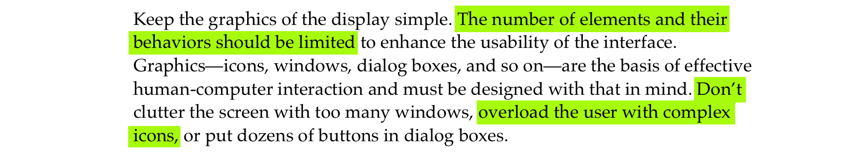
And I think this is a goal we should all aspire to. Wayland is talking about the technical side of things (modern GPU stacks are very complex and Wayland is trying to take control back) but it could be applied to UI too.
The rule of thumb is:
If I take a screenshot of your app at any moment, you should be able to explain what I see
EDIT: This used to say “..., it must make sense” but that doesn’t account for advanced animation techniques such as smear frames etc.
Why care about every frame? It builds trust. Users can’t see the code, so UI is the only way for them to judge the quality of the app. If UI looks good, that means developers had time to polish it, which means that they probably spent a comparable amount of time to iron out the code. It’s a heuristic, but a reasonable one.
Now, what does it mean in practice? I can think of a few things:
No white flashes between screens.
No partially loaded content.
No relayout while content loads.
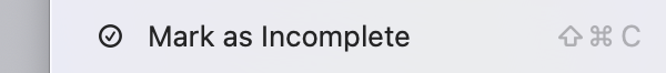
Internally consistent. If one part of the UI says “1 update available”, another part should not say “Checking for updates...”
Precise animations.
Animations often end up being forgotten. A UI might look great in both start and end states but very janky in between. Like this:
If you feel like there are weird things going on there, there are! Look at slowed down version:
Now let’s apply our rule and take screenshots in the middle of the animation. This doesn’t look right:
Neither does this:
Both of these frames are not perfect.
Let’s look at another example. Safari:
Placeholder text here moves from the center but cursor animates from the left position:
Not the end of the world by any means, but it does create a feeling that these two components are not in sync with each other. Next thought: maybe they weren’t designed together? If so, then they might not work well together. That’s how trust is lost.
This desynchronization can lead to a lot of confusion. For example, in Photos, when switching between Crop and Adjust mode, picture snaps into place immediately but the crop border is animated:
This creates a
false
feeling that something subtly changes when you switch between modes. And you know what? I don’t want my UI to give me false feelings. I want it to be a precise instrument, not an animated toy.
Sometimes animations are supposed to help you understand a transition, so it’s doubly sad when they make it harder. Follow the magnifying glass:
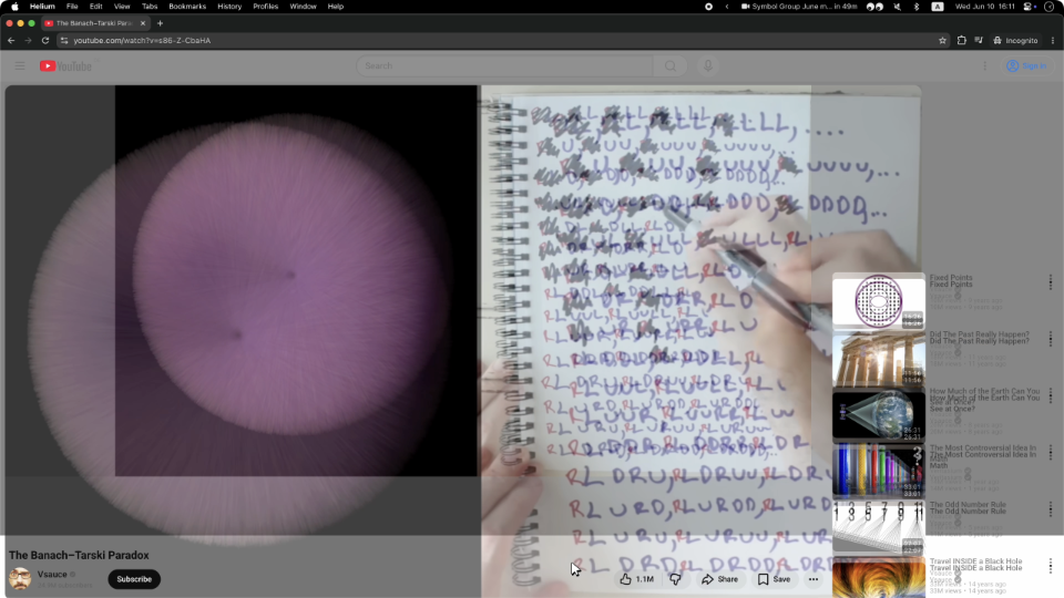
Same with Youtube. They had the simplest task in the world: move a rectangle from one position to another! Yet they decided to do something very strange:
Can you explain this? Does it make sense?
Probably a technical limitation of the DOM architecture they decided earlier on. I call these situations “The technology has outsmarted the programmer”. But no matter the reason, the result is an imperfect frame.
Sometimes animations are left out as an afterthought. Whatever happens, happens. Then we get this:
The details are fascinating to watch:
So yeah. Please pay attention not only to the start and end states, but also to everything in between.
Every frame matters.
I’ll leave you with this unprovoked zoom animation from Preview app. Take care!
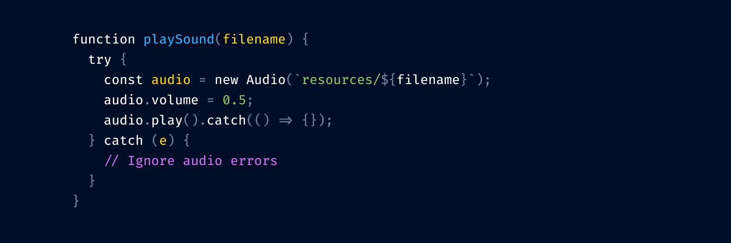
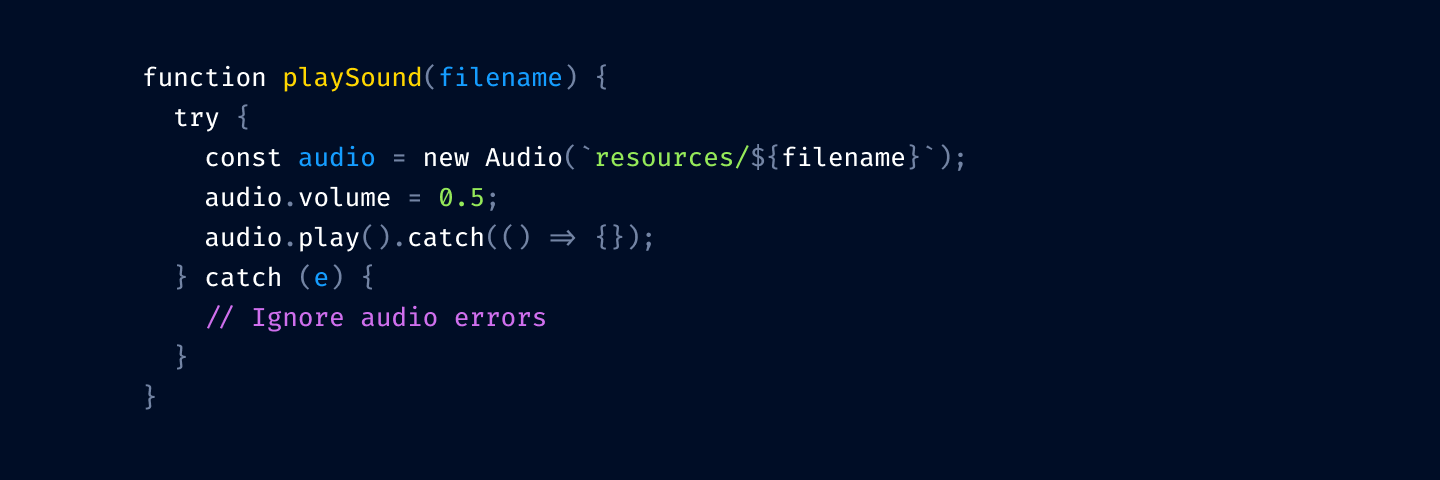
Claude is an Electron App because we’ve lost native
Claude spent $20k on an agent swarm implementing (kinda) a C-compiler in Rust, but desktop Claude is an Electron app.
If code is free, why aren’t all apps native?
And then argues that the answer is that LLMs are not good enough yet. They can do 90% of the work, so there’s still a substantial amount of manual polish, and thus, increased costs.
But I think that’s not the real reason. The real reason is: native has nothing to offer.
API-wise, native apps lost to web apps a long time ago. Native APIs are terrible to use, and OS vendors use everything in their power to make you not want to develop native apps for their platform. That explains the rise of Electron before LLM times, but it’s also a problem that LLMs solve now: if that was a real barrier to developing native apps, it doesn’t exist anymore.
Then there’re looks and consistency. Some time ago, maybe in the late 90s and 2000s, native was ahead. It used to look good, it was consistent, and it all actually worked: the more apps used native look and feel, the better user experience was across apps (which we used to call programs).
These days, though, native is as bad as the web, if not worse. Consistency is basically out the window. Anything can look like anything, buttons have no borders, contrast doesn’t exist, and neither do conventions. Apple, for example, seems to place traffic lights and corner radius by vibes rather than by any measurable guidelines.
Looks could be good, but they also can be bad, and then you are stuck with platform-consistent, but generally bad UI (Liquid Glass ahem). It changes too often, too: the app you made today will look out of place next year, when Apple decides to change look and feel yet again. There’s no native look anymore.
Theoretically, native apps can integrate with OS on a deeper level. This sounds nice, but what does that mean in practice? There are almost no good interoperable file formats; everything is locked inside individual apps, most services moved to the web, and OSes dropped the ball for making a good shared baseline. You can integrate with OS-provided calendar, but you can’t do it with web calendar. Well, you can, of course, but it’s easier on the web; native doesn’t help with it at all.
Finally, the last hope of people longing for native is performance. They feel that native apps will be faster. Well, they can, but it doesn’t mean they will. Web apps can be faster, too, but in practice, nobody cares. There’s no technical reason why
Slack needs to load 80 MiB
just to show 10 channel names and 3 messages on a screen. The web is not the problem here! It’s a choice to be bad. What makes you think it’ll be different once the company decides to move to native?
Don’t get me wrong: writing this brings me no joy. I don’t think web is a solution either. I just remember good times when native did a better-than-average job, and we were all better for using it, and it saddens me that these times have passed.
I just don’t think that kidding ourselves that the only problem with software is Electron and it all will be butterflies and unicorns once we rewrite Slack in SwiftUI is not productive. The real problem is a lack of care. And the slop; you can build it with any stack.
Podcast: На Маке нет никаких шкафов @ Думаем дальше
С Ильей Бирманом провожаем Алана Дая, вспоминая, в чём состоят достижения Мака, Джобса и ХИГа (но и Винду добрым словом тоже вспоминаем).
Content Preview
С Ильей Бирманом провожаем Алана Дая, вспоминая, в чём состоят достижения Мака, Джобса и ХИГа (но и Винду добрым словом тоже вспоминаем).
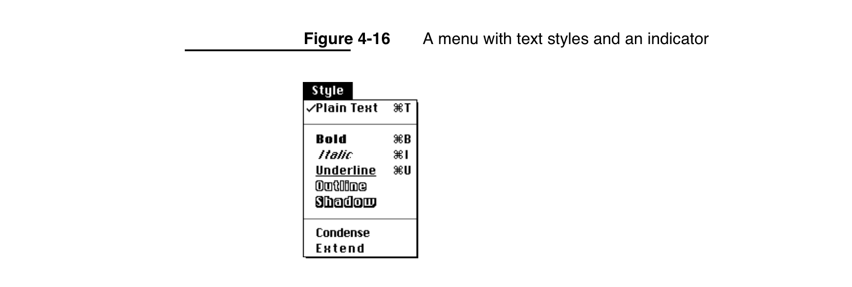
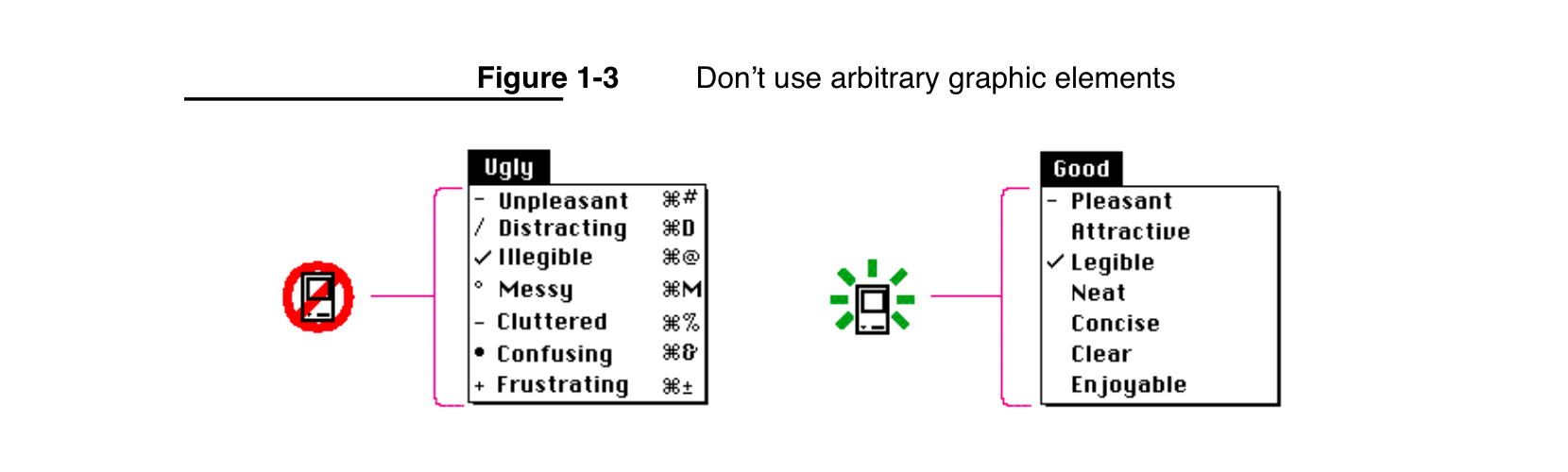
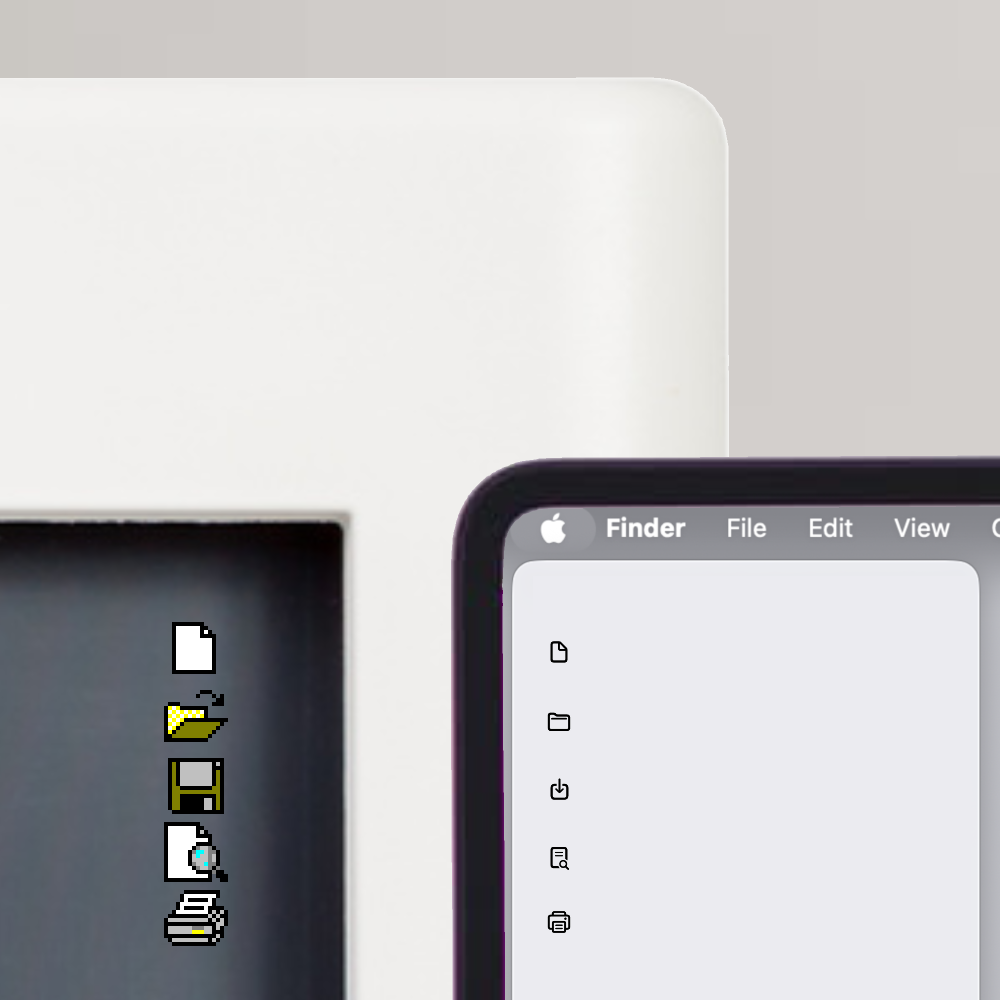
I was reading Macintosh Human Interface Guidelines
from 1992
and found this nice illustration:
accompanied by explanation:
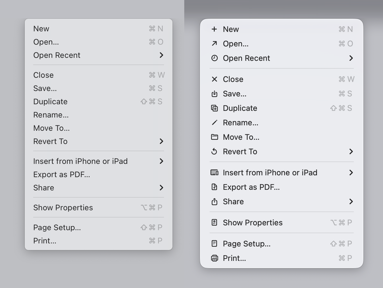
Fast forward to 2025. Apple releases macOS Tahoe. Main attraction? Adding unpleasant, distracting, illegible, messy, cluttered, confusing, frustrating icons (their words, not mine!) to every menu item:
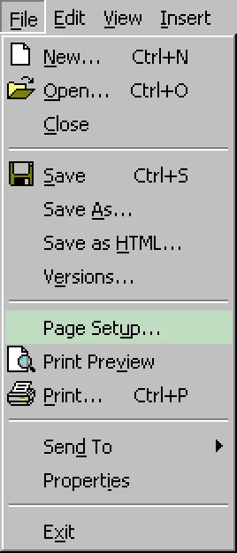
Sequoia → Tahoe
It’s bad. But why exactly is it bad? Let’s delve into it!
Disclaimer: screenshots are a mix from macOS 26.1 and 26.2, taken from stock Apple apps only that come pre-installed with the system. No system settings were modified.
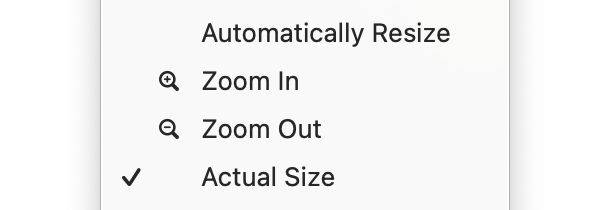
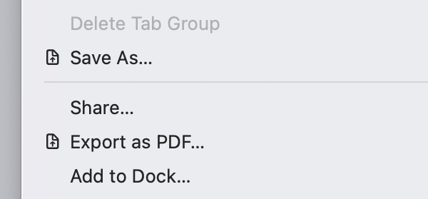
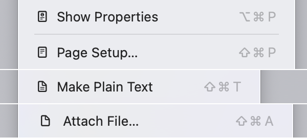
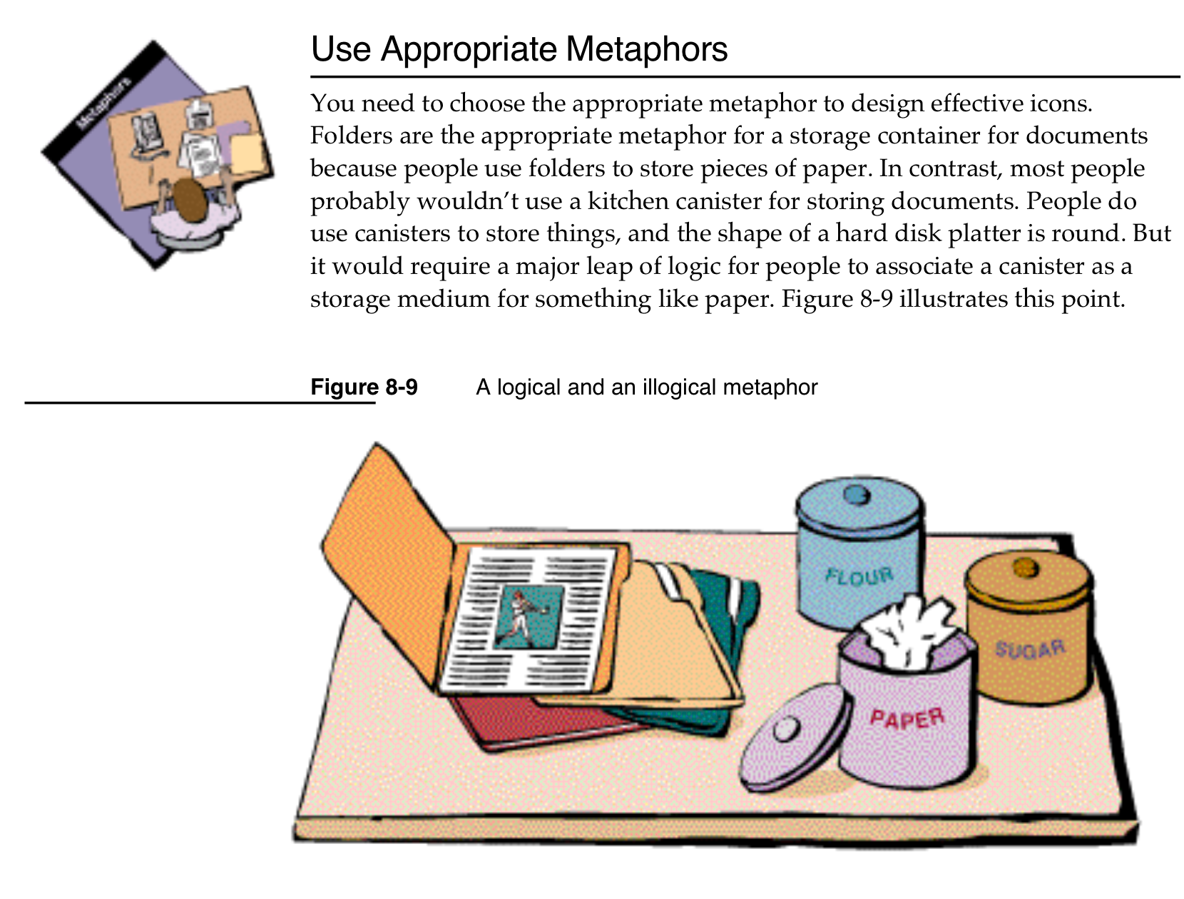
Icons should differentiate
The main function of an icon is to help you find what you are looking for faster.
Perhaps counter-intuitively, adding an icon to everything is exactly the wrong thing to do. To stand out, things need to be different. But if everything has an icon, nothing stands out.
The same applies to color: black-and-white icons look clean, but they don’t help you find things faster!
Microsoft used to know this:
Look how much faster you can find Save or Share in the right variant:
It also looks cleaner. Less cluttered.
A colored version would be even better (clearer separation of text from icon, faster to find):
I know you won’t like how it looks. I don’t like it either. These icons are hard to work with. You’ll have to actually design for color to look nice. But the principle stands: it is way easier to use.
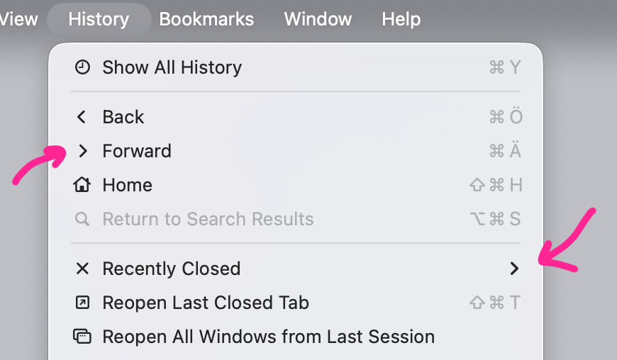
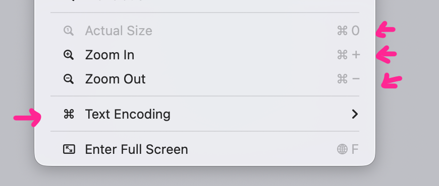
Consistency between apps
If you want icons to work, they need to be
consistent
. I need to be able to learn what to look for.
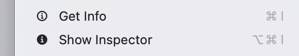
For example, I see a “Cut” command and
next to it. Okay, I think. Next time I’m looking for “Cut,” I might save some time and start looking for
instead.
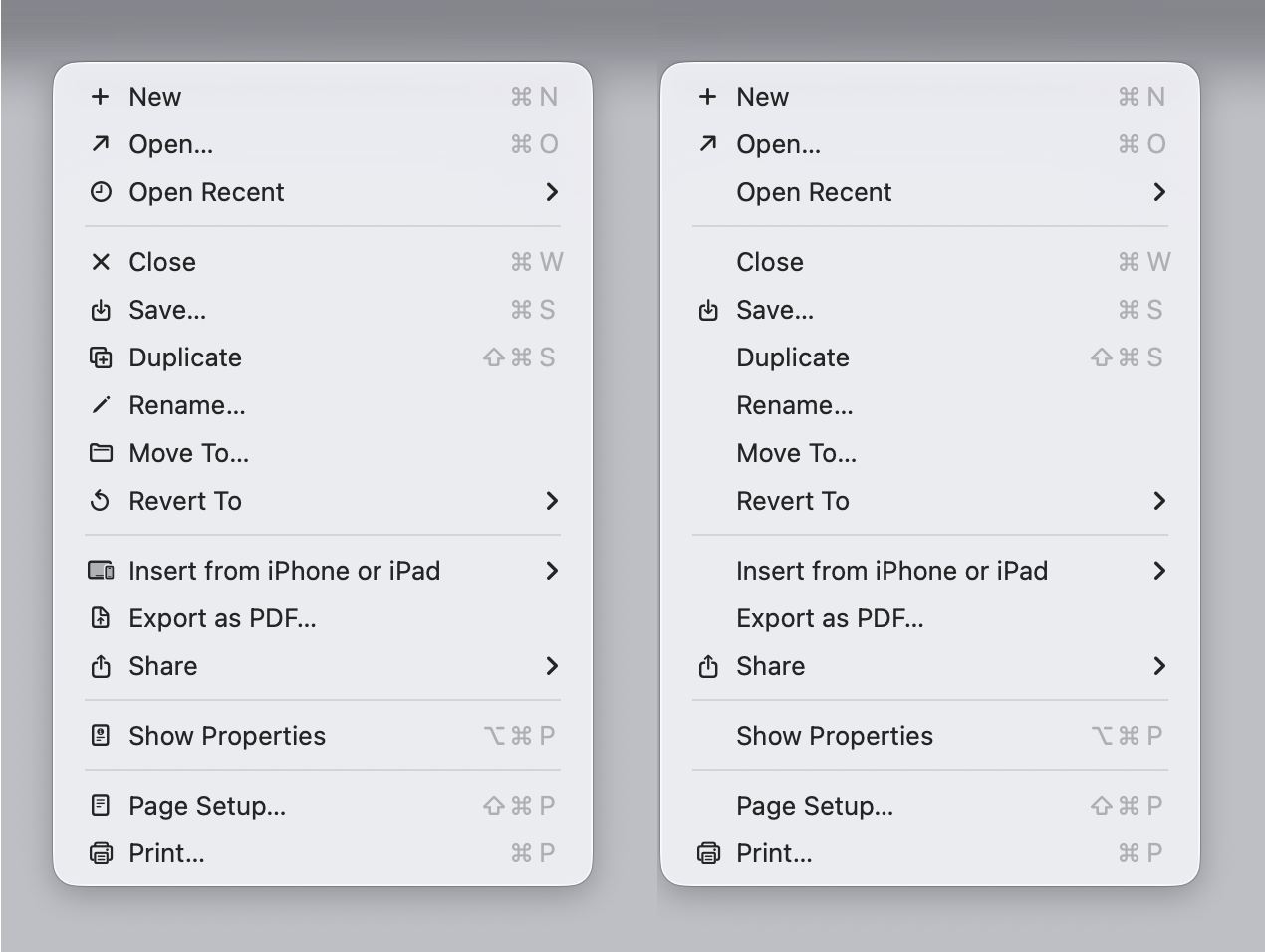
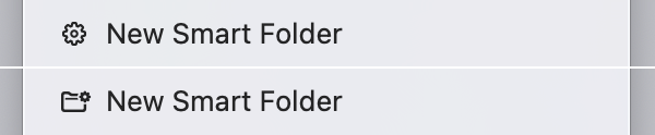
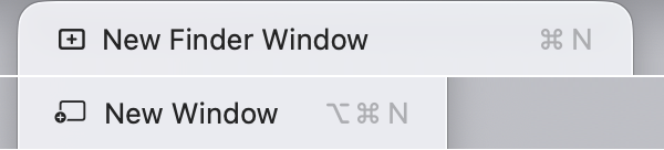
How is Tahoe doing on that front? I present to you: Fifty Shades of “New”:
I even collected them all together, so the absurdity of the situation is more obvious.
Granted, some of them are different operations, so they have different icons. I guess creating a smart folder is different from creating a journal entry. But this?
Or this:
Or this:
There is no excuse.
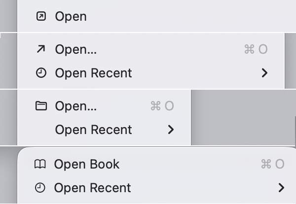
Same deal with open:
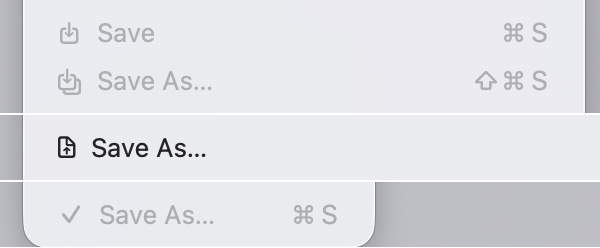
Save:
Yes. One of them is a checkmark. And they can’t even agree on the direction of an arrow!
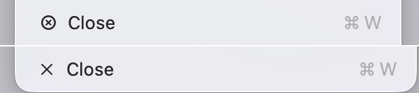
Close:
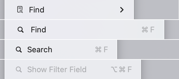
Find (which is sometimes called Search, and sometimes Filter):
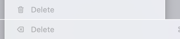
Delete (from Cut-Copy-Paste-Delete fame):
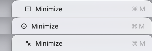
Minimize window.
These are not some obscure, unique operations. These are OS basics, these are foundational. Every app has them, and they are always in the same place. They shouldn’t look different!
Consistency inside the same app
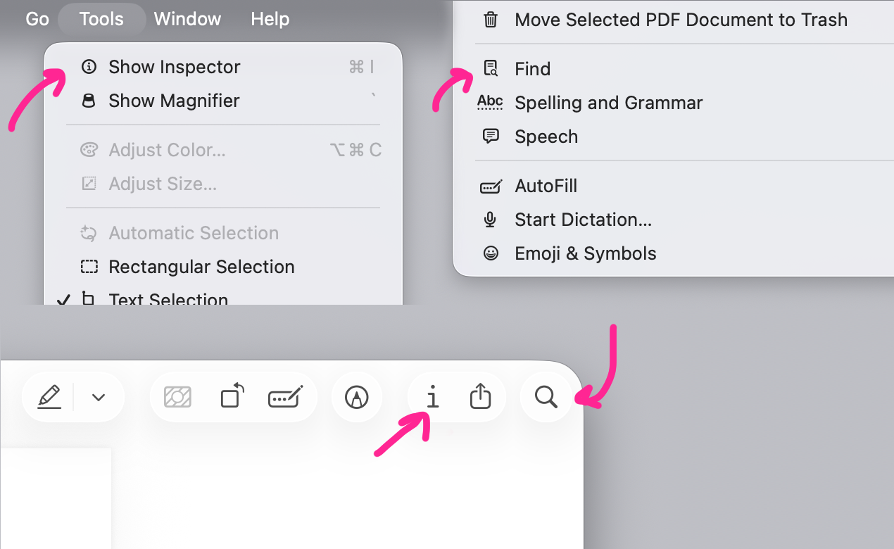
Icons are also used in toolbars. Conceptually, operations in a toolbar are identical to operations called through the menu, and thus should use the same icons. That’s the simplest case to implement: inside the same app, often on the same screen. How hard can it be to stay consistent?
Preview:
Photos: same
and
mismatch, but reversed ¯\_(ツ)_/¯
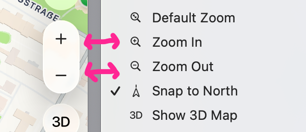
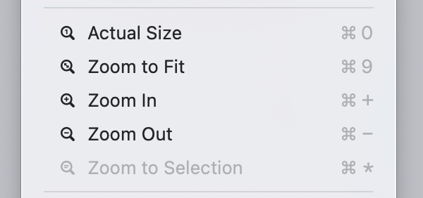
Maps and others often use different symbols for zoom:
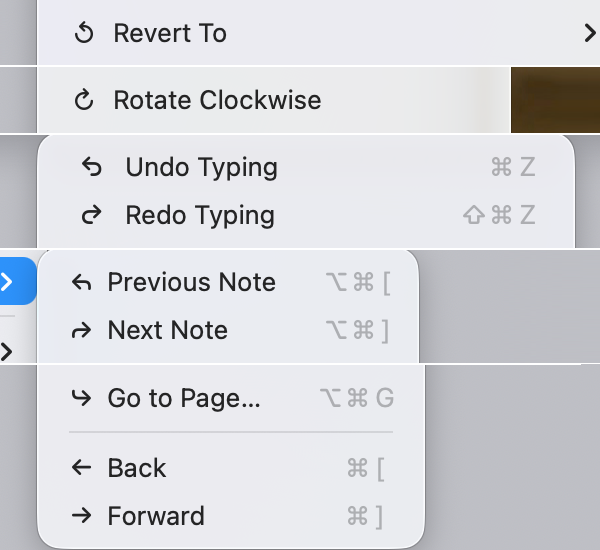
Icon reuse
Another cardinal sin is to use the same icon for different actions. Imagine: I have learned that
means “New”:
Then I open an app and see
. “Cool”, I think, “I already know what it means”:
Gotcha!
You’d think: okay,
means quick look:
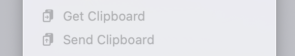
Sometimes, sure. Some other times,
means “Show completed”:
Sometimes
is “Import”:
Sometimes
is “Updates”:
Same as with consistency, icon reuse doesn’t only happen between apps. Sometimes you see
in a toolbar:
Then go to the menu
in the same app
and see
means something else:
Sometimes identical icons meet in the same menu.
Sometimes next to each other.
Sometimes they put an entire barrage of identical icons in a row:
This doesn’t help anyone. No user will find a menu item faster or will understand the function better if all icons are the same.
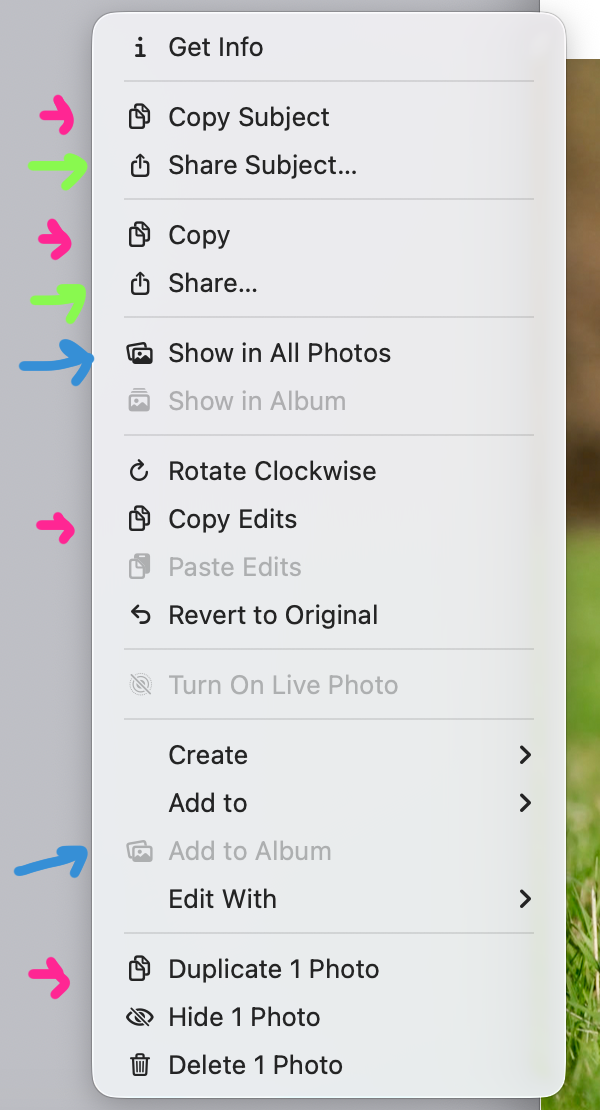
The worst case of icon reuse so far has been the Photos app:
It feels like the person tasked with choosing a unique icon for every menu item just ran out of ideas.
Understandable.
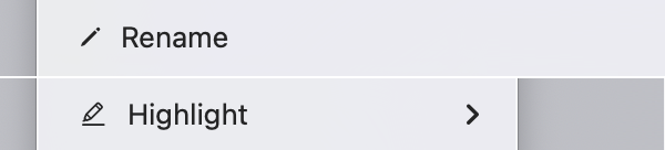
Too much nuance
When looking at icons, we usually allow for slight differences in execution. That lets us, for example, understand that these
technically different
road signs mean the same thing:
Same applies for icons: if you draw an arrow going out of the box in one place and also an arrow and the box but at a slightly different angle, or with different stroke width, or make one filled, we will understand them as meaning the same thing.
Like,
is supposed to mean something else from
? Come on!
Or two letters A that only slightly differ in the font size:
A pencil is “Rename” but a slightly thicker pencil is “Highlight”?
Arrows that use different diagonals?
Three dots occupying ⅔ of space vs three dots occupying everything. Seriously?
Slightly darker dots?
The sheet of paper that changes meaning depending on if its corner is folded or if there are lines inside?
But the final boss are arrows. They are all different:
Supposedly, a user must become an expert at noticing how squished the circle is, if it starts top to right or bottom to right, and how far the arrow’s end goes.
Do I care? Honestly, no. I could’ve given it a shot, maybe, if Apple applied these consistently. But Apple considers
and
to mean the same thing in one place, and expects me to notice minute details like this in another?
Sorry, I can’t trust you. Not after everything I’ve seen.
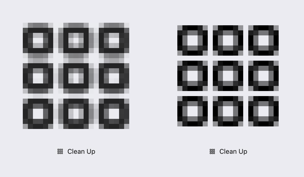
Detalization
Icons are supposed to be easily recognizable from a distance. Every icon designer knows: small details are no-go. You can have them sometimes, maybe, for aesthetic purposes, but you can’t
rely
on them.
And icons in Tahoe menus are
tiny
. Most of them fit in a 12×12 pixel square (actual resolution is 24×24 because of Retina), and because many of them are not square, one dimension is usually even less than 12.
It’s not a lot of space to work with! Even Windows 95 had 16×16 icons. If we take the typical DPI of that era at 72 dots per inch, we get a physical icon size of 0.22 inches (5.6 mm). On a modern MacBook Pro with 254 DPI, Tahoe’s 24×24 icons are 0.09 inches (2.4 mm). Sure, 24 is bigger than 16, but in reality, these icons’ area is 4 times as small!
Simulated physical size comparison between 16×16 at 72 DPI (left) and 24×24 at 254 DPI (right)
So when I see this:
I struggle. I can tell they are different. But I definitely struggle to tell what’s being drawn.
Even zoomed in 20×, it’s still a mess:
Or here. These are three different icons:
Am I supposed to tell plus sign from sparkle here?
Some of these lines are half the pixel thicker than the other lines, and that’s supposed to be the main point:
Is this supposed to be an arrow?
A paintbrush?
Look, a tiny camera.
It even got an even tinier viewfinder, which you can almost see if you zoom in 20×:
Or here. There is a box, inside that box is a circle, and inside it is a tiny letter
i
with a total height of 2 pixels:
Don’t see it?
I don’t. But it’s there...
And this is a window! It even has traffic lights! How adorable:
Remember: these are retina pixels, ¼ of a real pixel. Steve Jobs himself claimed they were invisible.
It turns out there’s a magic number right around 300 pixels per inch, that when you hold something around to 10 to 12 inches away from your eyes, is the limit of the human retina to differentiate the pixels.
And yet, Tahoe icons rely on you being able to see them.
Pixel grid
When you have so little space to work with, every pixel matters. You can make a good icon, but you have to choose your pixels very carefully.
For Tahoe icons, Apple decided to use vector fonts instead of good old-fashioned bitmaps. It saves Apple resources—draw once, use everywhere. Any size, any display resolution, any font width.
But there’re downsides: fonts are hard to position vertically, their size
doesn’t map directly to pixels
, stroke width doesn’t map 1-to-1 to pixel grid, etc. So, they work everywhere, but they also look blurry and mediocre everywhere:
Tahoe icon (left) and its pixel-aligned version (right).
They certainly start to work better once you give them more pixels.
iPad OS 26 vs macOS 26
or make graphics simpler. But the combination of small details and tiny icon size is deadly. So, until Apple releases MacBooks with 380+ DPI, unfortunately, we still have to care about the pixel grid.
Confusing metaphors
Icons might serve another function: to help users understand the meaning of the command.
For example, once you know the context (move window), these icons explain what’s going on faster than words:
But for this to work, the user must understand what’s drawn on the icon. It must be a familiar object with a clear translation to computer action (like Trash can → Delete), a widely used symbol, or an easy-to-understand diagram. HIG:
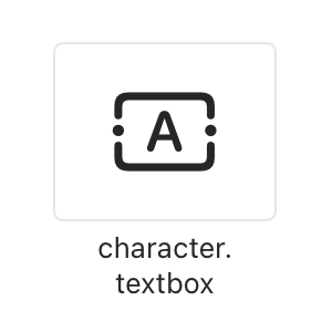
A rookie mistake would be to misrepresent the object. For example, this is how selection looks like:
But its icon looks like this:
Honestly, I’ve been writing this essay for a week, and I still have zero ideas why it looks like that. There’s an object that looks like this, but it’s a text block in Freeform/Preview:
It’s called
character.textbox
in SF Symbols:
Why did it become a metaphor for “Select all”? My best guess is it’s a mistake.
Another place uses text selection from iOS as a metaphor. On a Mac!
Some concepts have obvious or well-established metaphors. In that case, it’s a mistake not to use them. For example, bookmarks:
. Apple, for some reason, went with a book:
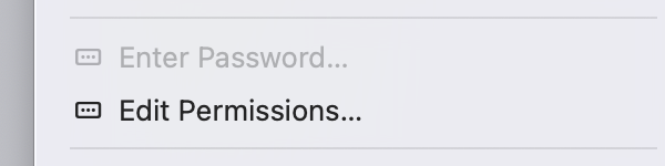
Sometimes you already have an interface element and can use it for an icon. However, try not to confuse your users. Dots in a rectangle look like password input, not permissions:
Icon here says “Check” but the action is “Uncheck”.
Terrible mistake: icon doesn’t help, it actively confuses the user.
It’s also tempting to construct a two-level icon: an object and some sort of indicator. Like, a checkbox and a cross, meaning “Delete checkbox”:
Or a user and a checkmark, like “Check the user”:
Unfortunately, constructs like this rarely work. Users don’t build sentences from building blocks you provide; they have no desire to solve these puzzles.
Finding metaphors is hard. Nouns are easier than verbs, and menu items are mostly verbs. How does open look? Like an arrow pointing to the top right? Why?
I’m not saying there’s an obvious metaphor for “Open” Apple missed. There isn’t. But that’s the point: if you can’t find a good metaphor, using no icon is better than using a bad, confusing, or nonsensical icon.
There’s a game I like to play to test the quality of the metaphor. Remove the labels and try to guess the meaning. Give it a try:
It’s delusional to think that there’s a good icon for every action if you think hard enough. There isn’t. It’s a lost battle from the start. No amount of money or “management decisions” is going to change that. The problems are 100% self-inflicted.
All this being said, I gotta give Apple credit where credit is due. When they are good at choosing metaphors, they are good:
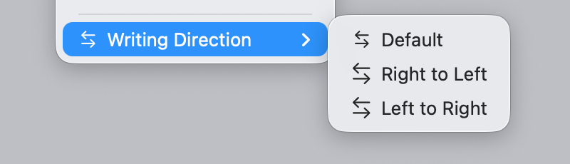
Symmetrical actions
A special case of a confusing metaphor is using different metaphors for actions that are direct opposites of one another. Like Undo/Redo, Open/Close, Left/Right.
It’s good when their icons use the same metaphor:
Because it saves you time and cognitive resources. Learn one, get another one for free.
Because of that, it’s a mistake not to use common metaphors for related actions:
Or here:
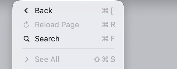
Another mistake is to create symmetry where there is none. “Back” and “See all”?
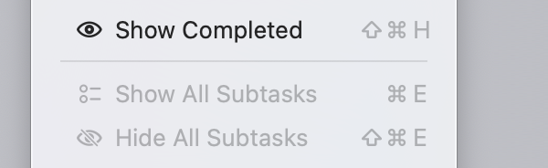
Some menus in Tahoe make both mistakes. E.g. lack of symmetry between Show/Hide and false symmetry between completed/subtasks:
Import not mirrored by Export but by Share:
Text in icons
HIG again:
Authors of HIG are arguing against including text as a part of an icon. So something like this:
or this:
would not fly in 1992.
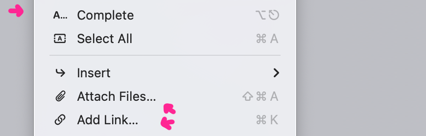
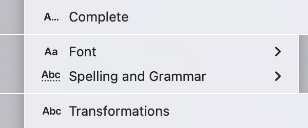
I agree, but Tahoe has more serious problems: icons consisting
only
of text. Like this:
It’s unclear where “metaphorical, abstract icon text that is not supposed to be read literally” ends and actual text starts. They use the same font, the same color, so how am I supposed to differentiate? Icons just get in a way: A...Complete? AaFont? What does it mean?
I can maybe understand
and
. Dots are supposed to represent something. I can imagine thinking that led to
. But
? No decorations. No effects. Just plain Abc. Really?
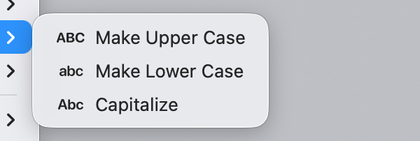
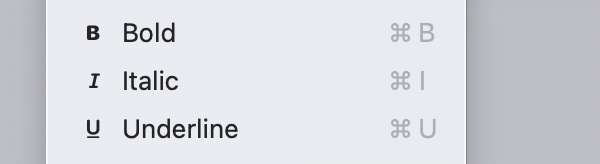
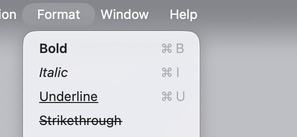
Text transformations
One might think that using icons to illustrate text transformations is a better idea.
Like, you look at this:
or this:
or this:
and just from the icon alone understand what will happen with the text. Icon
illustrates
the action.
Also, BIU are well-established in word processing, so all upside?
Not exactly. The problem is the same—text icon looks like text, not icon. Plus, these icons are
excessive
. What’s the point of taking the first letter and repeating it? The word “Bold” already starts with a letter “B”, it reads just as easily, so why double it? Look at it again:
It’s also repeated once more as a shortcut...
There is a better way to design this menu:
And it was known to Apple for at least 33 years.
System elements in icons
Operating system, of course, uses some visual elements for its own purposes. Like window controls, resize handles, cursors, shortcuts, etc. It would be a mistake to use those in icons.
Unfortunately, Apple fell into this trap, too. They reused arrows.
Key shortcuts:
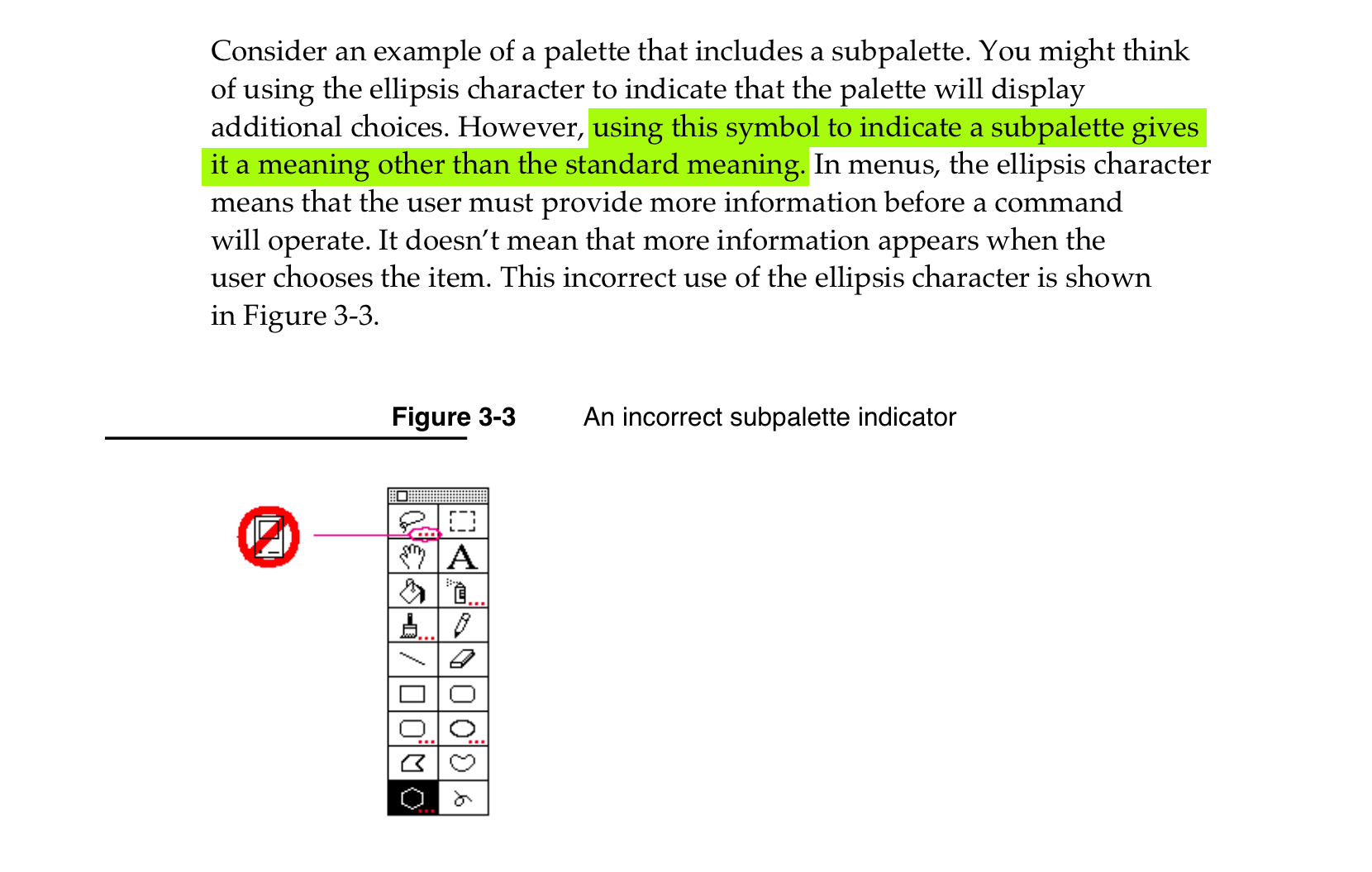
HIG has an entire section on ellipsis specifically and how dangerous it is to use it anywhere else in the menu.
And this exact problem is in Tahoe, too.
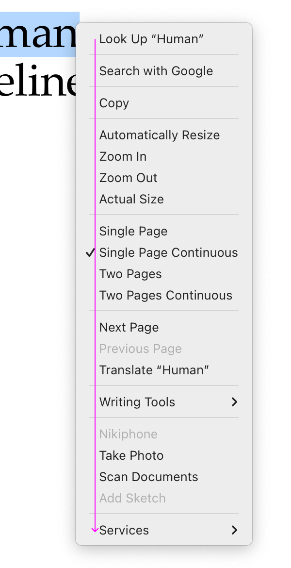
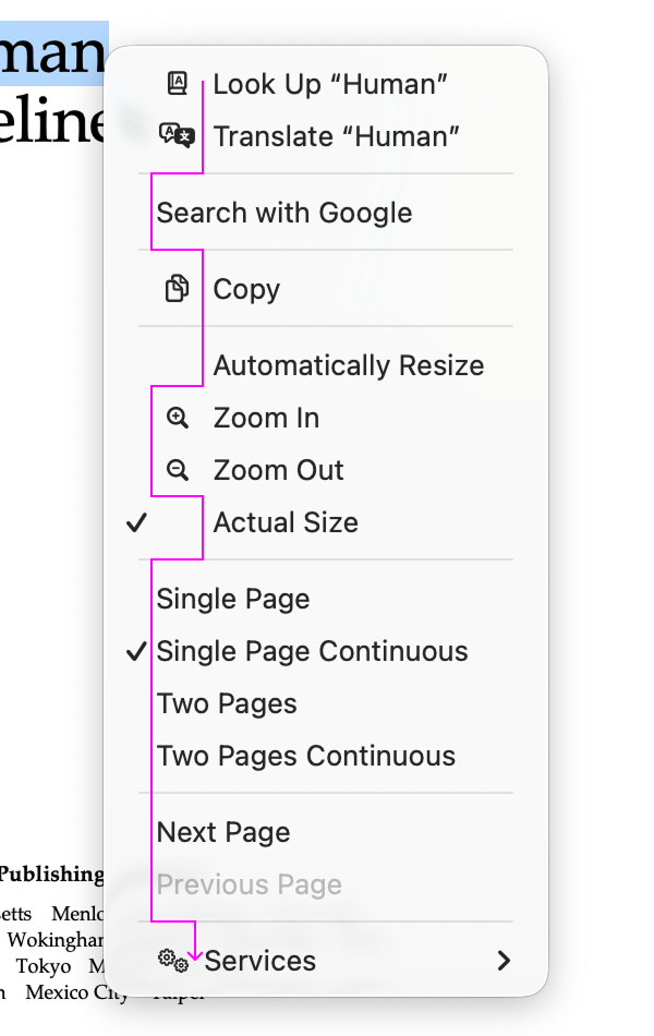
Icons break scanning
Without icons, you can just scan the menu from top to bottom, reading only the first letters. Because they all align:
macOS Sequoia
In Tahoe, though, some menu items have icons, some don’t, and they are aligned differently:
Some items can have both checkmarks
and
icons, or have only one of them, or have neither, so we get situations like this:
Ugh.
Special mention
This menu deserves its own category:
Same icon for different actions. Missing the obvious metaphor. Somehow making the first one slightly smaller than the second and third. Congratulations! It got it all.
Is HIG still relevant?
I’ve been mentioning HIG a lot, and you might be wondering: is an interface manual from 1992 still relevant today? Haven’t computers changed so much that entirely new principles, designs, and idioms apply?
Yes and no. Of course, advice on how to adapt your icons to black-and-white displays is obsolete. But the principles—as long as they are good principles—still apply, because they are based on how humans work, not how computers work.
Humans don’t get a new release every year. Our memory doesn’t double. Our eyesight doesn’t become sharper. Attention works the same way it always has. Visual recognition, motor skills—all of this is exactly as it was in 1992.
So yeah, until we get a direct chip-to-brain interface, HIG will stay relevant.
Conclusion
In my opinion, Apple took on an impossible task: to add an icon to every menu item. There are just not enough good metaphors to do something like that.
But even if there were, the premise itself is questionable: if everything has an icon, it doesn’t mean users will find what they are looking for faster.
And even if the premise was solid, I still wish I could say: they did the best they could, given the goal. But that’s not true either: they did a poor job consistently applying the metaphors and designing the icons themselves.
I hope this article would be helpful in avoiding common mistakes in icon design, which Apple managed to collect all in one OS release. I love computers, I love interfaces, I love visual communication. It makes me sad seeing perfectly good knowledge already accessible 30 years ago being completely ignored or thrown away today.
On the upside: it’s not that hard anymore to design better than Apple! Let’s drink to that. Happy New year!
From SF Symbols: a smiley face calling somebody on the phone
Notes
During review of this post I was made familiar with
Jim Nielsen’s article
, which hits a lot of the same points as I do. I take that as a sign there’s some common truth behind our reasoning.
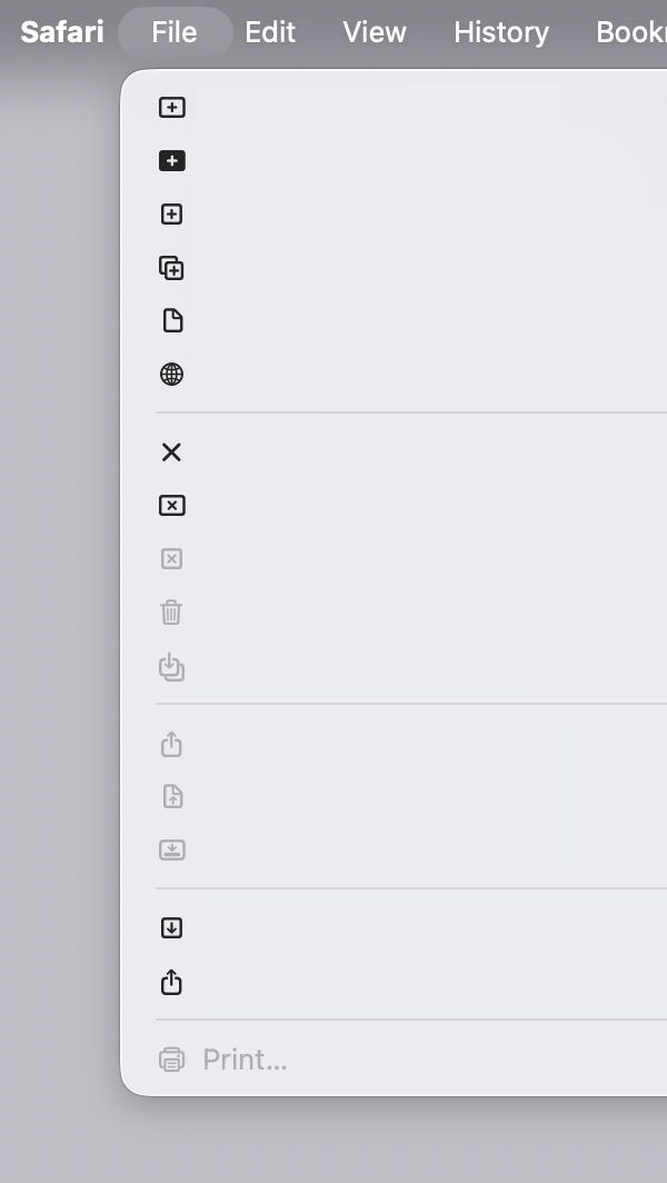
Also note: Safari → File menu got worse since 26.0. Used to have only 4 icons, now it’s 18!
Thanks Kevin, Ryan, and Nicki for reading drafts of this post.
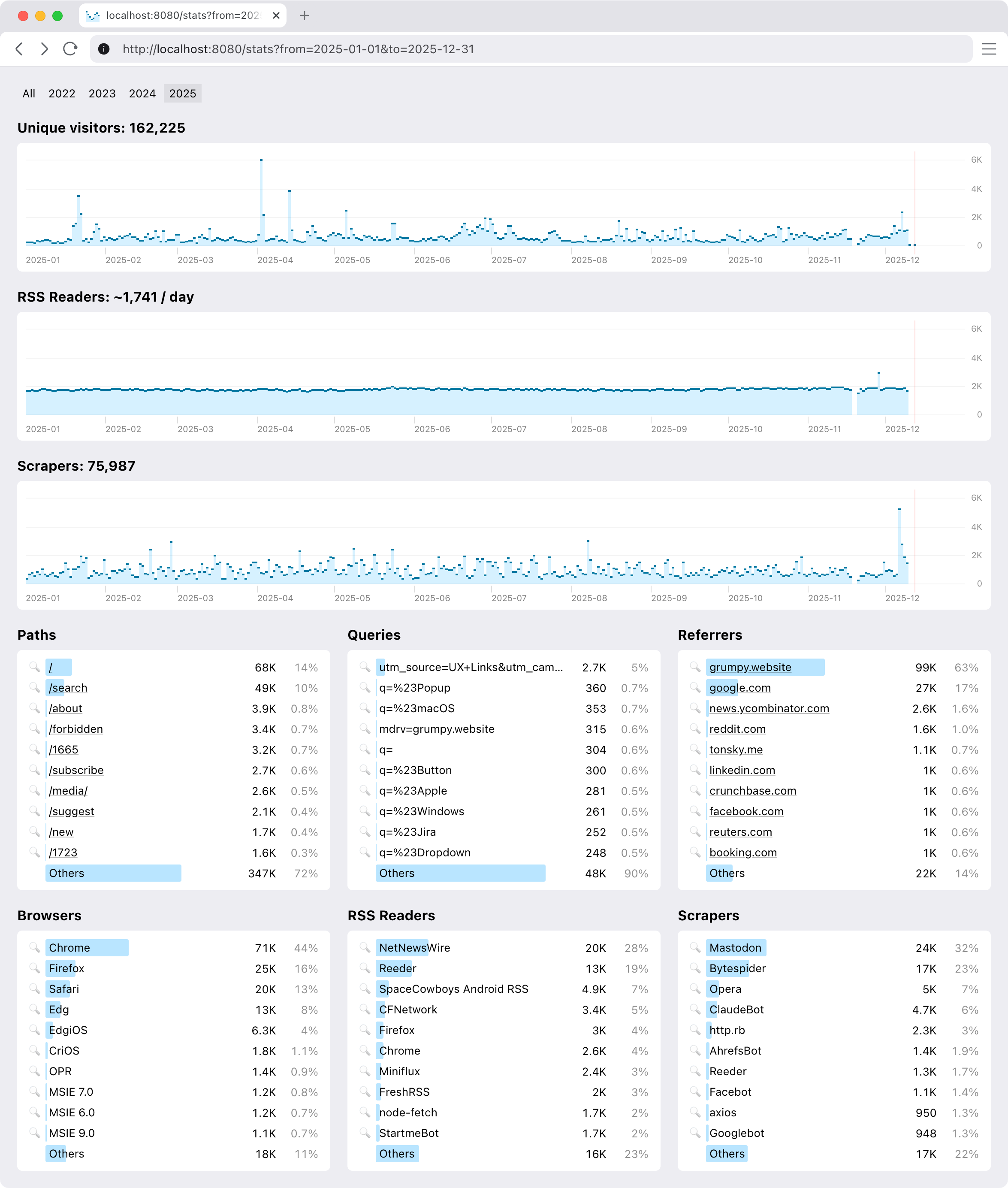
Announcing a simple statistics library for Clojure web servers
Content Preview
I have a weird relationship with statistics: on one hand, I try not to look at it too often. Maybe once or twice a year. It’s because analytics is not actionable: what difference does it make if a thousand people saw my article or ten thousand?
I mean, sure, you might try to guess people’s tastes and only write about what’s popular, but that will destroy your soul pretty quickly.
On the other hand, I feel nervous when something is not accounted for, recorded, or saved for future reference. I might not need it now, but what if ten years later I change my mind?
Seeing your readers also helps to know you are not writing into the void. So I really don’t need much, something very basic: the number of readers per day/per article, maybe, would be enough.
Final piece of the puzzle: I self-host my web projects, and I use an old-fashioned web server instead of delegating that task to Nginx.
Static sites are popular and for a good reason: they are fast, lightweight, and fulfil their function. I, on the other hand, might have an unfinished gestalt or two: I want to feel the full power of the computer when serving my web pages, to be able to do fun stuff that is beyond static pages. I need that freedom that comes with a full programming language at your disposal. I want to program my own web server (in Clojure, sorry everybody else).
Existing options
All this led me on a quest for a statistics solution that would uniquely fit my needs. Google Analytics was out: bloated, not privacy-friendly, terrible UX, Google is evil, etc.
What is going on?
Some other JS solution might’ve been possible, but still questionable: SaaS? Paid? Will they be around in 10 years? Self-host? Are their cookies GDPR-compliant? How to count RSS feeds?
Nginx has access logs, so I tried server-side statistics that feed off those (namely, Goatcounter). Easy to set up, but then I needed to create domains for them, manage accounts, monitor the process, and it wasn’t even performant enough on my server/request volume!
My solution
So I ended up building my own. You are welcome to join, if your constraints are similar to mine. This is how it looks:
It’s pretty basic, but does a few things that were important to me.
Setup
Extremely easy to set up. And I mean it as a feature.
Just add our middleware to your Ring stack and get everything automatically: collecting and reporting.
(def app
  (-> routes
    ...
    (ring.middleware.params/wrap-params)
    (ring.middleware.cookies/wrap-cookies)
    ...
    (clj-simple-stats.core/wrap-stats))) ;; <-- just add this
It’s zero setup in the best sense: nothing to configure, nothing to monitor, minimal dependency. It starts to work immediately and doesn’t ask anything from you, ever.
See, you already have your web server, why not reuse all the setup you did for it anyway?
Request types
We distinguish between request types. In my case, I am only interested in live people, so I count them separately from RSS feed requests, favicon requests, redirects, wrong URLs, and bots. Bots are particularly active these days. Gotta get that AI training data from somewhere.
RSS feeds are live people in a sense, so extra work was done to count them properly. Same reader requesting
feed.xml
100 times in a day will only count as one request.
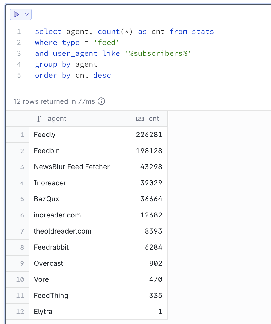
Hosted RSS readers often report user count in User-Agent, like this:
My personal respect and thank you to everybody on this list. I see you.
Graphs
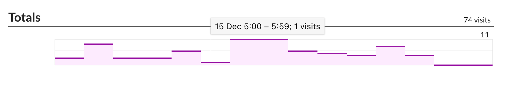
Visualization is important, and so is choosing the correct graph type. This is wrong:
Continuous line suggests interpolation. It reads like between 1 visit at 5am and 11 visits at 6am there were points with 2, 3, 5, 9 visits in between. Maybe 5.5 visits even! That is not the case.
This is how a semantically correct version of that graph should look:
Some attention was also paid to having reasonable labels on axes. You won’t see something like 117, 234, 10875. We always choose round numbers appropriate to the scale: 100, 200, 500, 1K etc.
Goes without saying that all graphs have the same vertical scale and syncrhonized horizontal scroll.
Insights
We don’t offer much (as I don’t need much), but you can narrow reports down by page, query, referrer, user agent, and any date slice.
Not implemented (yet)
It would be nice to have some insights into “What was this spike caused by?”
Some basic breakdown by country would be nice. I do have IP addresses (for what they are worth), but I need a way to package GeoIP into some reasonable size (under 1 Mb, preferably; some loss of resolution is okay).
Finally, one thing I am really interested in is “Who wrote about me?” I do have referrers, only question is how to separate signal from noise.
Performance. DuckDB is a sport: it compresses data and runs column queries, so storing extra columns per row doesn’t affect query performance. Still, each dashboard hit is a query across the entire database, which at this moment (~3 years of data) sits around 600 MiB. I definitely need to look into building some pre-calculated aggregates.
A collection of red flags in software engineers' test assignments
Content Preview
It’s 2025 and you are applying for a software engineer position. They give you a test assignment. You complete it yourself, send it over, and get rejected. Why?
Because it looked like AI.
Unfortunately, it’s 2025, AI is spreading like glitter in a kindergarten, and it’s really easy to mistake hard human labor for soulless, uninspired machine slop.
Following are the main
red flags
in test assignments that should be
avoided
:
The assignment was read and understood in full.
All parts are implemented.
Industry-standard tools and frameworks are used.
The code is split into small, readable functions.
Variables have descriptive names.
Complex parts have comments.
Errors are handled, error messages are easy to follow.
We used to use software; now software started to use us
Content Preview
If you’ve been around, you might’ve noticed that our relationships with programs have changed.
Older programs were all about what you need: you can do this, that, whatever you want, just let me know. You were in control, you were giving orders, and programs obeyed.
But recently (a decade, more or less), this relationship has subtly changed. Newer programs (which are called apps now, yes, I know) started to want things from you.
Accounts
The most obvious example is user accounts. In most cases, I, as a user, don’t need an account. Yet programs keep insisting that I, not them, “need” one.
I don’t. I have more accounts already than a population of a small town. This is something
you
want, not me.
The only correct reaction to an account screen
And even if you give up and create one, they will never leave you alone: they’ll ask for 2FA, then for password rotation, then will log you out for no good reason. You’ll never see the end of it either way.
This got so bad that when a program doesn’t ask you to create an account, it feels
refreshing
.
“Okay, but accounts are still needed to sync stuff between machines.”
“Okay, but you still need an account if you pay for a subscription?”
Mullvad VPN
accepts payments and yet didn’t ask me for my email.
How come these apps can go without an account, but your code editor and your terminal can’t?
Updates
Every program has an update mechanism now. Everybody is checking for updates all the time. Some notoriously bad ones lock you out until you update. You get notified a few seconds after a new version is available.
And yet: do we, users, really need these updates? Did we ask for them?
I’ve been running barebone Nvidia drivers without their bloated desktop app (partly because it asks for an account, lol).
As a result, there’s nobody to notify me about new drivers. And you know what? It’s been fine. I could forget to update for months, and still everything works. It’s the most relaxing I’ve felt in a while.
Even terminal programs bother you with updates now.
There has been a new major release of Syncthing in August. How did I learn about it? By accident; a friend told me. And you know what? I’m happy with that. If I upgrade, nothing in my life will change. It works just fine now. So do I really
need
an update? Is it
my
need?
It’s simple, really. If I need an update, I will know it: I’ll encounter a bug or a lack of functionality. Then I’ll go and update.
Until then, politely fuck off.
Notifications
Notifications are the ultimate example of neediness: a program, a mechanical, lifeless thing, an unanimate object, is bothering its master about something the master didn’t ask for. Hey, who is more important here, a human or a machine?
Notifications are like email: to-do items that are forced on you by another party. Hey, it’s not my job to dismiss your notifications!
I just downloaded this and already have three notifications to dismiss.
Sure, there are good notifications. Sometimes users need to be notified about something they care about, like the end of a long-running process.
But the general pattern is so badly abused that it’s hard to justify it now. You can make a case that giving a toddler a gun can help it protect itself. But much worse things will probably happen much sooner.
These fucking dots.
There’s no good reason why, e.g. code editor needs a notification system. What’s there to notify about? Updates? Sublime Text has no notifications. And you know what? It works just fine. I never felt underinformed while using it.
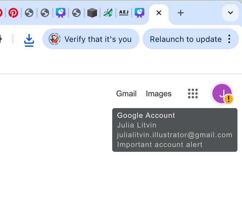
The ultimate example: account, update, and notification
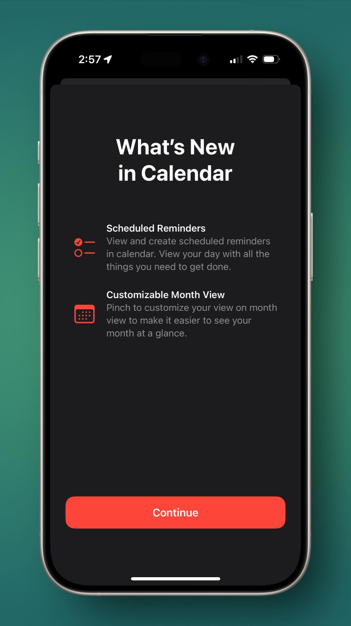
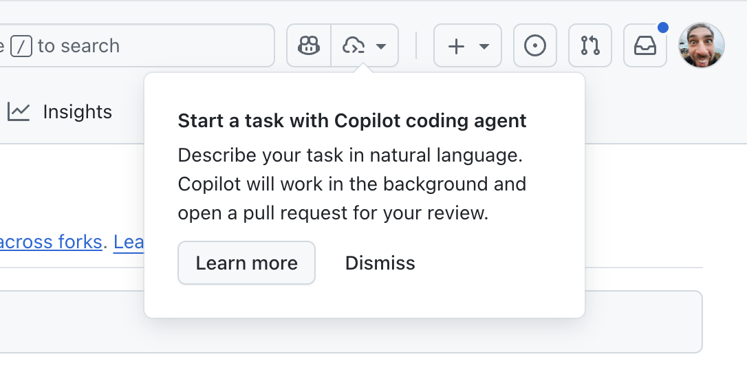
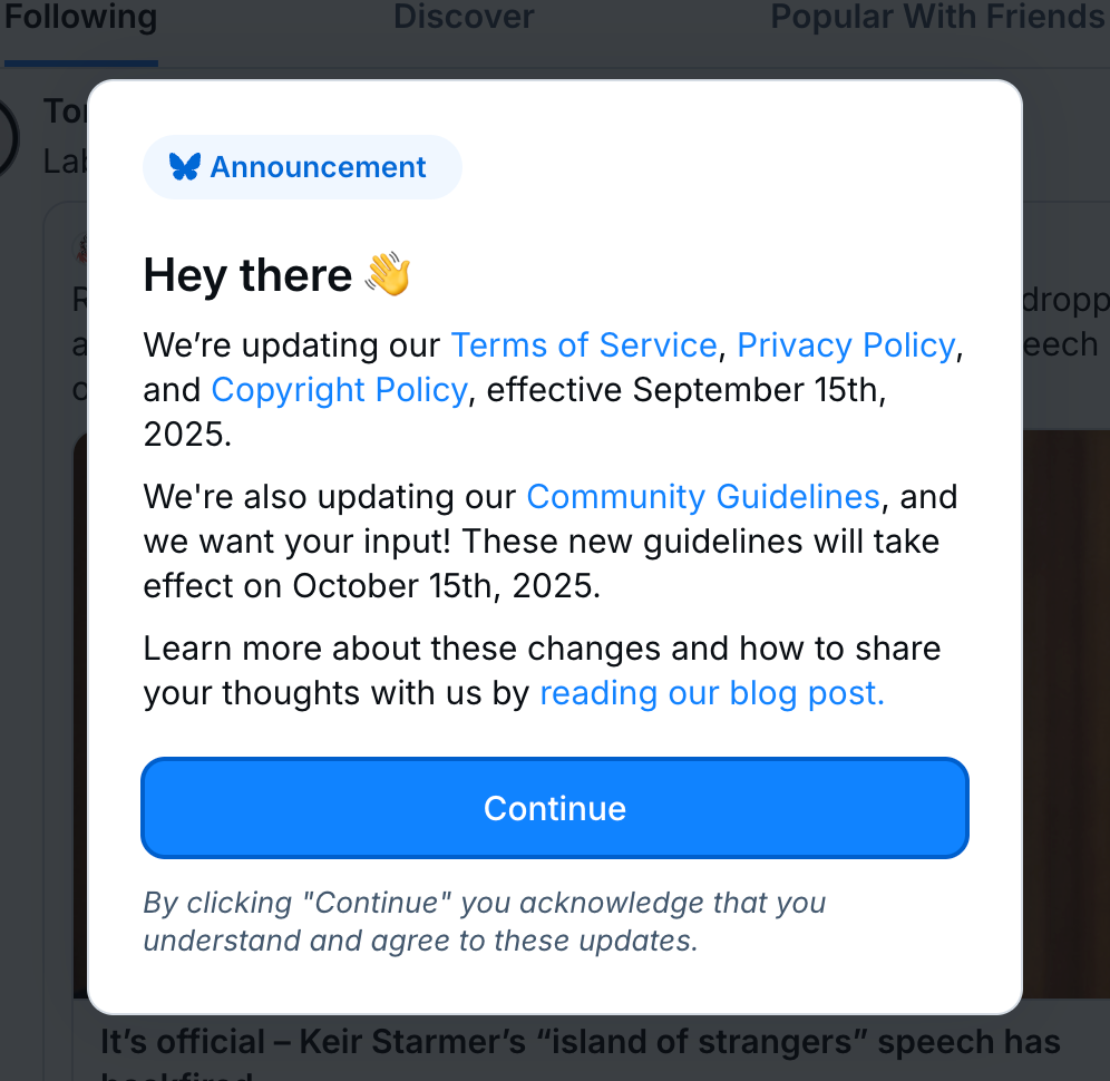
Onboarding
The company needs to announce a new feature and makes a popup window about it.
Read this again: The company. Needs. It’s not even about the user. Never has been.
What’s new in Calendar? I don’t know, 13th month?
Did I ask about Copilot? No. The company wants me to use it. Not me:
Do I care about Figma Make? Not really, no.
Yet I still know about it, against my will.
To sum it up
I’ve read somewhere (sorry, lost the link):
ls
never asks you to create an account or to update.
I agree.
ls
is a good program.
ls
is a tool. It does what I need it to do and stays quiet otherwise. I use it; it doesn’t use me. That’s a good, healthy relationship.
At the other end of the spectrum, we have services. Programs that constantly update. Programs that have news, that “keep you informed”. Programs that need something from you all the time. Programs that update Terms of Service just to remind you of themselves.
Programs that have their own agenda and that are trying to make it yours, too. Programs that want you to think about them. Programs that think they are entitled to a part of your attention. “Pick me” programs.
And you know what? Fuck these programs. Give me back my computer.
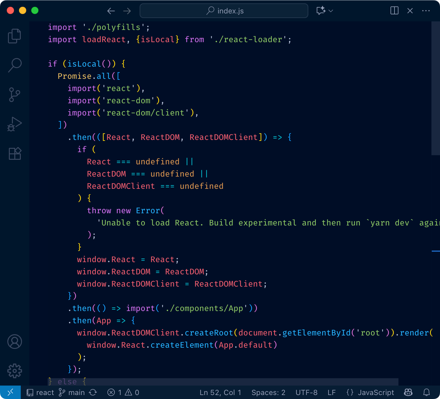
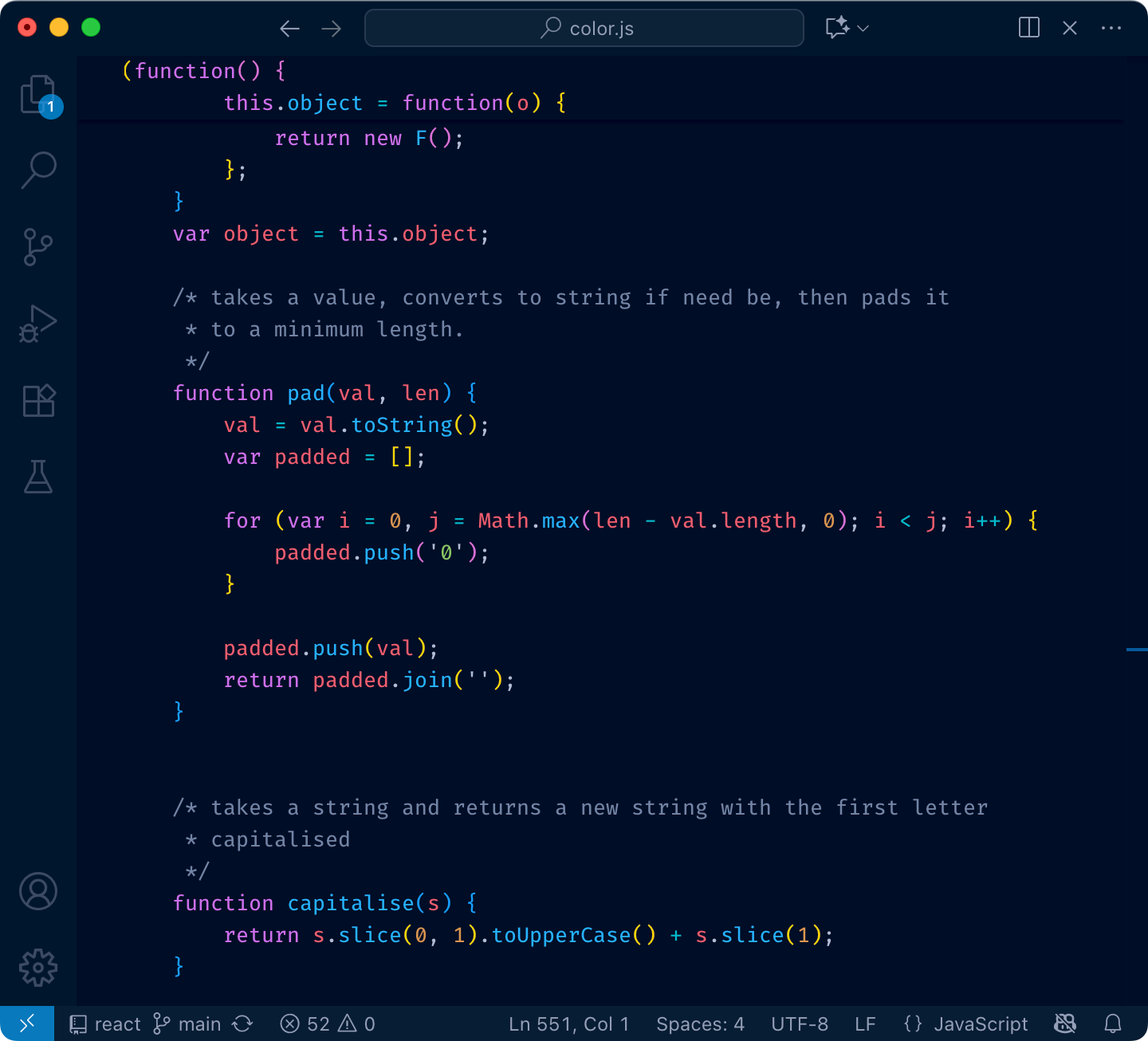
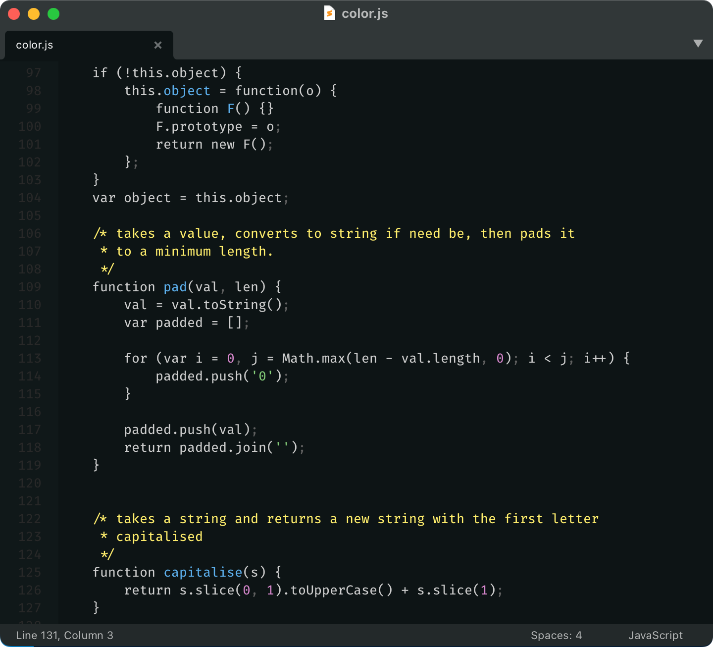
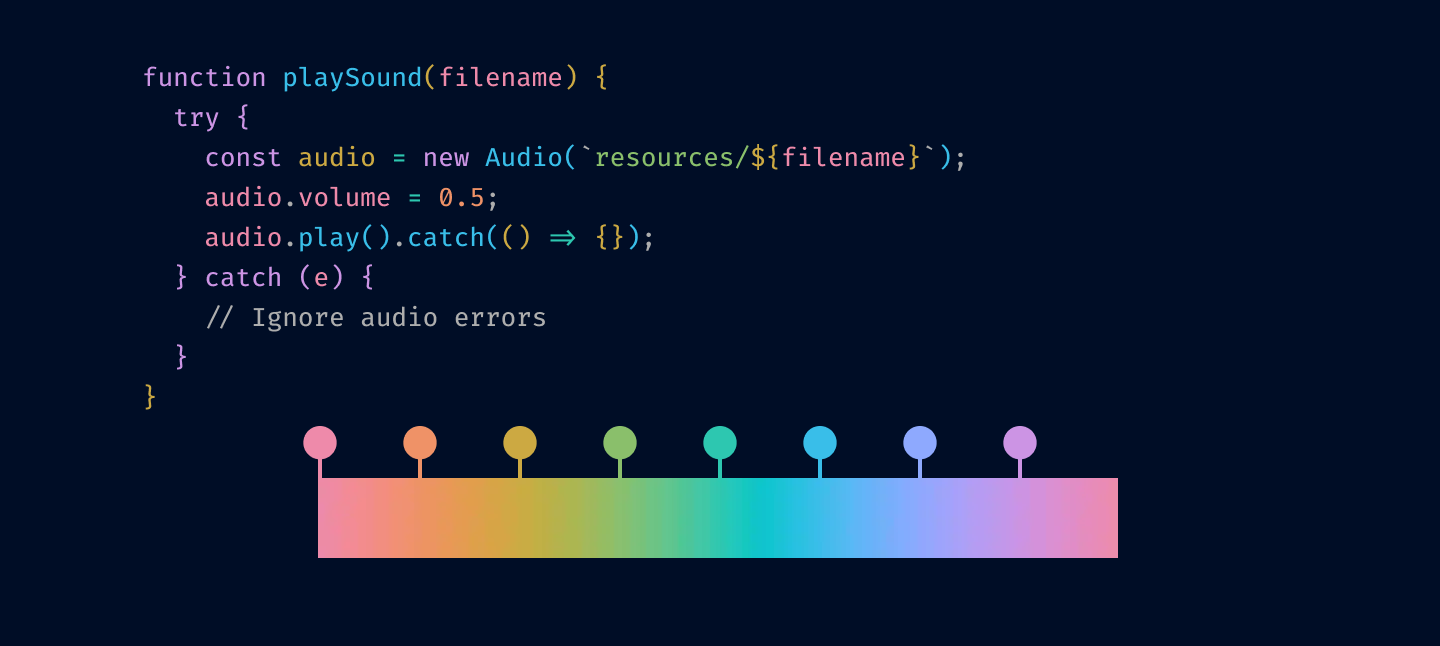
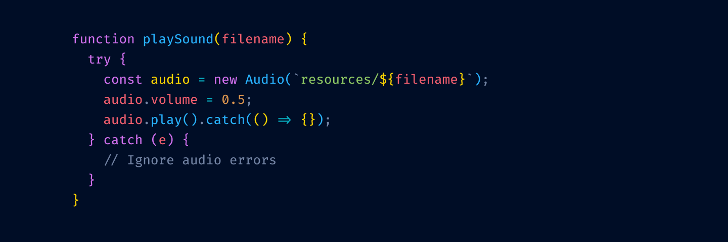
I am sorry, but everyone is getting syntax highlighting wrong
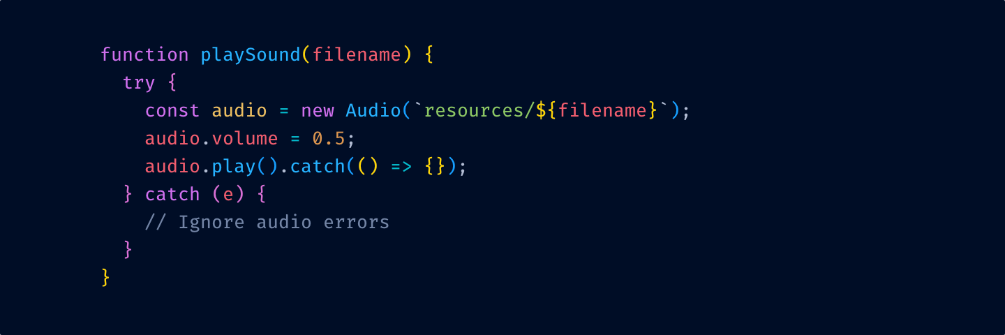
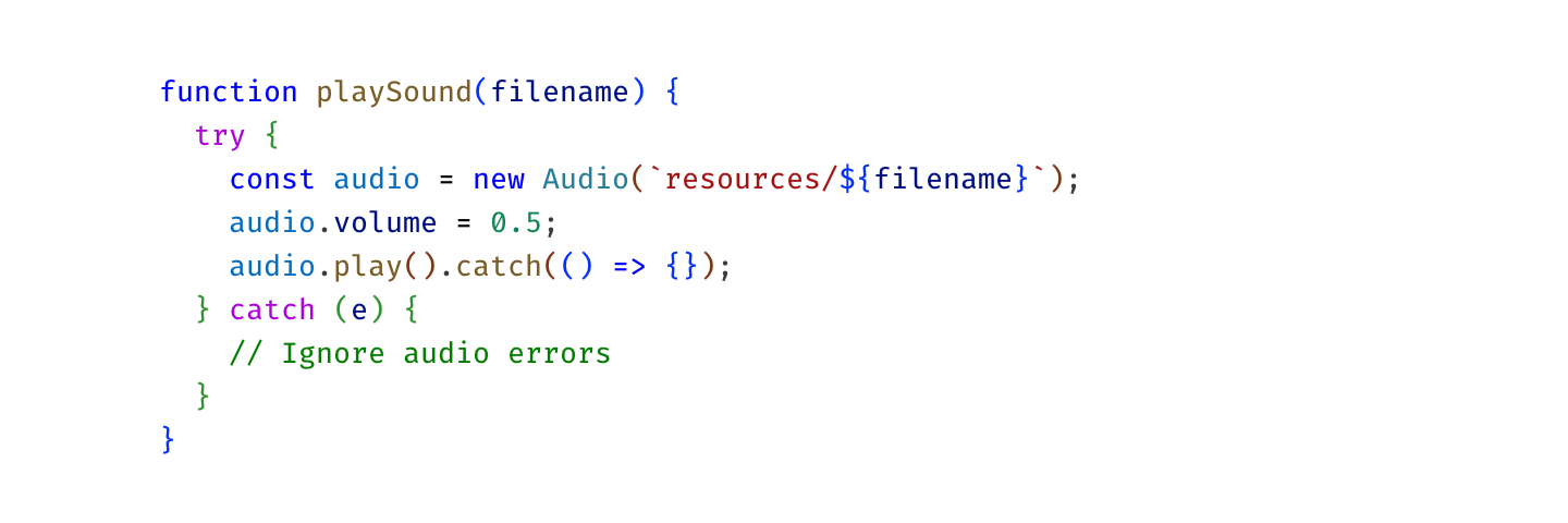
Syntax highlighting is a tool. It can help you read code faster. Find things quicker. Orient yourself in a large file.
Like any tool, it can be used correctly or incorrectly. Let’s see how to use syntax highlighting to help you work.
Christmas Lights Diarrhea
Most color themes have a unique bright color for literally everything: one for variables, another for language keywords, constants, punctuation, functions, classes, calls, comments, etc.
Sometimes it gets so bad one can’t see the base text color: everything is highlighted. What’s the base text color here?
The problem with that is, if everything is highlighted, nothing stands out. Your eye adapts and considers it a new norm: everything is bright and shiny, and instead of getting separated, it all blends together.
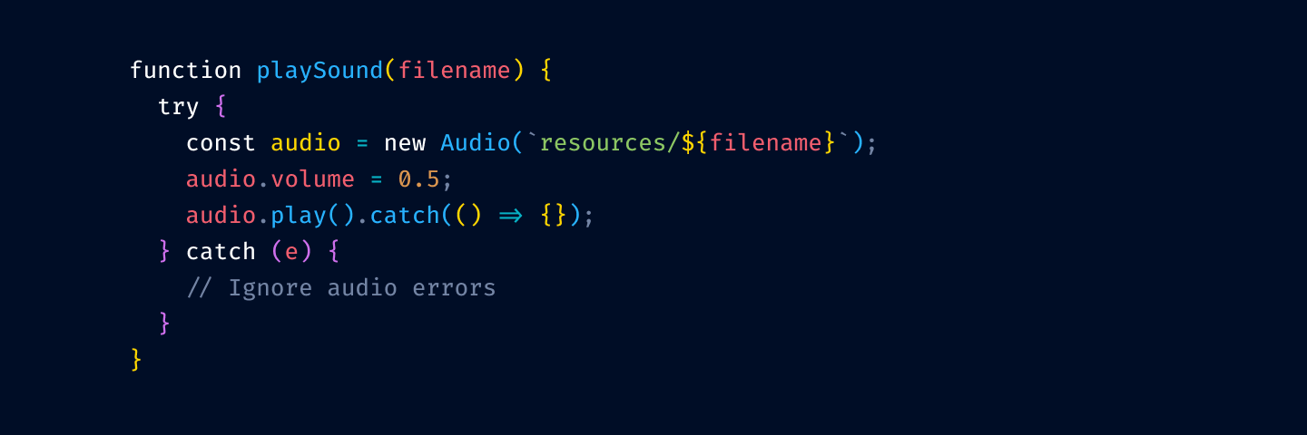
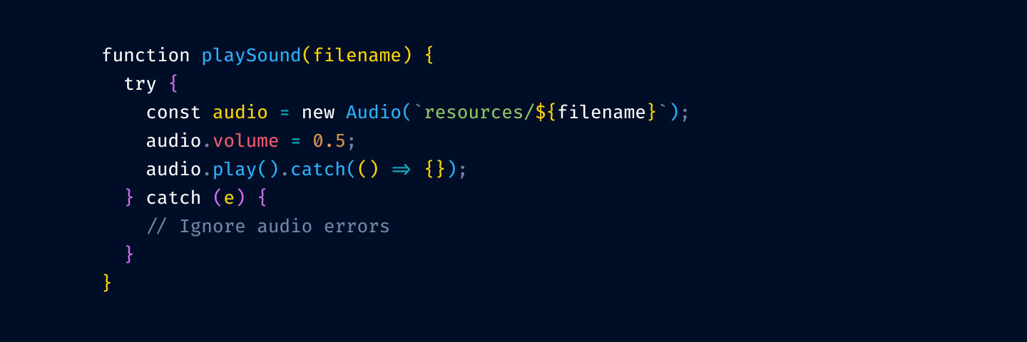
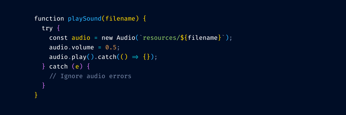
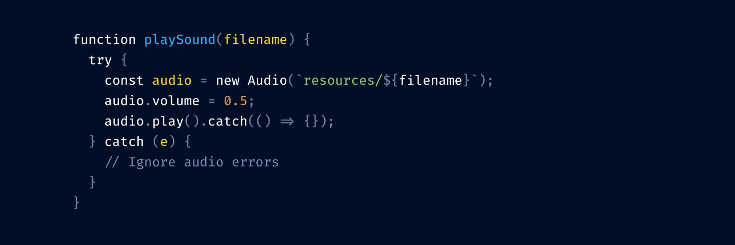
Here’s a quick test. Try to find the function definition here:
and here:
See what I mean?
So yeah, unfortunately, you can’t just highlight everything. You have to make decisions: what is more important, what is less. What should stand out, what shouldn’t.
Highlighting everything is like assigning “top priority” to every task in Linear. It only works if most of the tasks have lesser priorities.
If everything is highlighted, nothing is highlighted.
Enough colors to remember
There are two main use-cases you want your color theme to address:
Look at something and tell what it is by its color (you can tell by reading text, yes, but why do you need syntax highlighting then?)
Search for something. You want to know what to look for (which color).
1 is a direct index lookup: color → type of thing.
2 is a reverse lookup: type of thing → color.
Truth is, most people don’t do these lookups at all. They might think they do, but in reality, they don’t.
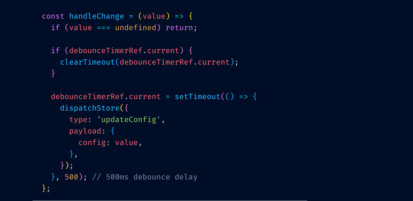
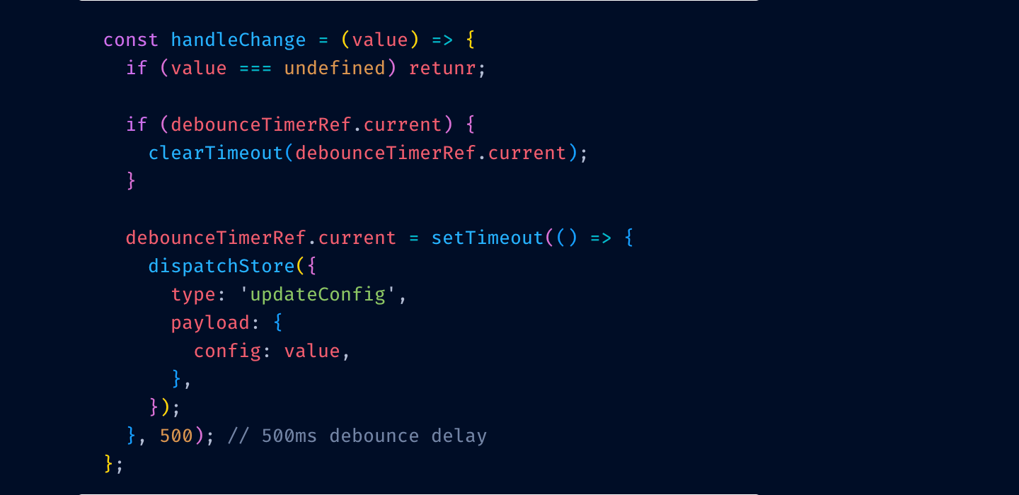
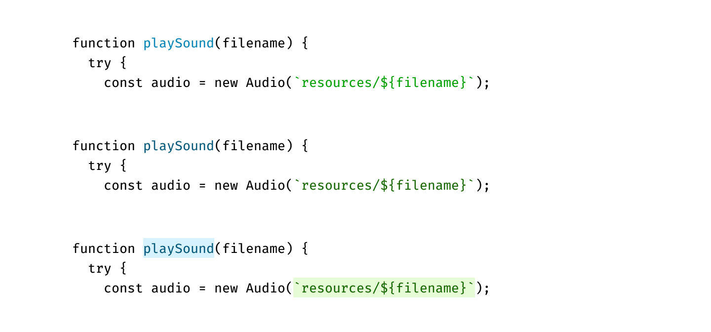
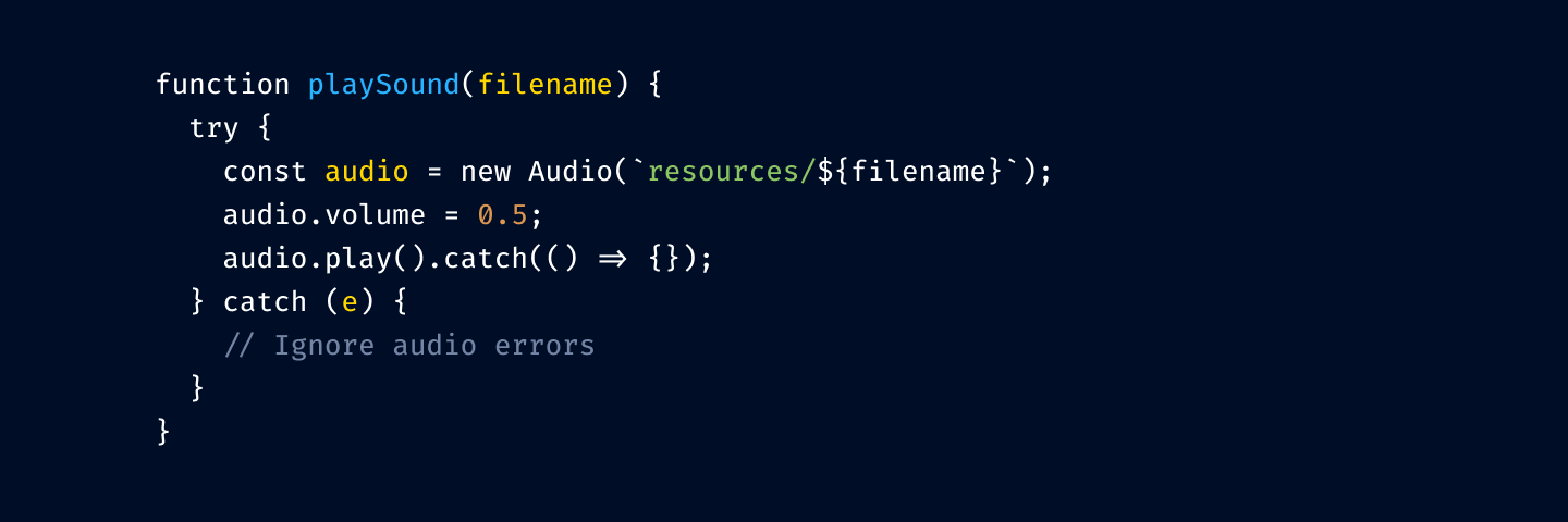
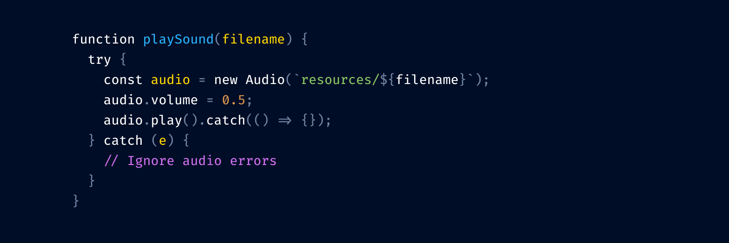
Let me illustrate. Before:
After:
Can you see it? I misspelled
return
for
retunr
and its color switched from red to purple.
I can’t.
Here’s another test. Close your eyes (not yet! Finish this sentence first) and try to remember what color your color theme uses for class names?
Can you?
If the answer for both questions is “no”, then your color theme is
not functional
. It might give you comfort (as in—I feel safe. If it’s highlighted, it’s probably code) but you can’t use it as a tool. It doesn’t
help
you.
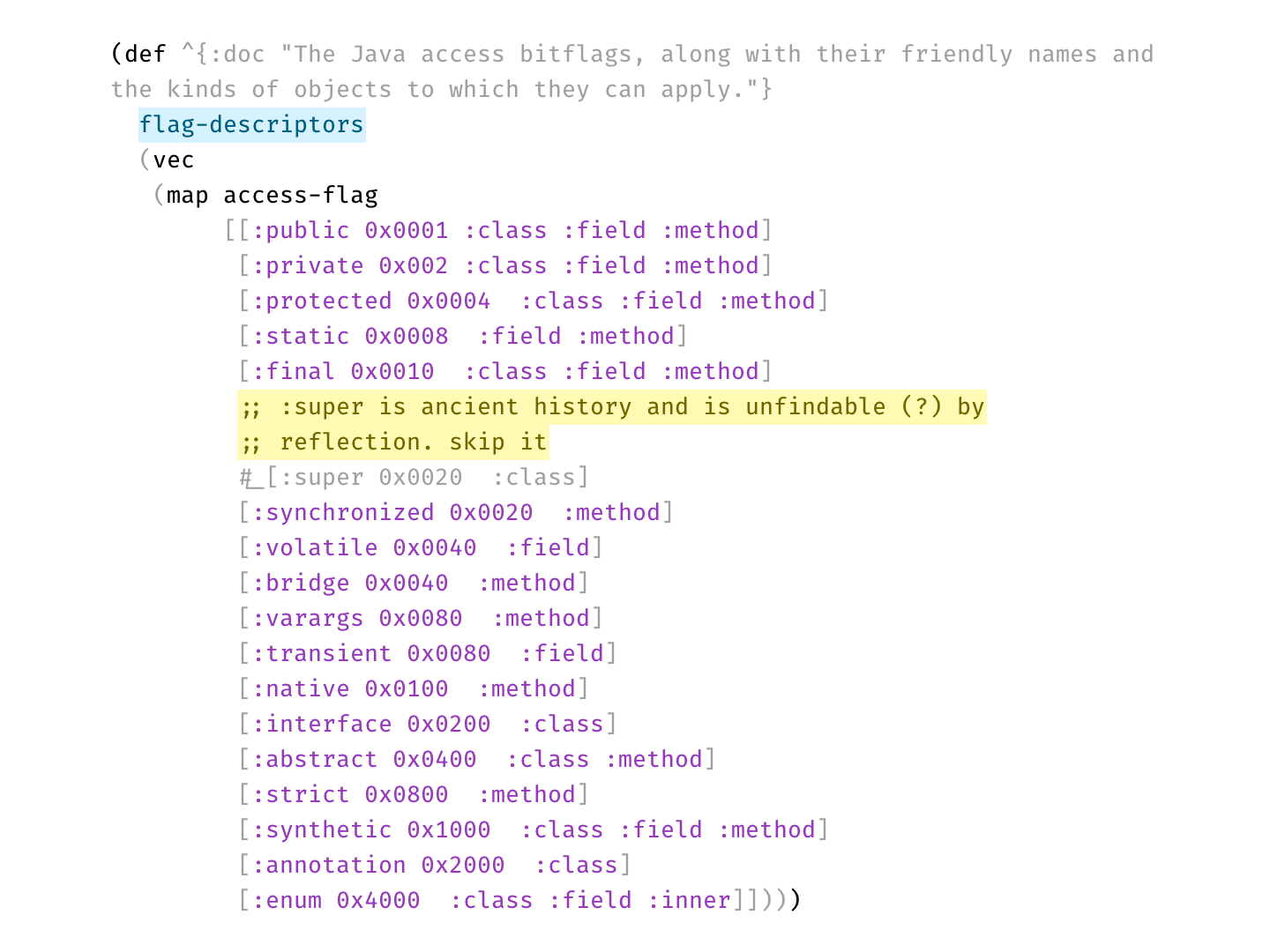
What’s the solution? Have an absolute minimum of colors. So little that they all fit in your head at once. For example, my color theme, Alabaster, only uses four:
Green for strings
Purple for constants
Yellow for comments
Light blue for top-level definitions
That’s it! And I was able to type it all from memory, too. This minimalism allows me to actually do lookups: if I’m looking for a string, I know it will be green. If I’m looking at something yellow, I know it’s a comment.
Limit the number of different colors to what you can remember.
If you swap green and purple in my editor, it’ll be a catastrophe. If somebody swapped colors in yours, would you even notice?
What should you highlight?
Something there isn’t a lot of. Remember—we want highlights to stand out. That’s why I don’t highlight variables or function calls—they are everywhere, your code is probably 75% variable names and function calls.
I do highlight constants (numbers, strings). These are usually used more sparingly and often are reference points—a lot of logic paths start from constants.
Top-level definitions are another good idea. They give you an idea of a structure quickly.
Punctuation: it helps to separate names from syntax a little bit, and you care about names first, especially when quickly scanning code.
Please, please don’t highlight language keywords.
class
,
function
,
if
,
else
stuff like this. You rarely look for them: “where’s that if” is a valid question, but you will be looking not at the
if
the keyword, but at the condition after it. The condition is the important, distinguishing part. The keyword is not.
Highlight names and constants. Grey out punctuation. Don’t highlight language keywords.
Comments are important
The tradition of using grey for comments comes from the times when people were paid by line. If you have something like
of course you would want to grey it out! This is bullshit text that doesn’t add anything and was written to be ignored.
But for good comments, the situation is opposite. Good comments ADD to the code. They explain something that couldn’t be expressed directly. They are
important
.
So here’s another controversial idea:
Comments should be highlighted, not hidden away.
Use bold colors, draw attention to them. Don’t shy away. If somebody took the time to tell you something, then you want to read it.
Two types of comments
Another secret nobody is talking about is that there are two types of comments:
Explanations
Disabled code
Most languages don’t distinguish between those, so there’s not much you can do syntax-wise. Sometimes there’s a convention (e.g.
--
vs
/* */
in SQL), then use it!
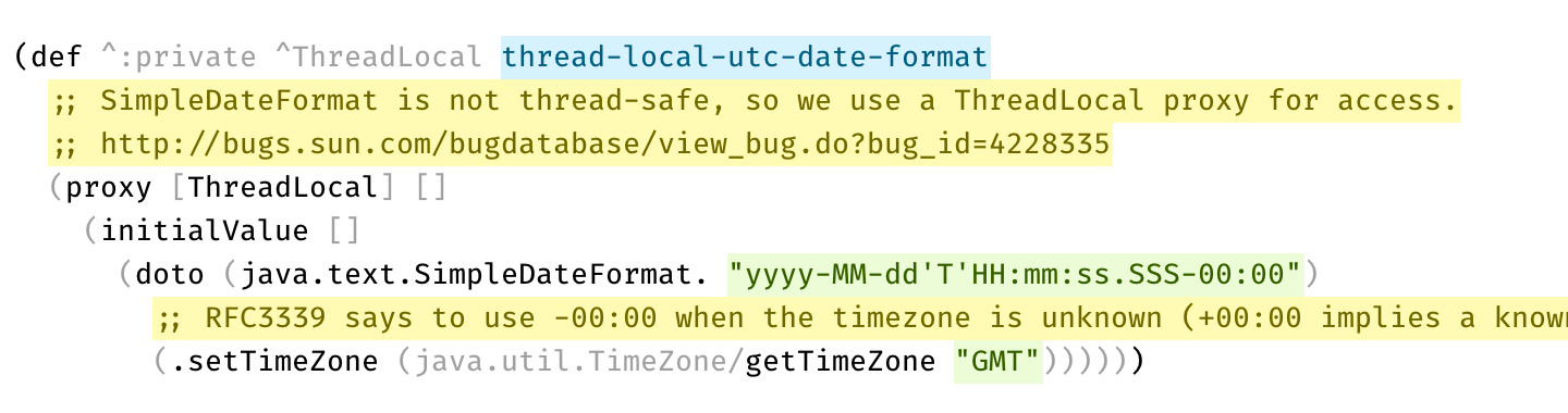
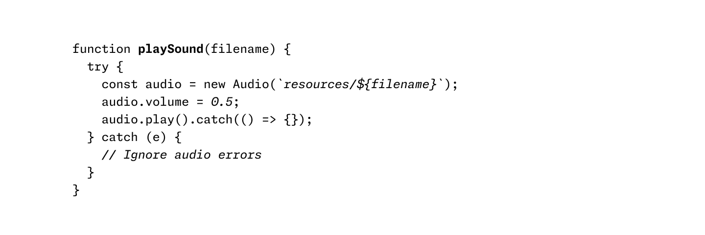
Here’s a real example from Clojure codebase that makes perfect use of two types of comments:
Disabled code is gray, explanation is bright yellow
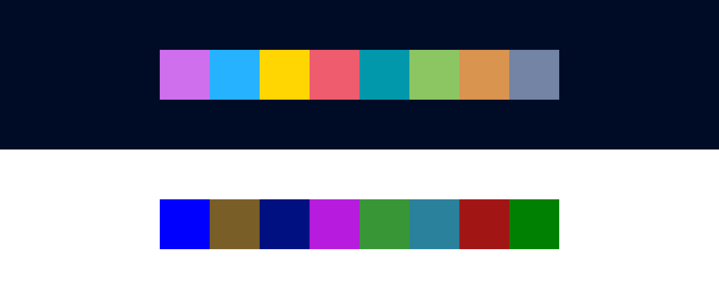
Light or dark?
Per statistics, 70% of developers prefer dark themes. Being in the other 30%, that question always puzzled me. Why?
And I think I have an answer. Here’s a typical dark theme:
and here’s a light one:
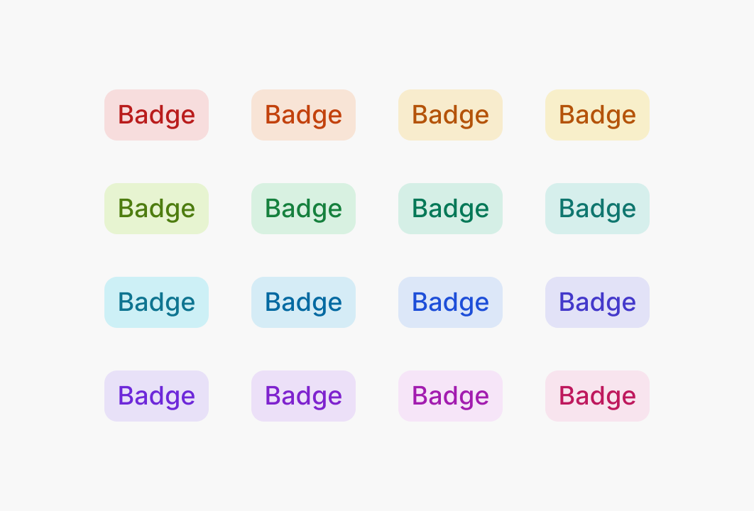
On the latter one, colors are way less vibrant. Here, I picked them out for you:
Notice how many colors there are. No one can remember that many.
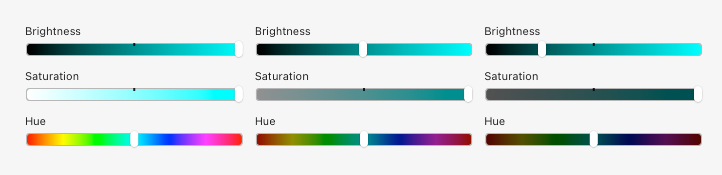
This is because dark colors are in general less distinguishable and more muddy. Look at Hue scale as we move brightness down:
Basically, in the dark part of the spectrum, you just get fewer colors to play with. There’s no “dark yellow” or good-looking “dark teal”.
Nothing can be done here. There are no magic colors hiding somewhere that have both good contrast on a white background and look good at the same time. By choosing a light theme, you are dooming yourself to a very limited, bad-looking, barely distinguishable set of dark colors.
So it makes sense. Dark themes do look better. Or rather: light ones can’t look good. Science ¯\_(ツ)_/¯
But!
But.
There is one trick you can do, that I don’t see a lot of. Use background colors! Compare:
The first one has nice colors, but the contrast is too low: letters become hard to read.
The second one has good contrast, but you can barely see colors.
The last one has
both
: high contrast and clean, vibrant colors. Lighter colors are readable even on a white background since they fill a lot more area. Text is the same brightness as in the second example, yet it gives the impression of clearer color. It’s all upside, really.
UI designers know about this trick for a while, but I rarely see it applied in code editors:
If your editor supports choosing background color, give it a try. It might open light themes for you.
Bold and italics
Don’t use. This goes into the same category as too many colors. It’s just another way to highlight something, and you don’t need too many, because you can’t highlight everything.
In theory, you might try to
replace
colors with typography. Would that work? I don’t know. I haven’t seen any examples.
Using italics and bold instead of colors
Myth of number-based perfection
Some themes pay too much attention to be scientifically uniform. Like, all colors have the same exact lightness, and hues are distributed evenly on a circle.
This could be nice (to know if you have OCD), but in practice, it doesn’t work as well as it sounds:
The idea of highlighting is to make things stand out. If you make all colors the same lightness and chroma, they will look very similar to each other, and it’ll be hard to tell them apart.
Our eyes are way more sensitive to differences in lightness than in color, and we should use it, not try to negate it.
Let’s design a color theme together
Let’s apply these principles step by step and see where it leads us. We start with the theme from the start of this post:
First, let’s remove highlighting from language keywords and re-introduce base text color:
Next, we remove color from variable usage:
and from function/method invocation:
The thinking is that your code is mostly references to variables and method invocation. If we highlight those, we’ll have to highlight more than 75% of your code.
Notice that we’ve kept variable declarations. These are not as ubiquitous and help you quickly answer a common question: where does thing thing come from?
Next, let’s tone down punctuation:
I prefer to dim it a little bit because it helps names stand out more. Names alone can give you the general idea of what’s going on, and the exact configuration of brackets is rarely equally important.
But you might roll with base color punctuation, too:
Okay, getting close. Let’s highlight comments:
We don’t use red here because you usually need it for squiggly lines and errors.
This is still one color too many, so I unify numbers and strings to both use green:
Finally, let’s rotate colors a bit. We want to respect nesting logic, so function declarations should be brighter (yellow) than variable declarations (blue).
Compare with what we started:
In my opinion, we got a much more workable color theme: it’s easier on the eyes and helps you find stuff faster.
It’s also been ported to many other editors and terminals; the most complete list is
probably here
. If your editor is not on the list, try searching for it by name—it might be built-in already! I always wondered where these color themes come from, and now I became an author of one (and I still don’t know).
Feel free to use Alabaster as is or build your own theme using the principles outlined in the article—either is fine by me.
As for the principles themselves, they worked out fantastically for me. I’ve never wanted to go back, and just one look at any “traditional” color theme gives me a scare now.
I
suspect
that the only reason we don’t see more restrained color themes is that people never really thought about it. Well, this is your wake-up call. I hope this will inspire people to use color more deliberately and to change the default way we build and use color themes.
Talk: Почему компьютеры не умеют считать? @ Podlodka
Как компьютеры представляют числа – от int и float до NaN, BigInt, decimals и комплексных. Прошлись по всему числовому зоопарку: обсудили, зачем нужны разные типы, где они подводят, и почему 0.1 + 0.2 ≠ 0.3 – не баг, а особенность.
Content Preview
Как компьютеры представляют числа – от int и float до NaN, BigInt, decimals и комплексных. Прошлись по всему числовому зоопарку: обсудили, зачем нужны разные типы, где они подводят, и почему 0.1 + 0.2 ≠ 0.3 – не баг, а особенность.

next to it. Okay, I think. Next time I’m looking for “Cut,” I might save some time and start looking for

and
mismatch, but reversed ¯\_(ツ)_/¯
means “New”:


means quick look:


is “Import”:


in a toolbar:


? Come on!


to mean the same thing in one place, and expects me to notice minute details like this in another?


. Apple, for some reason, went with a book:


and
. Dots are supposed to represent something. I can imagine thinking that led to
. But
? No decorations. No effects. Just plain Abc. Really?